Art History Essay: Introduction

Link to my proposal here.

Buddhism originally originated in India and spread to China as early as the second century B.C during the Han Dynasty, where Confucianism and Taoism beliefs were already a well-established school of thought for the citizens. Going against the already their values of relating oneself to family and the community, Buddhism instead focused on creating awareness of one’s self and attaining enlightenment. It was thus seen as selfish, and was not immediately accepted in China. It started gaining traction during the fourth century in the north part of china, where non-Han Chinese ruled. China descended into a period of instability and disunity, and people were looking for ways of salvation. Buddhism drew influences from various elements in Taoism and Confucianism and eventually flourished. This is especially evident in the later Buddhist sculptures such as those found at the Longmen Caves, where more than a thousand Buddhist sculptures can be found. It can said that through the sinicization of Buddhist art, it became more accessible to the masses and thus more popular.

Essay Proposal


Chosen Question:

What is Chinese Buddhist art? Compare two sculptures and address the question of change in art and religion when Buddhism arrives in China. The images need to be from lecture or from the Asian Civilizations Museum.


Introduction Paragraph:

  • Buddhism originated in India
  • Spread to China around the 1st/2nd century
  • Gained traction during the late Han Dynasty, and experienced new heights of popularity in the Tang Dynasty.
  • This is especially evident in later Buddhist art such as those found in the Tang Dynasty.
  • Bring focus to the Buddha Vairocana in the Longmen caves (983CE)

    Thesis Statement:  Buddhism successfully became more accessible and assimilated into Chinese culture and society through sinicization.

Screen Shot 2016-03-10 at 11.14.38 pmSeated Buddha, Gilded Bronze (338CE)

Screen Shot 2016-03-10 at 11.15.01 pmBuddha Vairocana, Longmen Caves (983CE)


1st Paragraph:

  • Comparison between early Buddhist art and late Buddhist art
  • Chosen artworks:
    • Buddha Vairocana, Longmen Caves (983CE)
    • Seated Buddha, Gilded Bronze (338CE) (Earliest known Buddhist art)
  • Visual Analysis between the two
  • Comparisons:
    • Buddha Vairocana is more naturalistic and realistic (perhaps reflecting Taoist beliefs?)
    • Materials
      • Usage of limestone in the Buddha Vairocana – softer and rounder, allowing for more serene and realistic depictions of the figures
    • Scale
      • the Buddha Vairocana is 17m tall and on a very large scale (why?)
      • Perhaps a testament to its influence and significance such that people are willing to pour in the amount of money and time needed to create it.
      • Contrasts with the Seated Buddha, which is on a much smaller scale.


2nd Paragraph:

  • Contextual Analysis
  • China was in a time of turmoil and instability, and people were seeking other forms of salvation (need proper citation!)
  • Buddhist beliefs and practises were rejected because it was the opposite of pre-existing Taoist and Confucianist thinking
    • Both were focused on the individual’s relation to the family and community, while
    • Buddhism focused on being aware on one’s self and enlightenment
  • Buddhism thus had to undergo several changes
    • It eventually gained the acceptance of scholars, and was influenced and partially ‘fused’ with existing taoist beliefs
    • (Reference to visual analysis and link the cultural/religious growth to the aesthetics of the Buddha Vairocana)
  • Another sign that it had assimilated/was accepted in China:
    • Most statues were commissioned by emperors/empresses to gain good karma
    • Highlights the strong presence of Buddha such that even royalty participated in it


Conclusion

  • Re-state/summarise the cultural influences on Buddhism (and therefore) Buddhist Art.
  • It wasn’t just Buddhism that changed when it arrived in China. It developed a mutual relationship with Taoism and Confucianism, and they influenced and changed the other.
  • Buddhism underwent changes to suit China, and sculptures became more natural and realistic.


Project 2: POV (Initial Research and Sketches)

Hello!


I had a few ideas about what do choose as my object, and I eventually settled on the idea of happiness.

The idea of happiness varies a lot depending on each individual and I initially thought it would be interesting to tackle it.

For example, happiness to a beauty queen would be eternal beauty and youth whereas happiness to a businessman would be status and money.

However, for the purpose of maintaining a unified theme/look, I decided to scrape the idea because I felt the ideas would be too diverse and look too different.

So instead, I decided to look at the idea of happiness from different objects:

  1. Happiness from the point of view of a cloud is peeing.
  2. Happiness from the point of view of a ghost is companionship.
  3. Happiness from the point of view of a feet is freedom.
  4. Happiness from the point of view of  boobs is freeing the nipple.
  5. Happiness from the point of view of armpit hair is being untamed.
  6. Happiness from the point of view of a introvert is being left alone.
  7. Happiness from the point of view of a star is recognition.
    1. Happiness from the point of view of a artist is recognition.
  8. Happiness from the point of view of a dirty dish is being washed.
  9. Happiness from the point of view of a cat is doing whatever it wants.
  10. Happiness from the point of view of a comb is smooth hair.
  11. Happiness from the point of view of a vain-pot is looking ideal.
  12. Happiness from the point of view of a former beauty queen is eternal youth.
  13. Happiness from the point of view of a weirdo is being ok with being weird.
  14. Happiness from the point of view of a goth is being full black.
  15. Happiness from the point of view of a bimbo is being full pink.
  16. Happiness from the point of view of a lover is being with their partner 24/7.
  17. Happiness from the point of view of a fashionista is being in trend.
  18. Happiness from the point of view of a ADM student is graduating.

Inspirations:

5c4dd49b7002bcd8d4e0a0055ff4ef48


tumblr_nt9bku22nZ1rmvzs8o1_12801270984 (1) enhanced-5678-1391204649-2


Mrzyk & Moriceau:


3c0962af7b0bdf67468d7f00be5b5296


91c341fed2a3bcf642f48acc1b215b1c a12835c66b2f909ae17e0f37b31402a8


Ultraaviolets:

Screen Shot 2016-02-25 at 11.12.13 am

Screen Shot 2016-02-25 at 11.12.28 am

Screen Shot 2016-02-25 at 11.12.45 am


Nimura Daisuke:

His works are really weird and funny but I love it HAHAHA

6006103072249614fc2059c33acc7a89d6237ad0d11e1702e9b50f975f9935acedbc11af8a0b35dee5615ecafd04802a26bb1128f9dd3f806afcbb50269d8891

This is so wonderfully weird and I love it!


53fe166671948e4ebea0f6746de8c8b1


Some of my sketches:


File_000 (2)


As someone who can’t draw well, I wanted to challenge myself this time round to see if I could cope with using a more illustrative style. It’s something I’ve always liked but never really attempted (simple vector art on AI is the furthest I usually go) so hopefully all goes well and I don’t kill myself halfway through?

2D: Typographic Portrait (FINAL)

Hello!

This will be my final post for Project 1.

To be completely honest, I got really lost in the midst of doing the project. What exactly is typography? Is it the type itself, or is it how it interacts with background and context to present a set of information/ideas to its audience? Different people interpret typography differently, and I definitely struggled with finding out what typography meant to me.

After much thought, I pushed through with the project.

I’ll bring you through my 4 artworks and other ideas that i discarded along the way.


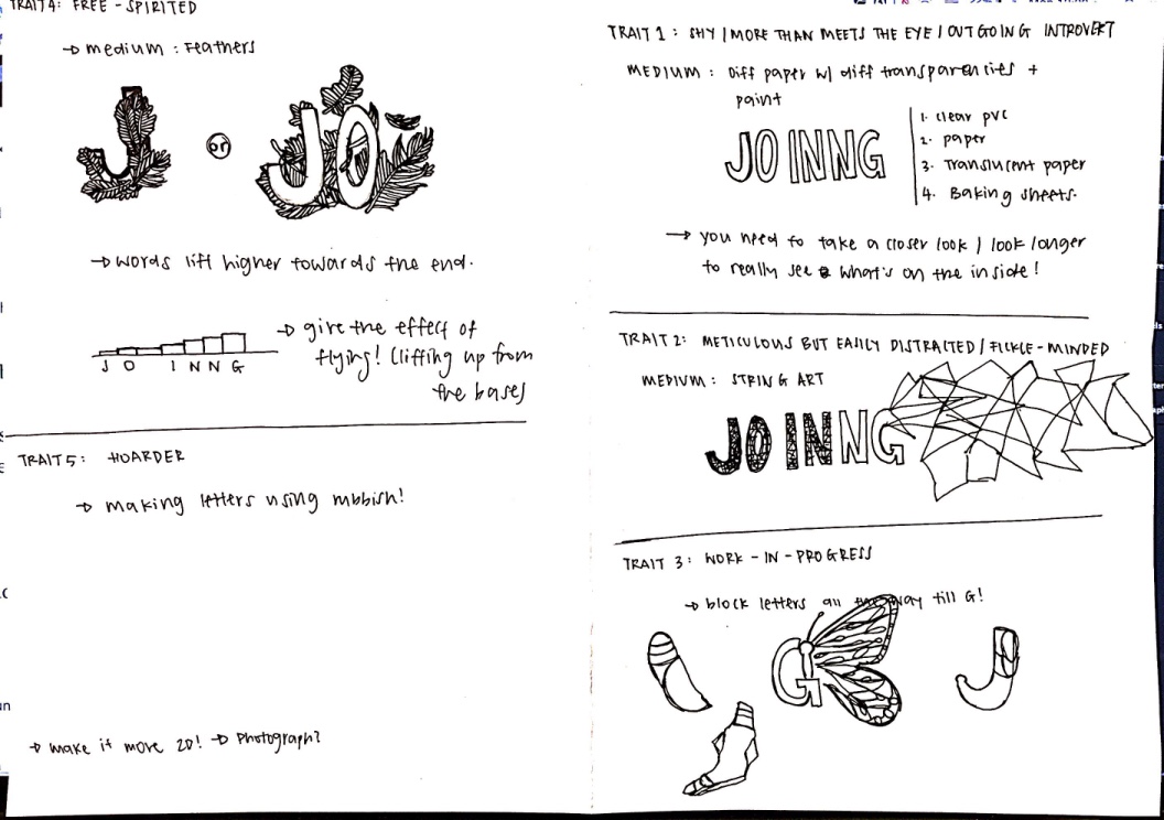
TRAIT #1: MORE THAN MEETS THE EYE

This might not apply to be as strongly as it did when I was younger, but I identify with being shy/introverted. The irony here is that people closer to me know that I am very outgoing and loud! In short, I wanted to portray myself as someone who might appear normal and forgettable but is actually very vibrant and colourful on the inside.

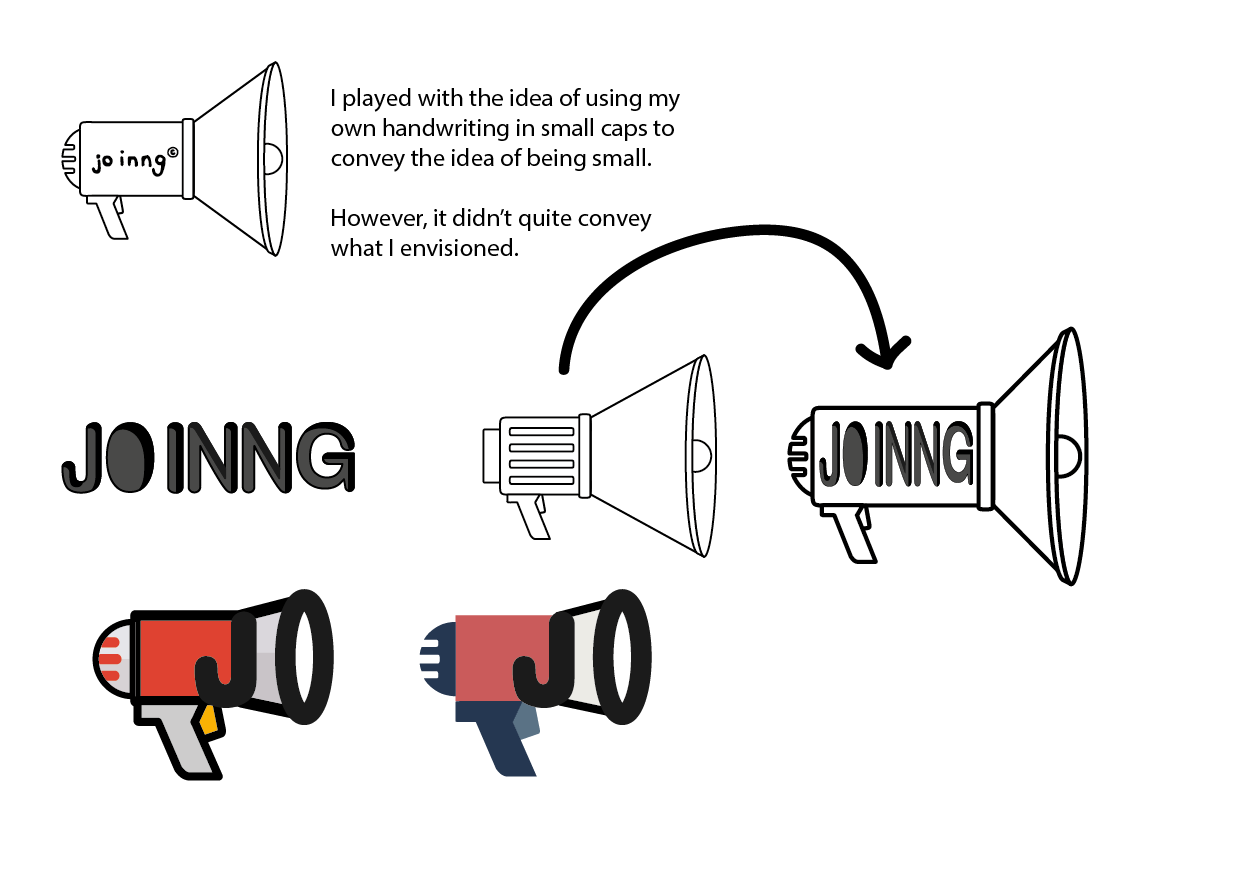
Before I show the picture of my final artwork, let me show you some of the works I did in the process! One of my initial ideas was to play with the size of the font:

All Drafts-Ideas (Cleaned Up Version)-10 All Drafts-Ideas (Cleaned Up Version)-11

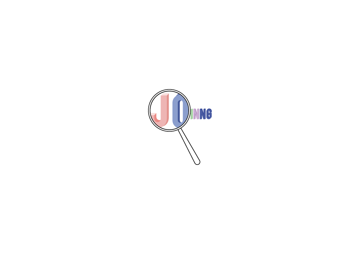
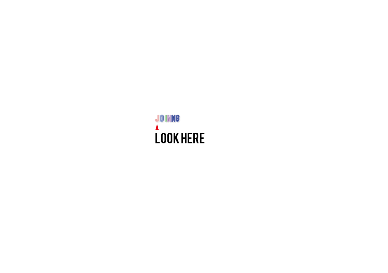
I made the font as small as I could, and used an additional element (the magnifying glass and “look here”) to hint at the audience to take a closer look. I decided this didn’t convey the idea of more than meets the eye very effectively, and scraped the idea.

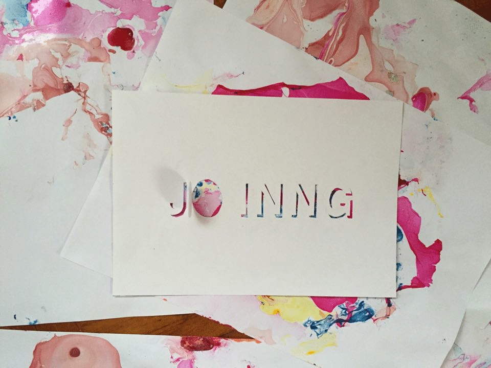
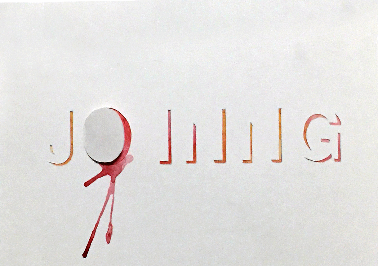
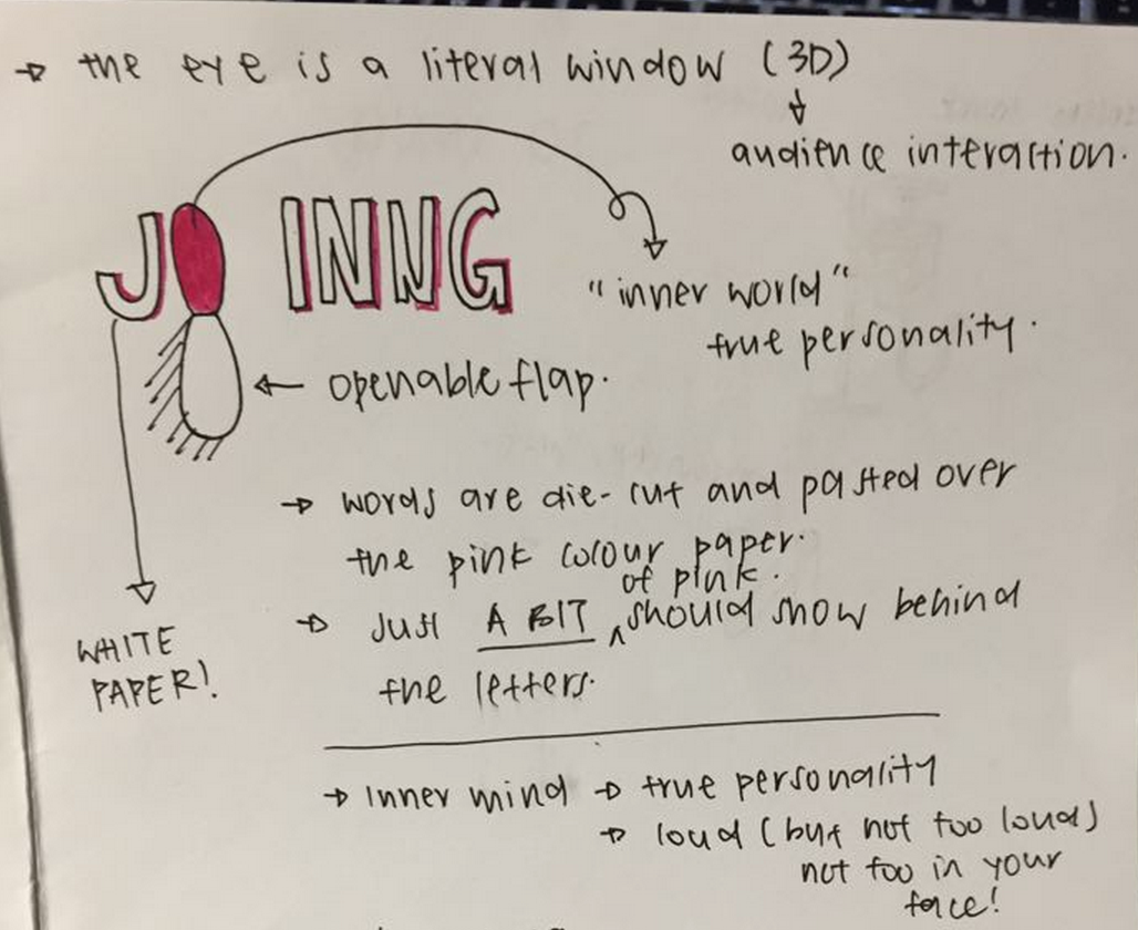
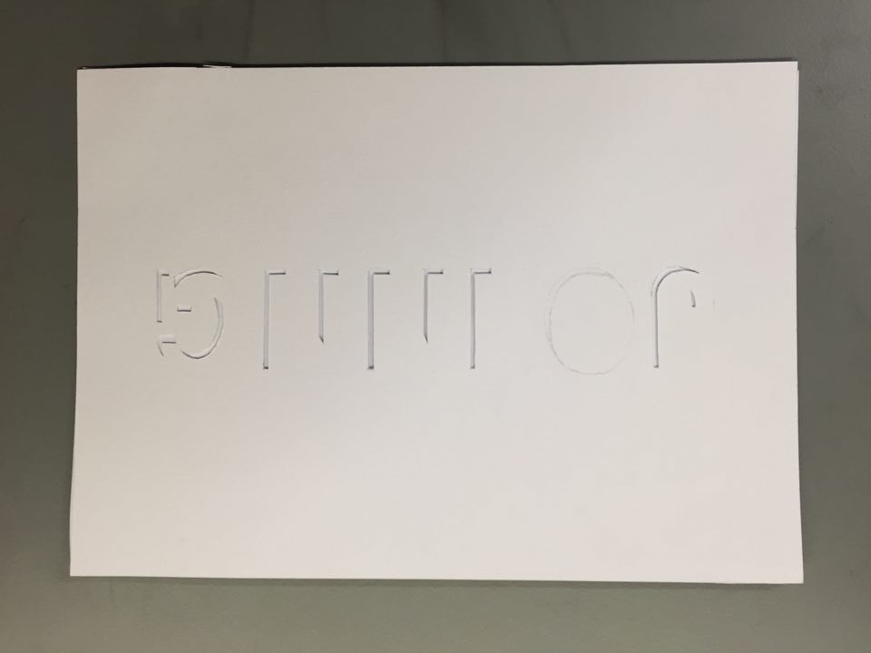
I also wanted the audience to take the approach in discovering the inner me, and I thus wanted to design the type in a way where it would invite the audience to interact with it. After some brainstorming, I settled on the idea of using die-cuts.

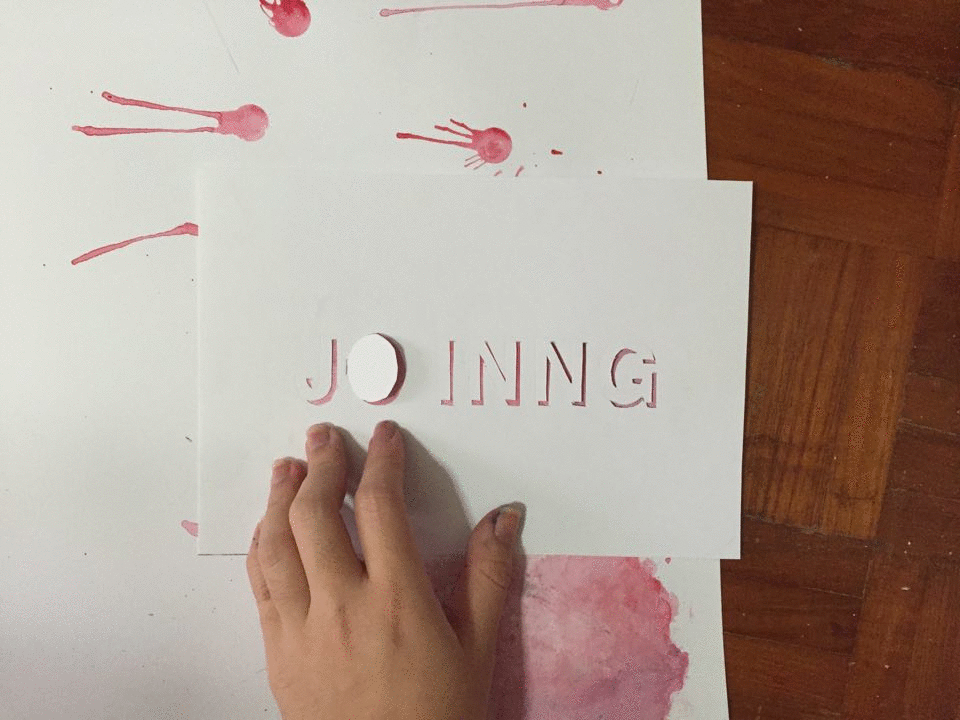
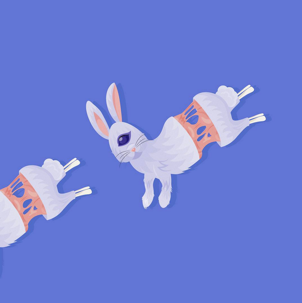
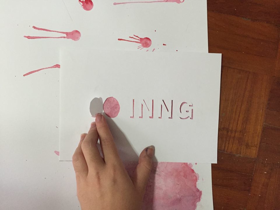
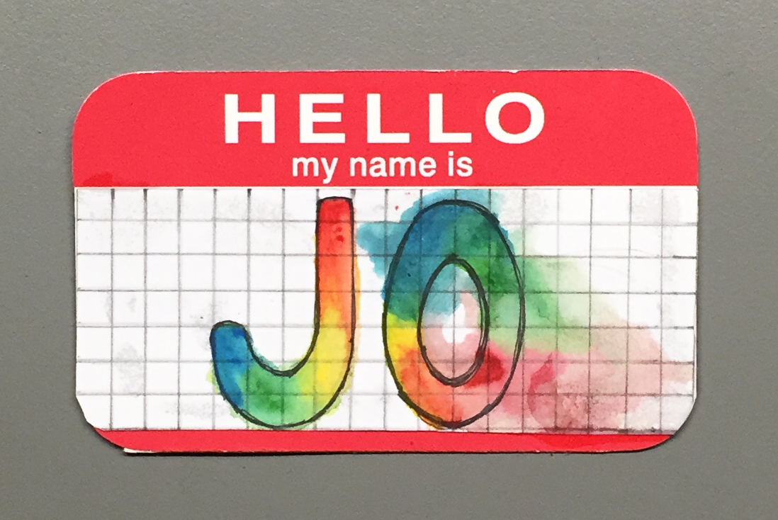
I purposely chose to use the Helvetica font. It’s an excellent font that’s good, but it’s also very common. I wanted to make use of its common usage to represent the idea of being normal and blending in (and almost becoming forgettable). To play up the idea of the font being almost invisible, I used illustrator to create a ‘shadow’ of the font and cut out the shadows. All Drafts-Ideas (Cleaned Up Version)-09
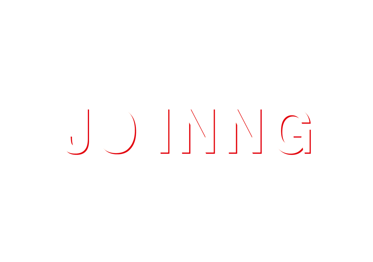
The eyes are said to be the windows to our soul, and I thus turned the O in JO into a window that could be opened by the audience. The next step was to then decide what colour/patterns to use. I decided against using solid colours because I felt it would be too flat and 1 dimensional.

output_OdIvxP

I thus explore the idea of using marbling:

File_001 File_003 File_005

output_waQCZP

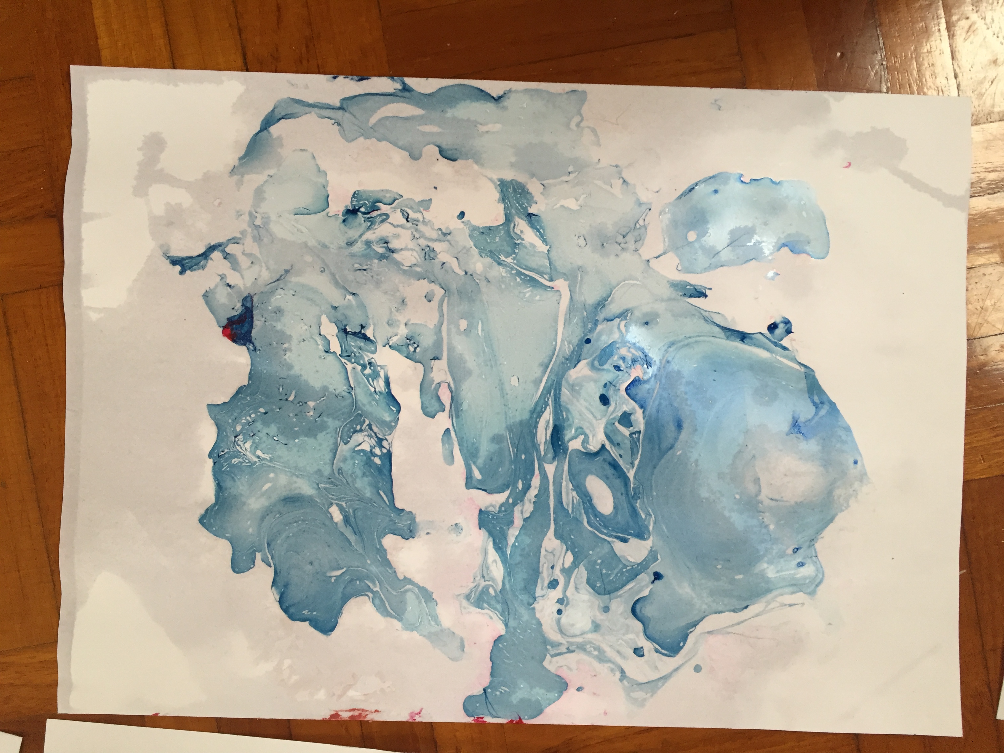
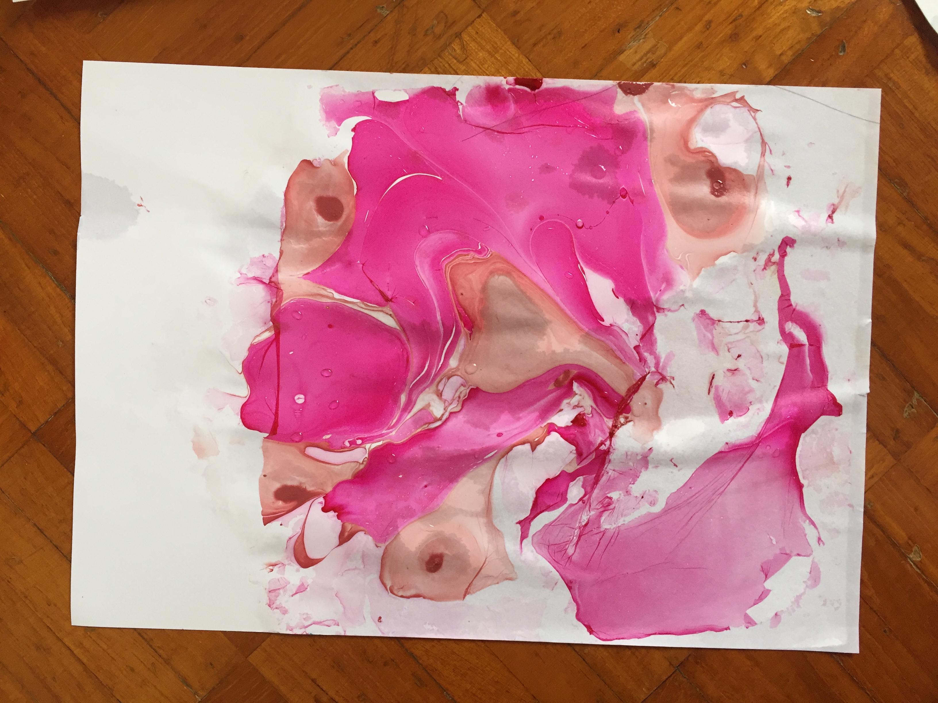
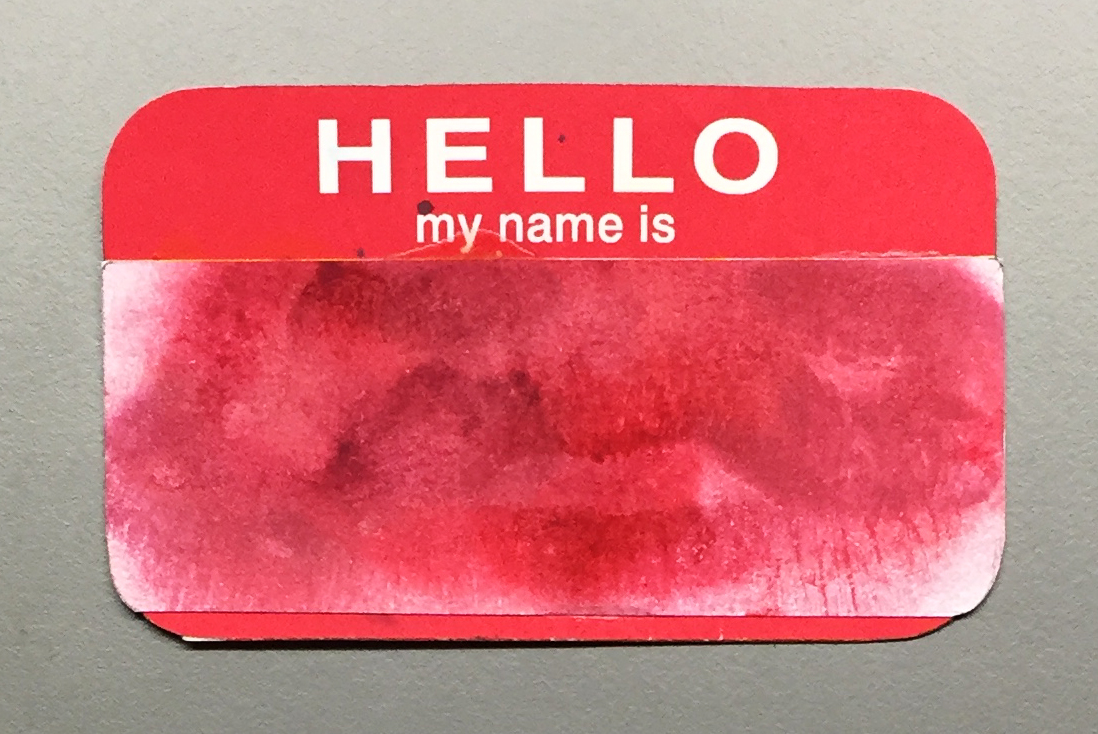
I still wasn’t satisfied with the results, and finally decided to use watercolour instead. I also decided to have some watercolour leak out/escape from the window so as to hint to the audience that there were more things underneath! This was done through stamping some diluted paint on the paper with my paint cap, and using a straw to blow the paint outwards.

Final Artwork:

output_s5J68u


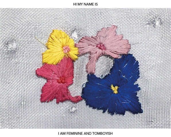
TRAIT #2: FEMININE AND TOMBOYISH

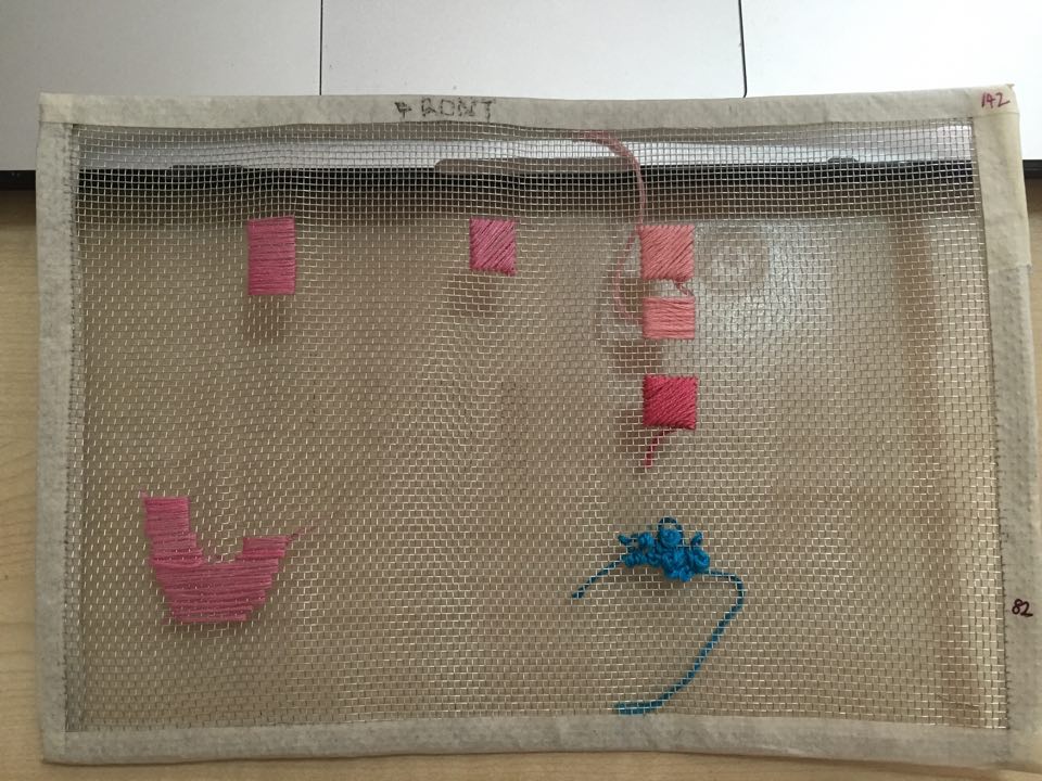
Like mentioned in my previous post, I grew up rather tomboyish. My initial idea was to simply have letters and flowers embroidered on a mesh surface.

My attempt at plotting my letters and flowers on illustrator before starting on the actual artwork:Embroidary 1-01-01

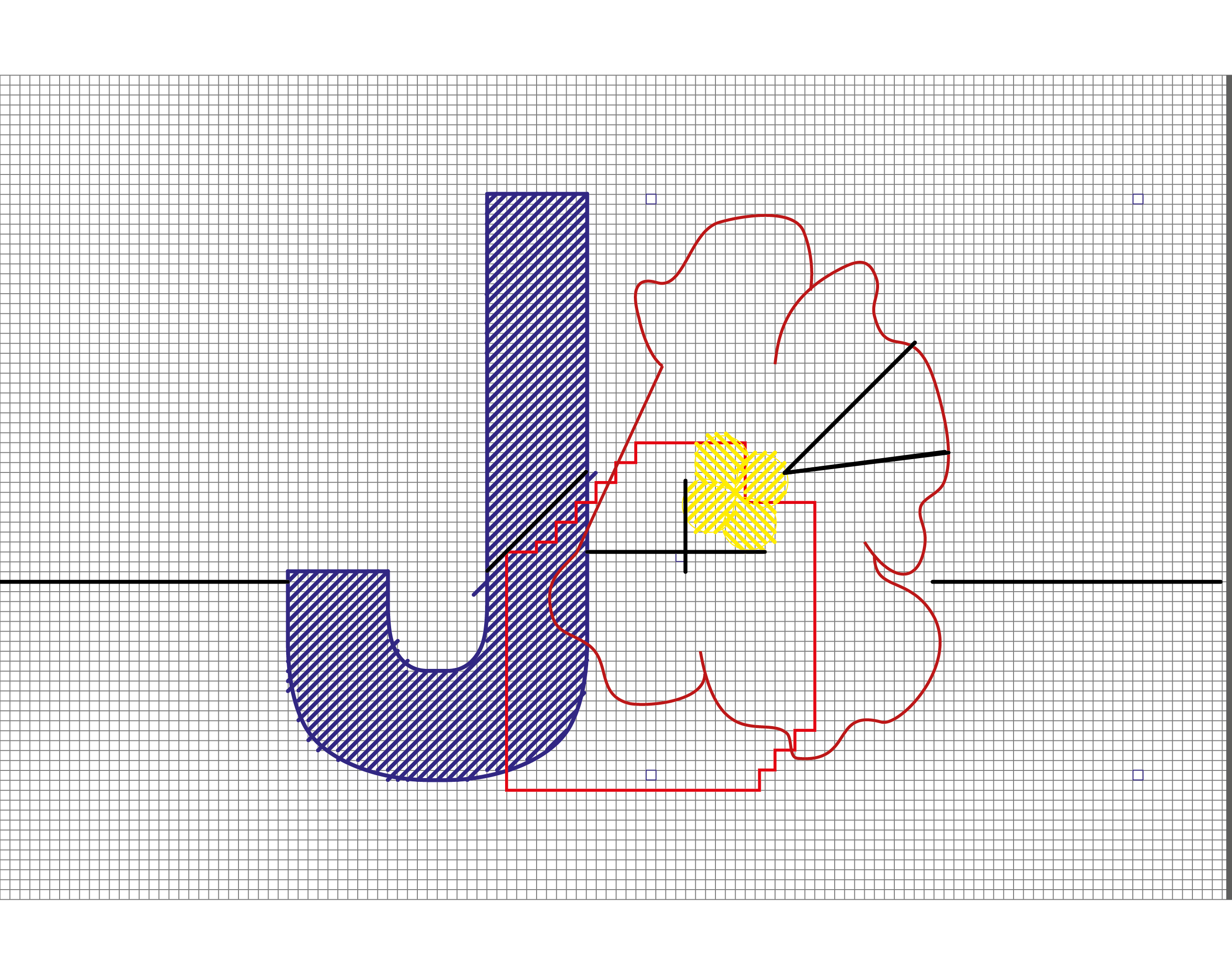
The two below were the results of my initial tries.

File_001
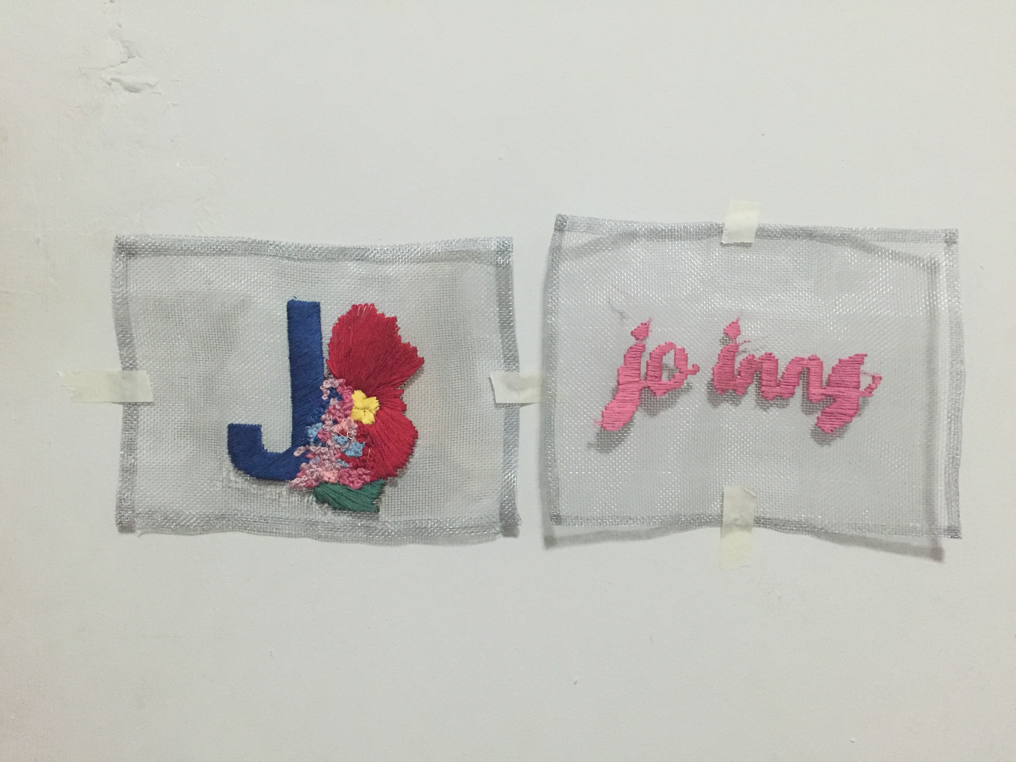
(looking a bit… grandma-ish?)


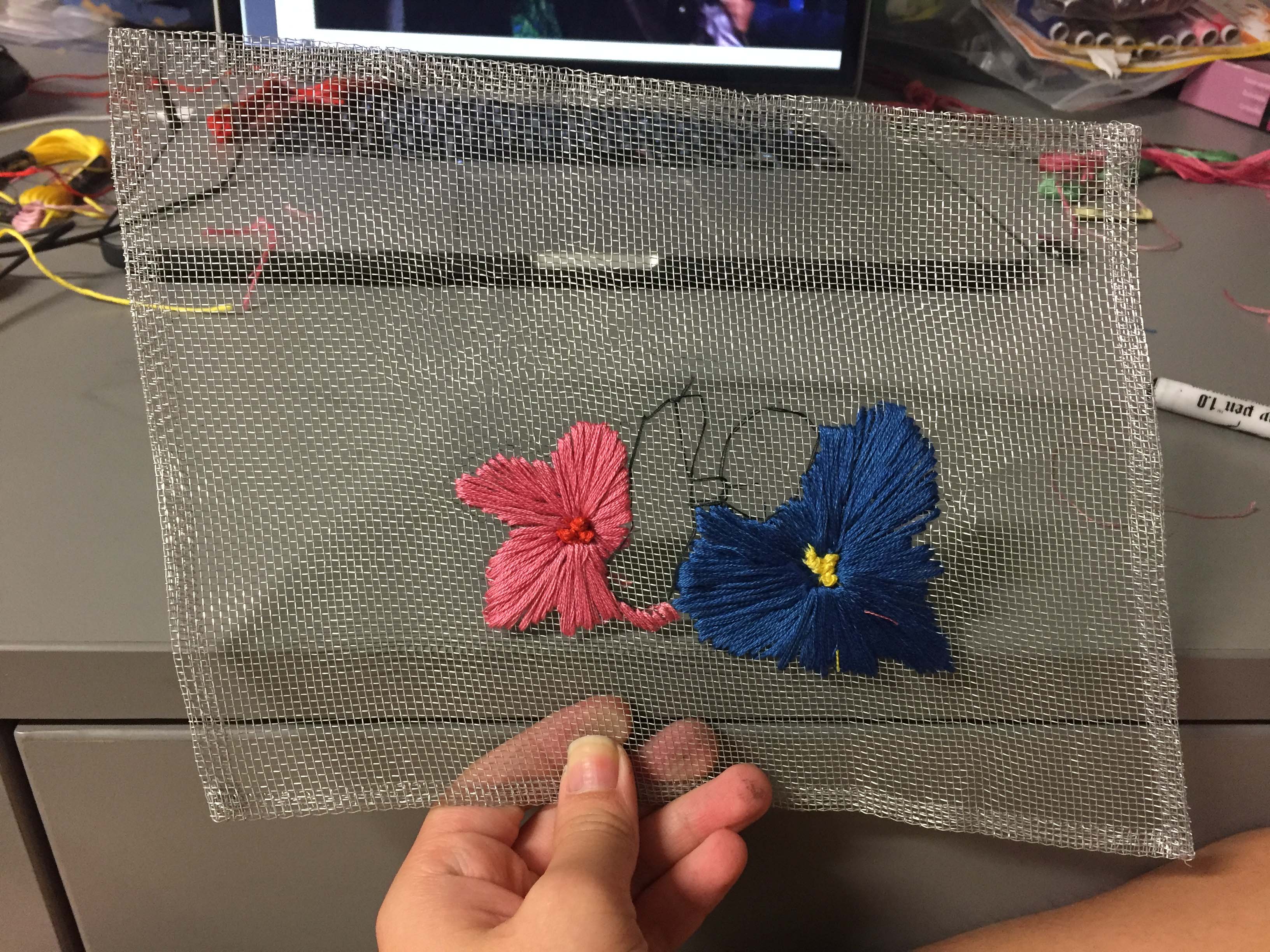
After some consideration, I realised the mesh and thread still seemed very separate, and I thought of ways to make the thread interact with the mesh even more. That is how I arrived at the idea of playing with negative spaces:
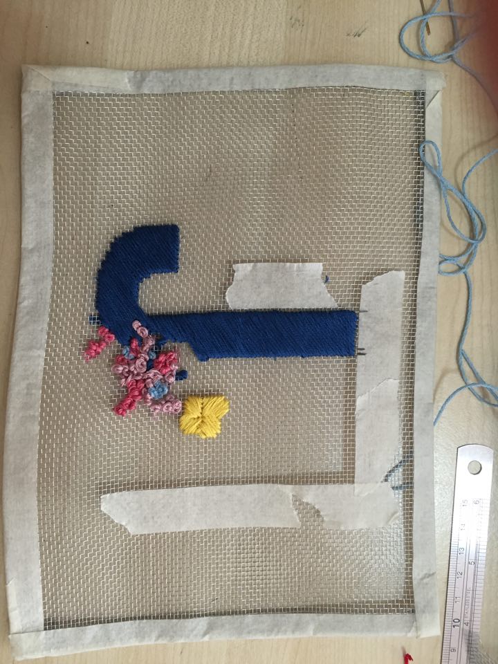
File_002(2)

Final Artwork:

Girlish & Tomboyish


I liked this much better than my first 2 tries.

I created a negative space using the flowers, and this negative space spelt out the words JO. I thought method displayed more interactivity between the two mediums, and this represents how I wouldn’t be JO without both elements present. Without the flowers there would be no letters forming the word JO, and without the mesh the negative space created by the flowers would be boring and nothing interesting.

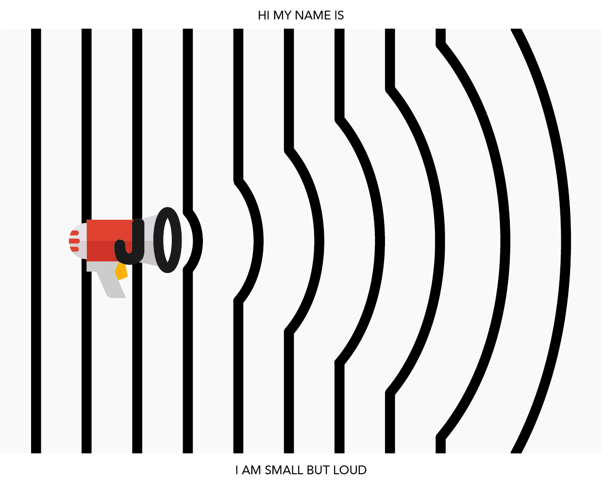
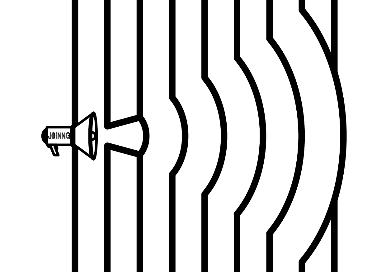
TRAIT #3: SMALL BUT LOUD

I’m often told that I’m very loud for my size, and I thought that was an interesting trait to represent myself with.

Because of how small I am, people sometimes hear me before they see me (that’s because i laugh REALLY loudly sometimes HAHAHAHA). If you hear random explosive laughter echoing within ADM, the possibility of it being me is pretty high!

I thus tried to come up with a design that would place an emphasis on the fact that people usually hear me before seeing me.

I thought the most straightforward way to show loudness was to have straight lines being bent out of shape by sound waves created by a loudspeaker.

All Drafts-Ideas (Cleaned Up Version)-13

I wanted to create a hierarchy where the audience’s eyes would go to the warped lines. This would then be followed by the loudspeaker and my name. I thus decided to go with the last loudspeaker design where the font is much less obvious.

Final Artwork:
All Drafts-Ideas (Cleaned Up Version)-14

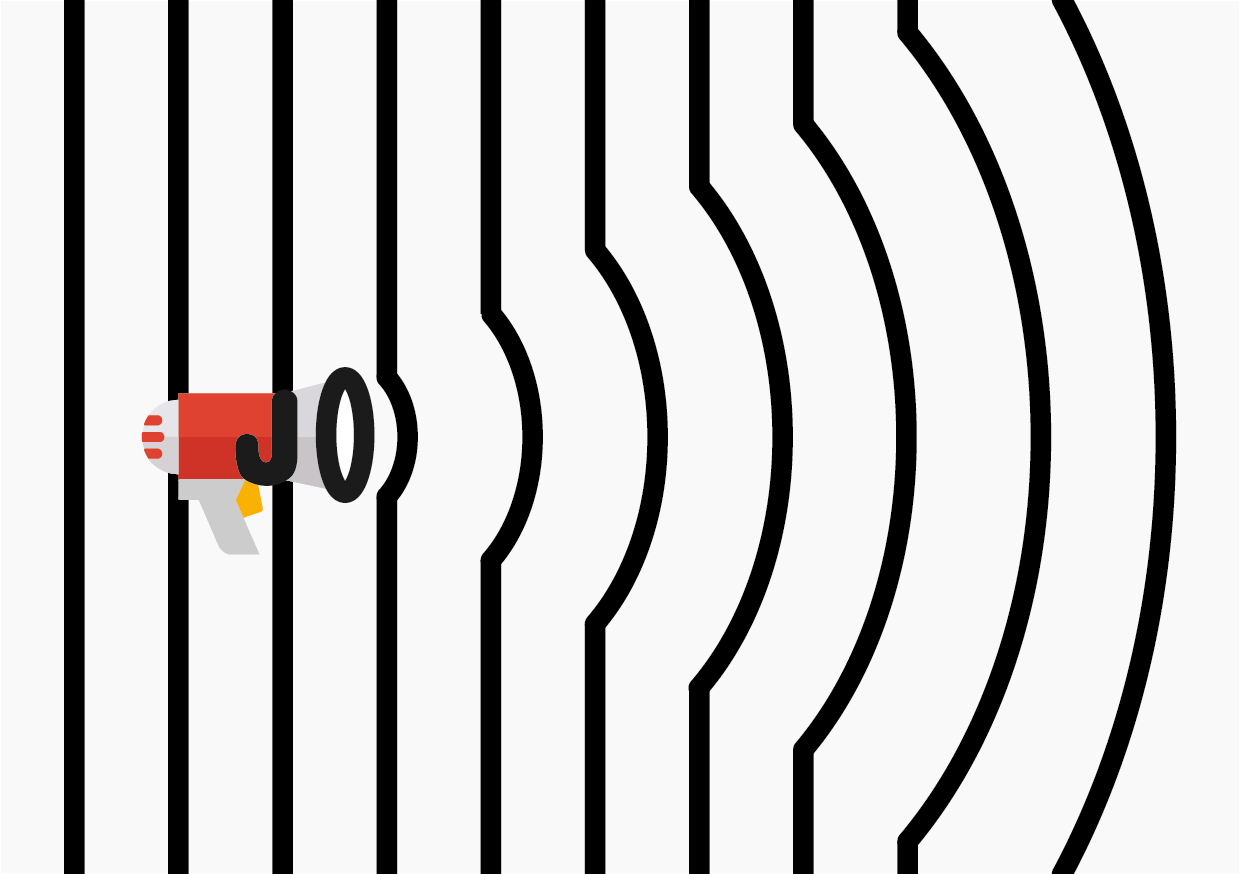
The bright orange colour draws attention to the form of the loudspeaker rather than the typography itself. I did this so that my name would be the least noticeable thing in the image.


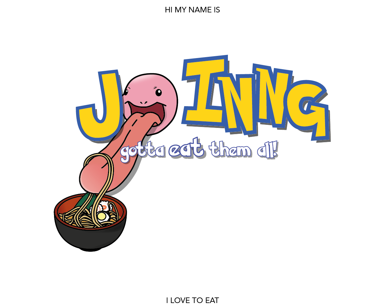
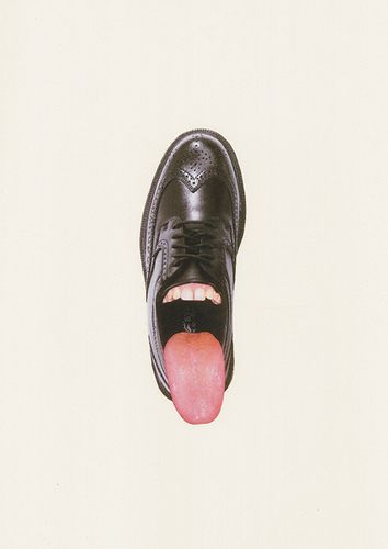
TRAIT #4: I LOVE FOOD

This was the most straight forward concept of the 3. As mentioned in the previous post, I wanted to make use of an exiting slogan/catchphrase and modify it to fit my trait so that people would be able to relate to it more easily.

This was what I settled on:

Pokemon Reference

I briefly contemplated using the fighting scene but later decided against it and I felt using the slogan would be a stronger and more relatable way to convey my message.

All Drafts-Ideas (Cleaned Up Version)-05

Font: I downloaded a font off the internet and further tweaked it so that it would look as close to the original pokemon font as possible.

Draft 1:

All Drafts-Ideas (Cleaned Up Version)-03

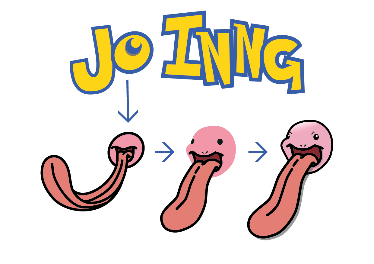
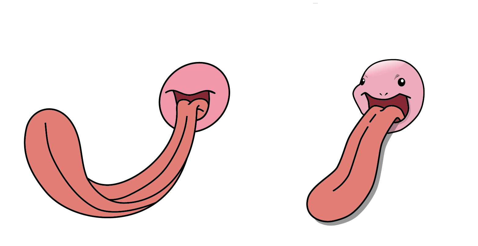
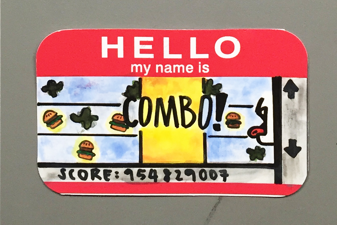
I decided to use Lickintung for my 2nd attempt because i felt its long tongue would fit into my concept more seamlessly versus other pokemon. The way it stretches its long tongue out of its mouth also made it look more greedy.

Evolution of my lickintungs:
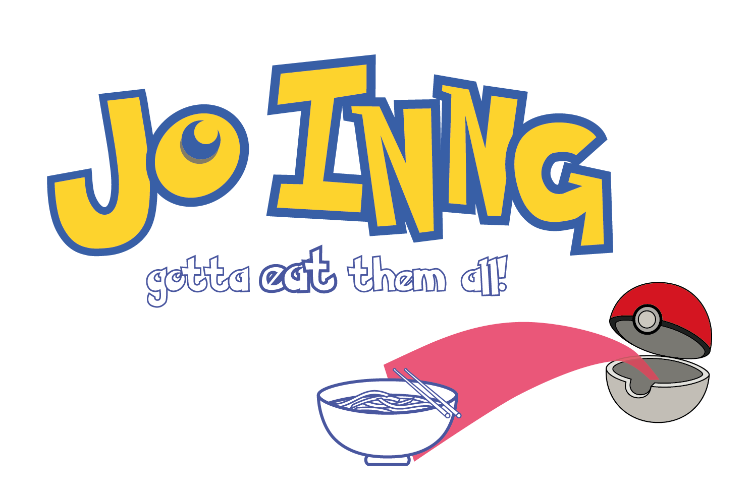
All Drafts-Ideas (Cleaned Up Version)-06


Final Artwork:All Drafts-Ideas (Cleaned Up Version)-04
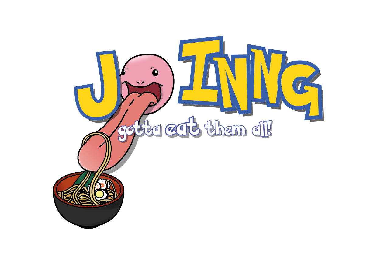
I thought this was a very straight forward design that made use of the audience’s contextual knowledge of Pokemon and its slogan. The ramen was chosen because it’s japanese (like pokemon) and I loooove ramen!

So those were my final 4 artworks!

Here is a another idea i toyed around with:

Hi I am JO INNG and I am multi-layered:

output_FZR3tM
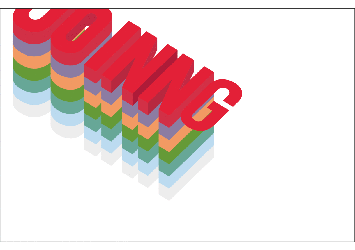
This was inspired by the Kueh Lapis. I wanted to bring across the idea that I was multi-layered and that there are many different layers to my personality. I decided to use Kuek Lapis because I thought it was more local and relatable. I thought this was pretty similar to my ‘More than meets the eye’ trait, and thus decided not to use this.


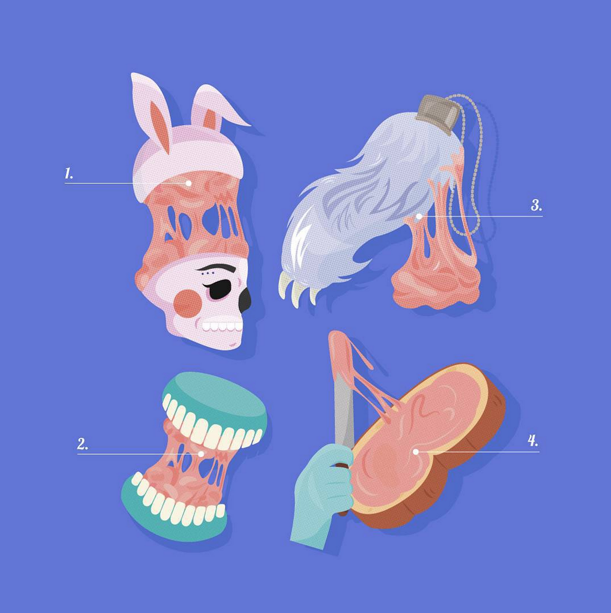
So to end of this loooong post, here are my 4 final works once again!

output_XZ6IoT


Untitled-4-02-02 Small but Loud-03 Love to Eat-04


That’s all! Thank you! 🙂


P.S. I’m not sure why but I can’t really get my pictures and text to align properly. When it is aligned, the GIF files don’t work. I’ll check back on this space tomorrow and see how to fix it, so I’m sorry if the presentation’s a bit messy for now!

Hellooooo world!


I’ve done some drafts since my last update!


#Trait 1: More than meets the eye

I decided against the russian dolls idea I mentioned in the previous post because I decided it didn’t fully bring out the meaning of more than meets the eye. I changed perspective and decided to go with a design that was there but ‘not really there’.

These was one of the concept I came across while trying to assemble a mood board:

2d1418971f26f8c8e401f5dd2dff5364 44353ad78f2ff87c3afa65e15c16d181

Here is a draft I did using a similar concept:

Screen Shot 2016-02-14 at 11.02.48 pm

However, I still felt that it didn’t manage to convey the message I had in mind. After some more thought, the following phrases came to mind:

1.) Your eyes are the windows to your soul

2.) Never judge a book by its cover

Screen Shot 2016-02-14 at 11.08.52 pm

While the rest of my name would be almost invisible, I wanted to make the O in JO a window that reveals my inner self.

12735872_10207729798716540_1928594861_n

12714438_10207729804956696_807668225_n

The only challenge left now is figuring out how to make the inner design really pop! I initially played with the idea of using red, but decided a solid colour would be too flat. I wanted something more fluid that is an opposite to the exterior text.

Moving on!


#Trait 2: Girlish & Tomboyish

My childhood was spent with my younger brother, where we would often host tea parties where both barbies and bionicles were invited. I’ve been kind of tomboyish since young, and friends usually complain about how chor lor (translation: rough) I can be. Still, there are times when I can be more feminine and like being more feminine. It’s a contrast that I’ve grown to love about myself.

So when I saw some wire mesh lying around in my hall, I had the idea of combining two very different mediums to portray these two contradicting traits.

I decided to try embroidery/cross stitch on wire mesh.

In my opinion, embroidery is something very feminine that demands a lot of patience and skill. I therefore picture someone extremely meticulous and well, feminine.

Screen Shot 2016-02-14 at 11.31.40 pm

Artist: Ana Teresa

I stumbled across this artist on pinterest, and loved how the flowers looked on top of the black and white photograph!

I decided to go ahead with embroidery on wire mesh. To bring across the contrast and contradiction between the two mediums, I will be ripping parts of the wire mesh to make it more rugged.

Work in progress:

Testing out stitches and strings:12746513_10207729797796517_1628170819_n

12746197_10207729797916520_1509764709_n


#Trait 3: Live to Eat

I DEFINITELY fall under the group of people who live to eat! In my previous post, I mentioned using pac man to illustrate the concept.

However, I thought I could push the idea further and I wanted to tweak an existing slogan/catchphrase/game to fit my concept.

The first slogan I thought of was “Gotta catch them all” from Pokemon.

Screen Shot 2016-02-14 at 11.42.30 pm

It’s something that everyone is familiar with since the majority of us grew up with Pokemon.

Soooooooo –

Since my determination to eat as much as I can may even rival Ash’s determination to catch all the pokemons (lol), I modified the catchphrase to the following:

Gotta catch them all = Gotta eat them all!


Screen Shot 2016-02-14 at 11.45.20 pm

Because the Pokemon text is so easily recognisable, the design became pretty straightforward and easy to understand.

After the group consultation and getting some feedback from my classmates, I decided to push my concept further, and decided to strengthen the concept through the words alone (and not the background) :

Screen Shot 2016-02-14 at 11.45.28 pm Screen Shot 2016-02-14 at 11.45.35 pm


.

.

.

.

.

That’s all for now! 🙂


2D Typography Progress (1)

To be completely honest, I have a bad habit of being very fickle-minded.

As such, my ideas tend to change very frequently, and the updates I post weekly might not be the most up-to-date version of my plans!

Listed below are all the traits I came up with:

  1. More than meets the eye
  2. Outgoing Introvert
  3. Meticulous but easily distracted / Fickle-minded
  4. Work in progress
  5. Food monster
  6. Optimistic / positive outlook
  7. Hoarder
  8. Procrastinator
  9. Coffee Lover
  10. Different / Non-basic

thumb_IMG_1953_1024

Most of my ideas were very 3D, and Joy mentioned rethinking these ideas from the point of a editor.


After the consultation, I reorganised my thoughts, and came up with some additional ideas:

Trait: More than meets the eye/shy

IMG_1947

I initially attempted to create 3D letters from different materials. I tried to create lightly tinted letters that would look translucent at first glance, and I wanted to mimic the iridescent sheen bubbles have. The goal was to bluff viewers into thinking the letters were almost transparent, and they would only realise how colourful/dynamic the letters were upon closer inspection. The materials I used in the image above are clear PVC, paper and tracing paper. During the experiment, I realised finding the right material was a challenge.

While I am still exploring the idea and thinking of how to perhaps transfer it into photoshop or ai, I came up with an alternative plan:

Russian Dolls!

Russian dolls often have a lot of hidden layers and open up to reveal multiple smaller dolls inside. I thought this would be a good representation of how you don’t see the many layers to my personality unless you spend more time with me, and you never know when you’re going to discover another part of me. This is something I’ve yet to try, so i’ll be updating soon!

Trait: Different / Non-basic

Basic is a term used to describe people who are very mainstream – they listen to whatever’s popular, eat whatever’s popular, follow the latest fad, etc, etc. I’d like to think of myself as someone who doesn’t necessarily follow this lifestyle, and I try as much as possible to maintain my individuality.

As such, I thought of how to convey the idea of breaking out of the mould.

punch-out-model-art-kits

The picture above shows some toy model kits – something that follows preset measurements and is mass produced. I thought it would be a good idea to illustrate myself breaking out of it!


Trait: Food Monster

I wanted to revisit the game concept I used for the “Hello my name is” card, and thought of pac-man.

Pac-man

I thought this would be much more relatable since it’s a game everyone is familiar with, and I could illustrate the food that pac man eats!


That’s all for now, but I’ll be sure to update this space once I have more concrete ideas!


Project 1: ALTER EGO

Fictional Characters

  1. Phoebe, Friendslargeoriginal

    Phoebe is a character that has gone through ups and downs – her father walked out on the family when she was young, her adoptive mother killed herself, and she was left to live on the streets. She has a rough life and never experienced a normal childhood.
    Instead of becoming a directionless and life-less adult, she rose above her past and became an incredibly zealous adult full of passion and optimism. She doesn’t shy away from her problems and deals with them with courage and honesty. She doesn’t back down when her principles are challenged. However, she also sees the best in people and can be naïve at times.She’s also eccentric and unpredictable, and has fun no matter what she does. To sum it up, she’s quirky, had a unique way of seeing the world, and is a very upbeat person filled with genuine love and concern for the people she holds dear to her.Throughout the seasons, Phoebe became more normal. By the end of the series, she had found and reconciled with her biological mother and father, gained a half-brother and was happily married with plans of having children. It was a vast difference to the eccentric and free-spirited hippe she was introduced as. I think the major dilemma she faced as a character was thus choosing between remaining a free-spirited and eccentric character or becoming someone she needed as a kid (stable and normal).


  2. Chihiro/Sen, Spirited AwayTop_image_article_COH

    Chihiro was thrown into a situation that even an adult wouldn’t know how to handle. In the spirit world where nothing made sense to her, she had to step up and learn how to be self-sufficient. This is a stark contrast to the whiney and seemingly dependent child she was before the journey.She was also optimistic and trustful of the people who helped her, treating them with respect and sincerity despite the apprehensive circumstances she was in. Her situation was certainly chaotic and she was soon stuck in the dilemma of either prioritizing the rescue of her parents vs rescuing Haku, the first person who offered her help when she accidentally entered the spirit realm. However, by the end of the movie, she has developed enough courage and wit to conquer all the presented challenges.


  • Dukseon, Reply 1988Dukseon is the main character in the Korean drama Reply 1988, and is the middle child of a family in debt. Despite being the victim of the middle child syndrome, she is still considerate of her parents and tries her best to be a good daughter.
  • Mulan, Mulan 
  • Olive Hoover, Little Miss Sunshine


 Public Figures

  1. Jenn Im
    Jenn Im is a famous youtuber. She has over 1 million subscribers on youtube, and I think the reason she is able to draw in such a huge number of followers is because of her bright personality.She is very individualistic and has a very distinct fashion style that is flexible yet unique. She is also incredibly articulate and well spoken, being well versed in all sorts of music and literature. However, she doesn’t come of as pretentious or snobbish. Instead, she gives off a very approachable vibe as someone who is more than eager to learn and share her knowledge. She is also a go-getter, and seems very focused and clear on her goals.
  2. Hani, Part of K-Pop group EXIDAs with most K-pop idols, Hani is under a lot of pressure to be the perfect role model. The thing I appreciate the most about Hani is her candidness and slight disregard to the idea of being feminine. She is comfortable with herself, and isn’t afraid to be seen in a way that may come across as undesirable or unglamorous. She comes off as a genuine and down to earth character despite her success.However, being an idol does have its downsides. Because of how competitive the industry is, there is a lot of pressure on keeping a squeaky clean image. Most idols thus lie about dating due to the fear of loosing fans. She was recently criticized for previously stating that she wasn’t dating prior to paparazzi uncovering her relationship with another idol.I think this sort of dilemma is very relatable in everyday life – do you be true to yourself and your character, or should you play it smart and give your friends and those around you what they want to see/hear?
  3. Emma Watsons
  4. Jennifer Lawrence 
  5. Youngji

    Shares similar traits with Hani.


People you know/have known

  1. MotherMy mother is an extremely resilient person who always puts others before herself. Although she is quite a tough woman, she too has her limits. Despite that, she is always constantly pushing herself and always does what’s best for the family rather than what’s best for herself. She is incredibly independent and brave, becoming a waitress after 10 years of being a housewife. Despite that, she adopted very fast because of her willingness to learn, her flexibility, and her affable nature. She is always quick to familiarize herself with people, and gains the support and help of people as she is sincere towards others. However, being so nice has its downfalls too. She might sometimes stretch herself and overcommit to the idea of helping others that she fails to take care of herself. This selflessness is definitely an admirable aspect of her, but also takes a toll on her.
  2. Stephanie
    Stephanie is a close friend of mine. Similar to my mum, she is extremely resilient. She is fiercely independent and a strong worker, but can also be extremely naïve and scatter brained around friends. She is firm and resolute, and will not be pushed over by people. At the same time, she is always kind and supportive of friends, and is a great source of levelheaded judgments and encouragement.
  3. Ericia
    Ericia strong-headed and stubborn, and is never afraid to speak her mind and fight for what she thinks is best.
  4. Jesca
    Jesca is loud and bright, and is always positive no matter what the circumstances are.
  5. Aunty Cecelia

An incredibly warm-hearted woman who was always there when you needed her.


FINAL VIDEO

Hello, my name is _____!

Typography

Typography

Qualites Expressed: Meticulous, detailed but spontaneous

Although I’m not very organised or systematic, I like to plan ahead and set down some groundwork when it comes to doing work. However, I also tend to be very indecisive and I realise the best ideas come to me while I’m already in the process of doing work. It is from there that I become more spontaneous and abandon whatever I had planned before hand to do something that may be completely different. That being said, I feel uncomfortable working without any sort of pre-set guidelines, and I like working within this sort of controlled spontaneity.

To bring this contradiction across, I started off by drawing grids on my name card. Similar to a graph paper, these grids allow me to mark the exact points of the words so that it may be connected in a neat manner. I then proceeded to fill in the lines with paint. To bring across the idea of me being spontaneous and deviating from my previous idea, I became more careless with the paint, mixing in more water so that it would seep outside of the lines.


Conceptual

Conceptual

Quality Expressed: Love for Food

Some people eat to live, while others live to eat.

I definitely fall under the category of those who live to eat. I love eating and have been told that I have quite a big appetite for someone my size. My friend sometimes comment on how I’m a combo breaker since I tend to eat very often and in large quantities.

This was what sparked the idea for this card. Much like a game where the goal would be to get as many points as possible, my ‘goal’ in life is to eat as much as I possibly can. To illustrate this point, I drew a simple game consisting of 3 horizontal lanes. The mouth/player would then have to move up and down to eat the burgers while avoiding the yucky green goo that is floating around as well.

I thought this was a quirky way to represent my eating habits and was a better representation of my care-free and fun personality.


Abstract

Abstract

Qualities Expressed: Work-in-progress

People wear makeup for different reasons. Some people may wear it to impress others, while others wear it to empower themselves. Either way, the one thing each makeup user has in common is the desire to put forth the best version of themselves.

Much like mixing paint, there are hundreds and thousands of different shades that lipsticks can be mixed and made in. As such, it is always a challenge to find that one perfect shade that complements you perfectly. I related this quest for the perfect colour to how I have yet to find the best part of me that I can be proud of and show off to the world. I go through different phases and seasons, but I have yet to find a colour (both in life and in design) that best represents me, my strengths and my ideals. As such, I continuously imprinted and whipped away my lipstick prints. This is to signify how i’m unsatisfied with the marks I have left in my life and in others, and how I am actively experimenting and seeking for improvement.


Typography

Hi everyone, this is Jo! 🙂

I’ve always been interested in typography, but have never properly explored it. After doing a quick search on google and pinterest, I found a few that I liked:


1a022e194cd55824d38dbb3c9aa0ac0df9a1bfccc0430a56371f0b32a936f2631eb9c6bb0852ff8e6e75178744849dc4e

Although 3D mediums sometimes make the type hard to decipher, I find myself leaning towards 3D and handmade typography because it comes across as thoughtful and interesting.

image_11_versatilimage_08_maricar_maricorimage_01_maricar_maricor(delicious)

7650d8170c4f11f4ca5bd53b2091d16a9341027a2c8cb500b94b8d2e6f59f00d

I also came across images where the surface on which the type was placed on played a key role in the overall typography. I loved how the respective artists played around and experimented with the medium/surface and used it in a way that very effectively enhanced their message.

b77121d0ccec3845d43d80629246af2ac8441af5cc281a30a6ce8c79e17d097atumblr_mbyt6n7pVM1qzrwla167f5027edf0e148e9a0217fb2dae24e

All in all, I realised there are endless possibilities when it comes to typography. Besides the actual design of the words itself, there are a lot of additional factors such as the placement, juxtaposition, medium and surface that plays an important role in creating the overall typography as well.