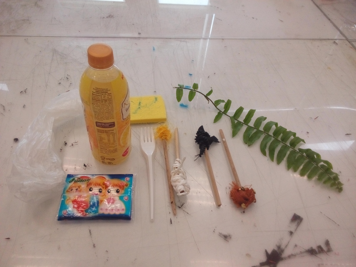
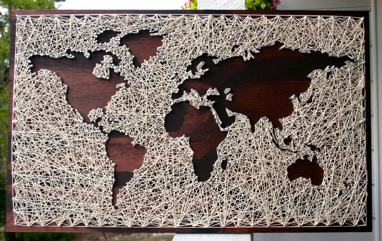
Initially, I had wanted to do string art for my project. I wanted to try a much more hands-on, craft-kind of art. So why not try doing string art, since I have a bunch of strings left from the string sculpture project in 3d! These were a few of the artist I was inspired from.
Rachel Furlough:
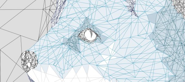
Her works were once of the first I seen when I google ‘string art’. I like how she play around with the space -leaving the main object blank while the strings are used to bring the image out.

Alan Dindo:
I love the intricate designs in his work. However, I think It would be really time-consuming to carry out something similar to this especially since we are tackling with other projects as well. So I might have stuck with a much more simpler design like Rachel’s work.

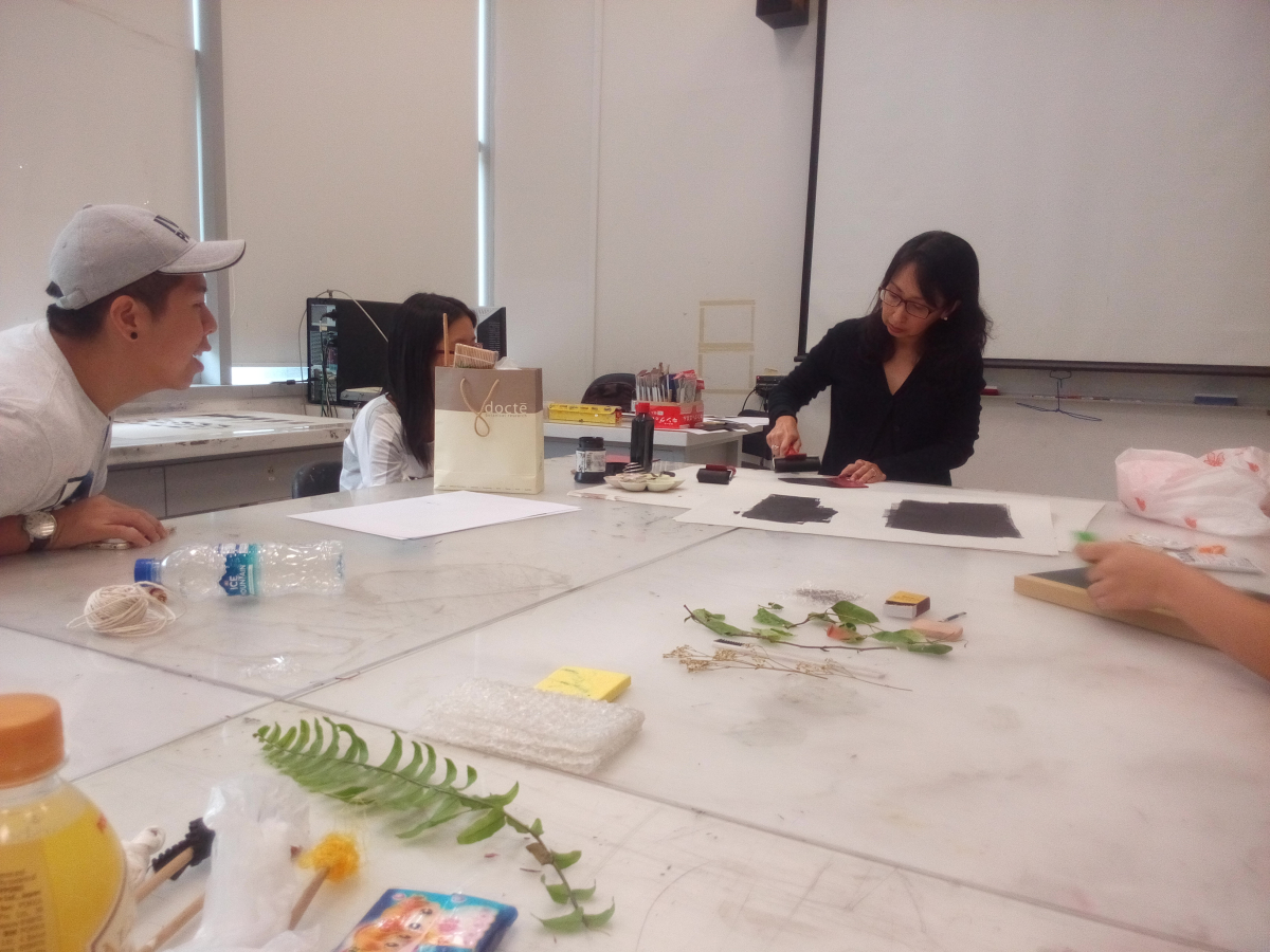
Process (trying it out):
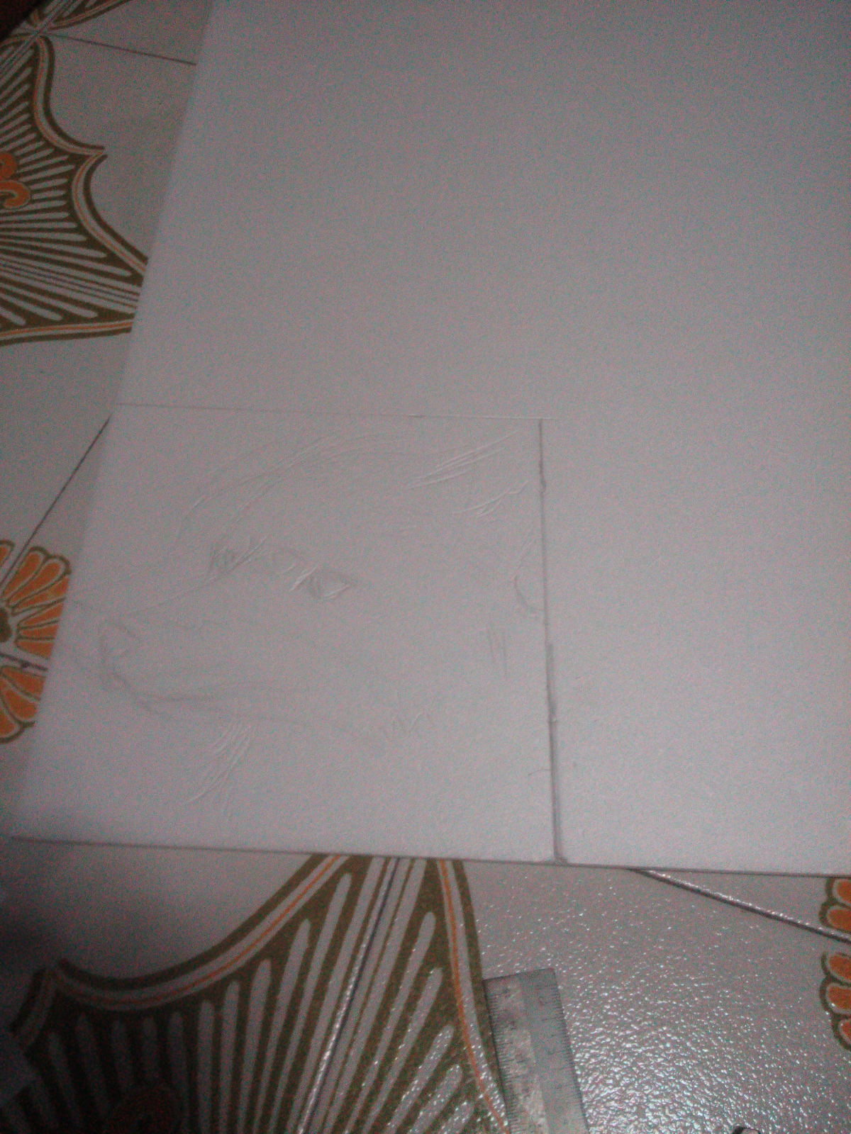

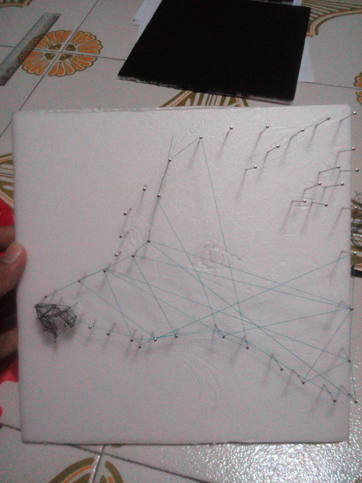
Apologies if I didn’t take much picture of it. I was kind of frustrated with the results because it took too long just to achieve something simple looking as that. I might have underestimated the amount of work out into string art! The problems I encounter was that the strings kept being loosen and falling apart. Smaller details or part of the image were a pain to do. I had did the eye but it fall apart later on.
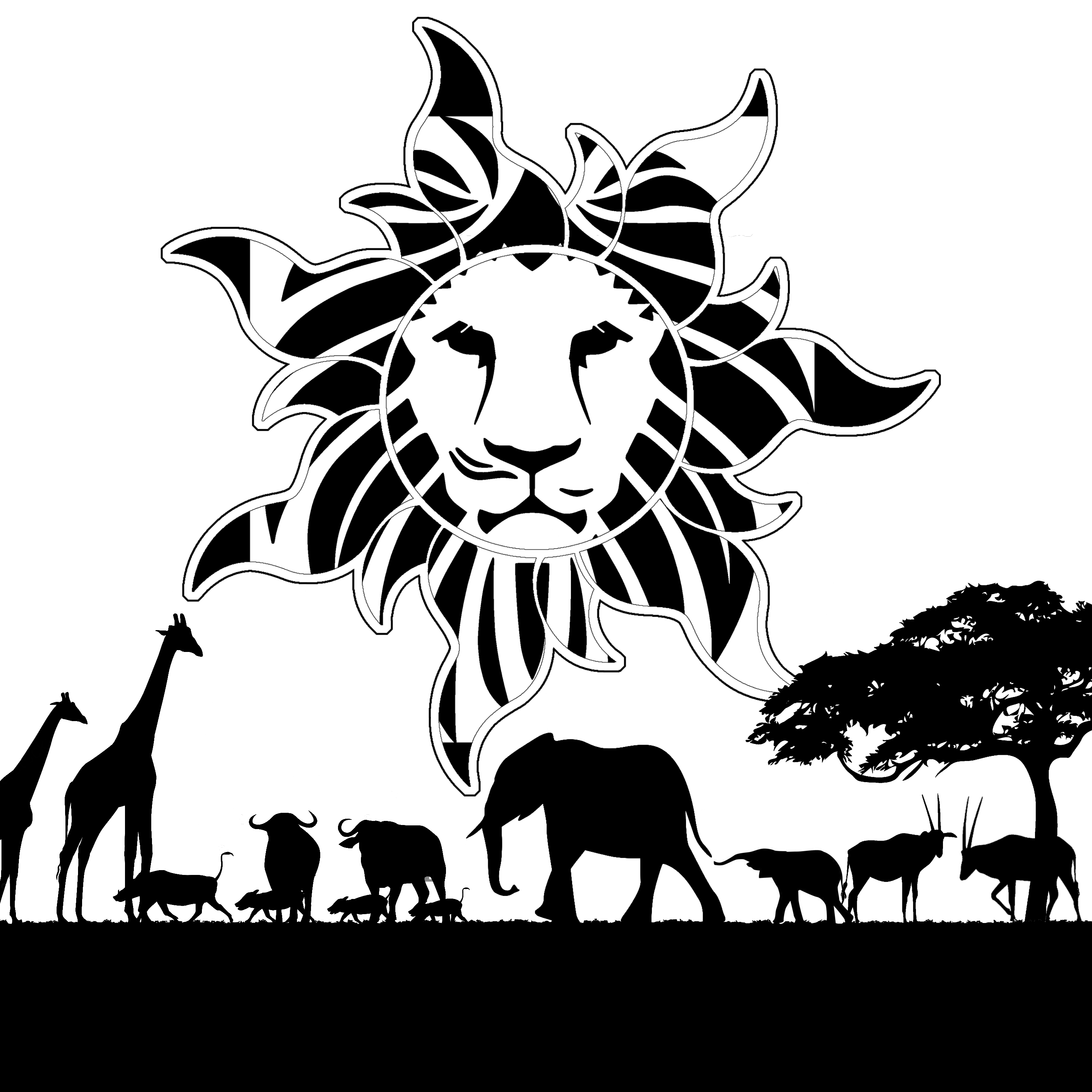
So from here, I decided that string art was not working out for me. I have decided to try using digital instead, because of time-constrain. However, I still wanted to incorporate the design of it on my work. Hence I tried looking up at geometrical works because they have that certain style I’m looking for and I could get inspirations from.
Animal + Minimalism = Animalism by Stephanie Cahyadi:

365 days of of devise:

Josh Bryan:


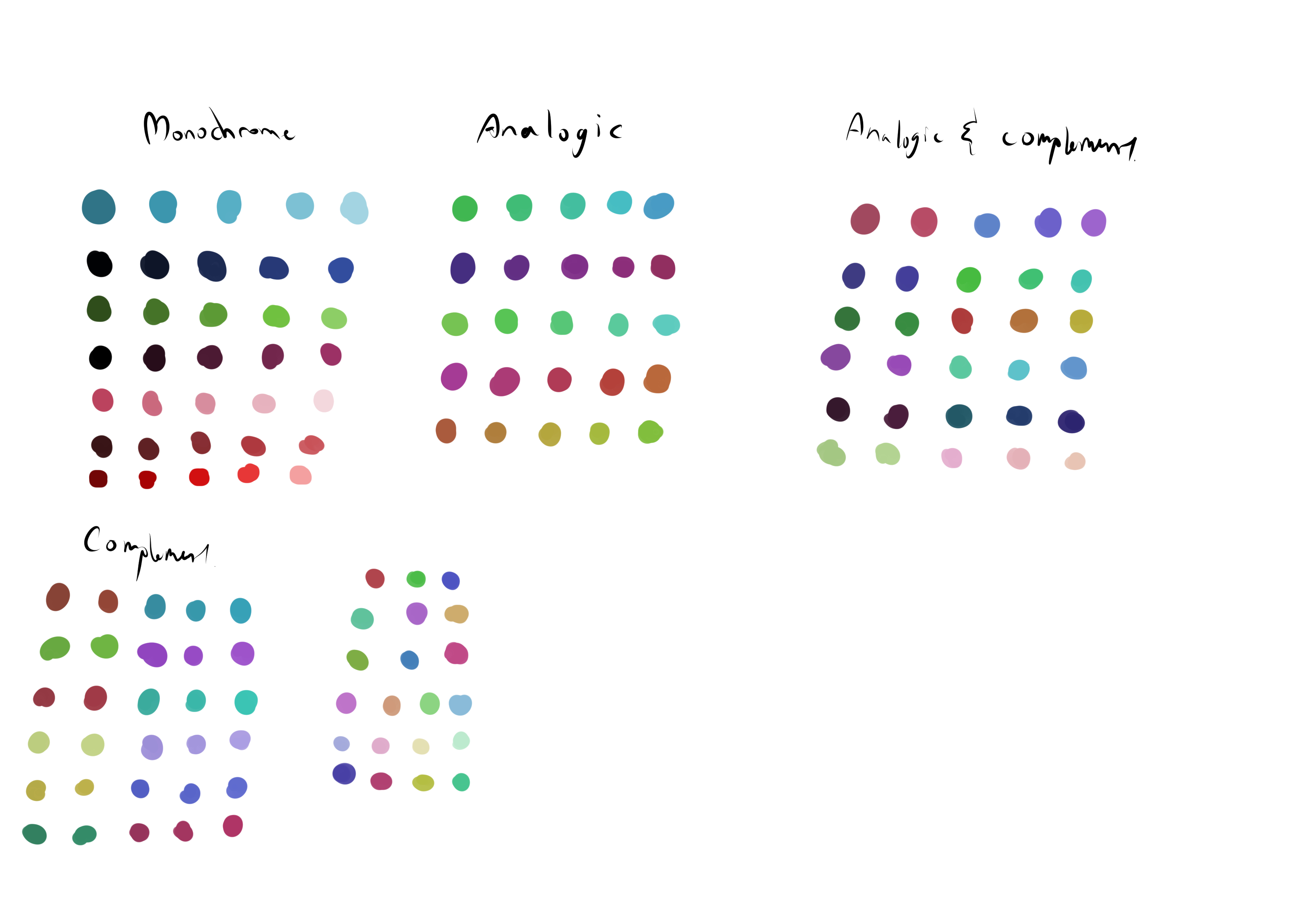
Colours:
The colours for this project, I’ve decided to use them on in regards of the meaning of each colour. Like what does it portray -blue means melancholy and purple was nostalgia.
Because different colours evoke different emotions.
http://www.creativebloq.com/web-design/12-colours-and-emotions-they-evoke-61515112 (brief explanation of colours and emotions.
I used a program called colour.co to get the scheme I had. (Link was provided by Lydia, thanks!)
Types of colour chosen or found insteresting:
Process:

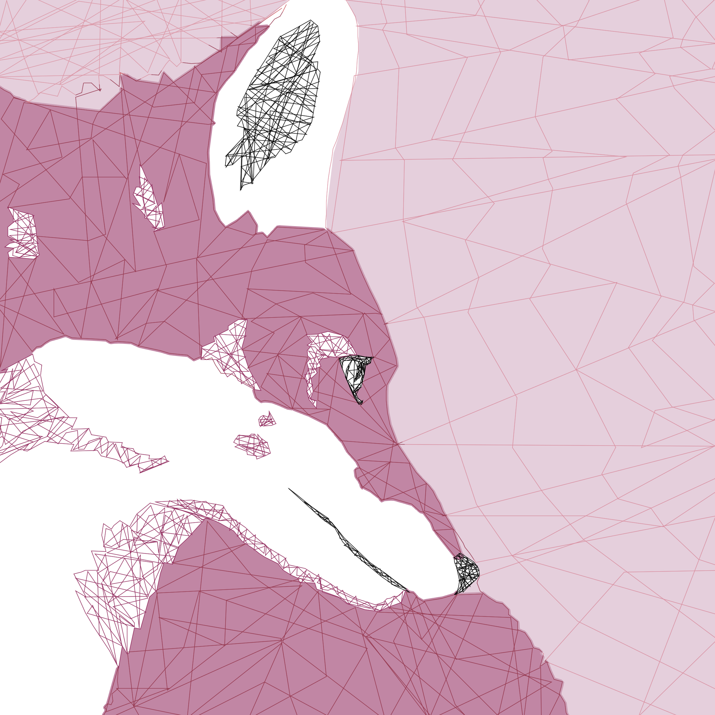
Reason why I choose a fox to represent myself was because due to the reference of the trilogy book His Dark Materials. (A.k.a the famous movie, the golden compass) This is where “Dæmons are the external physical manifestation of a person’s ‘inner-self’ that takes the form of an animal.”
A fox is like my inner self, they are seen as sly, dangerous creatures which are easily misunderstood as they are simply shy, peaceful and can be very curious. More details about it can be seen in this link here!
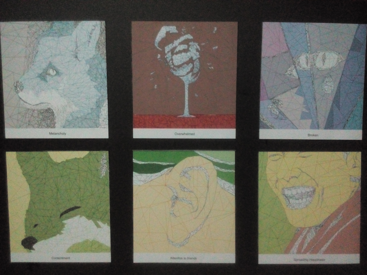
How I did my work was Me (emotions) + Setting = Outcome
In order:
- Melancholy + Overwhelmed = Broken
- Contentment + Attentive to friends = Spreading Happiness
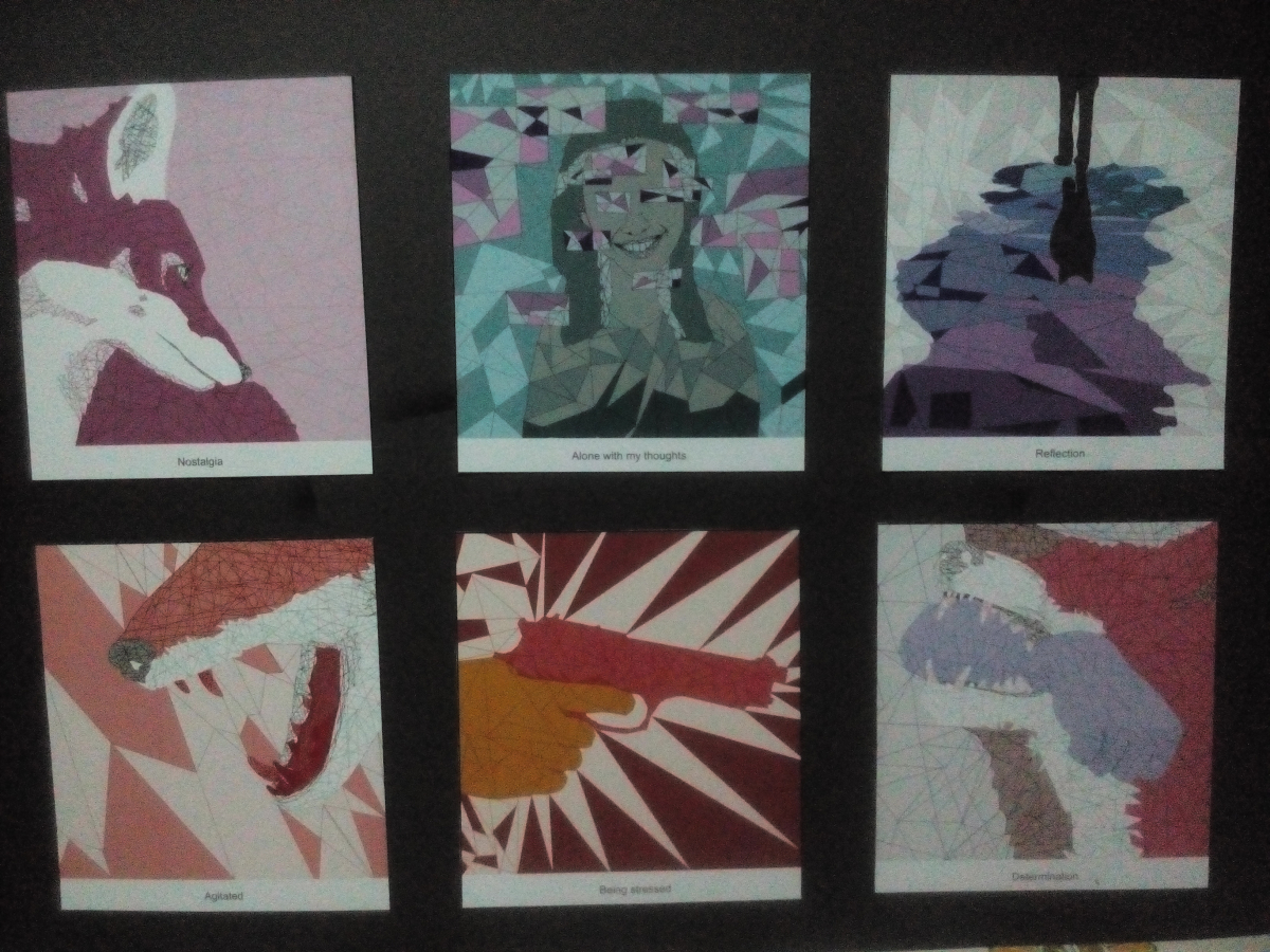
- Nostalgia + Alone with my thoughts = Reflection
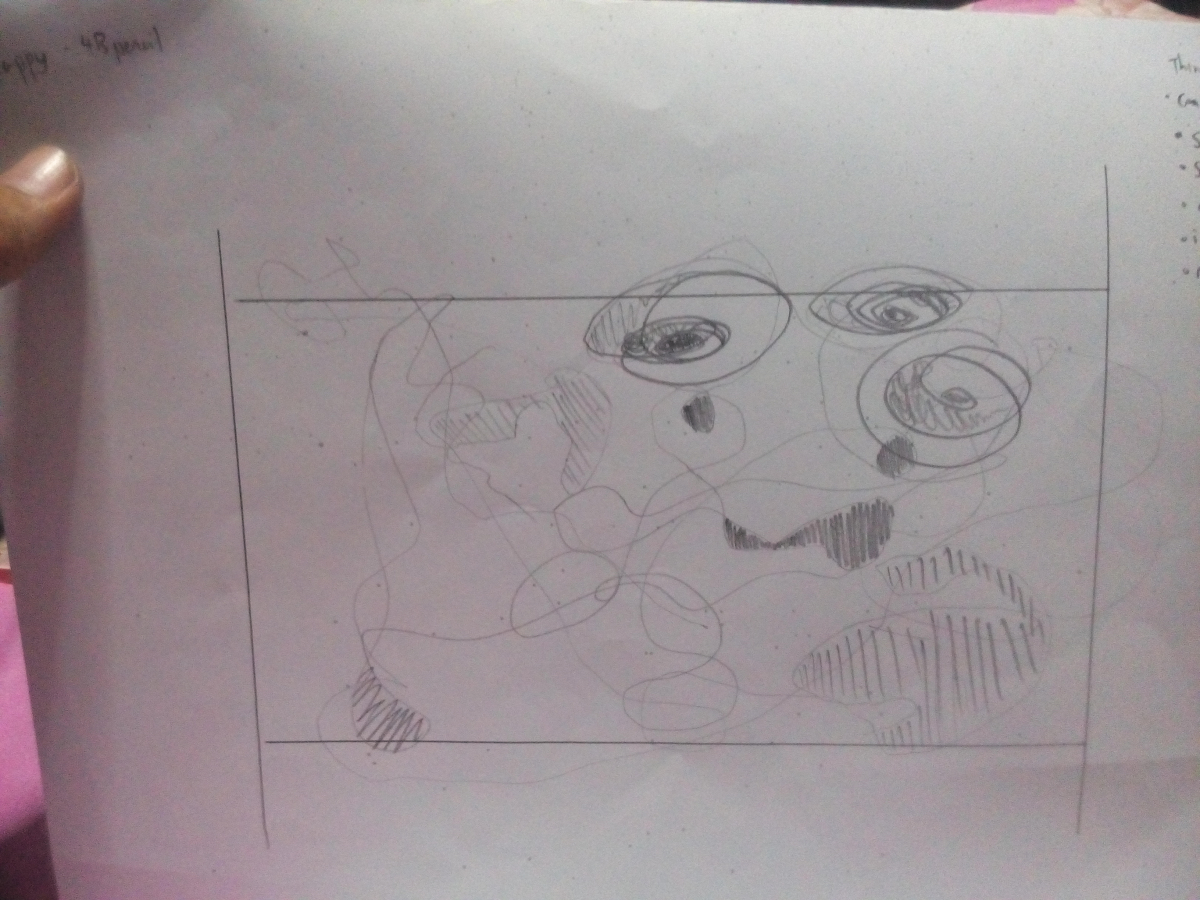
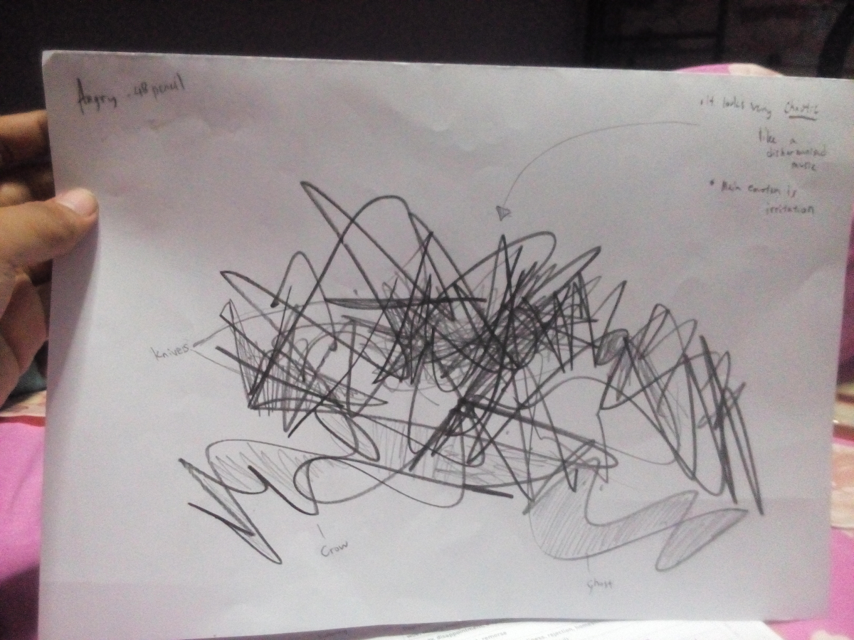
- Agitated + Being stressed = Determination
First Ego:
Melancholy
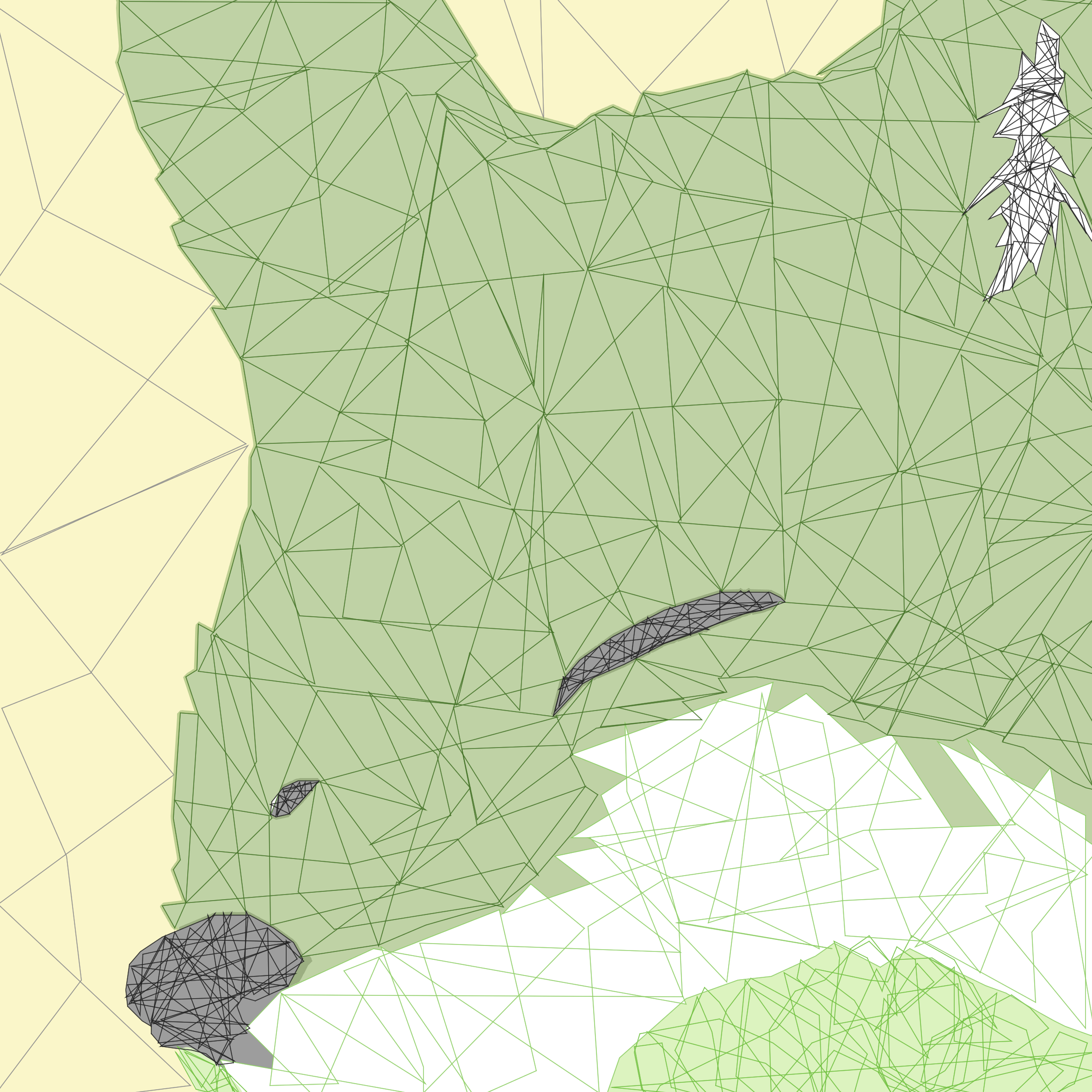
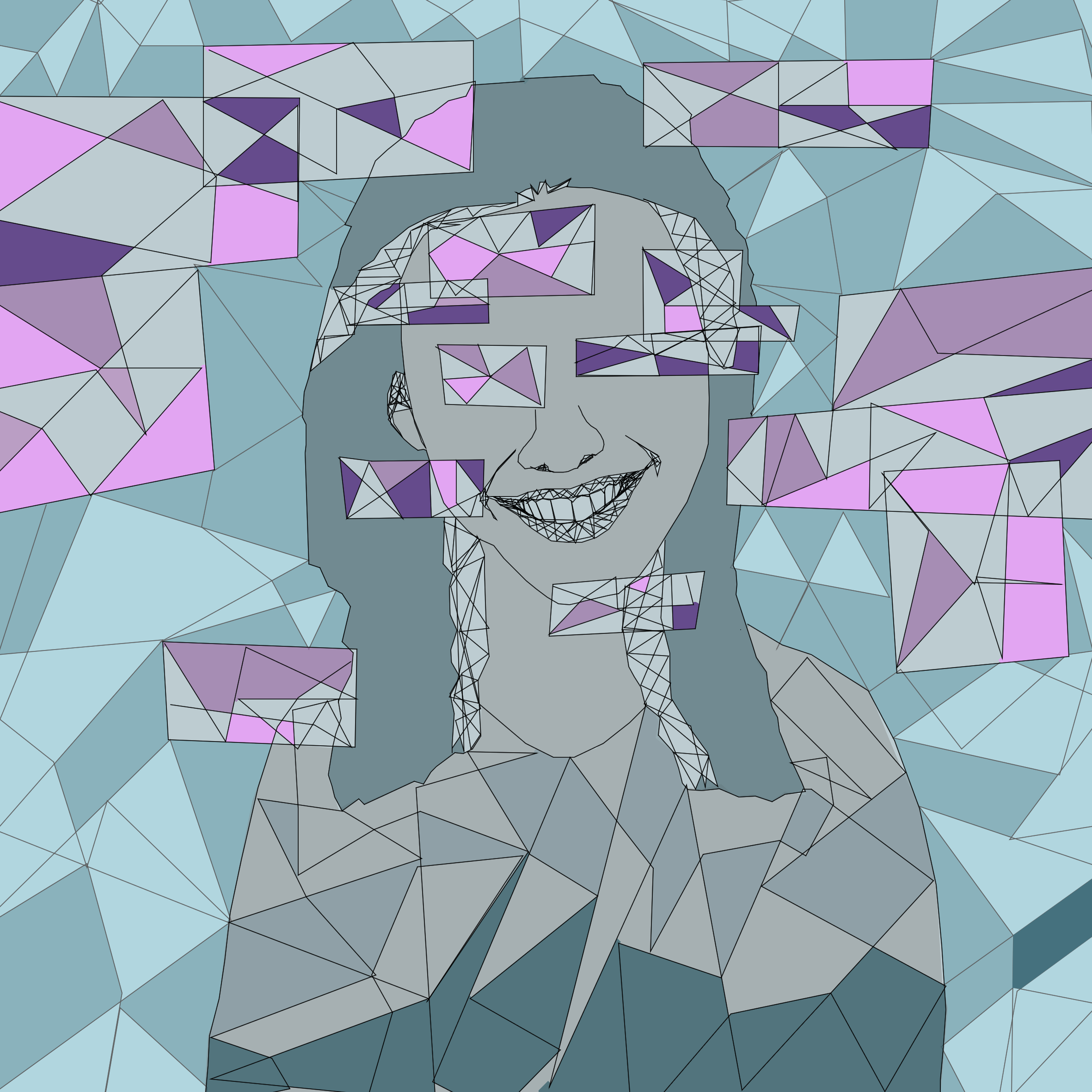
I used the colour blue because upon research, blue was a colour primarily chosen to represent sadness. Animals can’t really show their feelings, so in a sense, I played around with the colour, in a way changing the entire image to show just how colour plays a huge part in changing the mood of an image.
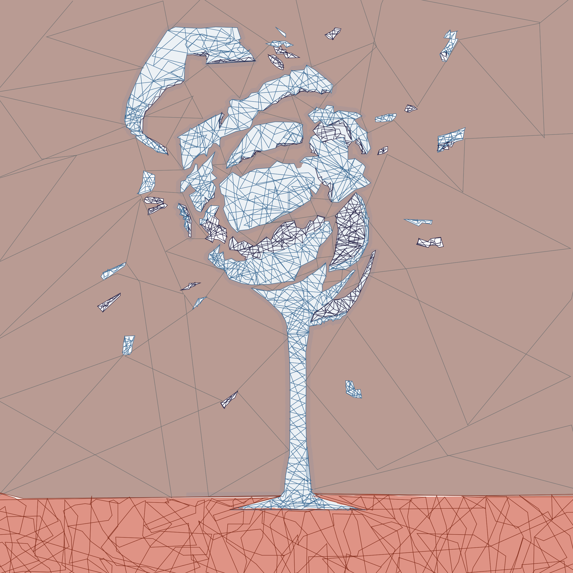
Overwhemled
Sometimes feelings pent up overtime and there’s a breaking point to it. Here I tried to show the limit of it with a shattering glass.
Broken
I tried to portray myself (the fox) looking at a broken mirror with the iconic teardrop shape. This is the point of the result of after being overwhelmed, I tend to end up ‘broken’. Everyone will experience in a point of their life where they feel helpless and all they could do at the moment is to wallow. But eventually, life will go on and that moment will pass! Just like how my second ego is a more positive one.
Second Ego:
Contentment
A happy looking fox is a fox being cozily asleep. I used the colours green and yellow as they are welcoming colours. Green symbolizes growth while yellow is a friendly, warmth colour. A combination of both colours is a way for me to show lightheartedness.
Attentive to friends
I realize there are lots of talkers nowadays and little listeners. I am one who rather listen than talk. Sometimes, my friends just need someone who will listen to their problems and I’m willing to do so. It’s a way to help them have a outlet to let themselves out and get a form of relief -despite big or small.
Spreading Happiness
The result of this is making others around me have a brighter day. In the end, I would love to see smiles on my friends face, a reason why I don’t mind joking about. Why would one rather be gloomy all the time when you can be happy, even for just a moment? Life is too short to be full of remorse.
Third Ego:
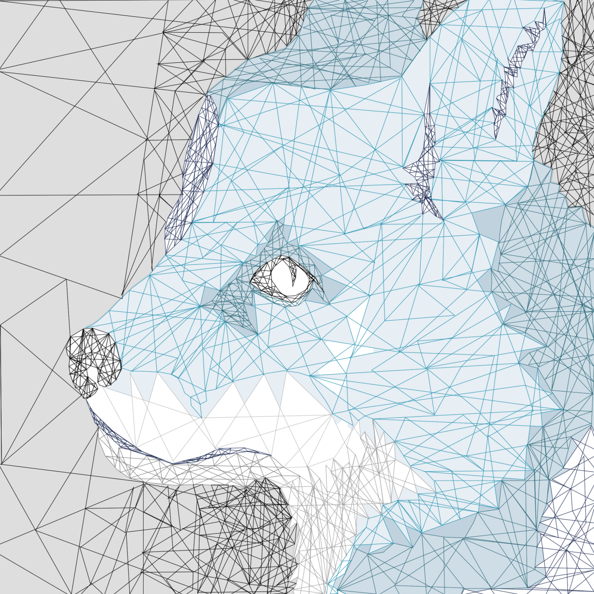
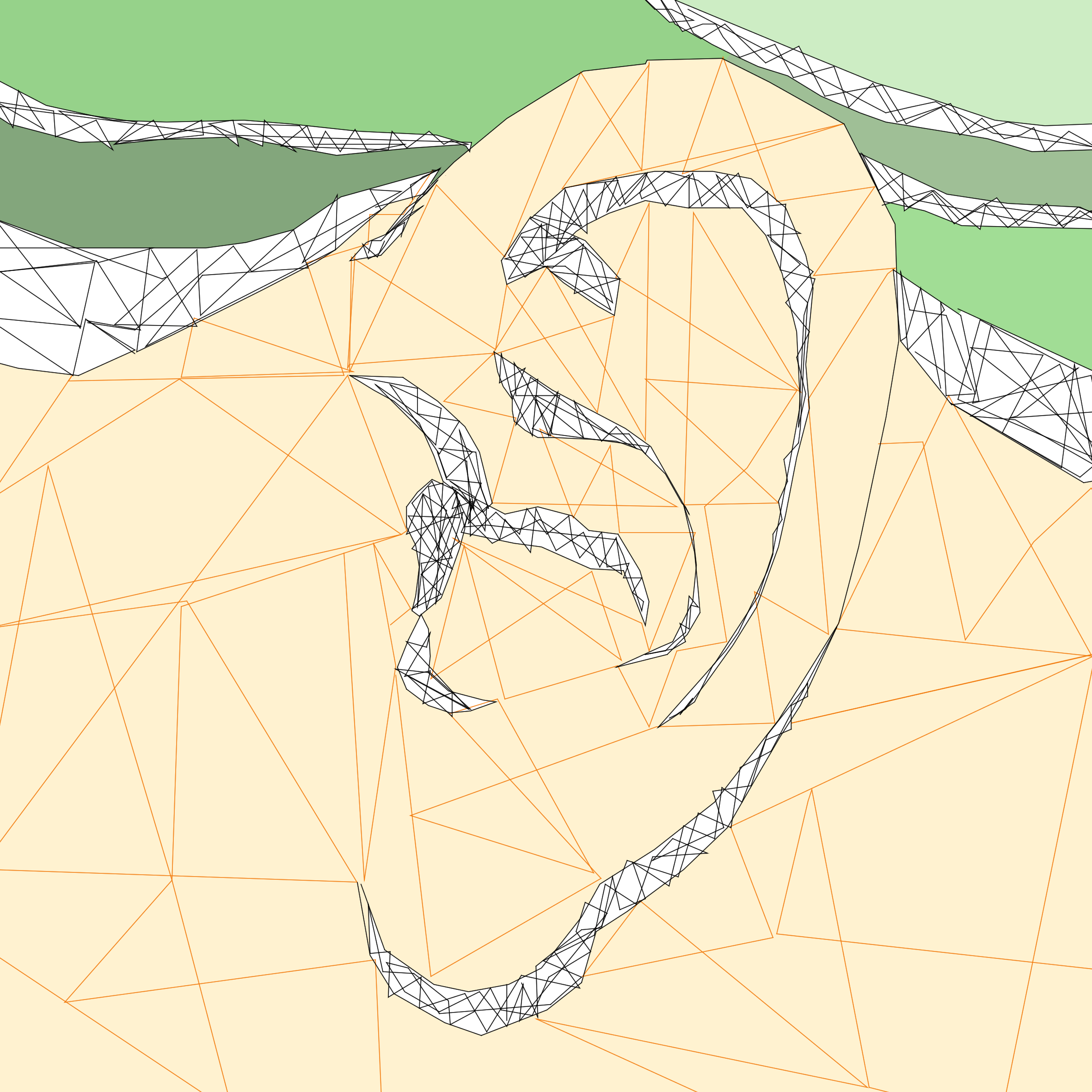
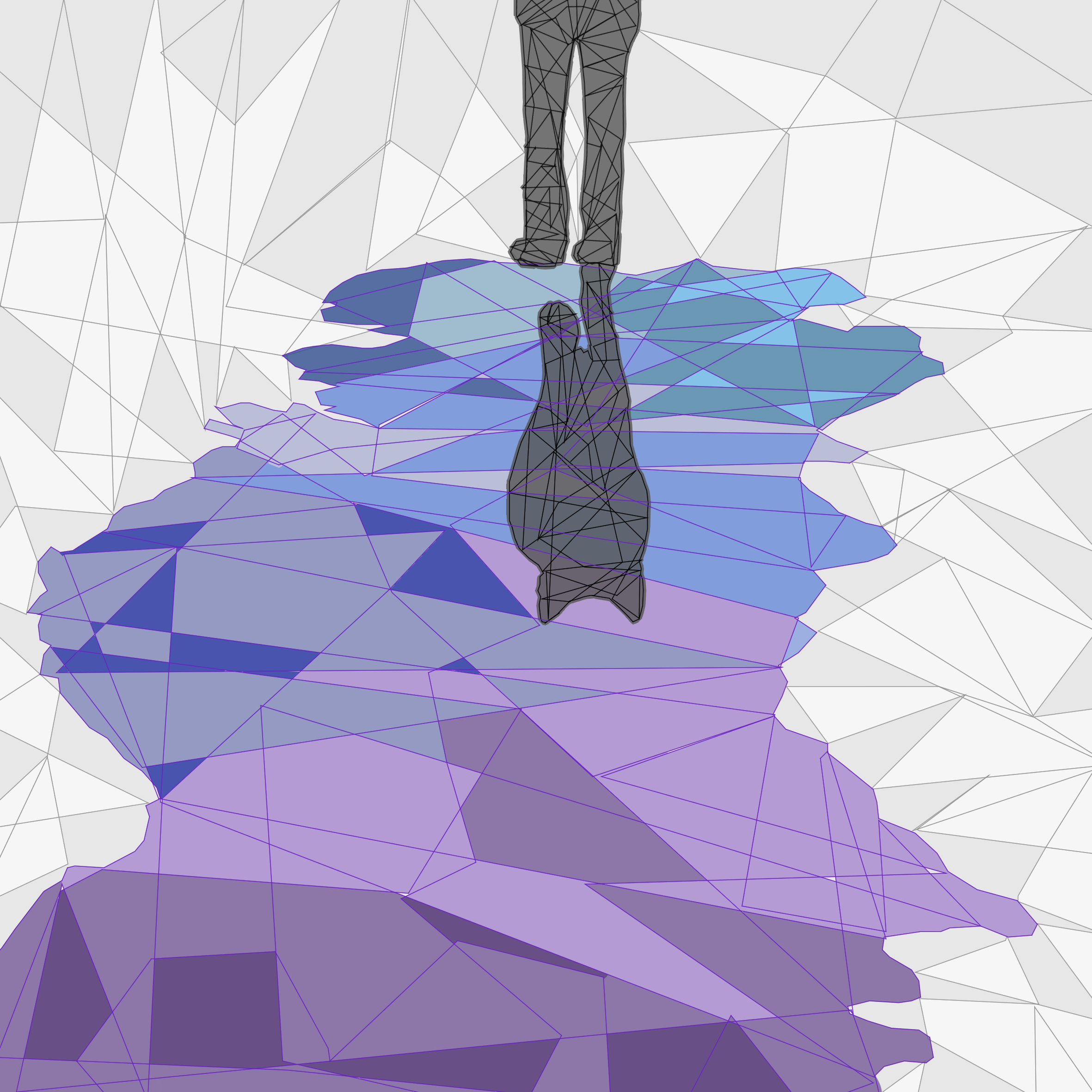
Nostalgia
Purple was a colour that represents nostalgia. There is a limitation yet once again working with animals as it is hard to show feelings. This is why I did a fox looking off into the distance while using the colour purple to set the mood. Because once again, the colour theory of where colours affects the overall emotion/mood of the image.
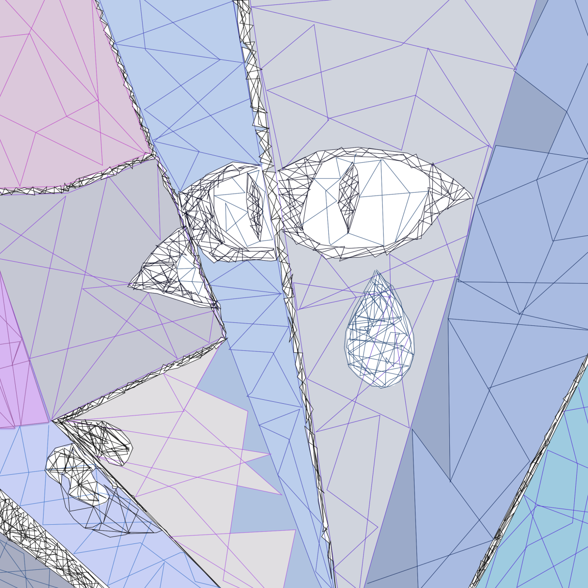
Alone with my thoughts
I admit that the result of this image threw me off for a moment by how creepy it looks. But in a sense, it portrays what I want to say. I may come off as a bubbly person but I do tend to get lost in my own thoughts when I’m alone. Reason why the eyes are not shown here is because eyes are the windows to one soul.
Reflection
In the end, what has happened has happened. The only thing I can do is reflect on it, move on and try to be a better person. My image shows a reflection of me shown as a fox because that is who I am still in the end. What happened won’t change me for who I am. I can only be true to myself.
Fourth Ego:

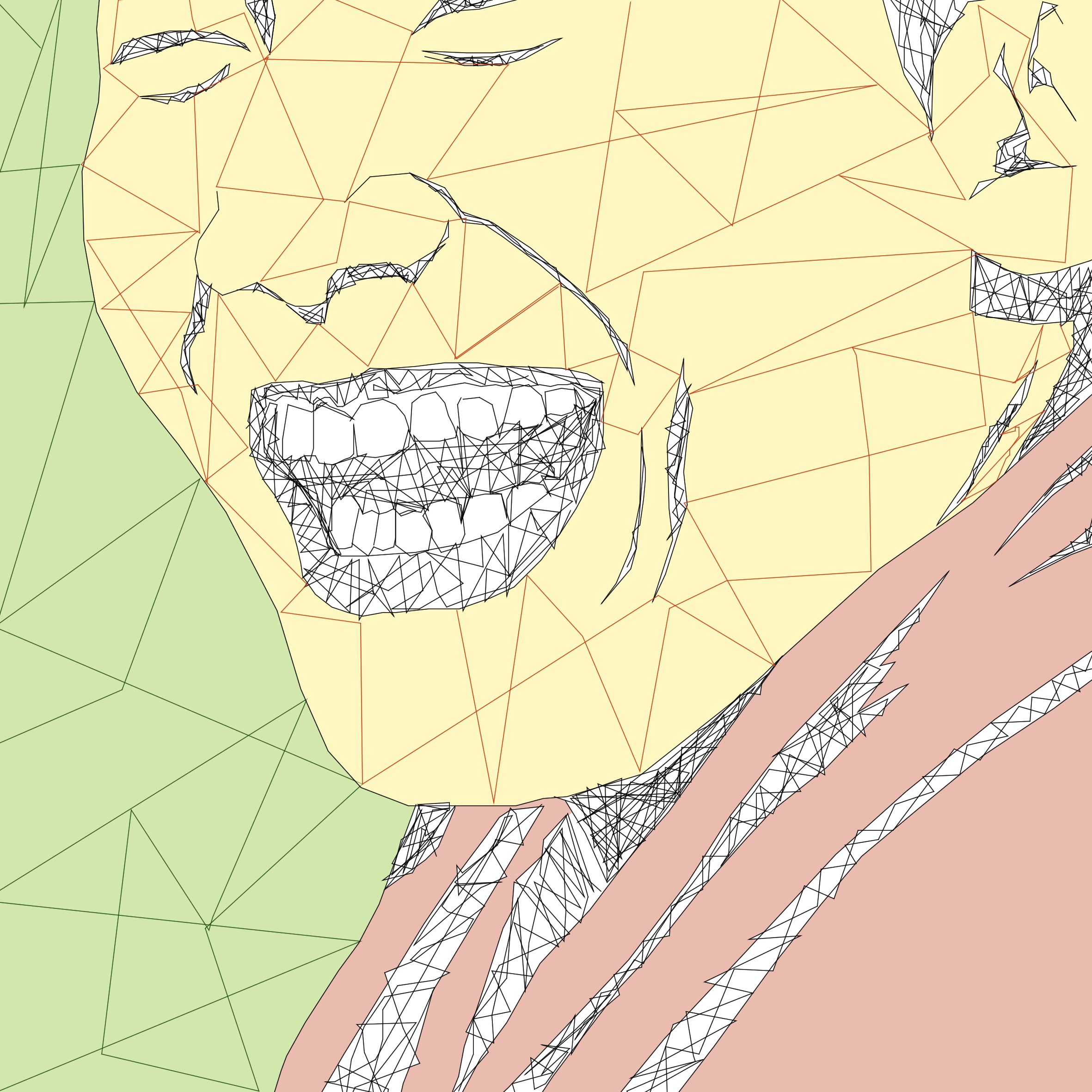
Agitated
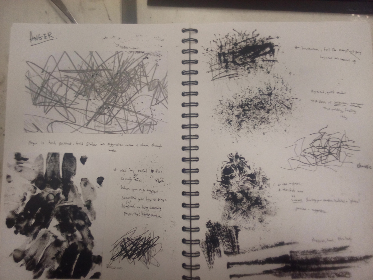
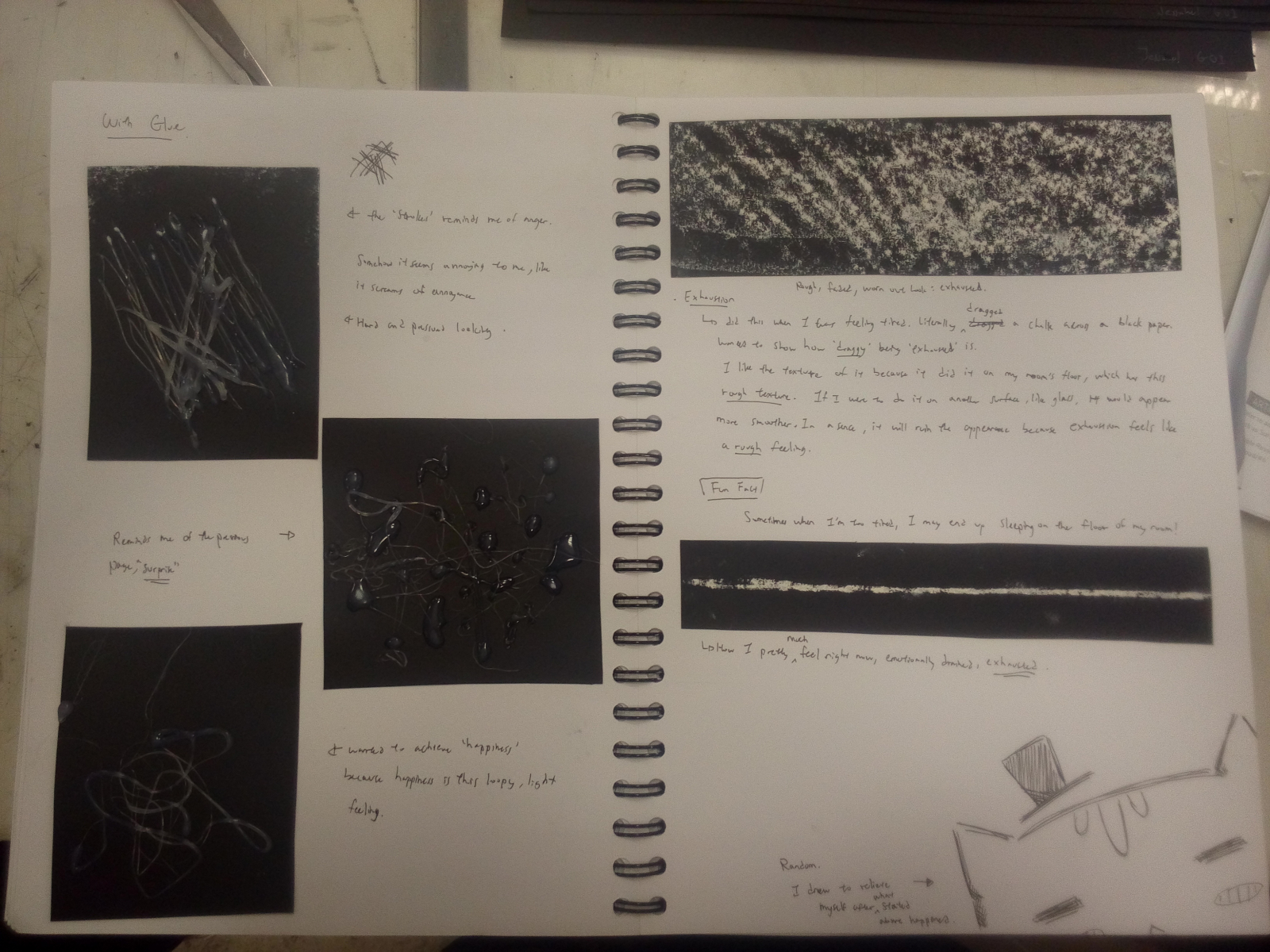
Anger in an animals can be shown thrown their defensive reaction. Some snarl and bare their fangs. Red is also a colour that shows anger and aggressive movements. For the first and second images, I started using much more jagged edges in the background while giving the a much darker red to imply movements, or at least a sensation of it. When you’re angry, it’s feels like shards of broken glass prickling.
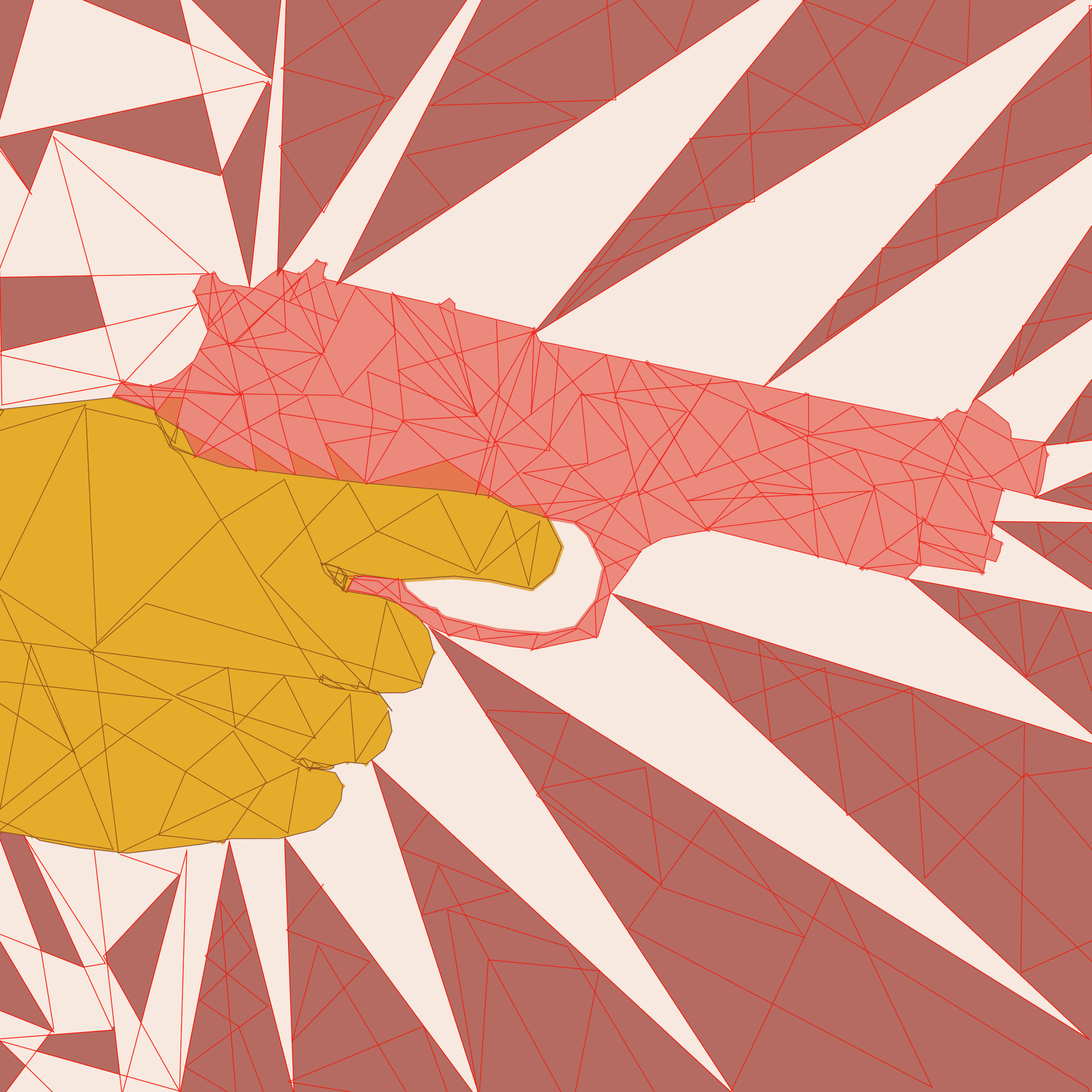
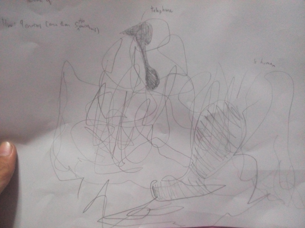
Being stressed
A stressful situation for me is like being at gun point. Similar to how a hunter aims before shooting. There’s this tension between the hunter and the animal, a.k.a the fox within that few seconds which I think portray well the feeling of being stressed.
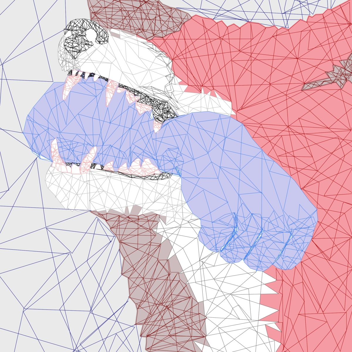
Determination
I do strive to be the one who make it out alive. Hence the last image of where the fox has bitten off the hunter’s hand. It symbolizes the determination to succeed and make it through the stressful situation.
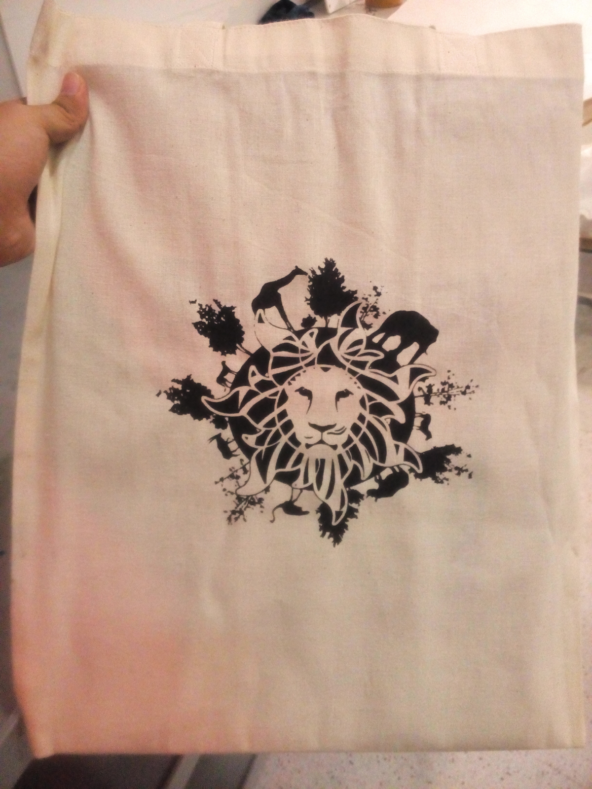
Overall look (apology for bad camera quality):
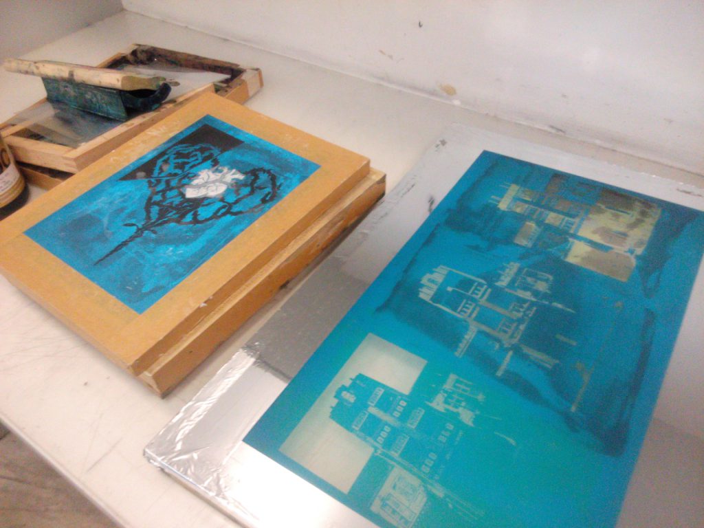
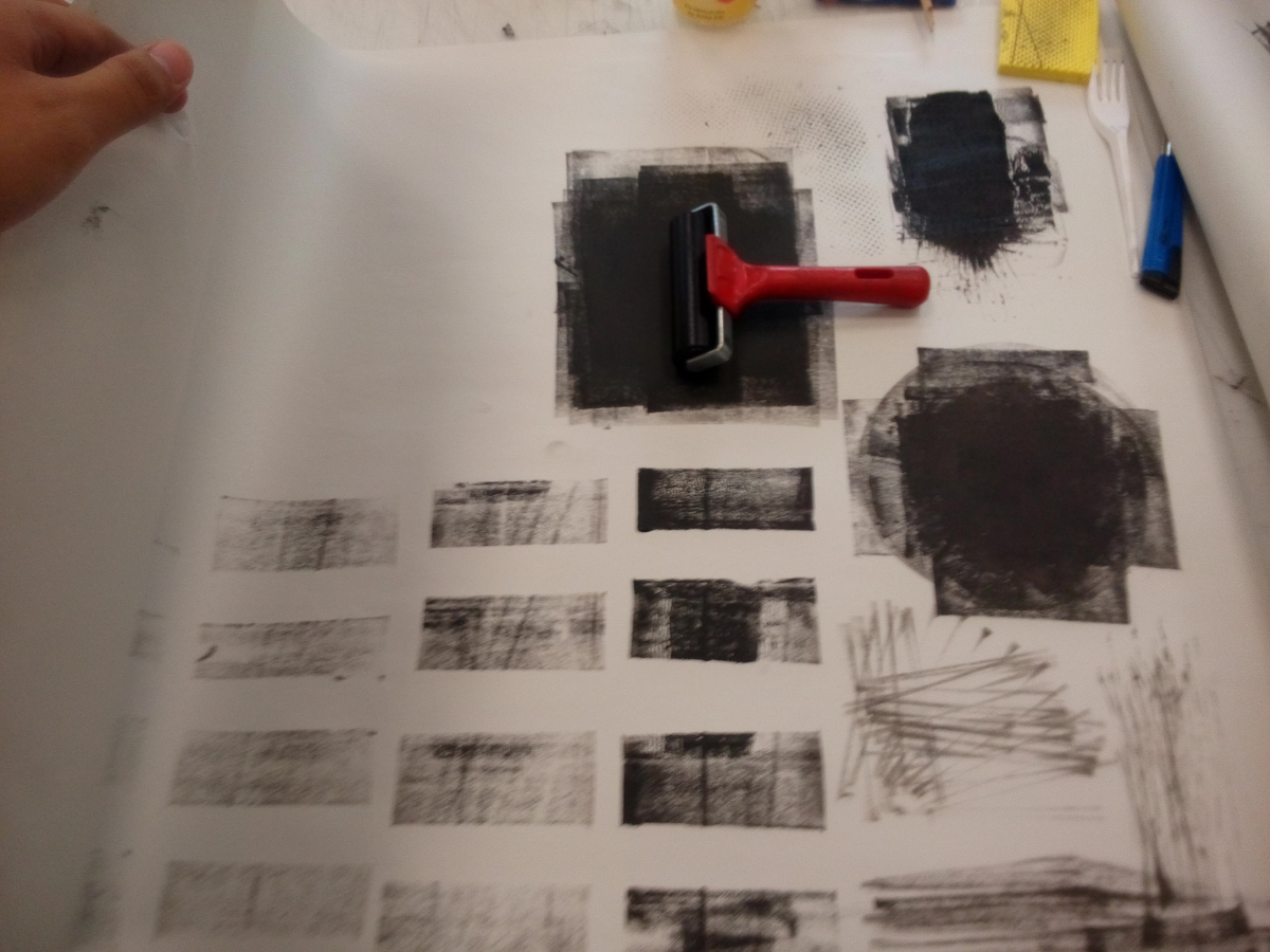
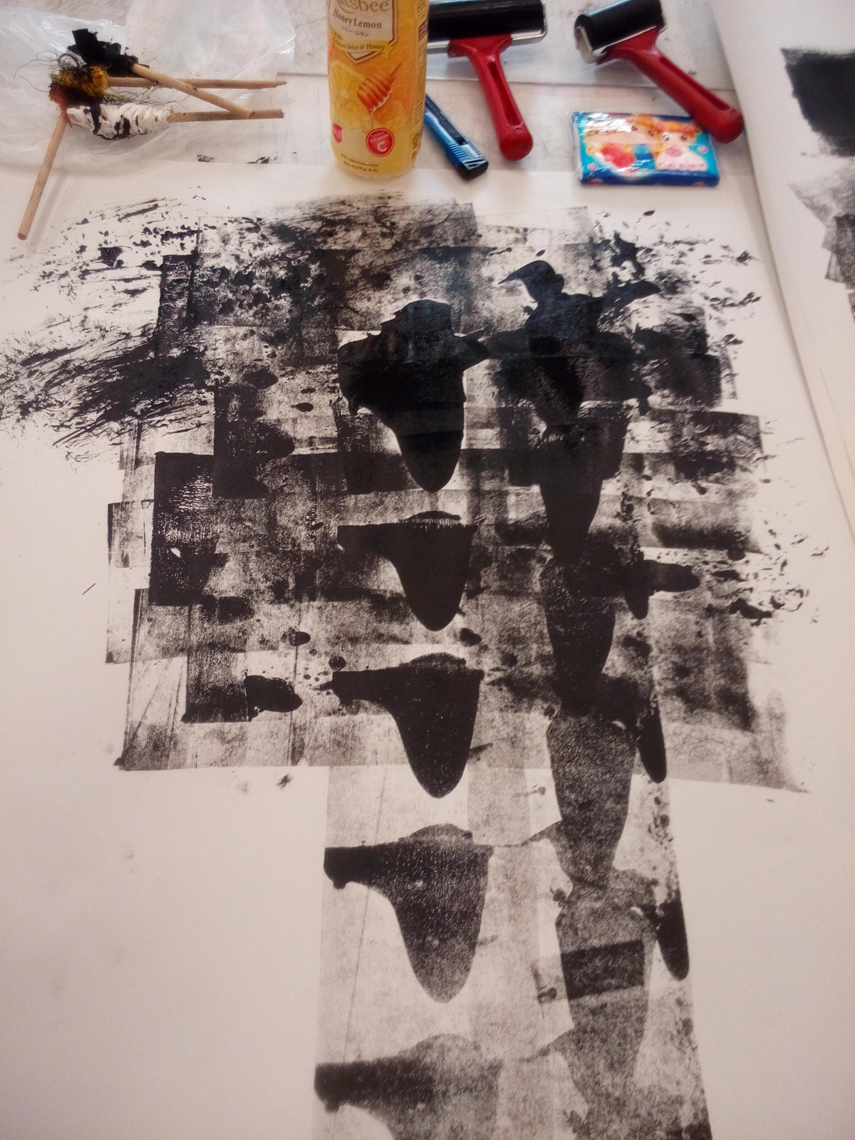
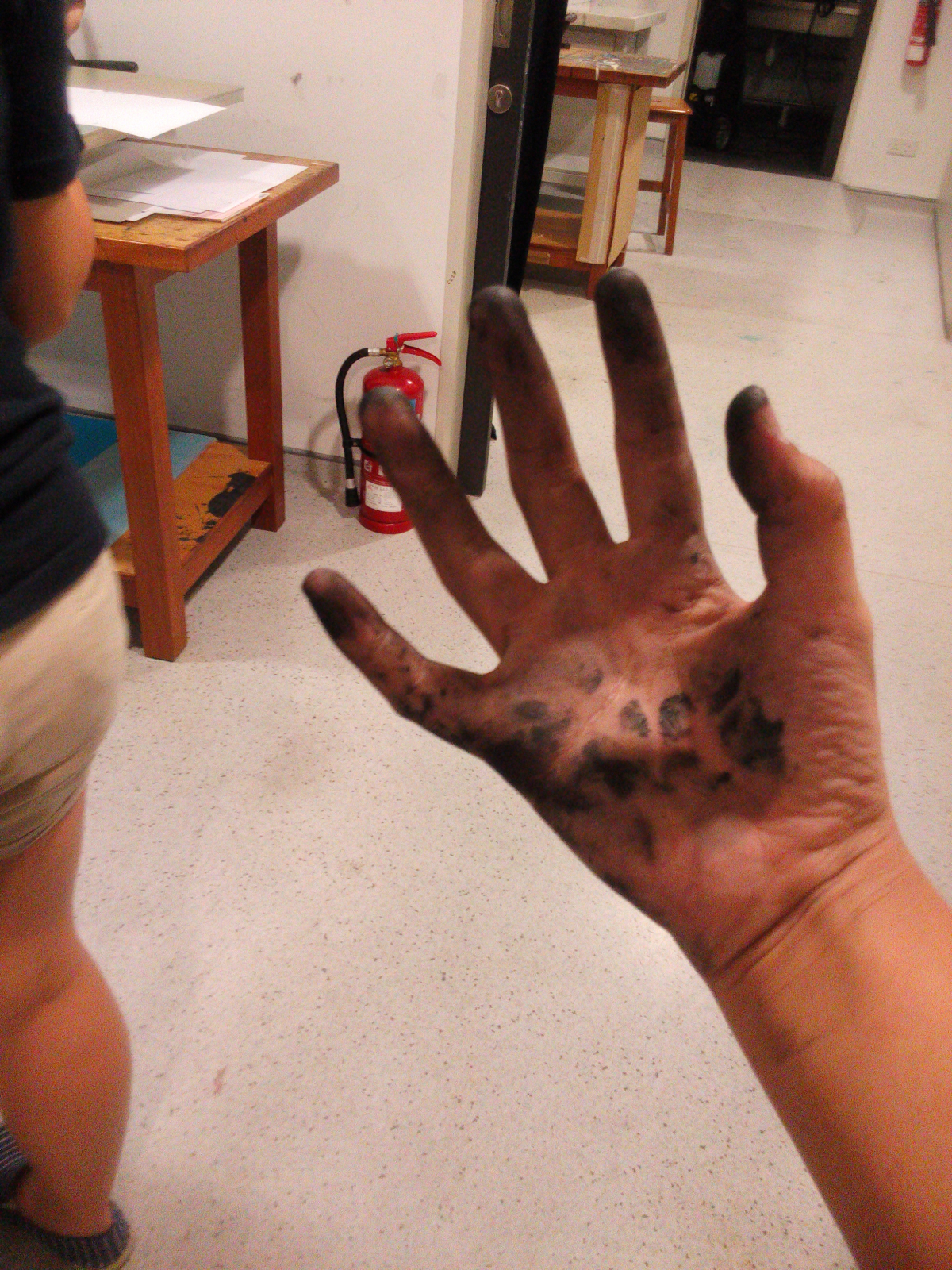
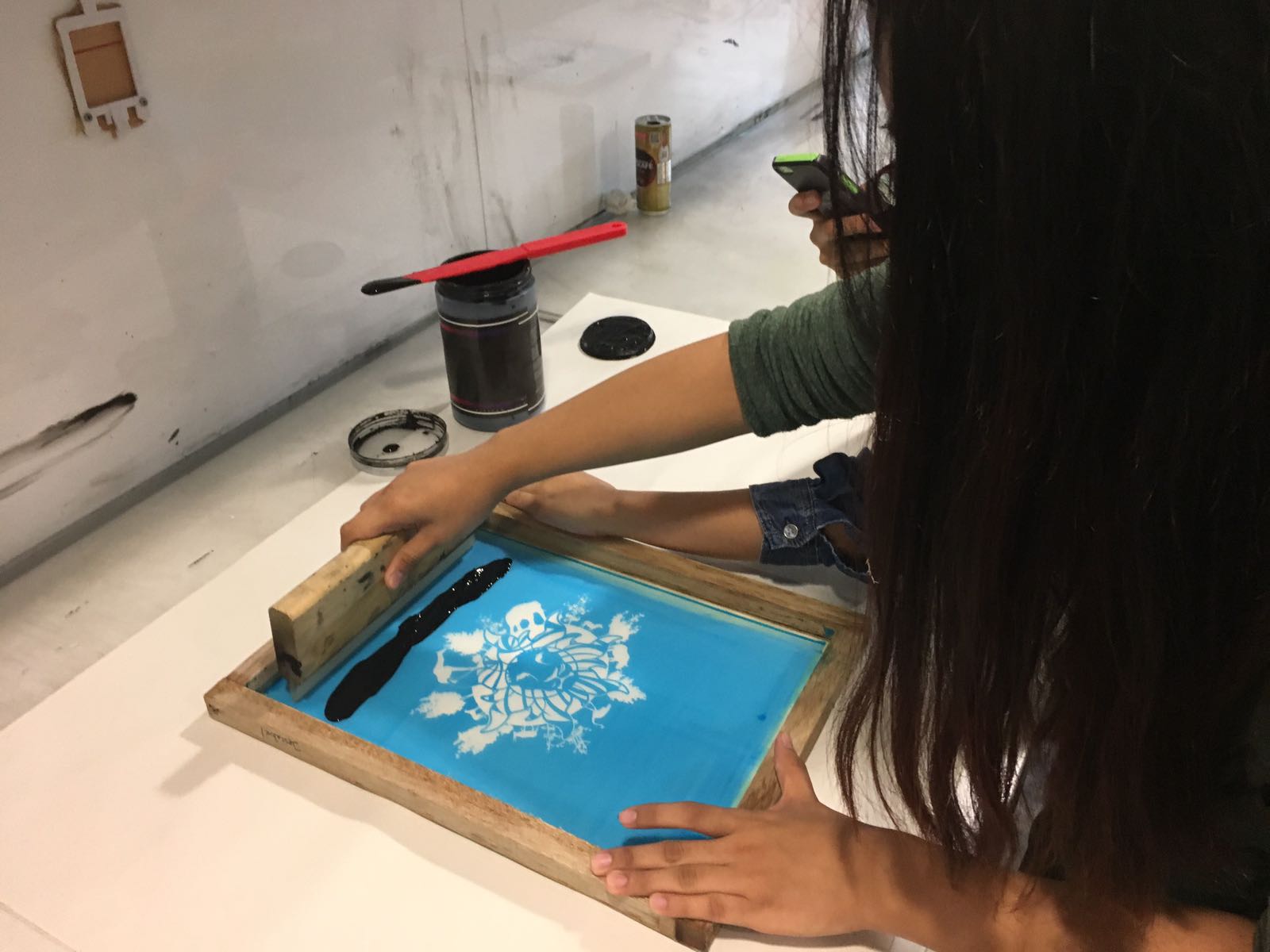
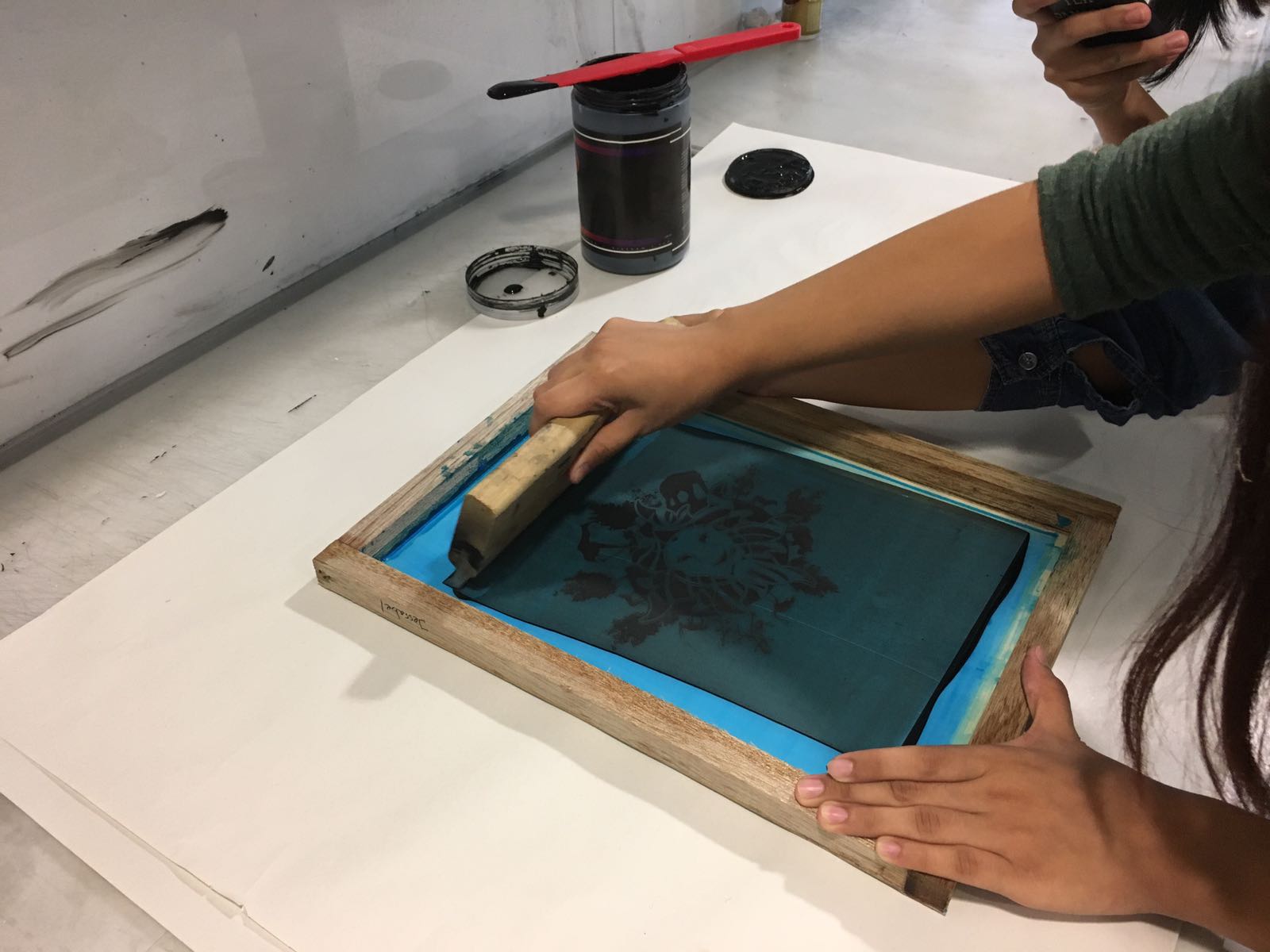
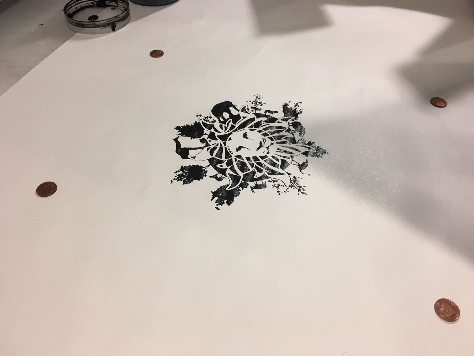
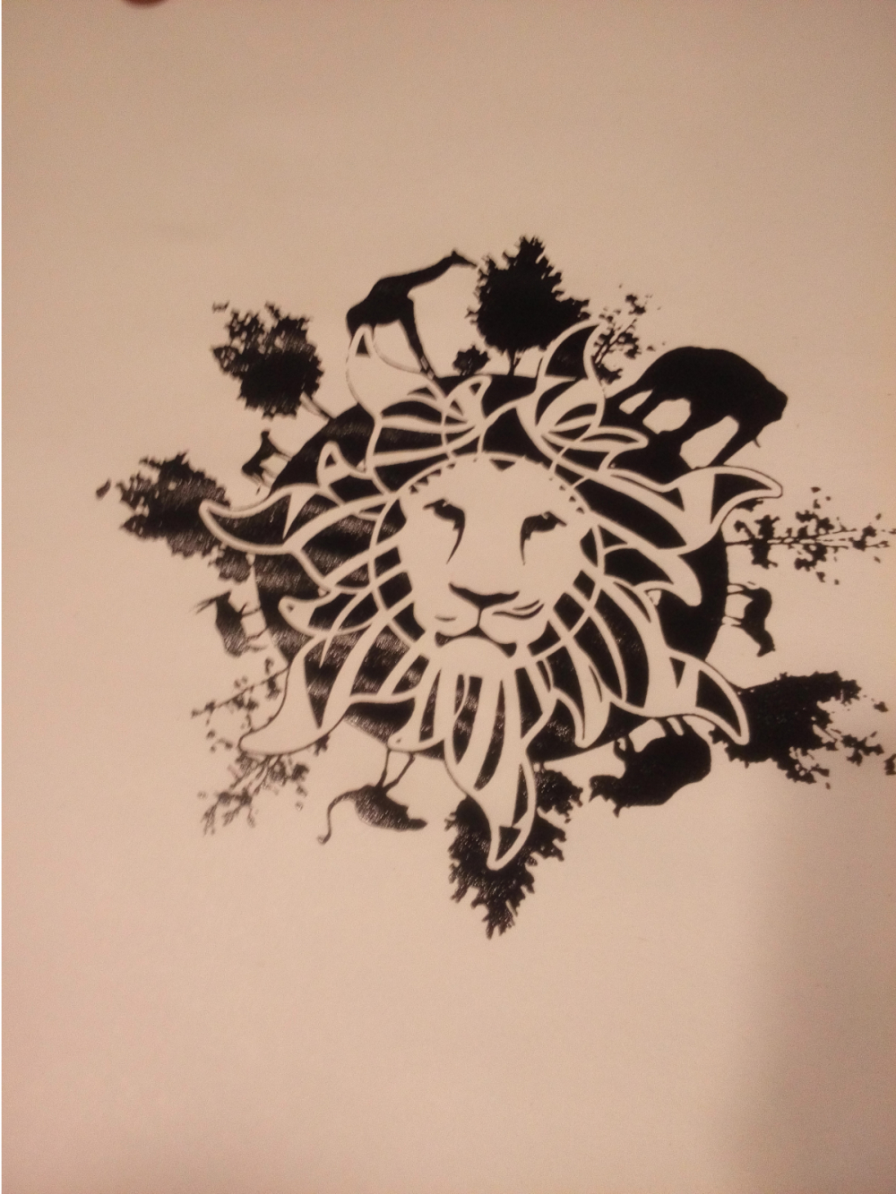
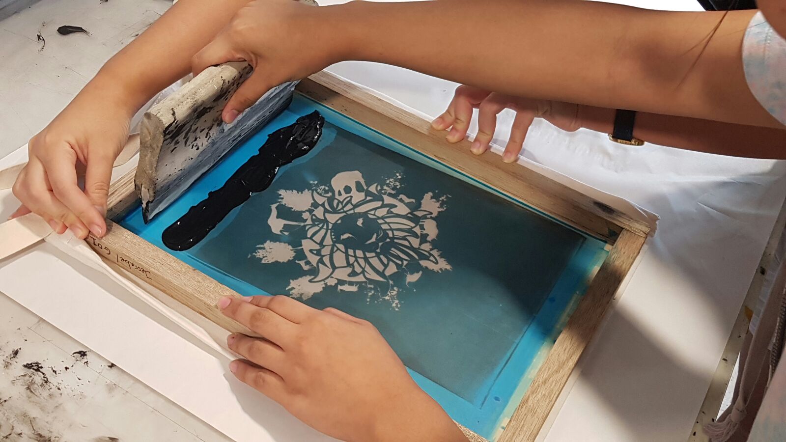
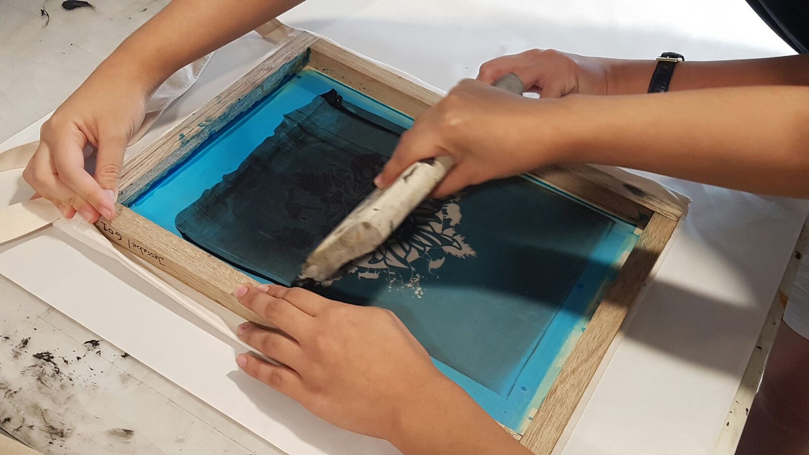
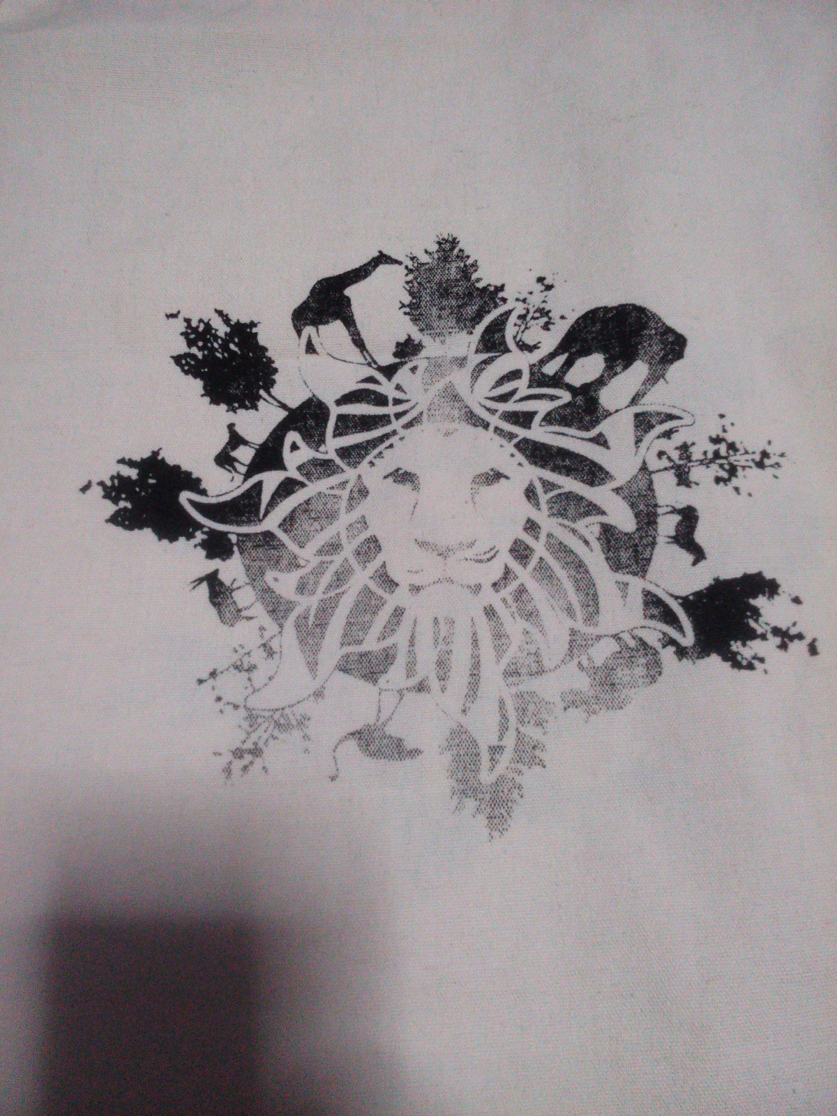
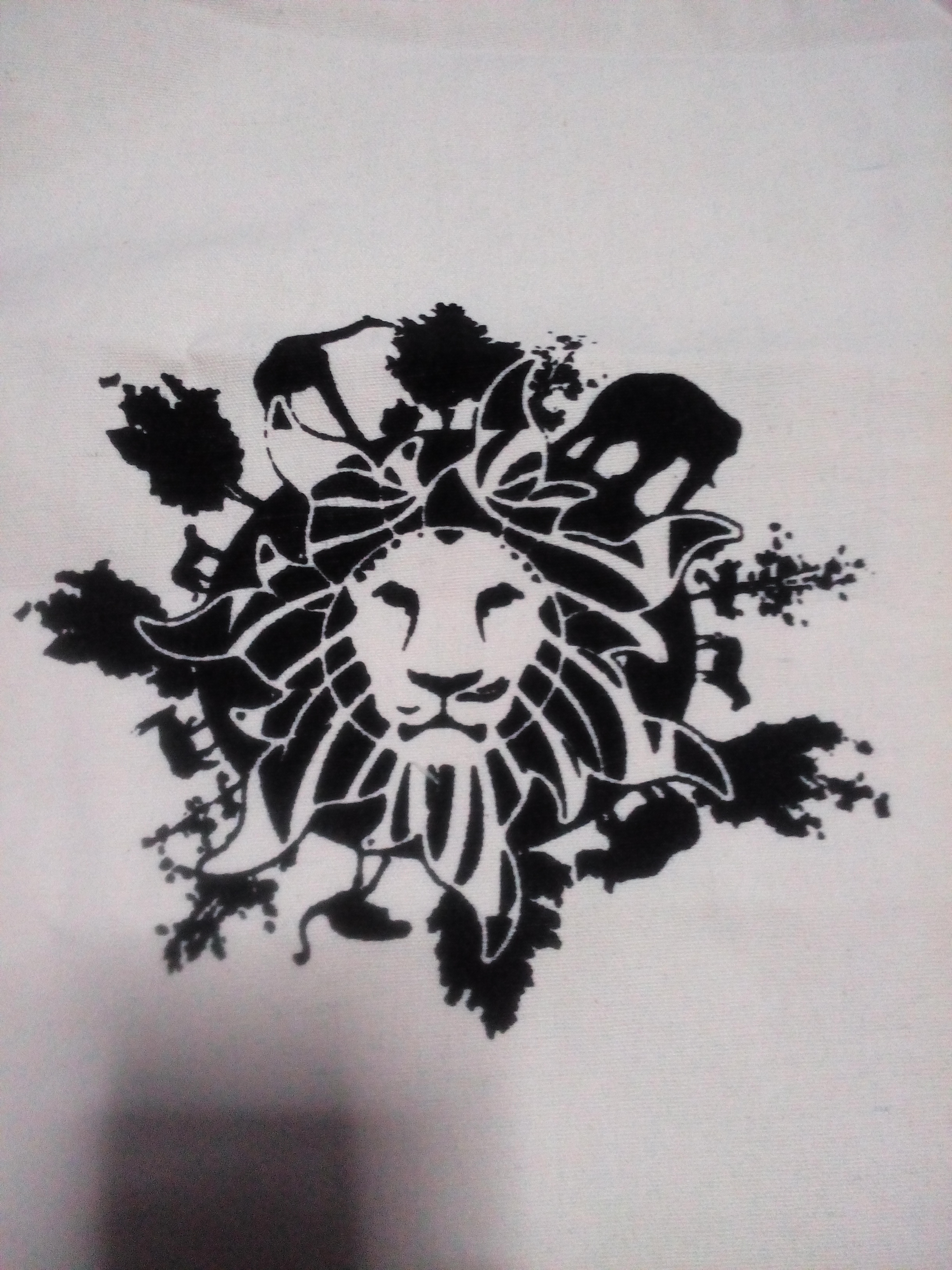
 At that time, this design was the first to be finalized and it came out really well, so why not use this design for silk screen printing. We had to print our work on a transparency sheet where it will be placed onto the silk screen. The silk screen will then be covered with emulsion before exposing to light. So the black prints on our work were areas which will not be exposed to the light, thus appearing on your silk screen.

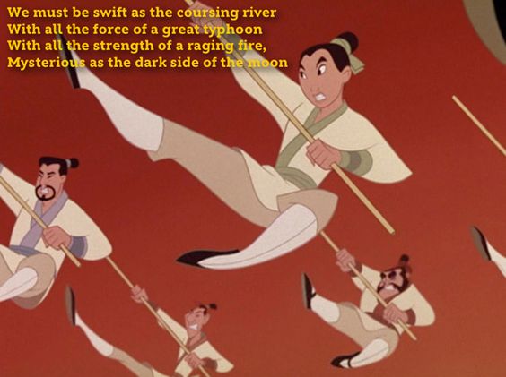
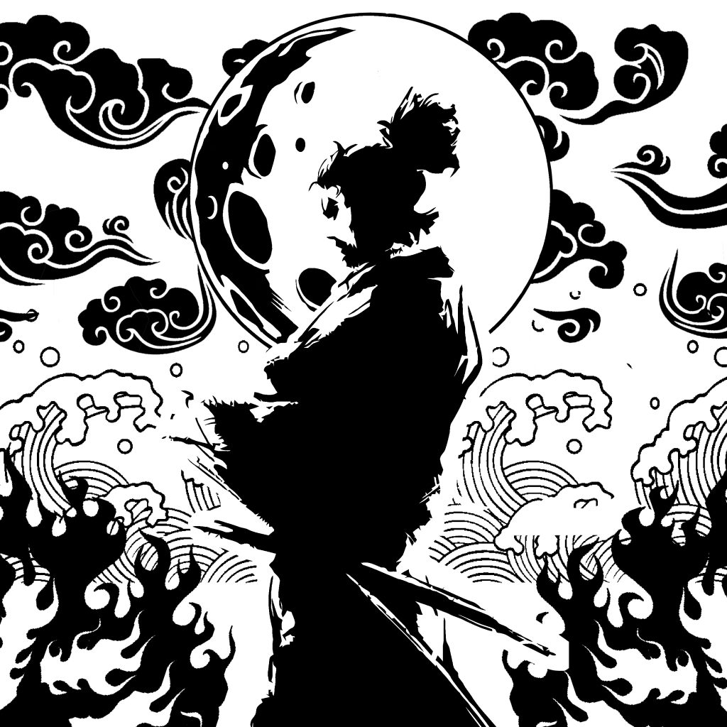
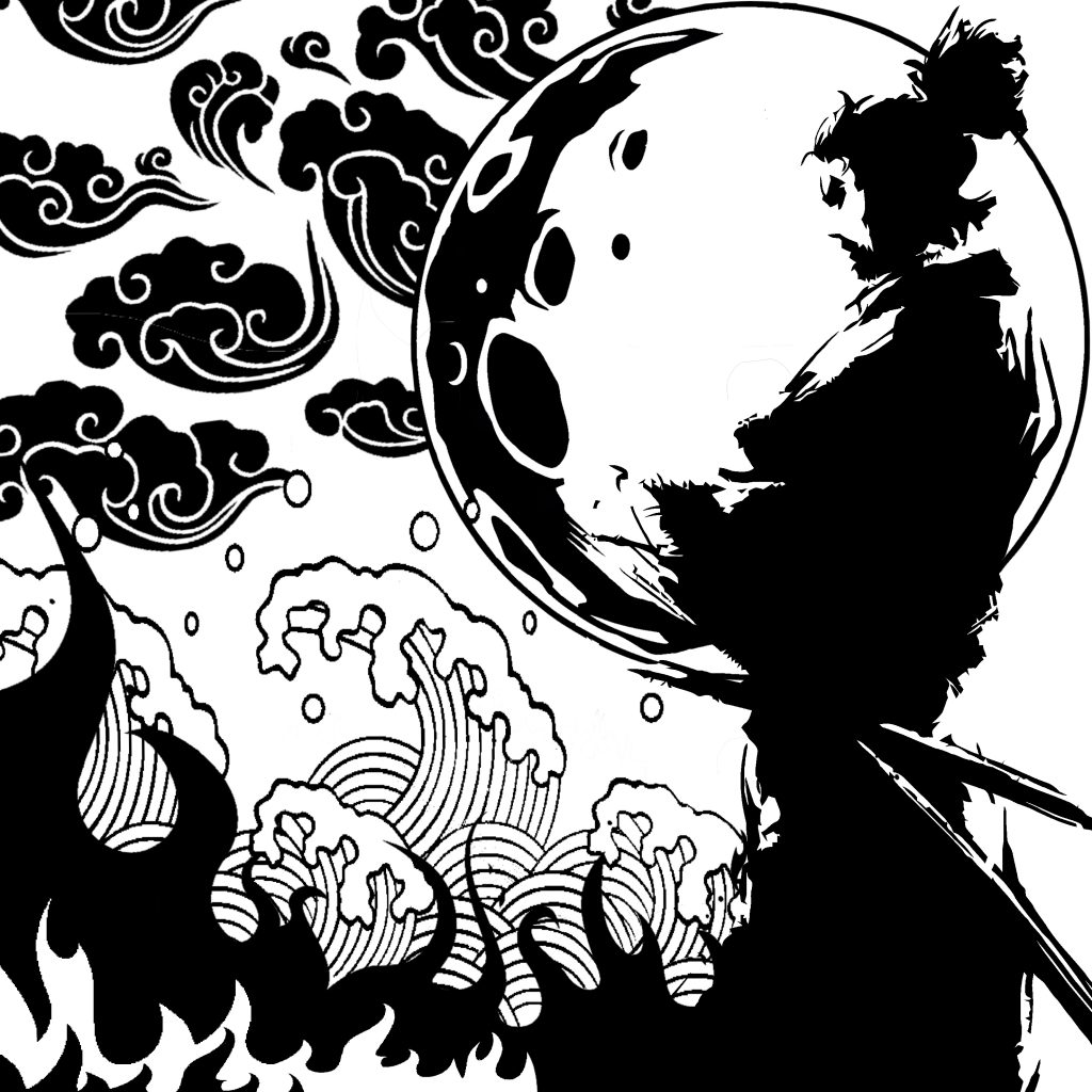
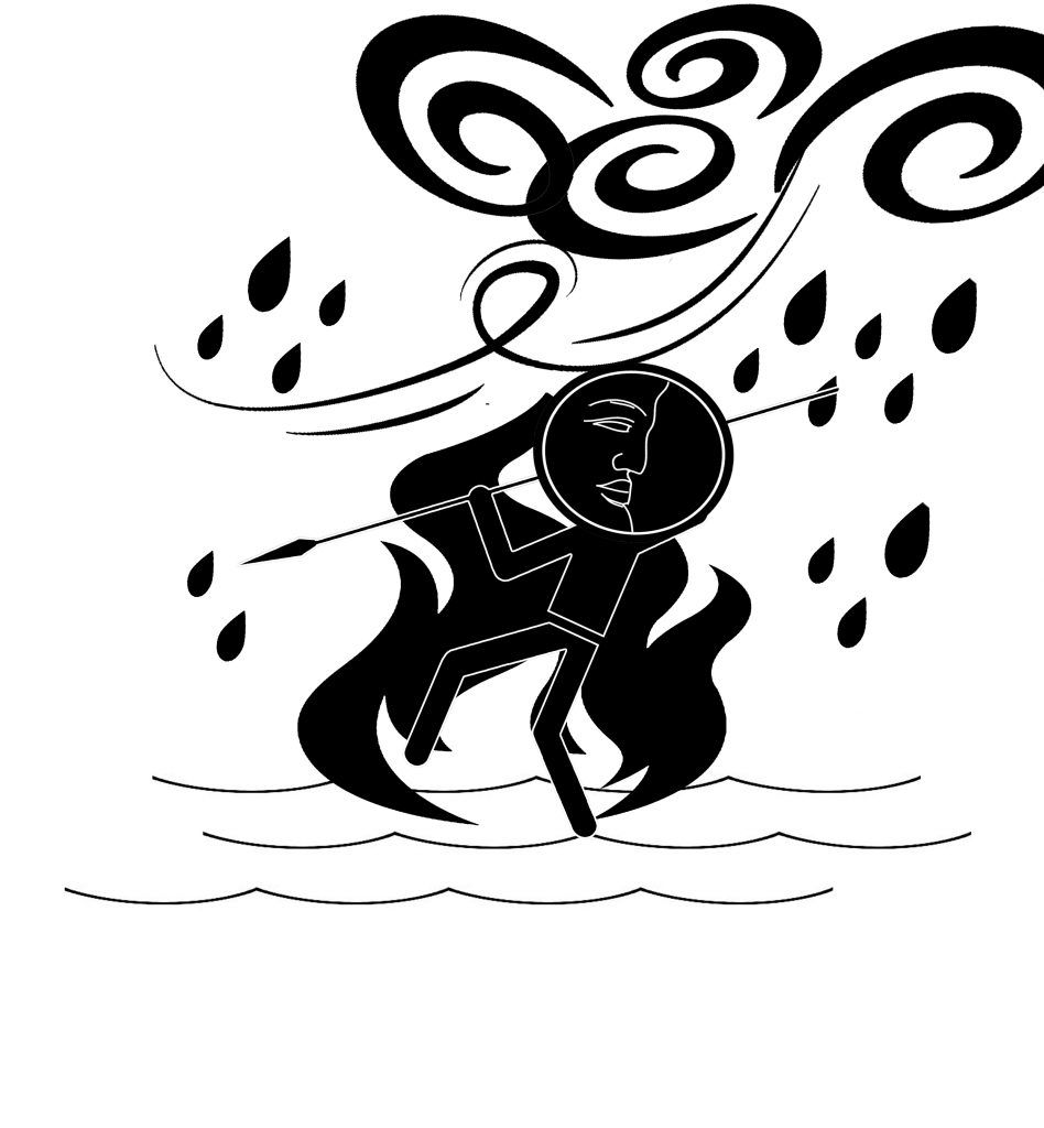 This was a rough design. I had wanted to capture the elements and show where this person is braving through them. I wanted to have this Asian style to it. I also tried following the picture above where the characters are striking with a spear.