Part 1
While people are surrounded by phenomena constantly, maps can bring about conscious awareness and comprehension. They call our attention to a few elements in our world from the millions of things we could be noticing. They also provide information about its attributes and a view of how those elements are related to each other spatially. In this way, maps provide a visual narrative of our world and how things work. And in addition to telling a story, maps suggest how we might navigate our world.
However, having to say that, there are often times when one is given a map and still faces difficulty in finding his or her ways. Personally, I find conventional print map not as helpful as the “map” we have in our conscious mind. This could be related to the sense of feeling we recognized when we see familiar places, objects or sometimes, a déjà vu moment we experience. It is a certain language that is not static, but constantly being renewed and recreated. For example, when one pass by street A, he or she might have recognized a specific building or site like an Indian shrine, taxi stand or even little details like a specific red pillar with graffiti painted on it. It is in the human mind that we subconsciously knew these symbols existed but never really looked at them or thought about them much. By objectifying them with the frame of camera as the central focus, naming them street symbols, organizing them into typologies, and mapping their existence, they became a thing.
After all, maps are about a process or performance rather than an end product. And everyone’s ways of mapping would differ from one to another. Some might use their sense of sight while others might seek comfort in mapping through smell, hearing, touch or even taste. One example of mapping through performance is Beijing artist, Qin Ga. He participated in the project from Beijing by remotely following the Long March team’s movements. The artist first tattooed a map of China onto his back, and then would tattoo each new site that the Long March team would arrive at in its respective position on the map, permanently leaving behind each route and site.
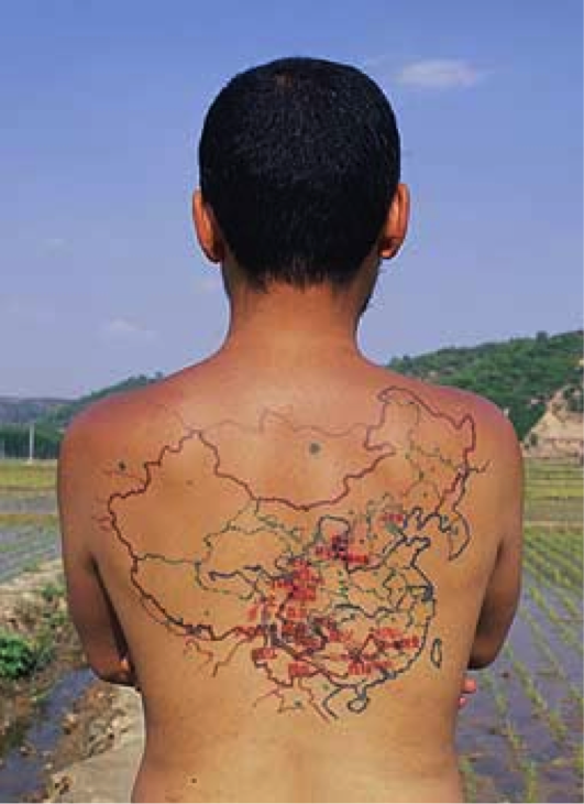
The final site of the Long March and the foundation of a new Utopian society (2005) Copyright © Qin Ga
(Source: http://leoalmanac.org/gallery/locative/longmarch/index.htm)
When the Long March team declared a temporary stop to the project on September 2002, at Site 12 (Luding Bridge, Sichuan Province), Qin Ga’s tattoo work also stopped. Through a small needle, the 25000 li (6,000 mile) Long March was miniaturized onto Qin Ga’s back. His body is both an artwork and a Long March object, combining together elements of history, and collective and individual memory.
Every time they reached a new site, he would have the site and route tattooed onto his back, recording the process with video and photography, as well as collecting the daily items used during the journey as an archive of the process itself. Traveling with him were tattoo artist Gao Xiang, photographer and cameraman Liu Ding, Gao Feng, and Mei Er.
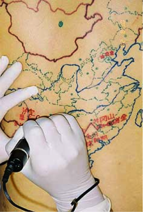
Remotely following the Long March team’s progress in 2002 Copyright © Qin Ga (Source:http://leoalmanac.org/gallery/locative/longmarch/index.htm)
Hence, we see how mapping involves not just the human memory, but about the experience we gain through the journey.
Part 2: Reading Response
Sidewalks have the potential to be a remarkable democratizing space.
One point that hits me the most throughout this reading regards the debate over competing conceptions of the sidewalks. In fact, it was not unique to Ho Chi Minh City but gaining policy attention in cities around the world e.g. Singapore City. As people continue to migrate to urban centers at unprecedented rates, sidewalks are particularly important for the lower income and marginalized urban dwellers who try to make their living in this space. As seen in the picture below, we see local vendors making a living by selling homemade food on a common sidewalk in Ho Chi Minh City.
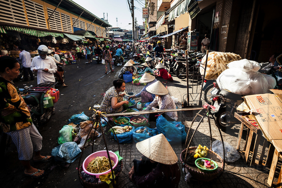
(Source: http://noipictures.photoshelter.com/image/I0000nEWD6z9889g)
Community recreating and vending practices on the sidewalks have also been viewed as sites of “authenticity”. Take Singapore for example, conservation of built heritage is an important part of urban planning and development. Historic areas like Boat Quay, Chinatown, Kampong Glam, and Little India as they add variety to the urban landscape environment, stimulating visual interest and excitement within the city. The conservation of these buildings and areas is testament to the rich architectural, historical and cultural heritage. It also adds to the distinctive character and identity of Singapore city a multi-racial, cultural place. More importantly, they give people a sense of history and memory even as they move into the future.
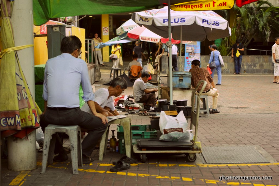
Unofficial Cobbler Square located at Exit C of Chinatown MRT Station
(Source:http://www.ghettosingapore.com/wpcontent/uploads/2013/05/Cobbler-Square_1.jpg)
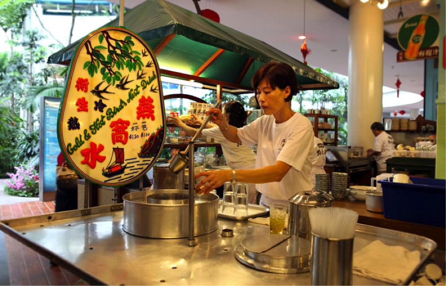
Recreating Singapore Street Food
(Source:http://trishawuncle.com.sg/images/page_content/tours_experiences/03/sft_photo03.jpg)
Next in point, I have also learnt that urban design that has been generated by idealized design principles without being informed by ethnography can produce disastrous results. The author mentions how spacial ethnography joins together social science research and physical spatial analysis to uncover how sidewalks are actually used and social processes and meaning of that use. Hence, it is important for the designer to be informed about the particular society and how their work interact with different subgroups of the population while making bold interventions and contribute a personal aesthetic vision. I think this point is not only relevant to urban landscape designers/architects, but also useful to designers in any fields as a whole. This is because understanding before designing is one of the most important aspects in design process.
Setting this into local context, I have learnt that urban design process should include going out to the site and interviewing and observing people. For example, urban redevelopment authority of Singapore made use of a “3R” Principle: Maximum Retention, Sensitive Restoration and Careful Repair. The original structure and architectural elements of historic buildings should be retained and restored as far as possible, without reconstructing the entire building. Parts of the building should only be replaced when it is absolutely necessary. Before any conservation work begins, thorough research and documentation should be carried out on the conservation building to ensure that quality restoration work is carried out through careful and accurate repair. This process helps ensure that the conservation works adhere to the 3R principle.