I actually came up with 6 designs before they changed the final submission to 4 designs. I will start with my final designs first and then show off the two other unused designs.
“I am short-sighted”
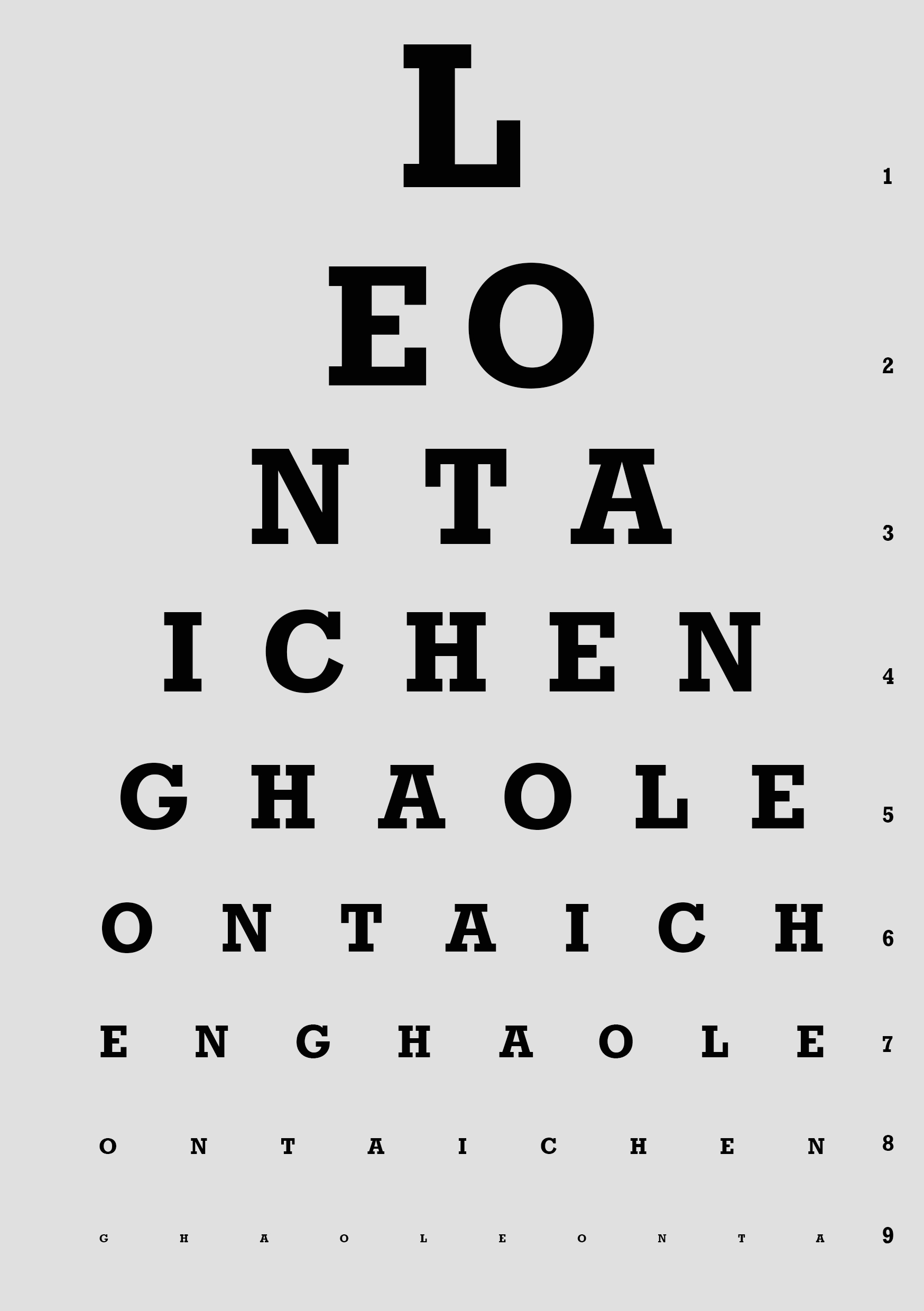
Anyone who wears glasses will find this eyesight chart familiar. I actually find that I look really weird without my glasses now, so in a way my short sightedness has become my identity.
Instead of random letters, I used my full name (Leon Tai Cheng Hao), repeating it over and over. I also used a grey background instead of white to not make the text pop out too much.
“I love coffee”
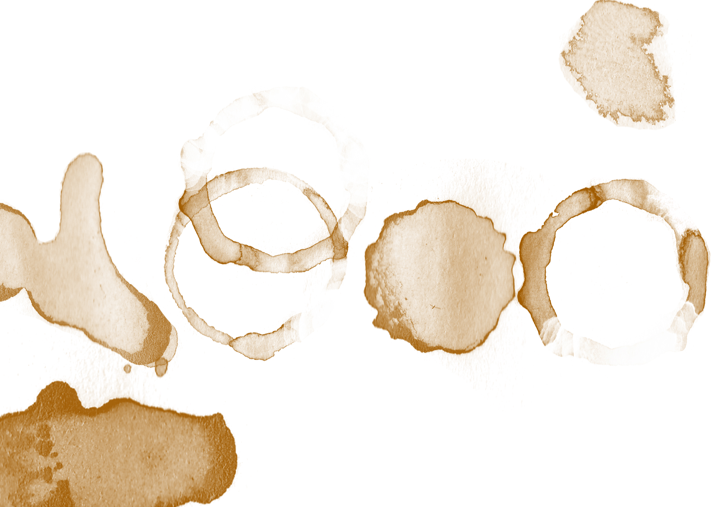
Coffee is every design student’s saving grace, myself include. Many nights have been kept awake by this beverage. My initial idea was to physically create the coffee stains on paper using a cup, but that did not turn out so well. The colours were solid, blocky, and had no character to them. I then decided to search the internet to find coffee stains to manipulate.
I then used and manipulated the many different coffee stains to make up my name. I also decided to add some random stains at the corners to fill up the negative space.
“I love soup”
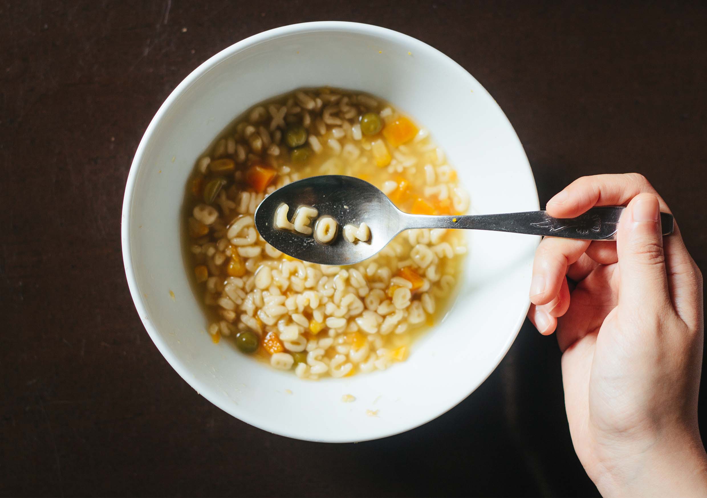
I love drinking soups. Be it cream of mushroom, bah kut teh, minestrone, I’ll drink any soup. For this, I cooked up some alphabet soup and took out the letters of my name. Fun fact: the “N” is actually a sideways “Z” as I could not find the letter “N”.
“I love cardistry”

Cardistry – the art of shuffling playing cards, is a cool little hobby that I partake in. My first thought was to spell out my name by laying out many different playing cards, but I eventually found that idea to be really bland. So, I decided to think out of the box and uses the indices of the playing cards to spell out my name.
One problem I faced was the letter “N”. There’s no number from 1-10, or any alphabet in the deck of cards that can pass off as an “N”. I decided to use the “K” to form a lower case “n”. If I were to do this again, I’d probably photoshop in the “N”.
Now, here are my two other designs.
“I love streetwear”

I wanted to imitate the “Supreme” brand, but instead of just the logo, I decided to imitate their “Harajuku box logo” design.

To give some variety, I decided to surround the logo with a denim material. However, in retrospect, the two materials sort of make everything look very cluttered. I think I would have gone with a plain white background instead.
“I love music”
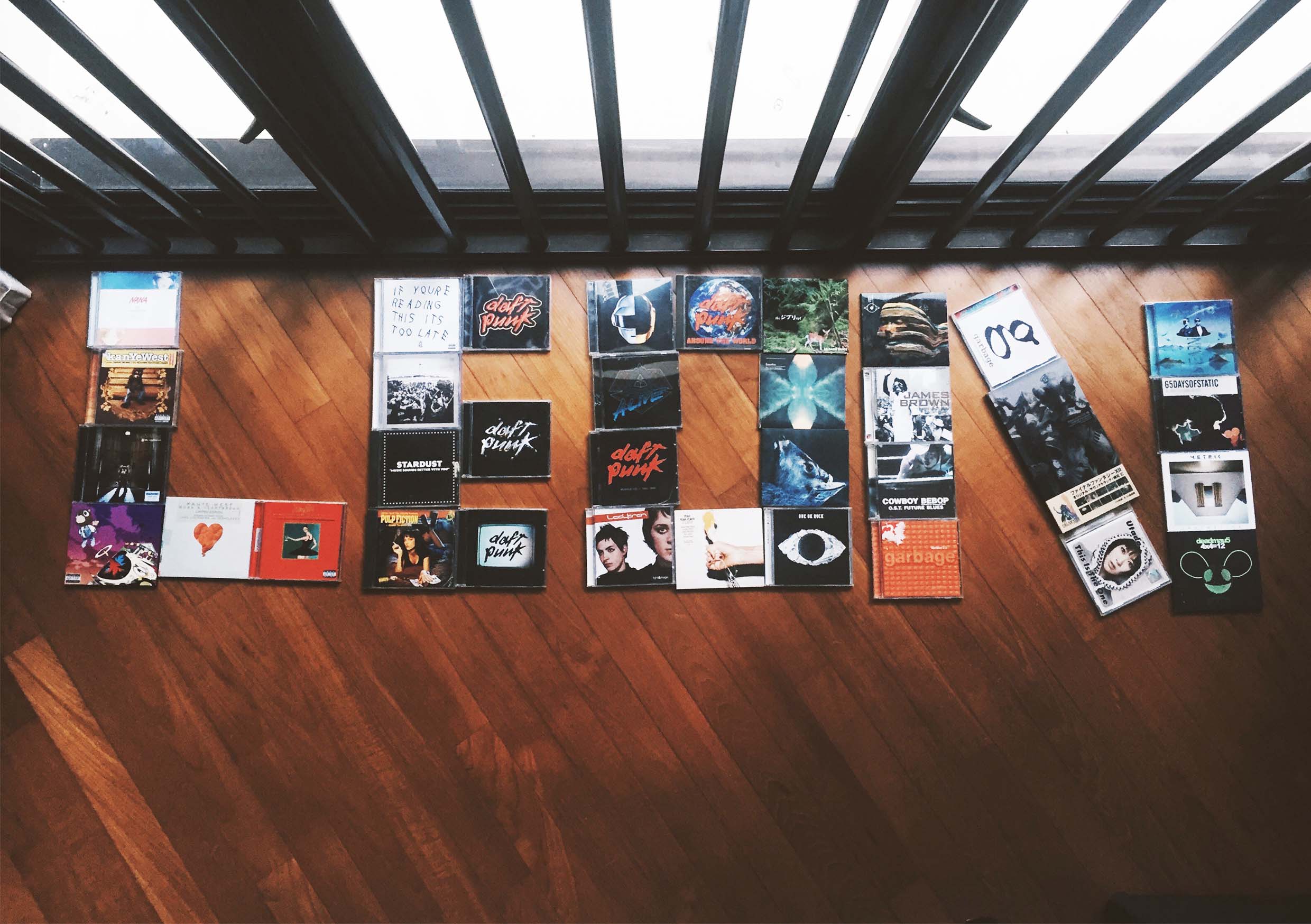
This was done using my personal music collection. Okay lah, this was pretty uninspired, and I’m glad I didn’t use this for my final designs.