Statement
For this assignment, I decided not to have a recurring “character” to represent myself as my drawing skills are not that good as my peers, so I decided to approach this from an abstract point of view; there is no continuity between the equations. I figured that the main point of the assignment was to explore different colour schemes, and that was what I tried to do.
1.) Solitude + Music = Me (epic CD riding on wave action)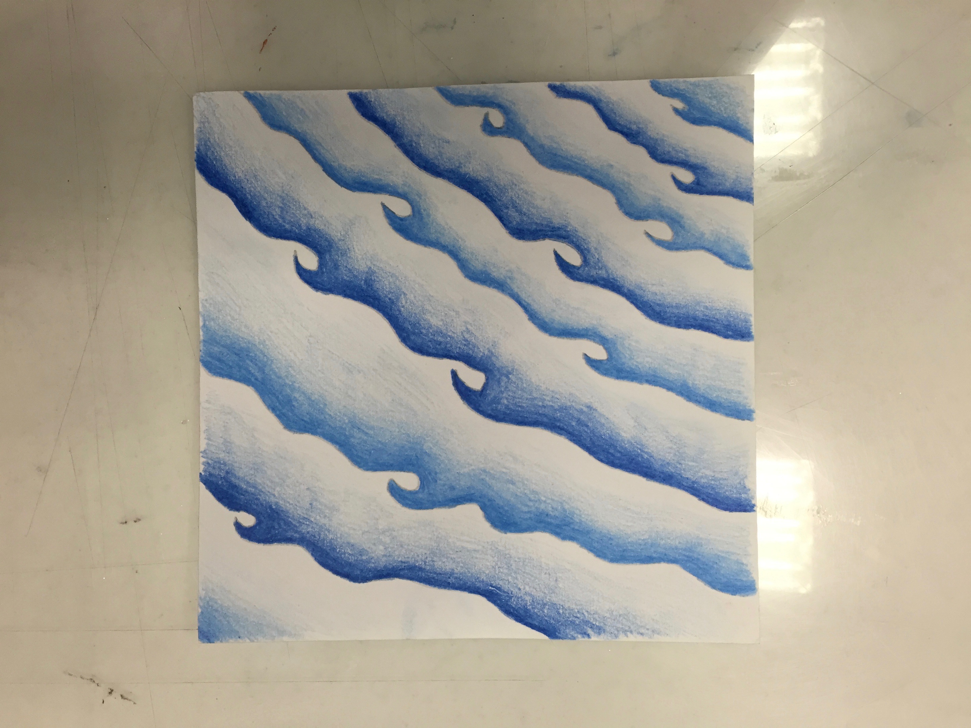

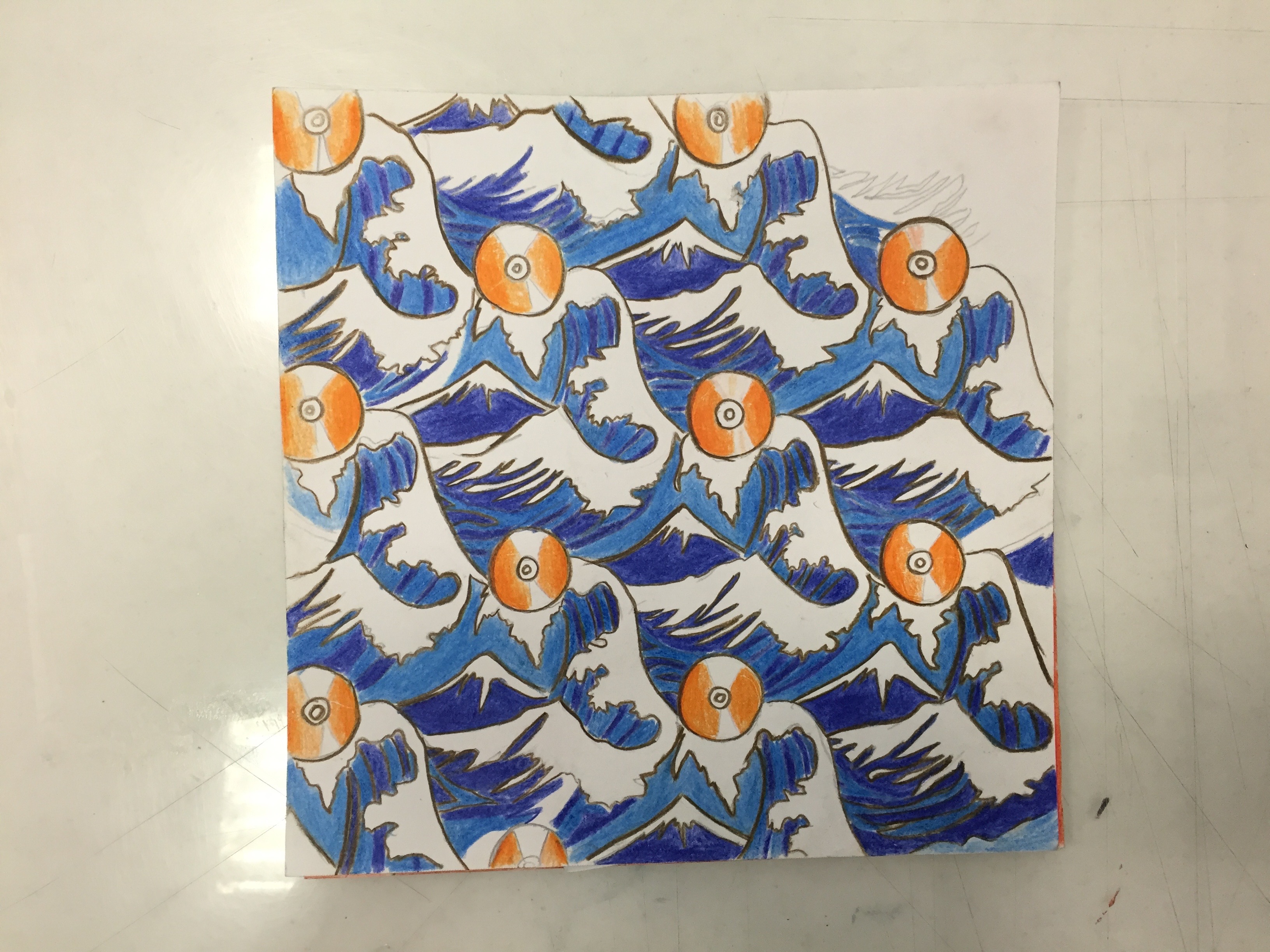
I depicted solitude as the ocean, as… I like music, so I portrayed it as a hand holding a CD. The combination of both elements resulted in many CDs riding on waves. For the colour scheme, I showed how 2 analogous colours combined into a complementary colour scheme.
2.) Creativity – Fear = A better me (Godly stuff making powers)
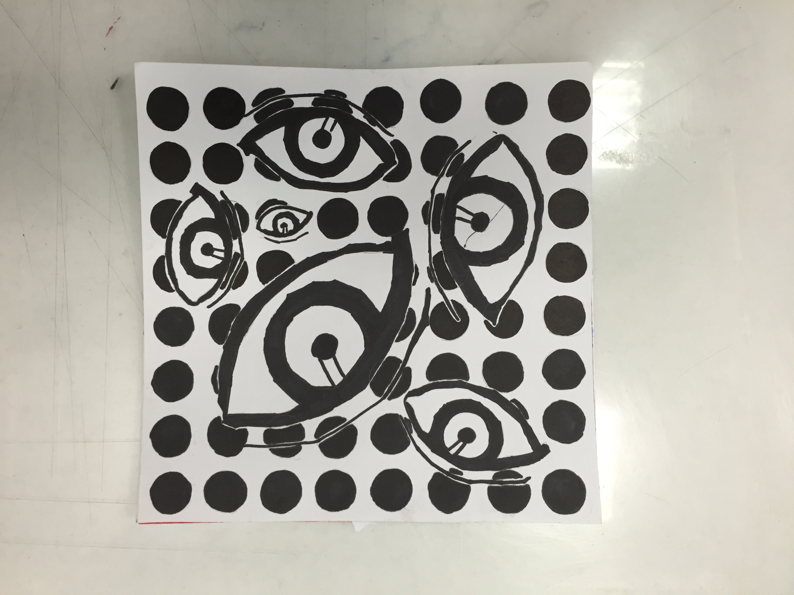
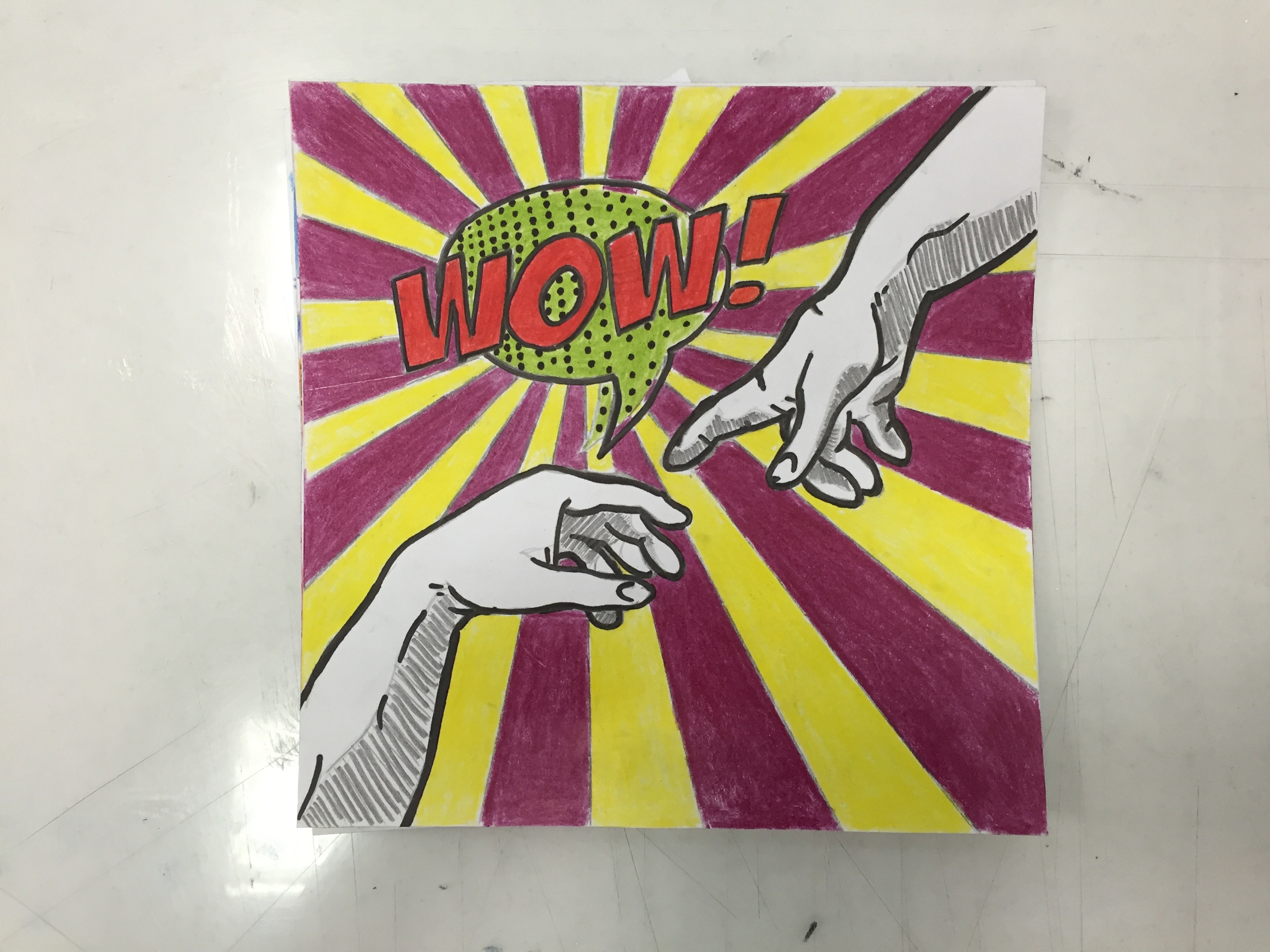
For this equation, I decided to go with a pop-art theme. I depicted “creativity” as a pair of hands, as I feel that most creative things that humans do all involve their hands. I used a triadic colour scheme (red/blue/yellow) for this. For fear, I went with a monochrome colour scheme as the way I represented fear (many judgmental eyes) calls for a black and white scheme, as fear has no colour. Finally, for the last panel, I re-interpreted the famous painting, “The Creation of Adam”, using a tetradic colour scheme (purple/yellow,red/green). I drew a parallel between “The Creation of Adam” and my own creative potential. Personally, this is my favourite equation.
3.) Playing Cards X Abstract Thinking = An ideal me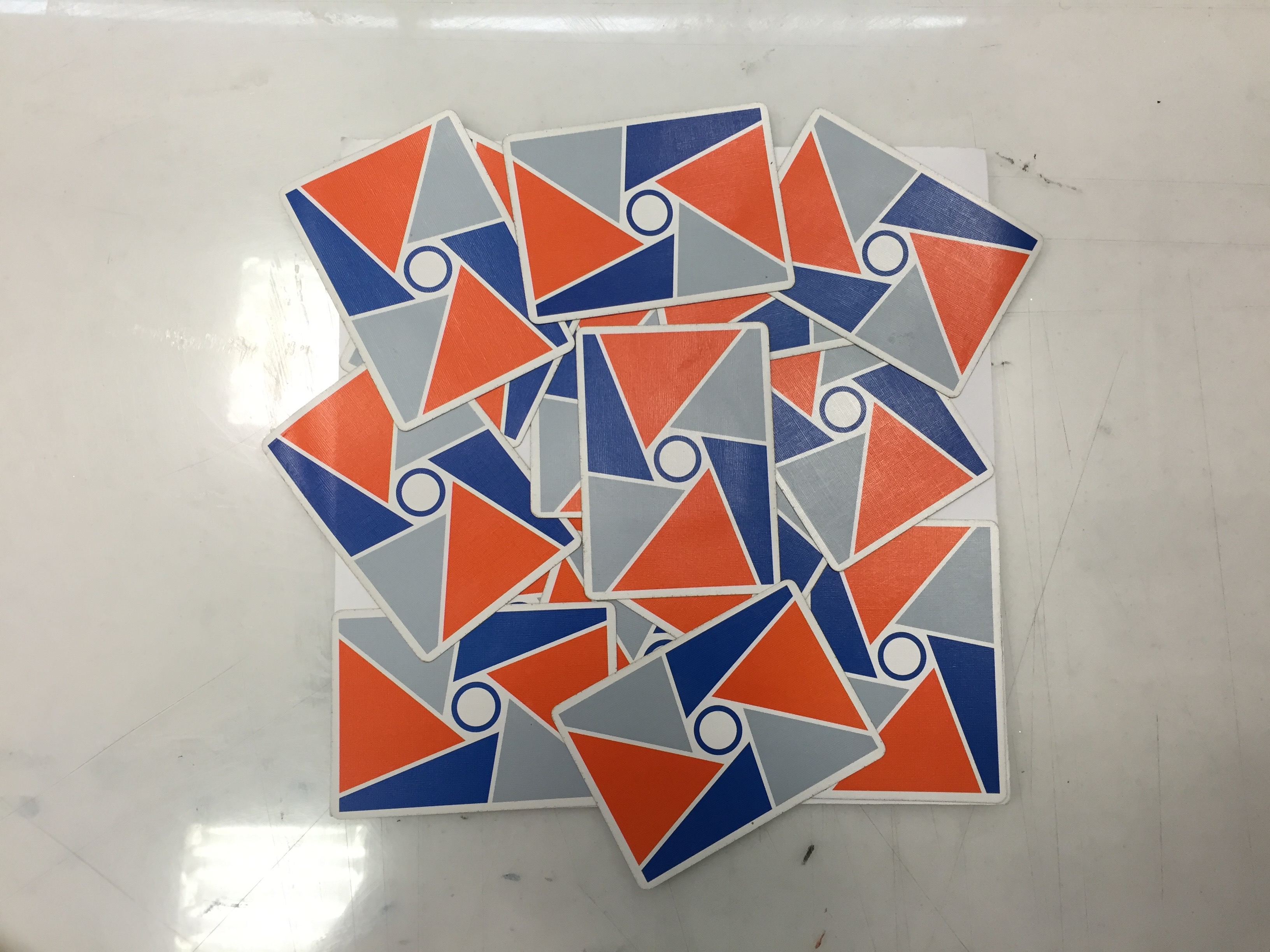

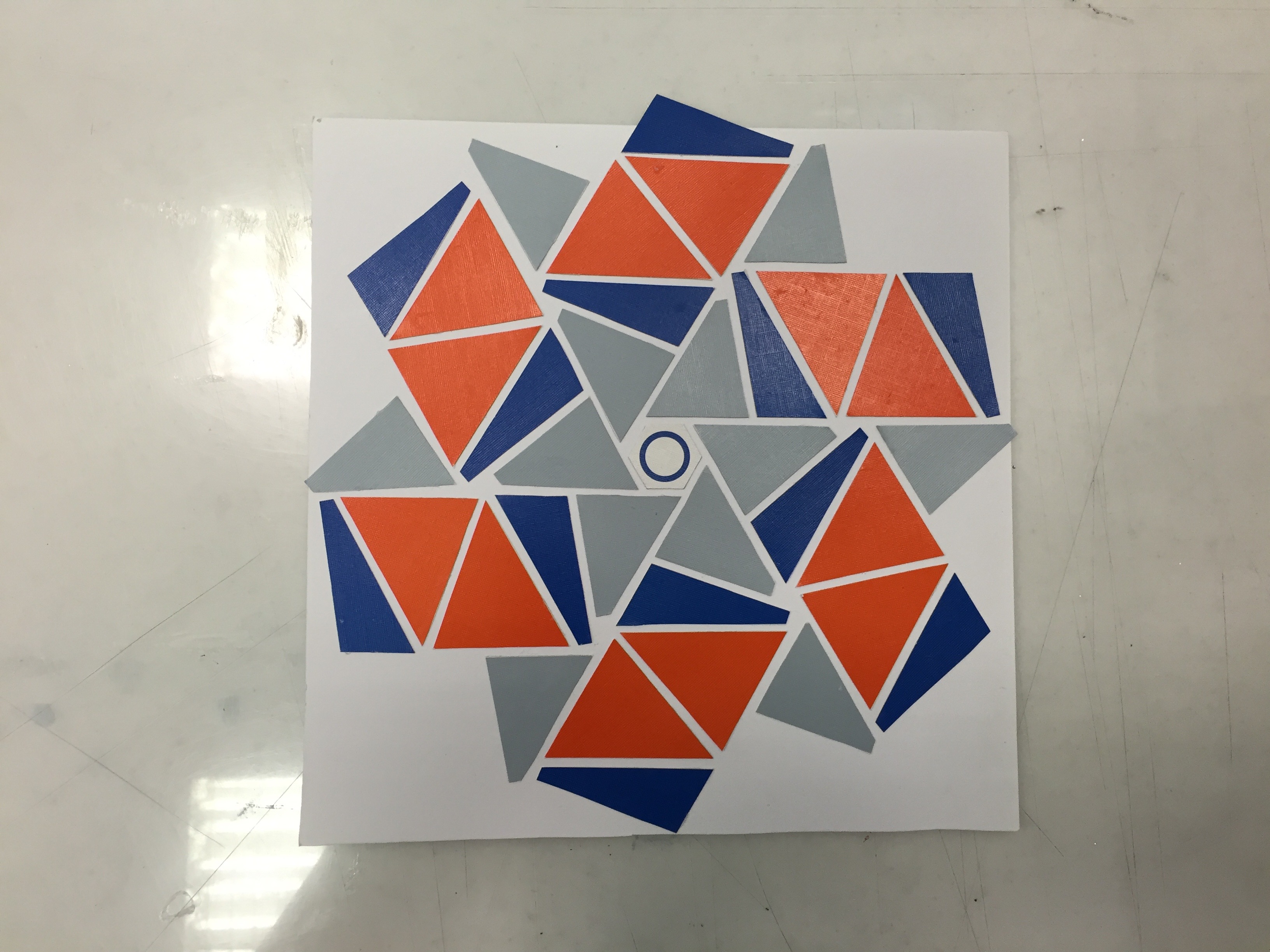
For this equation, I decided to think outside the box and attempt to creatively use playing cards. The most interesting panel is the last one, where I cut up numerous playing cards to form a star shaped pattern. The main colour scheme here is blue and orange (complementary).
4.) Photography + Dogs = Me in 5 years (making dog movies)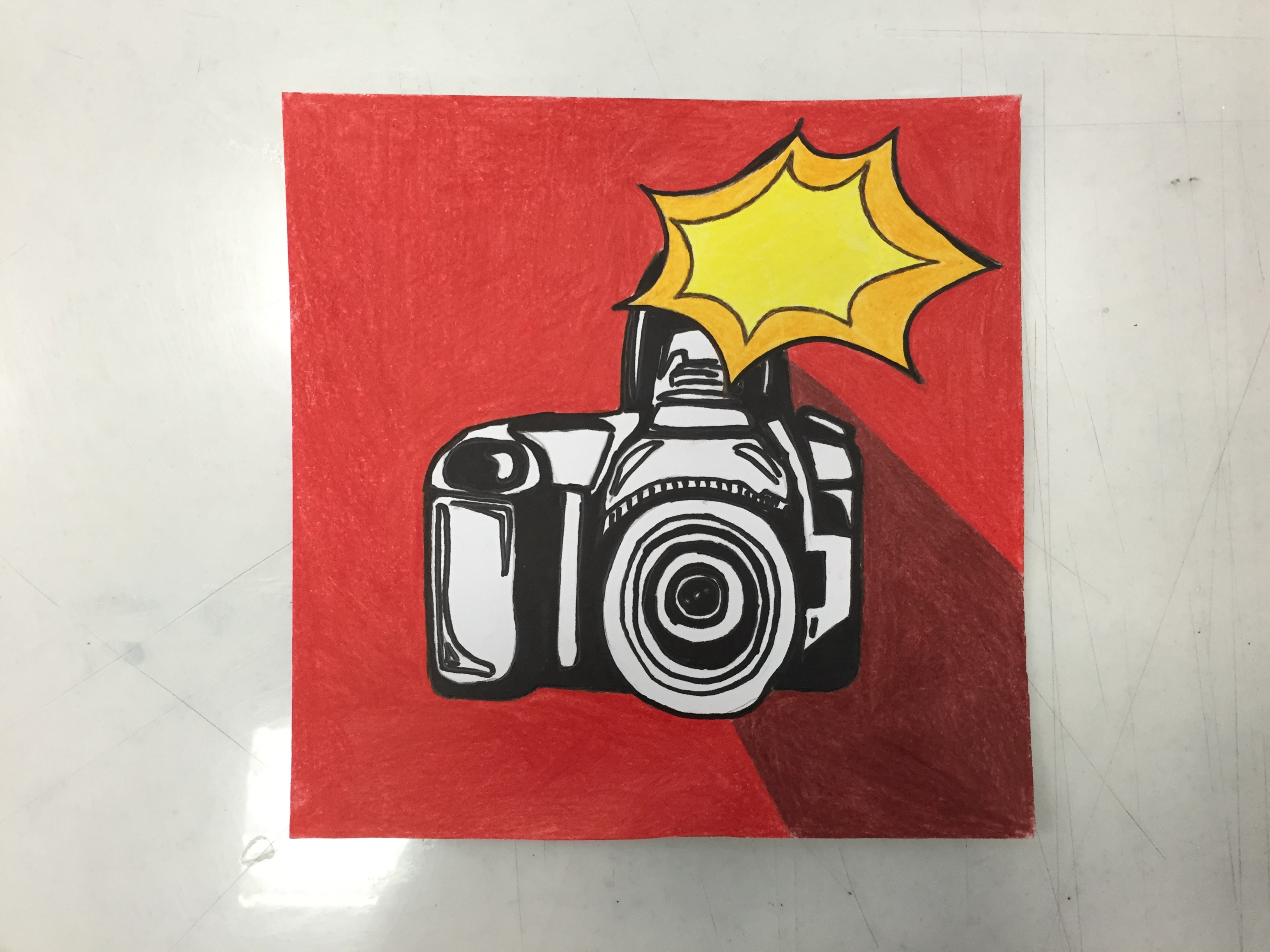
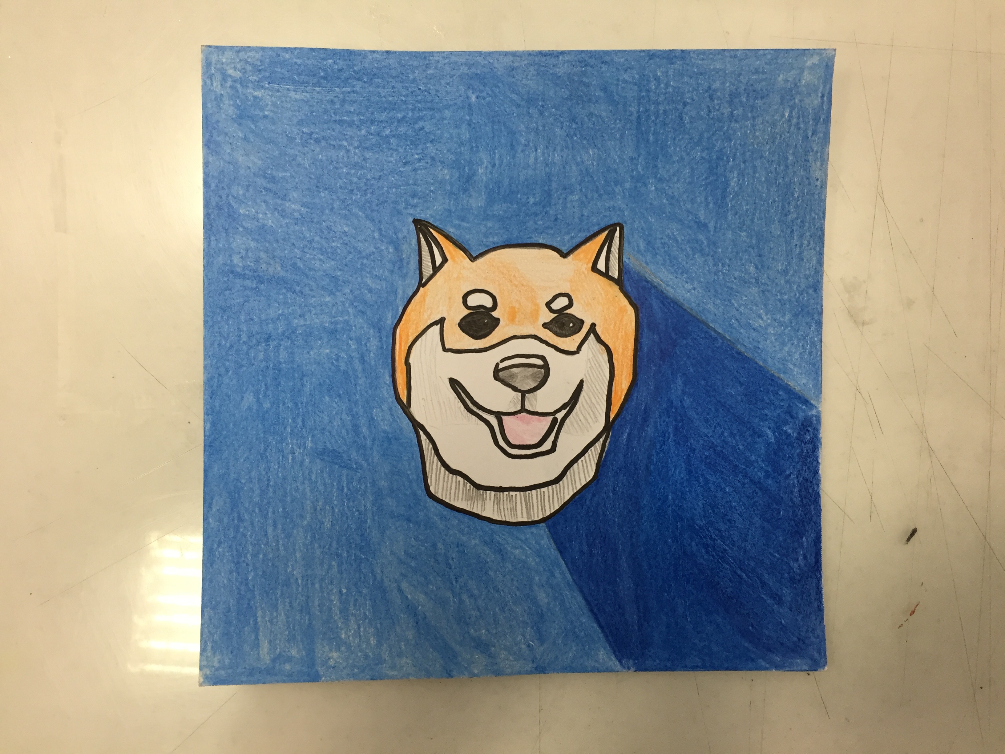
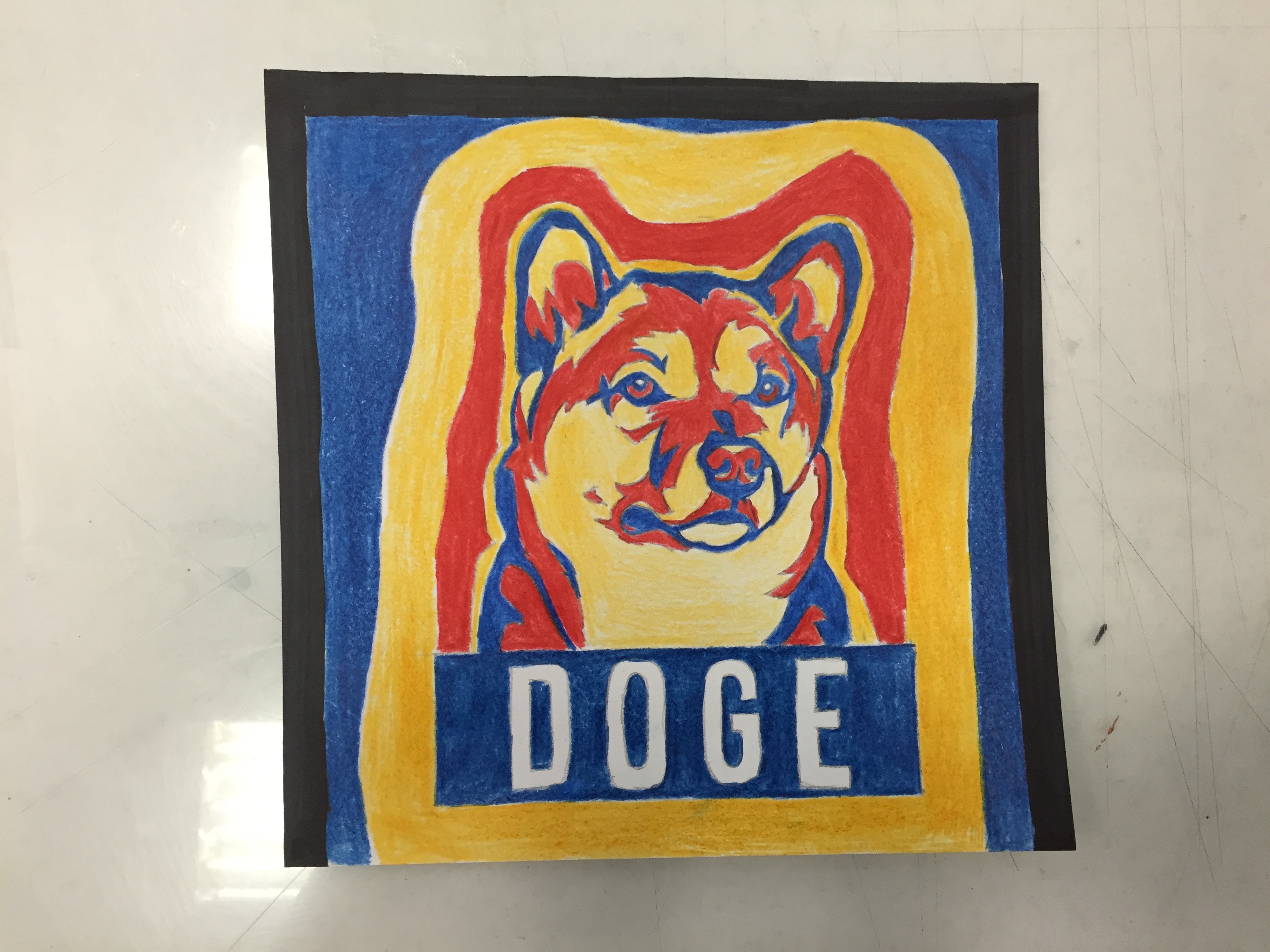
For the last equation, I played with analogous colour schemes for the first 2 panels (using the darker colours to portray a shadow), while for the final panel, I combined the previous 2 panels and played with a triadic colour scheme (red/blue/yellow).
Reflections
I learnt a lot about implementing different colour schemes into my artwork. I also learnt to work around my limitations, as initially, I was quite lost on how to approach this assignment as I wasn’t really proficient in either drawing or photoshopping. I took Shirley’s advice and traced out my main elements, while adding my own touch as well. Overall, I am quite satisfied at the final result.