
What would things look like if they’re in the point of view of a cat/from a cat?
In this project, I explored various possibility on how a cat would see, or be seen by things.
The main idea was to explore the cat in motion.
The miniature cats were being placed in different area of the house to depict a playful style.
–
 14th March 2016, ADM
–
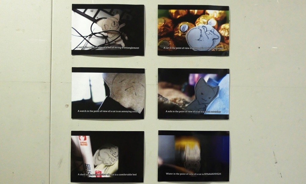
This series follows a documentary style with the captions included within the image to mimic the subtitles. All images are composited to have a cinematic look.
The images are printed on 100gsm paper that are slightly glossy so that it have a movie poster-like effect.
As for the presentation format, they are arranged in rows of 3 by 2.
With the left side more focused on contrast and thus employ less colours, and the right being more colourful.
Choice of font used is Arvo, and it is added at the bottom of each image in white colour and black border with a little grey glow.
Each images is carefully choose out of many taken that is depicting the same idea, after they are chosen, some basic photo manipulation is being conducted, such as adjusting of the curve and levels.
In the process of taking the photos, the lighting and composition are the main concerns. In general all of the image have a obvious area of dark and light, it is to portray an idea of the cat being discovered in the motion of doing something. The emphasis placed in composition of the photos was to make all of them look more three dimensional and have the concept of depth, so that the image look more dynamic and interesting.
While preparing the cat drawings, there were also many decision made. The type of paper, type of pen, dimension, colour.In the end, I used sketch paper with pencil drawing to give it a sketchy effect. The cats are drawn in a size of about 3 to 4 cm big, and left uncoloured so that they can be easily distinguished from the background. However, during the critique it was mentioned that using black marker for outlining might make the cat stands out more, but I think the reason I didn’t do so is because I wanted to go for a more natural, subtle effect. I want the cat to blend with the background, and not pop out totally. Generally, the cutting for the cats was done with a border to emphasis on the idea that the cat is hand drawn, and I believe that is sufficient to make the cat stand out.
–
The most difficult process in this project is arranging the set for photo taking. Not only is setting up composition that looks nice difficult, but also the process of recreating the same composition under the same lighting and angle for refinement. For the presentation, the colour printed was a little too dark which makes the images look a little dull than it was originally, if time and money permits, test print should have been conducted next time.
–

The ray of light symbolises the cat being discovered playing with something it shouldn’t be.
It is also the only cat drawing of which no white border is left to make it more interactive with the objects.
–

Motion blur was used to show the shock of the cat, and the original image of the cat was hidden in the reflection of the water.
–

Committing crime in bright daylight
–

The label of the plush(above the head of the cat) was deliberately to signify the item used and the scale.
–

Ray of light is used to depict the idea of hiding.
–

Cats around chocolate, it is ironic that chocolate are poisonous to cat yet the cat pictured is sleeping in it without noticing the “dangerous” item around it
–
Thanks for reading!
I hope you have fun identifying the representation of object used in the photo!