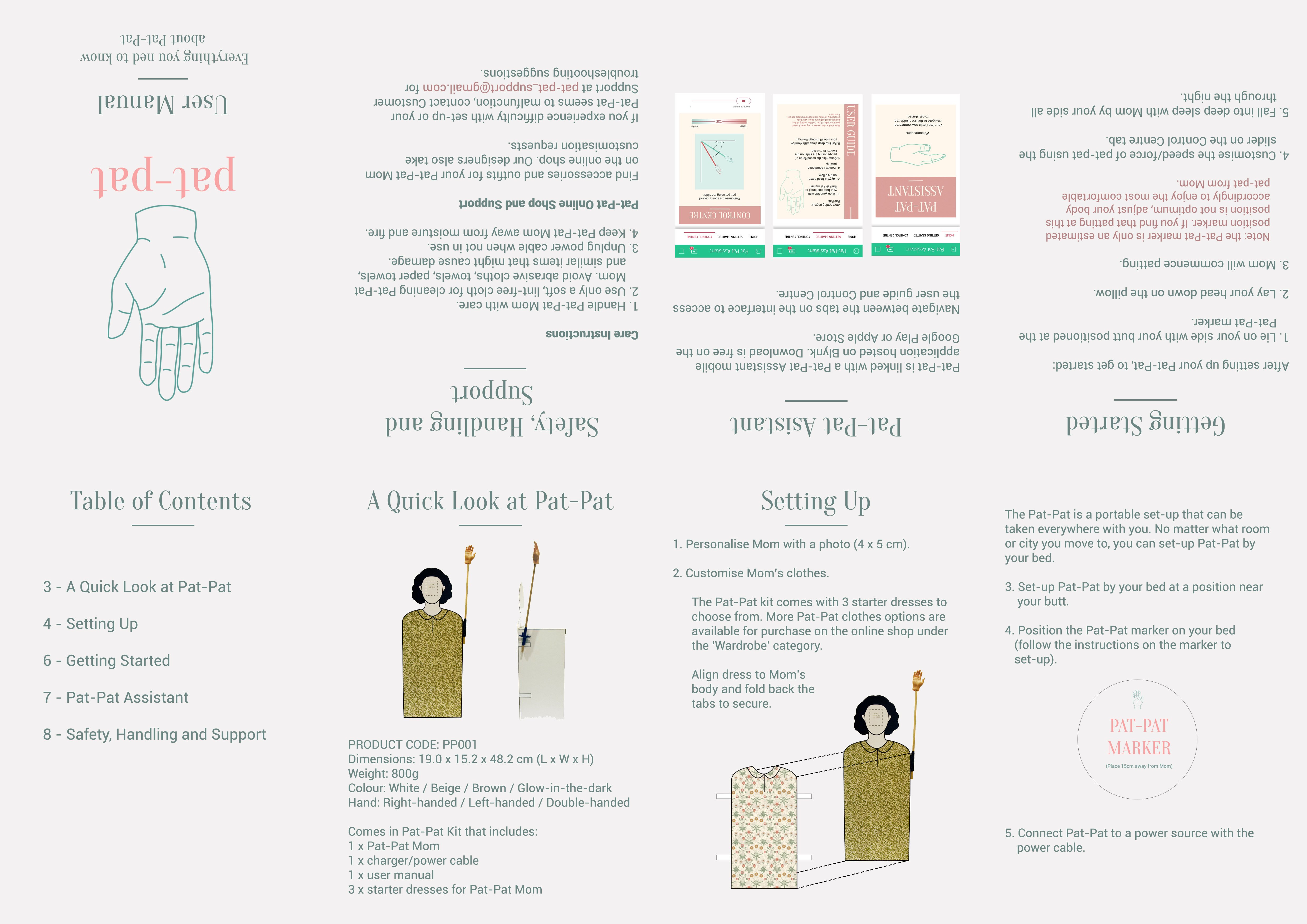
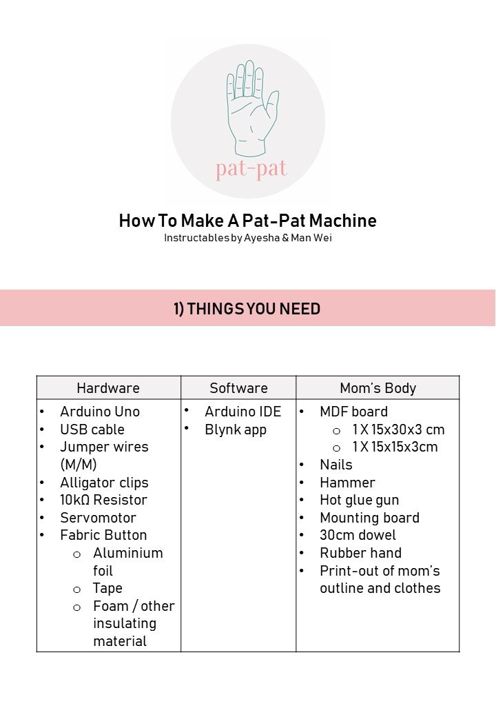
Final Project: Pat-Pat

“Pat-Pat”
By Ayesha and Man Wei

PROJECT DESCRIPTION


Our product, the Pat-Pat, is a dark object that explores feelings of loss, loneliness and nostalgia.

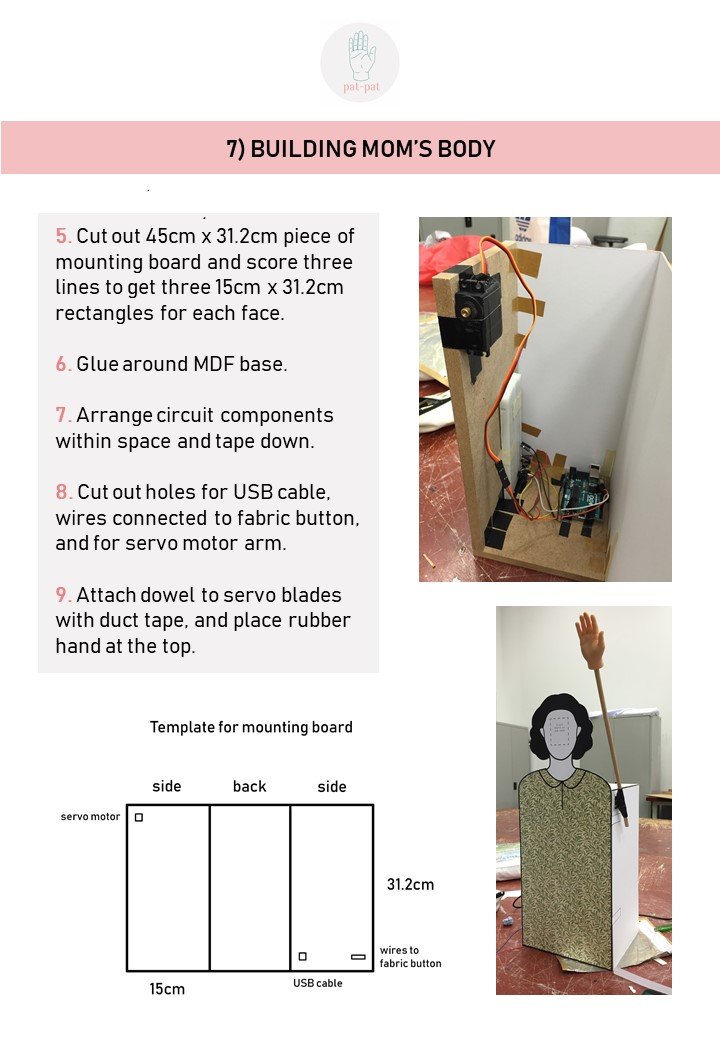
On the surface, we are creating a product that mimics and potentially replaces a mother’s patting her child to sleep. The Pat-Pat is catered to adults who long for this comforting ritual that they experienced during childhood, or perhaps to those who never experienced it because they lacked a maternal figure. With the Pat-Pat, one could easily relive these feelings of comfort and childhood nostalgia by purchasing a bedside appliance.

However, our aim is to subvert this idea by proving that it is impossible to replace or recreate the warmth and comfort of your actual mother’s patting, and to evoke a sense of discomfort at the idea of trying to replace your mother with a mechanical appliance.


USER TESTS: OBSERVATIONAL DOCUMENTATION 

TEST 1: Bodystorming Exercise

(Refer to Bodystorming OSS post)

TEST 2: IN-CLASS PLAYTEST
Details on stage of development:
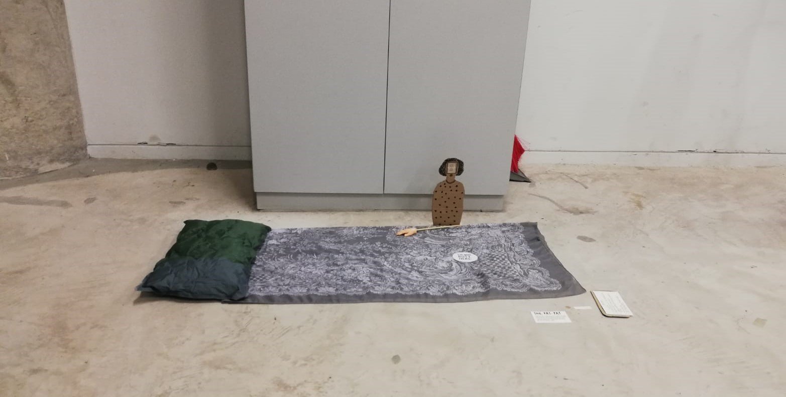
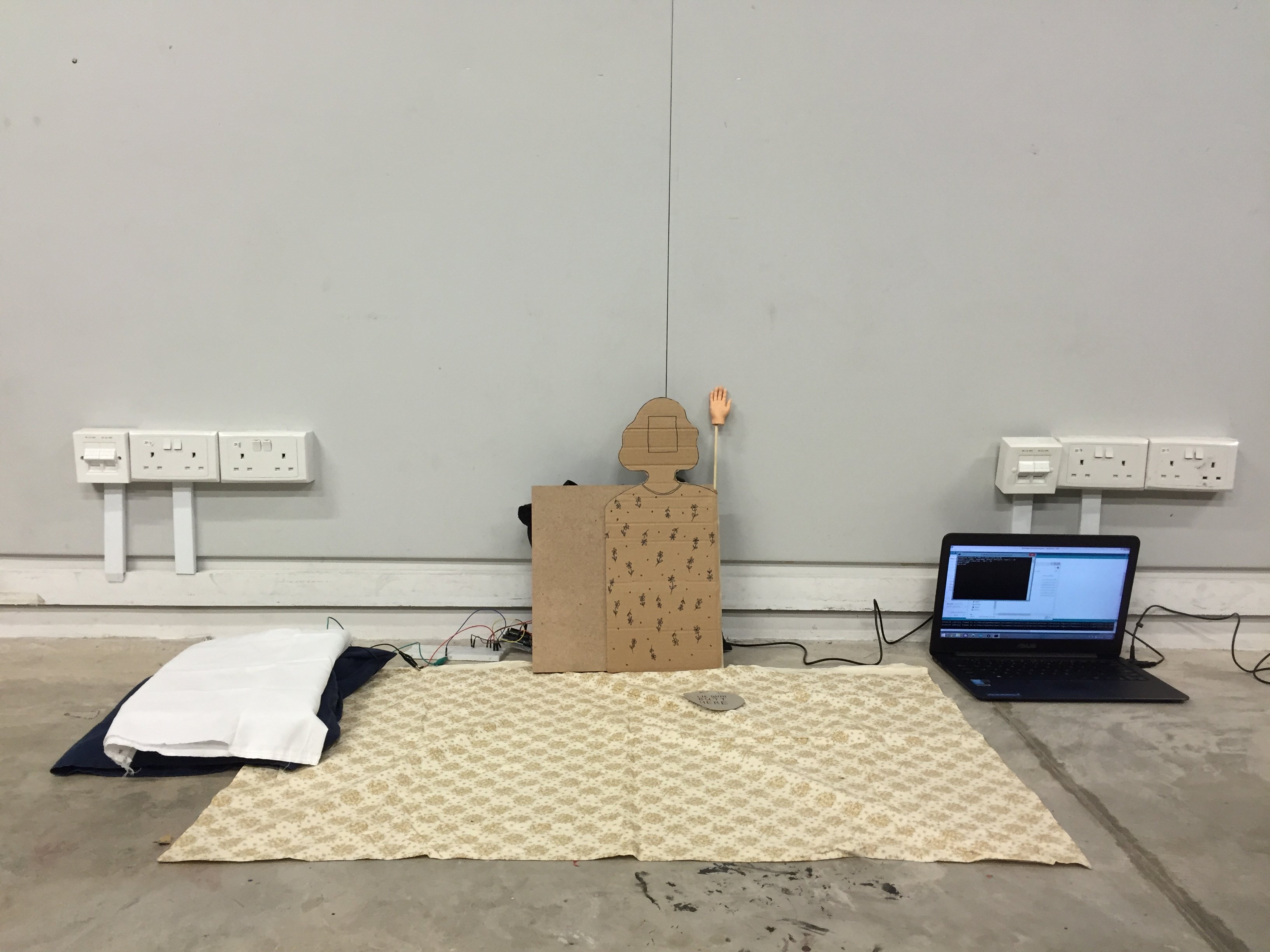
  • Environment – blanket laid on floor, pillow with sensor
  • Pat-Pat Mom – made of cardboard, hand-drawn details, chopstick arm
  • Interaction – motor hand activated upon resting on pillow, adjustable speed, no sound

NOTES:
- Make arm longer
- Suggestion to change position to face Mom, instead of back-facing
- Nice to customise speed
- Clear instructions
- Unsure if slider on phone worked
- Ashley didn’t lie down completely so it didn’t work properly
- Customise the speed, some people lie it fast
- Make the hand bigger
- Eugene shifted his body to adjust to the Mom after seeing Wen De fail
- If the presentation/user experience setting is framed like a sales pitch product test, classmates will be apprehensive about approaching set-up: awkward
- Users prefer experiencing product on their own (instead of guided): more personal being left with just instructions 
- “Greet Mom” instruction a bit awkward 
FInal critique user test
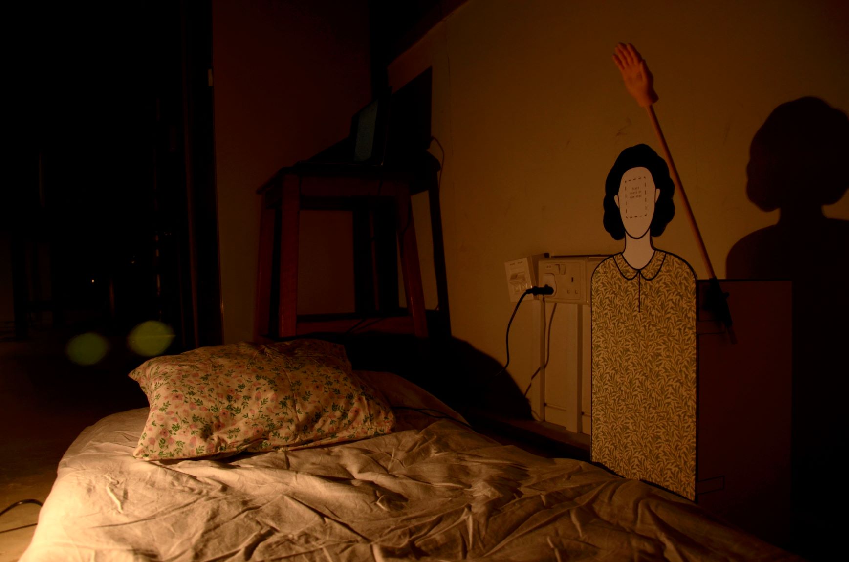
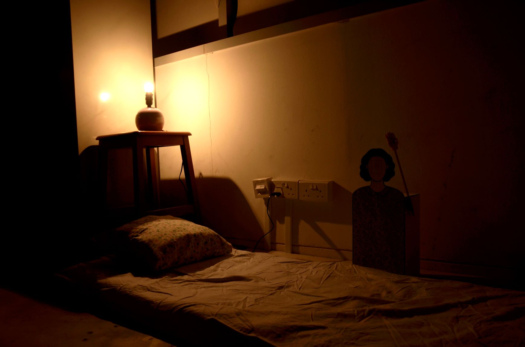
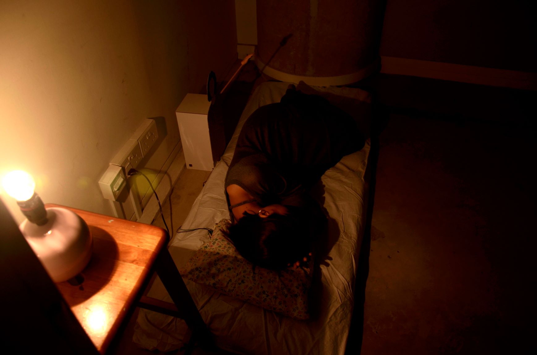
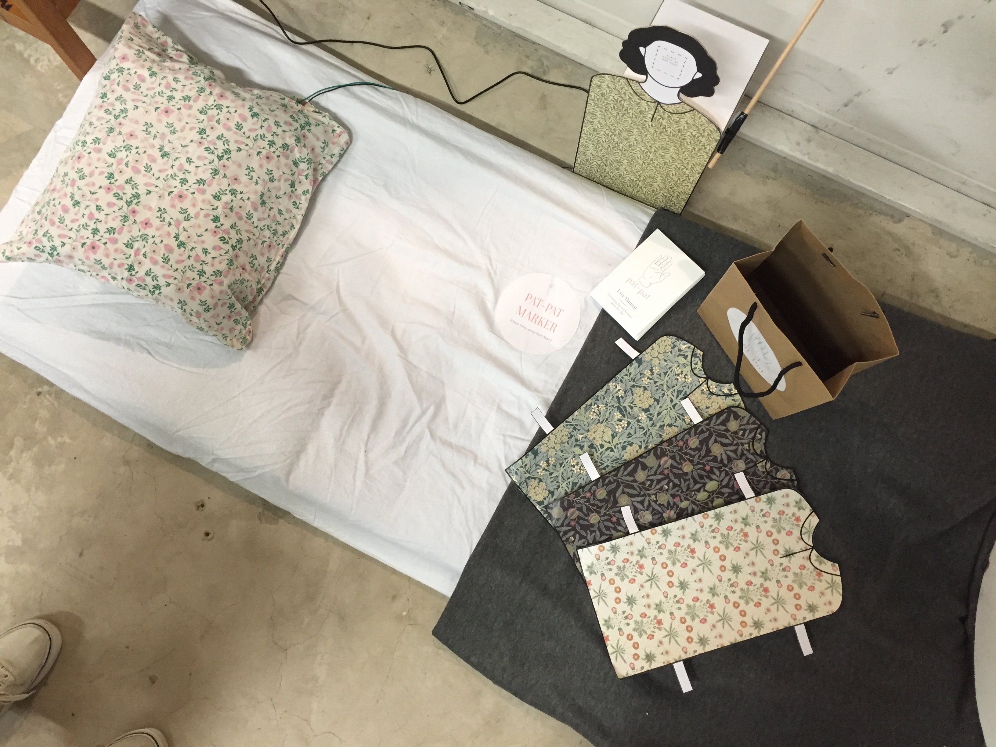
Details on final deliverables:
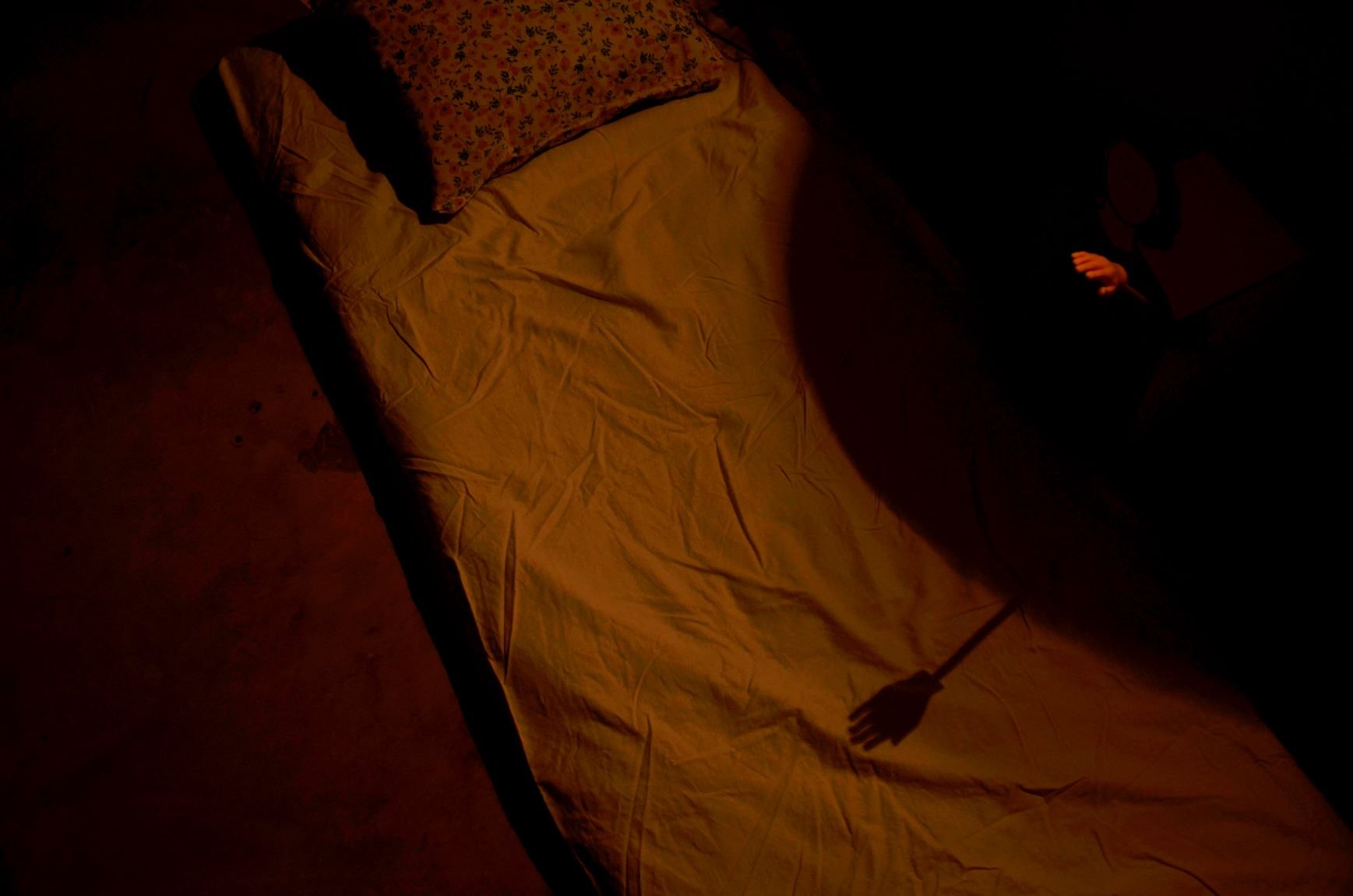
  • Environment – room simulation with dark room and bedlight, mattress, pillow and blanket
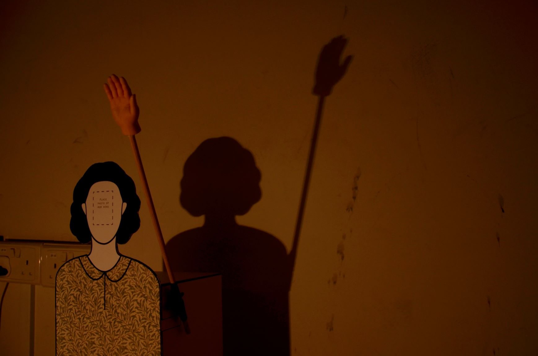
  • Pat-Pat Mom – made of white mounting board, vector-printed designs, extended arm
  • Interaction – motor hand activated upon resting on pillow, adjustable speed, no sound
  • Secondary elements/presentation – online website and shop, user guide video, Blynk app with designed interface, physical user manual, packaging with customisable clothes

Online website & store: https://manweileong.wixsite.com/website

Final deliverables
Hardcopy zine user manual

NOTES:
1 Hamimah 
- Really liked the soft and hard force changes, responsive 
- Think it’s funny 
- Harder patting quite shocking but fun
2 Emma
- Like customizable elements: face and clothes
- Tried to adjust to harder force but unable to 
- Got scared by it tapping on her butt
- Feels embarrassed in front of everyone
3 Wende
- Very comfortable didn't even remember to test out the strength
- Thought of grandmother who passed away and used to pat him
- Cloth that they used reminds him of grandparents
4 Lei
- Mechanical sound reminds her of 'sarong spring' cradles used for babies
- Lighting is effective in setting up mood
- Likes choice of fabric coinciding with mother's clothes  

How do testers feel with and without music (silence)?
- Wende: reminds him of the baby and swing
- Hamimah: too engrossed doesn’t really matter to her 
- Music can give a sense of what to feel but also be taken differently


DESIGN PROCESS DOCUMENTATION 

{ Product Design
1 Initial idea
  • Product = Cardboard standy Mom + baby mattress + sheet covers/blanket (with fabric button)
2 After playtest
  • Product = Cardboard standy Mom + pillow
3 Final
  • Product = Cardboard standy Mom only

We refined the decision to have the pillow framed as part of the bedroom environment, instead of being part of the marketed Pat-Pat product. The idea was to have a portable Mom that could be brought anywhere, set-up by any bed, (contrast with physical distance between mother and grown-up children) so a pillow would be bulky. We didn’t need to include the fabric button in the marketed product– we needed only to suggest that the product worked so and so (VS the functioning actual product supporting this narrative).

}
{ Aesthetic Considerations: Unpolished VS Refined

This was an important design consideration we had to constantly return to and mediate between creating an unpolished and refined product. The finish and aesthetics of Pat-Pat directly translates how genuine/insincere we are in trying to create a product that is able to fulfil its postulated functions (replacing the actual patting experience and serving as a substitute mother). A balance of both approaches was crucial to communicate our work’s intent.

}
{ User-friendliness/ Functionality

We had to conduct a few tests to figure out a suitable:

  • Height for Pat-Pat Mom (corresponding with mattress set-up), such that she could pat people of different heights
  • Length of arm, such that user could be a comfortable distance away from the Mom and not risk knocking her over by shifting their bodies
  • Position for Pat-Pat marker sticker
}
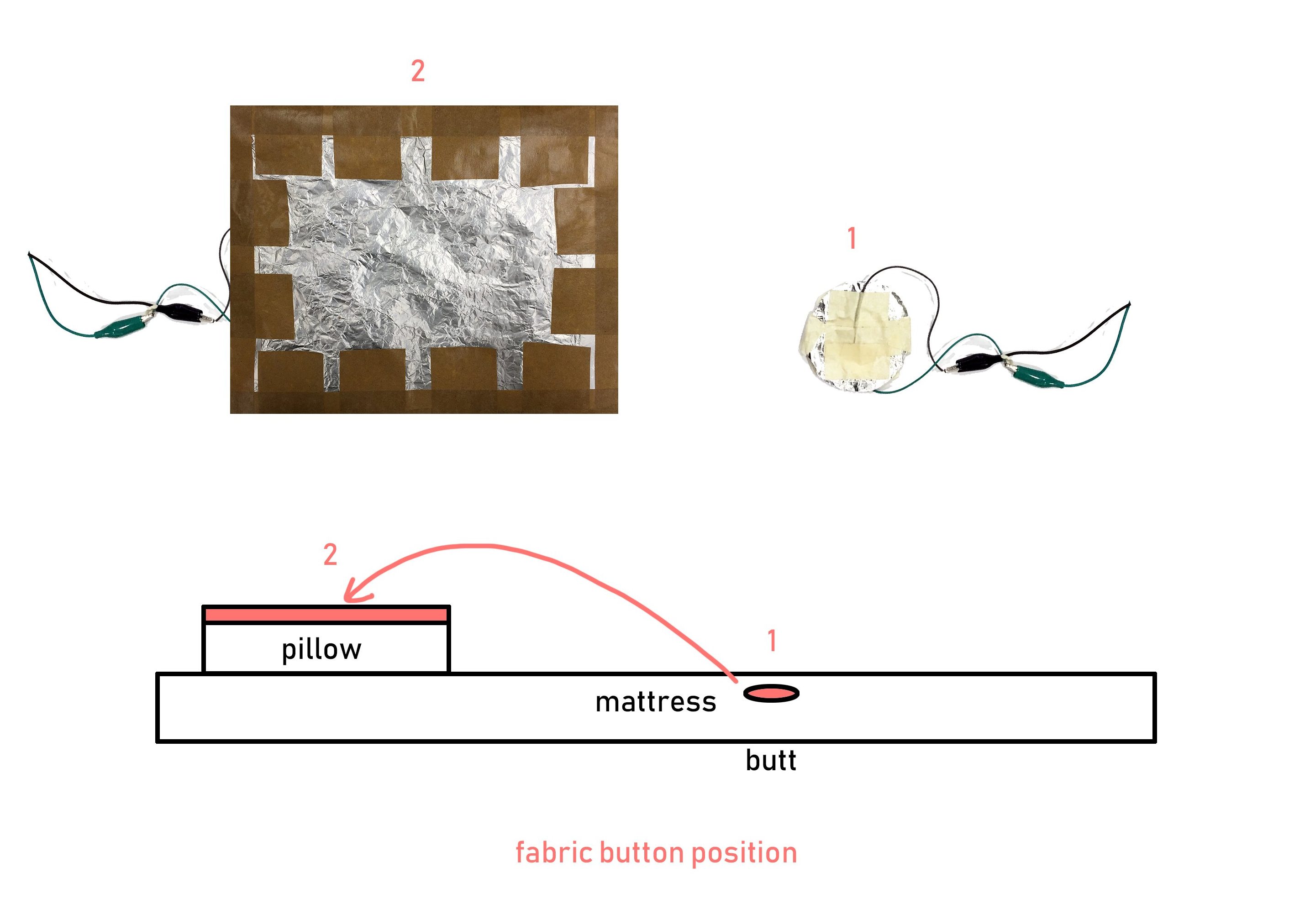
{ Input/Sensor: Fabric Button
1 Initial idea
  • Small circular pressure button hidden under mattress sheet at butt position
2 Final idea
  • Pillow-size pressure button hidden in pillow

Before running the playtest, we tried the patting ourselves and discovered that having the pressure button positioned at the butt started the patting motion before the user could properly lie down and position his/her body. This was problematic because the patting hand would get stuck/obstructed by the body that was still shifting and not yet in the optimal position. To resolve this, we shifted the button to the pillow, since it is the last part of the body to come into contact with the bed set-up while the user tries to position him/herself. For this new set-up, we had to design a larger pressure button to cover a greater area of the pillow. This also worked better in making the product more sensitive compared to having a small spherical circle that users were more likely to miss.

}
{ Music
1 Initial idea
  • Have polyphonic mechanic instrumental soundtrack of lullaby (via Processing/buzzer speaker)
//BODYSTORMING: used unedited soothing instrumental lullaby for simulation//
2 After bodystorming
  • Have robotic/mechanical voice singing lyrics to lullaby

The music made a big difference in inducing the mood of a comforting experience. This wasn’t quite our intention. At least in terms of music, we wanted to emphasise the machine nature of the Mom and cause unease or discomfort.

We decided also that instead of an instrumental soundtrack, we wanted to play an actual voice singing lyrics to a lullaby instead to evoke the idea of a Mom singing. The bodystorming music sounded a lot like just music playing in the backdrop.

//PLAYTEST: experienced without sound (did not manage to record a polyphonic singing voice and program it with the rest of the arduino circuit)//
3 After playtest
  • Remove music completely

Running the product without music, we became aware of the mechanic sound of the motor itself, previously concealed by the lullaby. It made a rhythmic sort of white noise that was comforting almost, which we felt was appropriate as a lullaby from a machine. More importantly, the sound allowed users to be aware of the presence and functioning state of Pat-Pat. Where they could not feel the patting on their butt because they were not in an optimum position, the sound of the motor rotating hinted to them that the machine was working rather than malfunctioning. The sounds also helped signal changes to speed/force of the patting by adding an auditory dimension where you could hear the rhythmic differences. For the onlooking non-testers, this helped them better appreciate how the speed/force changed since they were not feeling the patting themselves. Without the sound to signal the changes, they could only rely on seeing the hand change its angle of patting.

Additionally, after watching how the motor started and stopped almost like it was glitching when testers shifted their bodies, pressing and missing the fabric button repeatedly, we imagined how the abrupt starting and stopping of a soundtrack the same way might be distracting. A broken soundtrack disrupted by the input state would make the product sound like its glitching and probably scary even, distracting from the patting action itself too.

4 After tech consult
  • Remove music completely

We had planned to nonetheless continue the coding with processing that we started in order to play the lullaby, and test ourselves how that affected the experience of the product. After consulting Lei however, we found out that we could not connect all 3 programs (arduino, Blynk and Processing) at the same time because of serial port issues. So that cemented our decision to remove music entirely and work with the “music” of the motor.

}
{ The Hand

We tried different ways of attaching the arm to the motor, considering the durability and aesthetics each material allowed. Materials tried:

  • Rubber band
  • Cloth/duct tape
  • Masking tape

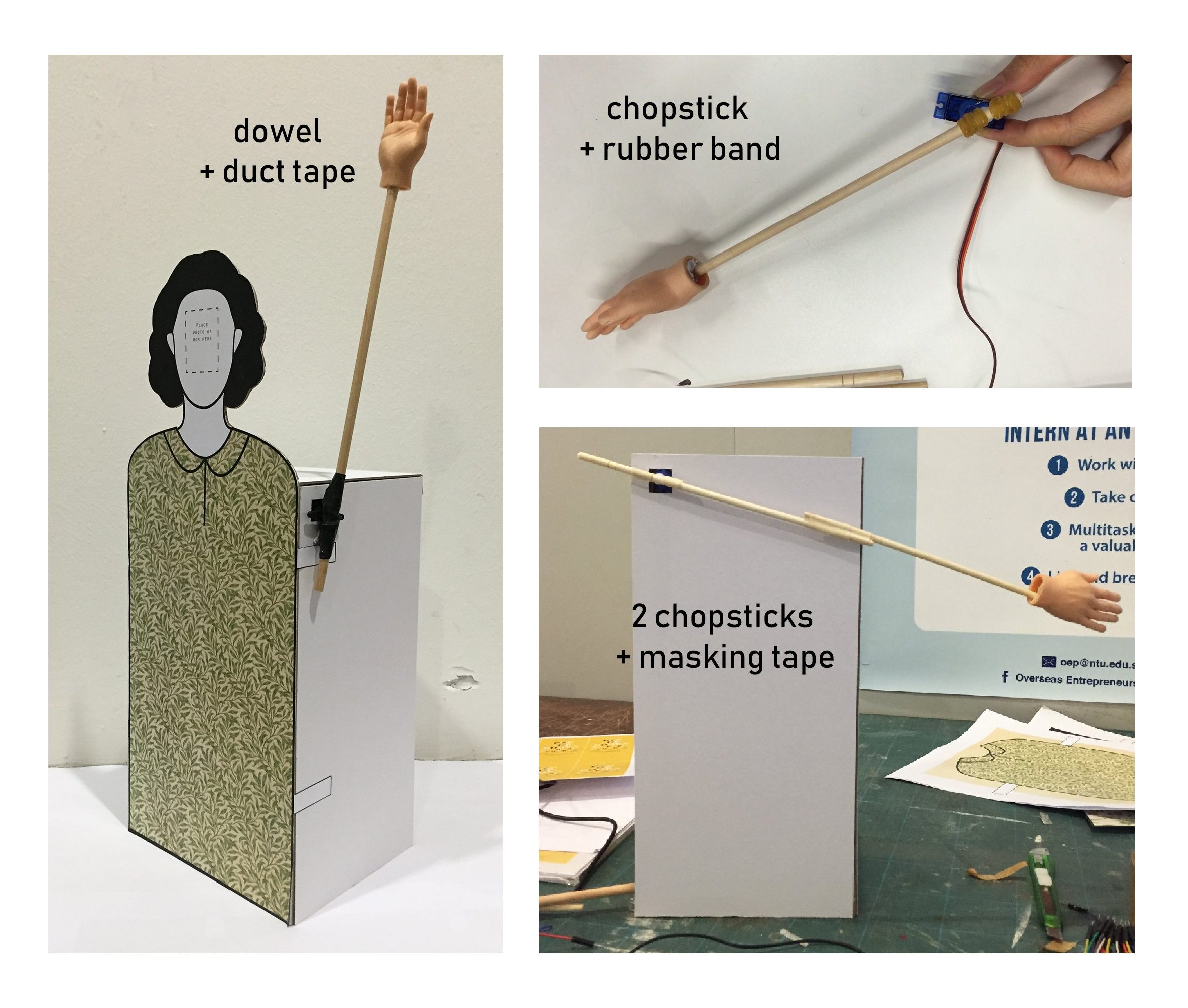
Initially we used only a wooden chopstick for the arm but after the user tests we got feedback that the arm was too short. Although we conceptualised our design to be user “unfriendly” (requiring the user to adjust and fit him/herself to the product instead of the reverse), we still wanted the design to have a “minimum” threshold of functionality or user-friendliness. So we decided to extend the length with a dowel instead.

However the dowel was too heavy, together with the momentum created by weight of the hand attached at the end. We tried using two lighter chopsticks joined together as well but the same problem persisted with the resultant momentum. We ended up overworking our servo motor as it slowly became unable to support the weight and made sounds like its gears were going to break.

We resolved that we had 2 solutions:

  1. Change the rubber hand to a lighter material like a cut-out cardboard hand
  2. Buy a stronger servomotor able to withstand the weight and momentum of the rubber hand

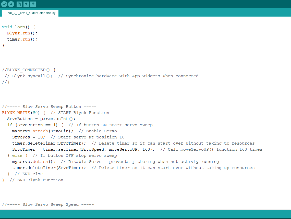
We ended up going with 2: we bought servo motor MG995(180) with a higher stall torque in order to support the hand on the dowel. After changing the motor, we had to make adjustments to our code for a new suitable angle. Even with this new motor however, we faced problems. This motor was somehow more affected by obstructions to its motion, i.e. when its arm contacted with the butt and could not complete the full angle of rotation. The obstruction (needed to create the effect of a hand being held longer for the pat), together with the weight and torque produced, caused the screw to loosen over time, making the motor unable to lift the arm when this happened. We had no full-proof solution to this and could only make sure to screw and rescrew the motor arms to ensure the patting could last at least 3 user tests. We also adjusted the slider angle limit for Blynk to a smaller angle (from 120 to 90 to 80 to 60) in order to reduce the duration of each time the motor was obstructed/stopped by the butt, so that there was a lower risk of the motor spoiling/screw coming loose. We resolved that to prevent the scenario of the hand stopping too early and not coming into contact with the butt of someone who was shorter, we would change the limit of the Blynk slider accordingly to better fit the user. (Higher range for shorter people capped at 90, and lower range for taller people around 60).

}
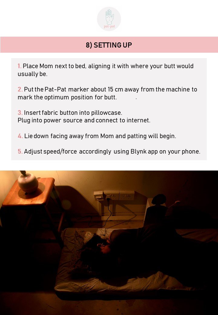
{ Installation Environment & Context
1 Initial idea
  • Mattress – baby mattress reduced scale, kiddy prints for bedsheet

For the audience, the visual composition of the user curled in foetal position on a tiny baby mattress that they have clearly outgrown would help communicate our concept (how the mother-child bond has changed since they used to be small enough to fit the mattress, how the machine and set-up cannot measure up and replicate the actual pat-pat experience).

However this approach did not fit with our product narrative of it being for set-up in buyers’ own bedrooms. Since we could communicate our concept through other means, we ditched the kiddy aesthetics to simulate the bedroom of a grown-up person instead.
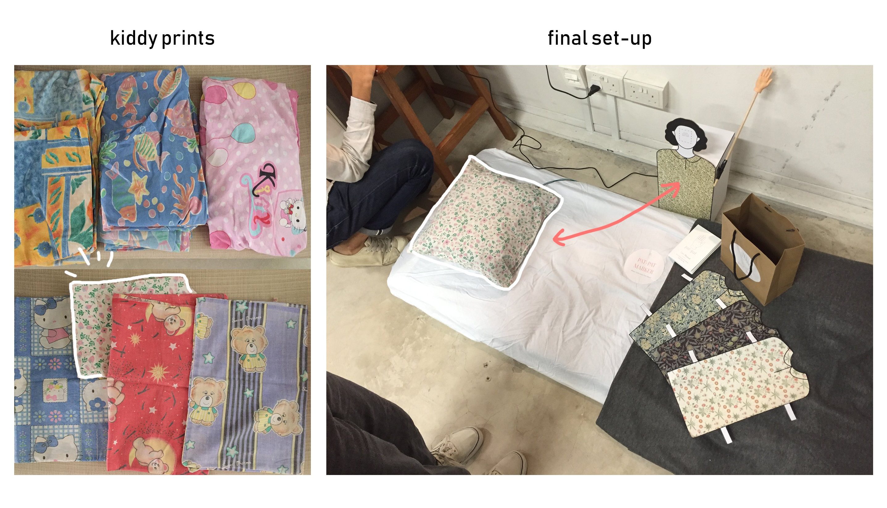
2 After playtest
  • Mattress – smaller-than-single size, plain prints for bedsheet (grown-up)
  • Table lamp and dark lighting to simulate room environment at night

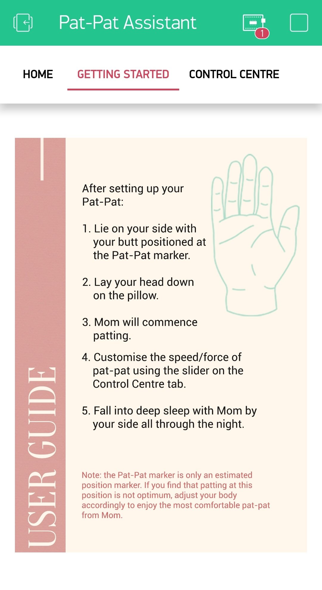
From the playtest, we received feedback that framing the product in the context of a sales product test walkthrough/demonstration would feel awkward or intimidating for users, and also rushed. They preferred going through the instructions on their own and felt that this allowed their experience of the product to be more personal.

Hence for final critique, we decided to create an environment that embodied both contexts. On one hand, we tried to simulate a setting that allowed users to imagine their own bedroom environment, to allow them to experience the product on their own without our guidance/sales directives. But we also maintained and made explicit the idea that the Pat-Pat is a product that they have bought, through the display of a shopping bag, laid out user manual, and instructions that start off with “after setting up, to get started”. The instructions were meant to imply to users that they had already set up the Pat-Pat themselves in their own room (that we created for them).

}
{ Instructions Design

We considered a few alternatives for delivering instructions in the context established above:

  • Written instructions only VS
  • Pre-recorded narration step-by-step + written instructions

a. Broadcasted over speaker: single audio with instructions strung together (own coordination, without any coding)

b. Broadcasted over bluetooth speaker connected to processing, activated sequentially by user who sends sensor/switch input after performing each step (e.g. arduino button/button pin on Blynk that users press each time to display/hear the next instruction)

c. Narrated by Blynk app itself as an audio user guide

PROS:

We thought how narrations made it less awkward for users to do the unnatural reading aloud of instructions themselves for the class to hear, and could also help with pacing the experience. In the playtest, testers rushed through all the instructions at one-shot from the start before executing the steps, instead of following through step-by-step. This meant that they paid less attention to registering each step, especially the instruction disclaimer for them to adjust their body accordingly to fit the Pat-Pat– which was important in conveying the idea of our product as user unfriendly to a certain extent, and helping users get the most of the experience.

CONS:

User might find the narrated instructions scary/awkward. They might prefer to have instructions to hold and figure out themselves, at their own pace (VS narration pacing). Possibly more intimate experience. Narration could also be distracting

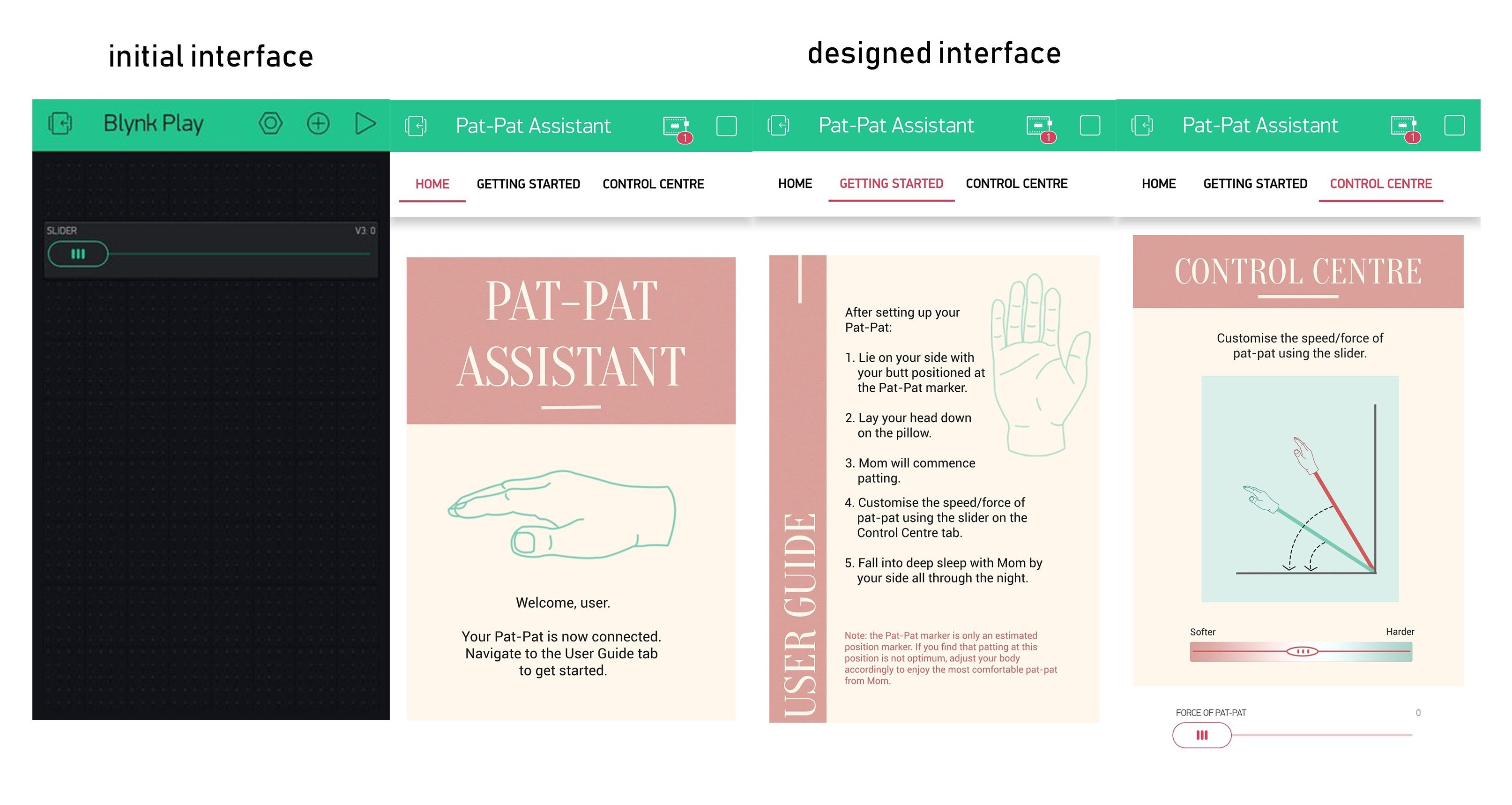
We decided to stick to written instructions only after gathering feedback from classmates. To make the product narrative more cohesive, we hosted the instructions on the Blynk app itself together with the slider and offered a hardcopy user guide as well.

}
{ Business Model Ecosystem

We constructed a comprehensive business model ecosystem with an online website and store, and physical product deliverables (paper bag with logo, zine user manual) to “complete the product narrative”. We came up with a colour scheme and typeface for our brand identity and researched on existing online shops and user manuals (Apple Store and Fitbit manual) on how they framed their products and wrote their documents.

We paid particular attention to the aesthetics of the Blynk interface as well since the motor adjustment was the highlight of our product. We added tabs as well as images to make the Blynk app seem like an app we created ourselves called the Pat-Pat Assistant.

CODING DEVELOPMENT DOCUMENTATION

At the start of the project, after brainstorming and narrowing down our choice to building a product that mimicked a mother’s patting, we consulted Lei.

Our original idea included:

Input

  • Photocell OR pressure sensor OR fabric button
  • Blynk virtual slider

Output

  • Servomotor
  • Buzzer OR speaker for sound playback

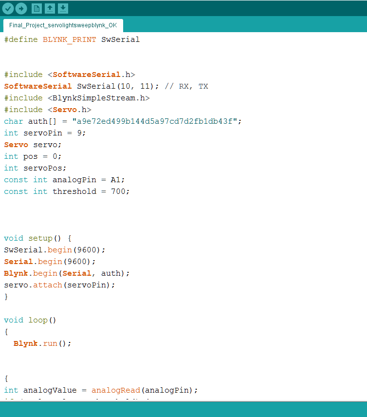
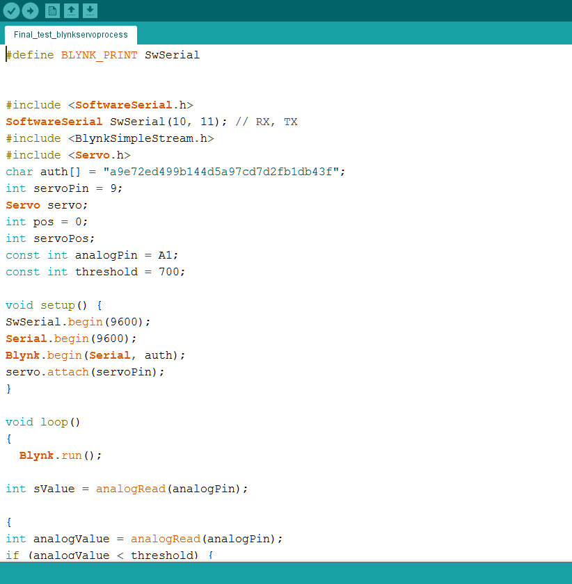
Lei steered us to the Arduino Blynk IFTTT tutorial in Week 9’s Design Noir post, as well as the Servo > Sweep example found in Arduino. The IFTTT code allows the servomotor in our set-up to be controlled wirelessly by a virtual slider on Blynk, changing the direction that the blades are facing according to the value on the slider, while the Servo Sweep code turns the servomotor blades back and forth on a loop and the speed can be changed within the code.

ServoSlider code
1. Code for Arduino Blynk IFTTT

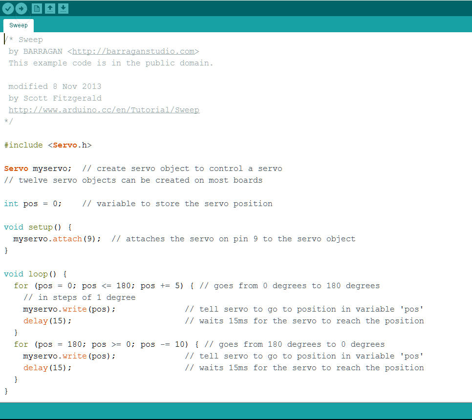
2. Code for Servo > Sweep

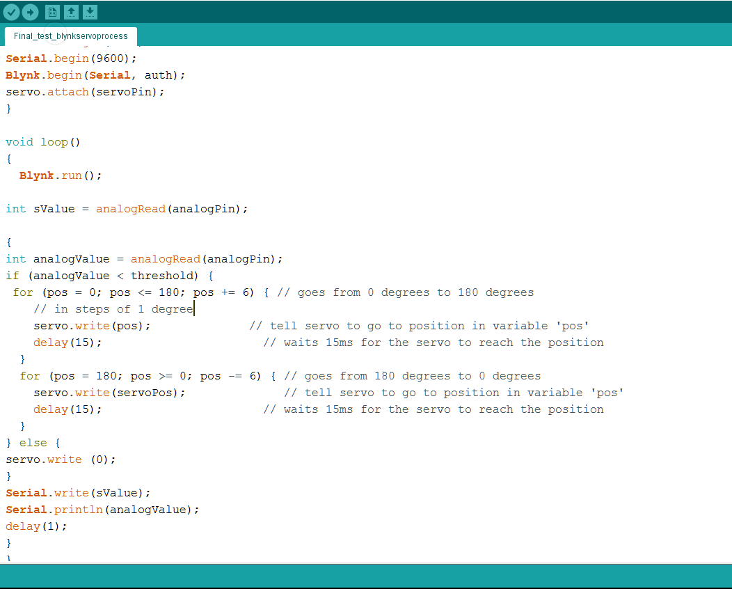
Both codes worked successfully on their own, but we needed to combine them so that we could change the direction via Blynk slider while also adjusting speed. We also needed to add in an analog sensor as the trigger. In this case we used a photocell. However, when we tried to mix them together, our code was incorrect so it did not work.

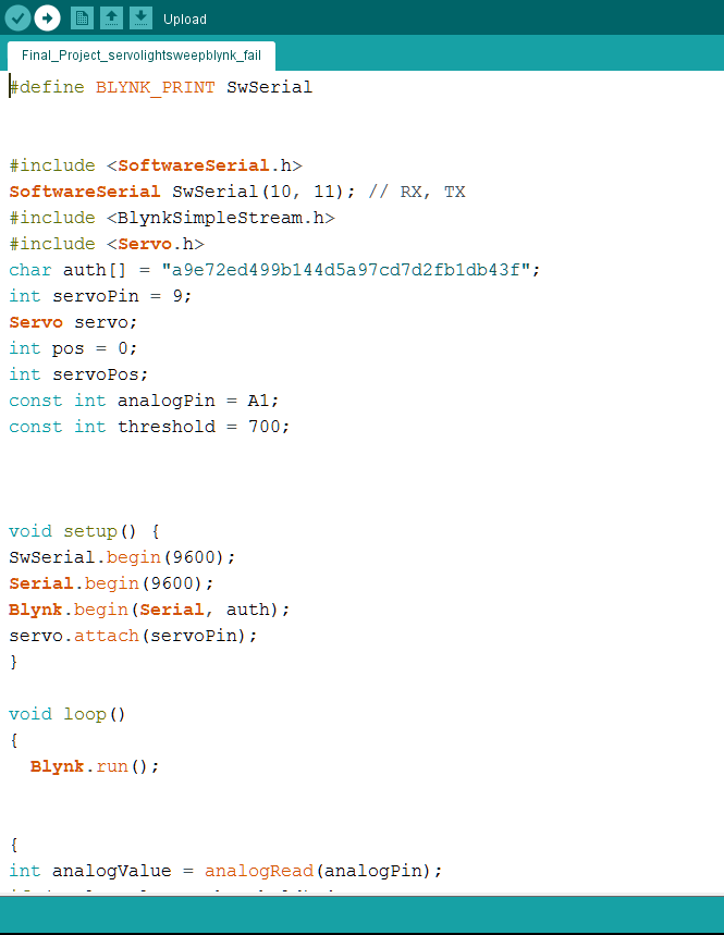
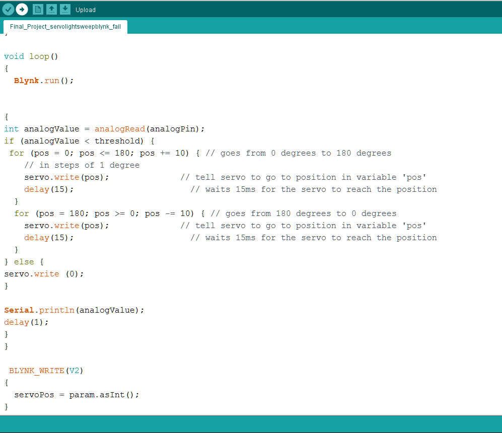
3. FAILED CODE: Mash-up of IFTTT + Sweep + Photocell

We also tried a code we found online (https://community.blynk.cc/t/c-blynk-code-examples-for-basic-tasks-work-in-progress/22596/6)  that used a button + slider on Blynk to control a servomotor. The original code used a wifi connection, so we changed those parts to serial port language.

4. CODE for blynk + timer + Servo

This code worked, however, the button used here was a virtual one in Blynk. This was a problem as our Pat-Pat machine was supposed to be triggered by an analog sensor that responded when the user laid down on the mattress.

Another problem was the speed of the servomotor. The blade turned very slowly in steps and we tried to adjust it but couldn’t figure out how to tweak the code to change the speed.

We abandoned this code as we felt that the previous ones served our needs better if we managed to figure them out. However, in trying out this code, we learned something crucial: how to write the variables for Blynk and incorporate them into our original code.

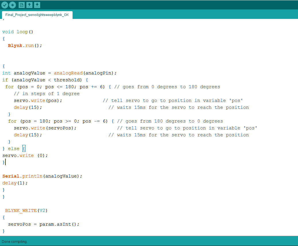
5. CODE for MASH-up of ifttt + sweep + photocell reworked

Observing the code in #4, we applied what we saw to change code #3 so that the while the servo was moving at a constant set speed, the slider on Blynk would change the angle that the servo blade would return to. This meant it wouldn’t change the speed directly, but rather indirectly by either lessening or extending the range of motion of the motor.

What we learned and applied from code #4:

1. We need to declare:
int servoPos;
2. CHANGE FROM:
BLYNK_WRITE(V3)
{
myservo.write(param.asInt());
}
TO:
BLYNK_WRITE(V3)
{
 servoPos = param.asInt();
} 
3. WRONG: 
(1)
pos +/- = servoPos
servo.write(pos)

(2)
pos + = number
servo.write(servoPos);

Pos - = number
servo.write(pos)
<Reason: return angle and position different>

CORRECT:
(1)
pos + = number
servo.write(pos);

Pos - = number
servo.write(servoPos)
5 - 10 - 7/8

After the excitement of managing to complete the first part of our code, which was to use an analog light sensor to turn on a servomotor and remotely control the speed of the servomotor via Blynk, we moved on to the hard part. Our original idea included a lullaby that would play at the same time as the servomotor turned. Lei advised us to use Processing, which can be connected to Arduino via the Serial Port USB.

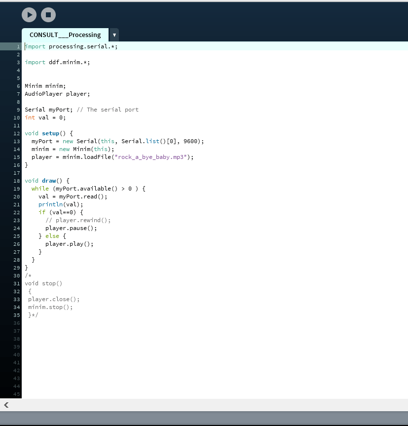
6. failed code for #5 + processing code
import processing.serial.*;
import ddf.minim.*;

Minim minim;
AudioPlayer player;

Serial myPort; // The serial port
int val = 0;

void setup() {
 myPort = new Serial(this, Serial.list()[0], 9600);
 minim = new Minim(this);
 player = minim.loadFile("rock_a_bye_baby.mp3"); 
}

void draw() {
println(val);
if (1<myPort.available()){
  val = myPort.read();
}
if (val==1)
player.play();
}

We tried many different codes that we found online and tried to adapt to our project.

https://learn.sparkfun.com/tutorials/connecting-arduino-to-processing/all

http://forum.arduino.cc/index.php?topic=19584.0

https://bgsu.instructure.com/courses/1157282/pages/tutorial-sound-arduino-to-processing

http://cmuems.com/2013/b/sounds-with-arduino-and-processing/

However, none of them were able to play the music and this was the error we encountered over and over again:

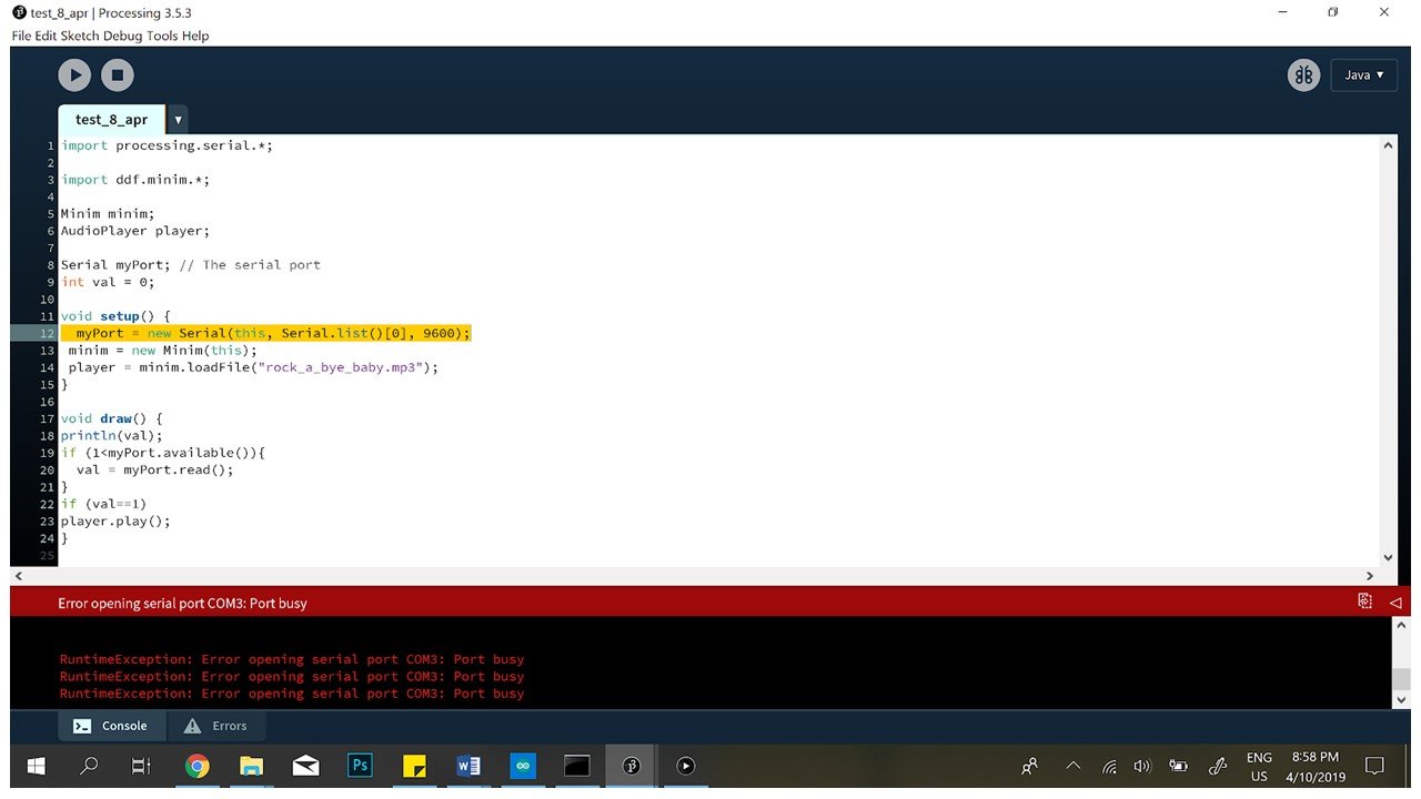
Error message on Processing

However, when we tried the code without connecting to Blynk, we found that the music player worked after all (although we still had a problem with getting the music to pause when the sensor wasn’t triggered). This meant that Blynk and Processing could not work together at the same time. We tried to confirm this online but found nothing, and only when we consulted Lei again did we learn that it was not possible to connect two applications to Arduino via the same Serial Port, so we still kept trying until we neared the end of the project.

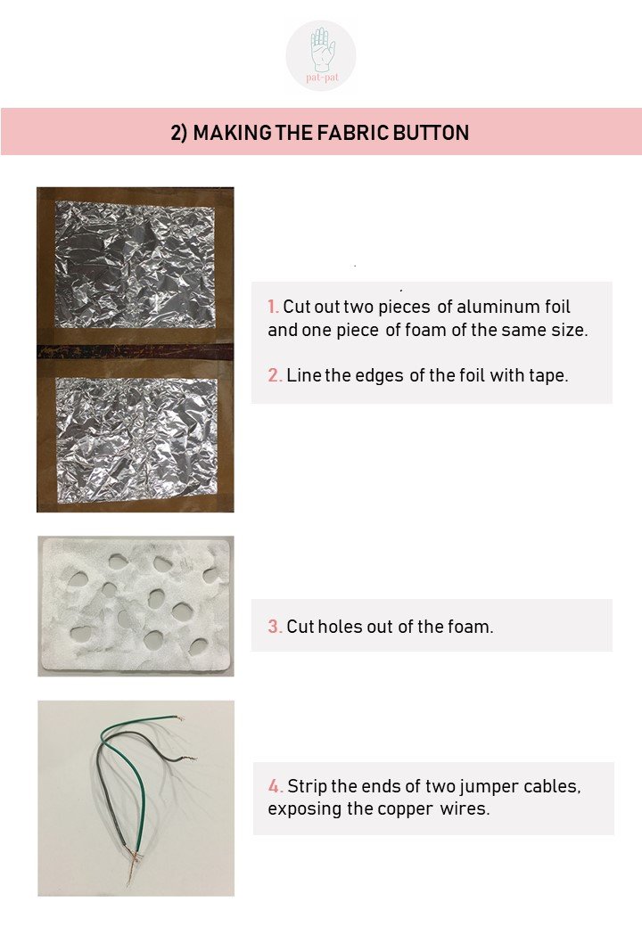
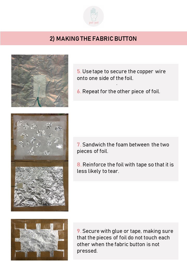
For our circuit, we also created a fabric button that we could easily conceal within a blanket or pillow case. We DIY-ed it with aluminium foil and some foam, and then we had to change the code. Since the fabric button basically had two states, we changed our code to reflect that.

7. code for new fabric button

Then, we tried Processing again (this was before Lei told us), hoping that since the fabric button would only be sending HIGH or LOW to Processing, it would be easier to figure out our problem, but it didn’t work, unless we disconnected Blynk by commenting out all the parts of the code for it.

8. processing + fabric button
import processing.serial.*;

import ddf.minim.*;


Minim minim;
AudioPlayer player;

Serial myPort; // The serial port
int val = 0;

void setup() {
 myPort = new Serial(this, Serial.list()[0], 9600);
 minim = new Minim(this);
 player = minim.loadFile("rock_a_bye_baby.mp3"); 
}

void draw() {
if (0<myPort.available()){
  val = myPort.read();

if (val==1){
player.play();
println(val);
}
else{
player.close();
}}
}

void stop()
{
  player.close();
  minim.stop();
}

We still couldn’t find a way to make it pause, even though we tried adding player.close(); commands.

We were hoping to get Lei’s help to fix our whole Processing problem during consultation in Week 13. But it turns out it wasn’t possible to incorporate Processing at all as we already used Blynk, and both apps were trying to communicate with Arduino via the same serial port. We did, however, get her help to make the music pause when the button was not pressed.
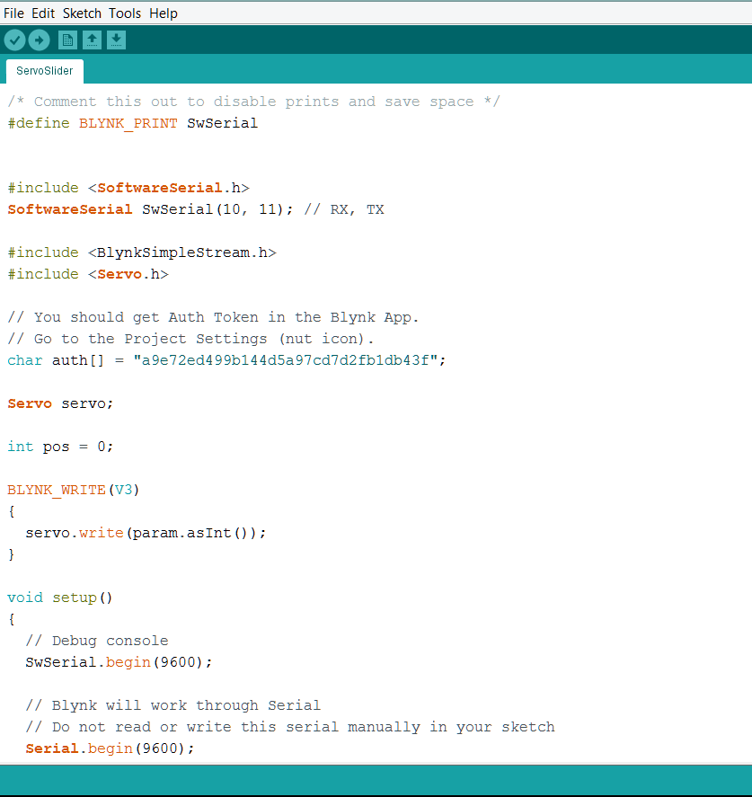
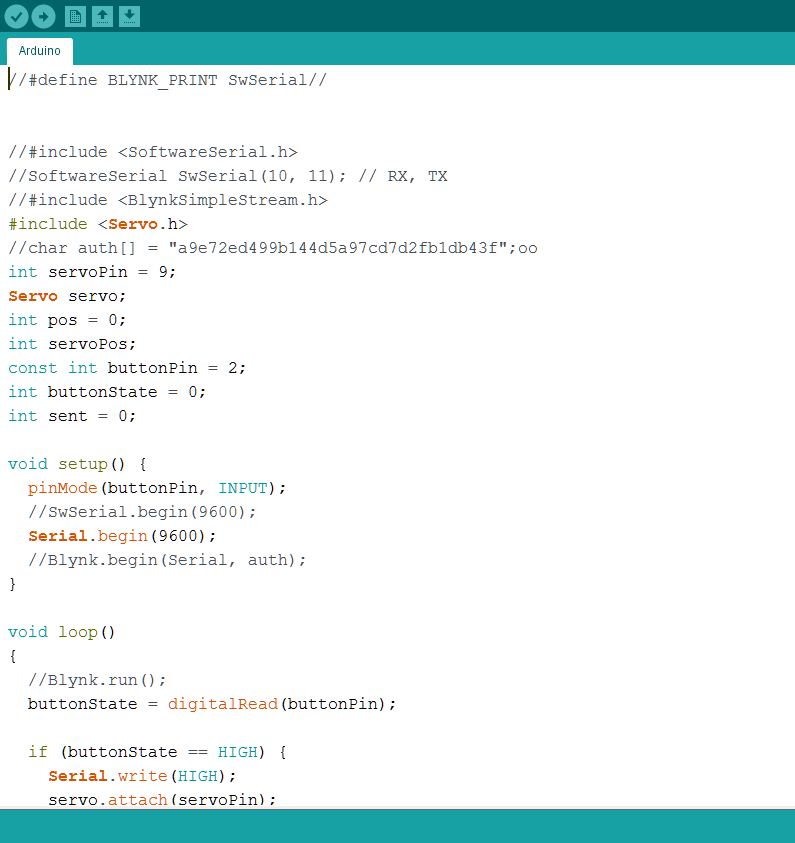
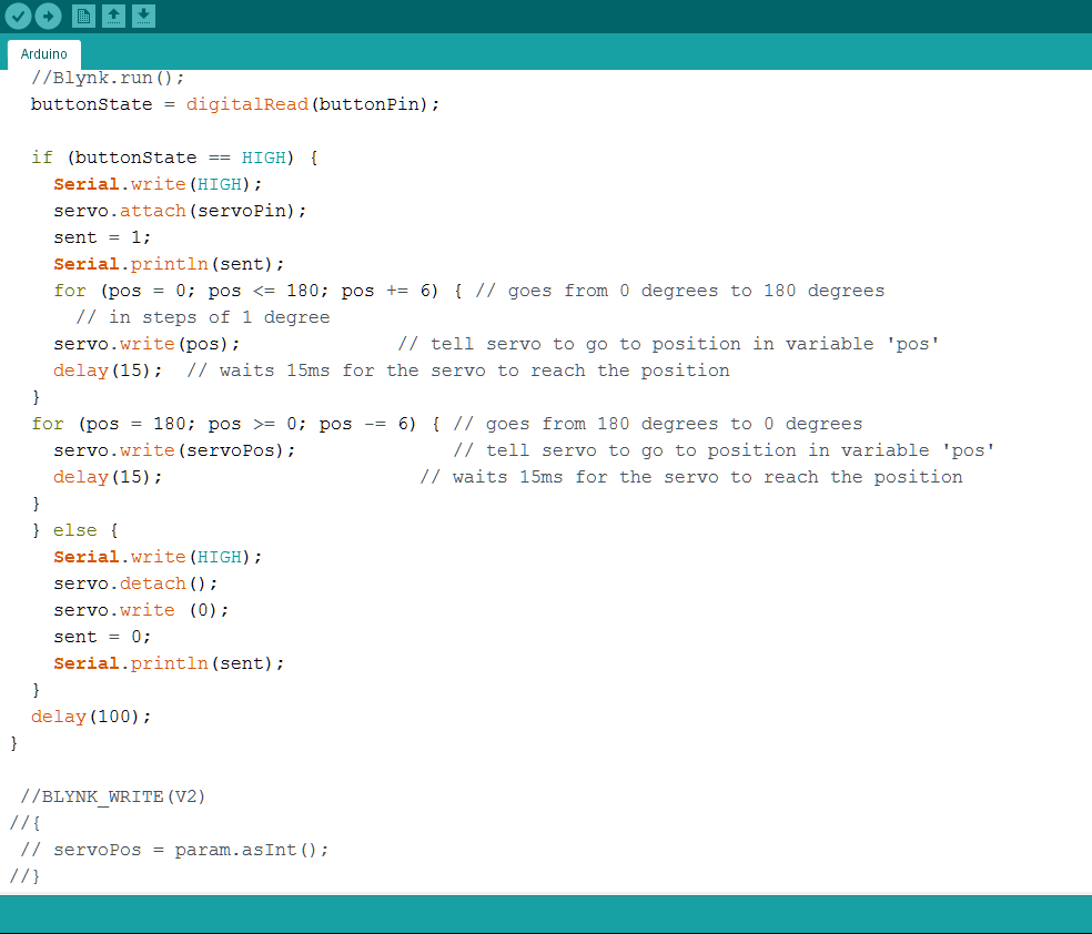
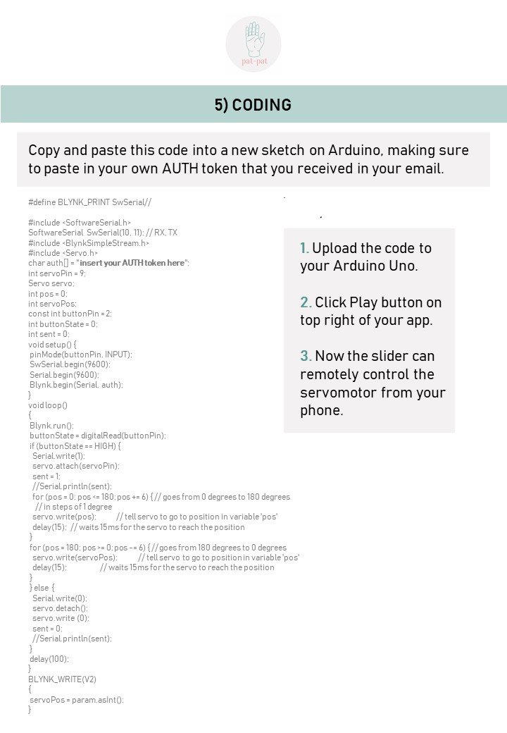
9. final code

In the end, this was the code that we needed:

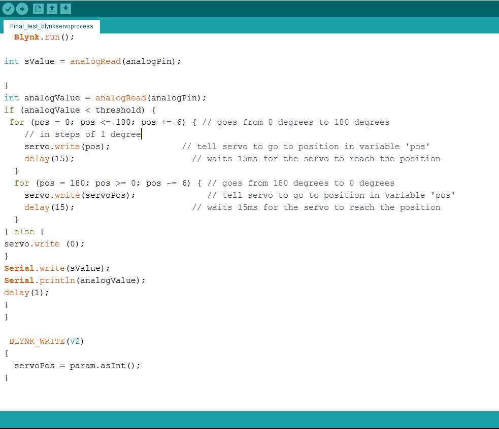
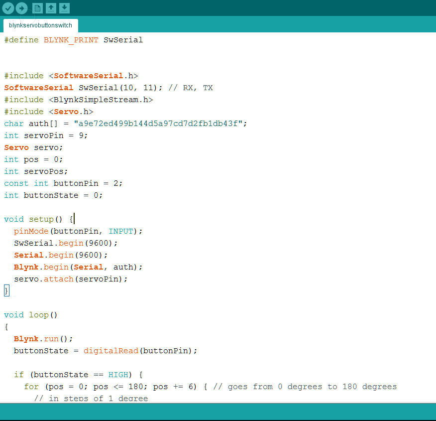
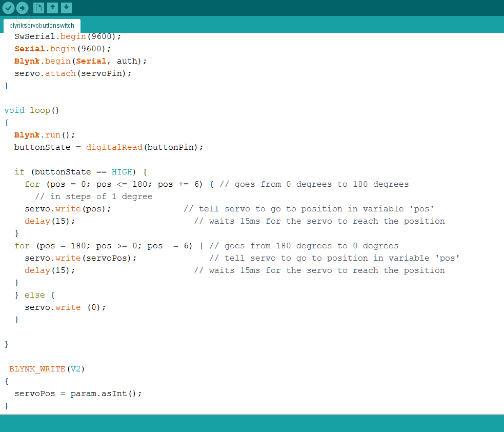
#define BLYNK_PRINT SwSerial//


#include <SoftwareSerial.h>
SoftwareSerial SwSerial(10, 11); // RX, TX
#include <BlynkSimpleStream.h>
#include <Servo.h>
char auth[] = "a9e72ed499b144d5a97cd7d2fb1db43f";
int servoPin = 9;
Servo servo;
int pos = 0;
int servoPos; 
const int buttonPin = 2;
int buttonState = 0;

void setup() {
  pinMode(buttonPin, INPUT);
  SwSerial.begin(9600);
  Serial.begin(9600);
  Blynk.begin(Serial, auth);
}

void loop()
{ 
  Blynk.run();
  buttonState = digitalRead(buttonPin);

  if (buttonState == HIGH) {
    servo.attach(servoPin);
    for (pos = 0; pos <= 180; pos += 6) { // goes from 0 degrees to 180 degrees
      // in steps of 1 degree
    servo.write(pos);              // tell servo to go to position in variable 'pos'
    delay(15);  // waits 15ms for the servo to reach the position
  }
  for (pos = 180; pos >= 0; pos -= 6) { // goes from 180 degrees to 0 degrees
    servo.write(servoPos);              // tell servo to go to position in variable 'pos'
    delay(15);                       // waits 15ms for the servo to reach the position
  }
  } else {
    servo.detach();
    servo.write (0);
  }
  delay(100); 
}

 BLYNK_WRITE(V2)
{
  servoPos = param.asInt();
}


INSTRUCTABLES PROCESS DOCUMENT


INDIVIDUAL REFLECTIONS

I wonder if I got carried away with the whole polishing of set-up and business ecosystem thing. The module was about interaction so the highlight/star of the show should have been the product with its interactive mechanisms. I felt slightly like I placed more emphasis on the website and fictional business narratives I had built, than the product itself. That is not to say that I did not pay great attention and consideration to the design of the product, together with Ayesha. Admittedly our code is relatively simple and we had more elaborate ideas we explored, but after user tests and discussions among ourselves, the final code and interaction we produced was what we felt best suited our intentions and concept.

Going forward however, I hope to create works that can be more effective and powerful in communicating their intent on their own. Definitely I recognise the importance of having a polished work “holistically”: interaction, design, presentation, concept etc. It was clear from works like Kaitlyn and Alvin’s HIDEBEAST hat how the “secondary elements” like packaging and (very engaging) promo video could really make a difference to the user experience. After viewing everyone’s works however, I thought it was also possible to make highly powerful products on their own. I felt this about June and Jia Xi’s teddy bear. They didn’t have elaborate “secondary elements” to compliment their product, nor a very polished box for the bear, but the bear itself was sewn together beautifully and the interaction it provided was so carefully curated with the strings of text and light sequences. I wonder what viewers might take away differently from just experiencing our Pat-Pat alone, if it hadn’t been set-up in the elaborate business model we constructed (most perhaps felt it was completely unnecessary/excessive).

Final critique session aside, the whole development process has been a trying one that I’ve gained and learnt a lot from. Compared to our Disobedient Objects project, this final project was met with a lot more challenges. There was a lot more trial and error and trying of different codes from forums to figure out how to play sound on processing, connect processing to arduino successfully the way we want it, and figuring out how to vary the speed/force of the patting. There was also the headache of trying to connect all 3 programs (arduino, processing and blynk) that we tried for days before finding out there was no solution for it after consult with Lei.

In terms of hardware we also had a lot of setbacks with the motor. Attaching the rubber hand to the end of a stick, to the motor created a lot of weight and torque that caused our servo motor to malfunction. The screw with the motor arms came loose, the gears got forcefully turned by the weight, the angle of rotation changed several times… Eventually our micro servo motor not only made cracking noises but also became unable to lift the hand at all completely. We bought a stronger motor after but even that faced some of the same problems and we had to try our best to reduce the weight and torque, and adjust our codes accordingly for the angles. Overall, I’m quite proud of myself and Ayesha for accomplishing what we have done 🙂 (yay hi-5 gurl)

I think the final project really allowed me to combine all the things I learnt over the whole Interactive module. In my own design of Pat-Pat, I applied lessons from the Design Noir artists on unpopular and critical design. Meywa Denki that I researched on for Researcher of the Week was a big influence in the fictional business narrative and unpopular design direction. As a tester for Gwen and Deb’s Silent Pillow, I felt firsthand the thrill of waiting for my turn (and how onlookers were participants of an art installation this way too) that Wen De explained in his Uncomfortable Interactions presentation on “Breathless”. In the creation process itself, I thoroughly appreciated the open-source culture of arduino, processing and blynk. This final project didn’t have our micro-project brief of being an open-source/crowd-sourced work, but its very creation is based entirely on help Ayesha and I found on online forums. Our final code is a mix mash of suggestions and codes plucked from different people and places. Together with the feedback gathered from our classmates, we consolidated and refined these with our own artistic direction.


Zine: Locale – Pasir Panjang

I:  R E S E A R C H

Visitation records
1.  16 Feb 2019, 1:00PM - 4:30PM (Saturday afternoon)
2.  01 Mar 2019, 7:30PM - 9:30PM (Friday night)
3. 02 Mar 2019, 7:00PM - 9:30PM (Saturday night)
4.  04 Mar 2019, 12:00PM - 4:00PM (Monday afternoon)
5.  31 Mar 2019, 8:00AM - 9:30AM (Sunday morning)
data collection
  • On-site interviews
<Recorded transcripts log>
1 Rock n Hop Bar staff
(Singaporean Indian) 
ICON #01-01
2 Bento-Go takeaway and dine-in shop owner Mayumi Endo
(Japanese)
ICON #01-05
3 Star Shine Wellness Massage/Spa Therapist 
(China Chinese) 
ICON #01-07
4 Jurong Provision Shop shopkeepers 
(South Indian)
ICON #01-09
5 KEEPS/COOKS FRESH market/cafe staff
(Singaporean Chinese)
ICON #01-10, #01-11
6 Blossom Hair Salon hairdresser, Janet Choey
(Singaporean Chinese)
ICON #01-16
7 Music school teacher
(Japanese)
ICON #02-?
8 HOOHA Restaurant & Cafe boss
(Singaporean Chinese)
VIVA VISTA #B1-06, #B1-11, #B1-50
9 Edge Creations Interior Design staff
(Singaporean Indian)
VIVA VISTA #B1-56
10 Global Craft staff
(Singaporean Chinese)
VIVA VISTA #01-04
11 Natural TCM Clinic physician 
(Singaporean Chinese) 
VIVA VISTA #01-10
12 Lotus Yog yoga instructor, Sudha
(Singaporean Indian)
VIVA VISTA #01-34
13 CV Global Resources Pte Ltd trade managers 
(Singaporean Chinese) 
VIVA VISTA #01-37
14 Wood World Renovation Timber Consultant, Qiu Feng
(Singaporean Chinese)
VIVA VISTA #01-38
15 American passer-by
16 Norwegian passer-by
  • On-site surveys: 40 respondents

Profile


Nationality:

American - 3
British - 1
British (Scottish) - 1
Filipino - 3
Holland - 1
Indian - 3
Japanese - 2
New Zealand - 1
Norwegian - 1
Singaporean - 24
  • Online surveys: 57 respondents

Profile

Nationality:

Burmese - 2
Malaysian - 6
Swiss - 1
Singaporean - 48
  • Online database/repository for memories

I created a Google Docs and put up prints around the neighbourhood (mail boxes, bus stops, lift buttons, doors) with a QR code to link people to the site.

Link to repository:

https://docs.google.com/document/d/1M97dtW8DDSdgyi1-NZ2FUt3reGWITwpDr3rHaftYL6w/edit

Sadly, I only got one response to this (highlighted text).
  • Photographic and video documentation
  • Sound meter data + audio recordings
  • Document analysis (namecards, brochures)
  • Online research: property websites, news articles, heritage archives
Far East Organization properties website
Brochure for ICON
URA Conservation Portal archives  
  • Guestbook


Not even an hour since I set the guestbook up, someone stole the pen and post-it which had gathered quite a few responses (that I didn’t manage to read).
presentation of findings

My findings are hosted on a website:

https://manweileong.wixsite.com/pasirpanjang

Content of the website is framed by the basic questions: “What comes to mind when you think of Pasir Panjang?” and “Has Pasir Panjang changed in the time you’ve known it?” Information is grouped into 3 main themes on different tabs:

  1. Profiling – SES status, nationalities of people in Pasir Panjang
  2. Impressions of Pasir Panjang – state of development, activity, soundscape
  3. Change in Pasir Panjang – extent of change, attitudes towards change
Development: curating themes and layout planning.

I curated my findings by the stark contrasts in a variety of aspects. The layout/organization of research materials (interview transcripts, photos, newspaper articles etc.) is hence organized with a 2-column structure that assigns each column with a polarity that contrasts the other. The website is a mix-mash of materials consisting of transcripts, photos, videos, infographics, GIFs and animated text.

Infographic created for “What is your relationship with Pasir Panjang?”

II:  Z I N E

concept ideation

From part 1 of the research, I decided to portray the concept of change in Pasir Panjang. What stood out for me most was how change in my childhood neighbourhood consists of many stark contrasts/paradoxes.

IDEA 1:  Design-your-gallery/shop Activity Playbook

  • Sticker book concept with each page showing empty shop units from VivaVista/ICON. Pages decorated with stickers/images of objects found in these sites: rental/sale advertisements, flyers, graffiti, store room objects etc.
  • Centre spread = sticker page, where people and shop displays depicted in “artist impressions” of development project brochures can be removed and pasted on other empty unit workbook pages
  • Intention: highlight unoccupied, deserted state of new development projects, dusting in their coat of newly acquired dust (poor business and rental of units despite 5 years passing since redevelopment completed) > question narrative of improvement presented by development and its necessity (satirical/ lamenting tone)


IDEA 2:  Spot-the-difference Sticker Playbook

  • Similar idea to idea 1, but with spot-the-difference spread aesthetic instead of individual sticker pages to decorate.


IDEA 3:  “Accordion” of Pasir Panjang Village/ICON shophouses


final concept

<  c o n c e p t   x   l a y o u t  >

In the extent of change that the place has undergone, Pasir Panjang has both changed drastically in some aspects and remained the same in others. And it continues to change, despite development works starting close to 10 years back since I moved away.

Some buildings have been torn down and redeveloped, others have stayed. Some people have moved, others continue to stay. All this movement—of people, construction work and heavy vehicles—embody the idea of Pasir Panjang as a place of transition; a stopover at which all things are suspended and somewhat displaced in change. The place as a point of transition also emulates the idea of a port which is a crucial part of Pasir Panjang’s identity also.

For my zine I zoomed in specifically to the iconic row of shophouses previously known as Pasir Panjang Village because of its position at the “gate” of Pasir Panjang—all traffic has to pass it to “enter” the neighbourhood.  Also, I felt that the changes at this site embodied the landscape of change of the whole neighbourhood itself. Right now the place is a mixed use commercial and residential property called ICON with a “same same but different” facade, with an extra row of high rise buildings behind. But about 10 years back it was a quaint row of shophouses with little restaurants, bars and services catered to the neighbourhood like mama shops and laundry.

There’s some subjective bias to my preference and longing for the past Pasir Panjang Village over the present ICON, but through research I discovered I wasn’t alone on this, and neither was I unjustified in feeling this way. Finding out that the site was a gazetted conservation site gave me a starting point for staging a conversation on change in Pasir Panjang.

back + front covers:  narratives of conservation

Spot-the-difference

Although “conservation” of the site by URA’s terms did not mean the preservation of its state as Pasir Panjang, I appropriated it for my own purpose anyway to take this meaning. I took the conservation plan map of the site from the online heritage archive (unfortunately the only place you can visit Pasir Panjang Village now) and manipulated it with elements from the ICON property development brochure.

> I wanted to evoke a sense of irony and inconsistency to the “conservation” narrative I took URA to promise: that despite the gazetting of the area for conservation (in my terms), Pasir Panjang Village was redeveloped into ICON. 

Similarities in language/information type found between conservation map and property brochure.
Development: I tried different ways of showing the comparison between the ICON brochure and Pasir Panjang Village conservation map.

Within the zine itself, I also made use of this spot-the-difference/comparison idea in my layout. The pages are not limited to being read as spreads with the pages they are directly side-by-side with. I curated the content to allow connections and contrasts to be made across pages not directly next to each other, to form new spreads. For each spread/pair of pages, I use a different  device for showing contrast, or convey a different type of contrast in content.


< overview of ways pages can be read as spreads >


< individual spreads >

1 + 4:  introduction to narrative of change

Spot-the-difference in
– Facade of shophouses: past (1) VS present (4)
– Number of people: number of people reduce from past (1) to present (4)
   Only people that remain on (4) are those walking to the left, towards the past.
– Quotes:
   “Pasir Panjang is changing for the better” – Property Website (1) VS

“worse.” – Interview response on changes in Pasir Panjang (4)

> Typically you expect development to bring improvement, but what I found about change in Pasir Panjang was that this wasn’t necessarily the case. The present state of ICON is much more deserted than its past state when it was Pasir Panjang Village. Many shops remain unsold without tenants, and shops with businesses set up do not have much customer flow. This led me to question the purpose of redevelopment in the first place and the irony in the narrative of improvement implied/presented.

[]

1 + | 2 , 3 | + 4: narrative of obstructive construction 

Separating (1) and (4), (2) and (3) depict elements from construction sites there: construction signs, sound barrier cloths, property development advertisement text etc.

– Quote on (4): “Pasir Panjang is built on its rich history and charm.” – Property Website

Direct reference to literal meaning of ICON being built upon Pasir Panjang Village (the audacity of it to replace the Village and make it history while praising its charm)

> I felt that construction work had a very intrusive character to the locale, separating the past and the present, representing a state of displacement in transition for the people living there/passing through. I thought construction work would have completed by the time I visited after growing up, but the building continues. The ceaseless construction continues to obstruct and separate life there even today. Thus I set aside 2 pages specially to depict construction, breaking the continuity and flow of the row of shophouses spreading across the rest of the pages.

Development: different images used for the construction pages changed the nature of obstruction evoked. Some added additional messages like noise and direction.

[]

| 4 + 5 | : views on extent of change 

Compare and contrast quotes on (4) and (5) which are back-to-back
– Quotes:
  “no denying that it has indeed come a long way.” – Property Website (4) VS

“looks pretty much the same to me”, “Still ___” Interview transcripts (5)

> Contrasting views on extent of change that Pasir Panjang has gone through (from people who have known the place for different lengths of time)

[]

5 + 6: attitudes towards change 
Remixing contrasting elements
– Facade of shophouses:
  (5) One entire unit replaced with past facade, others maintain present facade
  (6) Small details (windows, roof, signboards) of present replaced with past
– Quotes spread across (5) and (6):

Interview transcripts about attitudes towards change. Not curated according to positive/negative attitudes, remixed together. Increasingly densely packed from left (5) to right (6), with greater distance from sound barrier 防音 page (3).

> The attitudes towards the changes that Pasir Panjang has undergone and continues to go through, are just as varied as the state of change in the place. Some people are negative and reminisce the past, others are positive and optimistic about the development. Then there also those who occupy the middle ground and are neutral. Mixing the elements of the old and new shophouses together as well, I wanted to show the confusing coexistence of past and new physical infrastructure/architecture in Pasir Panjang. I also wanted to express how despite all the changes, even in the present landscape, you can still find traces of the past—both tangible and intangible ones—in the physical landscape, people that remain, and memories.

[]

3 + 6:  contrasting visual noise/quiet 
Compare and contrast
– Visual noise:
  (3) Bare composition with sound barrier text

(6) Packed with visual noise of quotes

 > I wanted to highlight how all the views about change in Pasir Panjang are sort of like unspoken “white noise”. Hence the not-so-clear readability of the words against the pictures. The sound barrier, representing construction work, blocks out the activities and voices of the people living there (obstruction to daily life). It is however not the physical barrier that does this, but the deafening noise of construction work that drowns all other sounds. (It is unclear what sounds these sound barriers are designed to be barriers for: sounds of building or voices and activities of residents?)

Development: I tried different text formats and arrangements for what fit my concept best, while ensuring (some) readability.

[]

1 + 6:  ambiguous conclusion/feelings about change
Compare and contrast
– Number of people: number of people reduce from past (1) to present (6)
   “more crowd” – Interview transcript (6) VS lone person occupying page
– Number of vehicles: car moving to right from (1) does not appear in (6)
– Quotes from property websites:
(1): “Greater” taken out of quote from
(6): “Plans are in place to transform the whole area into the ___ Southern Waterfront.”
Extension
   “Pasir Panjang is changing for the better.” (1)

“It’s only getting better in the near future.” (6)

> All the changes are framed within the narrative of development that the government has planned for Pasir Panjang: plans to relocate the ports amongst others in the Great Southern Waterway Masterplan. Combining mixed observations and attitudes on change in (1) and (6), I address the uncertainty that I feel about the “Greater” masterplan and Pasir Panjang’s state in the future.

DEVELOPMENT: layout

Stitching

I had to stitch photos of both the past houses and present houses before I could compare and stitch the two times together. However, multiple perspectives present in each photo made the task a bit more difficult and I had to remove elements like the roof separators that threatened the frontal perspective I tried to create across the row. The past houses also had to be skewed and manipulated to fit the perspective of the present houses.

Joining the individual pages to create the continuous spreads, I also had to make sure they aligned.

First draft

For the construction work page (3|4), my original idea was to have a hole in the silhouette of a shophouse unit cut out such that you could see the past/present house concealed behind, but framed by the sound barrier construction cloth. The idea was to allow for comparison between the past and present houses with the construction narrative framing/contextualising it. I wanted to have holes also to allude to the idea of demolition of the past to create an empty space, before the present/future succeeds it. The holes also implied the absence and sense of loss I felt towards Pasir Panjang Village more strongly.

However after trying the idea out with the images stitched together, I couldn’t find an elegant/aesthetic solution. The hole made by one house did not frame the house on the other page similarly. Changing the shape of the hole to just a rectangle created a window instead of a silhouette that registered the past’s absence/disappearance. In the end, I decided to discard this hole idea and use the full-page opaque sound barrier cloth idea instead (final).

printing

Because of the poor resolution of the past photos of the shophouses I had to work with (from the conservation archives online), I had to find ways to make the zine look like it wasn’t using bad quality images. I considered replacing the photographs with illustrations/traced drawings but using photographs was important for me because of its “documentation” idea and how it alluded to a real place. With Pasir Panjang Village already non-existent as a physical site, I needed the power of photographs to prove it existed. Illustrations would not have achieved the same effect.

Joy recommended I play with pixelation so I tried different distortion and blurring effects. However, the effects either made the past photos too ambiguous (unidentifiable specifically as Pasir Panjang Village VS just any row of shophouses) or added a different layer of meaning. The stagger filter effect created a vacuum/erasure sort of motion. In the end, I decided to fade the colours and use inkjet instead of laser printing to resolve the problem. The printed effect achieved a “low-res” sort of consistency across the past and present photos.

Blurring/noise filters experimented with

I also chose plain paper of a thinner weight to fit the aesthetic of the ink. This gave the zine a sort of fragile quality as well when you held it in your hands. It captures what I feel about the present state of Pasir Panjang, suspended in a fragile, uncertain state of change and transition. It also reflects how I personally feel about the site as a place that both allows and does not allow me to reconnect with all the childhood memories I formed there.

M&W: Image-Making Through Type

concepT

All 4 compositions describe a single job: a researcher who is a universal man— a l’uomo universale Da Vinci in the 21st century. Other synonyms for the title of this job would be anatomist, cartographer, artist, scientist and storyteller. The universal man researcher I dream of being is one who dabbles in everything and makes interdisciplinary connections between subjects. Hence each composition represents a field I’m interested in:

  1. arts, culture and history (oracle bone)
  2. nature and the environment (taro leaf)
  3. science and physiognomy (scientific diagram of lungs)
  4. geography and places (map)

The images were chosen by their ability to evoke the forms of the letters M and W. I chose to represent only these 2 letters of my name and make use of the fact that the same form of M or W can be the other alphabet as well, just by turning it around—suggesting the idea of how as a researcher I can connect these different disciplines in multiple ways. By connecting them in the different ways you are also able to see how my initials, M and W, can be formed and read in different ways also:  looking at the positive and negative spaces, both suggest the letter forms of M and W.


With this vertical arrangement where I stack the M and W, I wanted to show how two disciplines can be connected in this way to form a coherent unified whole. This idea of connection and unity is the essence of my job that I want to convey, and my name represented as a single entity (joined M and W).

development
medium/style

In terms of design, there were many ways I could go about it: having the images be photo-based or doing it with a hand-drawn style like the Vitruvian man with an antique sort of paper texture. However I wanted to convey the idea that in this job as researcher, my method of presentation and sharing of findings is deeply personal and subjective; the figures I present are my own interpretations and understanding of the world. This helped me decide to use a style that had the “hand-drawn” touch to it, but not in the Vitruvian man sketch sense. Joy asked me how the DaVinci I wanted to be was different from the man himself; how I was different from him as a researcher, and what was different about being based in the 21st century. This led me to decide to present my drawings in a digital instead of traditional/analogue sketchy style, that captured my own art style which is more graphic: cleaner lines and bold, flat forms. With the graph paper sort of blueprint background, I wanted to convey the empirical nature to my research, rooted in observation and reason, that exists alongside the contrasting subjectivity of it—conveyed in my drawing style.

Given this, for each composition I also had to navigate the decision of how much of a “drawing” style I wanted, versus a more stylised, graphic style. While I explored pencil/paint filters for the textures of the image at the start, I decided to stylise them completely in the end.

imagery/form

It was important that the images chosen not only captured the subject they represented, but also evoked the forms of the letters M and W clearly. While I used a brain for the scientist composition initially, this was not very effective/clear in bringing out the indent between the arches of M/W. I had to look for alternatives like villi and lungs instead.

Other considerations in rendering the forms were guided by the clarity of the M/W forms they evoked. While I wanted them to be clear, I also didn’t want them to be too clear and unnecessarily explicit. I had to find a balance between subtlety VS clarity, and variation VS uniformity. For outlines, I had to decide if they were:

  • standardised, fixed M/W typeface outlines across all 4 compositions VS flexible outlines created by image themselves, varied across 4 compositions
  • clear, distinct contrast with backdrop and image VS subtle/none

To ensure the letter forms could be easily perceived, I had to play around with how the details of images were portrayed as well such that they didn’t distract from the overall letter form.

text

Likewise with text specific to the imagery (scientific labels, names and symbols on map etc.), I had to balance their inclusion/omission such that they didn’t distract from the letter forms. I also wanted the networks formed by the details of the cracks/veins/rivers in each composition to be highlighted since they are used to connect the compositions further. So these details were prioritised over text.

Considerations to the font of the text were guided by the same ideas involved with the medium/style of the images.

At one point, I experimented with overlaying the text specific to an imagery over another as a different way of invoking interdisciplinary connections. However it got a bit excessive and affected the clarity of what image represented as well. Given the multiple other ways I was able to evoke connections across the compositions (through arrangement, colour, form, networks etc.), I discarded this idea.

colour

For the colour scheme it was important that I used a monochromatic palette for each composition so that its positive and negative spaces highlighting the M and W letter forms could be seen easily. Applying the same palette across all 4 compositions was also decided to create greater unity for the interdisciplinary connections idea, even as the compositions are sufficient on their own, viewed separately.

My experiment with inverting the brown colour scheme (inspired by palette of Vitruvian man but a digital graphic take of it) led me to discover the blue argyrotype-looking palette. I liked the colour scheme and thought the contrast worked well with further distinguishing the letter forms. This led me to adapt it to use both brown and blue schemes in a single composition with the graph paper grids overlayed.

Presentation

These were the preliminary drafts I made exploring how the different compositions could be connected in different arrangements and permutations. To maximise the permutations possible, I:

  • made the “figure” labels in both orientations so they could be read both ways and imply to the viewer that the composition can be turned around
  • drew networks of each image such that they allowed joining with the networks of other images where the paper ends

For critique, I displayed the compositions on a push trolley with stains that evoked a lab setting of a researcher/scientist. I really just needed a flat surface that would allow the compositions to be played around with easily (versus stuck on the wall) but the trolley made a fitting aesthetic.


Project Development Body Storming: The Pat-Pat Machine

instructions for tester
1. lie down on your side with your butt on the indicated position.
2. enjoy the comfort of Mom's pat-pat.
3. customise speed/force of pat-pat using the slider on Blynk.
4. fall into deep sleep
5. Mom will be by your side all through the night.
6. Greet Mom when you get out of bed.

Feedback from Jia Xi (tester):

  • Instructions were clear and straightforward
  • Cute concept
  • Patting action makes her think of her mom
  • Speed of patting and music (“soothing”) sets the mood
  • Was not sure about the deep sleep part and what to do after waking up (she closed her eyes only briefly and then sat up confused, not knowing what to do. Creator had to tell her she could get up from the “bed”)
  • Feels the presence of intended “mom”

There were suggestions to make the mom larger or life-size to give her a greater presence and enhance the creepy factor, likewise with the patting hand to make it more realistic and make it the focus of the design.

REFLECTIONS

What did you learn from the process?

Man Wei: The bodystorming exercise made me understand how important instructions and the framing of the set-up within an environment are in shaping the user’s experience. Instructions had to be written down and as creators we were not allowed to interfere or make clarifications. When I cut in  to point out that Jia Xi had read the instruction to get out of bed but was not doing so (only rising from her position lying down), my interference confused her into thinking my words were part of the experience, as words the surrogate mother said. Testing our written instructions on the tester, and observing the test-runs of other groups made me understand how important clarity as well as tonality of the instructions were in facilitating the objects’ use. While our product is meant to be used within the setting of one’s room at night when he or she wants to turn in, the environment of the classroom did not allow such a setting to be created and for the viewer to be in the position of “getting ready to sleep”. Watching how the tester was restless in bed and had not used the Pat-pat machine with the mood/desire to sleep, helped us confirm that we’d present our product in a pseudo businessmen product promotion setting for our final presentation. The influence of the environment in which the product is placed was even more significantly observed in the works of other groups. As a tester for Sze Kay and Qiu Wen’s non-comforting tissue box, I was not able to get into the mood for “think(ing) about someone you (I) love” and “imagine(ing) that the person left you (me)”. I’m confident that if the product had been set-up in a setting where I am isolated and confronted with just time and space to think by myself, I would have produced the desired responses of the creators and most certainly cried (and used the box the way they wanted). With the entire class’ eyes on me, however, I gave little thought or time to take the instructions of the creators seriously and merely rushed my test experience with the product.

Ayesha: Through the bodystorming exercise, I learned that a product needs to be tested by an unbiased participant for creators to truly understand if the product delivers its intended message. As creators, we already understood our own concept as we had been working on it from the start, but the bodystorming exercise showed us that although the gist of the idea was conveyed to the tester, some of the nuances, such as the tone we were going for, were misinterpreted.  

I also learned that it is difficult to create a product or experience that can be used as intuitively as possible by a first time user. In this exercise we were allowed to write down a set of instructions to the participants, but could not give any verbal cues. Choosing the correct wording, as well as trying to think from the point of a first time user of our product, was challenging. It had to be very precise, instructive and have a logical flow so as not to confuse our participant, which we did when we asked her to go to sleep, and then wake up.


What surprised you while going through the process?

Man Wei: I was surprised that our machine had the possibility of evoking comfort in the experience, and further, that the tester and audience actually had expectations of our machine fulfilling its (false) promises of serving as a substitute for the real mom and replicating the pat-pat experience. I had forgotten that to remind users of their own pat-pat experiences and allow them to draw connections between them and our object, there had to be some similarity in the experience created. I expected only feelings of unease and eeriness to arise from the interaction with our machine and did not think that comfort was possible at all.

Ayesha: I was surprised when our participant said that she felt comforted by the patting of our replacement mom. As creators, Man Wei and I had in mind a darker experience as we thought that the idea of buying a robotic replacement mom to pat you to sleep when you were a fully grown adult had a creepiness to it. Perhaps because in this exercise the patting was still done by Man Wei, the participant was also reacting to the human element. Maybe, when the patting is done by a rubber hand on a servo motor, the experience will be more uncomfortable. I think that the reading of the work is also dependent on the participant’s own memories of being patted to sleep as a child, so someone who has fond memories might not feel creeped out by the product.

How can you apply what you have discovered to the designing of your installation?

Man Wei: After discovering that our machine was actually capable of bringing some comfort and enough similarity to remind users of the actual pat-pat experience , I reflected more deeply on our design intention:

Are we trying to create similarity at all/emulate the pat-pat experience as it is? Or create something that completely, intentionally falls short of/denies the experience? To what extent do we want/need to be similar/contrasting in the experience we offer?

Answering these questions helped me decide on the size issue for the mom and hand, as well as navigate other design decisions. (Covered in greater detail in our collective, consolidated reflection response)

The Size Issue: big or small?

Classmates who were in favour of big said doing so would enhance the mom’s presence and the creepy factor. However I think it is less our intention to make the experience eerie, but more towards evoking a sense of emptiness and discomfort at the machine not being able to adequately, if at all, fill the void/satisfy the longing for a mother’s pat-pat; the pat-pat machine being an inadequate replacement is primary, while the darkness and creepiness behind its design and experience offered are secondary.

My personal preference is for the mom and hand to be miniature.

  • Small figure contrasts and emphasizes the user’s larger frame: all grown-up, having outgrown the baby mattress and need for/qualification to receive patting from mothers to sleep.
  • Smallness emphasizes how the device falls short as a replacement, unable to measure up/sufficiently replicate the experience created by actual mom herself and fill the user’s sense of nostalgia/longing/void.
  • Smallness also works well with the portable characteristic of our machine. Our machine is designed and presented as a product targeted at grown-up children who have become distanced (emotionally and physically) from their parents—living away from home, leading busy lifestyles involving the continuous shifting between places for work/relationships/travel. There is hence a “handy mom to bring you comfort and help you fall asleep wherever you are” narrative to our design.

On the other hand, I would think that a large figure creates a scary and overbearing presence that goes beyond the sense of darkness/creepiness we wish to evoke—suggesting an incorrect replacement as opposed to an inadequate replacement.

The Lullaby

For our original design, we wanted an electronic/mechanical sort of distorted instrumental lullaby soundtrack to play from a speaker at the mom’s mouth. For the brainstorming prototype however, we used a normal instrumental soundtrack of Rockabye Baby which was soothing and contributed to bringing the tester comfort in the experience. It was good that we did this though, because otherwise I might not have reflected on the comfort intention problem so much. Using the instrumental soundtrack (without voice singing lyrics) in the demonstration also made me aware of how the music just sounded like it was playing in the backdrop or on a radio, instead of coming from the mom’s mouth. However, in our design, we wanted the music to be associated with a mom’s singing of lullabies, to further extend the motherly love element to our pat-pat experience. Hence going forward, I think we should revise our design and make the soundtrack play lullabies with actual singing of lyrics, without backdrop instrumental music, to make the desired connection with a mom’s singing. The comfort problem presents two possible options for the kind of soundtrack we use: the lullaby could be narrated in a robotic, monotonous Siri sort of artificial voice, or have an actual human voice capable of bringing some sense of comfort.

Clarity of instructions

Lei advised that we have minimal instructions to our design, while maintaining clarity and straightforwardness of the procedures to take for the experience. The brainstorming exercise allowed us to uncover potential areas of confusion to our interaction that clarification of instructions could be improved—perhaps by weaving them into the design itself.

To let users know how to exit the experience/when it ends, perhaps there could be narration along the lines of “mom will be by your side all through the night/until you wake up” that plays once the motor and patting starts, before the lullaby singing plays. Currently, we have this description/instruction only in the product description of our design (presented as a product being advertised). Signalling the end of the experience, perhaps the mom could also greet “good morning dear”/”did you sleep well” when the user leaves the bed and the light/pressure sensor deactivates the pat-pat motor.

Ayesha: Our product is meant to accompany users throughout the night as they sleep. Since it is impossible to ask our tester to fall asleep within a short time, we decided to present our experience as a satirical sales demonstration for our product. Our testers would be placed in the role of would-be customers who watch the demonstration and get to test it out to see if they want to buy the product. Thus, their experience would be guided and act as a “preview” of what the product can do if they buy it for their own home. I think that this would solve the issue of our testers having to fall asleep.


<Collective response/changes to product after discussion>

CONCEPT

As businessmen, in trying to recreate the pat-pat experience with our product, we could approach our design 2 ways:

  1. Genuine attempt: having users discover themselves how one’s own mother and the real pat-pat is irreplaceable VS
  2. Insincere/half-baked attempt: making use of satire in design; knowing from the start that mom’s pat-pat is irreplaceable and purposely creating a product that doesn’t manage to serve its intended/proposed function
expectations vs reality

We decided that our intention is not for people to experience the product the way it is marketed/proposed to, but to expect to do so, with reservations

Our design approach will therefore be a balance of both 1 and 2, between a sincere and insincere attempt at trying to make our machine a substitute that can measure up to a real mother herself, however while marketing it as a wholly genuine attempt.

DESIGN CONSIDERATIONS FOR REVISED APPROACH

Product is a DIY kit that users can set-up on their own bed (lay cloth and displays) instead of an entire mattress with lining as the package. For the final presentation however, we will bring an inflatable/baby mattress for the demonstration.

  1. Sound: robotic/AI voice (without instrumental backdrop music) of lullaby voice
  2. Standy mom:
    • (insincere) Unpolished look: low-grade cardboard, paper clothes to change into, small size, small hand detached from mom
    • (genuine) More polished look: have drawings in digital vector on cardboard instead of hand-drawn (mass-production feel), realistic-looking rubber hand

Project Development Drawings: The Pat-Pat

IDEATION: Initial stages
Lighthouse Dishcover: distanced relationship with parents, longing (of parents for children to come home/of children for home-cooked meals), possibly trigger guilt/regret for children who do not spend as much time with parents anymore after growing up
Ang Bao For Every Occasion: distanced relationship with parents, provoke reflection/trigger guilt for grown-up children who hardly call home and simply send money back as the only form of interaction/”act of love” shown to parents (why send an ang bao when you could just call home; perhaps that is all they want?)
Pat-pat Machine: sense of nostalgia/loss/longing for mom’s pat-pat as a child, symbolic of close relationship shared
final selection: the pat-pat

How does your audience experience your project?

The Pat-Pat is a kit that a user can assemble in their own home and attach to their bed. It would include a blanket connected to a standy figure of a surrogate mother that pats you to sleep. Placing the blanket on their bed and lying on top of it will trigger the fabric sensor embedded inside to activate the surrogate mother to start patting the user on the bum. This is an attempt at recreating the scenario many may remember from childhood: that of their mothers patting them softly as they fall asleep. A lullaby will also start playing at the same time.

Once The Pat-Pat is on, users have the option to customize the speed of the patting via the Blynk app on their phones. A slider allows them to control how fast or slow they want their patting. Once the settings are to their liking, the surrogate mom will pat the user for as long as they are in bed.

Is it for a single person to engage with your project or for multiple participants concurrently?

The Pat-Pat, as an imagined product, is meant to be engaged with by a single user in the privacy of their own bedroom. It should be used as a self-soothing tool to fulfill their private longings for the comfort of their mothers patting them to sleep despite having grown up. The Pat-Pat is also meant to operate through the night as the users sleep, only stopping when they wake up and get out of bed. However, as our audience cannot go through this whole process in the span of a few minutes, our presentation will be engaged with in a slightly different way: we, as creators and salesmen, will be pitching and attempting to sell our product and participants will be invited to test drive The Pat-Pat in a guided demonstration. In this experience, one person may engage with it at a time, but in an environment with many others looking on.

What is the interaction or situation you are creating for your audience?

We are recreating the pat-pat experience of being patted to sleep by mothers, that many of us share as something we experienced as a child. The machine is designed to offer users the (false) hope of reliving those lost nostalgic experiences of comfort—in the present—even as they have aged and outgrown the need (or qualification as a young enough child) for pat-pat, and the dynamics of the relationship between mother and child have changed (often, for the city dweller immersed in the hectic modern lifestyle, it is increased distance—both emotional and physical). Should users not share this memory of having pat-pat in their childhood, the machine offers to meet their desires/ideals of  a loving relationship with one’s mother as a child, by letting them experience what it is like.

What is the intention of this interaction?

Our intent is for users to, firstly, be reminded of the pat-pat act of motherly love they used to experience as children, and the emotional and physical proximity involved in the relationships with their mothers then. And secondly, discover upon interacting with our machine, that the pat-pat experience offered cannot adequately, if at all, substitute that of one’s own actual mother herself; that the product delivers neither the comfort nor motherly love promised to customers who are children that have all grown up.

Hence, instead of being a fully genuine attempt to recreate the pat-pat experience, the machine is purposely designed to fall short in some areas as a replacement. Though as creators, we are skeptical that any genuine attempt at all can possibly create a replacement for the experience of pat-pat from one’s actual mother.

Beyond being just insufficient in recreating the same comfort, the experience offered is meant to also feel a little eerie and dark. The interaction puts users in a slightly dark/twisted position where they have assumed that of a grown-up child, who still longs for a mother’s pat-pat, and seeks out a machine product, sincerely hoping it can be a substitute for the real person and act themselves. Should users also find some comfort and similarity in the pat-pat experience offered by our machine and the actual act itself, a further layer of creepiness is added to the experience.

At the bottom line, motivating our project in the first place, it is hoped that users reflect on the present state of their relationships with their mothers, and act accordingly—especially if it is distance they discover.