

concepT
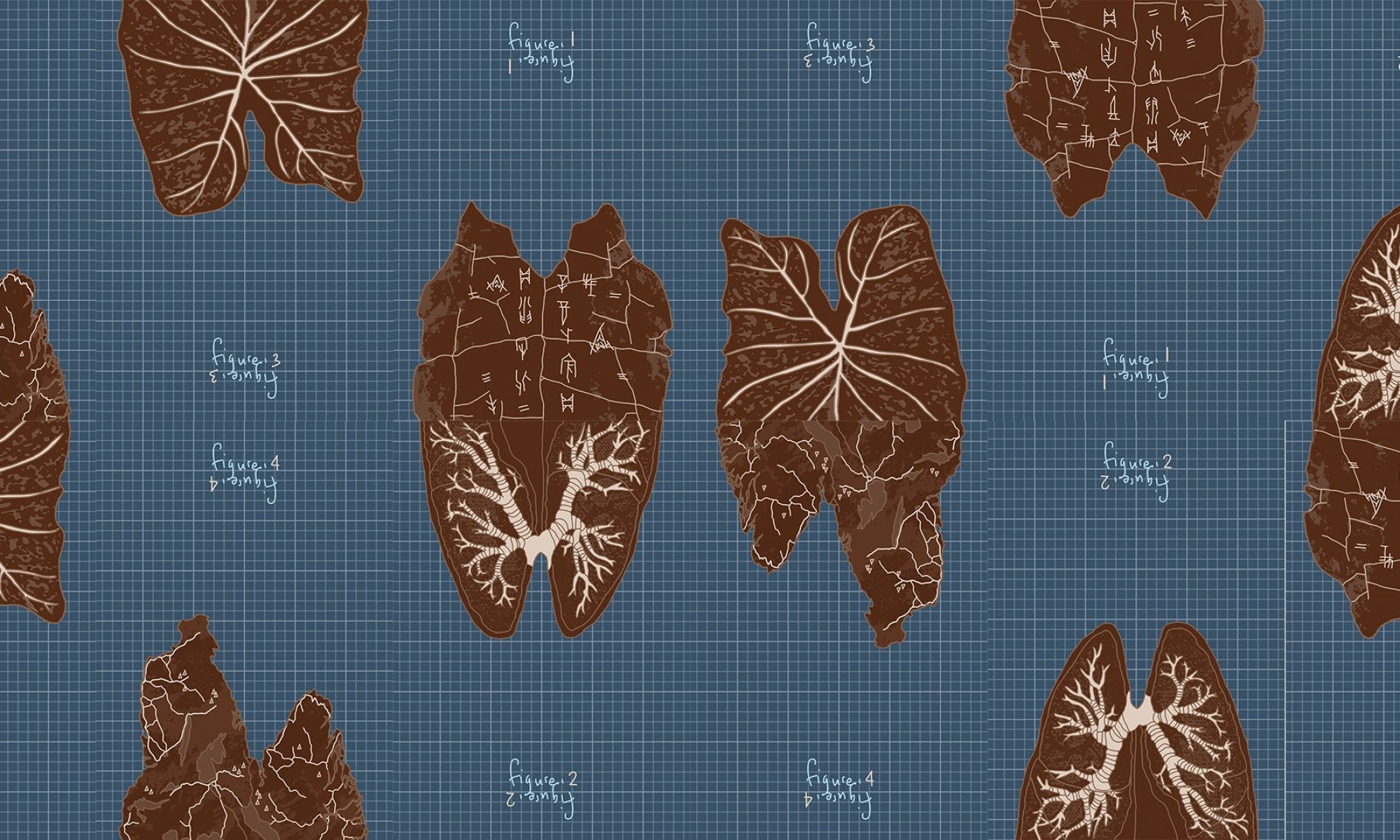
All 4 compositions describe a single job: a researcher who is a universal man— a l’uomo universale Da Vinci in the 21st century. Other synonyms for the title of this job would be anatomist, cartographer, artist, scientist and storyteller. The universal man researcher I dream of being is one who dabbles in everything and makes interdisciplinary connections between subjects. Hence each composition represents a field I’m interested in:
- arts, culture and history (oracle bone)
- nature and the environment (taro leaf)
- science and physiognomy (scientific diagram of lungs)
- geography and places (map)
The images were chosen by their ability to evoke the forms of the letters M and W. I chose to represent only these 2 letters of my name and make use of the fact that the same form of M or W can be the other alphabet as well, just by turning it around—suggesting the idea of how as a researcher I can connect these different disciplines in multiple ways. By connecting them in the different ways you are also able to see how my initials, M and W, can be formed and read in different ways also: looking at the positive and negative spaces, both suggest the letter forms of M and W.

With this vertical arrangement where I stack the M and W, I wanted to show how two disciplines can be connected in this way to form a coherent unified whole. This idea of connection and unity is the essence of my job that I want to convey, and my name represented as a single entity (joined M and W).
development
medium/style
In terms of design, there were many ways I could go about it: having the images be photo-based or doing it with a hand-drawn style like the Vitruvian man with an antique sort of paper texture. However I wanted to convey the idea that in this job as researcher, my method of presentation and sharing of findings is deeply personal and subjective; the figures I present are my own interpretations and understanding of the world. This helped me decide to use a style that had the “hand-drawn” touch to it, but not in the Vitruvian man sketch sense. Joy asked me how the DaVinci I wanted to be was different from the man himself; how I was different from him as a researcher, and what was different about being based in the 21st century. This led me to decide to present my drawings in a digital instead of traditional/analogue sketchy style, that captured my own art style which is more graphic: cleaner lines and bold, flat forms. With the graph paper sort of blueprint background, I wanted to convey the empirical nature to my research, rooted in observation and reason, that exists alongside the contrasting subjectivity of it—conveyed in my drawing style.


Given this, for each composition I also had to navigate the decision of how much of a “drawing” style I wanted, versus a more stylised, graphic style. While I explored pencil/paint filters for the textures of the image at the start, I decided to stylise them completely in the end.

imagery/form
It was important that the images chosen not only captured the subject they represented, but also evoked the forms of the letters M and W clearly. While I used a brain for the scientist composition initially, this was not very effective/clear in bringing out the indent between the arches of M/W. I had to look for alternatives like villi and lungs instead.
Other considerations in rendering the forms were guided by the clarity of the M/W forms they evoked. While I wanted them to be clear, I also didn’t want them to be too clear and unnecessarily explicit. I had to find a balance between subtlety VS clarity, and variation VS uniformity. For outlines, I had to decide if they were:
- standardised, fixed M/W typeface outlines across all 4 compositions VS flexible outlines created by image themselves, varied across 4 compositions
- clear, distinct contrast with backdrop and image VS subtle/none
 To ensure the letter forms could be easily perceived, I had to play around with how the details of images were portrayed as well such that they didn’t distract from the overall letter form.
text
Likewise with text specific to the imagery (scientific labels, names and symbols on map etc.), I had to balance their inclusion/omission such that they didn’t distract from the letter forms. I also wanted the networks formed by the details of the cracks/veins/rivers in each composition to be highlighted since they are used to connect the compositions further. So these details were prioritised over text.

Considerations to the font of the text were guided by the same ideas involved with the medium/style of the images.
At one point, I experimented with overlaying the text specific to an imagery over another as a different way of invoking interdisciplinary connections. However it got a bit excessive and affected the clarity of what image represented as well. Given the multiple other ways I was able to evoke connections across the compositions (through arrangement, colour, form, networks etc.), I discarded this idea.

colour
For the colour scheme it was important that I used a monochromatic palette for each composition so that its positive and negative spaces highlighting the M and W letter forms could be seen easily. Applying the same palette across all 4 compositions was also decided to create greater unity for the interdisciplinary connections idea, even as the compositions are sufficient on their own, viewed separately.


My experiment with inverting the brown colour scheme (inspired by palette of Vitruvian man but a digital graphic take of it) led me to discover the blue argyrotype-looking palette. I liked the colour scheme and thought the contrast worked well with further distinguishing the letter forms. This led me to adapt it to use both brown and blue schemes in a single composition with the graph paper grids overlayed.
Presentation

These were the preliminary drafts I made exploring how the different compositions could be connected in different arrangements and permutations. To maximise the permutations possible, I:
- made the “figure” labels in both orientations so they could be read both ways and imply to the viewer that the composition can be turned around
- drew networks of each image such that they allowed joining with the networks of other images where the paper ends

For critique, I displayed the compositions on a push trolley with stains that evoked a lab setting of a researcher/scientist. I really just needed a flat surface that would allow the compositions to be played around with easily (versus stuck on the wall) but the trolley made a fitting aesthetic.

