
Category: Research

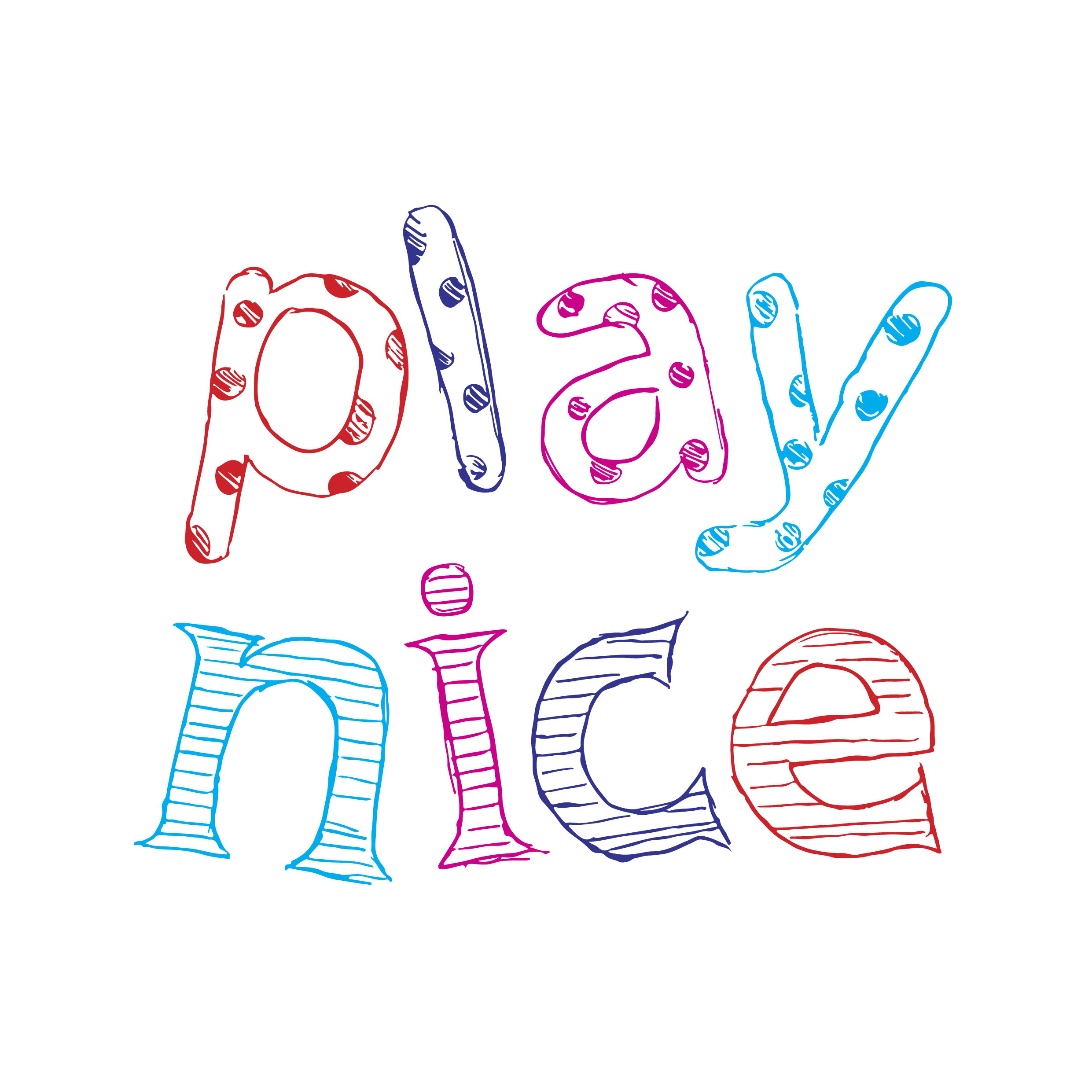
Play Nice

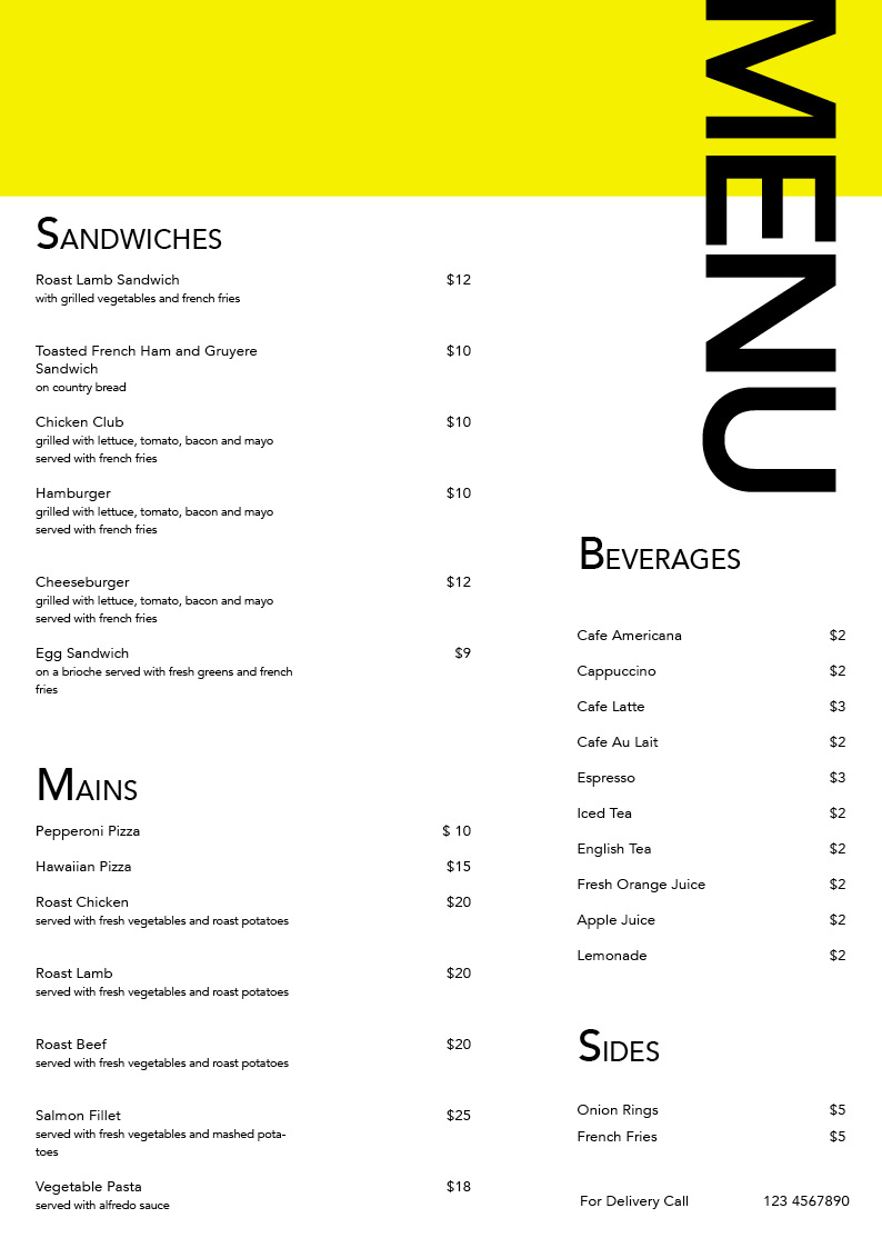
Menu

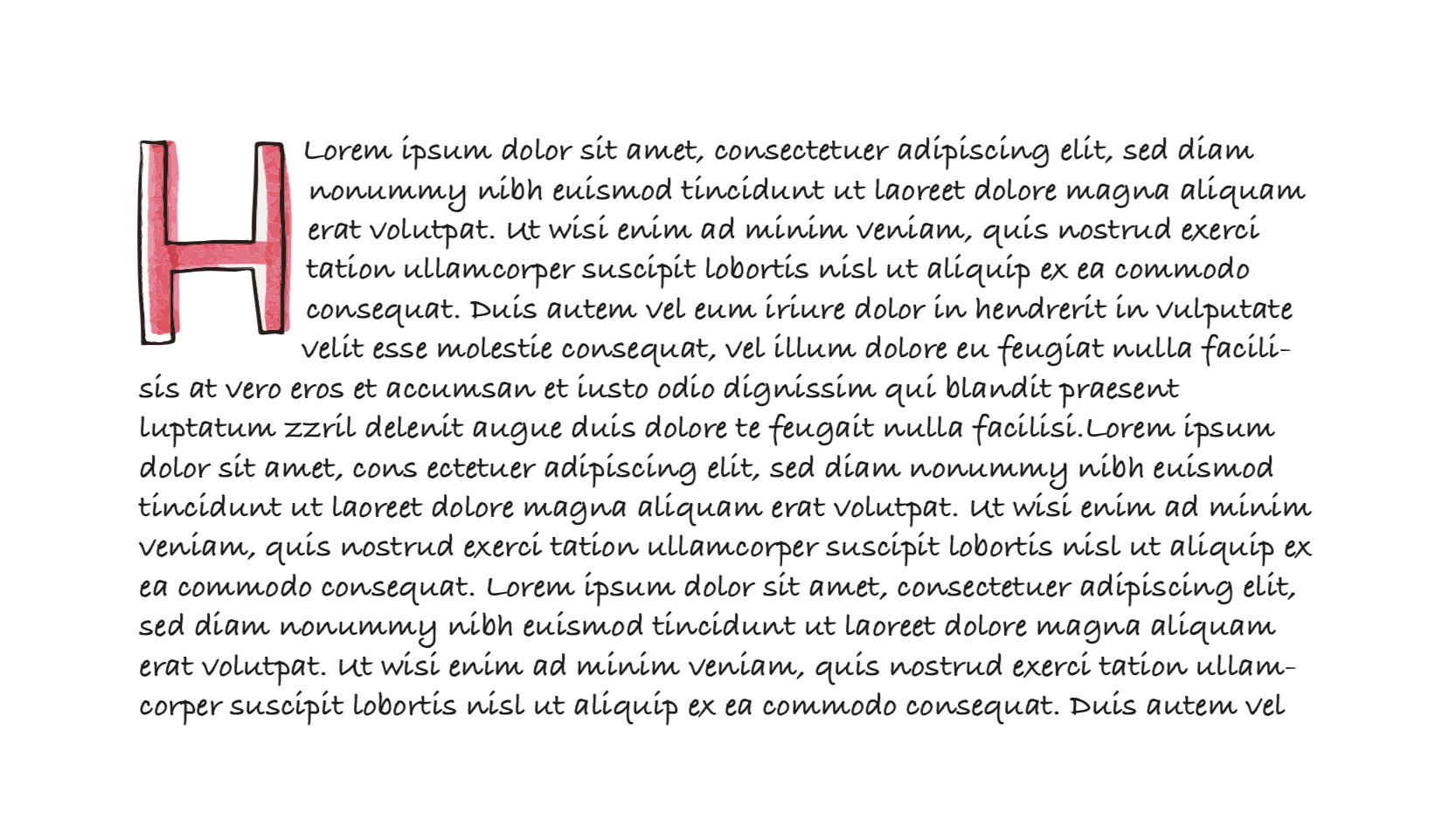
Type As Pattern

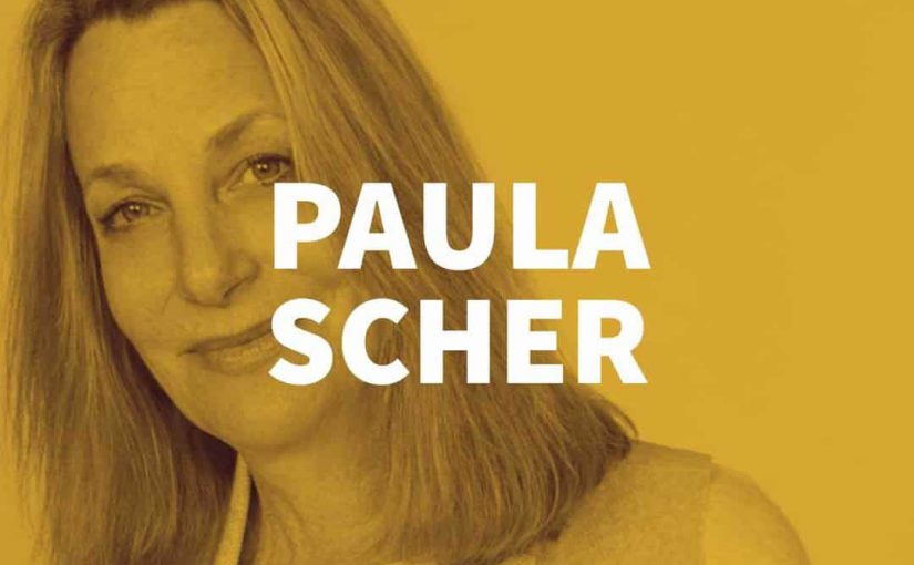
Paula Scher
A B O U T
Paula Scher is an American graphic designer, painter and art educator in design. She started her career as a layout artist for Random House’s children’s book division and subsequently joined CBS Records as an art director for the cover department. In 1984, she co-founded Koppel & Scher with Terry Koppel. During the seven years of their partnership, she produced identities, packaging, book jackets, and advertising. In 1991, after the studio suffered from recession, Scher joined Pentagram as a partner in the New York office. Since then, she has been a principal at the New York office of the Pentagram design consultancy.
W O R K S
Scher has developed identity and branding systems, promotional materials, environmental graphics, packaging and publication designs for a broad range of clients that includes, among others, Bloomberg, Microsoft, Bausch + Lomb, Coca-Cola, Shake Shack, Perry Ellis, the Museum of Modern Art, the Sundance Institute, the High Line, Jazz at Lincoln Center, the Metropolitan Opera, the New York City Ballet, the New York Philharmonic, the New Jersey Performing Arts Center, the New 42nd Street, the New York Botanical Garden, the United States Holocaust Memorial Museum, the Philadelphia Museum of Art, the Robin Hood Foundation, and the New York City Department of Parks and Recreation.
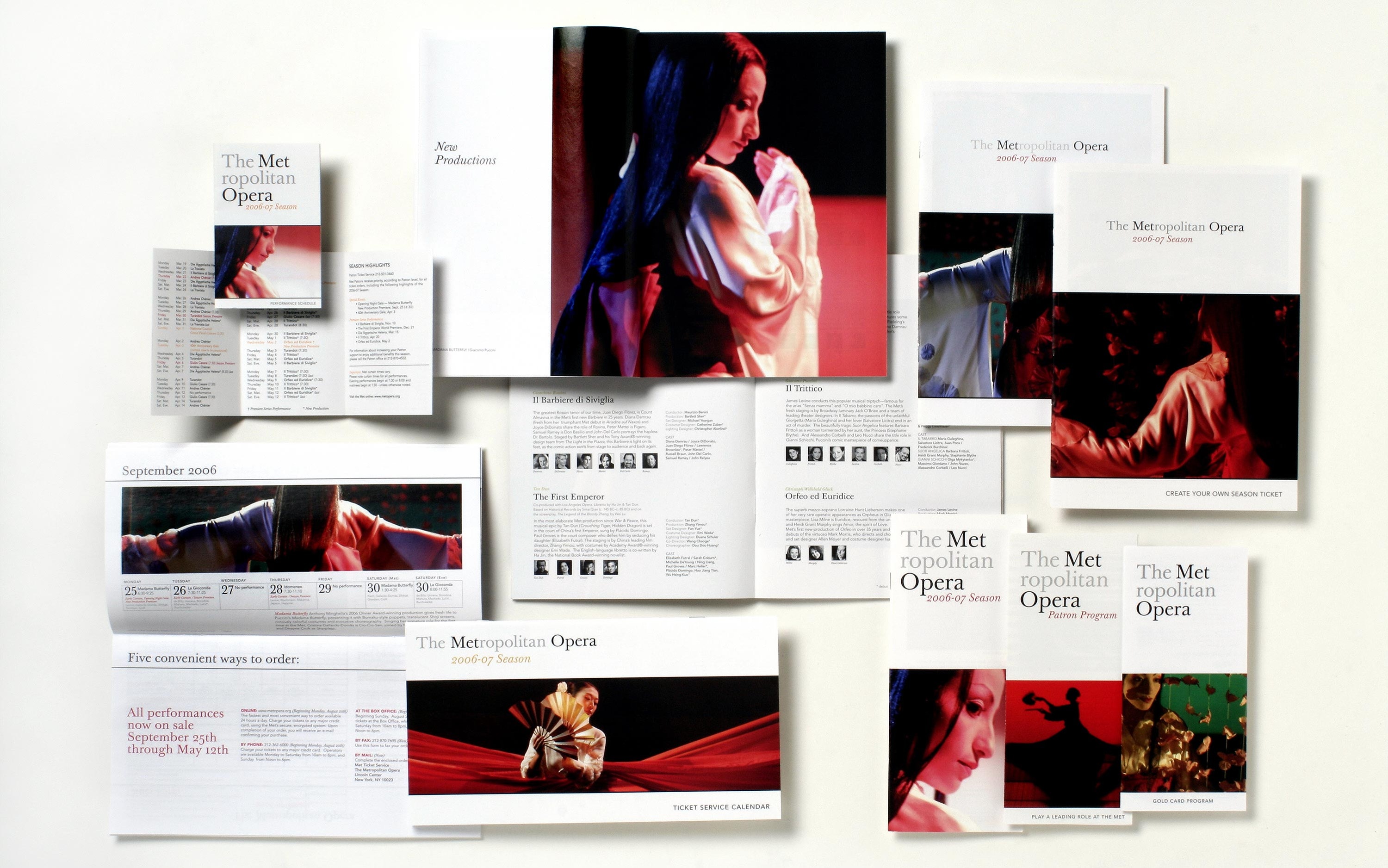 The Metropolitan Opera, Brand Identity
![]()
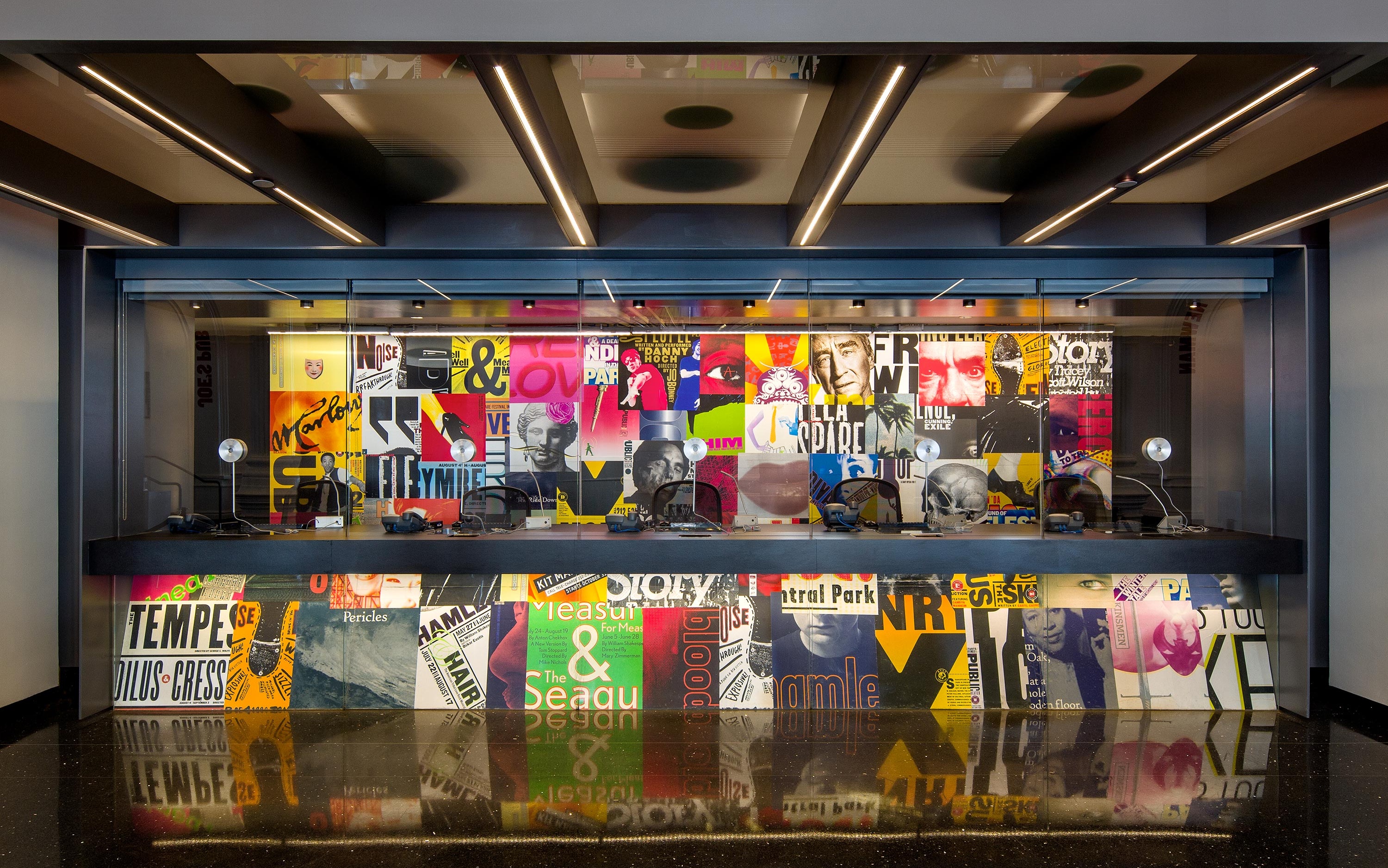
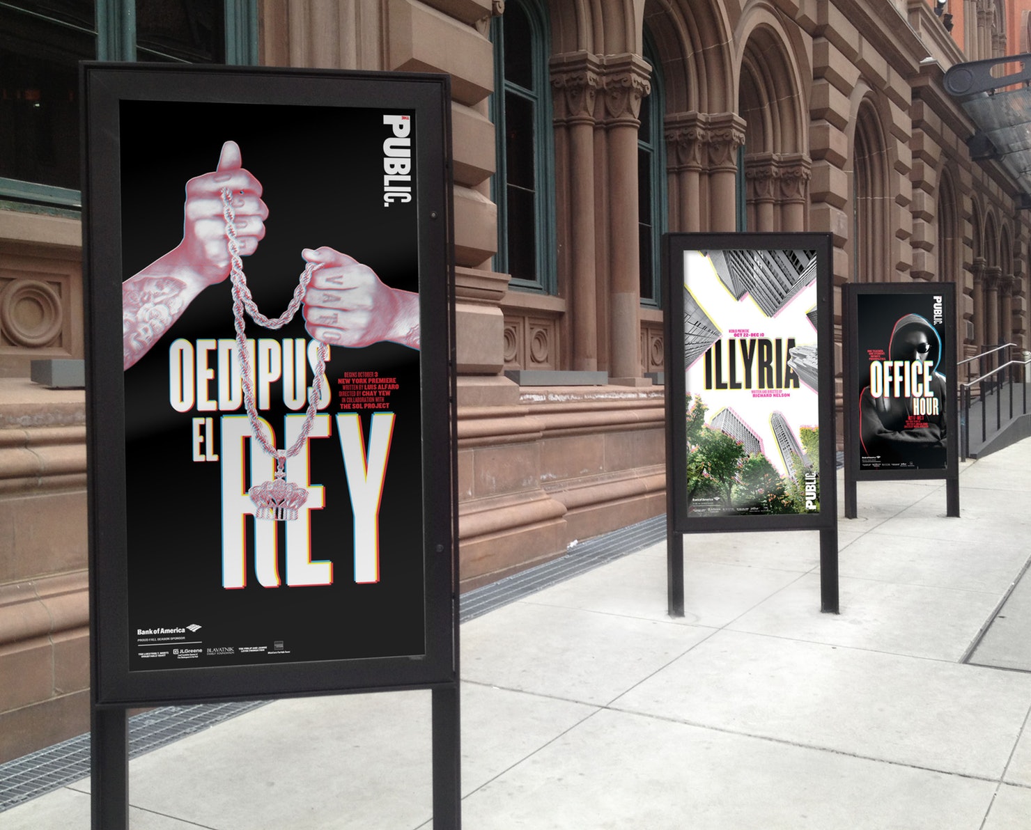
The Public Theater, Brand Identity
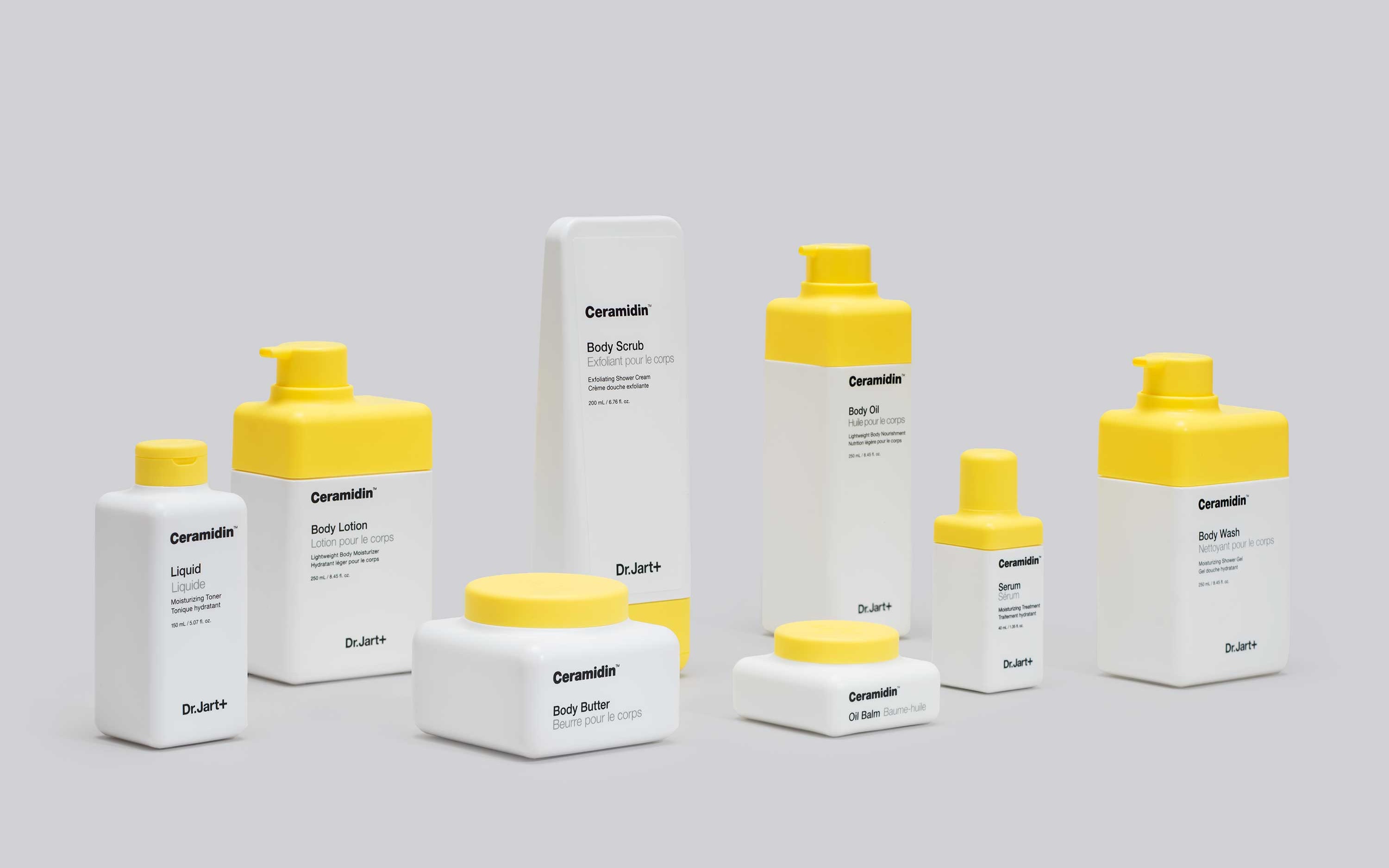
Dr. Jart+ Packaging, Product Design


Planned Parenthood, Environmental Graphics
T H O U G H T S
Scher is a multi-talented and versatile designer. She is well versed in many areas of design, from branding to packaging to environmental graphics. Her style evokes bold imagery as she uses typography in an almost illustrative way rather than print style. She believes that designing for vanguard local arts organisations is as valuable as designing for multinational corporations. Therefore, even though she did many corporate branding projects, she is most recognised for her work in the arts. Unlike her polished designs for major corporate brands, her works for arts are loud and expressive. I really enjoy her work because there is a mix of two styles, one for the commercial and one for the artistic.

The Crystal Goblet
In The Crystal Goblet, Beatrice Warde mentioned that typography should function like a crystal-clear glass, acting as a vessel to reveal rather than hide the beautiful thing which it was meant to contain.
She also mentioned that typography used in print should be invisible for a clear transmission of ideas. It should not be eye-catching because that would imply that its first purpose was to exist as an expression of beauty for its own sake and for the delectation of the senses.
I think that what Beatrice Warde talked about in her article was relatable, but only to a certain extent. I do agree that the primary function of typography should be to convey thought, ideas, images, from one mind to other minds and sometimes that can only be achieved with a ‘transparent’ type. For instance, books mainly use “transparent’ types that are highly readable and legible so that the reader can go through the lengthy content with ease and speed.
BUT,
Typography is more than just a transparent vessel. In many cases, designers or artists create beautiful and elaborate types that communicates ideas as efficiently, or even more so than ‘transparent’ types. In the case of posters, bold and beautiful types are used to draw attention and evoke reaction from the viewers. The essence of an idea can be enhanced using an appropriate and beautiful typeface.
Following the thoughts of Matthew Butterick, who wrote an opposing article Drowning the Crystal Goblet, I feel that a text would have no visual characteristic without typography. Beatrice Warde’s metaphor and concept for typography is extremely flawed. By using the word ‘transparent’ to describe typography, she indirectly suggested that typography devoid any meaning, which really isn’t the case.

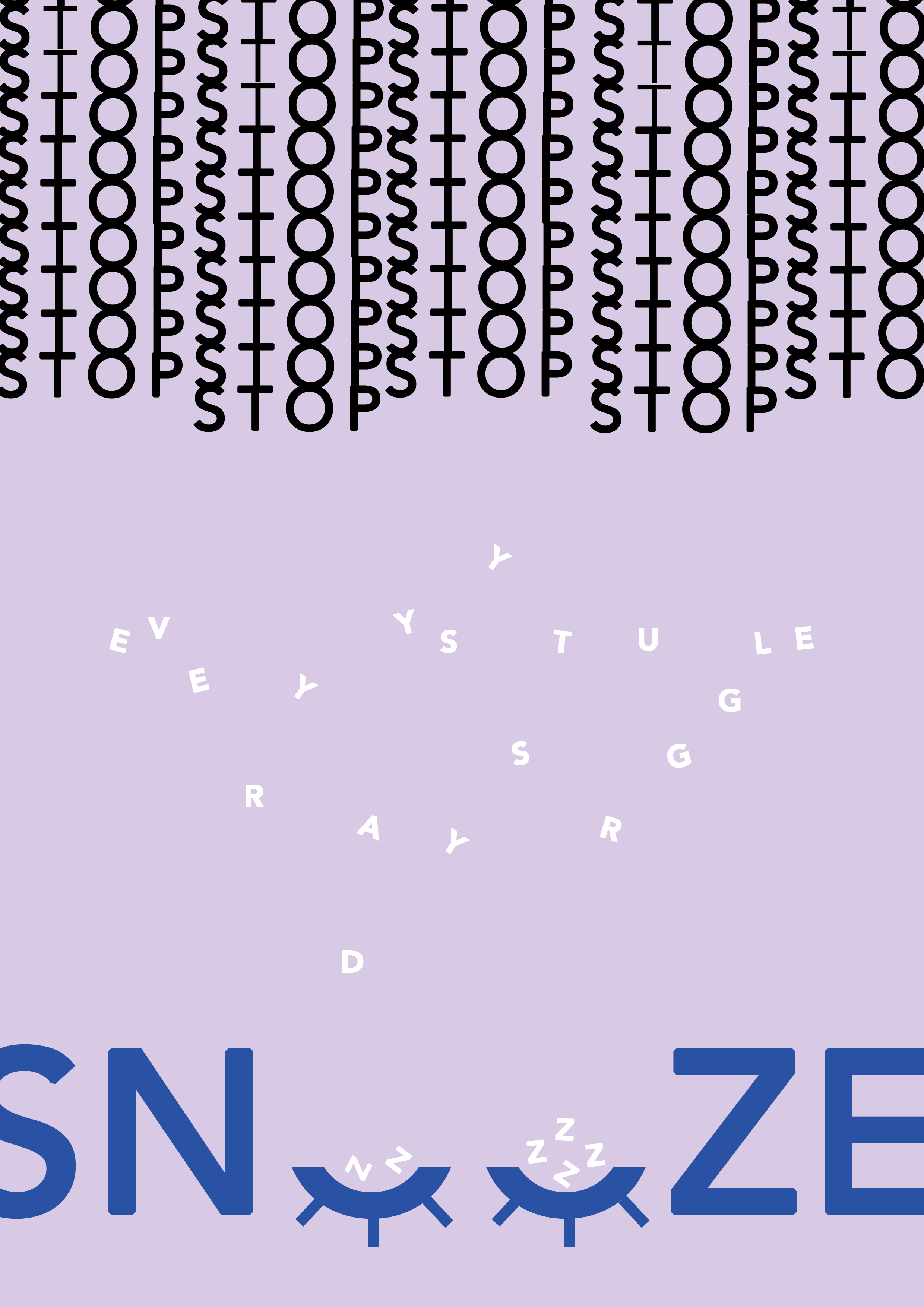
Haiku
everyday’s struggle
should I stop or should I snooze
just a little long…

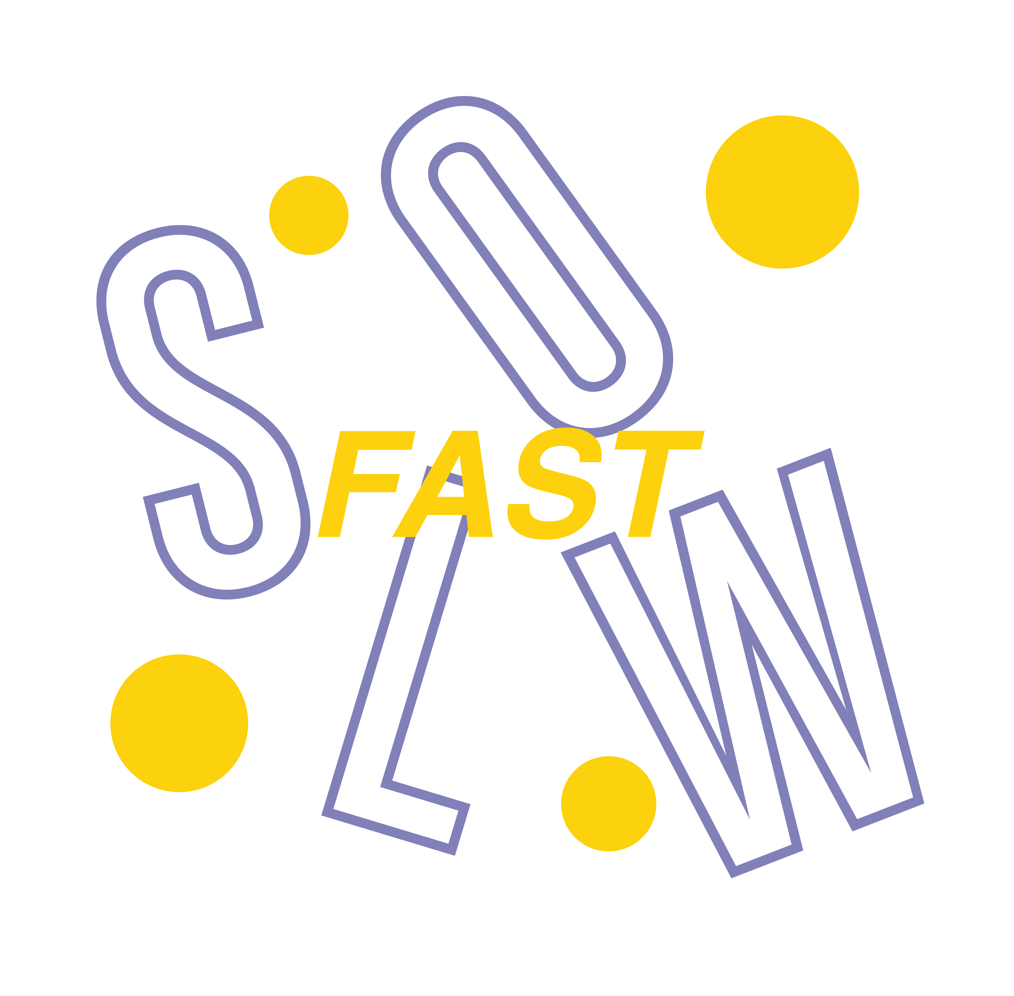
Expressive Words | Opposing Pairs

Neville Brody
A B O U T
Neville Brody is an English typographer, graphic designer and art director. He has been at the forefront of graphic design for over two decades. Brody started his career in a record company designing for artists such as Cabaret Voltaire and Depeche Mode. Later, he was recognised for his contributions to The Face and Arena magazines.
Cabaret Voltaire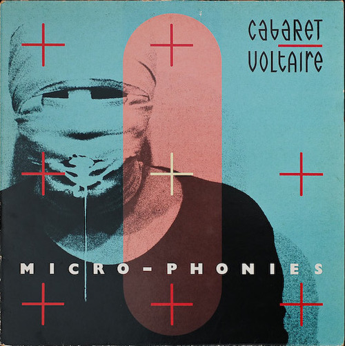
Depeche Mode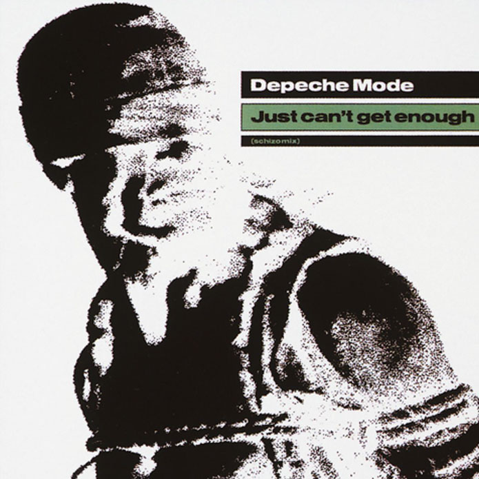
W O R K S
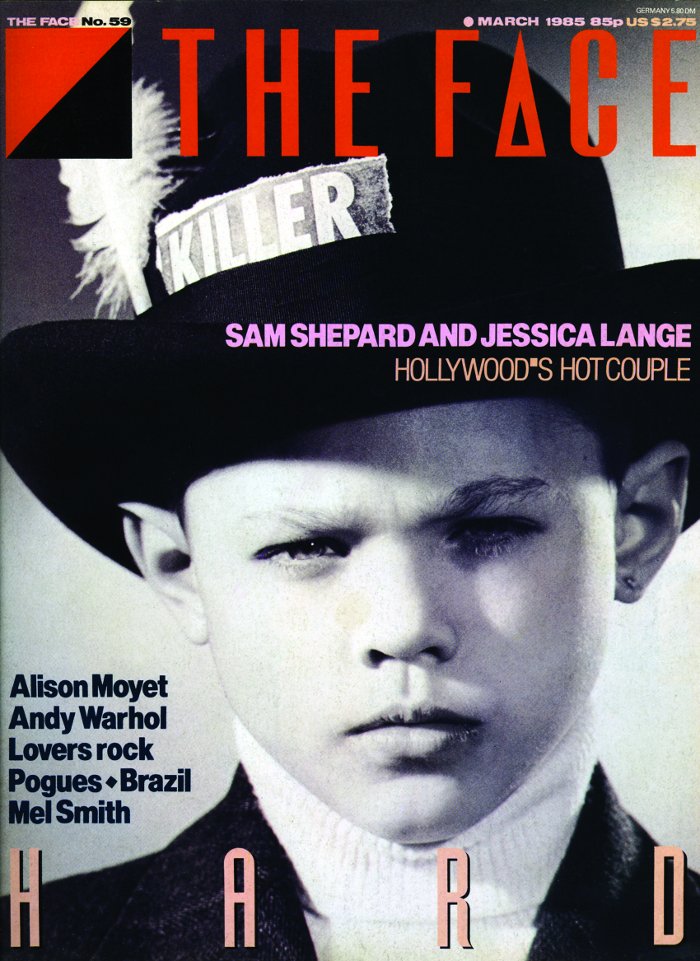
Brody’s most recognised works were for The Face magazine and Arena magazine. Subsequently, he then started Research Company Studio and founded Fontworks with a few others. His company is best known for its ability to create new visual languages. Some of their works include innovative packaging and website design for clients such as Kenzo, corporate identity for clients such as Homechoice, and on-screen graphics for clients such as Paramount Studios, makers of the Mission Impossible films. The more recent projects required him to redesign BBC and The Times with the creation of a new font Times Modern.
The Face Magazine
Arena Magazine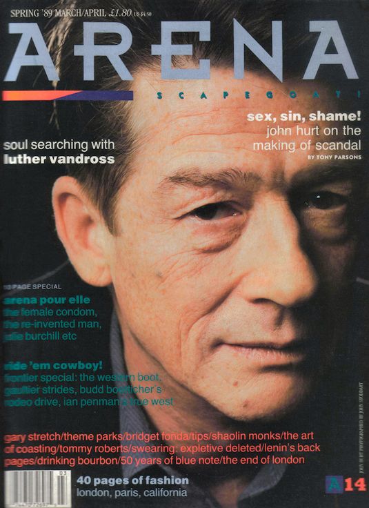
The Times
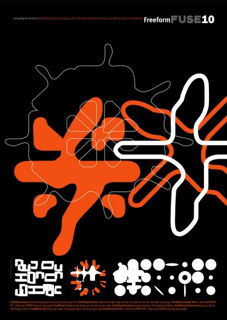
He also created the FUSE project, an experimental and influential typography publication. The publication is approaching its 20th issue over a publishing period of over ten years. The project also brings speakers from design, architecture, sound, film and interactive design and web together through conferences.
FUSE Publication

T H O U G H T S
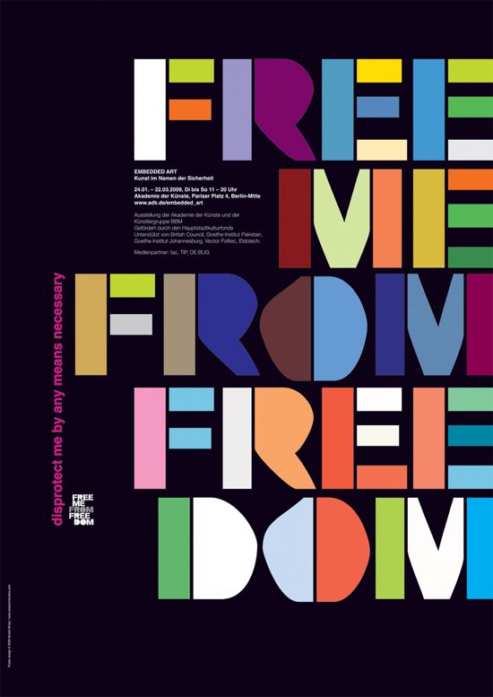
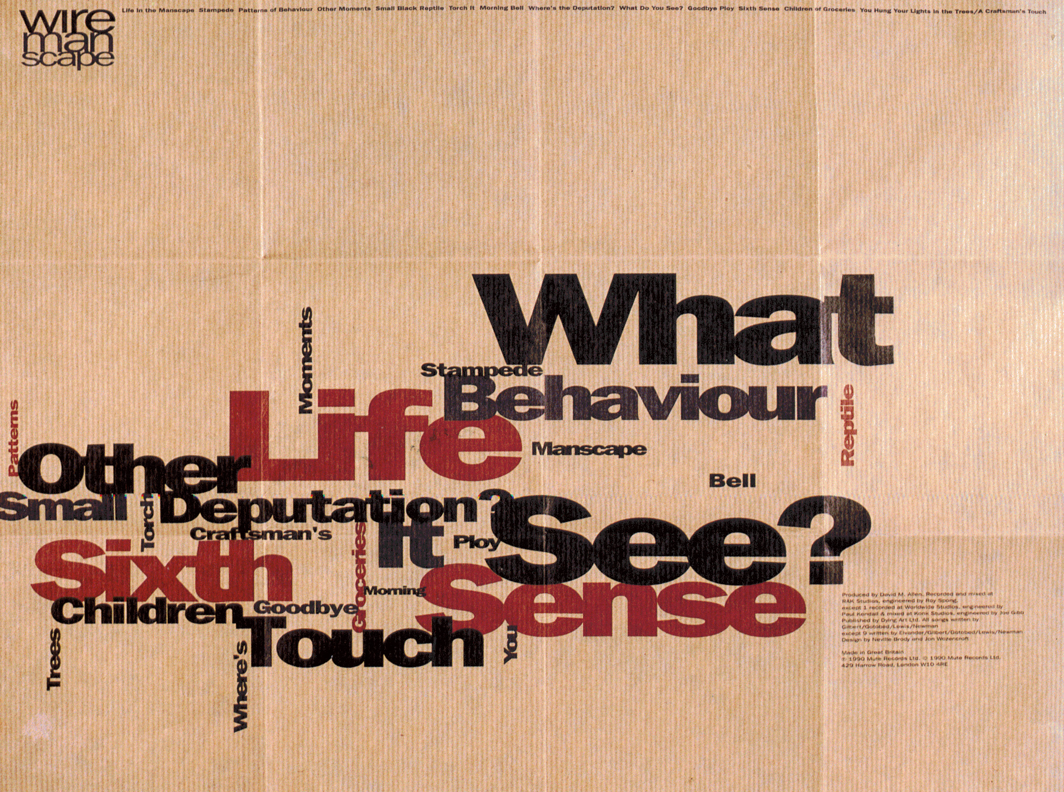
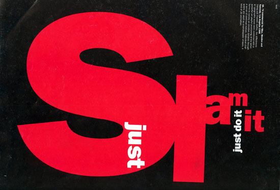
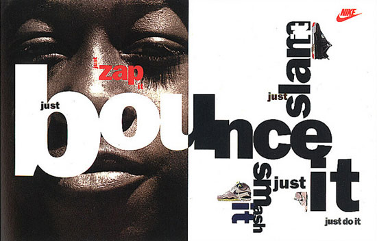
Brody’s design style is very bold and unconventional. He plays with the form, colours, weight and the arrangement of the type to create loud and interesting visuals. Brody pushes the boundaries of design as he explores and challenge conventional aesthetic through his creative expression in design. He is also a versatile designer, excelling in many art forms ranging from publishing to film. I think that his layout compositions are very dynamic and refreshing, differing from the previous typographers that we have examined. His works are very radical and captivating, but not necessarily the most easy to read and understand.

Type Speaks
T H O U G H T S
The art of typography has evolved greatly in the past centuries. It started from painstakingly written types to movable type system and now digitalised types created using computers. Through this video, I got to have a better understanding on how types were made and used for mass printing in the 1950s, also known as the printing revolution period.
Back then, the process of creating a type was very lengthy and tedious. It required many machineries, resources and craftsmanship, unlike today where type can be easily created using commercial graphic design software. There is so much hard work and skills behind the typefaces we see and use today. Yet, so often we neglect or use them with little consideration or regards.