Part 1: MONO-PRINT
Things I learn:
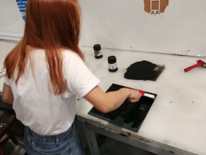
- experiment with different tools/ techniques for making prints
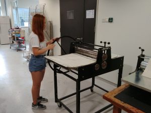
- how to mono-print properly and not get hurt by letterpress machine
- create various patterns to compare texture/ density/ thickness/ contrast etc with regards to various emotions
- develop a sense of direction for project 1
- have fun! 😉
Part 2: RESEARCH AND PROCESS
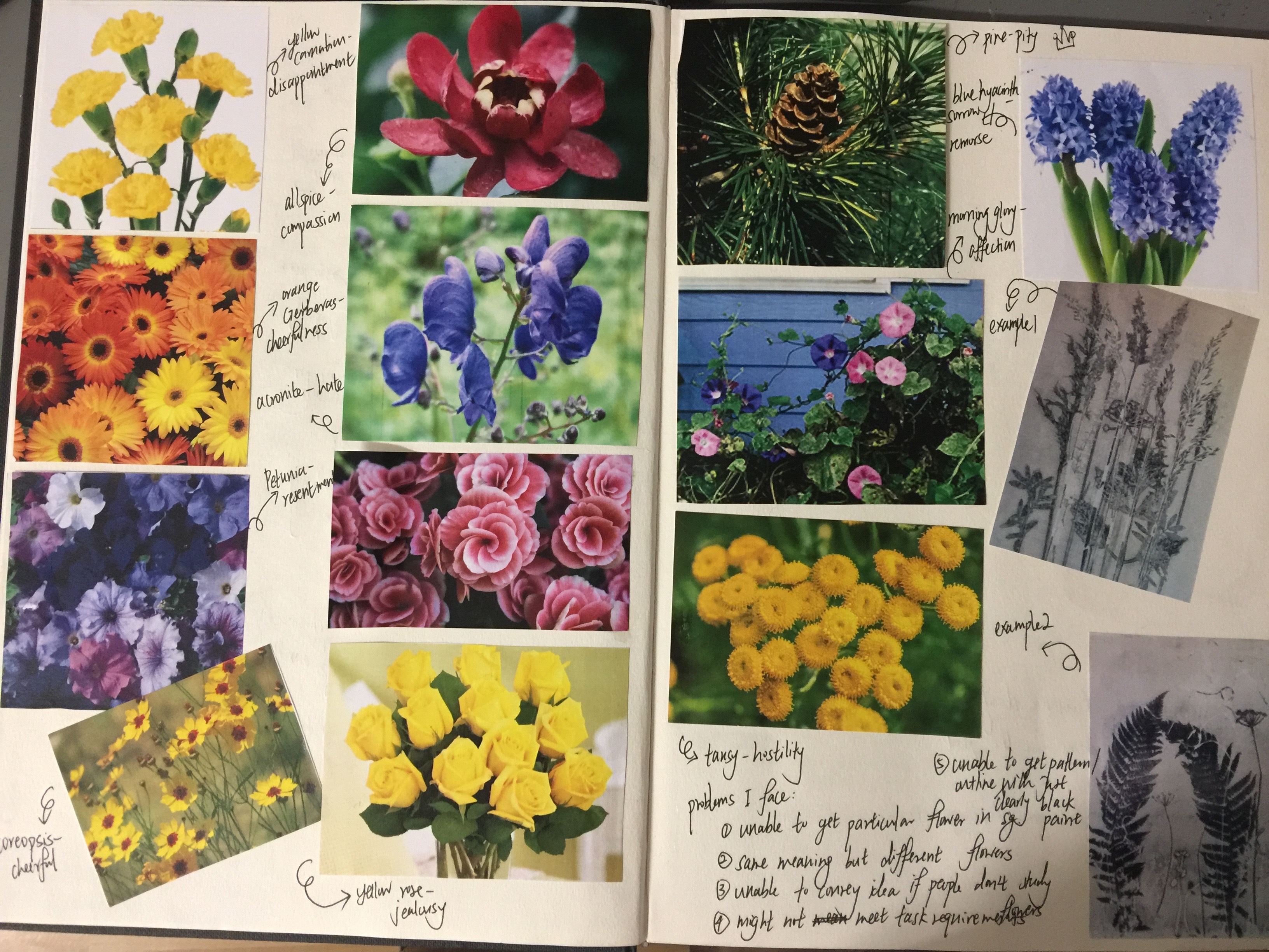
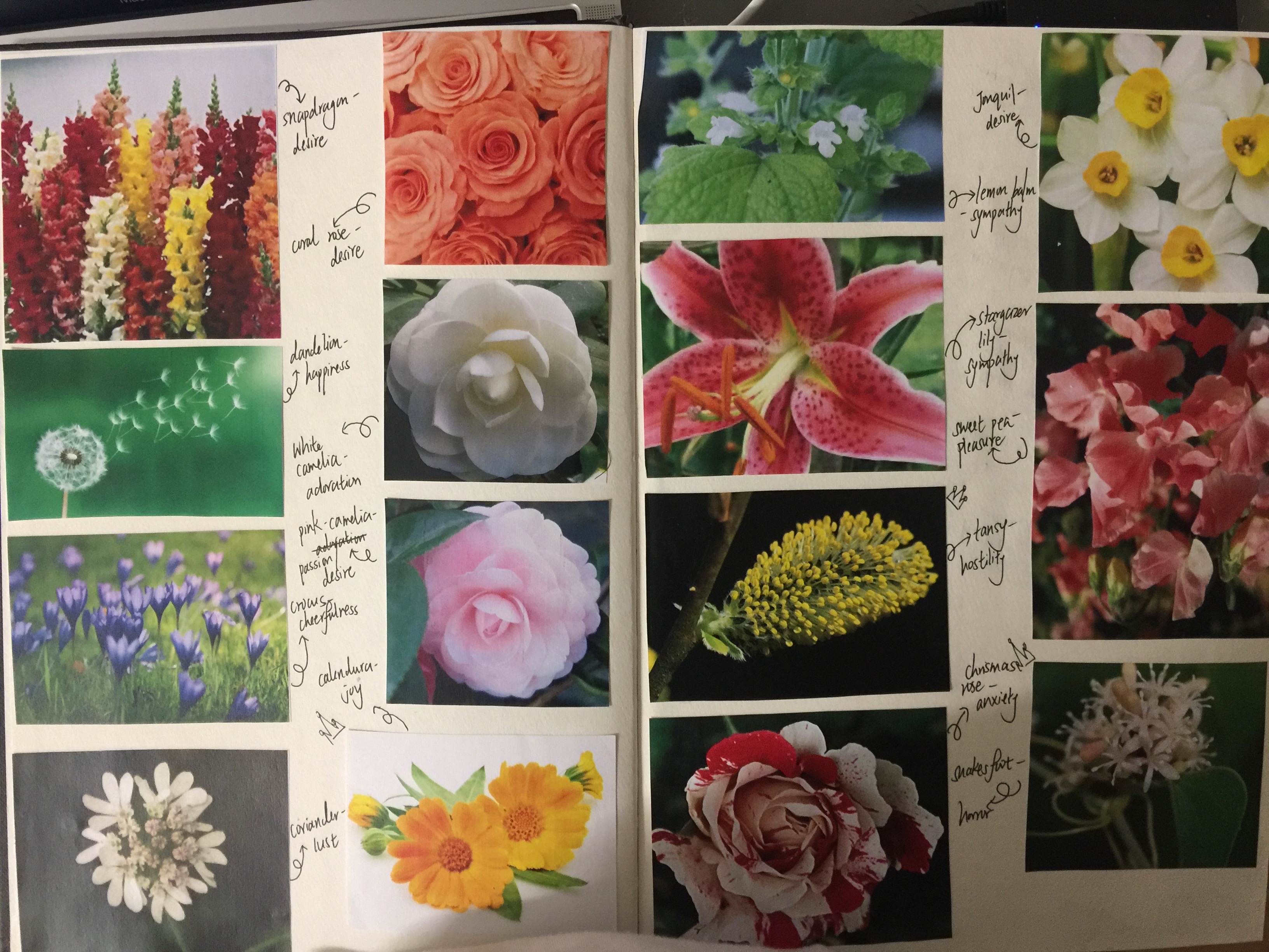
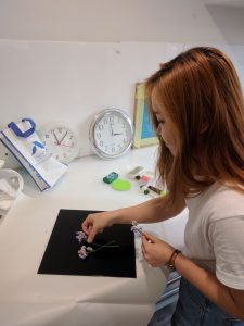
I set a theme for project 1; flowers, because each of them carries a unique meaning and I believe flowers makes amazing tools for mark making. After my research on flowers and its meaning, I match expressive, accessible and suitable candidate to a emotion. I went on to experiment with more ways of creating marks and study how each characteristic of a line would make a difference to my final product, affecting how my audience feel about them. I group my findings as of those listed under “things I learnt”.
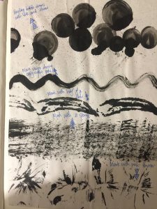
Before I start constructing the actual product, I planned, noted down the distinct characteristic of each emotions and how the study of lines can help me with conveying that particular emotion, with considerations for the type of flowers at the back of my head. I put some thoughts into textures as well because variation in textures would be less boring and it will enhance the aesthetic appeal of my final product.
Things I learnt:
- various textures can affect the final product
- gradients that exist within black and white plays an important role
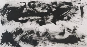
- denser prints = emotions that are more intense/ disturbing/ strong
- less dense prints = emotions that are more light-hearted/ bright
- sharp lines/ edges = emotions that span across a short time period/ sudden/ spontaneous
- curvy lines/ edges = emotions that became gradual/ non-spontaneous
- thin lines = carries motion and rhythm/ touch on emotions lightly
- thick lines = draw in attention/ place emphasis on certain parts
Challenges I face:
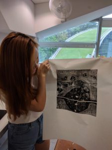
- converting 3D objects to 2D prints
- link flower meaning/ pattern/ structure to corresponding emotions
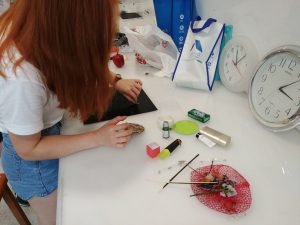
- gathering flower candidates (pluck/ buy/ draw/replace)
- handling of flowers e.g. maintain freshness / travel with minimal destruction done / when to get my flowers and start making prints
- NO COLOURS, ONLY BLACK AND WHITE
- handling the difference between expectation and reality… :’)
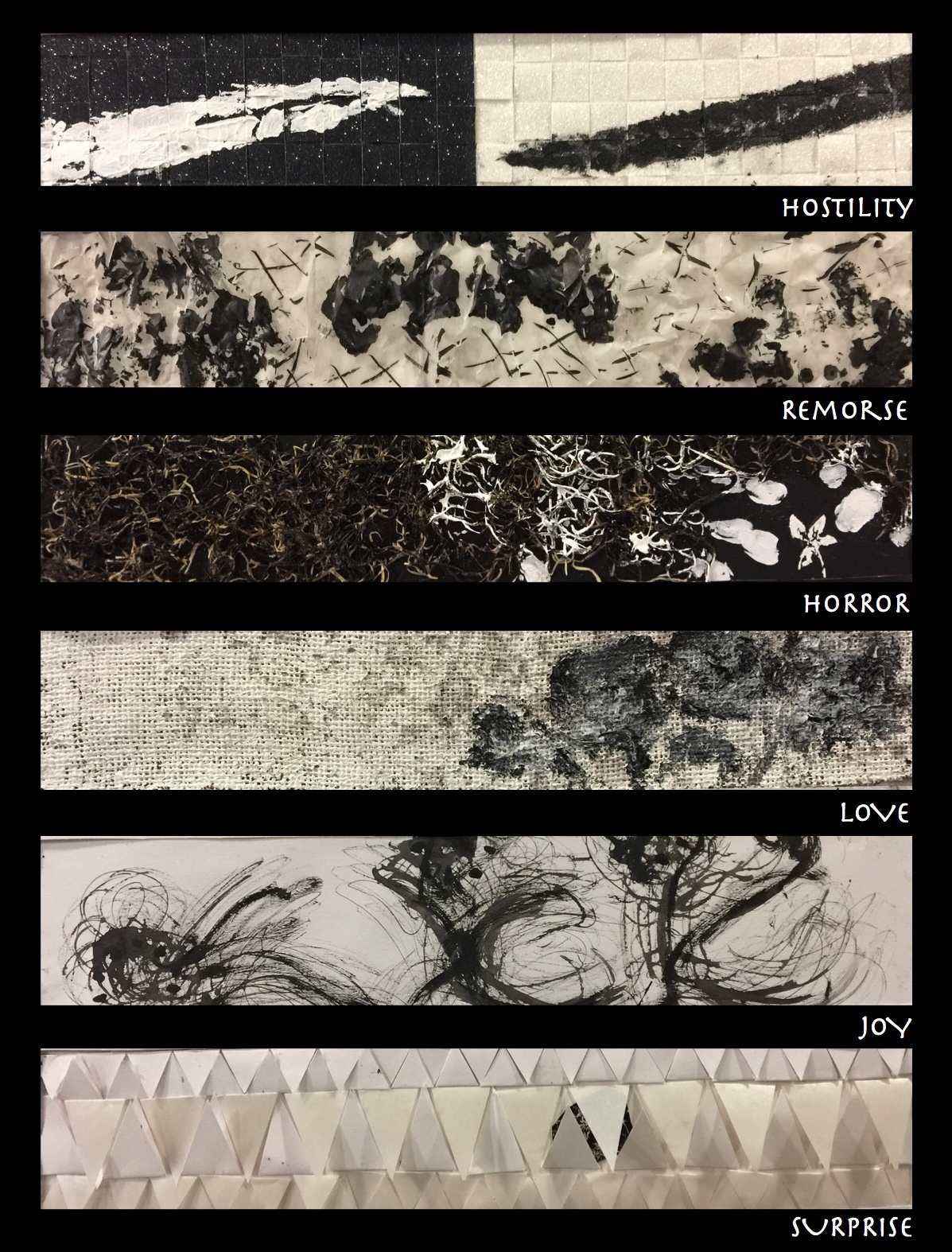
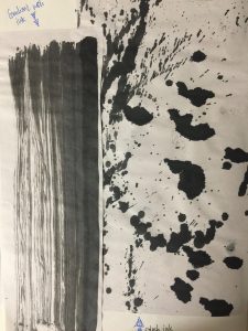
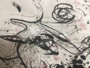
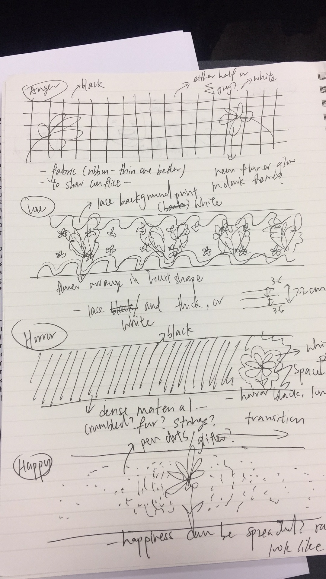
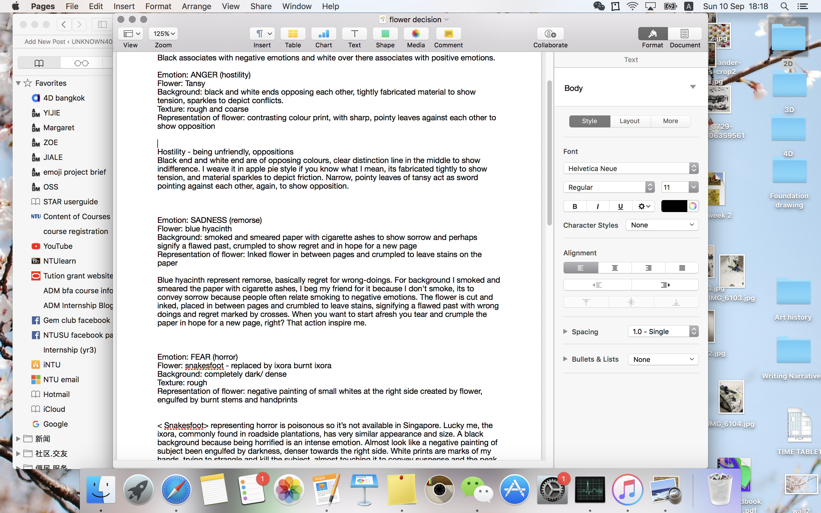
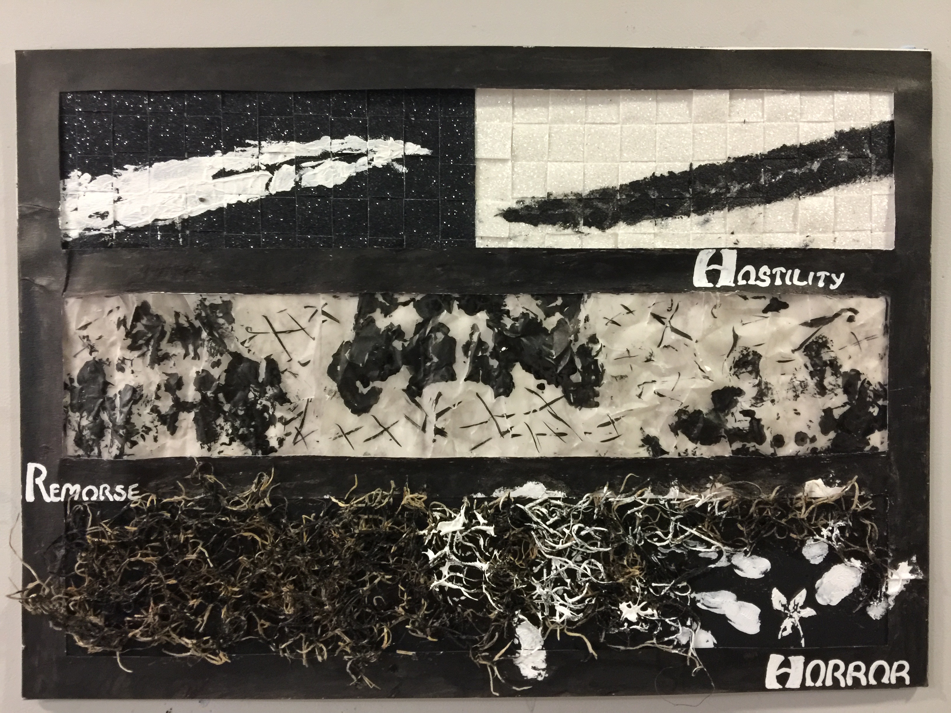
HOSTILITY(anger):
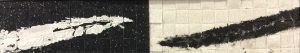
Flower: Tansy leaf
Background information and ideas: Tansy flower represent hostility. I chose solid, dense blocks of black and white as background because they are opposing colours, just like how hostility is caused by conflict. Background is tightly fabricated to show tension, sparkles to depict fiction. Feels rough and coarse. Line right in the middle to show two distinct parties. Sharp, pointy leaves against each other to show opposition, they look like swords that intend to hurt. Outline of the leaves are straight and narrow because hostility is always directed to a party.
Method: weave black and white sparkle tape in apple-pie style. Contrasting paint print of Tansy leaves in acrylic paint.
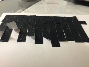
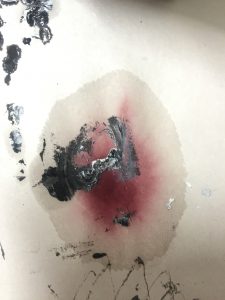
REMORSE(sadness):
Flower: blue hyacinth
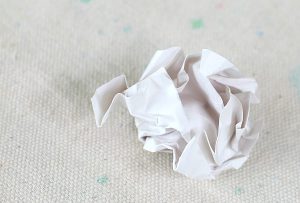
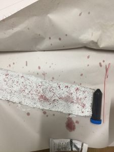
Background information and ideas: blue hyacinth represent remorse, regret for wrong-doings. Cigarettes are often associated with negative emotions and remorse can be one of them. The dense and dark stains of blue hyacinth signify a flawed past that cannot be forgotten. Crosses symbolise wrong-doings. Crumpled paper depict that past time was not all smooth sailing. One regrets, and thus hope for a new page because when people want to start afresh, they tear off a page and start on a new sheet, this action inspire my work.
Method: Smoked and smeared tracing paper with cigarette ashes. Sandwich inked flower in between pages and crumpled to leave stains on the paper. Make cross markings with brush pen.

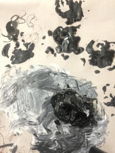
HORROR(fear):
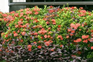
Flower: snakesfoot – replaced by burnt ixora
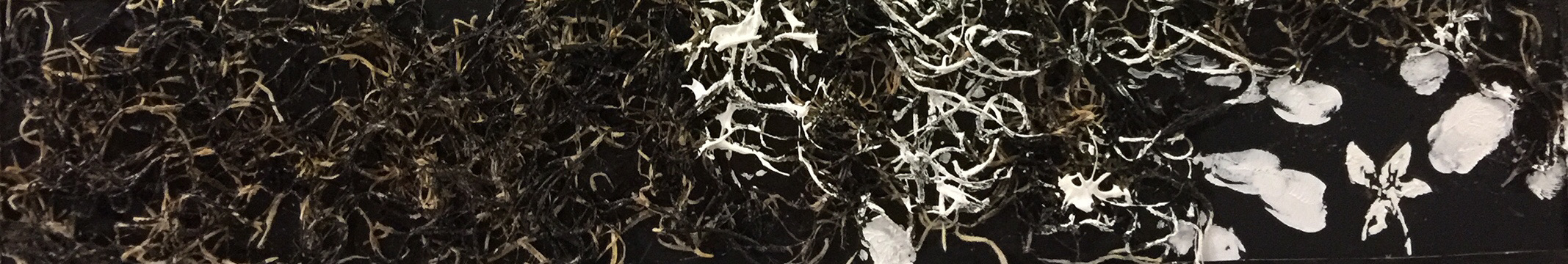
Background information and ideas: background is completely dark to depict fear, and being horrified is an intense emotion. Snakesfoot representing horror is poisonous so it’s not available in Singapore. Lucky me, the ixora, commonly found in roadside plantations, has very similar appearance and size. I burnt it because burning of flowers is often associated with witchcraft and black magic. Subject is been engulfed by darkness, with burnt Ixora denser towards the right side. It is placed in an dense, circular motion to create depth and uneasy sensation. White prints are marks of my hands, trying to strangle and kill the subject, almost touching it to convey suspense and the peak the horror as an emotion.
Representation of flower: negative painting of small white spaces at the right side created by flower, engulfed by pasted burnt ixora. Hand prints using white acrylic paint.
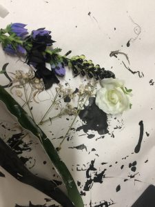
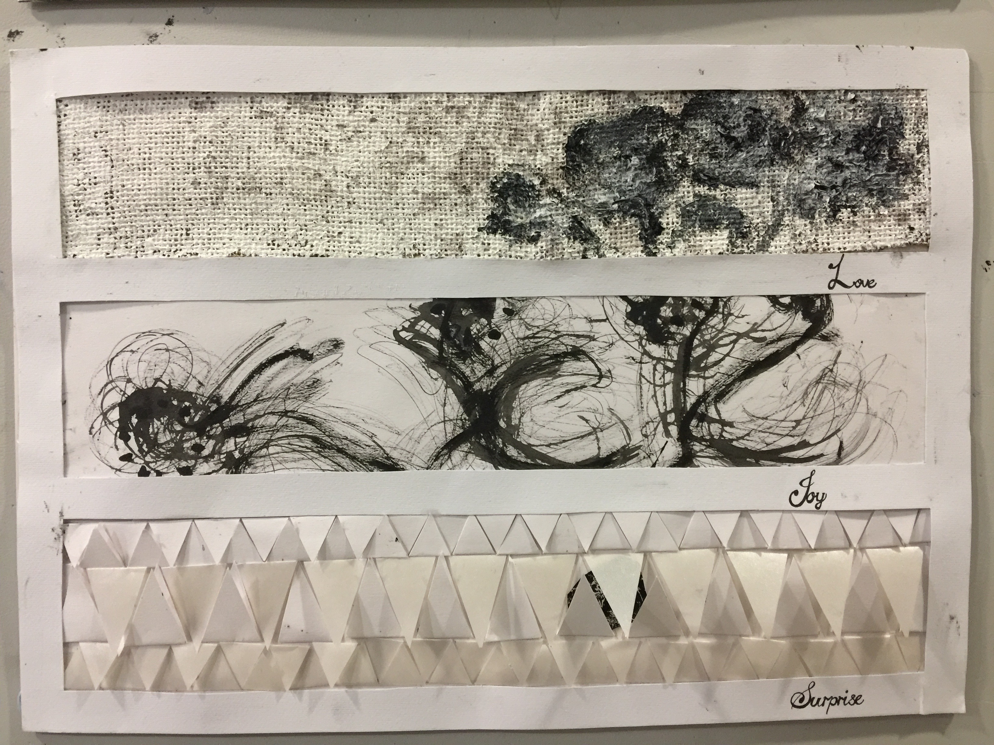
LOVE:

Flower:rose
Background information and idea: love would be represented by rose. For background I chose woven cloth with wine stains; weaving is associated with the act of affection and nurturing nature while red wine is associated with romance. Slight maroon tint and aroma of wine helps to convey “love”. Also, the texture omits coziness. Rose dipped in black and white paint to create a marble effect because, “sometimes it lasts and sometimes it hurts instead”, love is a mixture of happiness and sorrow. Flowers are arranged in a bouquet but facing different directions to signify different stages of love, lower towards left side because time might erode the level of affection. Inspired by Cai Guo Qiang’s “Chaos in Nature” painting that resembled the marking a rose would make. The flower prints are generally round in shape, light in colour with little contrast, representing a positive emotion.
Method: paint cloth to cover up the natural brown tint, spray red wine onto cloth, then paint marble gradient with rose.
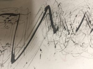
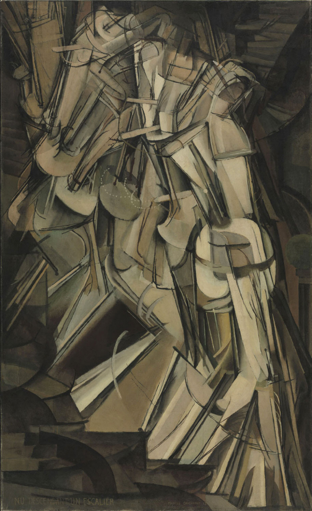
JOY:
Flower: Calendula
Background information and idea: sketch book paper as background because its white and smooth, best represents my thought that; happiness is the purest state of bliss. Happiness is a positive emotion hence there should be no harsh edges, points, mainly circular representations and should not be too dense because its a light hearted emotion. Since ancient times people dance when they’re happy, and seldom do we see stillness when being happy. Lines are thin and repetitive, and of various heights to convey rhythm and motion. I was inspired by a painting titled “Nude Descending a Staircase”. I made a simple print of calendula on their heads to show that they dance because they dance out of intrinsic joy.
Surprise:
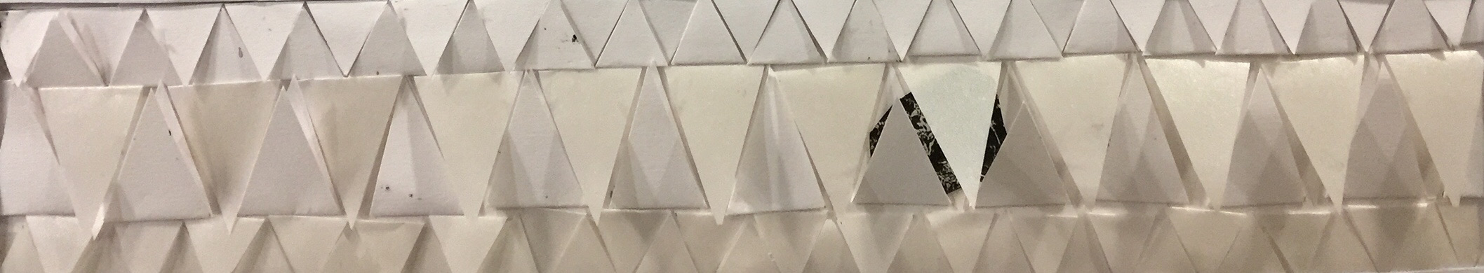
Flower: unfortunately I could not find any flower, so I decided to use mono-print instead
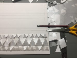
Background information and idea: Surprise is a spontaneous and short-lived emotion hence for background I used cut-outs of triangle because the shape itself is sharp and angular. Triangle also reminds me of party hats and colourful celebration flags. Unfortunately when I remove the weights, it did not turn out as flat as being a texture as I envisioned. I hide the cropped down the mono-print to the part with flowers only because it correspond to my theme and visual impact it has on my audience would be a surprise (hopefully) because it’s hidden. 😀
Method: cut out triangles. Cropped down mono-print to flowers and hide it in between the folds.
Part 3: FINAL PRODUCT

For OSS submission, the default background is black.
However, on the day of presentation I decided to categorise my emotions into 2 parts, black for negative emotions (anger/ sadness/ fear) and white for positive emotions (love/joy/surprise), this way, there is more contrast to the piece and emotions can be neatly organised into place according to their basic characteristic and colour theme.
disclaimer: many flowers were harm during the process and I apologised:'(
Part 4: REFLECTION AND ADVICE
Reflection:
This project is the first in which I explored the use of different textures and lines to convey emotions. By studying the quality of lines, I realised just simple strokes can have a profound effect on our emotional state. Lines are integrated into every aspect of our lives, and is subconsciously influencing how we see and what we feel. Perhaps I can better appreciate the beauty of lines and the importance of it after this project. I get to understand my classmates better and take on their perspective of seeing and expressing, learn from one and other.Based on feedbacks, I will also improve on my ability to convert 3D objects and perspectives into 2D representation. Nonetheless, I had fun throughout this project.
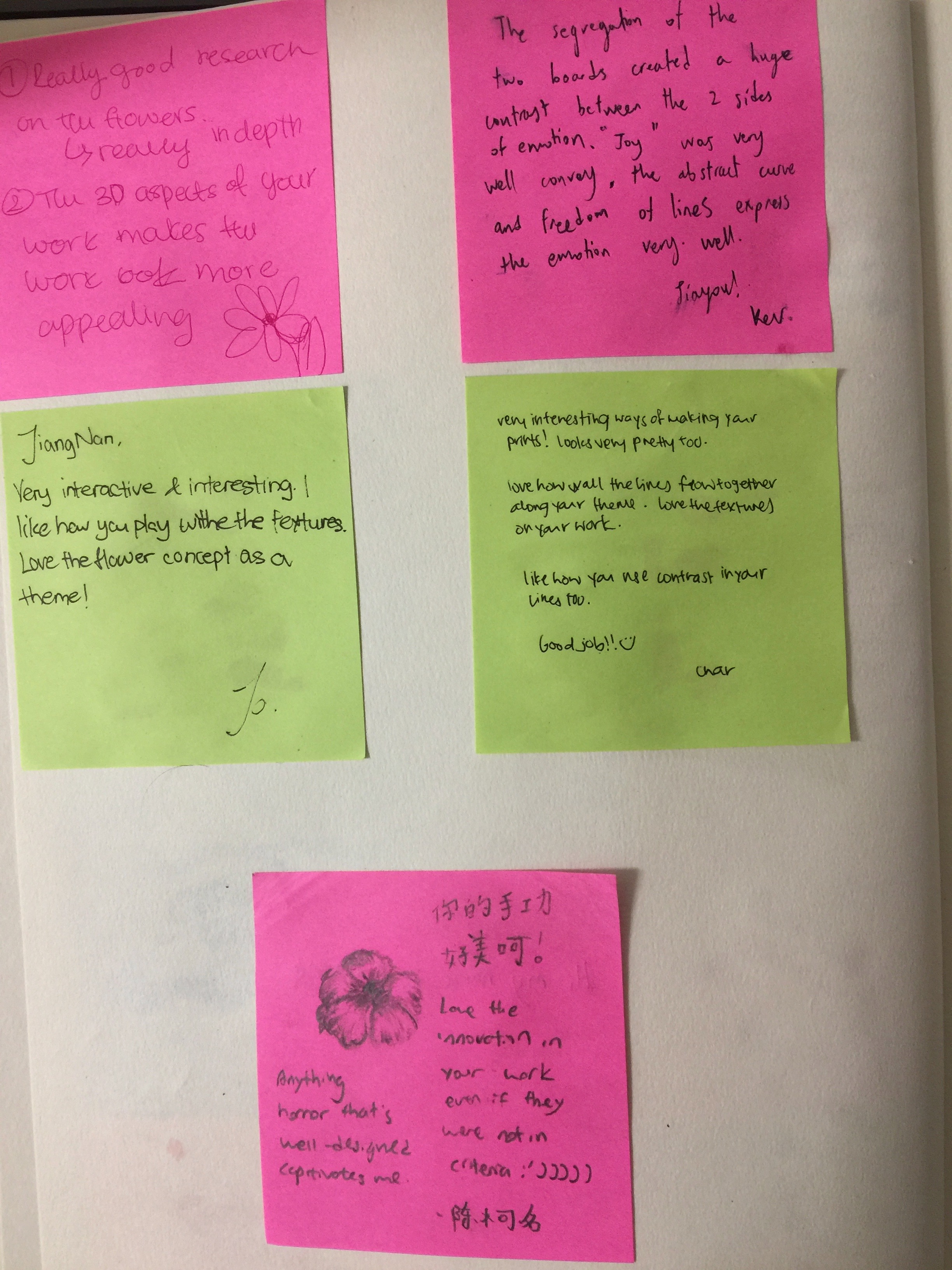
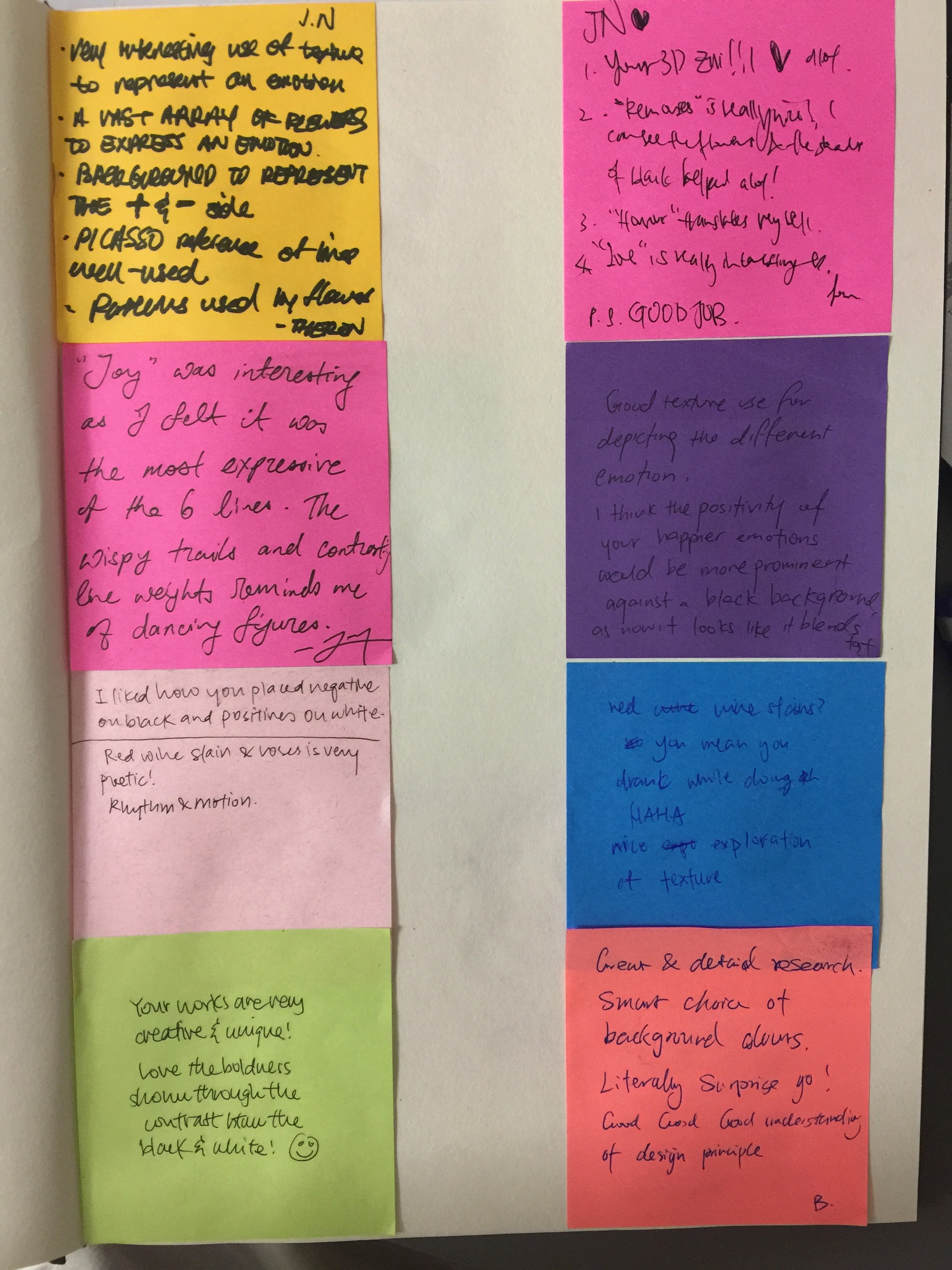
Feedbacks from ms Joy and classmates:
- Sensitivity towards texture and good utilisation of textures to convey emotions
- Variation in backgrounds and mediums
- Should use 3D objects as tools for mark making instead of the final product
- Good reference with regard to the painting
- Should adopt a more abstract approach to overall representation instead of how I feel subjectively
RESEARCH Artist:
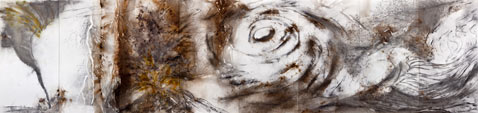
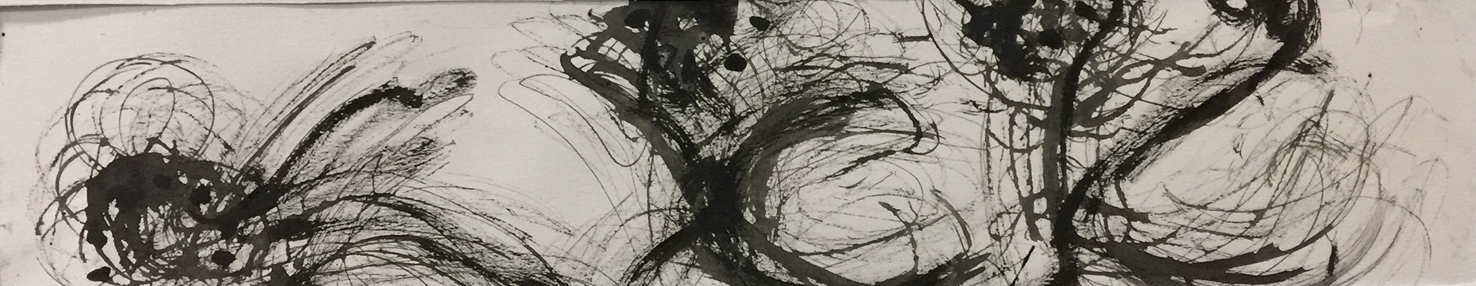
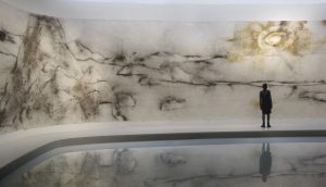
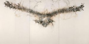
Cai Guo Qiang
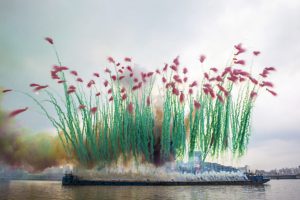
Cai Guo Qiang is a Chinese artist, famous for his artworks made by inflaming gunpowder. His main motive is to investigate both the destructive and constructive nature of gunpowder, and introducing this unconventional methods to create contemporary art that centred around chaos.
I personally feel that his artworks touch on the idea of “spontaneous reaction” more than aesthetic beauty because how the artwork will turn out to be is unpredictable. Perhaps the process of creating art is more important to him because he actually invites audience to speculate the performative explosions caused by the gunpowder. The reason why he choose gunpowder is also well-respected, out of patriotism as it is one of the greatest inventions China had.
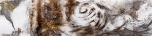
What I hope to extract from him, is how he link the medium to what he adore. He is a prominent nature-lover, evident from numerous paintings he did on villages, sceneries and the environment. In fact, one of the most beautiful and admired installation of his work is “unmanned nature”, a 45 metre-long, four metre-high gunpowder drawing. My favourite is “Chaos in the nature” because I feel like the explosive pattern resembles a flower or cloud by accident, and is intimidating to look at. Perhaps it might be helpful because my theme also relates to nature; flowers. Explosive nature of the gunpowder would also mean that I can take into consideration some of the possible presentation and organization I can adopt when I use flower since they have quite a similar appearance.
References:
Cai Guo Qiang’s painting with reference to:
Exhibition: ‘Unmanned Nature’ by Cai Guo-Qiang at The Whitworth
Images of flowers and meanings with reference to:
https://www.theflowerexpert.com/content/aboutflowers/flower-meanings
https://www.almanac.com/content/flower-meanings-language-flowers
Image and information of “Nude Descending a Staircase” with reference to:
https://en.wikipedia.org/wiki/Nude_Descending_a_Staircase,_No._2