Pandora’s Box: 2D Sketch Model of My Fabulous™ Hairdryer

Hello! This is Niki making her first Foundation 3D post about her wonderful hairdryer. Have some pics first:

Philips Hairdryer, Side view
Philips Hairdryer, Front view
Philips Hairdryer, Back view
Philips Hairdryer, Top view

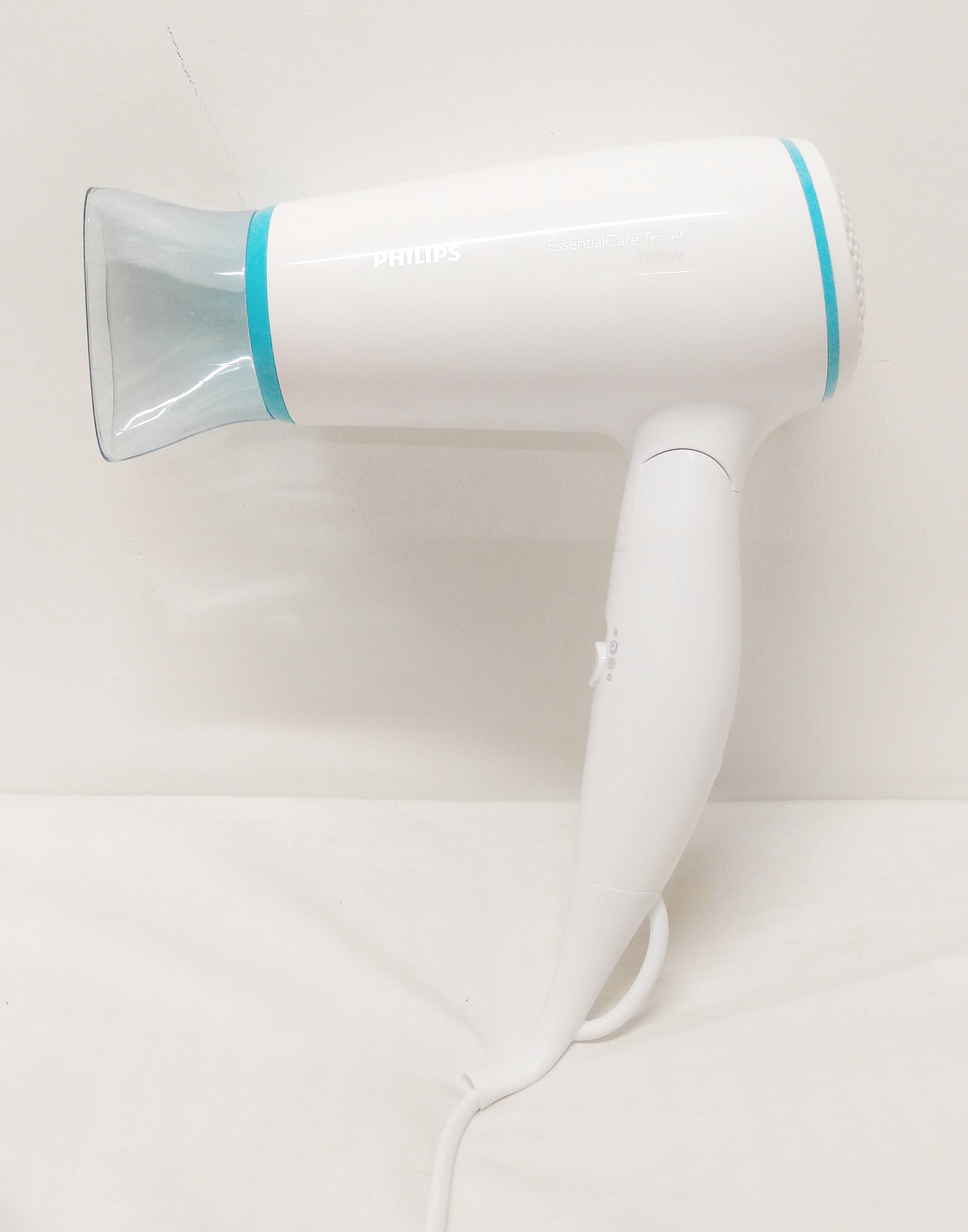
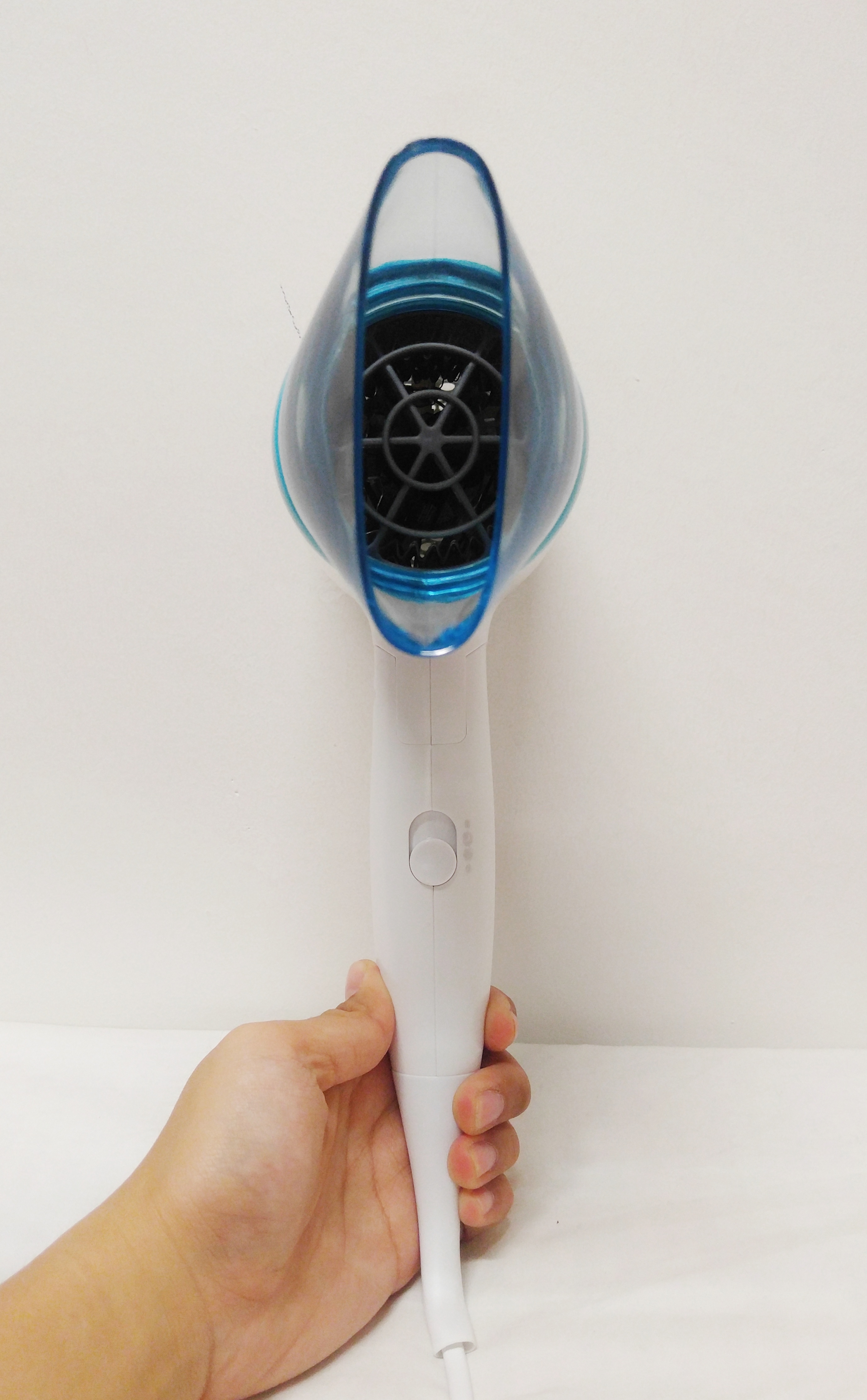
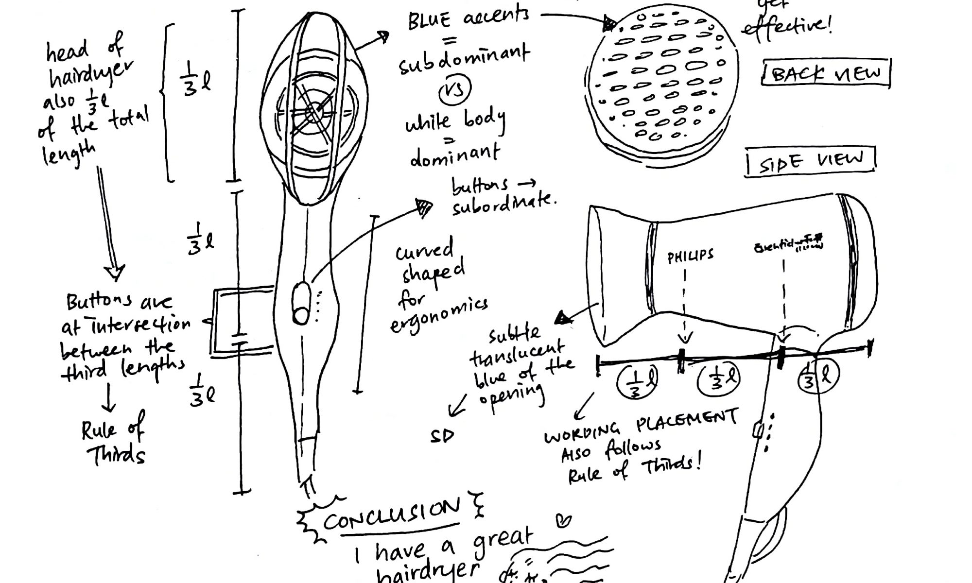
No, they weren’t edited to make it less obvious I took it on my bed in hall lol?? Everything was just that white. Anyway, I took it on a whim the night before the class because it seemed to be the most interestingly-shaped thing in my room which was not a high bar considering how dull my room is :// But the more I examined it after Cheryl mentioned things during class, the more interesting I found it!! By the time my presentation was over my hairdryer was the star of the room for like a few cool seconds. Here’s my 2D sketch analysis of my hairdryer:

2D Sketch Analysis of Philips Hairdryer

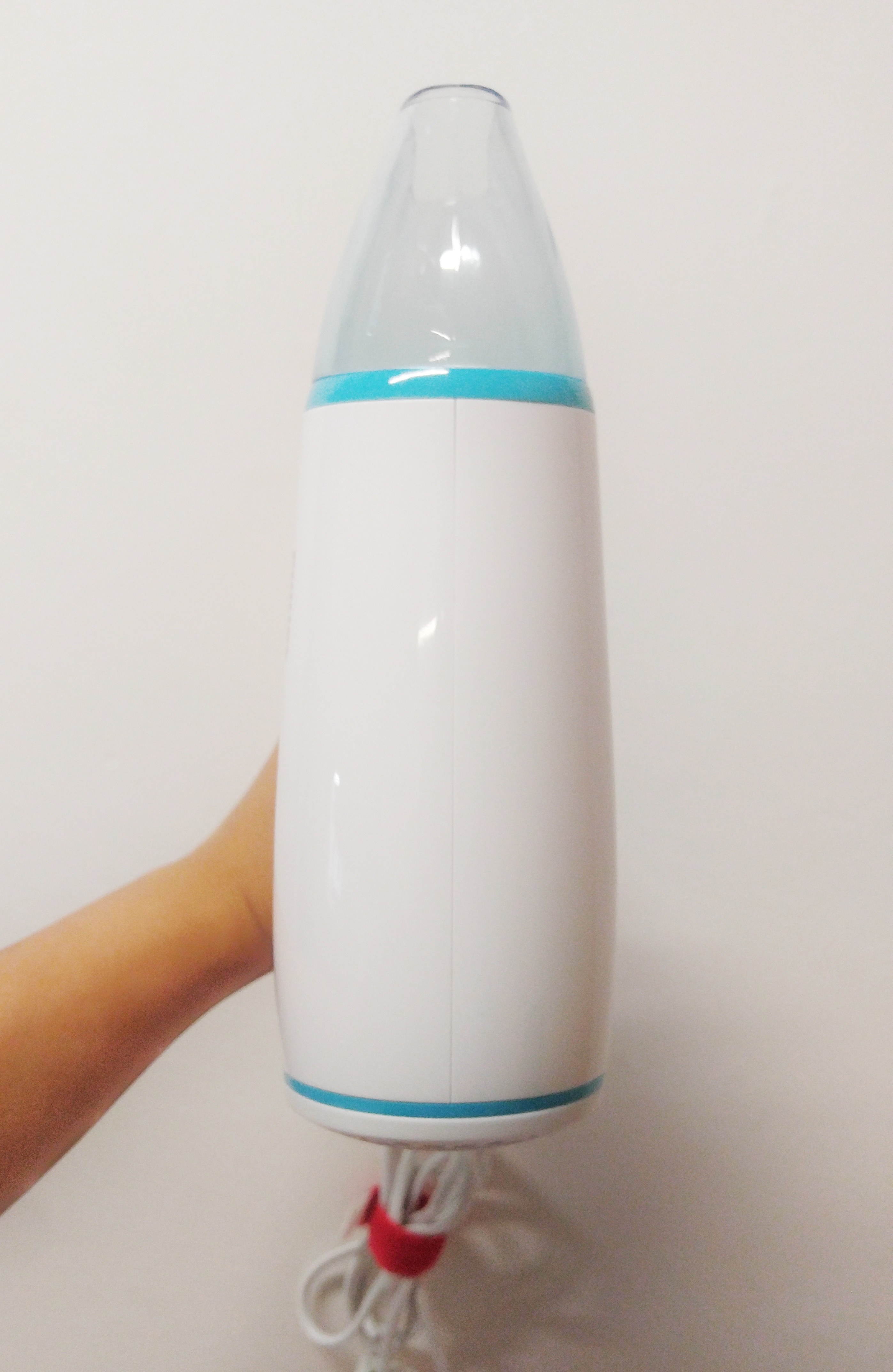
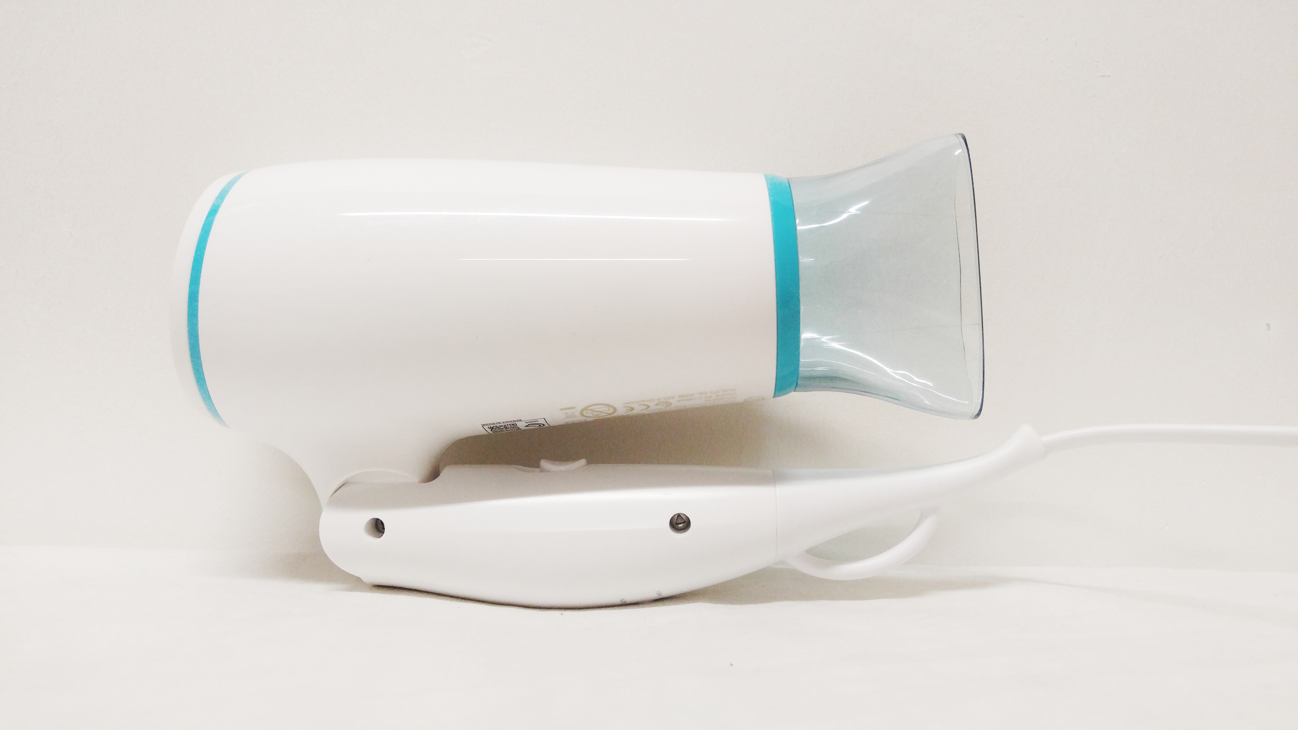
Something super cool about the hairdryer is also the fact that it has a foldable body so that it can be compacted for travel and portability! It looks like this after folding it completely:

Philips Hairdryer, Folded, Side view

I don’t think the dominant or the subdominant relationship changes when it’s in this state, but I do feel that since the button that was subordinate is hidden when the body is folded in, more attention is drawn to the bolts at the side, so they replace the button as the subordinate. However, from the opposing side of the hairdryer there aren’t any bolts, so my theory isn’t very strong haha. If it were viewed from the opposing side I think the translucent blue of mouth of the hairdryer becomes the subordinate. Which I think is interesting because even though it takes up more area compared to the blue stripes, the blue stripes still catch your attention more probably because they have brighter colours.

Overall, I think the blue-white scheme of the hairdryer was a good idea! Seems a bit basic but I think this colour scheme is something that resonates a feeling of no-frills reliability and usefulness. There’s also a lot of ‘Rule of Thirds’ going on in the hair dryer which is probably why the overall design of the hairdryer is pleasing to look at.  It makes me want to dry my already dry hair. I also really like the attention to detail, like making the inside of the hairdryer blue too even though no one ever thinks of looking inside a hairdryer, and the small loop at the end of the hairdryer so that I can hang it up if I want to! I always think that all the little things really make or break the big thing.

Next up I’ll need to work on my 3D Sketch Model about the theme ‘Complementary’. I’m still stumped but I guess I gotta think out of the BOX AHAHAH get it GET IT sorry its 1am and I’m tired from a day of work. See y’all (whoever is reading this………..) next post!

– Niki

My Line is Emo: Mark-making Research

Hello world!

Okay this is very scary because I don’t write blog posts and I tend to run my mouth so I have to keep a watch over what exactly I’m writing in these posts because it’s open for the WHOLE INTERNET TO SEE haha.

Anyway, it’s my first week in Year One in ADM (and such a big workload already dear god) and we’re going to be starting the semester with mark-making! We were given a list of artists we can draw inspiration for mark-making from so I’m going to be documenting my research on a couple of these artists so I can make really marky marks.


The first one on the list is Ed Moses, specifically his drawings from the 1960s and 1970s. He was considered a central figure internationally in innovative artwork, and experimented wholeheartedly with different styles and ideas. I think a lot of his work involves layering and grids.

Ed Moses – Mouse. Picture taken from RadiusBooks.

This piece is titled Mouse. I really like the colour scheme that reminds me of a marble texture, with stark geometric shapes interspersed with the background. Despite the contrast, I don’t feel that the geometric shapes interrupt the piece, but rather complement the rough and textured feeling of the rest of the piece, resulting in a soothing yet interesting piece. I may use the idea of contrasting shapes and textures in my mark-making. No idea why it’s called Mouse though but whatever floats your boat Mr Moses

Ed Moses, Untitled colour lithograph on two sheets. Picture from Simultaneous Visions

This next piece from Moses inspires a really different feeling! However I think the theme of contrast and shapes still run through this piece. The harsh, angled black lines form a grid over a blue backdrop. The idea of the overlap suggests a form of transition in emotion from tranquility to something akin to rage or anger. I like the grid pattern a lot and I might try to replicate it in my mark-making!


The artist I’m researching next is Emma Kunz, who was a Swiss spiritual healer and artist. Her drawing are really interesting and abstract, and were meant to inspire healing, and were even drawn using radiesthesia, something that refers to the spiritual aura/radiation from our bodies. Too chim for me to understand LOL

Emma Kunz, Unknown Title. Taken from www.ruthhoggerresearch.blogspot.sg

This really looks so carefully drawn oh my like one line out of place would simply ruin the whole thing. I can see why her drawings are linked to healing! The orderliness of the lines and geometric shapes are super satisfying and the colours picked like the light blue and yellow really are also calming to look at. It reminds me of  light refracting out of a raindrop, you know like that rainbow diagram. Not that Kunz was thinking of raindrops when she was drawing this but it just looks like it to me :v

Emma Kunz, Unknown Title. Picture taken from Invaluable

This one I think is really pretty! It looks like some sort of gemstone with rays of light shining out of it. Again there’s that theme of geometry and precise line placement that makes this amazingly soothing to look at. I notice that her drawings generally have a center around which the rest of the drawing springs/slowly connects from. Perhaps that brings about a sense of stability and tranquility. That would be useful for mark-making emotions :0


The last artist I’ll be conducting research on for now is Julie Mehretu, who is a renowned American artist known for her abstract works of art.

Julie Mehretu, Black City, 2007. Picture taken from www.nytimes.com

THAT IS DAMN BIG WOW I think if I tried to upload the picture in its full quality my com would crash. Anyway wow!!! That’s really something. Like while the painting is technically a bunch of intersecting lines, there is a very clear feeling of crumpling and folding of a certain mass, and the splashes of colours and lines makes me feel like I see life in the painting, and not just in a detached way, but perhaps in the sense of a busy society or city. What an apt name. I really like the sense of chaos travelling-on-a-highway thing. Don’t ask me about the highway thing I just feel like there are highways in the painting :// I feel like her line placement is unexpectedly careful. I’ll perhaps use this as a reference for the emotion of excitement or life in my mark-making!


Okay that’s all for now. I can’t go on any longer or I’m gonna pass out and shut down lol good luck to me for the rest of the semester!!! Dream sweets :)))