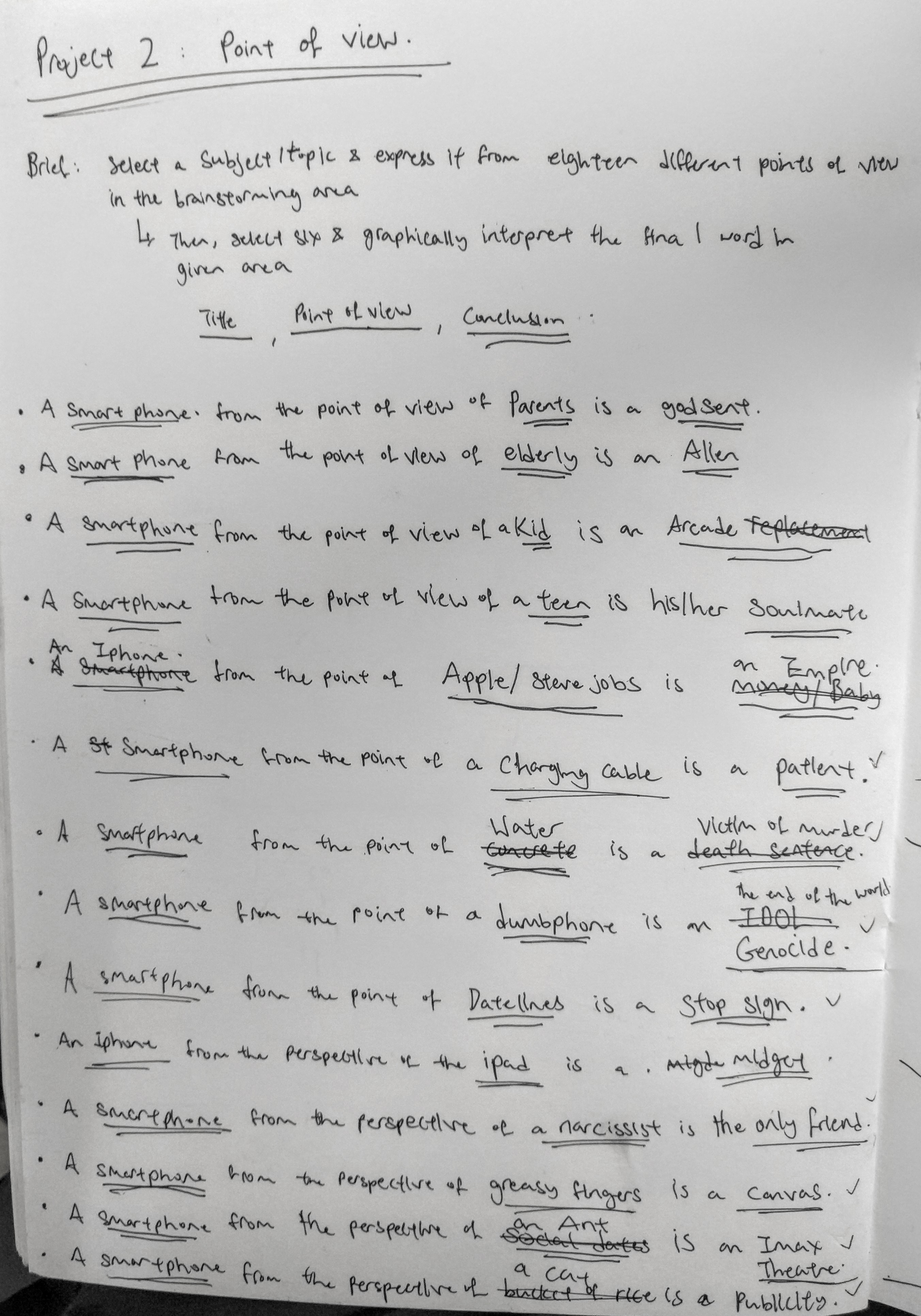
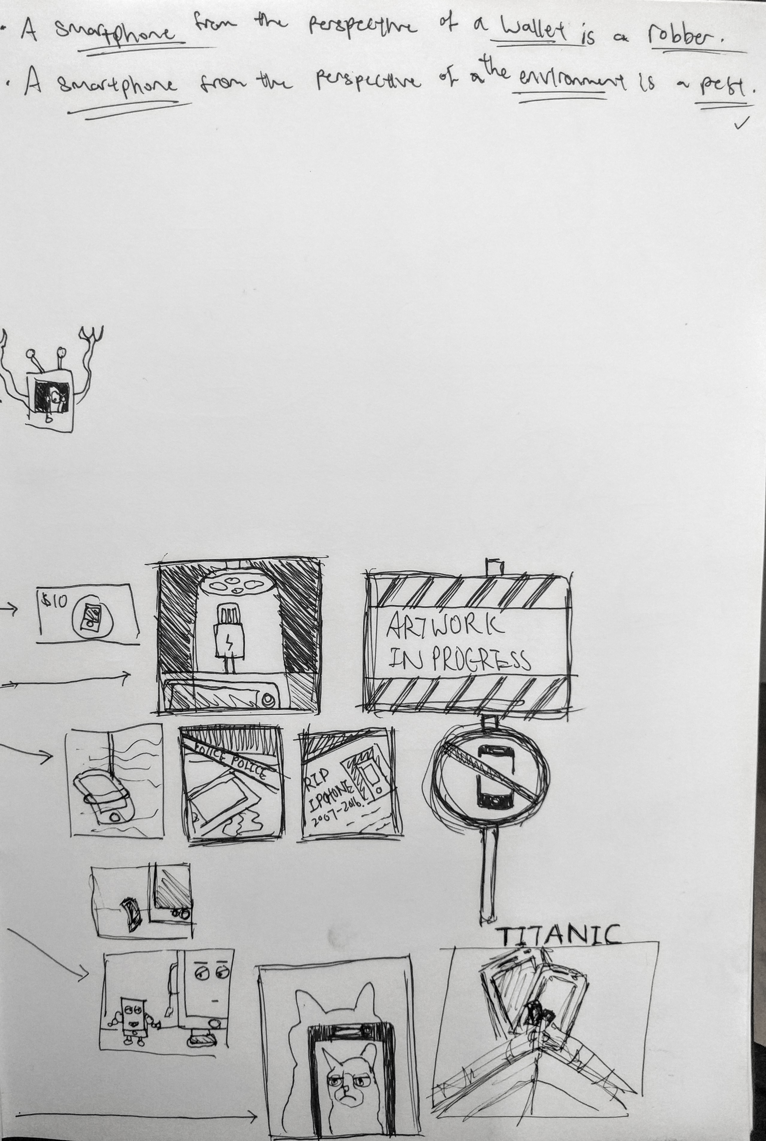
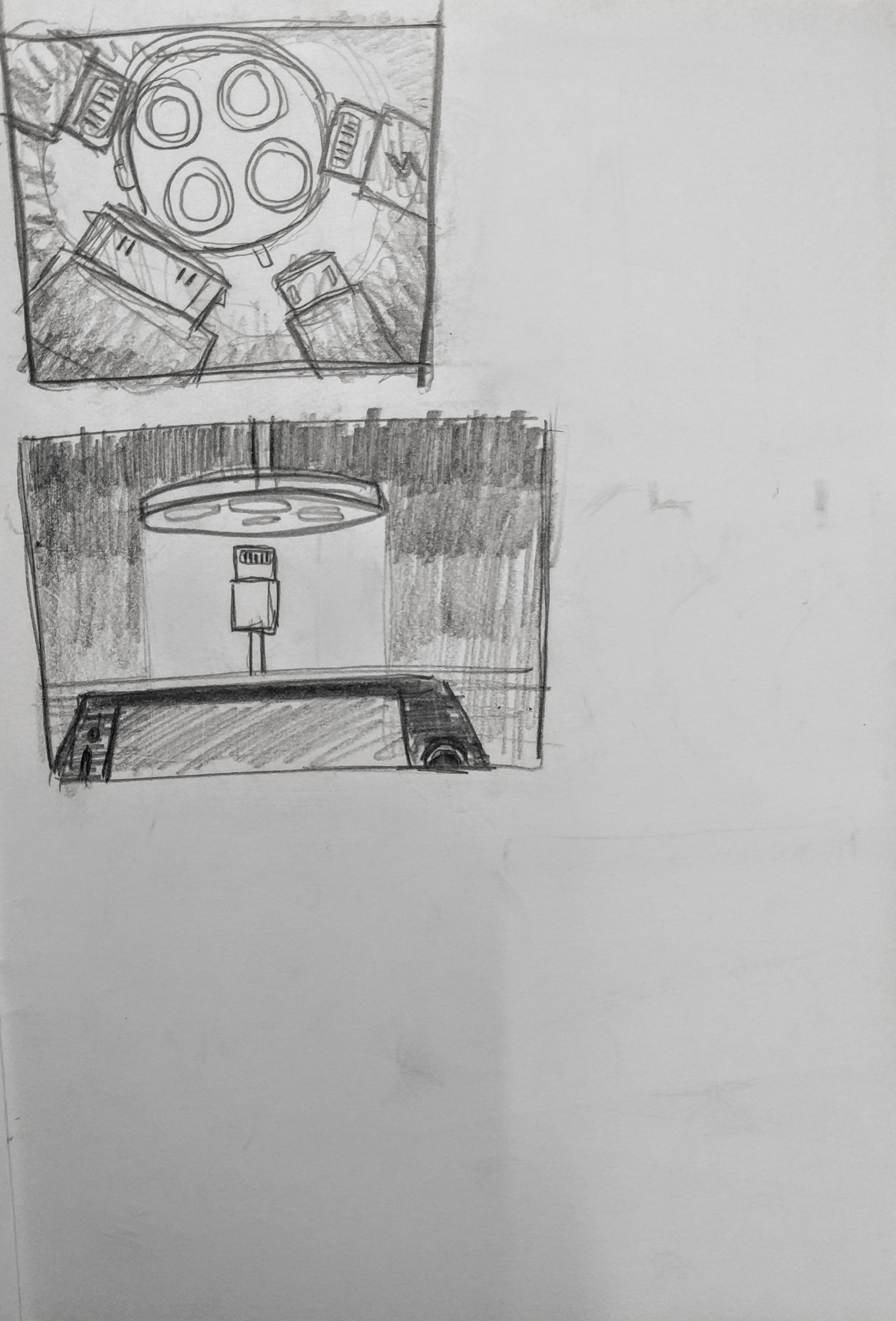
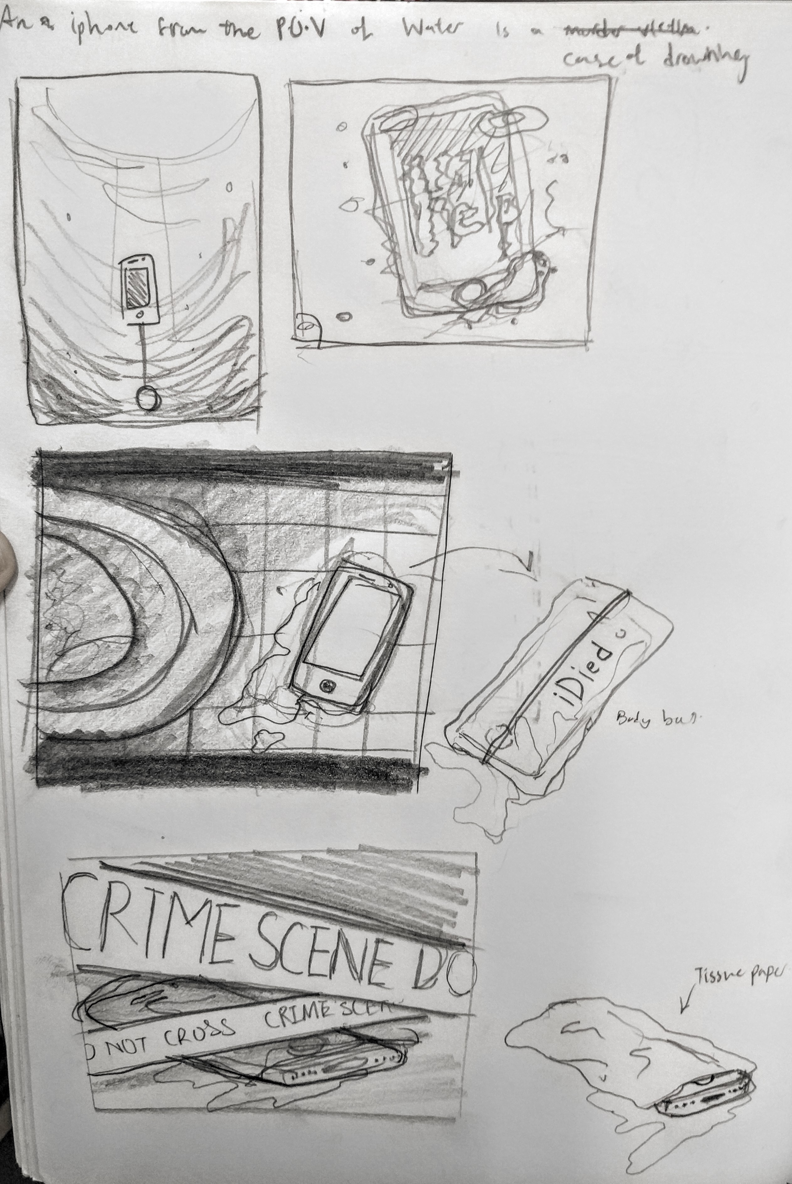
After my initial process… I GOT STUCK, LIKE LEGIT .

Truth to be told, there was no sketches done for the final project because of TWO reasons:

  1. I had no idea of what exactly I wanted to showcase.
  2. I spent most of time the tinkering and trying to make sense out of InDesign software. It killed me.

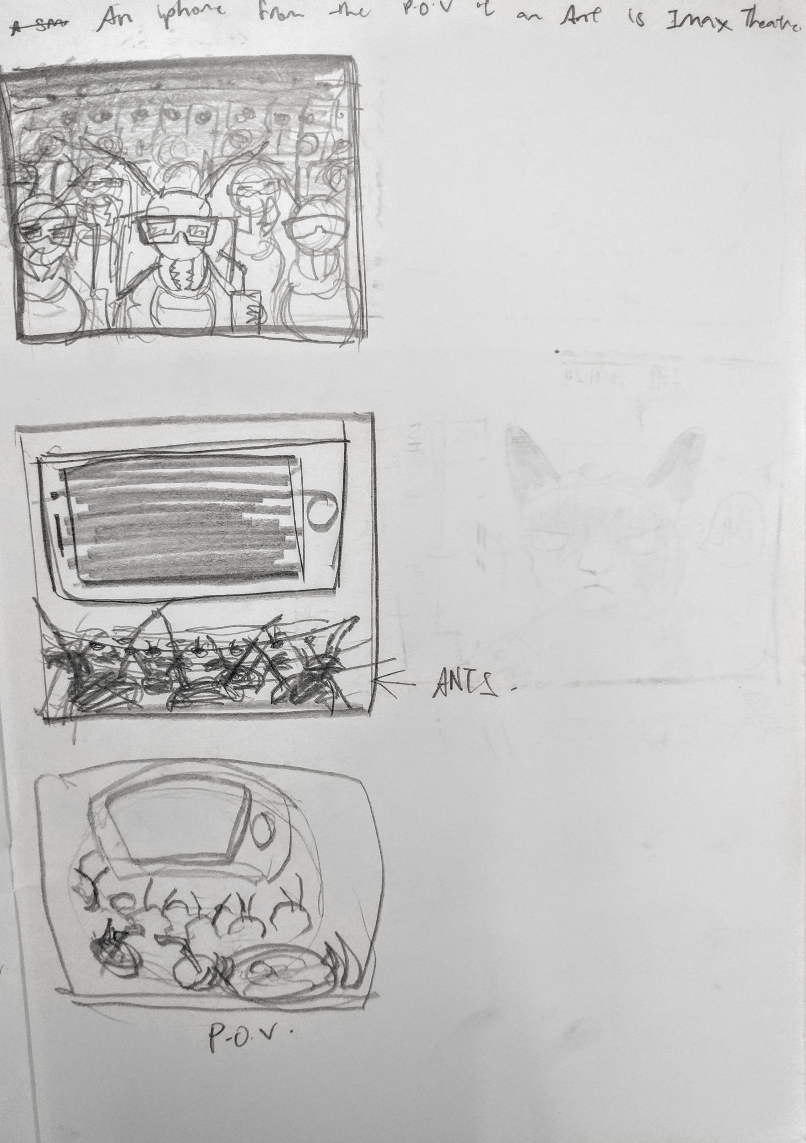
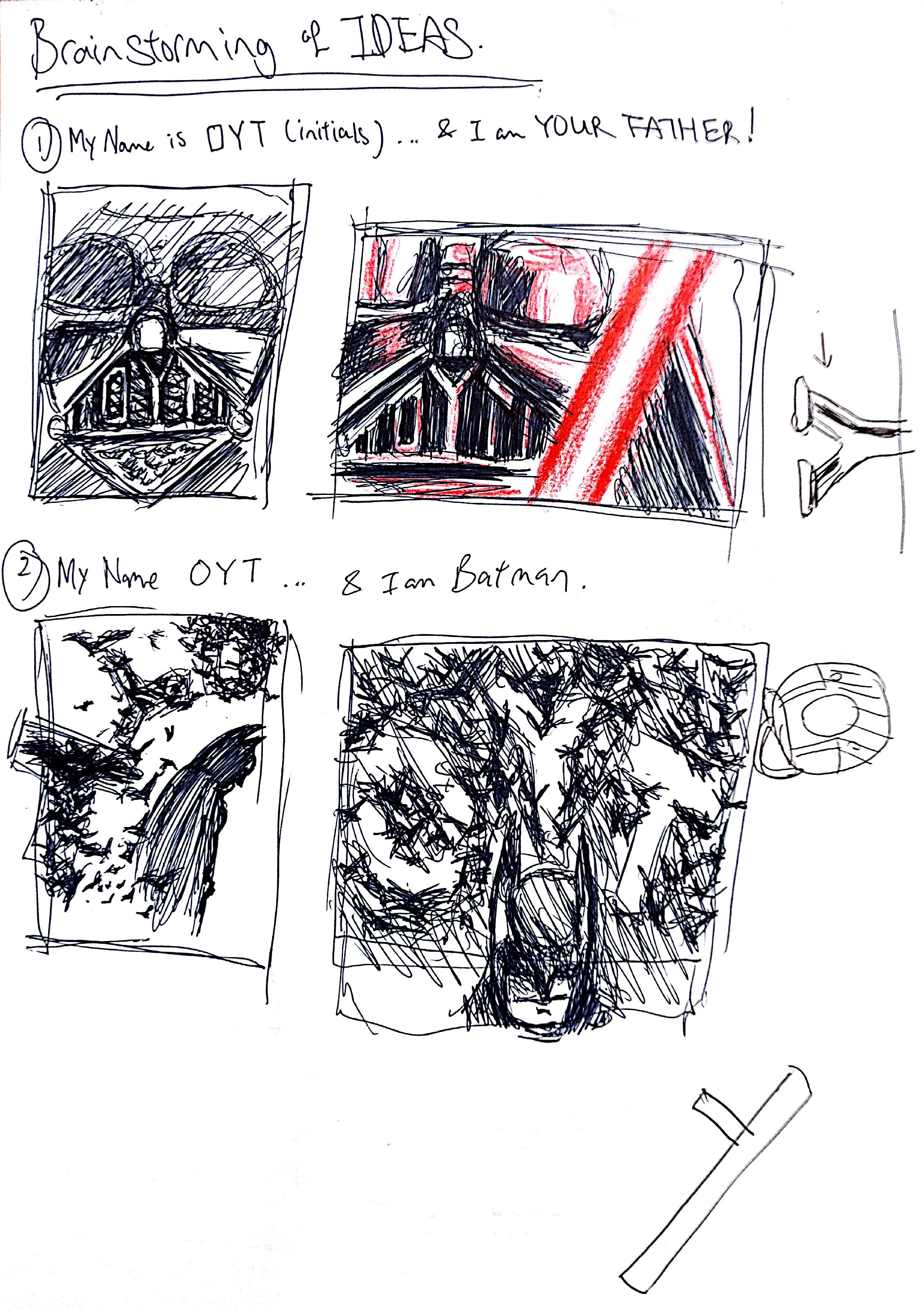
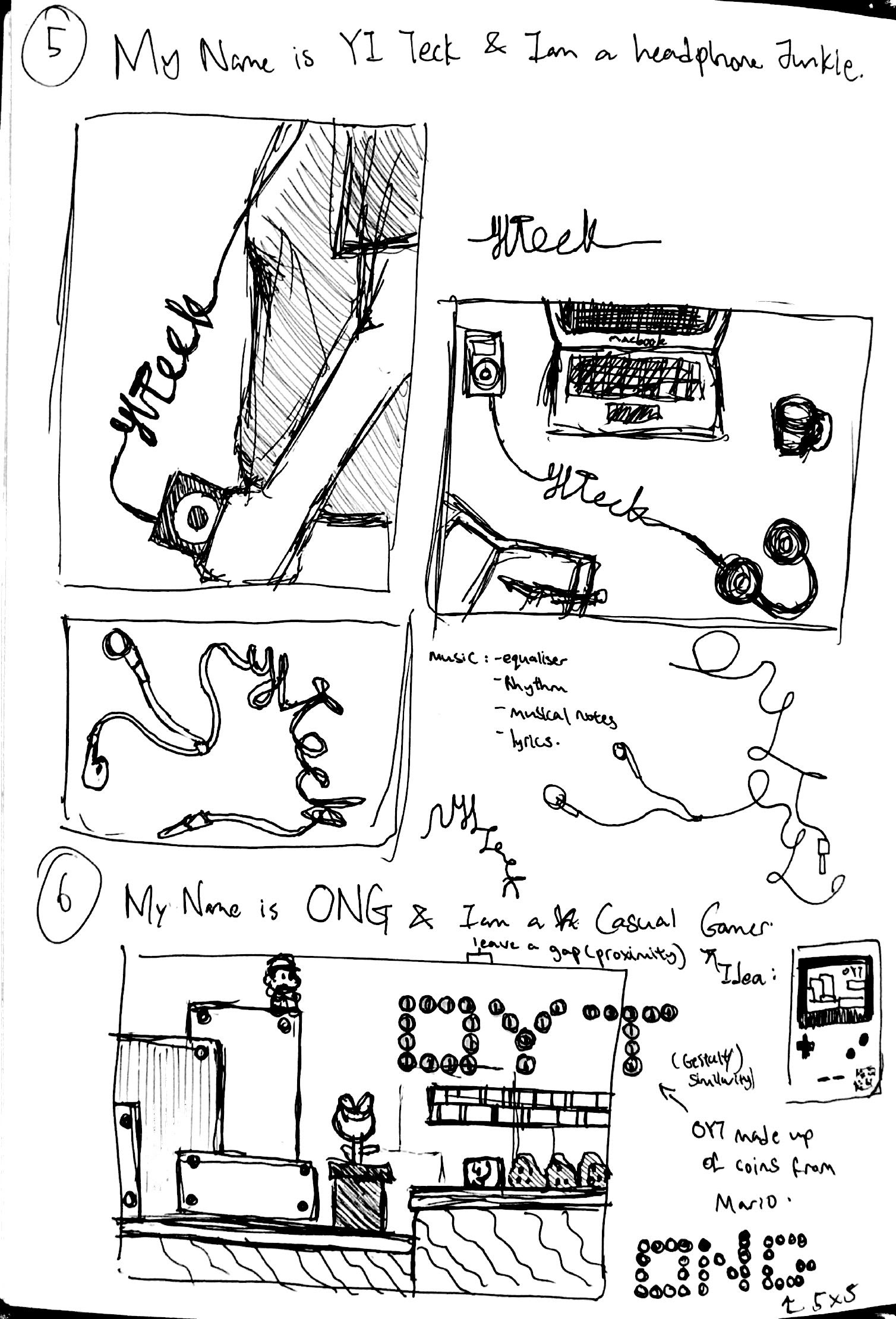
Either ways, it has not been a smooth sailing process in coming up with my zine but then again, when was 2D ever smooth sailing? Therefore, i am going to share with you the initial spreads that I came up with and my thought process. All of these images are screenshots from earlier versions of my Zine.

PROJECT 3

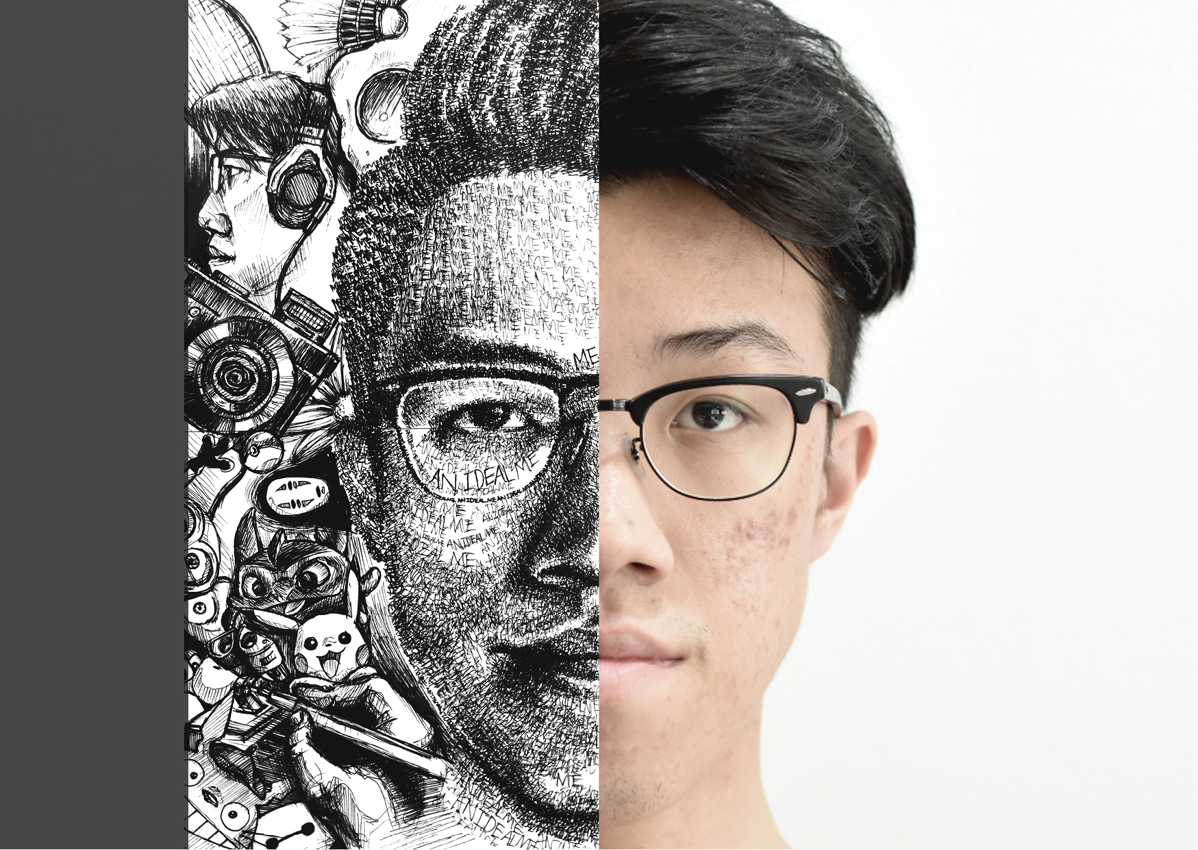
This was my initial front and back cover (which is now a spread inside the zine itself). Getting the inspiration from an online zine I saw, I wanted to create something minimal yet attention-grabbing and i thought by having half a face present on the front page might do the trick. And to complete it, I then juxtapose it with the ego project i did as a back cover.

PROJECT 34

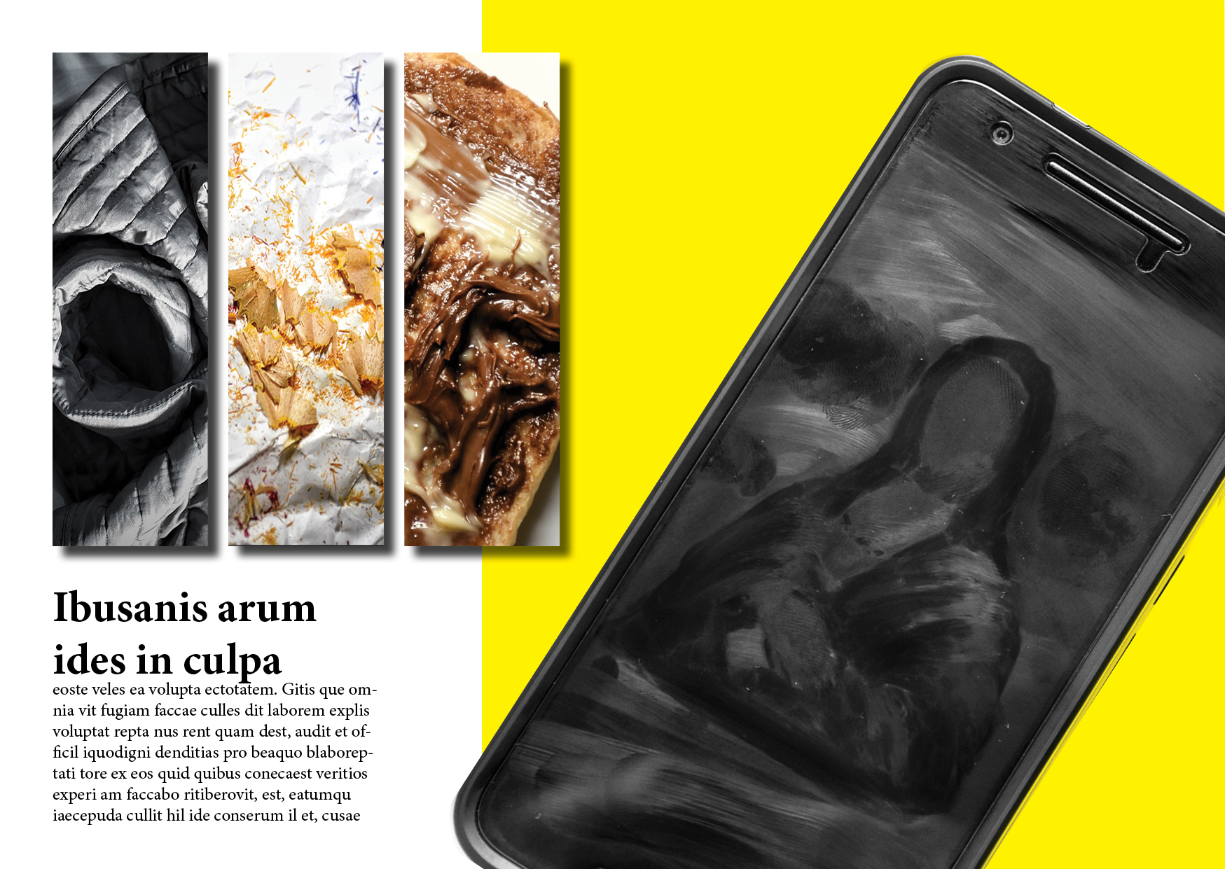
I played with the type of layouts and experimenting with rotation of an element, adding drop shadows and adding colors for the background. I thought it looked pretty okay at first but I realized that it lacked coherence and it seems too cluttered for my liking. In the end, I decided to split this spread into two separate spreads.


PROJECT 33

This was the only spread that remained largely unchanged in terms of its layout. However, after consultation with Shirley, I decided to take her advice and change the fonts used for my text into something more modern and less formal.


PROJECT 32

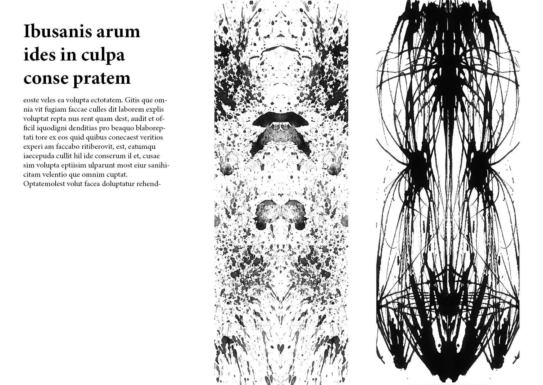
The idea for this spread is to transform the artworks from the first ever project into something more dramatic and interesting. After much exploration, I decided to rotate the individual strips to vertical orientation and have it mirrored such that it intrigues the viewers more. As you can probably see by now, the initial spreads were all pretty bare-boned and boring looking because i did not know how to incorporate colors correctly then.

That’s basically my process in a glance. Do read my final post for the final zine and my thoughts about it.


Truth to be told, there wasn’t as much exploration in this project as I was pretty much able to visualize the designs that i wanted right from the start, after i have made my 6 choices of point of views. Nevertheless, here are some of my thought process in my journal.

IMG_20160321_215728 IMG_20160321_215747 IMG_20160321_215759 IMG_20160321_215809 IMG_20160321_215832 IMG_20160321_215841

Disclaimer: What you are about to see in this post are 90% sketches and rejected work. You may not be able to decipher what my thought process is my looking at the messy work ( messy happens to be one of the final 4 compositions, coincidence? ).  

My normal routine for projects is that I dive straight into some rough sketches of the ideas i have in my mind, before they slip away. So, below is a showcase of some of the initial ideas i had.


1st Wave of ideas

image(4)


image(2)


image(6)


image(1)

So far these are the ideas I had in the early stages of developing some typography art works. My general approach at first was to draw illustrations that would have the fonts embedded into an image that depicts an actual scene or character… BAD CHOICE. I got so engrossed in creating these illustrations that my attention drifted away from the main focus which is the actual typeface it self!!!


2nd Wave of ideas

The second time i brainstormed for ideas came out like thrash (AGAIN! ). Apparently i couldn’t grasp the concept of typography portrait. What i envisioned seems to be too graphical and literal which is the complete opposite of the projects requirement.

image(3)

After consulting my tutor, i realized that the trick is to settle with the typefaces first and then slowly incorporate elements into the letters itself, giving it some sort of a character that would describe the desired meaning. OH I SEE… …

ITS LIKE A HUMAN PORTRAIT: DRESSING THE HUMAN UP WITH CLOTHES TO DESCRIBE THE OCCUPATION!!!

should be “TYPOGRAPHY’s PORTRAIT”


Drafts and rejected ideas

After I realized my mistake, i decided to take a different approach for my project. I decided not to do illustrations for this project even though it is very much my style to be drawing most of the time, as i feel that there is a lack of consistency and i tend to drift off from the objective. Also, I did not take on the Photoshop route either BECAUSE I SUCK AT IT. I tried though, and you will see some of the works i did thru Photoshop.

What I planned to do afterwards is to take actual photos of various materials that are manipulated to form the fonts.

AT THIS POINT, ANOTHER IDEA CAME INTO MY MIND>>> TO MOUNT THE FINAL 4 COMPOSITIONS INTO AN “INSTAGRAM FEED”.

since they were all going to be photographs, i thought it would be interesting to present my work as actual posts on social network, which is very much treatable to the majority today.


ANYWAYS, I will discuss more about the final outcome in the next post. For now, here are some of the work in progress and rejected ideas i had along this stressful journey…

headphones frb headphone junkie v1-Recovered battery v2 friedrice

snapseed-01pecil shaving final 2.0