Category Archives: Final Project

Project ZOO OF ODDS – Final

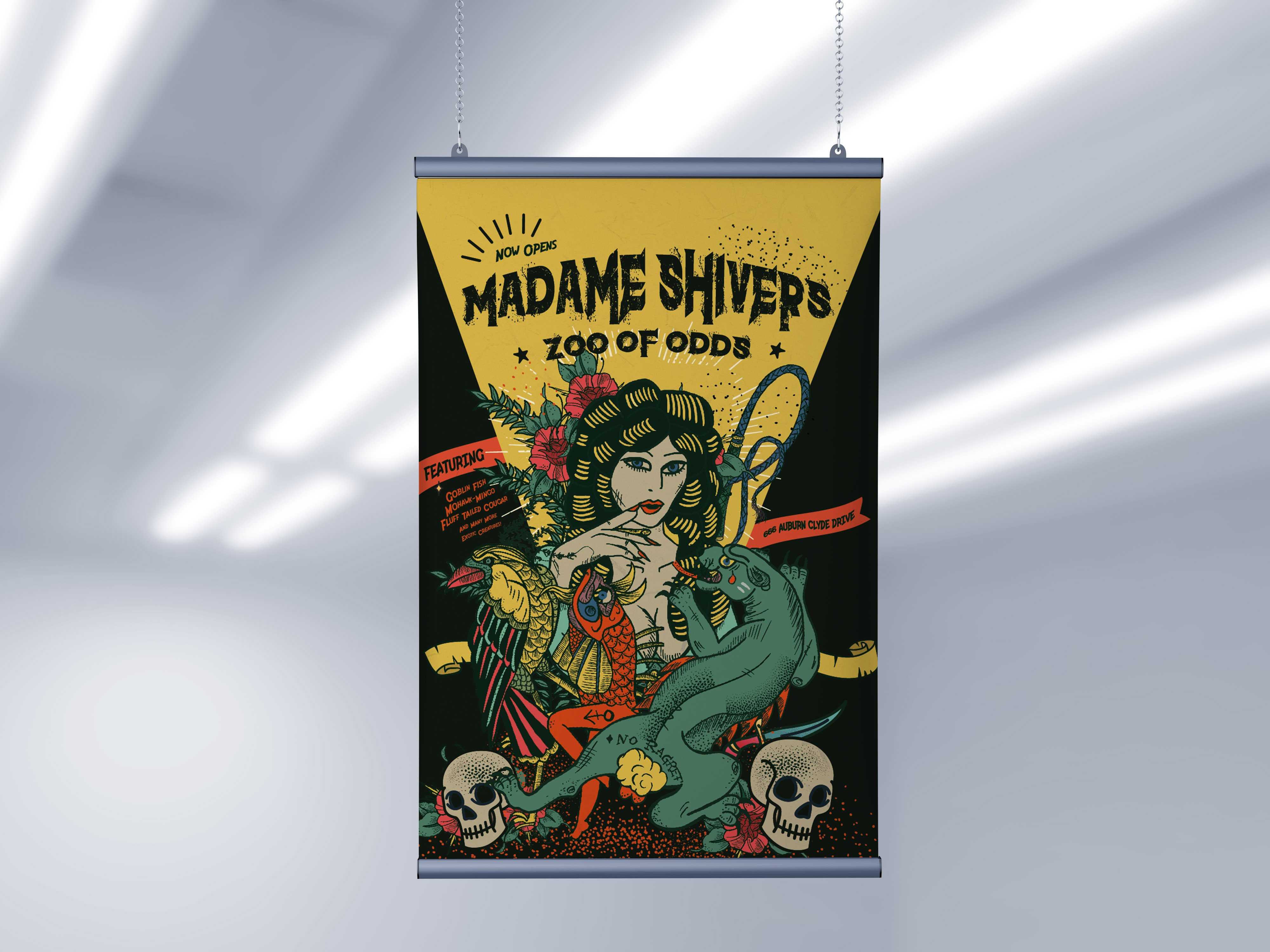
Collateral 1 – Exhibition Poster

Well, this will be the very first advertorial that people will be exposed to. Welcome to the Zoo of Odds, for it is now opened. The intended size is A2 and it will be advertised everywhere to make sure the zoo profit from all the money dumped into all these promotions.


Collateral 2 – Visitor Lanyard with Tag

The first 1000 visitors who purchased their tickets will receive this very special and of course, limited edition lanyard that looks super goth. I hope this lanyard helps to drive sales! Hehe. Please be enticed to come? 


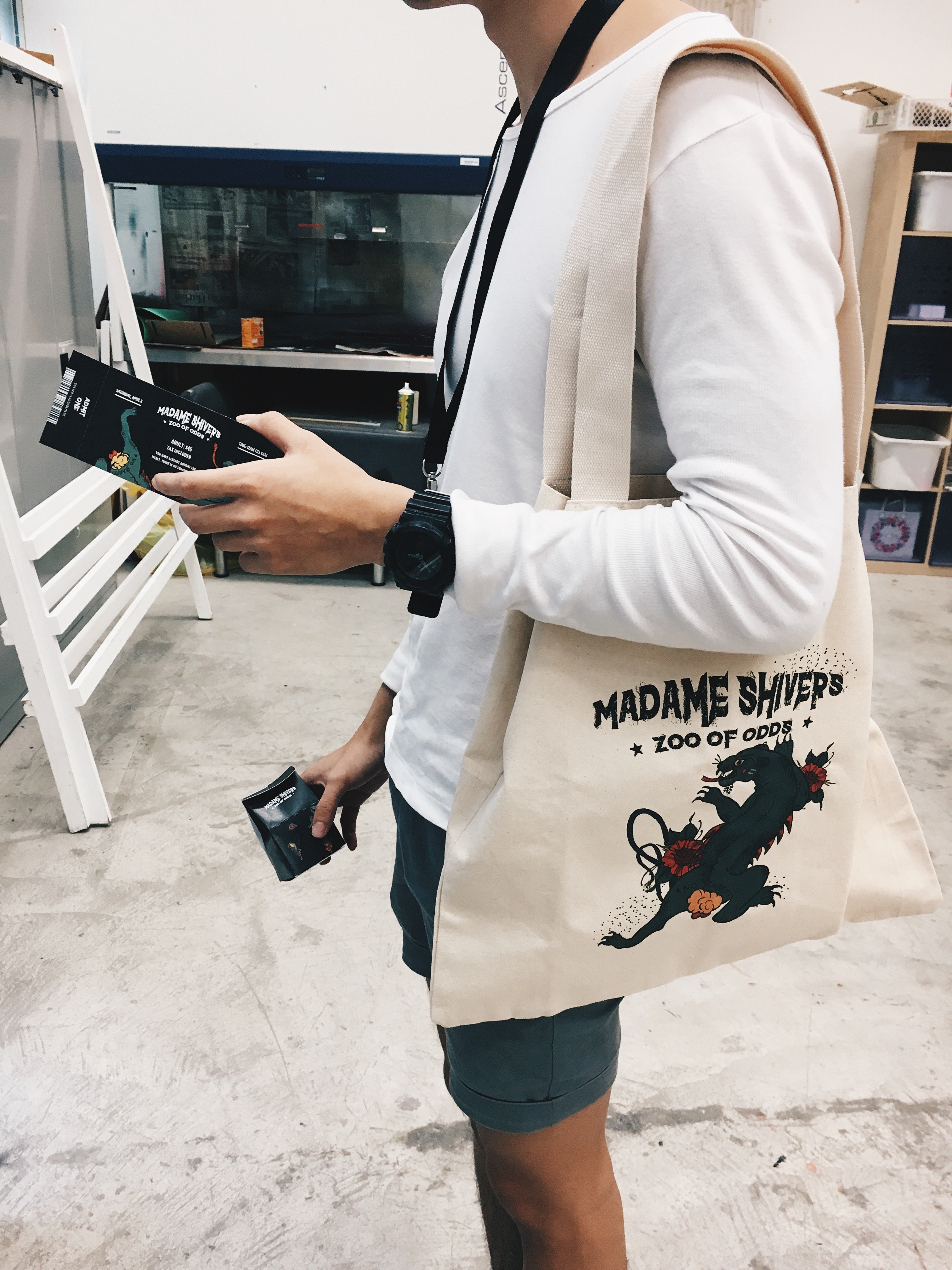
Collateral 3 – Tote bag merchandise 

The third collateral will be a collectable canvas tote bag that is sold at the souvenir shop, each priced at $44.40. These are some of the exclusive stuff you will find at the zoo of odds! (Cost price is $10 though, all profit goes to the maintenance and welfare of these animals!!)

Sample 1:

Sample 2 & 3: 


Collateral 4 – Entry Tickets

After the first 1000 cap hits, we will be distributing these tickets to each and every visitors instead of the limited edition lanyard. It can be used as a keepsake too, memorabilia from the never before exhibition.


Collateral 5 – Dark Cocoa Milk Carton

Visitors can locate this cute box of animal printed milk carton over at the cafeteria of the zoo exhibition. Collectors can purchase and even use the box as a form of memento or keepsake (that is if they wash it clean after the food consumption). Still preserving the whole “dark theme” across my collaterals, I thought this would be a cute add on to the whole concept of having a Zoo. 

Get your ultimate dark cocoa milk at only $6.90 – Available only at the ZOO OF ODDS okay. Give these exotic animals a visit, please!!


Documentation of some of the printed collaterals. Yay!

VAROOM – On final

Hello y’all! This is a post on the final outcome of my Varoom magazine cover design, with the chosen topic as “Obsession“. As a continuation from the research and conceptualising post, we will now be discussing the different aspects of my (hopefully) final layout design. To rewind back a little, my concept is based on the Japanese contemporary artist, Yayoi Kusama, who is often known for her bright red wig and quirky polka-dot ensembles, which is one aspect which makes her instantly recognisable. 

I was inspired but how strong a woman she is, as she overcame her many childhood trauma (which includes rape, gender discrimination, and several disorders), prejudice and mental illness to become a sensation late in life.  

“Kusama’s desire to create was always greater than her desire to die.” – this is one commentary about her which inspired me in so many weird ways, it makes me realise how tiny my problems are.

With this being my chosen idea, we will now proceed on to the execution + completion phase.


Watch my illustration progress in the videos below:


Here is the final layout on Yayoi Kusama after much corrections!


And here are some visual mockups: 


Read on my conceptualising process here!

Outcome – Self Portrait

Read my progress here: Click

Final Layout: Initial Progress VS Final 

I decided to frame my composition to something that resembles a Chinese calendar (I will insert a picture of it below) which is a reflection of my ethnicity background, especially being in a multi-cultural country, patterns and colours can hint at a certain tradition/culture. Therefore, with hues of red being the most prominent colour, I thought this can better bring about a sense of festivity especially for a time like now, ITS THE CHINESE NEW YEAR! 

P.S: It is my favourite holiday as I get to indulge in the most sinful snacks as well as receive money from Red Packets! Two of my most loved activities (Talk about a win-win situation!) 

The traditional Chinese calendar

The mandarin text in the border means “Food is life”, and the subtle details such as the date further build the impression of this being a Chinese Calendar. The dates that were written below signifies my birth date, a representation of the beginning of my life that reflects the ideology behind this advent calendar layout. More than just that, it is a reflection of my upbringing under the care of very strict and traditional parents. The traditional aspect, therefore, resulted in my personality as I am just a ball of shyness. The portrait is shying away to the right side to support my personality trait as forward facing portrait kind of suggest strength and confidence.

The random collage of food items in the background just brings out the quirkiness and vibrancy of my character as well as the stylistic aspect of hand drawing and detailing of the food packagings that brings out the personalised aspect of this portrait. 

Challenges faced:

As I attempted the food illustrations on the Ipad, I had to ensure that the brushes and colour scheme is seamless throughout each and every food packaging drawn. Restriction can sometimes be seen as a challenge as well, as you are only allowed to work within a limited ground with very specific tools. Experimenting with colours was quite a journey as well! I designed multiple colour schemes before finalising with the one above – which I am eventually satisfied with! Also, conceptualising the overall idea and theme is one of the hardest aspects, in my opinion. Besides just realising a portrait, I want my design to be able to tell a “compelling” story. 

This is the end of my journey for project one! Thanks for following!