About /
Tokugawa period, also called the Edo period, the final period of traditional Japan, a time of internal peace, political stability, and economic growth under the shogunate (military dictatorship).
Why a Thistle flower /
“If your thought is a rose, you are a rose garden; and if it is a thistle, you are fuel for the fire.” ~ Rumi
Like its rough exterior, Thistle is the name of a flower that acquaints with aggressiveness, pain, protection and pride. The significance of a Thistle flower is defined as not only the flower but also its weed. Though the weed is commonly associated as a parasitic organism, it is valued to symbolise not just might and brilliance; but also poverty and weakness. Alike to the notable warriors during the Japanese Edo period, their role was to defend their territories against rivals, to fight enemies identified by the government, and battle with hostile tribes and bandits.
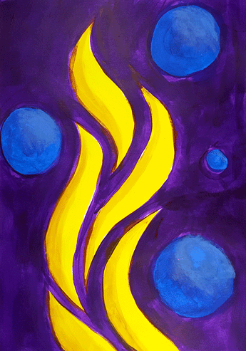
Overall, these Heroes are respected and worshipped because of their dexterity and heart for their people. This composition focuses on the retelling of Ancient Folklore in a campfire setting, where the fire is used as a repetitive motif that embodies the power of destruction, yet contains generative qualities to illuminate and renew — Just like these warriors.
Vertical Banner /
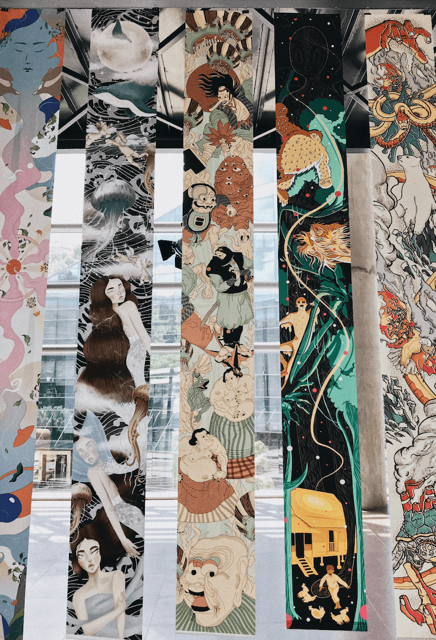
Cascading Banner – ADM Lobby
Media Wall /
For animated version: https://drive.google.com/file/d/1dowEcdiEXEaSHYOyVMJTKfWstxmYK17C/view?usp=sharing
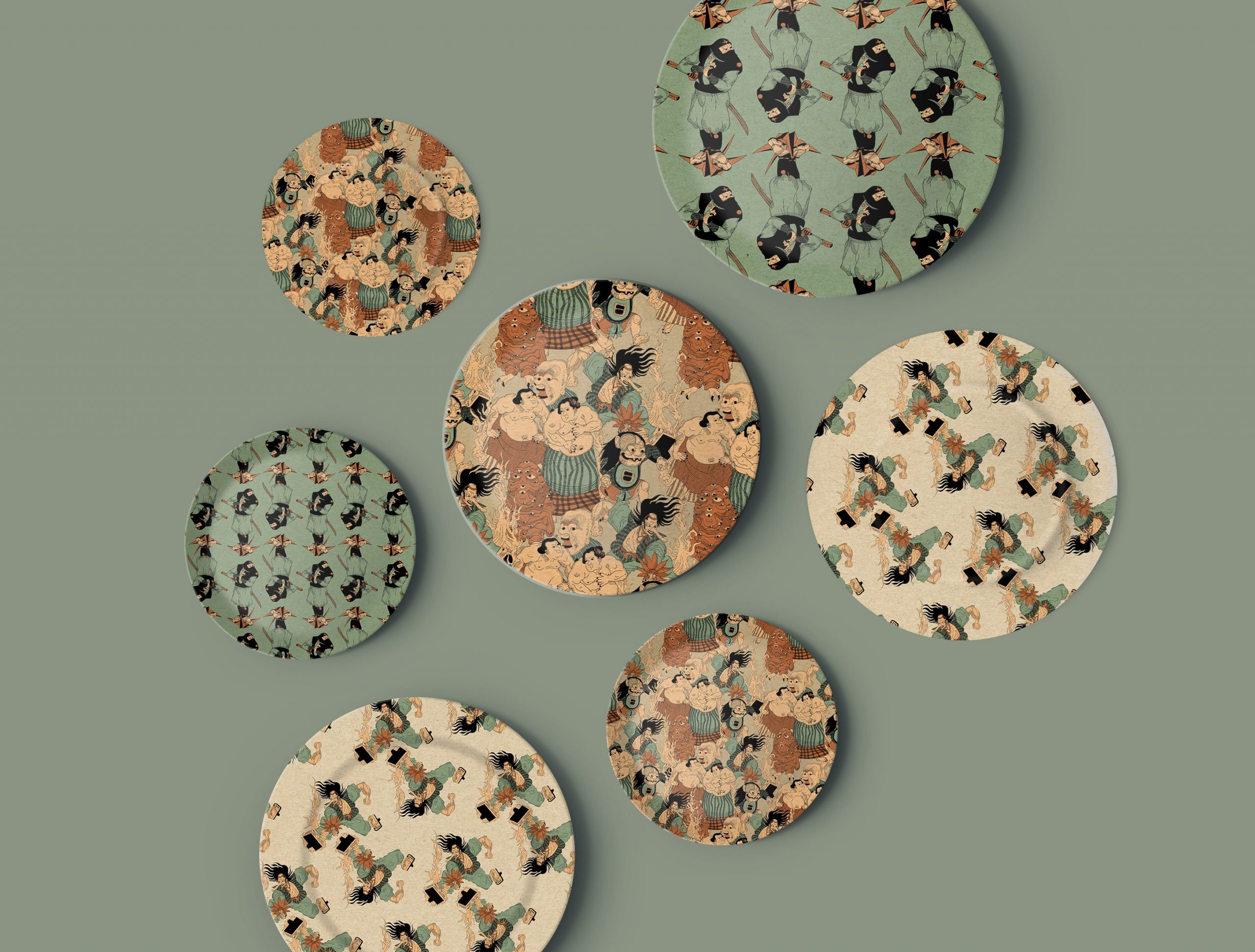
Mockups /
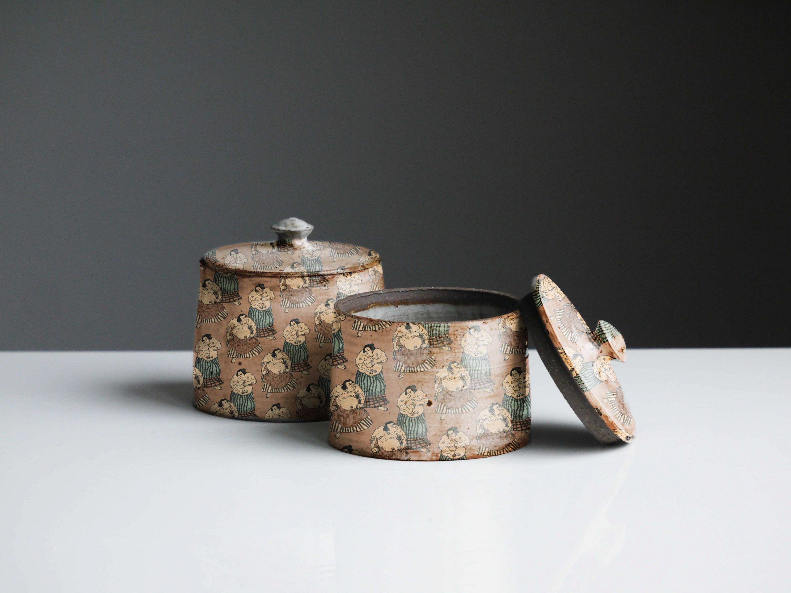
Japanese Condiment Bowl – ft. Wrestle of the Sumos
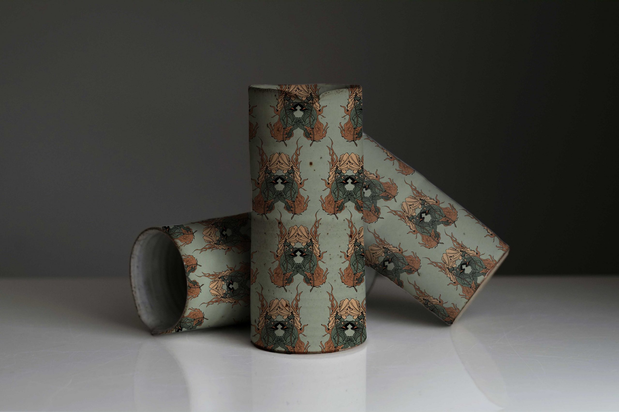
Artisan Ceramic Design – ft. Flaming Escape
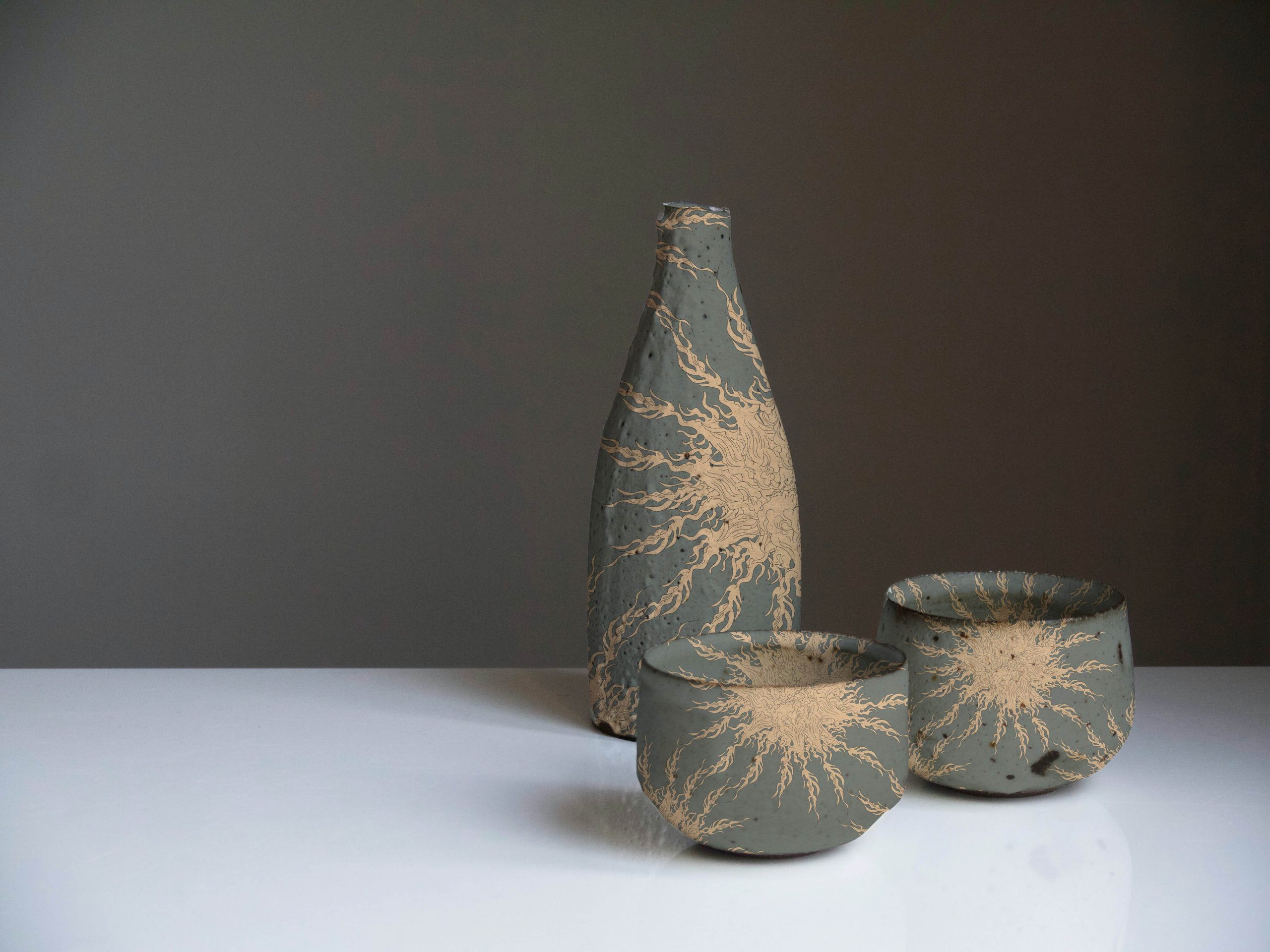
Ceramic Sake Pitcher w/ Cups

Ceramic Plate Collection – ft. assorted patterns
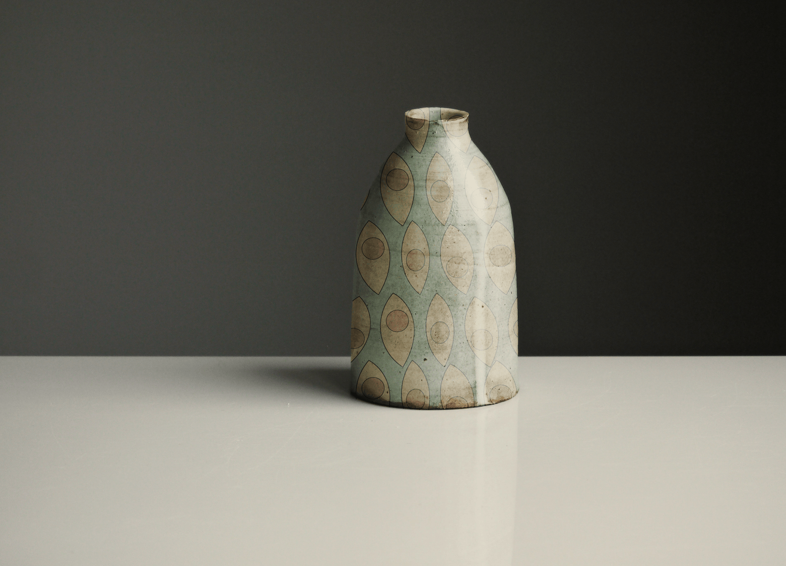
Artisan Vase – ft. Eye See You
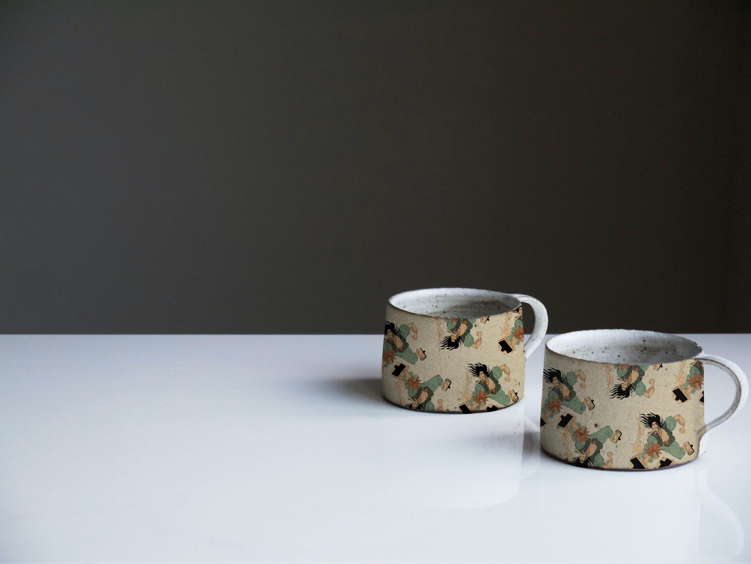
Ceramic Tea Cup – ft. Gunbai Villian
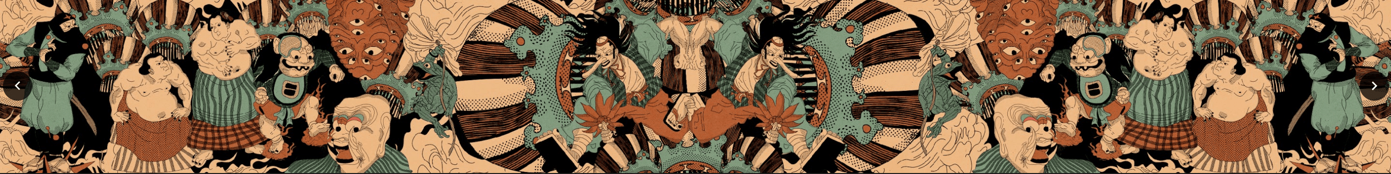
Patterns /
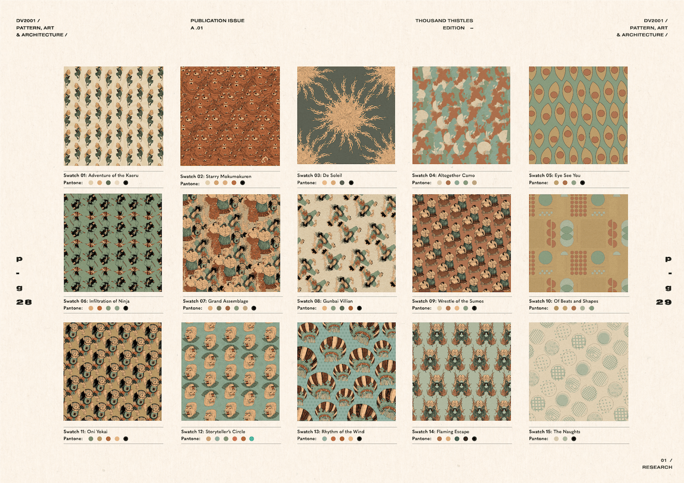
Pattern Swatches
Issuu Publication /