Introduction
So the task is to produce 6 lines to express various emotions.
The emotions provided are:
- Love
- Joy
- Surprise
- Anger
- Sadness
- Fear
and they can be branched off into Secondary and Tertiary emotions as well.
As for the method we have to use to create these lines:
Mark-Making
There are so many ways of mark-making, and an almost-infinite number of tools we can use. It became daunting as to knowing where to even begin.
Thus, I’ve decided to work backwards instead – by starting with the end-product in mind. The way and exact tool to use will then follow suit.
Research
Using the internet, i searched up on examples of expressive lines that others have created. Then, utilizing them as inspiration, I created sample products for each emotion.


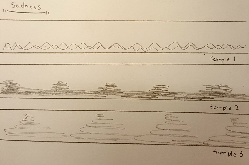
Now that I’ve got a general idea of how the marks will turn out, it’s time to consider the tools to use.
Literally anything can be used to make a mark on a piece of paper, and that is quite intimidating as i don’t know which tool to even start with. Therefore, I’ve decided to narrow them down to a theme:
Personal account of situation related to specified emotion -> Extract an object from that situation to use as a mark-making tool
Alright, now that the planning is settled, it’s time to make some test products.
Test products
Love:
Tool selection:
Love -> Love for an object -> I would be willing to spend any amount of money to buy it -> object: money -> Coin

Samples:


Joy:
Tool selection:
When I’m in happy/ in a good mood -> find fun things to do/ play -> fun things -> object: toy -> beyblade toy

Samples:

Surprise:
Tool selection:
Nothing surprises me more than an insect that appears suddenly -> I usually try to crush it using a pail or broom -> object: pail or broom
but a pail or broom is too big to use as a mark-making tool
continue situation -> I would then use a tissue to clean up the remains of the “obliterated” insect -> object: tissue

Samples:


Anger:
Tool selection:
When I’m pissed off at something -> usually try to suppress my anger and release it somewhere else -> such as by drawing -> drawing tool -> brush

Samples:


Sadness:
Tool selection:
When I’m feeling down -> nothing helps better than some cold beverage to comfort the soul -> object: beverage -> water bottle

Samples:


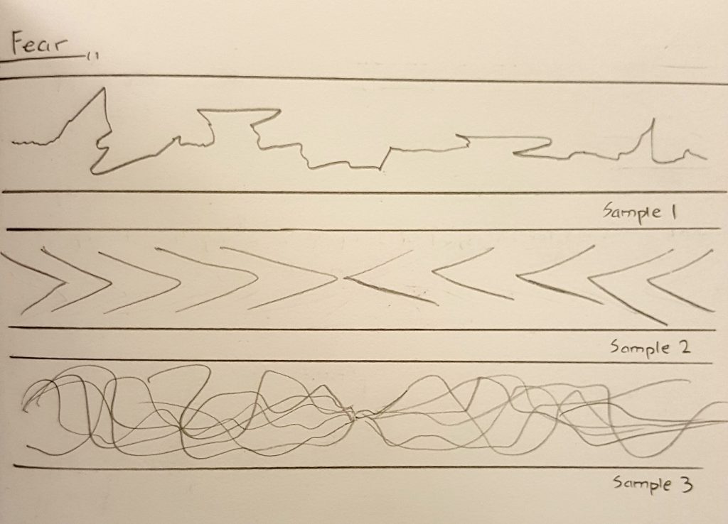
Fear:
Tool selection:
When I’m frightened or anxious -> tend to fidget a lot and grab onto my clothes -> object: clothes -> cut-off sleeve from an old shirt

Samples:


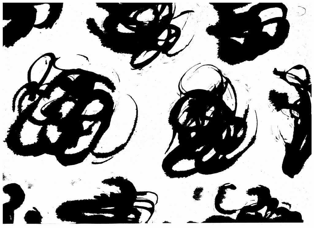
Draft 1:
Seeing that the test products all have white and plain background, I felt that more could have been done with the unused space. Hence, I tried using the Monoprint technique to create a background for each of the emotions.


The backgrounds were created by having an ink layered piece of paper covering over the product (ink side facing the product), and swiping the top of the paper with the mark-making tool.
However, feeling that the backgrounds diminish the appearance of the mark strokes, i have decided not utilize them.
Draft 2:
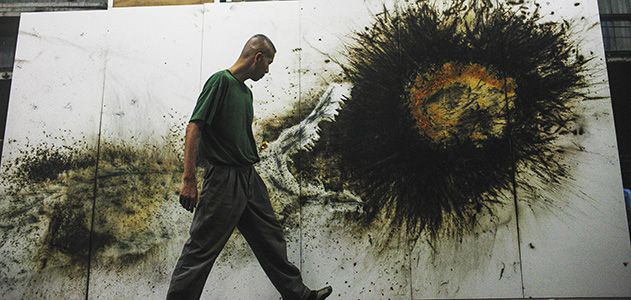
During the consultation with Professor Joy, I have been recommended to work on a larger scale.

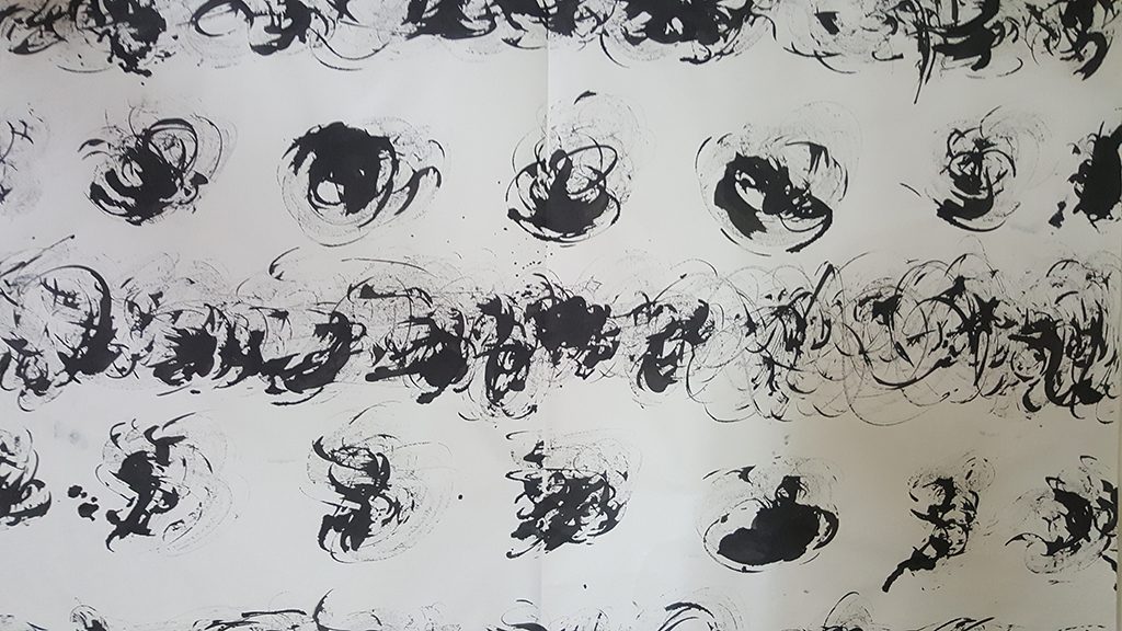


Having created the marks on a larger piece of canvas, I then cut up a section of them to use as the final product.
Final product
Love:

Explanation:
- The smooth lines of highs and lows represent love as a journey
– There will be good times at the top and bad times at the bottom
– The thicker ends at the top resembles how everyone works hard to make the good times last and memorable
- The splash at the bottom left of the strip represents a huge crash in any kind of relationship
– But the part that follows into the next upward curve shows that by persevering through thick and thin, we can overcome the odds and continue the relationship
Method utilized:
I threw and swept the coin across the paper as i would when purchasing something i like in eagerness at the cashier
Elation (Joy) :

Explanation:
- Quick spirals represent bursts of energy
– Ink marks looks like they are depicting a dance of joy and celebration through long swiping curves and playful splashes with no specific pattern
- Continuity of the piece represents continuous vigor of enjoyment with no time for rest
Method utilized:
I spun the beyblade piece around the paper energetically as if i’m playing and having fun
Astonishment (Surprise) :

Explanation:
- The darker areas at the bottom of the piece represents the initial impact of a shock
– Ink strokes that gradually becomes lighter towards either ends of the strip represent how one slowly recovers from the shock over time
- The texture of the ink strokes resemble the red veins one would see at the corners of one’s eyes when suddenly blinded by bright light
Method utilized:
I whipped tissue paper on the strip as if i’m hitting a fleeing insect
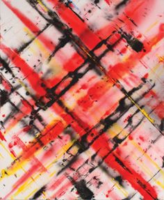
Rage (Anger) :

Explanation:
- Quick upright strokes that are generally lighter at the bottom and heavier at the top represents rising tension
- Thicker clots of ink concentrated in a few areas represents numbness that arises from a headache during a moment of anger
- Minimal amount of positive spaces in the strip represents how one’s mind is every tight and susceptible to bursting during a state of anger
Method utilized:
I whacked the brush forcefully on the strip as if i’m venting my anger out
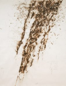
Depression (Sadness) :
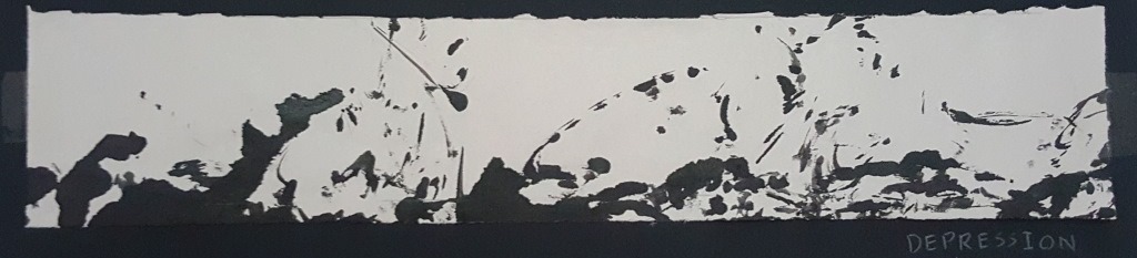
Explanation:
- Numerous blots of scattered ink represents the emotional wave in one’s heart which rises and sinks
– Sweeping flickers of ink at the top of the strip represents how the ups (moments of happiness) are usually short and fleeting during depression
– Majority of ink found at the bottom of the strip represents how one feels down most of the time during depression
Method utilized:
I spun the water bottle in a monotonous fashion – resembling how everything feels grey and lifeless when one is in depression
Anxiety (fear) :

Explanation:
- Dashing strokes to the left and right represents the blur of the surroundings when one looks around quickly and haphazardly during a state of anxiousness.
- The two dark areas to the left and right of the strip represents tunnel vision which one gets when anxious and not focusing on the surroundings
Method utilized:
I swiped the cut-off sleeve around the paper as i would when grabbing onto my clothes when anxious.
Research for this project can be found here: https://oss.adm.ntu.edu.sg/ryan011/project-1-my-line-is-emo-research/