I managed to complete collating my data for 100 of PM’s Lee’s Facebook posts, and visualised them using Google Fusion Table, which Juan taught me how to use earlier today:) This tool is really useful for giving a rough overview of the nature of the numbers I’m dealing with, and also helps me spot typo errors in my assignment of the categories.
Here are some of the interesting findings I made via Fusion Tables, which I seek to explore further in my project:

Pie chart showing the percentage of photographs taken by different sources. Most are by his photographer Terence Tan, while Lee’s own photos rank second.
 Pie chart showing the different countries at which the 100 photos were taken.

I assigned each post a general category and the number of likes, and Fusion Table helped me calculate the average number of likes for each category. So it looks like it’s Lee’s posts on sports that attract the most Likes, though only in the context of these 100 posts.
Notice that there’s two overlapping categories “Community Events” and “Community events” – it’s a silly typo I made. But at least Fusion Table highlighted that to me.
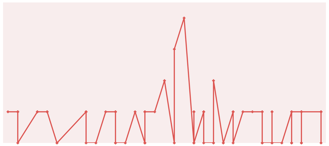
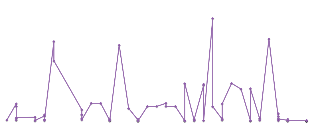
 Each time Lee appears in a photo, I assigned it a value of 1, so this scatter plot shows the number of times he appears in his photos each day over the duration of the 100 photos.
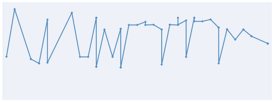
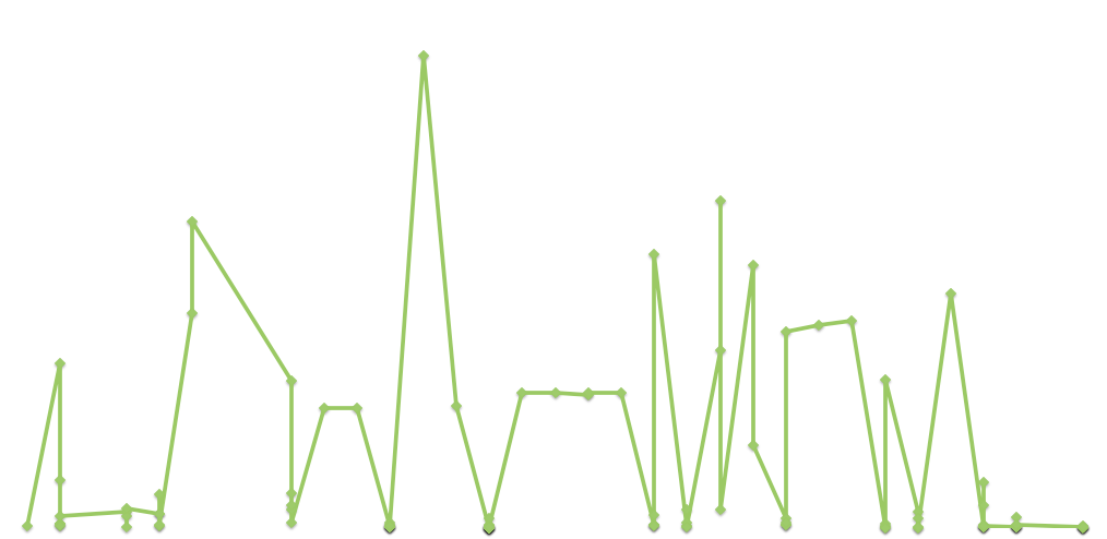
 The average number of adults (blue) and the average number of children (red)that appear in each photo over time.
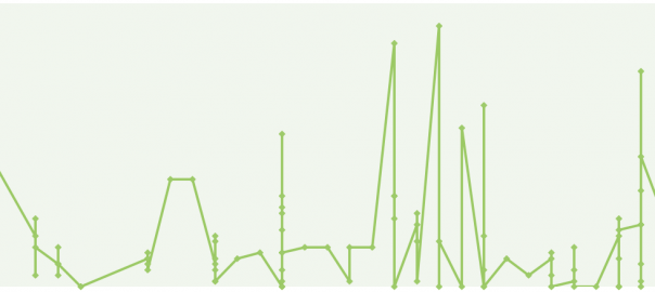
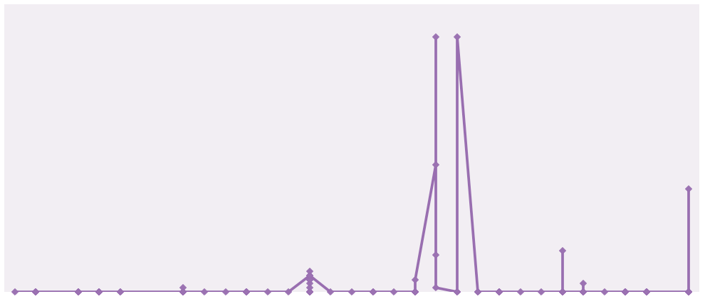
 A comparison of the number of likes against the number of shares over time.
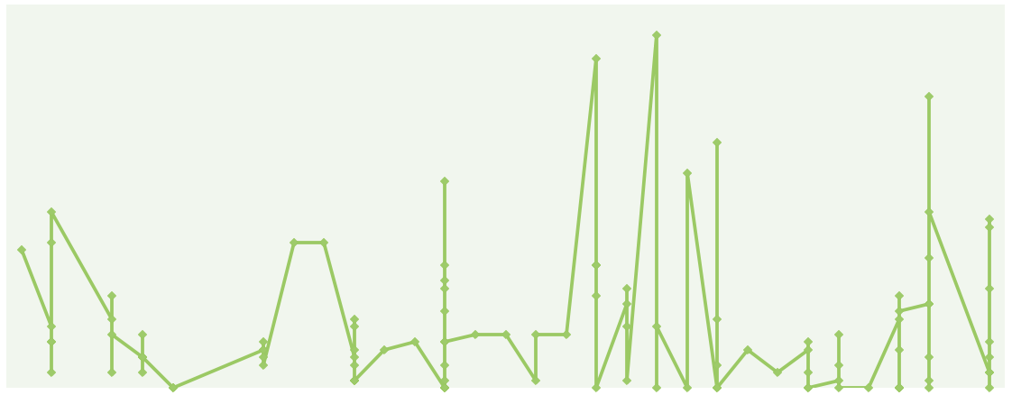
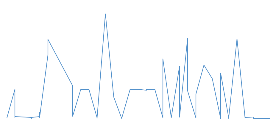
 A comparison of the number of shares against the number of comments over time.
 Lee’s locations within Singapore in his posts. I’ll have to find out the exact geocodes to make this more comprehensive. But this is one feature that I’m hoping to include in my final website (which will probably be another WordPress site, more details coming soon).
 Lee’s locations throughout the globe in these 100 posts. Again there are some inaccuracies I’ll have to rectify.
I also tried out the data with ImagePlot, and am quite puzzled by the results:

I set the x-axis to just a series of numbers (1-107) and the y-axis to the number of likes here. Unlike my visualisation with the 30 images, this time my graph seems to be running in a circular-ish form, like Manovich’s Instagram Cities. Problem is, I don’t really know how to interpret this. It’s as though the data has turned into a complete abstraction for me.

This visualisation is clearer, with x-axis set to time and y-axis set to the number of likes. I think that the straight rows indicate all the photos which were posted at the same time (Lee’s FB page has a little quirk here, he typically publishes about 4-5 posts within the same minute. In some cases it’s because he manually stated the time, but in others it genuinely seems to have been posted in that manner).
My biggest concern is that the ImagePlots here seem pretty sparse, so increasing the number of images to 300 per politician, while decreasing the number of parameters so that I can still complete this on time.
So here’s my plans for the technical realisation of this project.
1. Create a WordPress site: http://hackingvirtualpolitics.wordpress.com
2. Create a home page briefly explaining my project aim: To “hack” the Facebook pages of politicians, which are in essence, PR spectacles to improve their reputation. One way is to analyse the nature of the data (via Fusion Table), and another more abstract means, is to visualise their “data thumbprints” (via ImagePlot)
3. Create another page, “Analytics”, that compares the Fusion Table results of 100 photos each of the three politicians
4. Create a third page, “Thumbprints”, that shows visualisation of 300 photos each of the three politicians, but only based on the parameters of likes, shares, comments, date and time.
5. Create a fourth page, “OSSNTU” that links back to my project documentation and our class site.