This year, social media changed the face of Indian politics. In an election like no other the country has seen, a politician of humble origins toppled an entire political dynasty. As CNN journalist Fareed Zakaria notes:
“Here’s Modi, the son of a tea seller, of really humble origins, extraordinarily disciplined politician, running against a political dynasty like no other in the world. I mean this was Rahul Gandhi… his father was prime minister, his grandmother was prime minister, his great-grandfather was prime minister.”
[Watch the full interview with Zakaria on the Last Week Tonight show here. It’s hilarious.]
With the results of the watershed election, political observers scrambled to pinpoint the causes of this major shift in voter attitudes. And one of the main reasons they uncovered was Modi’s social media strategy.

Modi is the second-most Liked politician on Facebook, trumped only by US President Barack Obama. On Twitter, he has 7.16 million followers, earning him a Klout score of 89 out of 100, not too far behind Obama’s near-perfect 99.
While Obama’s social media influence could arguably stem from his role as leader of the world’s economic and cultural powerhouse, Modi was not endowed with any powerful position before he started engaging the public online. It then occurs to me that unlike Obama, Modi’s influence comes largely from the way he presents himself and communicates with voters online.
Modi’s success reminds me of Singapore’s own watershed elections in 2011, which was similarly dubbed a “social media election”. The Prime Minister, Lee Hsien Loong, created a Facebook account and as part of his campaign, even entered the Third Space via live Facebook chats with young Singaporeans.

What intrigues me is the sheer popularity of these politicians on social media networks – What is it about the status updates and photographs they post online that make them so Likeable? What is the nature of the data they leave online? How is data shaping public perception of them? How does social media help them transcend the identity of a politician and reach out to the common man?
Data traces of virtual politics
In my research post on The Feltron Report, I noted that Felton was in essence publishing a collection of data that no one else in the world would have – the numbers he collected are unique to his existence, similar to a thumbprint.
While Felton largely collected data from his real life, it occurs to me that the data trails we leave on the Internet are also likely to be unique to each individual. Lev Manovich has also noted the existence of “social media traces”, which he tries to capture in his data visualisations. As he explained in an interview with Randall Packer:
“To me I think (data visualisation) is a successful metaphor for how to speak about society today, when you think about all the traces you leave on social networks. I am trying to find the static visual forms to represent our new sense of society from seemingly random acts of individual people.”
While Felton and Manovich were largely concerned with collecting individual data, their observations can be applied to the context of politicians’ social media presence. The “data thumbprints” their each leave on social media is likely to be different – Obama, Modi and Lee are likely to have very different data trails even though they’re all using the same medium for the same purpose.
Rather than doing a scientific comparative analysis, I’m inspired to “paint with data”, the same way Manovich and his team did for the project Phototrails.

I hope to similarly visualise the Facebook data of Obama, Modi and Lee and uncover connections between specific parameters. While Manovich uses artistic parameters like hue and brightness, I hope to use more concrete parameters that might better answer my questions on this phenomenon of Virtual Politics.
The nitty-gritty
While Manovich collected 50,000 images for Phototrails, I don’t expect to be able to collect that much data, and so am setting a much lower target. I hope to collect 100 Facebook photographs (with accompanying captions) from Obama, Modi and Lee’s accounts and analyse them using the following data points:
1. Date and time
2. Location
3. Number of likes, shares, comments
4. Is the politician himself present in the picture?
5. Who took the photograph?
6. Number of people in the picture
7. Number of children in the picture (since politicians like to pose with kids)
8. Any significant individuals in the picture and how often they appear in the picture.
I hope to categorise all this information by hand (I foresee sleepless nights ahead) onto Excel and visualise it onto ImagePlot, a software developed by Manovich and his team, and available for free. I’ve tested this out for 30 of PM Lee’s photos thus far:

I had to fill up everything manually. Wondering if there’s any application that can make my work easier…
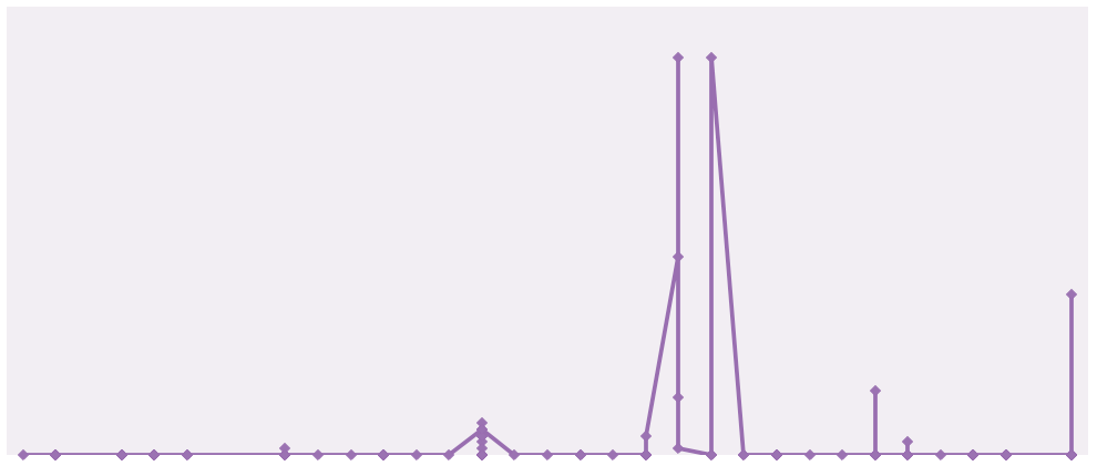
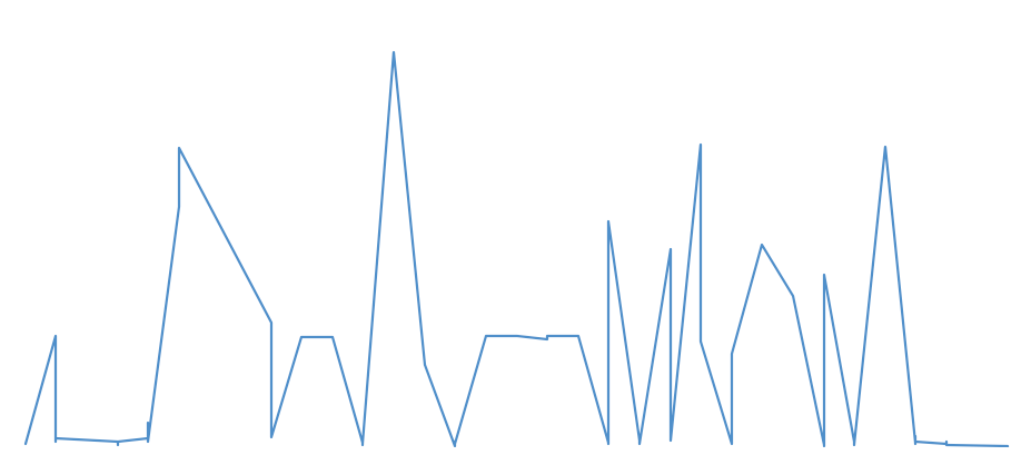
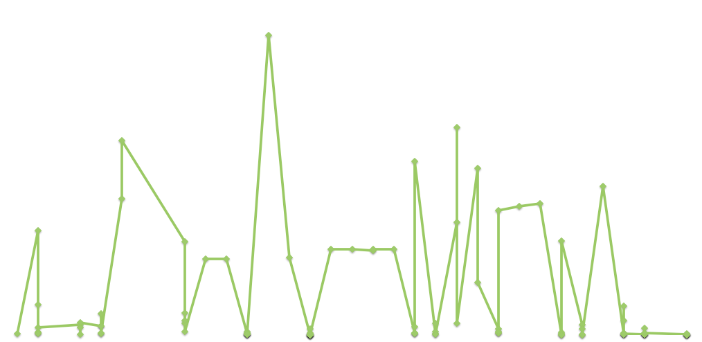
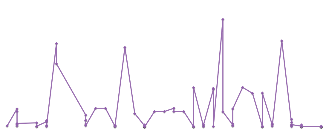
And I got some not-at-all-aesthetically-appealing visualisations, though my aim is not really to impress, but to inform:

The x-axis is the number of shares and the y-axis is the number of likes for each photo

The x-axis is time and the y-axis is the number of shares

No specific parameters here, I just typed in values according to the function x^2+y^2= 1000 to obtain this arc (never thought that maths would come in useful in art!)
Using ImagePlot is new territory for me, but I hope to adapt along the way and hopefully come up with a set of visualisations that will provide some insights into the nature of the data trails that politicians leave on social media.