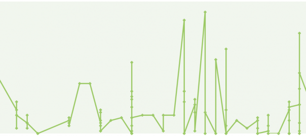
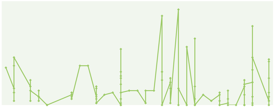
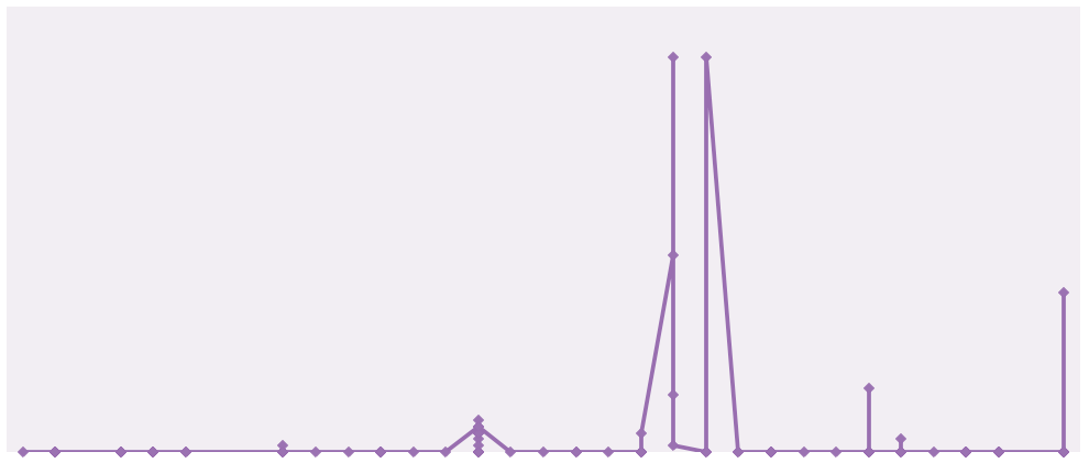
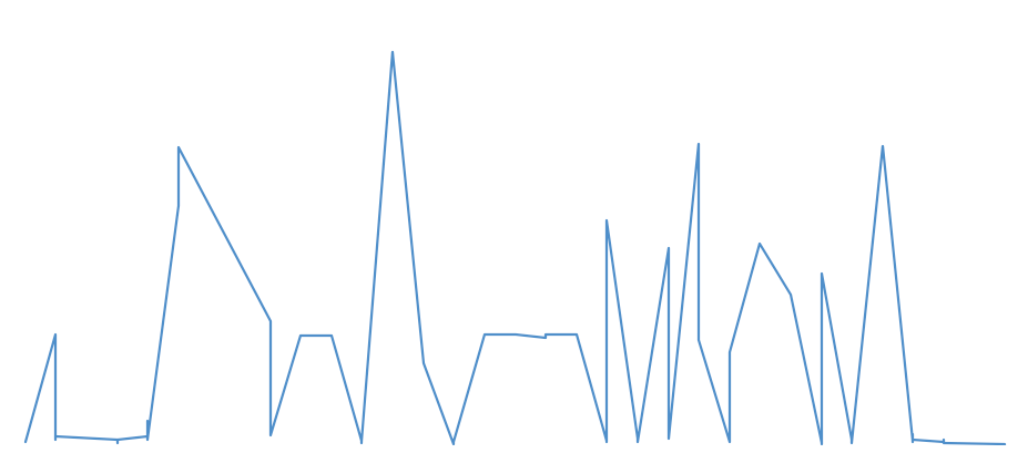
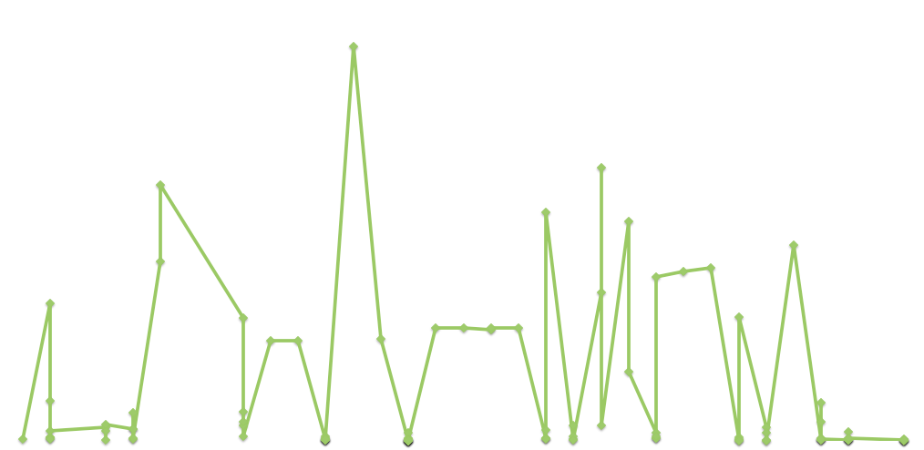
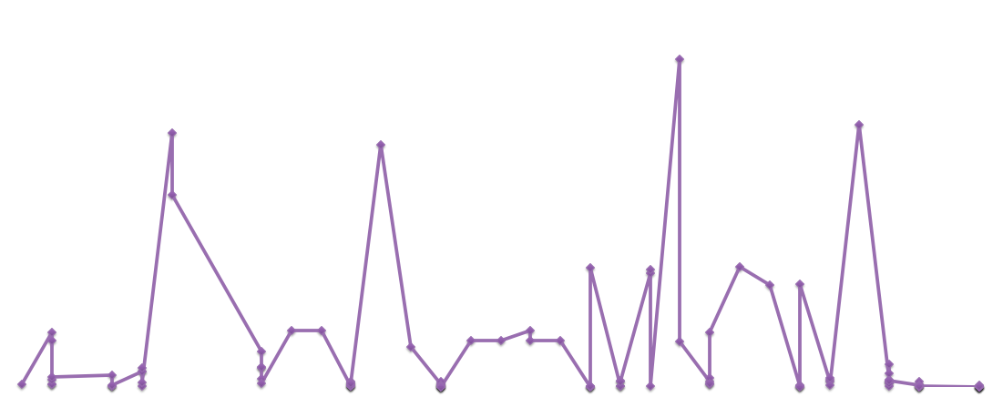
So during today’s consultation, I realised that Fusion Table was not presenting my data all that clearly. So Juan used another tool I had completely overlooked – Excel’s own graph generator. Which produced some interesting plots with my data (In the graphs below, I’m leaving out the numbers and grid lines since it’s the pattern that’s more interesting):
(A) Data which reveal the nature of his posts
1. PM Lee’s posts’ time against the date:
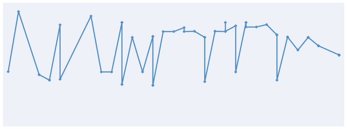
2. The number of times PM Lee appears in his photos against the date.

3. The number of adults in his photos against the date:
4. The number of children in his photos against the date:
(B) Data on public response to his posts
1. The number of likes against the date:
2. The number of shares against the date:
3. The number of comments against the date:
And then as we were discussing, Diana had this brilliant idea that the line graphs could be converted to music! Excited to see where this brings us.