Virtual Politics: It’s not goodbye

The semester has passed by so quickly and what started of as an ambitious idea while I was brushing my teeth (it’s true!) has materialised into a WordPress.com site, with three amateur visualisations that I am nevertheless extremely proud of.

As my site grew bit by bit, I feel that I have grown with it, both in terms of skills and critical analysis of the data I was handling. And so I pen some of my thoughts in this post.

Ideas and goals

My initial idea for the project, Virtual Thumbprints, was intended to turn my own Facebook data into an abstract collage of network diagrams. I got really excited and started producing some visualisations on Gephi.

Screen Shot 2014-10-06 at 1.38.27 AM

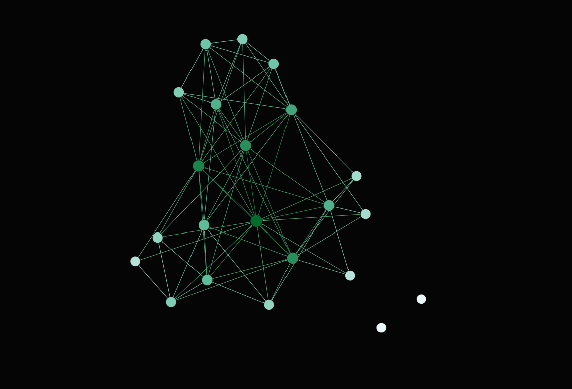
Network graph of friendships in the OSS NTU Facebook group

While comments from the class were positive, it just felt like there was something lacking in the idea. First, it felt too safe. I have taken a Network Perspectives class and am quite familiar with Gephi, so producing the visualisations would have just taken about 10 minutes each.  Second, it didn’t seem like something that had external validity, meaning that it could be generalised to a greater context, and would be thought-provoking for people all over the world.

So I started thinking of other ideas, and coming across Manovich’s Phototrails proved to be the turning point. I read their project documentation and realised that they had developed a macro for ImageJ, a software I had never heard of before. Perfect!

Concept and technical realisation

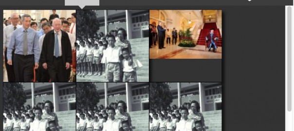
I began envisioning what I could produced with ImageJ, and my long-held scepticism towards politicians’ Facebook pages somehow came in into the picture. As a Singaporean of Indian descent greatly influenced by American culture, it didn’t take me long to settle on studying PM Lee, PM Modi and President Obama, all of whom are active on Facebook.

pm-lee-pm-modi

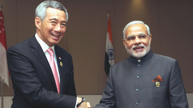
Two of the politicians I decided to study just met for the first time yesterday!

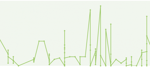
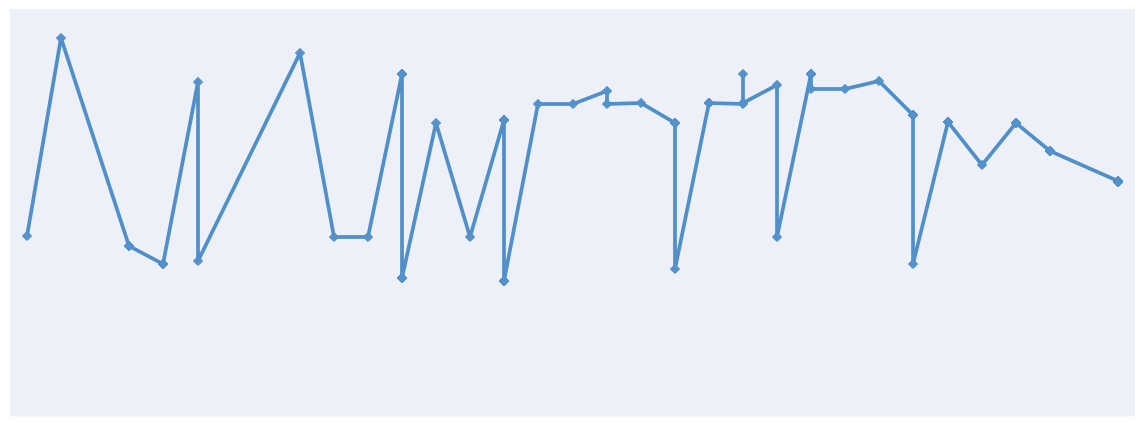
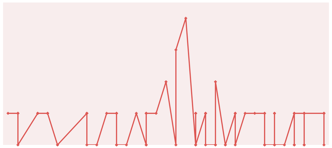
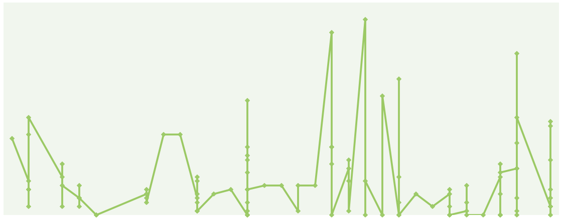
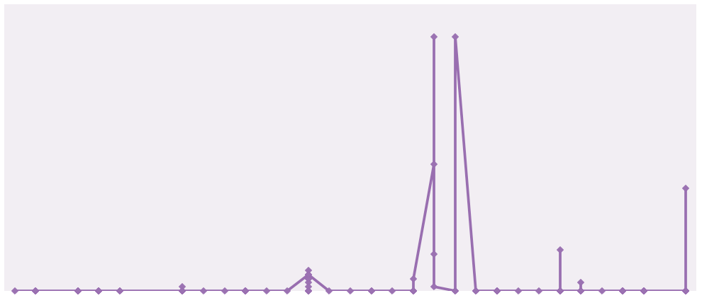
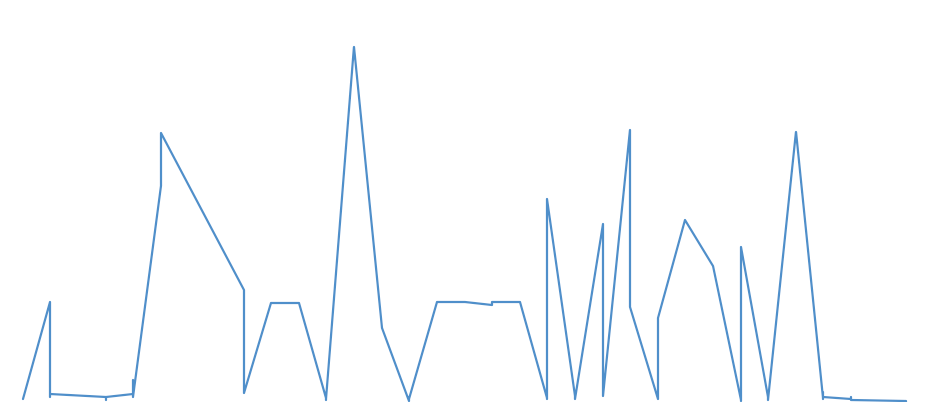
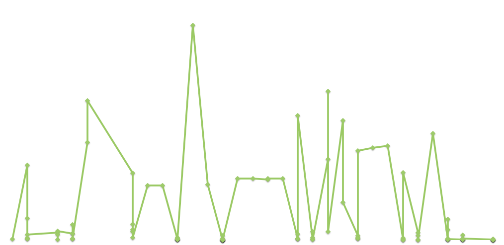
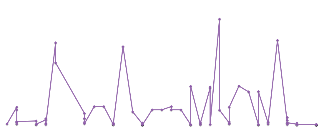
As I started collecting my data, with the help of Juan, I did some preliminary analysis of the information I had, producing all sorts of interesting graphs. It occurred to me that I didn’t have to be restricted to ImageJ, for Excel, while commonly associated with dull administrative work, provides scope for creativity as well.


LHL top 5 graph

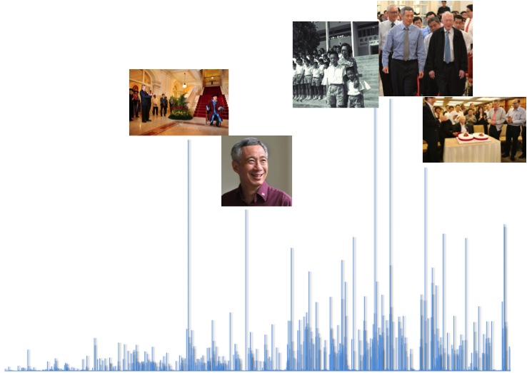
Graph of PM Lee’s Facebook likes per photo over time. The top three photos feature his father, former Prime Minister Lee Kuan Yew

While Excel is an excellent tool for critical analysis, feedback from the class also helped me realised that it is not dynamic enough, and also not best suited to the online medium. After all, net art is indeed about audience engagement and interactivity.

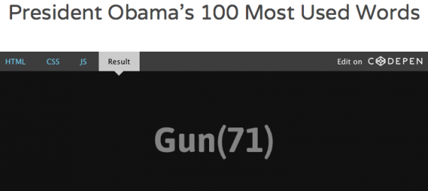
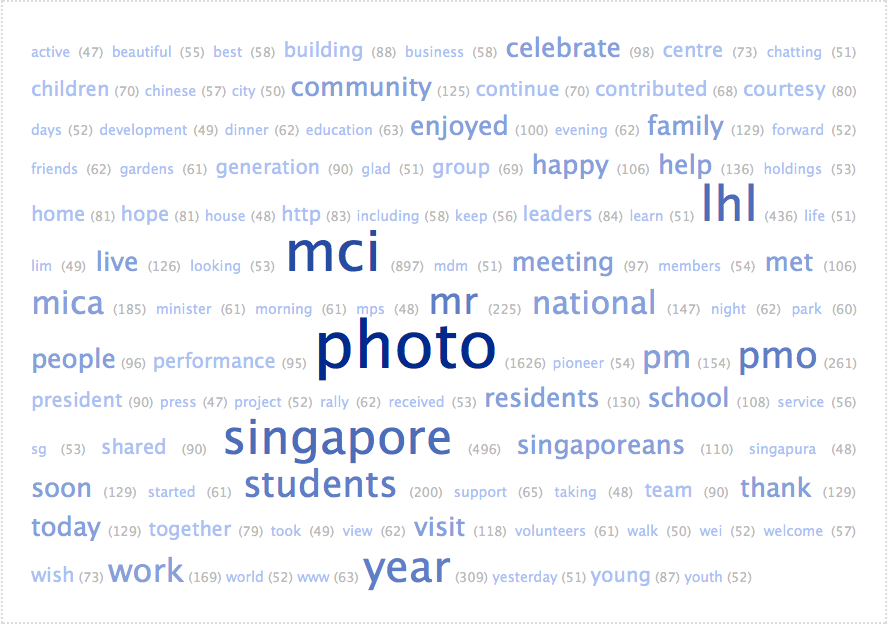
I was lost for a while and then remembered the open-source sharing platform Codepen we used in the Facebook network micro-project, where I can fork others’ pens to visualise my own data. So I produced a simple pen to replace my complicated word cloud. Not very impressive work, but I think it’s a great step for me because I was quite intimidated by code at first.

And along this process, my initial vision of using ImageJ has not faded away. I have been, and am still collecting data for ImageJ (I have  2700+ more jpeg files to download, rename and input the names into Excel), and hope to realise these visualisations soon.

Bridging my practice

Virtual Politics is based on the journalistic values of being faithful to information and presenting it with maximal accuracy. Settling on this principle was not an easy decision to make, but the process of consultations and documentation on this site helped me distill my thoughts on the issue.

At first, I wanted to break out of the mindset of a journalism student, but after some time, realised that what I truly wanted was to uphold transparency and accuracy. I wanted my work to stand up to scrutiny should someone important ever come across it, hence the more scientific approach to an art module. And I began to appreciate that art and science are not mutually exclusive, and that data visualisation on the Internet is a unique artistic approach to a traditionally scientific method of analysis.

Overall, I am really glad to have had the opportunity to immerse in data mining and visualisation, an invaluable skill to have in this information age. Surveillance through data visualisation is both fascinating and scary. As Manovich put it:

We seem to be back in the darkest years of Cold War, except that now we are being tracked with RFID chips, computer vision surveillance systems, data mining and other new technologies of the twenty first century.

-Manovich in What comes after remix? (2007)

I guess my message to Manovich would be that perhaps not all hope is lost. Because with open source software, the table can be turned, and the man-on-the-street may now have the ability to monitor the powers-that-be.

100 most used words by Lee Hsien Loong

Screen Shot 2014-10-29 at 11.10.03 PM

dinner (62) education (63) enjoyed (100) evening (62) family (129) forward (52) friends (62) gardens (61) generation (90) glad (51) group (69) happy (106) help (136) holdings (53) home (81) hope (81) house (48) http (83) including (58) keep (56) leaders (84) learn (51) lhl (436) life (51) lim (49) live (126) looking (53) mci (897) mdm (51) meeting (97) members (54) met (106) mica (185) minister (61) morning (61) mps (48) mr (225) national (147) night (62) park (60) people (96) performance (95) photo (1626) pioneer (54) pm (154) pmo (261) president (90) press (47) project (52) rally (62) received (53) residents (130) school (108) service (56) sg (53) shared (90) singapore (496) singaporeans (110) singapura (48) soon (129) started (61) students (200) support (65) taking (48) team (90) thank (129) today (129) together (79) took (49) view (62) visit (118) volunteers (61) walk (50) wei (52) welcome (57) wish (73) work (169) world (52) www (63) year (309) yesterday (51) young (87) youth (52)
created at TagCrowd.com
Photo(1626) MCI(897) Singapore(496) LHL(436) Year(309) PMO(261) Mr(229) Students(200) MICA(185) Work(169) PM(154) National(147) Help(136) Residents(130) Thank(129) Today(129) Family(129) Soon(129) National(127) Live(126)Community(125) Visit(118) Singaporeans(110) School(108) Happy(106) Met(106) Enjoyed(100) Celebrate(98) Meeting(97) People(96) Performance(95) Generation(90) Team(90) President(90) Shared(90) Building(88) Young(87) Leaders(84) http(83) Home(81) Hope(81) Courtesy(80) Together(79) Centre(73) Wish(73) Children(70) Continue(70) Group(69) Contributed(68) Education(63) WWW(63) Evening(62) Dinner(62) Friends(62) Night(62) Rally(62) View(62) Gardens(61) Minister(61) Morning(61) Started(61) Volunteers(61) Park(60) Best(58) Business(58) Including(58) Chinese(57) Welcome(57) Keep(56) Service(56) Support(65) Beautiful(55) Members(54) Pioneer(54) Holdings(53) Looking(53) Received(53) Sg(53) Forward(52) Wei(52) World(52) Youth(52) Project(52) Days(52) Learn(51) Life(51) Chatting(51) Yesterday(51) Glad(51) Mdm(51) City(50) Walk(50) Development(49) Took(49) Lim(49) House(48) MPS(48) Singapura(48) Taking(48) Active(47) Press(47)”);

See the Pen Machine Gun Text Effect w/ GSAP JS by Sharanya (@kaboomshalalalala) on CodePen.8361

Virtual Politics: New ideas

So during today’s consultation, I realised that Fusion Table was not presenting my data all that clearly. So Juan used another tool I had completely overlooked – Excel’s own graph generator. Which produced some interesting plots with my data (In the graphs below, I’m leaving out the numbers and grid lines since it’s the pattern that’s more interesting):

(A) Data which reveal the nature of his posts

1. PM Lee’s posts’ time against the date:

Screen Shot 2014-10-23 at 7.11.32 PM


2. The number of times PM Lee appears in his photos against the date.

Screen Shot 2014-10-23 at 7.19.25 PM

3. The number of adults in his photos against the date:

Screen Shot 2014-10-23 at 7.22.11 PM

4. The number of children in his photos against the date:

Screen Shot 2014-10-23 at 7.23.14 PM

(B) Data on public response to his posts

1. The number of likes against the date:

Screen Shot 2014-10-23 at 7.25.10 PM

2. The number of shares against the date:

Screen Shot 2014-10-23 at 7.27.31 PM

3. The number of comments against the date:

Screen Shot 2014-10-23 at 7.28.55 PM

And then as we were discussing, Diana had this brilliant idea that the line graphs could be converted to music! Excited to see where this brings us.

Virtual Politics: Technical Realisation

​I managed to complete collating my data for 100 of PM’s Lee’s Facebook posts, and visualised them using Google Fusion Table, which Juan taught me how to use earlier today:) This tool is really useful for giving a rough overview of the nature of the numbers I’m dealing with, and also helps me spot typo errors in my assignment of the categories.

Here are some of the interesting  findings I made via Fusion Tables, which I seek to explore further in my project:


Screen Shot 2014-10-22 at 3.26.59 AM

Pie chart showing the percentage of photographs taken by different sources. Most are by his photographer Terence Tan, while Lee’s own photos rank second.

Screen Shot 2014-10-22 at 3.24.45 AMPie chart showing the different countries at which the 100 photos were taken.

Screen Shot 2014-10-22 at 3.29.57 AM

I assigned each post a general category and the number of likes, and Fusion Table helped me calculate the average number of likes for each category. So it looks like it’s Lee’s posts on sports that attract the most Likes, though only in the context of these 100 posts.

Notice that there’s two overlapping categories “Community Events” and “Community events” – it’s a silly typo I made. But at least Fusion Table highlighted that to me.

Screen Shot 2014-10-22 at 3.34.13 AMEach time Lee appears in a photo, I assigned it a value of 1, so this scatter plot shows the number of times he appears in his photos each day over the duration of the 100 photos.


Screen Shot 2014-10-22 at 3.35.19 AMThe average number of adults (blue) and the average number of children (red)that appear in each photo over time.

Screen Shot 2014-10-22 at 3.36.38 AMA comparison of the number of likes against the number of shares over time.

Screen Shot 2014-10-22 at 3.37.11 AMA comparison of the number of shares against the number of comments over time.


Screen Shot 2014-10-22 at 3.43.38 AMLee’s locations within Singapore in his posts. I’ll have to find out the exact geocodes to make this more comprehensive. But this is one feature that I’m hoping to include in my final website (which will probably be another WordPress site, more details coming soon).

Screen Shot 2014-10-22 at 3.45.11 AMLee’s locations throughout the globe in these 100 posts. Again there are some inaccuracies I’ll have to rectify.

I also tried out the data with ImagePlot, and am quite puzzled by the results:


xaxisnooflikes


I set the x-axis to just a series of numbers (1-107) and the y-axis to the number of likes here. Unlike my visualisation with the 30 images, this time my graph seems to be running in a circular-ish form, like Manovich’s Instagram Cities. Problem is, I don’t really know how to interpret this. It’s as though the data has turned into a complete abstraction for me.

time and no of likes

This visualisation is clearer, with x-axis set to time and y-axis set to the number of likes. I think that the straight rows indicate all the photos which were posted at the same time (Lee’s FB page has a little quirk here, he typically publishes about 4-5 posts within the same minute. In some cases it’s because he manually stated the time, but in others it genuinely seems to have been posted in that manner).

My biggest concern is that the ImagePlots here seem pretty sparse, so increasing the number of images to 300 per politician, while decreasing the number of parameters so that I can still complete this on time.

So here’s my plans for the technical realisation of this project.

1. Create a WordPress site: http://hackingvirtualpolitics.wordpress.com 

2. Create a home page briefly explaining my project aim: To “hack” the Facebook pages of politicians, which are in essence, PR spectacles to improve their reputation. One way is to analyse the nature of the data (via Fusion Table), and another more abstract means, is to visualise their “data thumbprints” (via ImagePlot)

3. Create another page, “Analytics”, that compares the Fusion Table results of 100 photos each of the three politicians

4. Create a third page, “Thumbprints”, that shows visualisation of 300 photos each of the three politicians, but only based on the parameters of likes, shares, comments, date and time.

5. Create a fourth page, “OSSNTU” that links back to my project documentation and our class site.

Project Concept: Virtual Politics

This year, social media changed the face of Indian politics. In an election like no other the country has seen, a politician of humble origins toppled an entire political dynasty. As CNN journalist Fareed Zakaria notes:

“Here’s Modi, the son of a tea seller, of really humble origins, extraordinarily disciplined politician, running against a political dynasty like no other in the world. I mean this was Rahul Gandhi… his father was prime minister, his grandmother was prime minister, his great-grandfather was prime minister.”

[Watch the full interview with Zakaria on the Last Week Tonight show here. It’s hilarious.]

With the results of the watershed election, political observers scrambled to pinpoint the causes of this major shift in voter attitudes. And one of the main reasons they uncovered was Modi’s social media strategy.

Modi3

Modi is the second-most Liked politician on Facebook, trumped only by US President Barack Obama. On Twitter, he has 7.16 million followers, earning him a Klout score of 89 out of 100, not too far behind Obama’s near-perfect 99.

While Obama’s social media influence could arguably stem from his role as leader of the world’s economic and cultural powerhouse, Modi was not endowed with any powerful position before he started engaging the public online. It then occurs to me that unlike Obama, Modi’s influence comes largely from the way he presents himself and communicates with voters online.

Modi’s success reminds me of Singapore’s own watershed elections in 2011, which was similarly dubbed a “social media election”. The Prime Minister, Lee Hsien Loong, created a Facebook account and as part of his campaign, even entered the Third Space via live Facebook chats with young Singaporeans.

Picture3

What intrigues me is the sheer popularity of these politicians on social media networks – What is it about the status updates and photographs they post online that make them so Likeable? What is the nature of the data they leave online? How is data shaping public perception of them? How does social media help them transcend the identity of a politician and reach out to the common man?

Data traces of virtual politics

In my research post on The Feltron Report, I noted that Felton was in essence publishing a collection of data that no one else in the world would have – the numbers he collected are unique to his existence, similar to a thumbprint.

While Felton largely collected data from his real life, it occurs to me that the data trails we leave on the Internet are also likely to be unique to each individual. Lev Manovich has also noted the existence of “social media traces”, which he tries to capture in his data visualisations. As he explained in an interview with Randall Packer:

“To me I think (data visualisation) is a successful metaphor for how to speak about society today, when you think about all the traces you leave on social networks. I am trying to find the static visual forms to represent our new sense of society from seemingly random acts of individual people.”

While Felton and Manovich were largely concerned with collecting individual data, their observations can be applied to the context of politicians’ social media presence. The “data thumbprints” their each leave on social media is likely to be different – Obama, Modi and Lee are likely to have very different data trails even though they’re all using the same medium for the same purpose.

Rather than doing a scientific comparative analysis, I’m inspired to “paint with data”, the same way Manovich and his team did for the project Phototrails.

Screen Shot 2014-10-15 at 1.48.08 AM

I hope to similarly visualise the Facebook data of Obama, Modi and Lee and uncover connections between specific parameters. While Manovich uses artistic parameters like hue and brightness, I hope to use more concrete parameters that might better answer my questions on this phenomenon of Virtual Politics.

The nitty-gritty

While Manovich collected 50,000 images for Phototrails, I don’t expect to be able to collect that much data, and so am setting a much lower target. I hope to collect 100 Facebook photographs (with accompanying captions) from Obama, Modi and Lee’s accounts and analyse them using the following data points:

1. Date and time

2. Location

3. Number of likes, shares, comments

4. Is the politician himself present in the picture?

5. Who took the photograph?

6. Number of people in the picture

7. Number of children in the picture (since politicians like to pose with kids)

8. Any significant individuals in the picture and how often they appear in the picture.

I hope to categorise all this information by hand (I foresee sleepless nights ahead) onto Excel and visualise it onto ImagePlot, a software developed by Manovich and his team, and available for free. I’ve tested this out for 30 of PM Lee’s photos thus far:

Picture5

I had to fill up everything manually. Wondering if there’s any application that can make my work easier…

And I got some not-at-all-aesthetically-appealing visualisations, though my aim is not really to impress, but to inform:

lhl likes graph

The x-axis is the number of shares and the y-axis is the number of likes for each photo

Screen Shot 2014-10-16 at 7.44.02 PM

The x-axis is time and the y-axis is the number of shares

Screen Shot 2014-10-16 at 8.02.32 PM

No specific parameters here, I just typed in values according to the function x^2+y^2= 1000 to obtain this arc (never thought that maths would come in useful in art!)

Using ImagePlot is new territory for me, but I hope to adapt along the way and hopefully come up with a set of visualisations that will provide some insights into the nature of the data trails that politicians leave on social media.


Rethinking the Project Concept

I’ve been thinking long and hard about my final project idea. As I previously explained, I am bounded by the very huge limitation of only being able to extract data while being logged into a Facebook account.

This is a huge blow to viewer engagement and interactivity – It limits me my audience to only people I know who would be willing to help me out, and also alerts them to my intentions, which would remove the element of spontaneous engagement associated with a pop-up exhibition.

I have therefore been revisiting my initial idea of visualising the social media data of public figures/ organisations that everyone in the audience will be able to relate to.

Inspired by Lev Manovich’s use of ImagePlot in his work Phototrails, I am considering the use of images to produce visualisations that could also be part of the virtual thumbprint. I’ve been experimenting around and after several rounds of troubleshooting, managed to produce a visualisation of one of the sample data sets provided: Van Gogh’s paintings. The X-axis is set to the brightness of the painting while the Y-axis is set to the saturation of the painting.

Screen Shot 2014-10-15 at 7.08.43 PM


There is of course a long long loooong way to go for me, in learning how to prepare the data sets and perhaps even make it animated, which according to the ImagePlot tutorial, isn’t supposed to be too difficult (I hope).

But yes, I will update this post again today once I’m done experimenting:)

Updates:

After a whole day, I finally managed to create the txt files required to visualise the images I want onto ImagePlot. Tested it out with a few images on my laptop:

Screen Shot 2014-10-15 at 7.20.07 PM

This might look really insignificant but it’s a first baby step! I will be revising my project concept hyperessay in light of this.

Trails we leave on the Internet

Phototrails is a series of data visualisations revealing the mark each individual leaves on the Internet via their posts on the social networking platform Instagram, and the collective effect of every individual’s post on a “spatial and temporal level”.

Screen Shot 2014-10-15 at 1.48.08 AM


Visualisations of Instagram photos uploaded within the specific territorial spaces

Art-Science fusion 

Data visualisation has been largely associated with the sciences, with notable milestones including the Human Genome Project  and the advent of chemical  imaging.

Manovich notes that while his tool is provided by the sciences, he wields it with an artistic purpose, thereby “painting with data”:

“We also have to use the same kind of charts and labels because it’s almost like a standard language used by science. But as an artist I am also interested in the question of how can I present the world through the data…Thinking about landscape paintings in Impressionism, Fauvism, or even Cubism, how could I represent nature today through the contributions of millions of people? So I think of myself as an artist who is painting with data. “

Screen Shot 2014-10-15 at 2.30.47 AM

A montage (artistic technique) of data (scientific stuff)

Manovich also critiques the journalistic interpretation of data as the absolute truth:

“I’m basically trying to say that as opposed to a journalist who thinks about the “data” as a kind of truth, that it’s a way to find out what happened, what I’m thinking about is its own reality… It’s not a question of truth, it’s a question of making interesting connections.”

As a journalism student, this insight is especially captivating for me. A journalist is essentially a “data miner”, going out into the thick of the action to collect as many numbers, witness testimonies, photographs and sound bytes as we can – data which eventually determines the news angle. Manovich however, questions the assumption that data is objective, and instead proposes a new way of looking at data: from a macro perspective to form connections rather than to draw conclusions.

Technical realisation

I am intrigued by Manovich’s choice of Instagram as a repository of photo data. I initially thought that it was probably because Instagram has the richest collection of photographs, which would produce aesthetically-appealing visualisations. But through this week’s reading, realised that he is in fact motivated by the urge to democratise photojournalism:

“When popular media covers exceptional events such as social upheavals, revolutions, and protests, typically they just show you a few professionally shot photographs… Instagram has its own biases and it’s definitely not a transparent window into reality, but would give us, let’s say, a more democratic picture. “

The avoidance of Facebook and Twitter are also intentional, for Manovich was mindful that the uneven power distribution on these platforms would distort the data he obtains:

“We chose Instagram, specifically, because it was not an active tool for citizen journalism. Rather, it was used by a much smaller number of people. It wasn’t dominated by a few power users or by a few voices. “

The software Manovich and his team use is ImagePlot, which you can download for free here (hurray for open source software!!! It takes pretty long to download though). The techniques involved in creating the visualisations are also made transparent on here.

Open source culture

I am really inspired by Manovich’s creative exploration of the subjectivity of data through Phototrails, and am grateful that the thought processes and technicalities have been documented in such a transparent manner.

Screen Shot 2014-10-15 at 2.32.44 AM

The visualisation techniques are clearly documented for everyone to understand

Like the hacker culture of the pre-Microsoft days, the data visualisation culture is approaching, if not already experiencing, its heyday. I find it absolutely amazing that data visualisation artists and scientists are largely working in an open-source environment right now, with the data-mining software and apps freely available for anyone. This is the ideal environment to generate innovative and thought-provoking data visualisation pieces that could fundamentally change the way we think and work.

However, I also have this fear that someday, the art/science of data visualisation will be commodified, and that the open source culture will be replaced by tech giants enforcing their proprietorship of data mining tools.

Is this just another irrational fear of mine? I sincerely hope so.

[abandoned] Project concept: Virtual thumbprints

In my research post on The Feltron Report, I noted that Felton was in essence publishing a collection of data that no one else in the world would have – the numbers he collected are unique to his existence, similar to a thumbprint.

While Felton largely collected data from his real life, it occurs to me that the data trails we leave on the Internet are also likely to be unique to each individual. Even if I used the same software and algorithm to visualise two people’s data, the output would almost certainly be different. It was from this thought that I conceptualised the idea of a virtual thumbprint, created by visualising Facebook data.

In the reading Data Visualisation as New Abstraction and Anti-Sublime, Lev Manovich urges data visualisation artists to “not forget that art has a unique license to portray human subjectivity – including its fundamental new dimension of being ‘immersed in data’ “. While I will be producing individual network graphs and analysing them quantitatively first, I also hope to introduce a sense of subjectivity by arranging the different network graphs into a single mark, like a thumbprint, that symbolises the individual’s mark on the virtual world.

The process

I intend to use Gephi (for Mac) and/or NodeXL (for Windows) to produce the visualisations.  The former produces aesthetically appealing visualisations while the latter is, in my opinion, easier to use for analytics, for instance in calculating the number of mutual friends or the shortest distance between two nodes.

Screen Shot 2014-10-06 at 9.04.47 AM

My Facebook friend network on Gephi

optimisedfriendnetwork

The same network on NodeXL, using a different algorithm

I also intend to retrieve the data using apps such as Give Me My Data (which Juan taught us in the data visualisation micro-project) and the Facebook data import plug-in for NodeXL.

The output I hope to achieve is a composite of about 4-5 types of network graphs (eg. mutual friend network, liked pages network, group network) put together using Photoshop to achieve a unique virtual thumbprint. I have not decided the arrangement of the composite, but hope for it to be comprehensive yet not overly cluttered. I foresee that it with the heaps of unorganised data available, it will be challenging to decide which networks will be the best ones to use, so lots of exploration will be necessary.

my likes and comments network The like network for my past 10 posts, visualised on NodeXL. Notice how NTU OSS members are well-connected to one another:)

I also hope to draw some comments on the individual’s Facebook interaction using the analytics that NodeXL provides. For instance, a high Eigenvector centrality in one’s friend network would suggest that the individual is well-connected to influential people, while a high closeness centrality indicates that information spreads very quickly in this network. It might be interesting to compile a short report on these findings, and compare it to real-life interaction eg. am I really close to the person that the data suggests is my closest friend?

The ambitious side of me also wants to produce an interactive thumbprint visualisation, similar to Juan’s Codepen visualisation. I have absolutely no idea how I might attempt this, but I’ll think about it along the way.

Constraints and concerns

My initial idea was actually to produce the thumbprints for prominent public figures, but then I realised that I have to be logged into a Facebook account in order to retrieve data. This presents a major limitation, for I now will only be able to produce thumbprints for individuals I personally approach and who are willing to share their data. I am therefore reducing the scope of this project to myself and friends who are willing. Even then, finding the right apps to obtain all the data I need will be a challenge.

The OSS Facebook group interaction network on Gephi (unlike the NodeXL plug-in, Give Me My Data doesn’t seem to retrieve specific groups’ data. Another app, Netvizz, worked but keeps the members anonymous)

Screen Shot 2014-10-06 at 1.38.27 AMFriendships among the NTU OSS Facebook group members

There is also the ethical question of whether I should release the names of people on the visualisations, or keep them anonymous. In analysing the data, having specific names will be useful, for it might enable comparison across different individuals’ thumbprints. However, I’m not sure if anyone will feel that their privacy is being infringed, so this will be another issue to ponder along the way.

Thoughts on collaboration

My concept is actually quite broad, and can be adapted to more specific contexts, if I can find the right apps to retrieve the data or learn how to manually create the edge list (a list of all the nodes and the relationships). I’m open to collaborating with anyone whose work allows for data visualisation and analysis:)