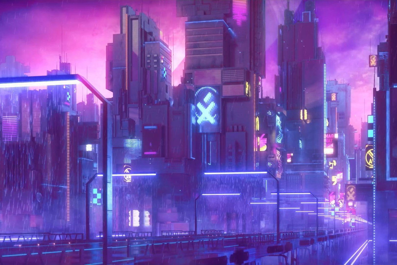
After consultation with Mimi and hearing the class’s feedback on my first draft of my zine. I started working on my second draft for my zine. I realised the colors that I used in my first zine were “too much”. And there were too many things going on. I did not want to go with the whole “the grass is green” and “the sky is blue” anymore. Because this is suppose to be a kid-friendly zine, I wanted the colors to be imaginative and special. So I went with only 3 colors: pink, purple, and white. Since the first draft, I wanted to use 3 colors, so I am quite happy that I am doing the 3 colors scheme. Here are what I came up with:
I wasn’t thinking much when I was creating this second version. What I was going for was mainly to focus on the color corrections and the fonts and words. I was trying to impose the text inside each pages to not have it look like a story book. They usually have the illustrations 2/3 of the page and the rest are text. I wanted the text to be part of the story and I wanted it to have meaning too. So I tried to make it like as if the text are coming out of the cat’s mouth. The comments I received from Mimi and classmates were:
- I am not able to focus on anything, there are too many things going on, the colors, the subjects, the opacities are all overwhelming.
I agree with this person completely. As I have mentioned I am looking for a more of color correction for this version so I was not focusing on if the colors were appropriate.
2. The text looks really creepy but in a good way. I still like the illustrations, they are still very cute. The colors are fine but I still don’t know what I have to focus on. I can’t see the primary subjects and the secondary subjects.
I agree with this comments as well. I believe that I was being very misleading in terms of the colors. The main focus should have been the cat, but now the background, the text, and the opacity of the other subjects are taking the attention away from the cat. I for sure need to work on making sure the reader can focus on the cats and the text.
3. The text looks like the cats are screaming.. ALL THE TIME.
HAHA! YAS! I agree with this comment too. If we are taking this narration as a 3 act structure, act 1 should have been the calmest section of the story, but once you open the zine, you are overwhelmed by a bunch of huge text! I totally will have to make the text look calmer, and that the text don’t take the attention away from the story or what the audience are looking at.
4. The cover page and the back page look boring..
Again, I was in a rush to finish this draft to show my process. I will defiantly come up with something that is related to the cat and her actions what she is going to do in this zine.
So, after all these comments I was set to go ahead and do my final design for my zine. I feel like I have developed enough concepts, stories, and received enough comments to go ahead and work on the final piece HOWEVER.. the problem is, the way I have doing my zine was ALL WRONG!
I started emailing Marilyn again and asked her for ways to do my zine. I am suppose to have created everything in color (okay fine) but I have to do it in RGB mode. I didn’t know that, I was doing everything in CMYK because I thought I needed to print, so I did it in the printing format, thats why the colors were so different from how risograph actually looks like. Now that I have the format settled, I need to work on it being in GREYSCALE… another big issue. For risoprinting, what they need is just shades of white, grey, and black, and the name of the color on the layer. What’s going to happen is that for example, the purple is all grouped in one layer, but some of them will be in different shades of black, so when the printer is printing, they will know how much paint they will pour for each sections! Then they will layer another color after the purple dies. It is very important that all the layers are named according to the names so the printer knows which color to print next.
Over all, for stage 3, I am super stress out because u just realised that the way I have been doing my project was wrong, so I need to redo a lot of things but thats okay! Will finish up my final draft ASAP! BECAUSE risoprinting takes up to 5 days to print…


