Project 3 – Ego (Final)

After consultation, I went back to look more in-depth about the colours in my compositions. Here are the results.


oss-01 oss-02 oss-03 oss-04


Idea 1

(Colour Emotion)

oss-05

oss-01

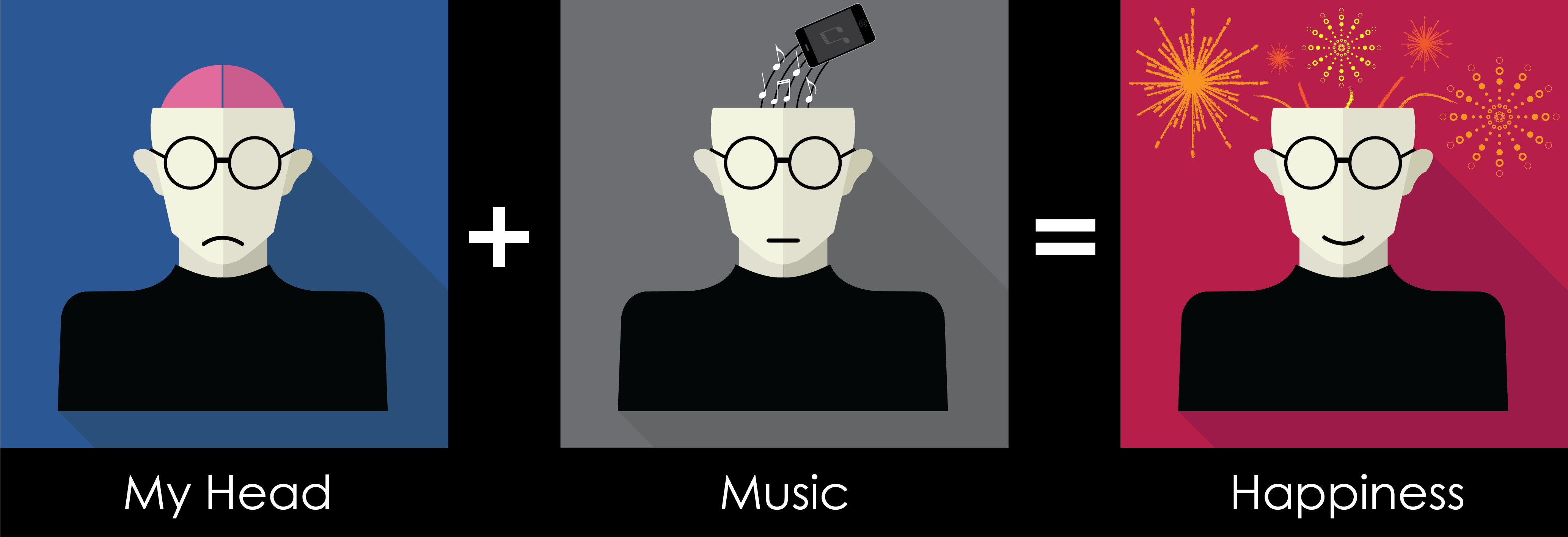
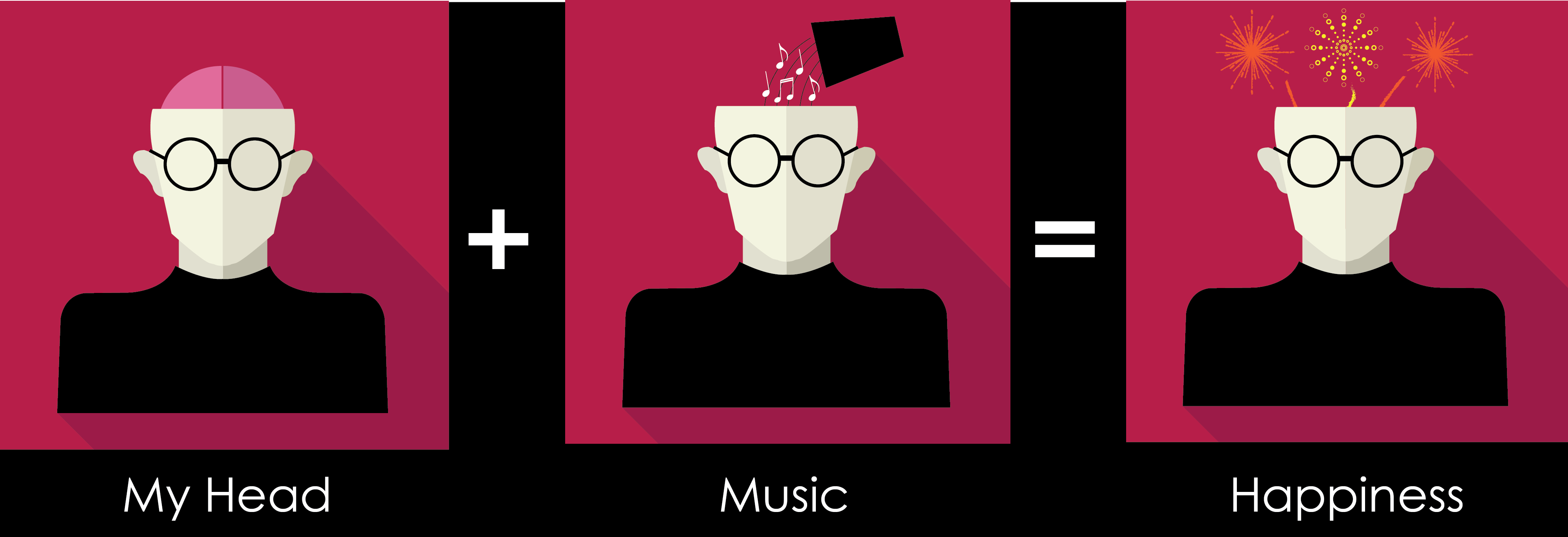
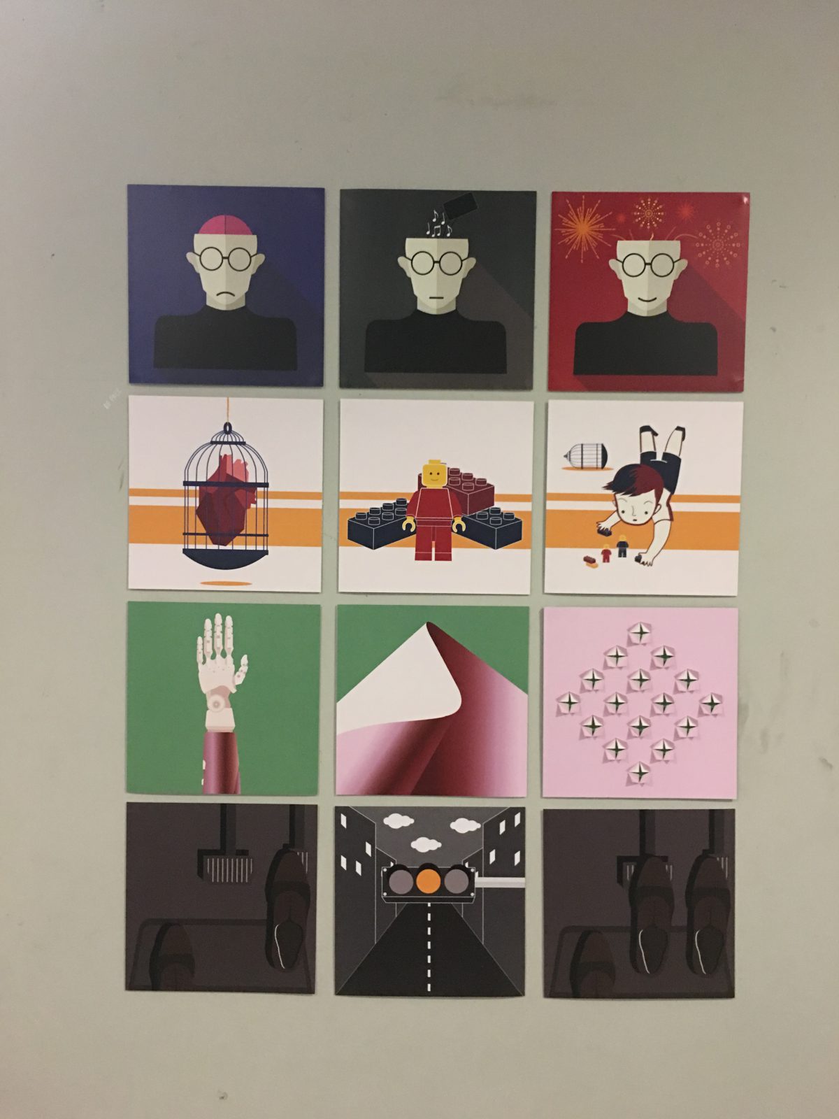
(My head): I’ve changed the background from red to blue to show the emotion as blue represent sadness. In addition, a sad mouth is added to enhance the emotion.

(Music): I’ve also changed the background for this composition. Grey is a neutral colour, it’s to represent no emotion. In addition, I make use of monochromatic for this composition, colours like black, white, grey and off white. I have also changed the “cup” to a “phone” as most of the time I use my phone to listen to music.

(Happiness): I’ve remained the colour red for the background as red represents happiness / love. I also added more fireworks. I have chosen to use analogous colours of red like orange and yellow. In addition, I added a smile to enhance the emotion.

Idea 2

(Triadic Colours)

oss-06

oss-02

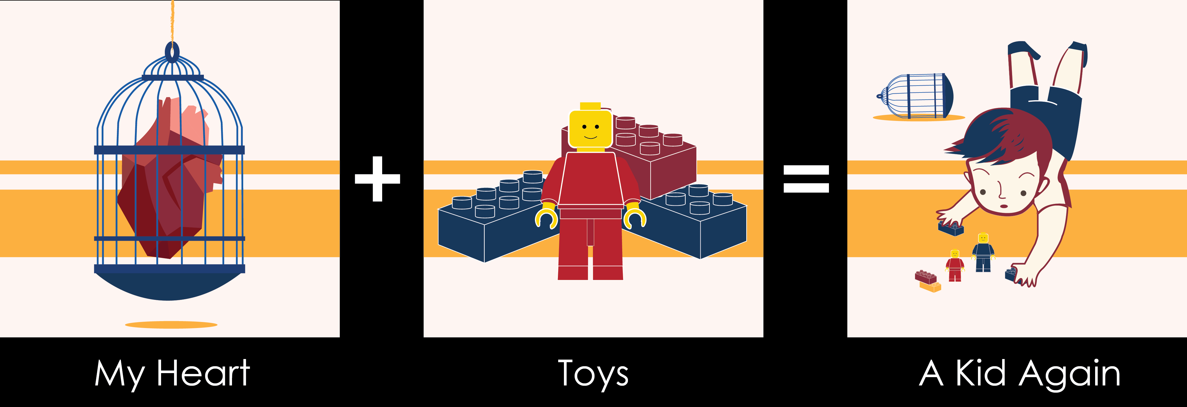
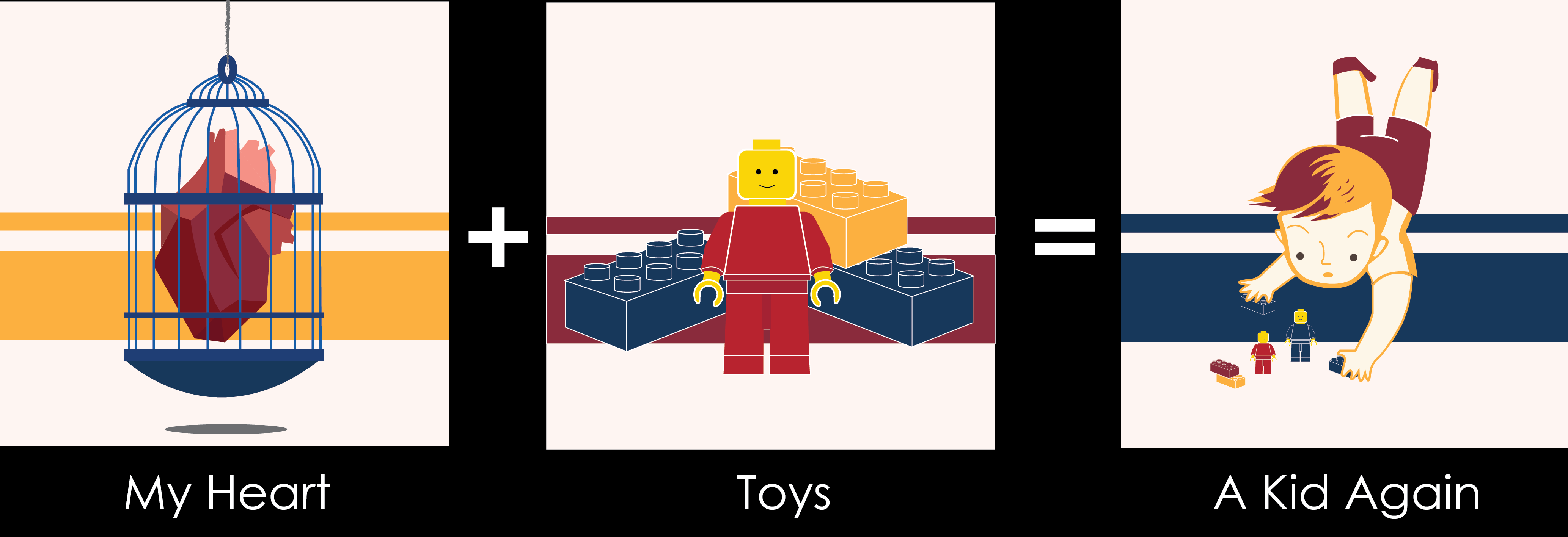
(My heart): My red heart is locked up in a blue bird cage. Meaning is that I always do things very logically, always follow what my brain tells me rather than my heart. Minimum changes on the colour.

(Toys): However, that is not the case when I see toys! Toys do not really have much used for an adult like me but I always buy them when I see them. In order for this composition to fit the (heart) composition, I change the background to yellow-orange which is the same as the first one.

(A kid Again): Same as before, I changed the background to yellow-orange. I also changed the boy’s colour to make the whole composition look more equal. The bird cage is added at the back to represent I broken out of my “logical” thinking.

Idea 3

(Complementary Colours)

oss-07

oss-03

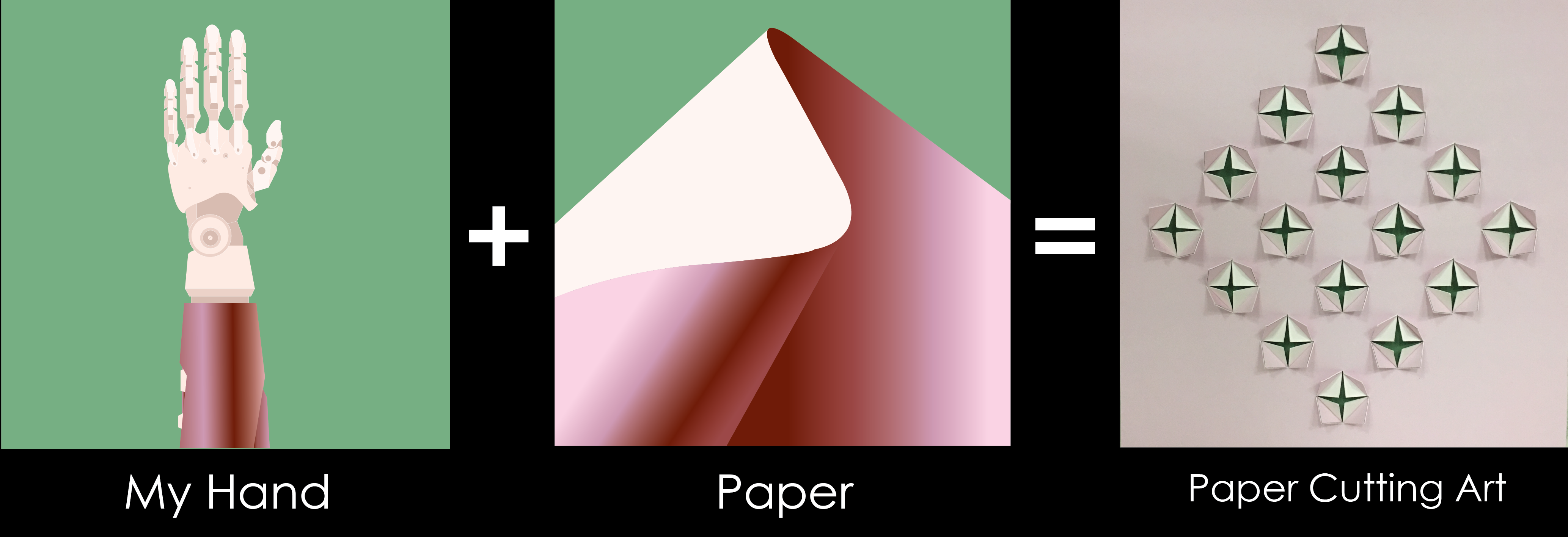
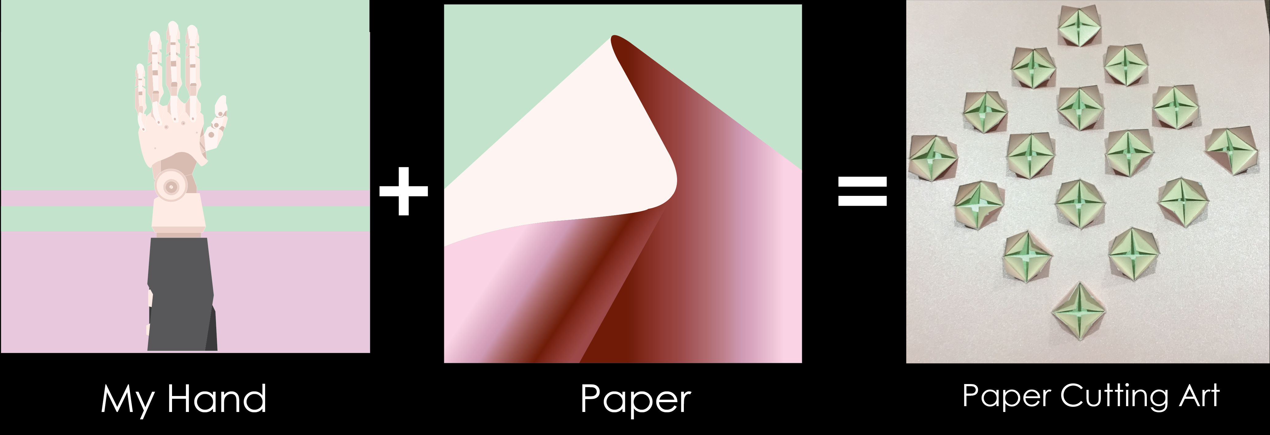
(My hand): Robot hands represents that I like hands on stuff and I’m good with using my hands, like making 3D models and paper cutting art. I removed the pattern at the back as it creates a distraction. I also chose a more saturated Green to make the hand stands out more.

(Paper): Making use of different Shades of pink to create an illusion that it has depth. (A 3D feel is created) In addition, I change the green to the same green as the (my hand) composition.

(Paper Cutting Art): I created a simple paper cut art, which able to show the 3 different colours.

Idea 4

(Monochromatic)

oss-04

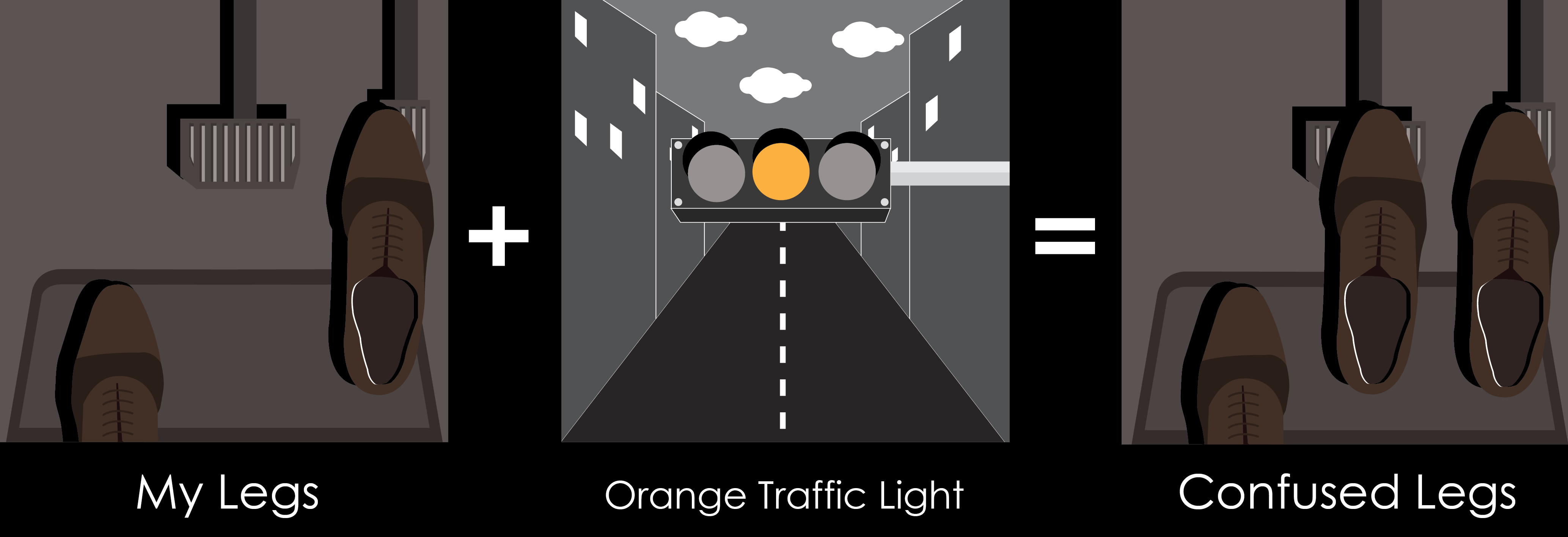
(My legs): I make use of different shades of brown to create a scene I’m familiar with. In addition, I used black for the shoe shadow to create depth. I don’t really use my legs expect or walking and driving, Hence I drew my feet/shoes stepping on the car pedals.

(Orange Traffic Light): Using the different value of grey which includes black and white to create this composition. However, I place an orange colour traffic light in the centre to create attention. Moreover, with the perspective created by the road makes one attention to the traffic light once again.

(Confused legs): Same as the first composition, now I add an additional leg to show my confusion whether I should stop or go when an orange light showed up.


Reflection

I really love this project as I get to do the project using any medium with no restriction. Although there is a lot of work but I really enjoy this class! Thank you G09 for the positive feedback which makes me think that my efforts are worth it. :’) Lastly, Thank you, Joy, for the guidance these 14 weeks, I definitely learnt a lot from you. Thank you for the Pizza too! 😀

Bye Bye foundation 2D… I will see you next semester.
 

2D Project 2 – Forrest Gump (Final)

Idea 1 (Human vs Technology)tan-wei-ming-saw-01

  • People not caring about their surroundings and the dangerous situation they could be in while playing / using their phones.
  • The efforts people put in for their addiction

Feedback after presentation

  • One of my better compositions
  • Some Photoshop issues on the girls legs and the human falling off the cliff.

Idea 2 (Human vs Human)

tan-wei-ming-saw-02

  • Different sports to represent the different countries / beliefs/ stands that we have, which can be a reason for war.
  • Bomb in replacement of ball
  • Saw in replacement of a net.

Feedback after presentation

  • Explosion looks like a plant. (should place more smaller explosions to look more real)
  • Photoshop issue again, on the tennis player’s legs.
  • Colour of the saw is too close to the globe.


Idea 3 (Human vs Animals)

tan-wei-ming-saw-03

  • Rhinoceros being hunted for their horns.
  • Rhinoceros’s lower part of the body is replaced by a dog’s and one of the dog’s leg is a fried chicken –> the cross between animals as pets and animals as food
  • Panda is confused by the ‘Panda dog’.
  • Gorilla as Harambe.

Feedback after presentation

  • Panda and the panda dog is too far away.
  • The entire composition feels separated

Idea 4 (Human vs Diseases)

tan-wei-ming-saw-04

  • A kid is fighting against a mosquito (to represent the present situation of us fighting against Zika).
  • Chicken to represent Bird Flu.
  • Pig to represent H1N1
  • Smaller mosquito to represent dengue fever.
  • The 3 ‘animals’ are leaving the room as they have lost the fight against the boy (which represents us humans)

Feedback after presentation

  • One of my better compositions.
  • Can add animals in the TV.


Silk Screening 

I went to buy myself a new silk screen as a backup and for efficiency sake too so I do not need to keep washing away the prints when it print don’t turn out nicely. However, things still didn’t turn out very well for me…

img_0124

1st Screen – The cliff could not be seen clearly because it was too white, so I went to print another transparency after I darken the cliff.

img_0125

2nd screen – The cliff can now be seen, but there is another problem. Due to the increased darkness of the cliff, the saw and Pikachu which was black could not be seen anymore. Perhaps it’s because I applied too much force when I silkscreen. Hence, I practised on paper the amount of strength I need to use.

After making sure I got the correct tone on the paper, I decided to give a go at printing on my bag. But because of the different material, I failed at the first try – the pikachu cannot be seen. So I repeated over and over again on paper. But no matter what it doesn’t work on the bag.

In the end I printed 10 times on 3-4 tote bags and picked the best one for submission. I believe my problem lies on the Photoshop stage. I should not bitmap the pictures one by one, I should have completed the entire composition then bitmap the whole thing altogether. My Photoshop skills can be much better too. Oh well, these are mistakes I need to learn from! I’m still glad I got to learn about silk screening as I have never done it before.

img_0127

Now it is time for me to focus on my final project in order to make up for my mistakes made in project 2!

Project 1 – Emo (Final Post)

-4 Meals a Day-

IMG_9885

STORY

Wake up 

1.Brush teeth (Grumpiness – well, who doesn’t?)

Breakfast (home-made)

2. Make coffee (Relief – finally the smell of coffee)

3. Hard boiled eggs (Surprise – ooops a bit too runny today)

4. Bread (Tenderness – i imagine the TLC the bakers put in baking the bread hmmm)

5. Orange juice (Delight – nice, refreshing!)

Lunch (coffee shop)

6. Tissue paper to “chop” seats (Worry – oh no, will my seats be taken away?)

7.  Buy Ramen/Instant noodles (Love – who doesn’t love ramen?)

8. Use chopsticks (Uneasiness – sigh I can’t use chopsticks well)

9. Soup drip all over the table (Embarrassment – so paiseh leh)

10. Drinking Coke using straw (Happiness – woohoo open happiness)

Dinner (BBQ)

11. Start fire using charcoal (Rage – argh why isn’t the fire starting)

12. Fire started (Passion – is the fire within you still burning? Mine’s dying :O)

13. BBQ-ing Satay/food (Fear – aiyo too near the fire, so scary)

14. Using toothpick after meal (Contentment – shiok)

15. Wash up using Sponge (Regret – sigh why so many dishes to wash?)

Supper (Fast food)

16. Open chili sauce packaging (Frustration – who design this packaging, so difficult to open?)

17. Nuggets/fries (Guilty – hmm yummy. oh shit, fats.)

Sleep

18. Brush teeth (Daze – time to go to bed…)

——————-

Feedback from Prof & Classmates:

I created a story to link all the 18 emotions + mark making tools. And it is a everyday story that most people can relate to, which I noticed is something that my classmates appreciate. This made me learn that sometimes design/ art is not always about being abstract. It is about conveying your views, feelings and experiences no matter how simple, small or “everyday” it is.

But I do note and appreciate the feedback Prof provided me. The intended meaning of one of my emotions, Happiness, was not expressed in a clear enough manner. I admit that the links between the concepts eyes vs family vs happiness are indeed too weak (and personal). This further shows the complexity of communication in art. Although art is often about self-expression, we do not want to go to the extent of being not understandable.

Reflections:

After listening to all the presentations by my classmates, I know I have a great deal to learn from them. I am especially impressed by the way they tried to play with different paper materials, different types of medium and even making use of various senses (like smell, hearing) to create their artwork. I find their concepts really interesting and intriguing.

For example, one of my classmates uses tracing paper which is translucent, and overlaps them to show how human beings are never just feeling 1 emotion. We are complicated, and that is very real. This is indeed something that I need to work on. I tend to be very direct and straightforward in my thinking. I never really dig deeper to explore the complexity of issues or meanings, which often lead to my concept being too simple and shallow.

It doesn’t seem like it will be easy having a strong yet understandable and relatable concept. But I shall continue to try 🙂