Mnemosyne Research

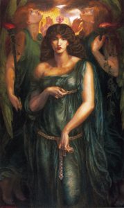
Astarte Syriaca by Dante Gabriel Rossetti

Mnemosyne, the Titaness of Memory, is among the 12 children of the first born gods, Uranus (Heaven) and Gaea (Earth). Remembrance was an important skill as there were no other predated way of recalling in Ancient Greece as language had not been developed at that point in time. Hence, Mnemosyne was credited to be the one who gave humans the ability to converse and reason.

It was said that when people crossed over to the Underworld of Hades after death, they were given the option to drink either from the River of Lethe, which causes people to lose their memory when they reincarnate as humans again to learn the values they needed, or to drink from the Spring of Mnemosyne, to remember all their painful memories of their lifetime and proceed to live happily for all eternity.

Mnemosyne is also known for her legacy for her motherhood of the 9 muses whom were all fathered by Zeus . He wanted people to remember his victory over the Titans and went to Mnemosyne disguised as a shepherd with the intention of seducing her for the 9 nights they spent together before heading back to Mount Olympus.

Research from: (click here please) 


Mnemonic Devices are techniques used to help us remember things better.  These techniques are crucial in helping different types of

Visual (spatial learners, prefers images and pictures),

Aural (musical learners, prefers use of sound and music),

Verbal (linguistic learners, prefers words like speech or writing) ,

Physical (kinesthetic learners, prefers use of body, hands, sense of touch), and

Logical (mathematical learners, prefers logic, reasoning and systems )

learners to retain information better.

Different types of learners research: (click here!)

Some of these techniques include:

Imagery

  • The use of visuals can help us to retain pieces of information better by associating the information we want to remember with an image/character/object. Before researching on mnemonic devices, I still had trouble remembering how many days are there in all the 12 months of the year but with the image attached above, it’s easier to associate the higher archs (knuckles) to 31 days and the lower archs (between knuckles) as 30 days.

Rhymes

  • Rhymes often have similar terminal sounds. Like in the attached image above, it shows how these words sound similar yet have vastly different meanings. Hence, they are easier to remember due to the acrostic coding in our brains.

Acronyms

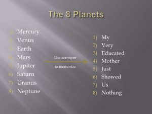
  • An acronym is formed by using the first alphabet of every word that you want to memorise, and turning it into a phrase.

Olfactory

  • Here, I’ve linked a video to explain how olfaction works in conjunction to taste.
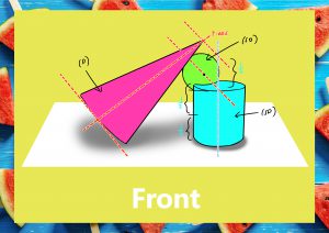
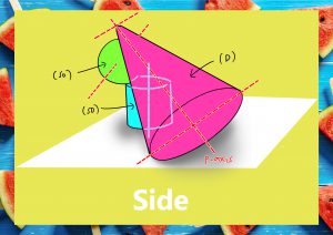
Method of Loci

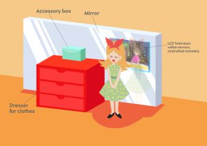
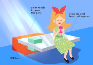
  • Using location to remember certain information better. For instance, using landmarks to help remember information better on your way back home.
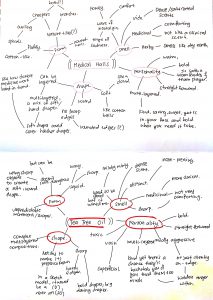
SCENTS

Pleasant Scent: 

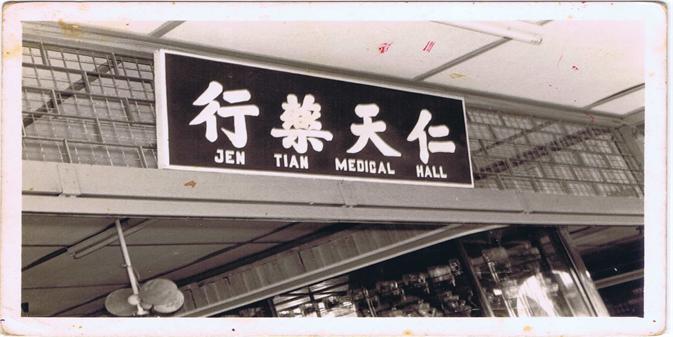
  • Chinese Medical Halls. Specifically, my grandmother’s medical hall.
    • I grew up practically in the Chinese medical hall my grandma used to own. To many people, they would shun away from it because they often find it too medicinal smelling but to me, it’s the smell of comfort.


Unpleasant Scent:

  • Tea Tree Oil
    • This happened just a few weeks back but I was dumb and didn’t know that you had to dilute tea tree oil in water before using it. Hence, I over-applied it topically and chemically burned my face. It was a hot blotchy mess and I now tea tree oil is dead to me (ok not really I’m exaggerating but you get my point)

(Cursed thing) 

Mindmap of scents:


Recycled Plastic Art

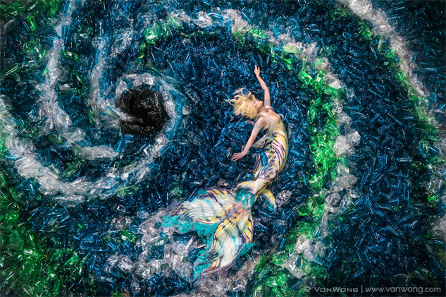
image from: https://www.pastemagazine.com/articles/2017/05/plastic-bottle-art.html

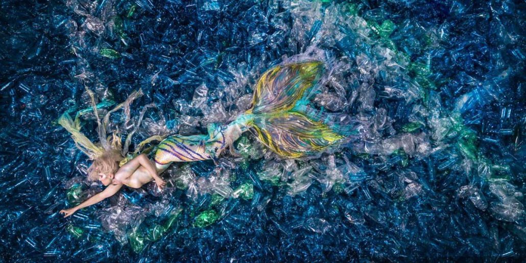
image from: https://fairsaturday.org/blog/sirenas-en-un-mar-de-plstico-y-fotos-que-conectan/

image from: https://mymodernmet.com/benjamin-von-wong-plastic-pollution-mermaids/

Mermaids Hate Plastic (2016) by Von Wong

image from: http://www.veronikarichterova.com/wp-content/uploads/2013/11/gallery_animal_96.jpg

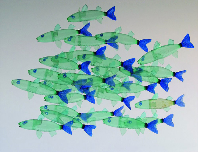
image from: https://www.handmadecharlotte.com/recycled-bottle-art-veronika-richterova/


Gaia’s Ikebana – Part 2

Initially when I was researching, I thought of using desserts for my final model but changed my mind as I thought it would be interesting to use savoury food instead. I was inspired by salads as it often an appetiser/meal that most people would eat on a summer day as it is refreshing and light. I realised that a lot of these salads would pair beetroot and goat cheese together so I decided to add that into my food model.

This was the final result for my food model. I used beetroot, feta cheese and baguette for my final food model.

I used the baguette to replace the cone (D) in my model, feta cheese to replace the cylinder (SD) and the beetroot to replace the sphere (SO). I wanted to different take on the ikebana as well so I used thyme.

Unfortunately, I lost the images that I took for the documentation process hence, I’ll illustrate them out.

These are the food items I got from the supermarket.

Here is the main preparation process for my food model. I made a vinegar reduction and used that for my final plating to create movement. I shaved off the baguette into the shape of a cone and attached that to my Feta cheese, which I cut from a rectangle to the shape of a cylinder. I bought pre-cooked beetroot hence all I did was to assemble the final model.


Gaia’s Ikebana Part 1

S U M M E R   

 Model 1


(D) – Cylinder

(SD) –  Cone

(SO) – Sphere

  • Cone is independent
  • Sphere is dependent to cone
    • sphere is cradled between the cone and cylinder
  • Cylinder is precarious to cone

– Overall it is unfitting of a balanced composition as the cylinder is way too long and the radius of cone is far too similar to the cylinder.

– Gives a sense of uneasiness an anxiety when you look at it.


Model 2

(D) – Cone

(SD) – Cylinder

(SO) – Sphere

  • Cone is dependent on Sphere
  • Sphere is dependent on Cylinder
    • sphere is wedged into cylinder
  • Cylinder is independent

– Overall, model is pretty well balanced. Does not look wonky but need to either increase the size of (SD) or reduce size of (SO) as they are competing.


Project 2: The Subverted Object

Layout

I placed component 1 at the top, component 2 at the bottom and component 3 in the middle.


Component 1:

#1

I wanted to capture the lamp in it’s natural state, interacting with the environment around it.

#2

I wanted to show the function of the lamp, which is to illuminate it’s surroundings. Hence, it is taken at a lower angle to show the upwards direction of the light and where the light does not meet, it is left in the shadows.

#3

I wanted to invite the viewer to take a closer look at the texture of the lamp, how the use of a simple paper can change the mood of the light, emitting a soft orange glow. On top of that, the colour scheme and the holes on the paper reminds me of a carved Jack-O-Lantern.


Component 2: 

#1


I decided to subvert the lamp into a power-fruit, which is the Kiwi. I wanted to portray the idea of a lighthouse in the dark ocean, emitting the light to guide you to a healthy lifestyle.

#2

I subverted the lamp into a strawberry which, just like the kiwi, has a high concentration of vitamin C which many people do not know.

#3


I decided to use different types of lamps to turn it into a spooky, ancient aliens sort of composition. The UFO lamps are harvesting the delicious mushroom lamps that could be found only on earth!

I was actually really inspired by a Japanese artist that I have been following online for close to a year, known as Tanaka Tatsuya. I love how he is able to use everyday objects and change it’s function to capture that perfect moment. It is very inspiring his works transcends the global language barrier.

References: (click on link)

@tanaka_tatsuya


Component 3:


Initially I wanted to use my component 2 image #1 as an advert for healthy living.

I used the slogan, “Eat healthier, think Brighter”  as the linguistic message to try and convey the idea that eating healthy will lead to a better way of life as your brain gets the power food it needs to function well.

I added a link at the bottom, “visit www.foodforthought.org to sign up for a free consultation today” as the anchorage. The website itself is a made-up one as I did manage to find a local website ( http://foodforthought.com.sg/)  but it is far from my ideal which is a medical campaign. The website “foodforthought” is also a play on the idea that healthy food can help stimulate the brain.

While I was researching for my component 3, I came across an advert by Dallas Market where they substituted unhealthy food with healthier local produce.

References: (click on link)

Dallas Farmer’s Market Fries 

Dallas Farmer’s Market Burger

Dallas Farmer’s Market Ice Cream

I thought it was really interesting how even though all the images are depictions of food, they are able to substitute the unhealthy food with their own local produce to portray the idea that local food produce are a healthier option that tastes just as good as your everyday fast food chain.


Conclusion

To be honest, I had a really hard time racking my brain, trying to fully understand what it means to subvert an object. Perhaps it was my slow-functioning brain that was unable to grasp the concept that many of my classmates were able to get right away. I had to reshoot several times and even after consulting Serena, many of my shots had to be rejected.

Even though I was dejected for quite a while, I am happy that I was able to pull this off and seeing all my classmate’s works made me understand subversion better.

For future kids seeing this, hello. Please don’t give up, y’all can do it c:

Brainstorming Ideas – Lamp

Hi Hi, so this is my brainstorming process for my object, a lamp.

When I was thinking about adding characteristics to my lamp, I wanted it to have a more animated feel for the thumbnails. Hence a lot of these concepts would be harder to translate into photography.


Thank you for looking 🙂

Pandora’s Box Final Model and Application – Counterbalance

Final Model Analysis


In the end, even though I made 2 models, I went with model 3 as I felt the shape was more interesting and made some last minute changes.

  • I made the (SD) 3 times larger as it would have been covered by the (D) in the back view (not shown here).
  • I decided to pierce the (SO) into the (D) and (SD) so that it would be seen from the side view and would also look like it is being cradled by the (D) and (SD) in the front view.

Applications

#1 (Rotated to the side in front view) 

Dresser, Mirror and a TV all-in-one 

I had always liked the idea of being able to watch the telly while getting ready for the day. Something about having a voice in the background while you go about your mundane chores seem very soothing. 

#2 (Top view facing down)

Cooling park bench with solar-powered USB charging 

When I wasn’t as busy, I would take my dog out for a walk in the park and I noticed that a lot of people who visited parks are often on their phones. With the abundance of sunlight coming in, it would be great to charge your phone as and when you need it, this is especially useful for joggers who are often using their phones for music when they run. 


Project 1 Pandora’s box – Counter Balance

Part One

# 1

Comments:

  • Width of all (D), (SD) and (SO) were too similar. It is hard to tell which is the (SD) and (SO) from the top and side view.


#2

Comments:

  • Doesn’t really convey the idea of counterbalance.
  • (SD) looks very out of place, a little too high.
  • Do not flush (SD) to the side of (D)
  • (SO) placed too high up, gives me anxiety


#3

Comments:

  • Doesn’t really convey the idea of counterbalance
  • (SD) is too long, competes with (D) thus is hard to tell which is (D) and (SD) at first glance, especially from the front and top view
  • (SO) shouldn’t be placed in the middle, doesn’t counterbalance anything, should be pushed more to the right

Part Two

Models 2 and 3 were chosen to further refine.

#Model 2

Comments:

  • shifted the (SO) to the right and pushed it further downwards to counter balance the (SD) on the top left
  • Pushed the (SD) towards the left to make a more interesting silhouette

#Model 3

Comments:

  • (SD) was cut in half so that it’ll be more distinguishable
  • (SD) and (SO) were shifted up
  • (SO) could not be seen from the side view. Not a very good sign


For my final model(s), I decided to use both and continued to refine it.


Project 1: Curating Self

The idea of Acceptance

I wanted to play around with the concept of acceptance in all 3 of my components. Usually, acceptance is associated with a positive meaning but in my case, I wanted to add a little sadness to it. 


Component 1: Me

absence of self-Acceptance

#1

I wanted to show vulnerability even in the place where I felt the most comfortable, which is my bed. I hid my face in my arms to show how afraid I am in my own skin.

The curling of the body creates a rectangular shape that holds the focus of the viewer.


#2

A mask of chemicals to hide my imperfections and only letting you see what I want you to see through my eyes in the mirror, the only way where I felt I looked presentable.

The polaroid-like borders brings emphasis to the subject.

#3

Portrait shots are meant to be taken as clearly as possible, to show you every detail of your face and body but in my portrait, I am looking at the camera but I am blurred out, showing how I am unable to bring down my walls.


The absence of my face in every photo of component 1 shows my insecurities, worries and lack of confidence as an individual, unable to face another person directly without worries.


Component 2

Accepting that he can’t always be with me

#1

This bear was a gift to me by someone I love.  The bear represents him when he’s not around me. I tried to give the bear a more human-like look, as though I’m actually leaning on a person to rest my tired, weary head.

#2

To me, physical affection is direct connection to another person. I wanted to give the bear a more humanly touch, just like how I would hold tightly onto the hands of the ones I love.

#3

The image is intentionally cropped to create a sense of closeness and the hands on the bear’s thighs adds a sense of affection and love I have for the bear.


Component 3

Accepting that most of my childhood can’t be taken back

#1

This is a familiar sight growing up, when I visited my grandma’s house.

The low angle shows how I view this flight of stairs being powerful and impactful in the earlier parts of my life.

#2

Whenever I revisit this flight of stairs,  I feel like my body has turned back in time back to when I was a kid, with my head playfully peeking through the triangular hole in the wall. The white walls signifies a sense of purity and innocence.

The image is shifted to the left to give a sense of flow and direction, as well as to adhere to the rule of thirds.

#3

This was a common view when I was a kid. The low angle gives emphasis to the big influence this place had in my life. The walls used to be painted red, which I associated with the love I had for my Grandma and her house though the repainted walls shows how I had to paint over the memories I made here as a kid. I never quite understood the reasons for the holes in the walls but the light peeking through it shows the newfound hope I have for an old but unfamiliar place.


END