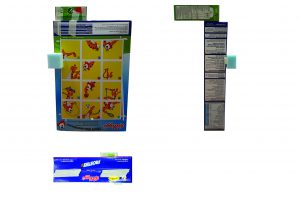
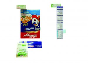
Part One
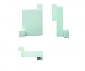
# 1
Comments:
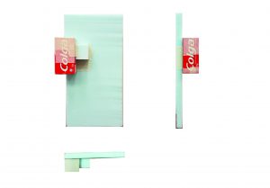
- Width of all (D), (SD) and (SO) were too similar. It is hard to tell which is the (SD) and (SO) from the top and side view.
#2
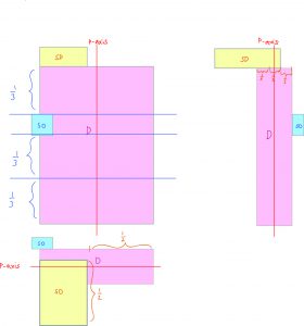
Comments:
- Doesn’t really convey the idea of counterbalance.
- (SD) looks very out of place, a little too high.
- Do not flush (SD) to the side of (D)
- (SO) placed too high up, gives me anxiety
#3
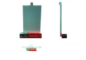
Comments:
- Doesn’t really convey the idea of counterbalance
- (SD) is too long, competes with (D) thus is hard to tell which is (D) and (SD) at first glance, especially from the front and top view
- (SO) shouldn’t be placed in the middle, doesn’t counterbalance anything, should be pushed more to the right
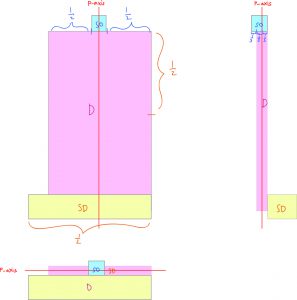
Part Two
Models 2 and 3 were chosen to further refine.
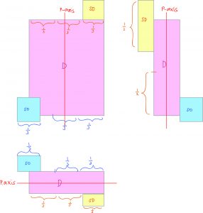
#Model 2

Comments:
- shifted the (SO) to the right and pushed it further downwards to counter balance the (SD) on the top left
- Pushed the (SD) towards the left to make a more interesting silhouette
#Model 3
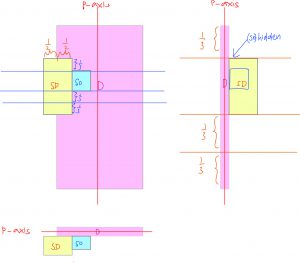
Comments:
- (SD) was cut in half so that it’ll be more distinguishable
- (SD) and (SO) were shifted up
- (SO) could not be seen from the side view. Not a very good sign
For my final model(s), I decided to use both and continued to refine it.
Good attempts with process documentation and 2D Sketch Analysis Yilei. Do remember to add in the principle axis to your SD and SO as well in future.