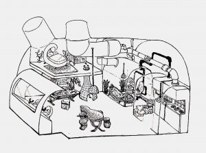
Curvilinear Form
As I did my research in Part 1, I knew I wanted my curvilinear space to be a cosy home on-the-go. I really liked the organic shape from the lotus teapots and the bamboo cicadas hence I wanted to utilise the shape.
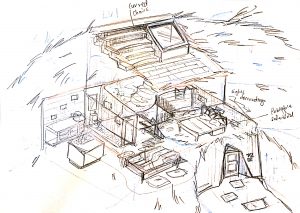
I made a rough sketch of the exterior and then went on to further design the interior with another sketch.
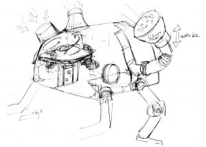
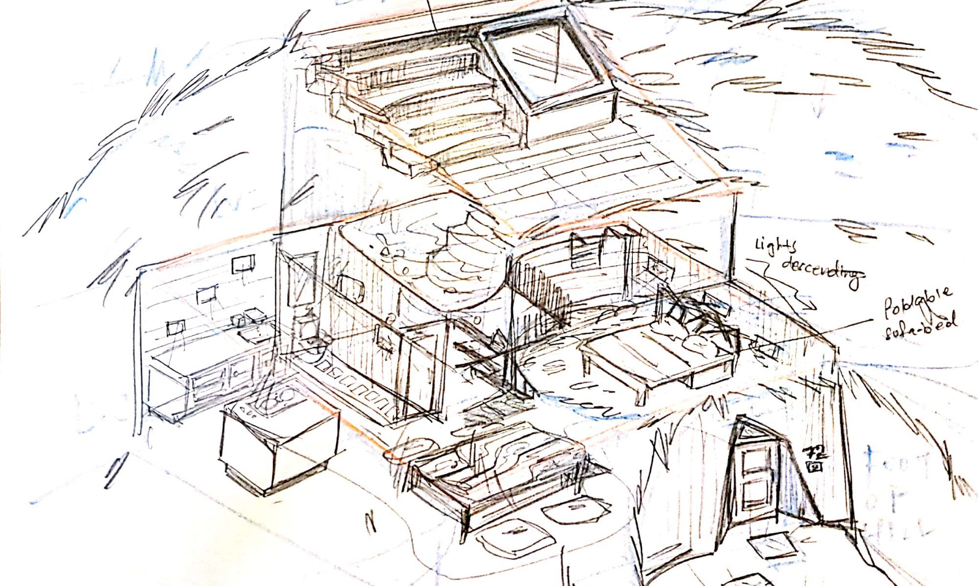
I wanted my home to have this industrial look with all the pipes coming out of the ceiling. There’s a control panel at the front of the home to maneuver the whole creature-home.
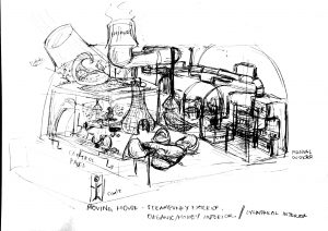
Here’s the final. I made several changes to the furniture.
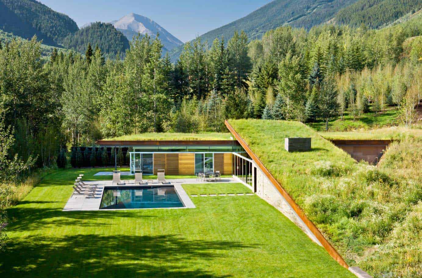
Rectilinear Form
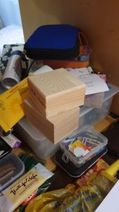
For the rectilinear form, I happen to stumble across these 2 boxes that were stacked on top of each other. For some reason, it reminded me of a television show about interesting houses which in an episode, there was a house that was completely hidden in the frontal view by a hill and could only be accessed through the back and light entered through a tiny hole in the ceiling. Sadly, I can’t find the original home that made me feel inspired, but these are pretty close:

I also researched on Bjarke Ingels, a Danish Architect who uses very interesting forms to create practical buildings.


Here are the boxes!
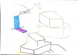
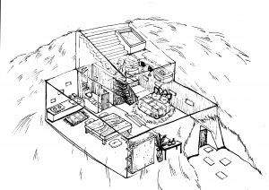
As soon as I saw the boxes, I made really simple sketches of the composition and went straight into creating the sketch.
The home would be underground, where a window on the ceiling is the only light source for the middle level. There’s a pool in the house which connects to the ground floor.
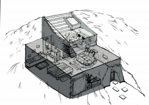
Here’s the final! To my dismay, the home looks really confusing without any shading. Hence, I added some shading to indicate the separation of floors.
That would be all! Hopefully, the homes I have created would look livable :,)
Thank you for looking through!!
wow, these are really complicated, thoughtful spaces. good use of transparency to give us the sense that we are peering into the spaces. the texture you added to select objects really helps the “lived in” feeling you were after, but maybe it is missing in some objects. managing levels of detail (in this case, texture) is different that simply leaving something blank. Maybe refer back to to john ruggeri’s work for excellent examples of using negative space that never feels “blank” Things like the carpet in front of the kitchen cabinets feels so nice and convincing, but the cabinets themselves are oversimplified and under described in terms of form and texture. Especially issues like the “glass” enclosures in the curvilinear design – these feel blank. you definitely need to solve the problem of transparency there. also some shapes are really described, and this seems to be mostly successful with the simpler, rectilinear forms like the bed, stairs, etc. but more complicated shapes like the crazy bed in the curvilinear design seems really only suggested at and doesn’t have convincing form. this is exactly the kind of challenge you want to jump after in order to improve.