
Fat Face Typeface
 Fat Face typefaces were first invented in the 1800s during the period of invention and discovery when more enterprising new trades started to flourish. Businesses turn to print advertising to differentiate themselves from their competitors. Its bold and extreme contrast of thick and thin were used in advertisements to grab the attention of the viewers.

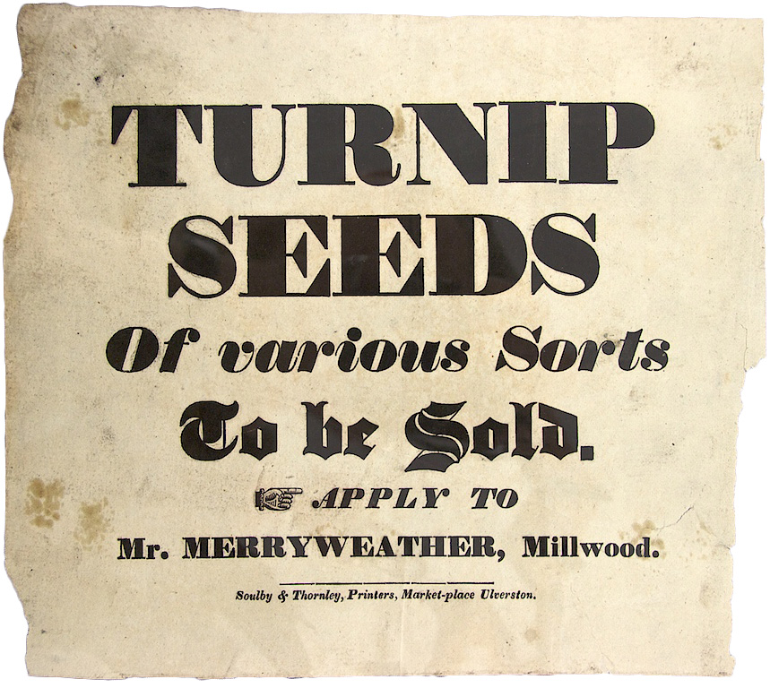
Then in the 20th century when people were starting to rebel against mass culture and industrialisation, many other sans serif typefaces like Gill sans and Futura were founded to move towards modernism. Despite that, fat face typefaces like Sphinx and Ultra Bodoni is still as popular to become body copies or small, readable design elements instead of being attention-grabbing headlines.
Digital fat face typefaces like Abril Fat Face are still used today on websites and posters. It is offered on Google Fonts and is featured in more than 780,000 websites, and served 166 million times last week according to Google API. This shows that it is still popular as a typeface even today due to its versatility to be a headline or a body copy.
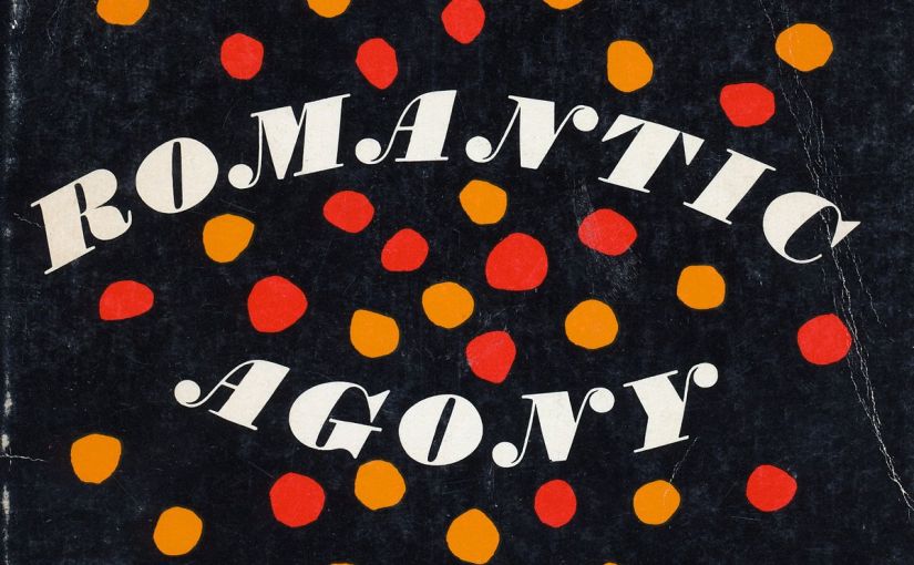
I like the fat face typeface a lot as it conveys the feeling of both friendly and jovial and it also has a lot of variations when it comes to the contrasts of thick and thin, and also the rounded serifs which look really cute! It also pairs well with non-serif fonts like Aktiv Grotesk (as shown above). According to Jennifer Kennard on Fonts In Use, which I think sums up my thoughts about the fat face typeface, “By their very nature, they could be loud, flamboyant and conspicuous, or speak softly with restrained elegance. Like the addition of spice to a bland dish, the fat face added character and flavour to an otherwise simple design.”
References
https://fontsinuse.com/uses/5578/the-story-of-our-friend-the-fat-face
https://fonts.google.com/specimen/Abril+Fatface