Category Archives: Research

Freedom – Artist Inspiration

For the second assignment, we had to work on the same topic as our first assignment. Since the word freedom is a very vague term, I picked a topic from my first assignment. One of the freedom that was shown for my photo is freedom from worry. I feel like this is something a lot of people can relate to, be it work, study or even relationship. We are required to find 15 – 30 images, be it found images or from old photo and make an image sequence from them.

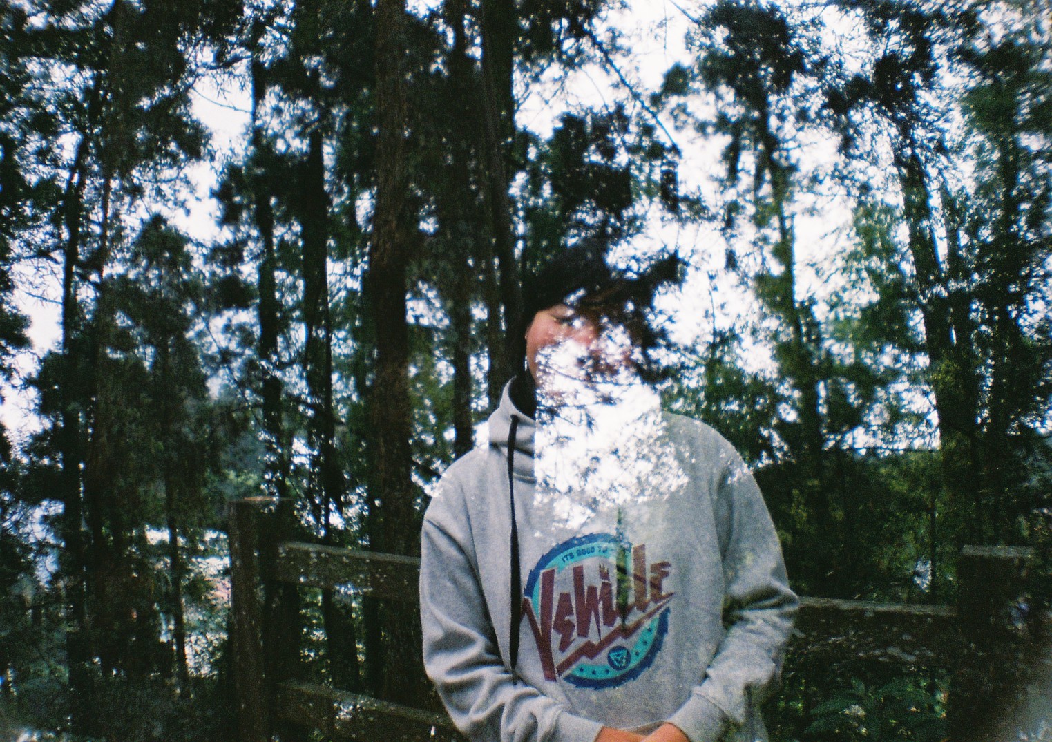
For the first assignment I did double exposure, which was a really nice experiment on photography for me. I had a lot of fun and learnt new things through the process. For this assignment I thought that maybe I can use both taken images and found images to tell a story through there, be it through photo manipulation or through the photos.

I actually went to search on google and typed in Freedom in the search box to see what are the images. Somehow the images that are there are generally of birds flying away , people with wide open arms or photos of the sky, etc. I guess this are probably one of the few things that will pop up in ones mind when the word freedom is mentioned. So I thought to myself what are other things that one would link to the word freedom, should I make it more personal to me or not?

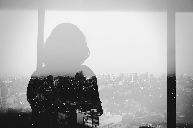
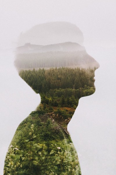
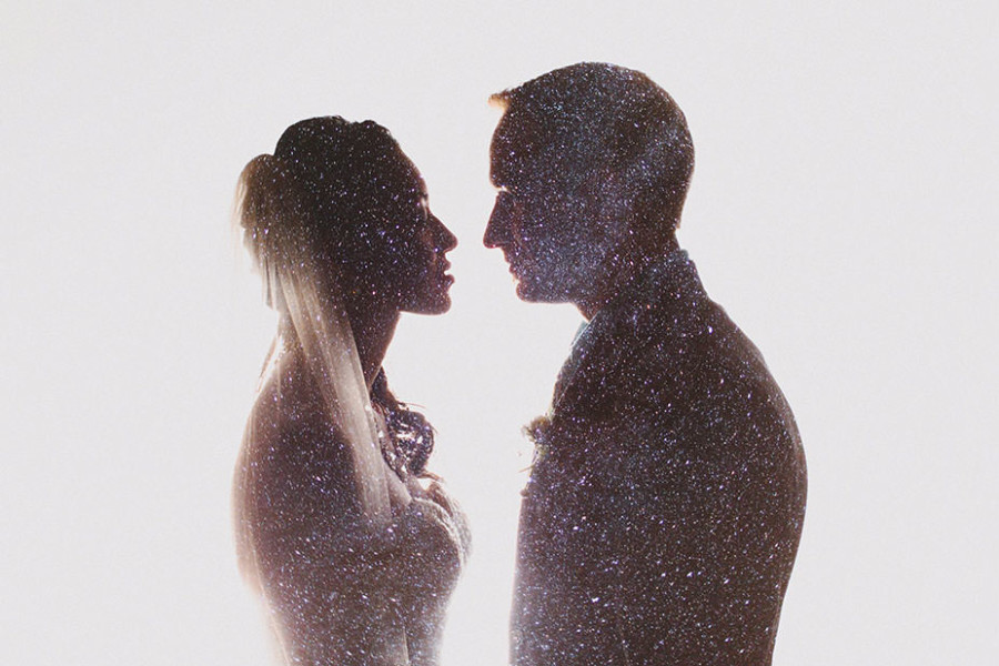
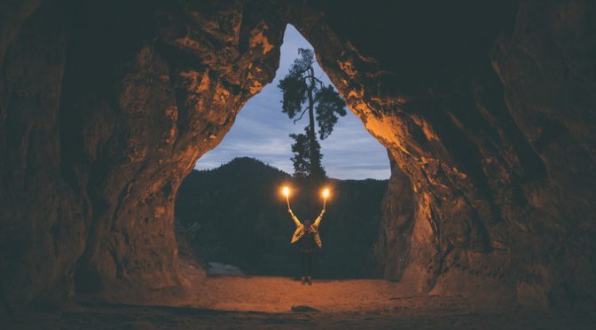
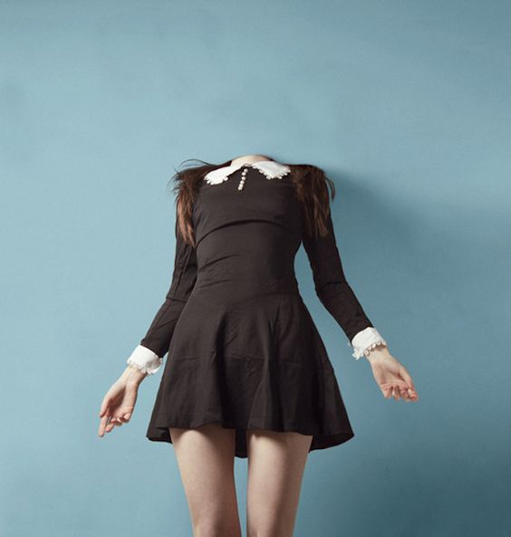
Since I was kind of stuck, I went to look on different photographers. While I was searching for images related to freedom, I came across this photographer called Julia Nimke. Her photograph are really beautiful, she also using double exposure for some of her photographs. The thing that actually stand out to me a lot when looking through her photographs is that her photos contain a certain depth to them. You could actually feel the vastness and space of the place through her photos, its really comforting in a sense to me too.

julia_nimke_06julia_nimke_03 julia_nimke_05julia_nimke_02julia_nimke_08julia_nimke_09

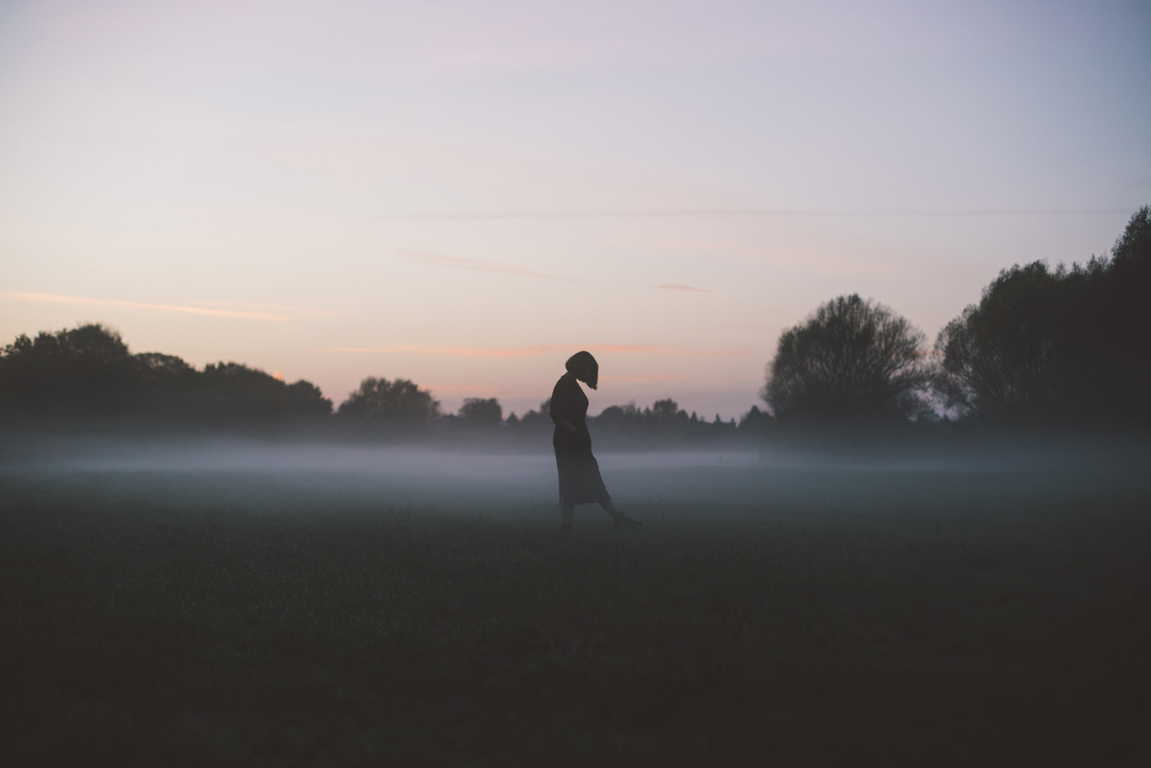
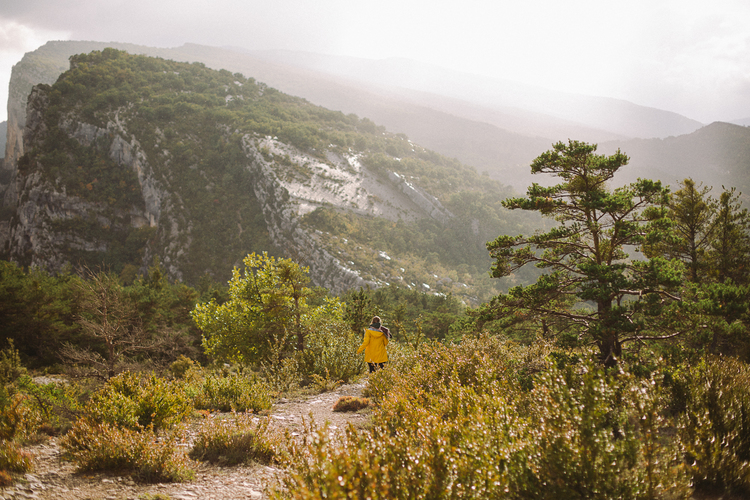
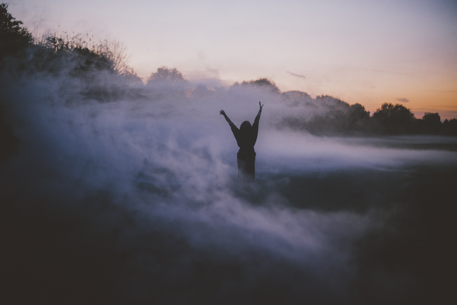
I really how the people in her photos looks like they are feeling very wild and free. The shot somehow feels very natural and it gives off this very calming feeling looking at her photographs, for me at least.


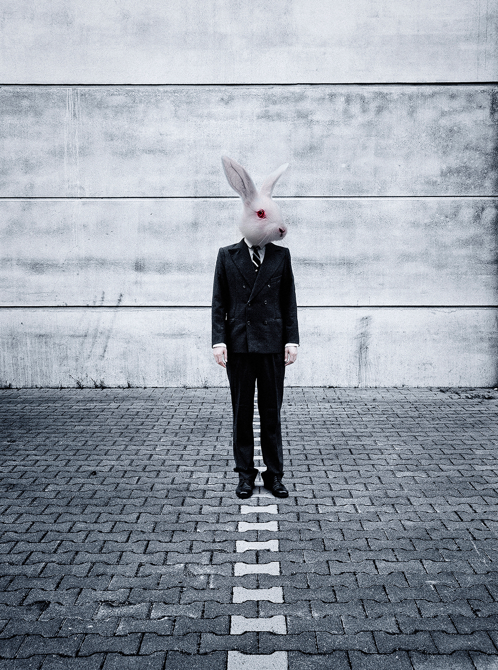
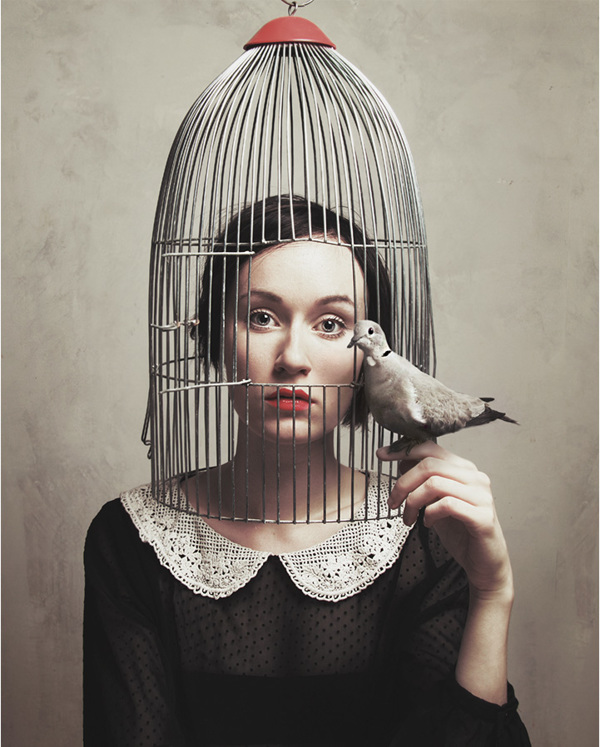
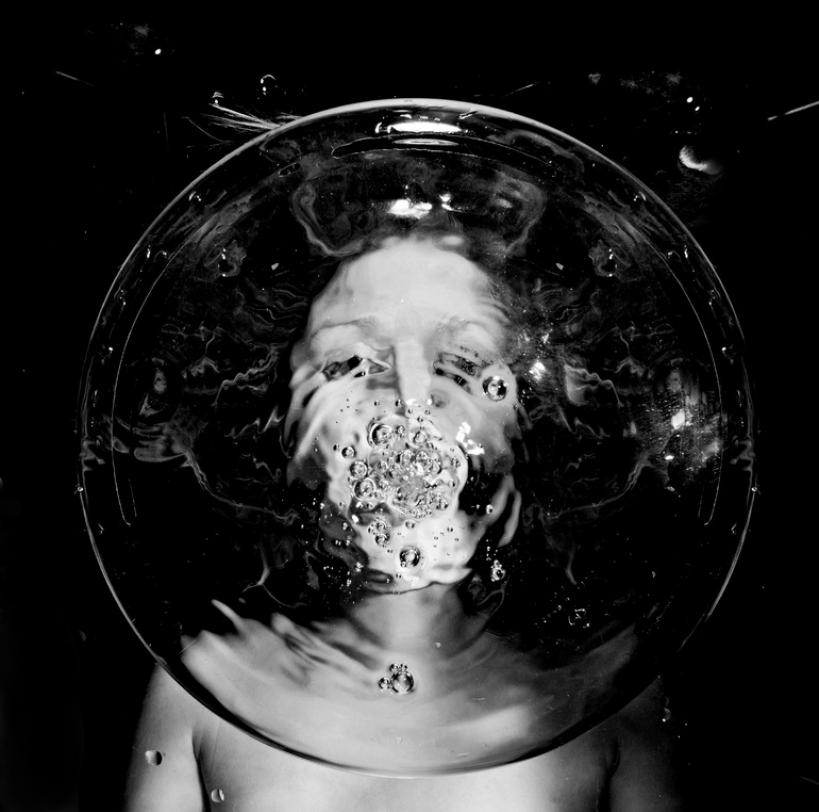
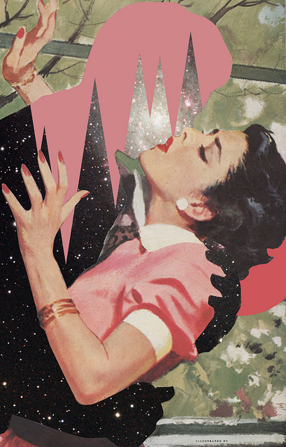
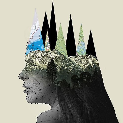
Another photographer that I actually found interesting is Flora Borsi. Even though the work she do may not necessary mean freedom, I really like the way she portray identity and dreams through surrealism. She using photo manipulation using metaphors, or even dark fantasies to make one think and feel through her photos. Something that I actually really like about her is the fact that her photos seems so right but yet wrong at the same time, I really pushes ones boundary.

flora_borsi_01 flora_borsi_02 flora_borsi_03 flora_borsi_04 flora_borsi_05

I was actually thinking of something like conceptual photography for my assignment two, but I am actually quite worry about how I would execute it since conceptual photography is something that I myself think is a lot more harder than double exposure photography.


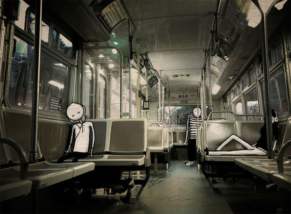
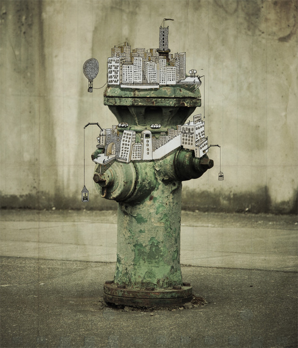
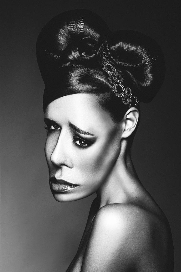
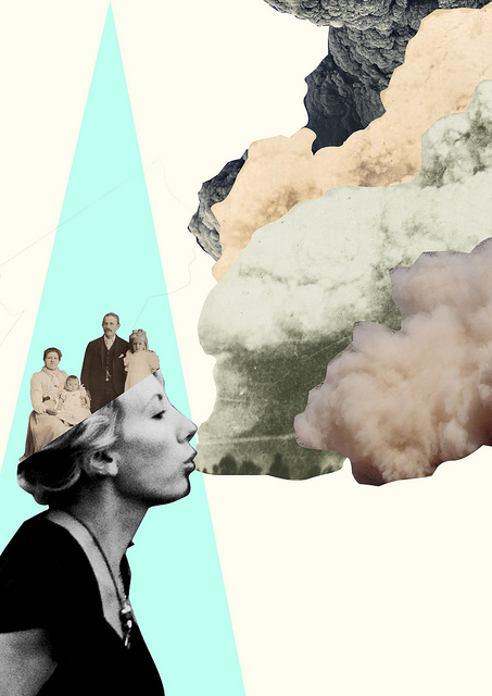
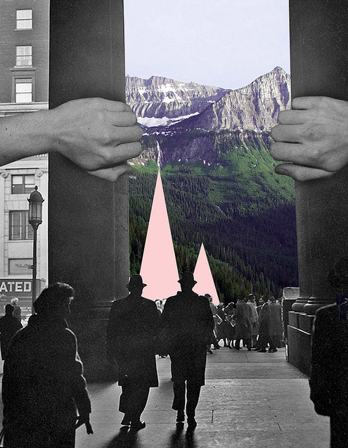
Ashley Edwards really intrigued me with her photo montage. Her photos have this really vintage touch to them, but even if I were to do photo montage I would not do this kind of vintage pin-up style. However what I really like about her is the way she put her photos together. She expressed a story through the photos using a mysterious yet  abstract way.

ashley_01 ashley_02 ashley_03 ashley_04 ashley_05 ashley_06

I have always wanted to try out photo montage, it is such a unique way of photo manipulation. In a sense it is like graphic design yet also photography at the same time. I am really curious on how all this type of photography techniques will work out, perhaps everything will work out when I get the feedback.

How i see the world – WIP 03

I also went to a few other places within the few weeks with my friends and family. I went to the Botanic Gardens to actually get information for the module but I thought Hey! Botanic Garden is also a place that I really would visit from time to time because I am a nature person. I also visited the S.E.A Aquarium with my family just for fun.

After trying out the black and white edits, I figured that maybe I can try out colours for the project too. It was just to try out whether I can also portray the same feeling using colours since I am not really a black and white person, I realised I have a few difficulty when it comes to adjusting the contrast between the value. The trial and error for the black and white really help me learn a lot and observe the different tonal values better.

So I went to the Botanic gardens, it was a downpour before I reached there. Everything was pretty much wet but hey that is actually a good thing because that would mean the flowers would have water droplets on them which can actually make them prettier. I kind of forgot I went there on a Sunday so the number of people kind of eek me. This would mean that it is more difficult to take photos of the landscape without the people swarming everywhere. Morever the recent Pokemon craze isn’t helping either.

20160821_1147371 20160821_1220041

I tried to put together the process of the blooming of flowers since I was actually thinking about how as our life, or rather my life, proceeded on it felt like you as a person becomes a better person. This in turn shaping us into a more defined being different from everyone.

colour_18

I did not want the colour to be too vibrant since I did not want the whole image to come off as too strong. I just wanted it to be subtle and the I have sort of decided that I want my photos to all have the washed out feeling. Somehow it just felt more calm and collected instead of the thing shouting out at you.

18

I did not edit too much for this photo but just mostly tweaked with the level of the images to bring down the contrast. It was somehow actually much more natural for me while doing colour as compared to black and white.

Somehow the black and white photos seem to make me depressing in a sense. The feeling of it being very solemn is there and I feel like I am not a person who can bring out a happy tone from a black and white image. It feels more natural to me in expressing my feelings in colours. Perhaps my animation background has something to do it since I am constantly told to try not to use muted colours.

06 20150902_125614 20160821_1147191

I actually merged 3 photos together to give it more details instead of having something just in one place. For this photo I actually thought that it reminded me of being free of constraint. The cloud being “me” trying to control myself, the pink flowers indicating the problem growing and the yellow flower making it look like it exploded.

colour_11

11

I actually had to change the colour of the whole image because all 3 of the images have very different tone. The flowers have a very yellow greenish tone to them while the image of the cloud is super bright and blue. I gave it a little more reddish tone because I thought that it has a more fluttering feeling to it, since warmer colours  give a happier feeling.

After trying out even more on double exposure and putting the images together. I thought that maybe I could actually use a different meaning of being free for my photos. They would still be from my memories but the different memories would represent a different type of freedom that actually means something to me.

Extra photos that I actually tried to edit :

How i see the world – WIP 02

Honestly speaking for two weeks, i just went to different places to shoot photographs of places or people that mean something to me, apart of my memories in a sense since my topic is about being free from my memories. What do i actually mean by being free from my memory, is that perhaps that is a particular incident or a place that stuck to me ever since because of something big that actually happened there or it just sort of changed me as a person on a whole.

So after trying to figure out exactly what I am trying to show through my photos after the first consultation/presentation during class, I thought of starting it simple with just shooting around my neighborhood. It was what I did for the first presentation but I was actually kind of lost still that time. However after the feedback, I realised actually what I wanted. I went around taking photos of the HDB flats, the trees, the temple, the playground and even the sky – even though the sky might not have been the same since last time but it was that particular spot that I would look up to the sky.

I thought was actually just testing out the different pictures and just putting them over each other.

20160906_1649041 20160818_1622091

The images I picked out was a photograph of the temple at the front of my block and a photo of my block behind the shades. At this point of time I still do not really have a specific idea of what photos I really wanted to overlay over each other. It is still just experimental.

16

I remember that among the two paragraphs, my black and white image was said to have a more define feeling of faded memory because of the softness the layers were over one another instead of the harsh one for the coloured one. So I tried also using the blending method that our lecture, Robert suggested. However, for this photo i did not use that method.

15
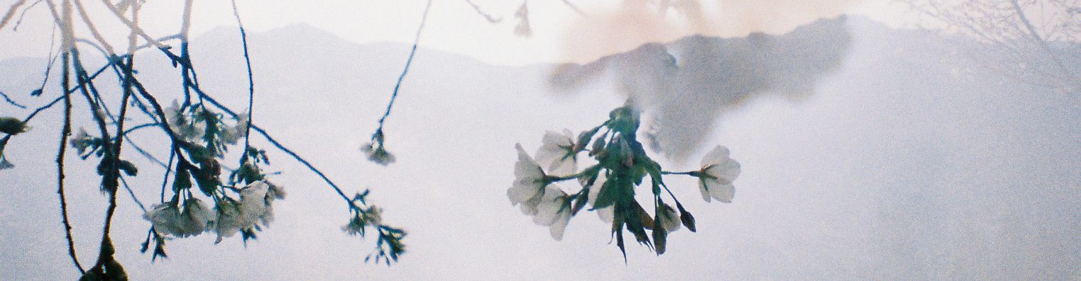
I changed the layer of the temple to screen and toggled with the opacity and fill. That was only managed to change a little of how I wanted the photo to look because the contrast between the tonal values were still pretty harsh among each other. I ended up pushing the darker greys into more of the mid-tone range to give it a more washed out feeling.

16a

Also as seen in the photo to the left, the white of it is too harsh, eliminating too much of the information for the temple. I ended up trying the channel mixer and toggling with the different colour to bring out the different shades which in turn gave a more clearer view that it is a temple.

I went ahead and got a photo of my kindergarten, the first time I made so many friends.

20160906_1643101 20160818_1623081

The sky photo was supposed to be vertical but I decided to rotate it in a way to fit the image of the kindergarten. For this image I tried out the blending method, I kind of realised the method is more easier to use and control is the tonal value has a difference between the darkest and the lightest shade.

17

This photo was actually more difficult to edit because I realised the photo of the Kindergarten when taken then value were mostly all the same. It kind of affected the whole image when I tried to put them together. The leaves were really much darkest part of the whole image so I needed to balance out the contrast between the two images, if not it would have looked like a very harsh contour between them. Also, I will ended up over exposing the sky part since it was the brightest part.

17aThis is what the photo would actually look like. I do not know why but somehow I feel like everything is too harsh and a lot of the details of the leaves around the kindergarten are lost.

I have always like double exposure photography but maybe I just haven’t the sense of style that I like yet. Maybe that is why I still feel kind of lost through the process.

How i see the world – WIP 01

Continuing from the research we were tasked to do test shots. I tried to put a few photos together and create the double exposure feeling. I did one in black & white and another with colour. Both of them give off a very different vibe. The black & white photo gave off a pretty mysterious feeling. The other one has more of a yellowish green tone to it, making it a more mellow feel. It was more closer towards nature while the other was more like a faded memory.

In the black and white shot i took a photo of myself with an overlay of a playground. I was trying to show more or less how the playground is part of my faded memory. Something that was once important.

In the coloured photo, i took a photo of my shadow and overlay it with the grass patch. I tried to make it seem like I am the one that happened to be fading away. Together with the nature. It is also a way of saying the grass is greener on the other side.

Print01Print02

How i see the world – Research

4D project 01 – Using my concerns in life to explore and develop a body of work.

Something that is meaningful to me, how i see the world. This is funny since i have never actually given a thought about something that actually bothers me. I would actually be intrigued by something rather than to be bothered by it. I would always like to dwell on the darker side of life. Perhaps one of my biggest concern would be wanting to be free from my thoughts. But i guess different people have different ways of defining what is being free. Be it away from the digital world, out in the woods enjoying nature.

So i thought that maybe i could work on something that represent the word free through my memories. The realm between reality and dream. I have also been thinking about how colours actually affect our thought. How specific colours create different emotion in us. So i went and search for the colour(s) that represent the word free. The colours that came up was blue and green. Perhaps its like the vastness of the sky, sea and nature.

The first thing that came into mind when i think about a way to show the realm between reality and dream is through double exposure. I have always like double exposure photography as it gives off a dreamy feeling. I have tried playing with exposure myself with film cameras. I just love how the photos feel like a memory. The way he expresses it with the person and the environment.

And_2 And_12

– Photo from Andre De Freitas

I also like the photos taken by Sara K Bryne. Her double exposure photos gives off a different feeling. It shows a world inside someone instead of a world with someone.

10446291_846740528671044_8581875109716837640_o-400x600 in-camera-double-exposure-900x600

– Photo from Sara K Bryne

There was another way of art that i found interesting. It was drawing illustrations on a photograph. It is like a way of showing a world that is your own reality. It could be a input or a world that you could imagine from that time and moment.

0b95e62510918.56017536d574cb55cf92510915.56017506d6861

– Photos from Johan Thörnqvist 

I am still thinking of the way of showing the end product. Should it be a series of photos that tells a story or a film that brings people through a journey? Should there be a main subject where they take a journey to finding the meaning of being free? Or it is a view of many different people representing the meaning on being free? On to more brain storming, in search of freedom.