


Hello folks! For project 3, since it is pretty personal in my opinion, I wanted to include subjects and things that I like in my recent years. Hence, I jotted down my initial ideas during my long train ride in my ideas notebook. 
for the first column, i had the idea of using different parts of my body as a representation of myself. as for the second column, i had the idea of including the things that i came across with in my recent years like going to my favourite sushi bar, reading a boring harry potter book, playing touch rugby or being introduced to cosmetics. the last column would be about results and outcomes from the subjects mentioned in the previous columns. although these were the ideas, i didn’t use all of them eventually and had some changes here and there.

so i get on with work like doing these drawings during the initial stages for this project. as for the reason for the idea of minimal drawing, i’ll mention it later! so after i’m done with the drawings, i scanned them in the computer and basically painted over my drawings and tried to be align to the flat-design/ vector style that i was going to aim for in the first place!


During my research for colour schemes, I chanced upon Malika Favre‘s works and I was intrigued by the choice of colours which I thought was super charismatic. There is somehow a “strong” vibe from her work, totally not dainty and soft which was exactly what I wanted to try for this project. Looking more into her work, I love her style of Gestalt and the use of negative space to form the shape of subjects in her illustrations which I thought was super clever but hard to compose at the same time.

Since I was also looking into a more vector-centred and flat illustration, I researched into Hey’s work which is also very simple and minimalistic at the same time.

This is really random. Once, I was on my way back home listening to the music of this particular singer above. I saw the border around the album cover and I really liked how it gave a vintage vibe around the design itself. I immediately thought of using that idea for my works, just somehow, in one of the rows.
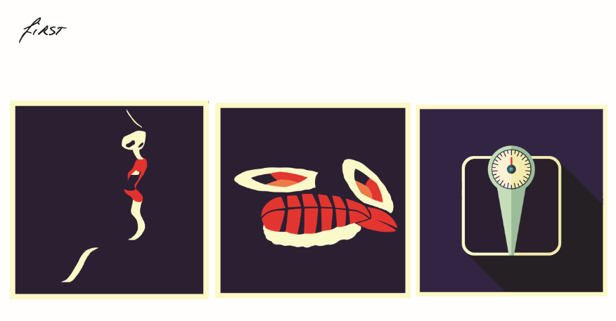
For the first row, I wanted to portray my thoughts when I am feeling hungry which is pretty common nowadays. But there’s always a contradictory – the urge to eat whenever I think about raw sashimi in between the rice rolls and the irk of eating them whenever I think of how I always go out of control eating them which could lead to a gain in weight. Also, I wanted to use the idea of the vintage border which I mentioned earlier so I put it in this particular row! Also, the weighing scale over there is inspired by Hey. So there you have it, the focus on the red lips, representing the urge to eat, my favourite food, and a weighing scale.

As for the second row, I wanted to portray my feelings whenever I get on field. The first illustration is again, another part of my body and I’ve tried using Gestalt this time to create the shape of a hand. The setting would be a rugby field and the last illustration would illustrate the feeling of ecstasy. I used pills to illustrate it since Ecstasy is also a name of a drug and thought it would be interesting to put it that way. A light blue colour is chosen as I wanted to create a bright and vibrant look for this particular row.

Again emphasizing on negative space for illustration, I tried to create shapes of a pug and lipsticks. The pug represents how I perceive myself in the past recent years – not appealing, just like how i see a pug as. The lipsticks represent the world of cosmetics which I was introduced to just this year and that eventually led to vanity which is represented by the women with lipsticks in the last illustration! I thought baby pink would be a cute colour to represent femininity as well.

As for the last row, i wanted to portray a more spiritual side of me. The first illustration means ‘Soul”. A soul shouldn’t only belong to your head, your heart or just some parts of your body but as a whole, which explains the body illustration. The setting would be inner peace which is always represented by a picture of a buddha. The last illustration would mean zen and is represented by the chinese translation of it to just give an oriental feel. Black is chosen to be the background as it creates a calm feeling in this case.

In order to make it my own, the texts below the illustrations are all hand-written (just like the one above)!

Couldn’t get the actual file to be uploaded due to huge file size so i screenshot it (which explains bluriness) .

There you have it, that’s project Ego by yours truly.