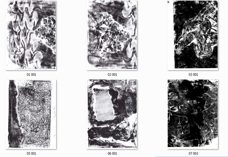
Hello! For this project, I’ve tried a few techniques. The first one would be monoprinting which contributed significantly in creating the lines. They were produced digitally after scanning the prints.
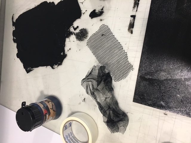
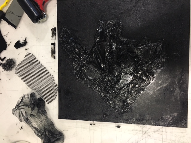
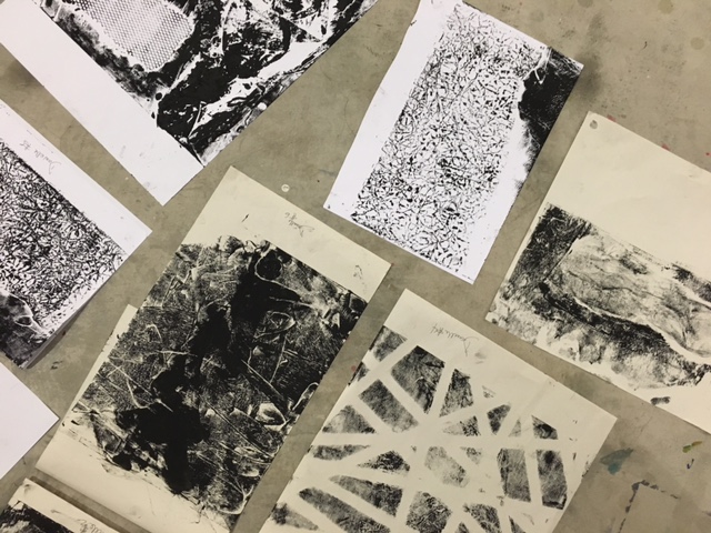
After scanning the prints, they look like these! The trashbag seen above made the print shown in the picture below (on the top right corner).

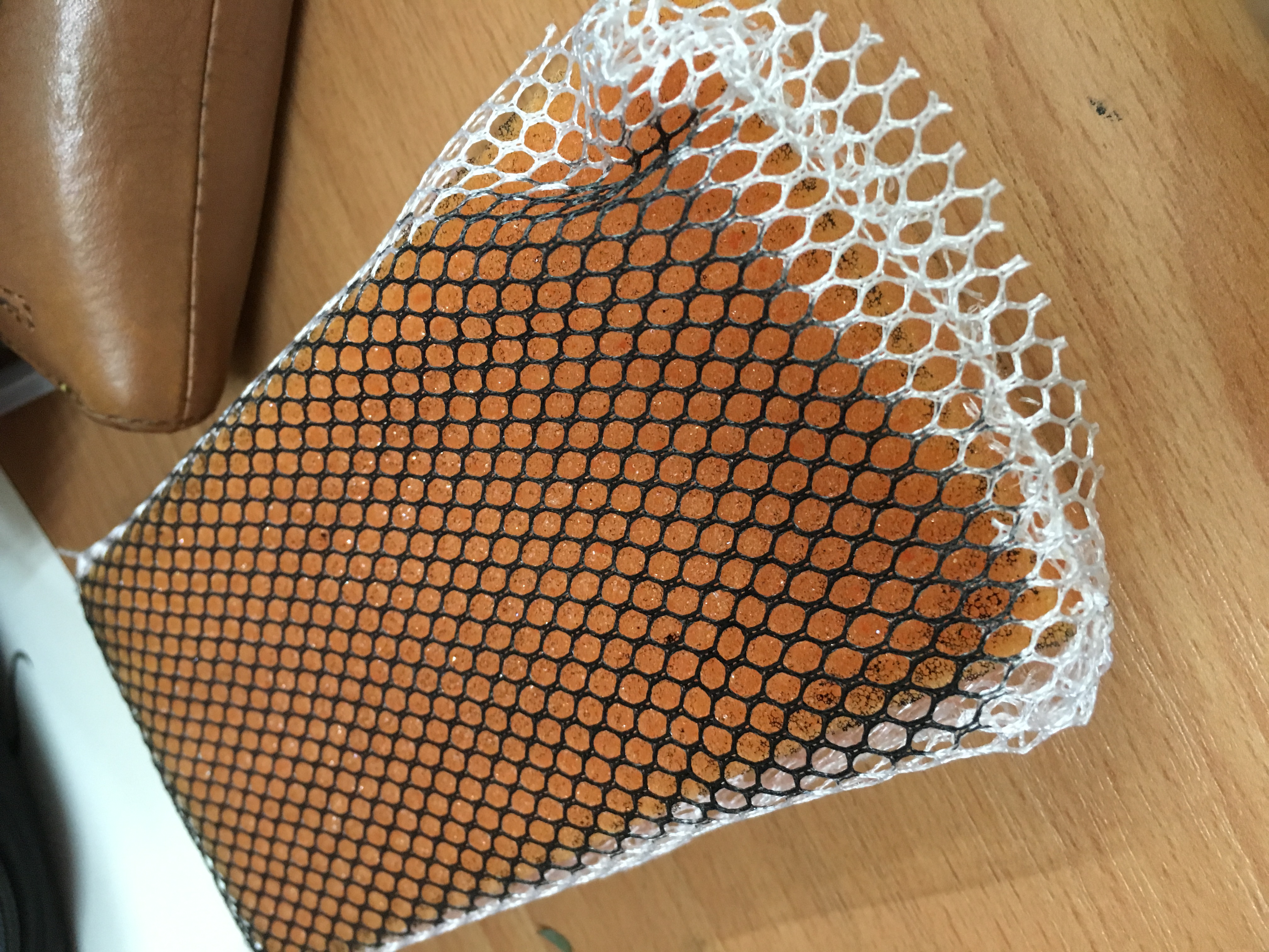
other prints are created by taping scotch tape (for the print seen on the bottom right), using crushed paper (print seen on top tight in second photo), thread gauze and others!
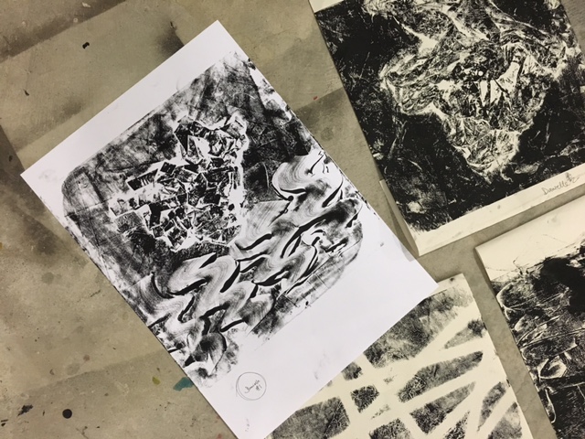
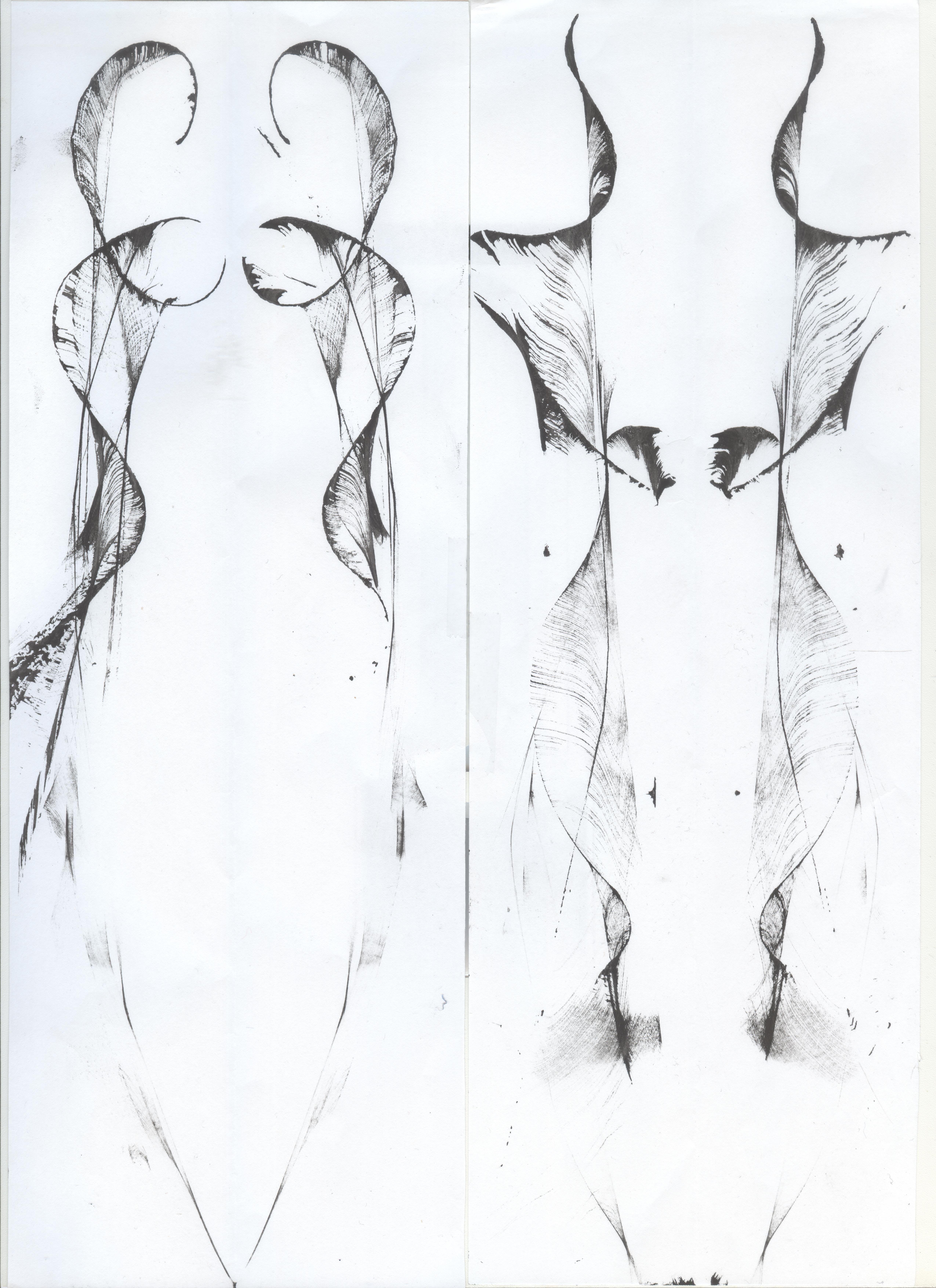
after scanning in, these are the products!
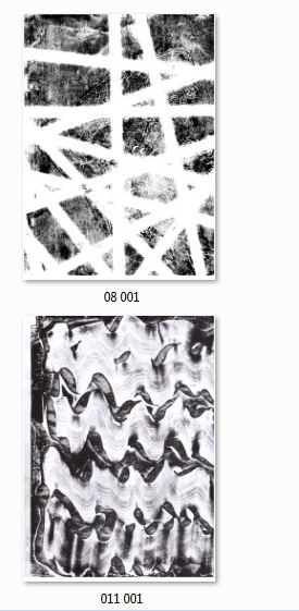
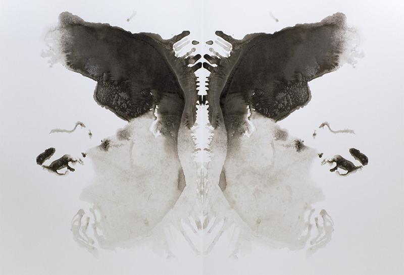
The photo labelled 08 001 above reminded me of Ed Moses’ Rose screen he created in 1963 which inspired me to edit the picture such that it is in a repetitive pattern. I will mention about this later in the post!
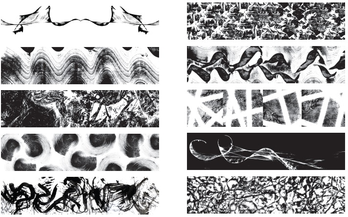
As for the digital prints, they’ll look like these after editing.
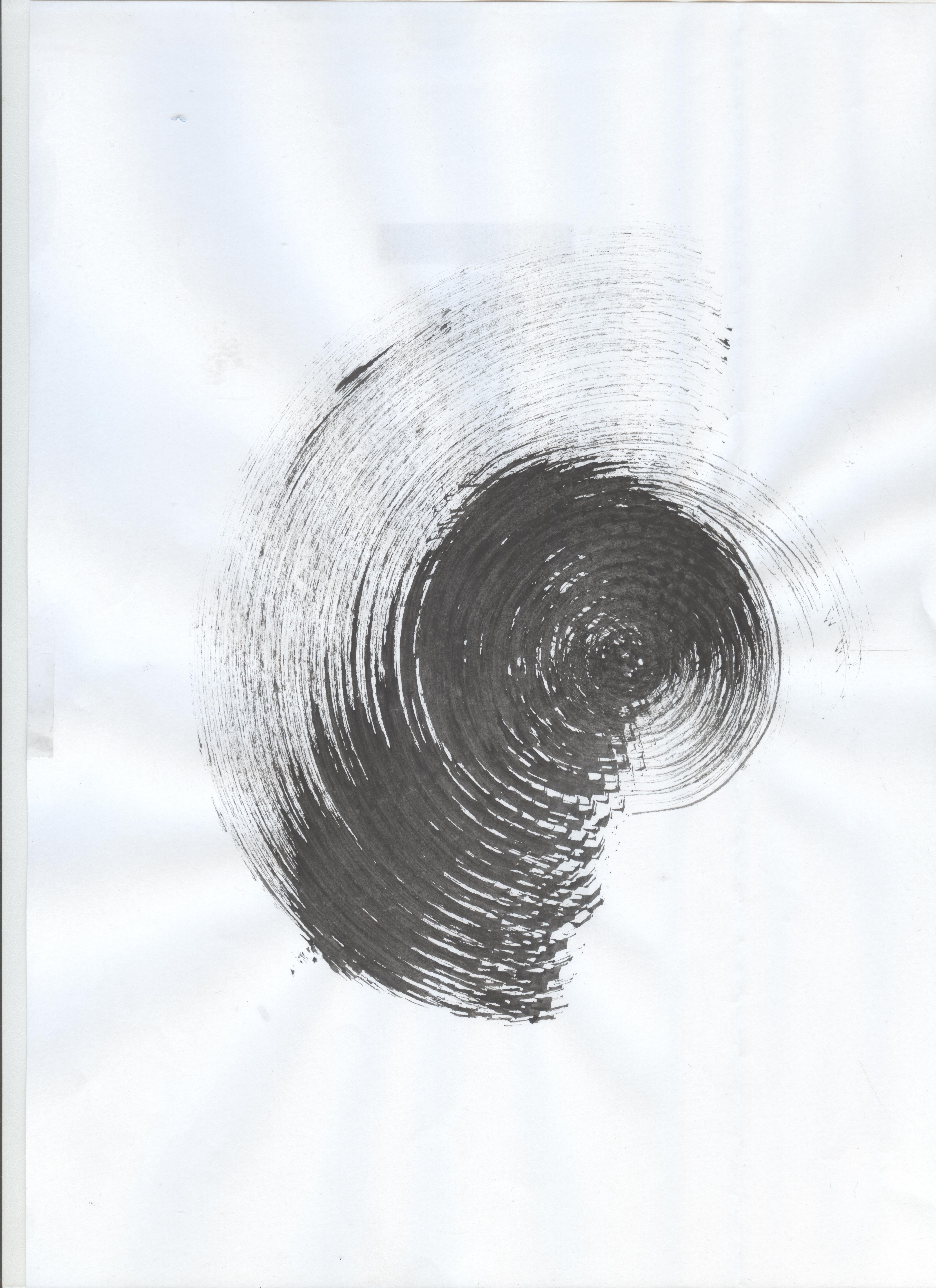
Other than the monoprints, this is one of the mark making tool that i’ve used to create more textures. a sponge wrapped with a cotton gauze.
The texture below is done by pivoting the sponge about a point in the middle of the paper.
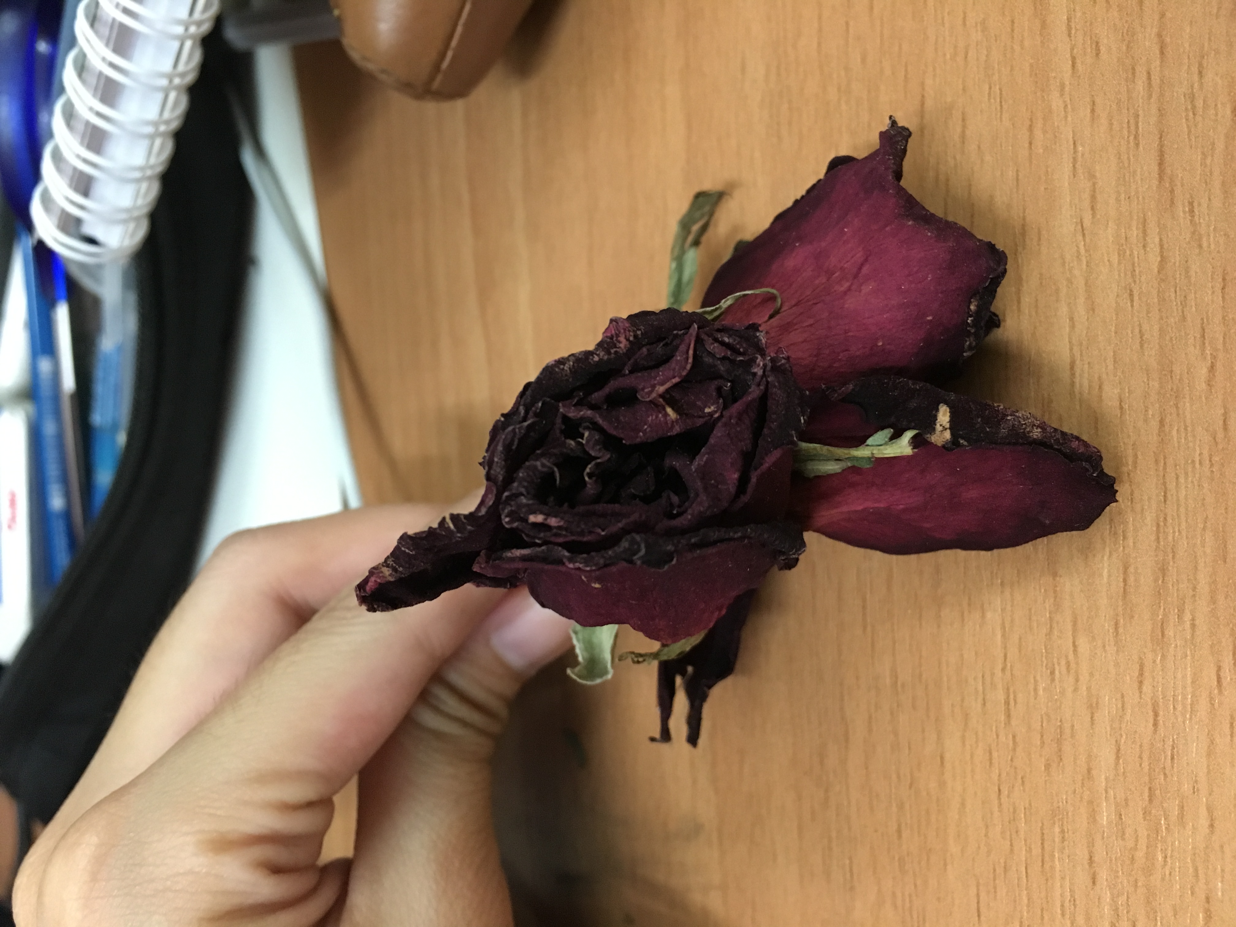
Another mark making tool I used is by bundling 2 roses together but the effect done by the petals wasn’t as nice as expected.
I’ve also tried some automatic techniques. The first one would be fumage art.
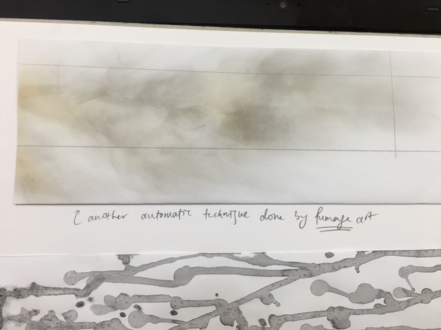
But I find that the effect created by the fumes isn’t as “free-spirited” and does not give off the “unrestricted” feeling that I’ve expected. Hence, I didn’t use any fumage art for my project but it was worth the try!
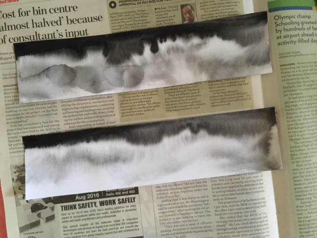
Next, I was inspired by chromatography, which is usually done in science experiments but the effect created by the movement of the water turned out to be quite nice.
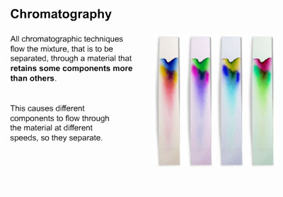
this is taken from www.lifeofplant.blogspot.com
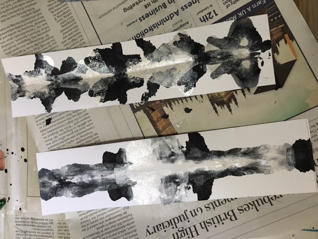
Another method I’ve adopted is Decalcomania. Decalcomania, from the French décalcomanie, is the technique of placing paint between two sheets of paper or between paper and some other material and pressing down and spreading the paint. This produces a random pattern over which the artist has no control. The term originates from the French word, “décalguer”, which means to transfer. I dabbed black and silver paint on one side of the line and folded the paper into half such that that they created symmetrical patterns. Using the colour silver for this piece, I hope to bring out the emotion of passion.
taken from http://art-design-glossary.musabi.ac.jp/decalcomania/
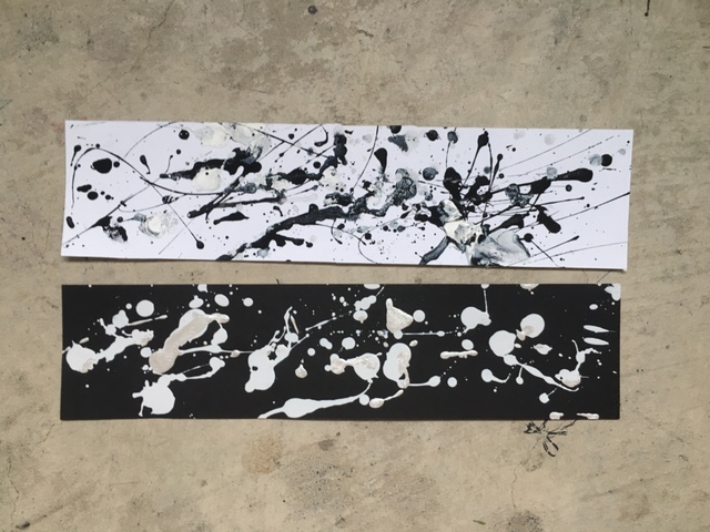
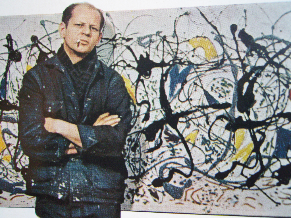
Next, I’ve seen some of Jackson Pollock’s works, which involve splattering of paint and i really like this technique as well. I feel that this technique gives off attitude and can have some potential in expressing some positive feelings so I decided to give it a try! I’ve researched about him and will mention about him more below in this post.
Using somehow the same method as decalcomania by folding the paper into half, these ambiguous marks are created by dipping a thread into black paint and maneuvering it around while pressed between the folded paper.
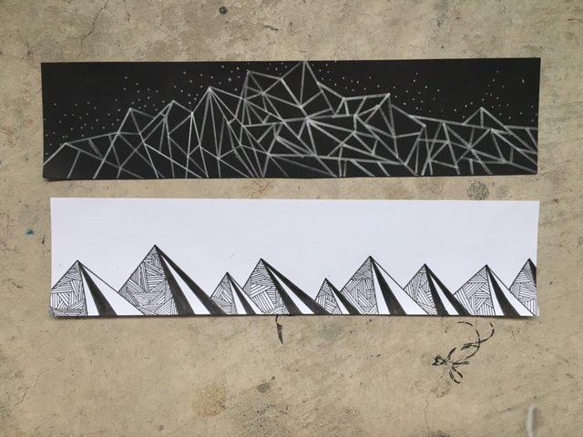
I’ve tried out different techniques that involve blotches of paint that gave ambiguous shapes. Hence, i decided to do some drawings that involve straight lines as well to have some definition in my work. I had some inspiration to create the lines with black paper, going with the astronomy theme. As for the second piece, I have purposely created a pattern with an ample amount of space, giving a sense of emptiness, misery or dejection.
After creating some lines, i felt that many of the lines I’ve created seemed to have more potential in carrying out emotions such as anger, frustration or dismay. Hence, I decided to hand-draw some more pieces which can show positive feelings. The first piece below was inspired by Indian henna painting. Since henna painting always involves patterns which are very full and “fruitful”, i feel that i can relate that particular strip shown below to “contentment”. The second one was inspired by oriental japanese drawings which usually give off very strong vibes to them, and i thought that those drawings can signify “infuriated”, something along that line.
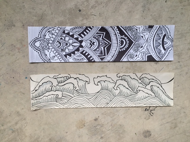
i tried out 2 different kinds of waves and see which one has more impact in expressing a strong and rigid emotion.
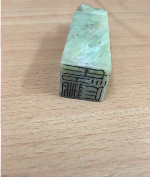
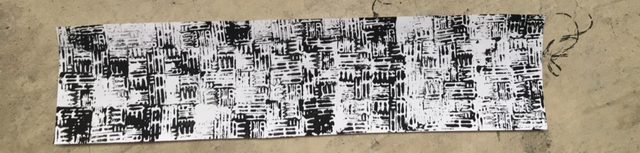
also, i was thinking how i could express feelings towards being scared or horror with the techniques I’ve tried. but i realised one good mark making tool would be a name chop that I’ve bought from china. We all humans are afraid of things we are not familiar with. since we are not familiar with ancient chinese words carved on the chop as well, i thought the marks would create a horror vibe with black ink. (as shown in the last line in the photo below)
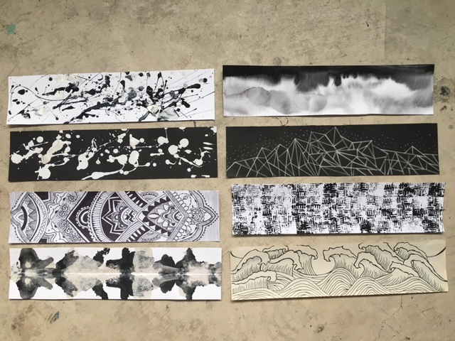
This is the end result!
Hence, as for works that are hand-drawn, they will look like these.
Artists Reference
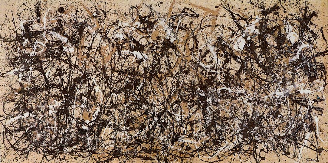
When creating these lines, I’ve taken some reference from artists that have created works which I understand from an emotional point of view and that their works have probably inspired me to recreate pieces which are similar to theirs. As mentioned, one of the artists that have made some impact on me would be Jackson Pollock. He is an American Painter and a major figure in abstract expressions.
taken from https://remodernreview.wordpress.com/tag/jackson-pollock/
taken from http://www.metmuseum.org/toah/works-of-art/57.92/
The piece above called the Autumn Rhythm especially inspired me to try out his unique style of drip painting. He once said this line. “When I am in my painting, I’m not aware of what I’m doing. It is only after a sort of ‘get acquainted’ period that I see what I have been about. I have no fear of making changes, destroying the image, etc., because the painting has a life of its own.”
I feel that from what he mentioned and the technique that he favours, this way of creating works by instinct and without caring too much of the end outcome is also kind of a beauty that I would like to try in my work as well.
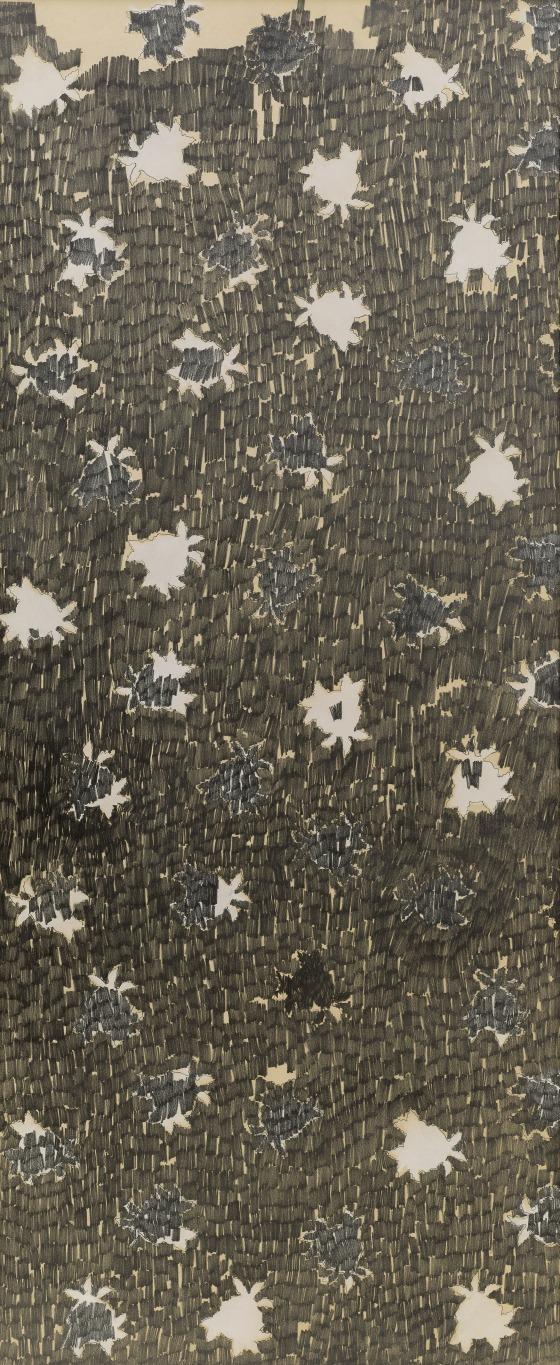
Another artist reference would be Ed Moses.
taken from http://alchetron.com/Ed-Moses-(artist)-269782-W
From what I have mentioned earlier, Ed Moses created a work called Rose Screen which actually influenced me to edit the specific monoprint in a way which was similar to his piece. It seemed to consist of repetitive white patterns on the graphite work, very similar to the dark shade on the monoprint with stretches of white.
taken from https://unframed.lacma.org/2015/05/08/weekend-lacma
While artists developed a mature style, Moses has managed to resist any stylized approach and remain more experimental, playing to his curiosities by moving past what he already knows. This particular idea of his influenced me to try out the different automatic techniques that I have heard of, although I have not actually decided to utilise all of the works created for the final pieces.
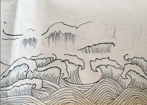
Another artist that I have referenced from is Katsushika Hokusai. I had the idea to include a few oriental pieces, resulting in lines made from the chop and the line that consists of “oriental-looking” waves. I wanted to do something related to waves because I feel that the motion of water gave off a very strong and rigid vibe. I happened to chance upon Great Wave off Kanagawa by Katsushika Hokusai and decided to give it a try to replicate the waves but with my own style.
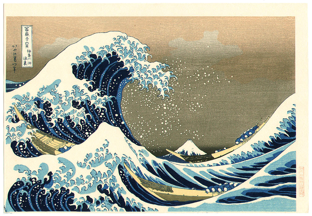
taken from https://en.wikipedia.org/wiki/The_Great_Wave_off_Kanagawa
With that, I shall end of this long post.