Please click on the pictures to get a clearer view! 🙂
Zine: The Departure
Leave a reply
Please click on the pictures to get a clearer view! 🙂


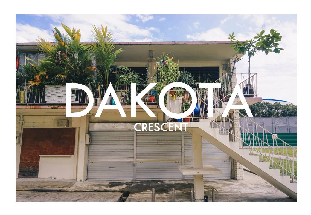
The place I am covering on is Dakota Crescent.
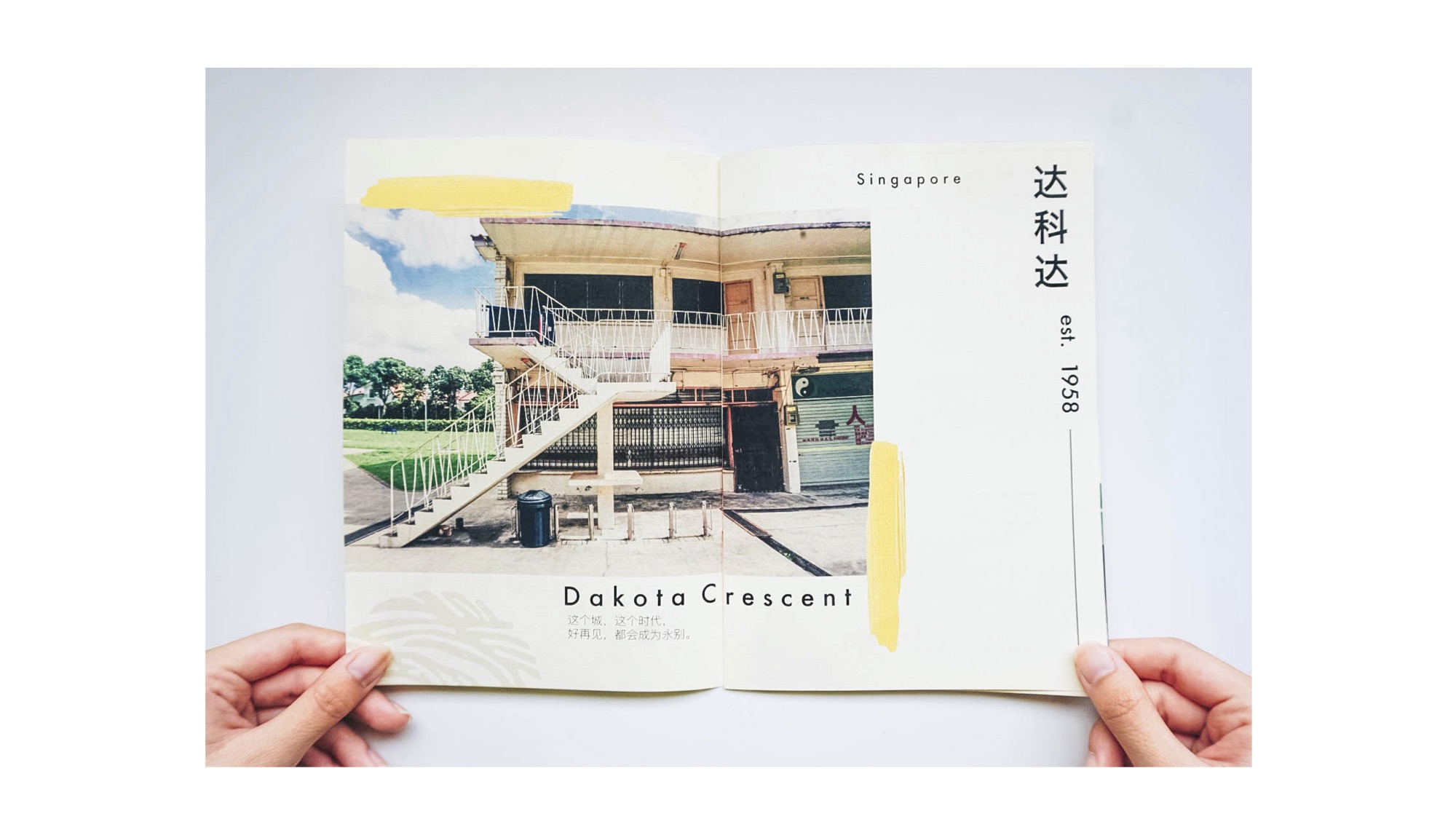
Cover page
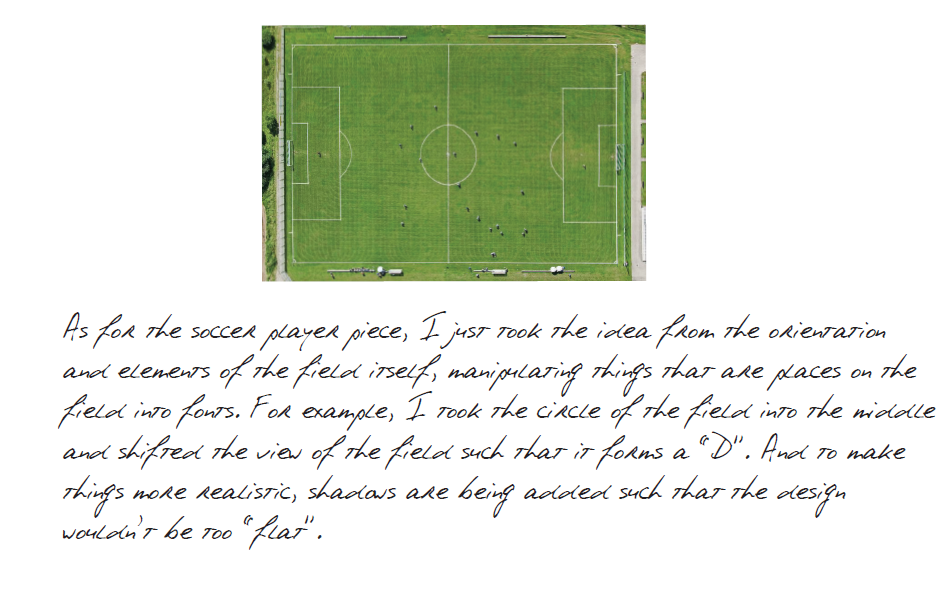
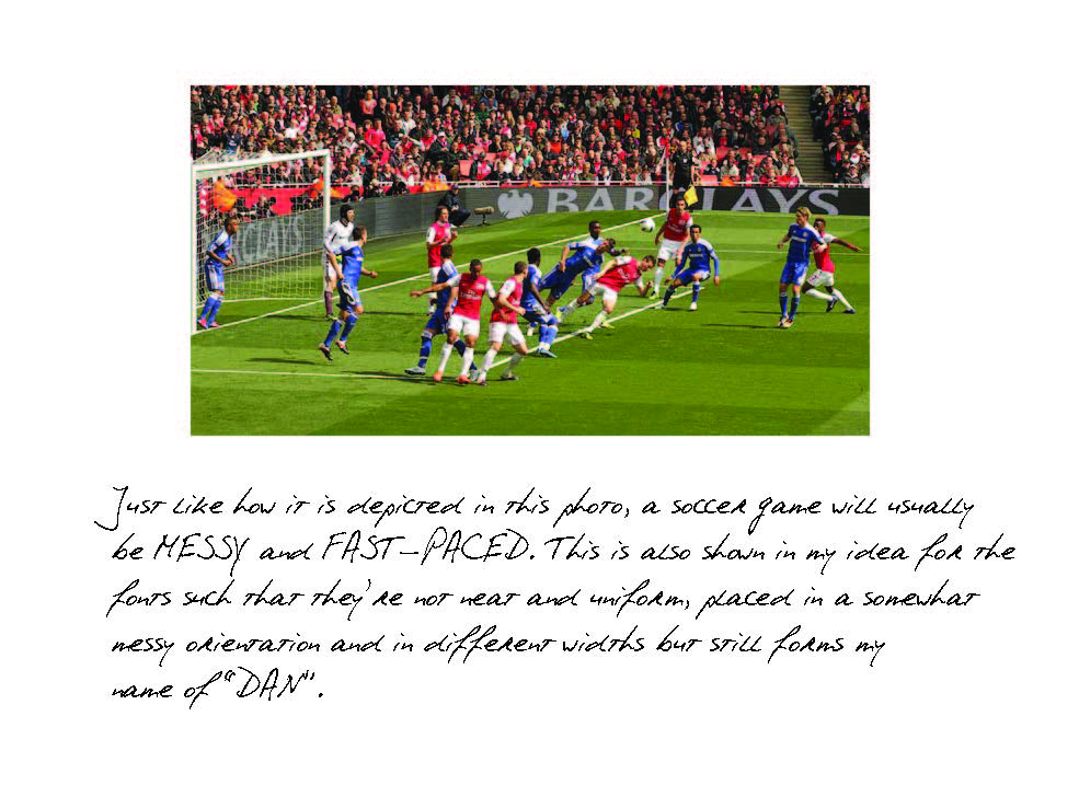
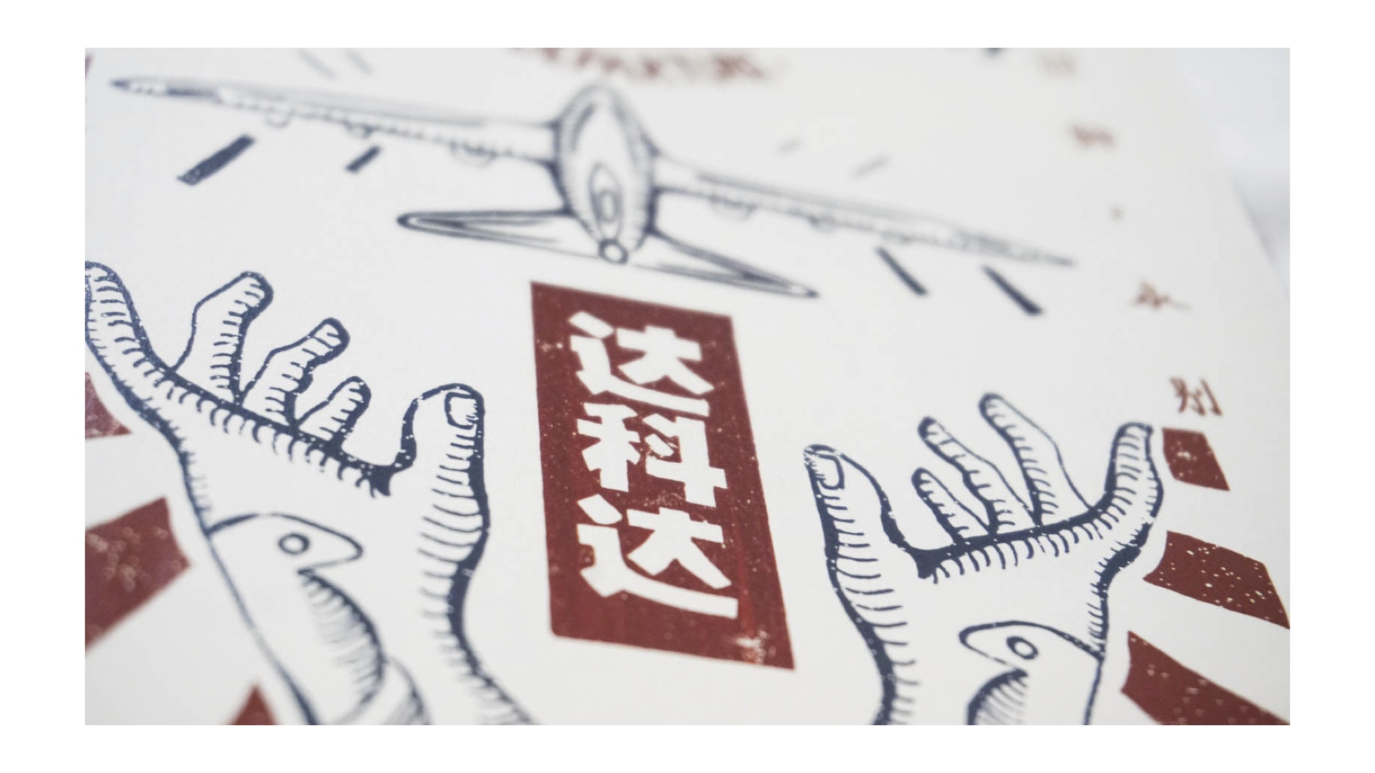
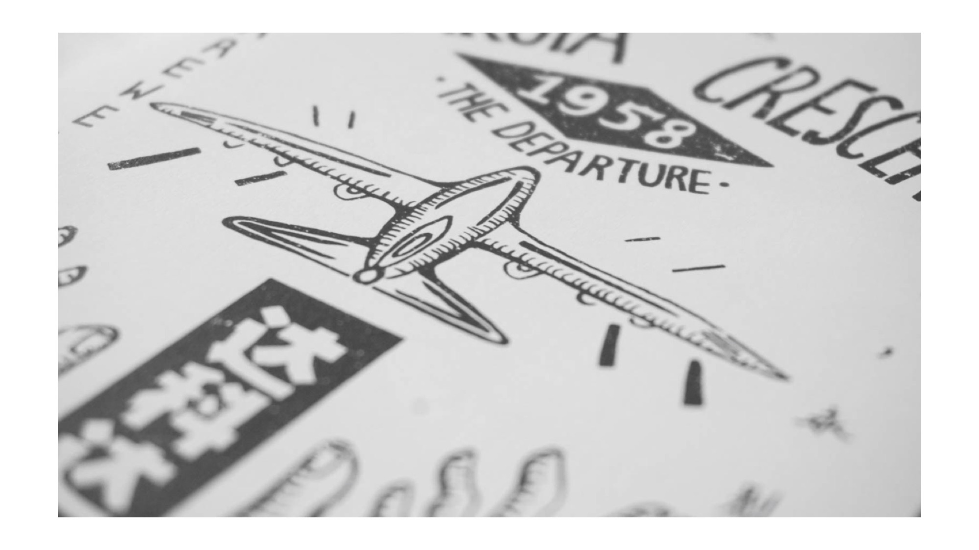
At the start, I knew that I wanted to have the concept of a vintage-looking cover page since Dakota Crescent is known to be an old neighbourhood (since 1958) with residents who are mostly senior citizens. However, I was quite lost about what colours to use and images as well. But I happen to chance upon this picture which I thought is pretty old school and I felt I could do something like this!


Thus, I decided to illustrate everything from the fonts to illustrations and wanted to go for something more symmetrical and neat so it kind of looks like an old poster/brochure (?) or that I feel that symmetry seems to be in alot of old school posters as well. Another illustration I referenced would also be the one below by BMD Design! (I love the technique of using technical pen to design due to more control)

Hence, I drew some elements of Dakota Crescent on a paper and then scanned them in and arranged them in the end. I used most of the illustrations but there are some that I feel are too stiff (such as the stairs and cat) hence I did not use them in the end.

Later on, I then arranged the different elements to the arrangement that I want, focusing on symmetry and that everything is kept within an imaginary rectangle box.

Later on I then added navy blue and maroon colours to the elements. After that, I learned a new technique (!!!) of using the clip mask technique to add textures into the elements. For the other fonts and shapes not in this picture, I used the wacom to illustrate them digitally.
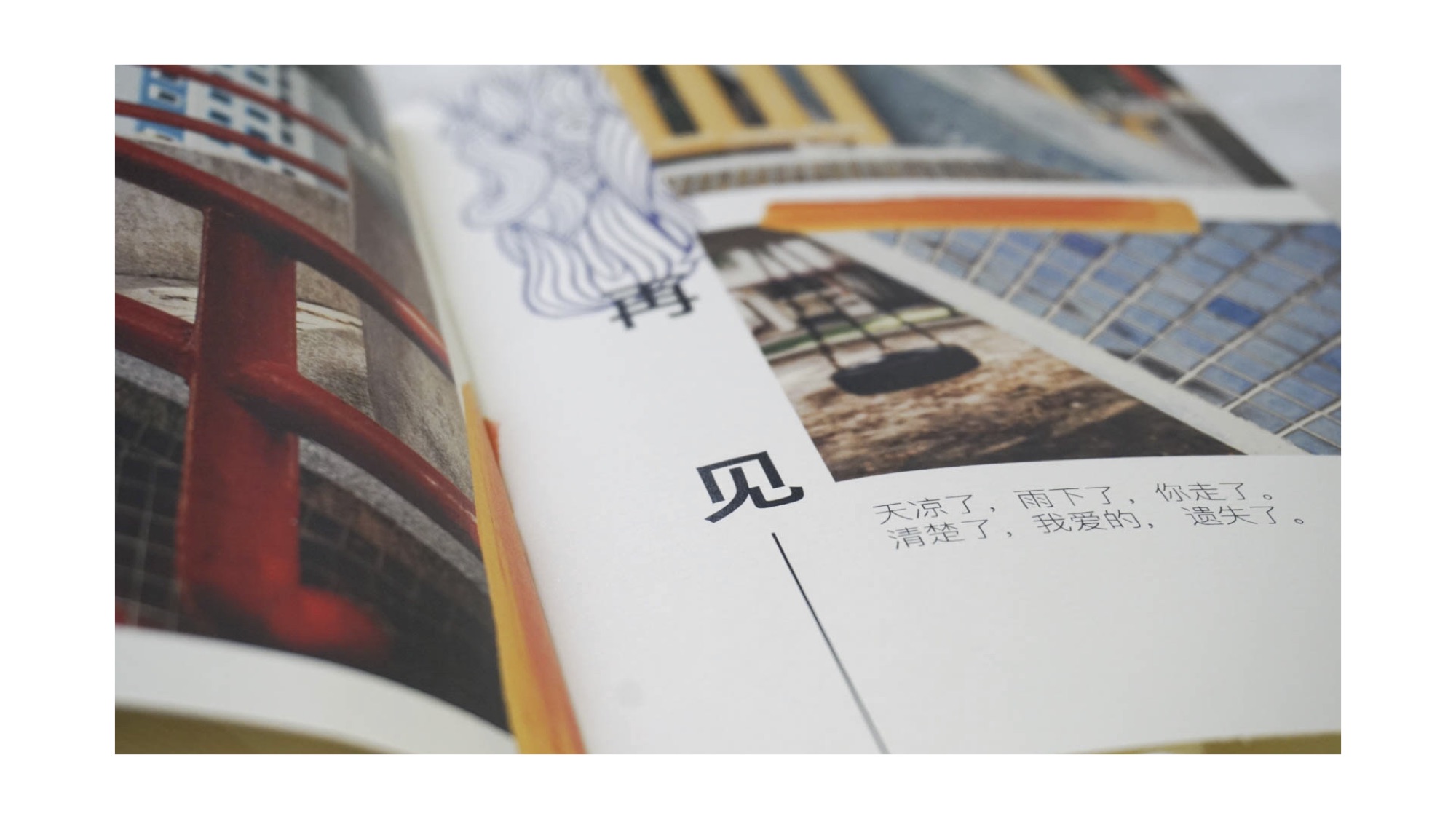
As for the content inside, I wanted my zine to have a semi-minimalistic concept and layout of a ‘Lookbook‘, not really something as detailed as a tourist guidebook or a manual of where to roam around in Dakota C. Also, I want a clean look just like what I have mentioned about my cover page. Hence, I referred to works by designers Tseng Green, nakamuragraph and works from Pinterest.

by Tseng Green

by Nakamuragraph

from Pinterest

from Pinterest (Really like the colours in this one!)
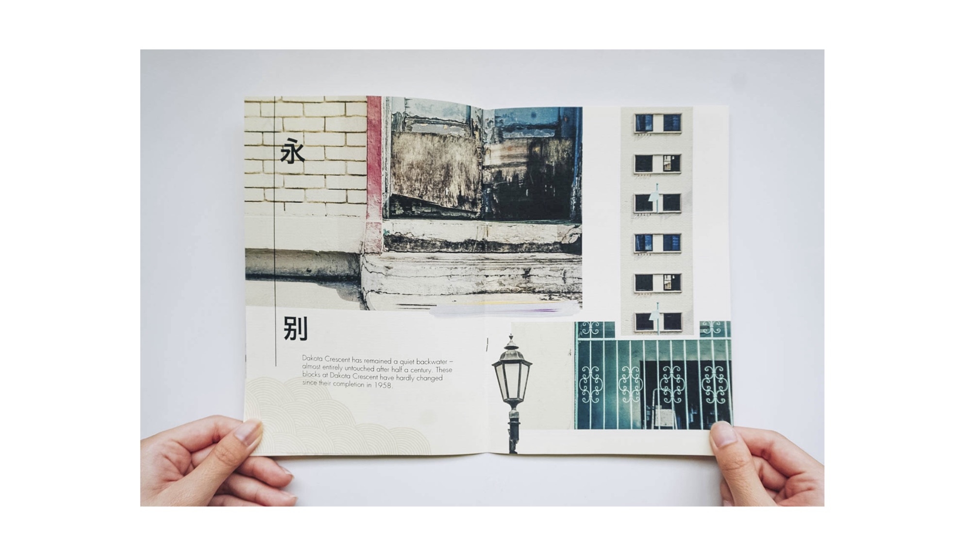
And also, to add some accent to my spreads, I added some patterns and paintbrush strokes and played around with the colour to see which suits the pages best as well.


My detailed explanations about the spreads are shown below.


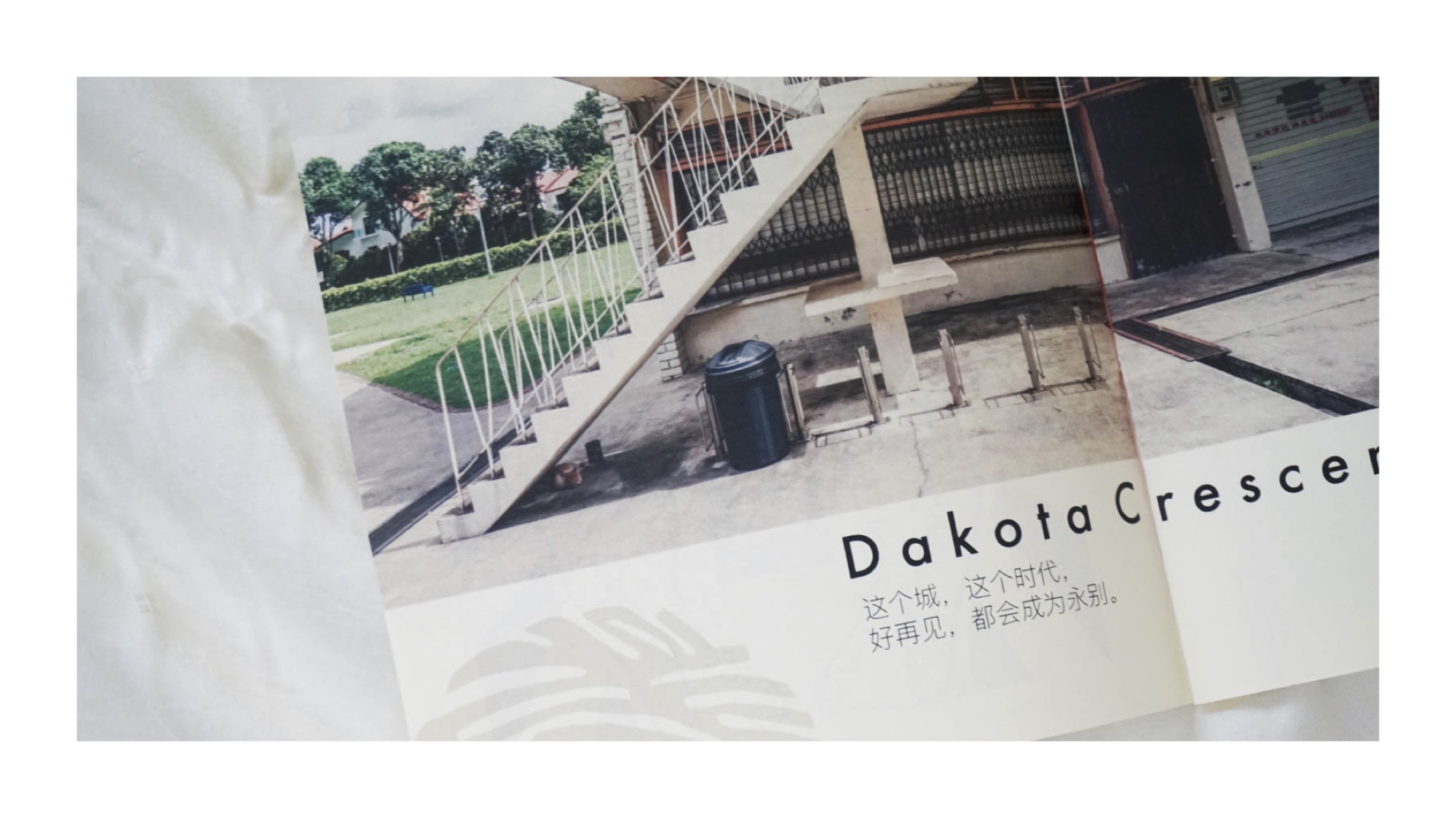
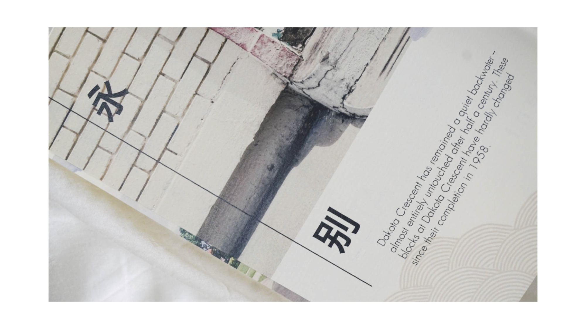
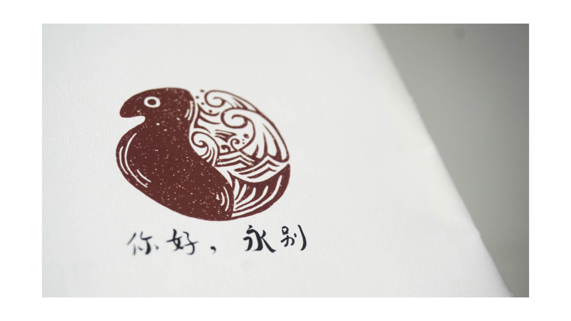
As for the last page, I referenced from this picture to give an oriental look as well, just like the cover page.

There are also other things that I did not put in my zine but I guess they are still part of the process. I picked up some dried leaves at Dakota Crescent thinking I could do something with them. Hence, I decided to do some mark-making thinking I could use them for the very back page. But this design is not suitable for the concept that I am going for and looks more like a cover page than a back page.


Overall, I have quite a few learning points throughout the whole project

The place that I have been assigned to is Kallang. However if you are a true blue Singaporean, you would know that Kallang alone is a large scope to look at. The area with sports arenas at the Stadium near Kallang Indoor Stadium? Or the older aspect of Kallang near the Old Airport Road?
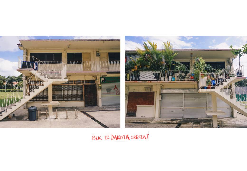
I decided to set my perimeters just in the area of Dakota Crescent in Kallang.
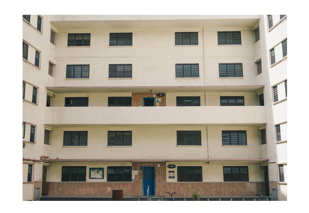
When I researched about Dakota Crescent, I felt pretty ignorant because never have I known that this place encompasses a rich history, even before Singapore’s independence and is now on the verge of disappearance due to Singapore’s future renewal plans for Mountbatten announced in 2014. Dakota Crescent is characterized by low rised buildings situated not far away from the city area. The estate, together with Tiong Bahru, was designed by Singapore Improvement Trust, before it was handed to HDB.
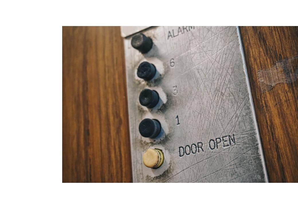
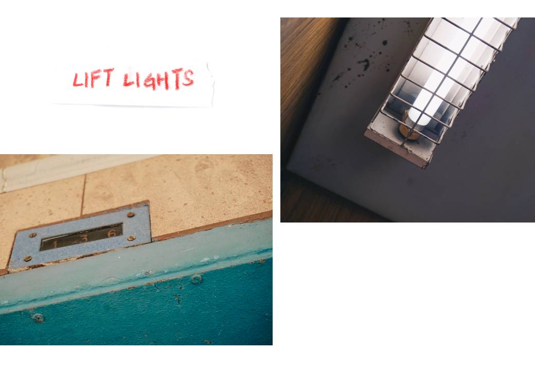
There are many interesting elements to the 17 blocks collectively. I saw for myself the “ancient” lift, not typical of Singapore’s flats to have which only travels to the first, third and sixth level. The lift is dimly-litted with its long fluorescent white light and a small screen with the numbers “1, 3, 6” on it which lights up whenever it reaches the levels respectively.
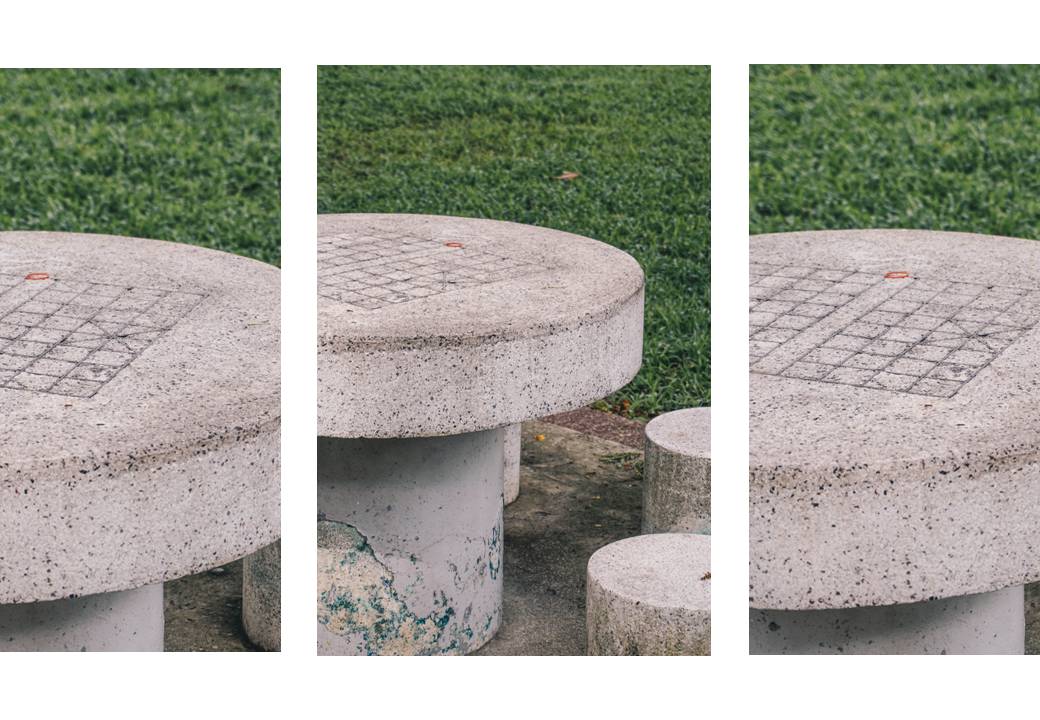
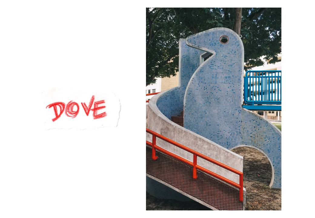
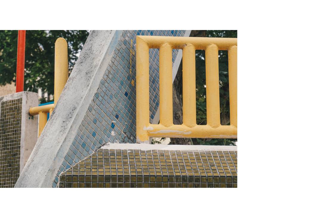
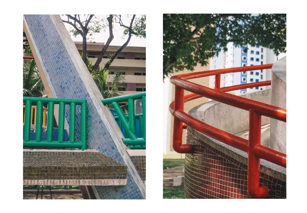
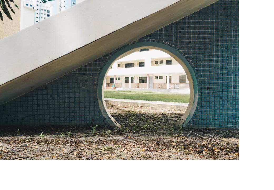
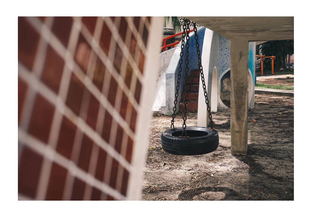
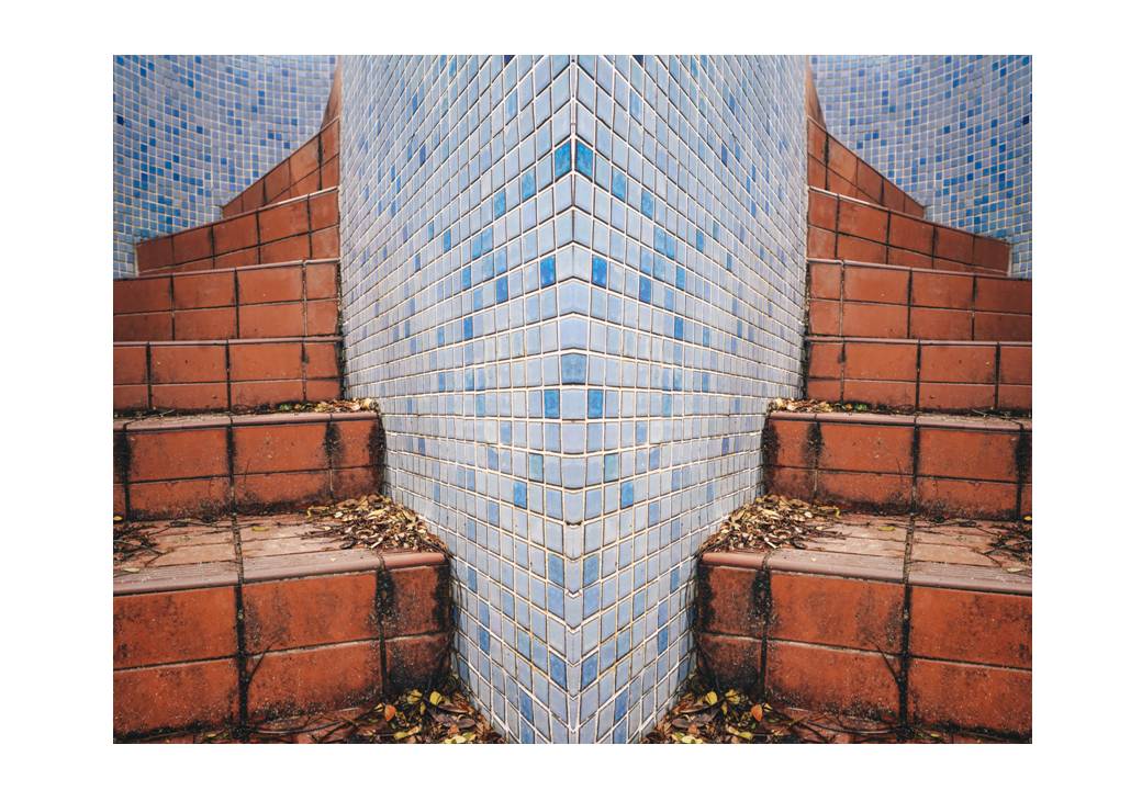
As you walk further in to Block 10, you would see the very iconic “Dove” playground which I would call it one of the “legedandary” playgrounds in Singapore aside from the “Dragon” and “Sampan” playgrounds. Very different from the typical playgrounds in Singapore, characterised with rubbery mats and plastic structures, the playground is made of stone, concrete and finished with tiles of maroon and gentle strobe of blue. The railings, I would say, is the mini accent to the playground with its vibrant colours of green, red and yellow. But of course, the highlight of the playground would be the figure of the dove which suggests the name of this playground as well.
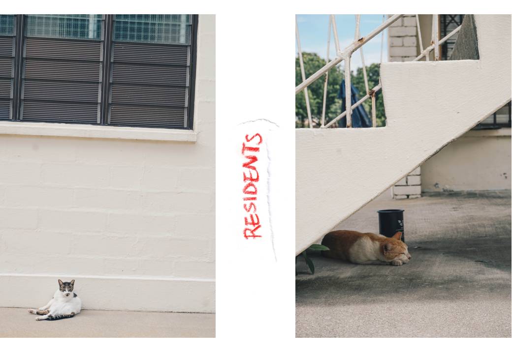
When I was walking around this playground, to be honest, the only people who walked by me seemed to come from the Old Airport Road, probably from the food court opposite. Other than that, the only living beings were stray cats and there were many of them in this neighbourhood.
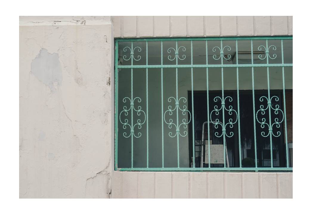
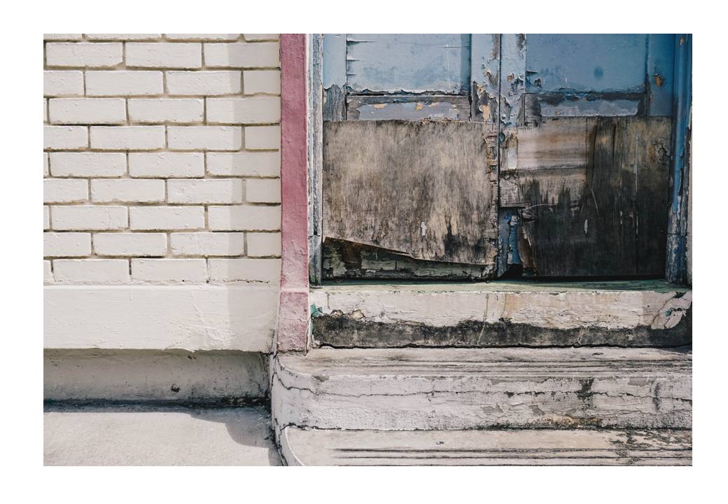
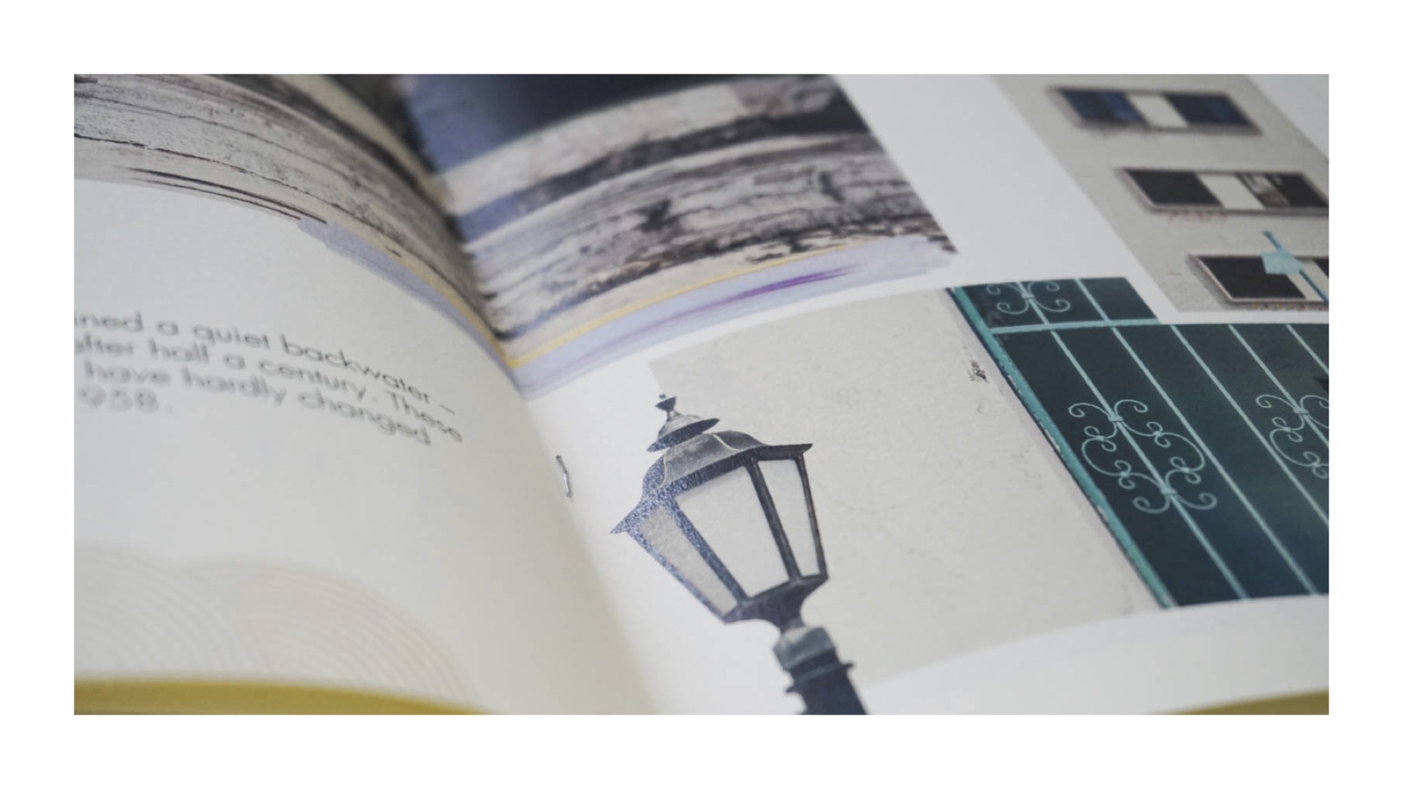
Other characteristics which I adore about this neighbourhood are the lamps and the window grills. The lamps stuck on the walls do not look like they’re from the concrete jungle but very vintage looking and I guess they seem to have some sort of British influence to it. As for the window grills, they have some sort of floral patterns to them and not typical black squares or lines of window grills which I find pretty dainty and interesting, especially because they are finished in pastel colours.
Admittedly, I found it creepy to venture around this estate which was near full abandonment. But it is saddening that this place is on the verge of disappearance with signs of flats and playground being abandoned since the government announced that the residents ought to leave the estate by the end of 2016. I feel that citizens ought to make a trip down to witness this estate before it is being wiped out since it is the last of the past to make it till this date. Conservation efforts have also been imposed. On Facebook, there is a group called “Save Dakota Crescent”, a group which focuses on ideas and thoughts about the renewal of this estate.

When researching, I came across news that involve the commotion of whether this estate, so rich in history, ought to be renewed.
 This news is from the straits times. If you all want to read about it, the link is here: http://www.straitstimes.com/singapore/parliament-lim-biow-chuan-asks-govt-to-reconsider-plans-to-redevelop-dakota-crescent
And last but not least, the very reason why the renewal of this state is so heart-wrenching – the residents who had their hearts in this neighbourhood for the longest time.


Credits: The Straits Times (http://www.straitstimes.com/singapore/people-behind-the-old-charm-at-dakota-crescent)