I am Peranakan
Upon interpreting this brief, I saw it as a chance to explore my roots and it seemed only natural to touch on my heritage. In my household, the Peranakan culture is very much celebrated and practiced throughout each year. I still remember the first time I ate my mum’s ayam buah keluak when I was a kid, and it was in that moment when I truly started to show an interest and embraced this culture of mine.
Paper

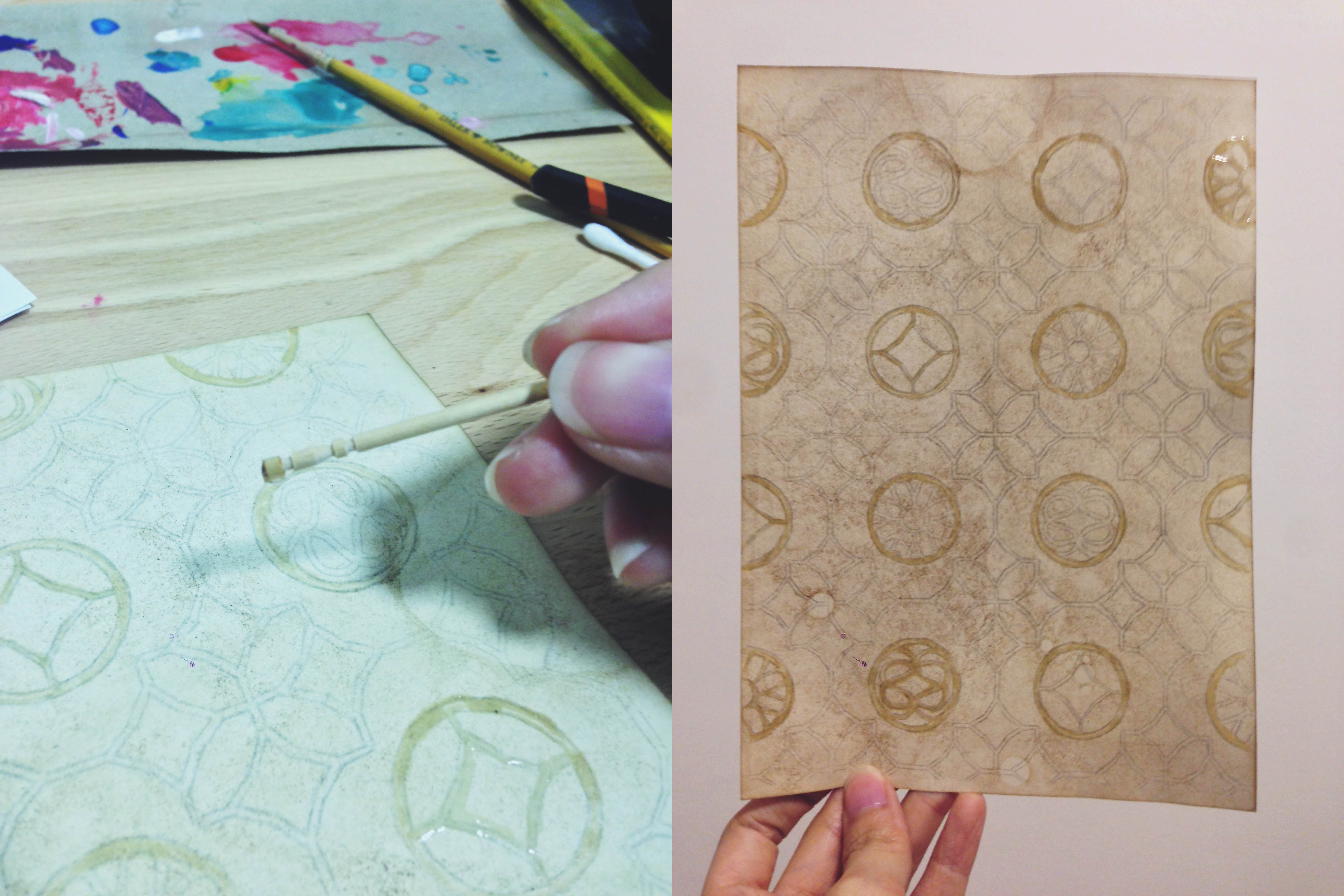
Experimented with coffee grounds, cold/hot water to tone paper
Adding coffee grounds added another detail to the stained paper; spontaneous shapes were formed each time.
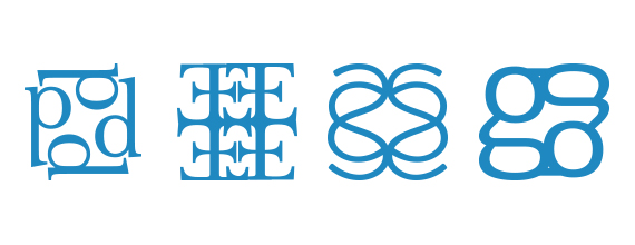
Dissecting Fonts

Experimentation with various serif and san-serif fonts; separated them in different ways to get different results.
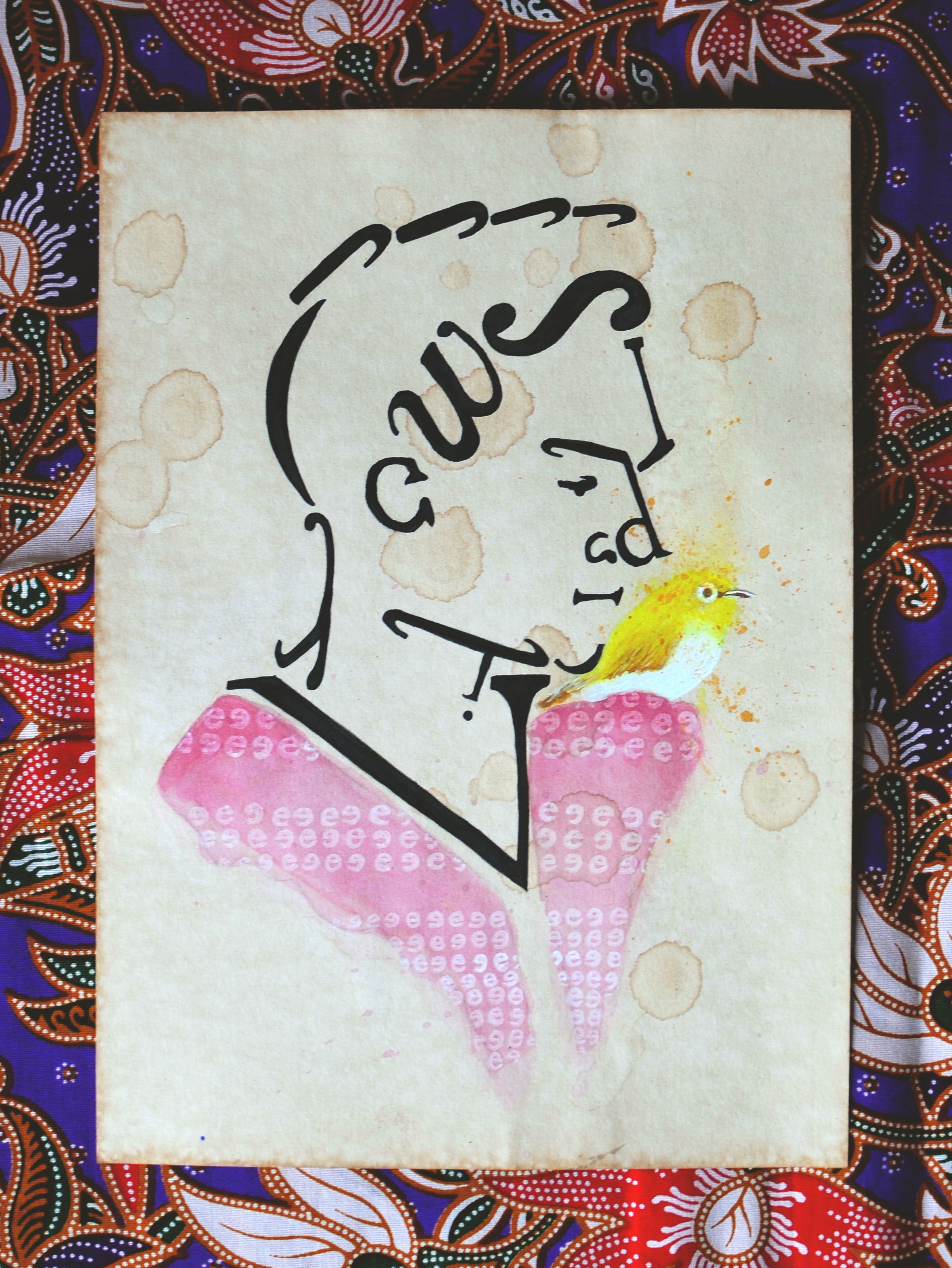
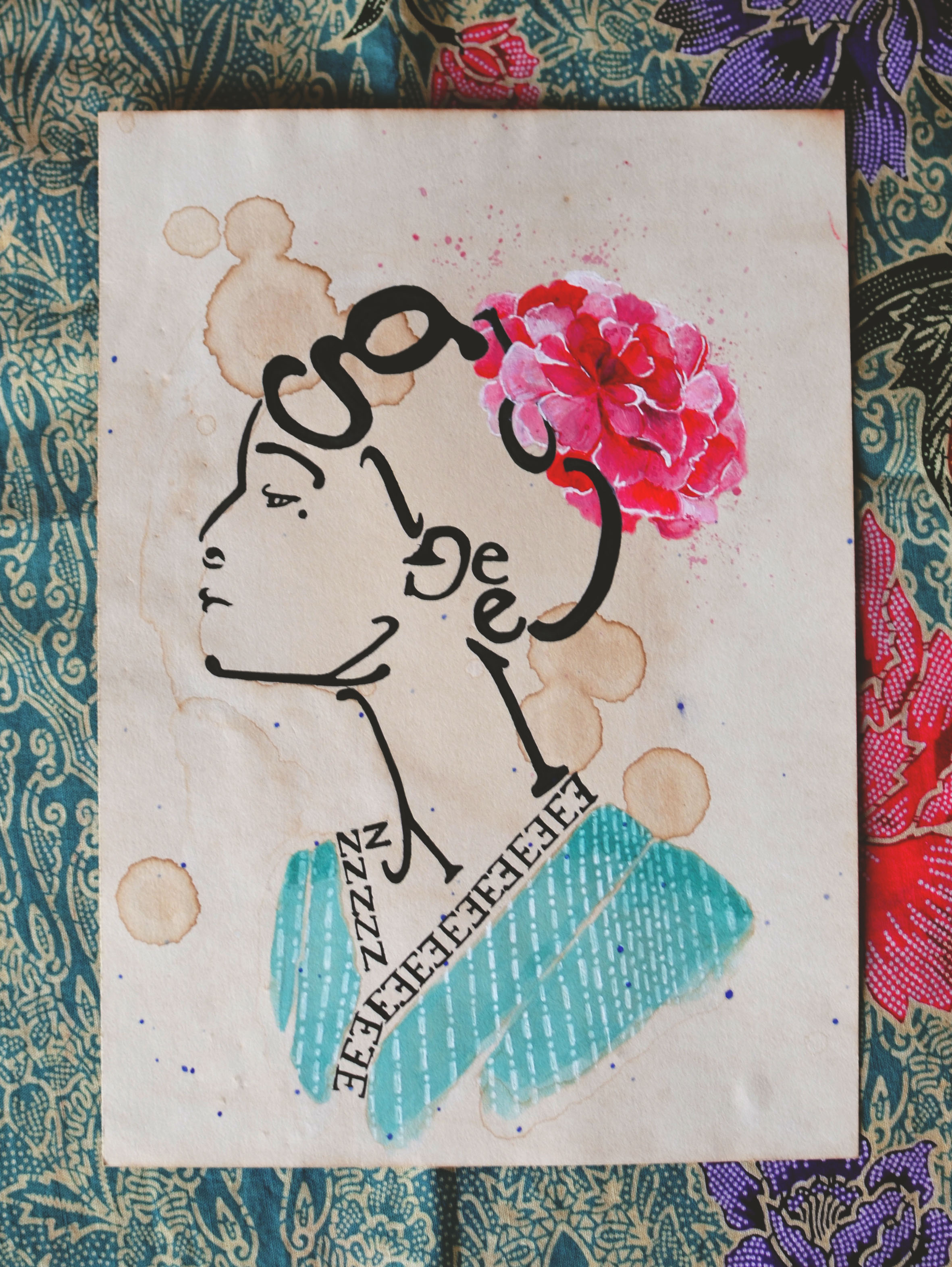
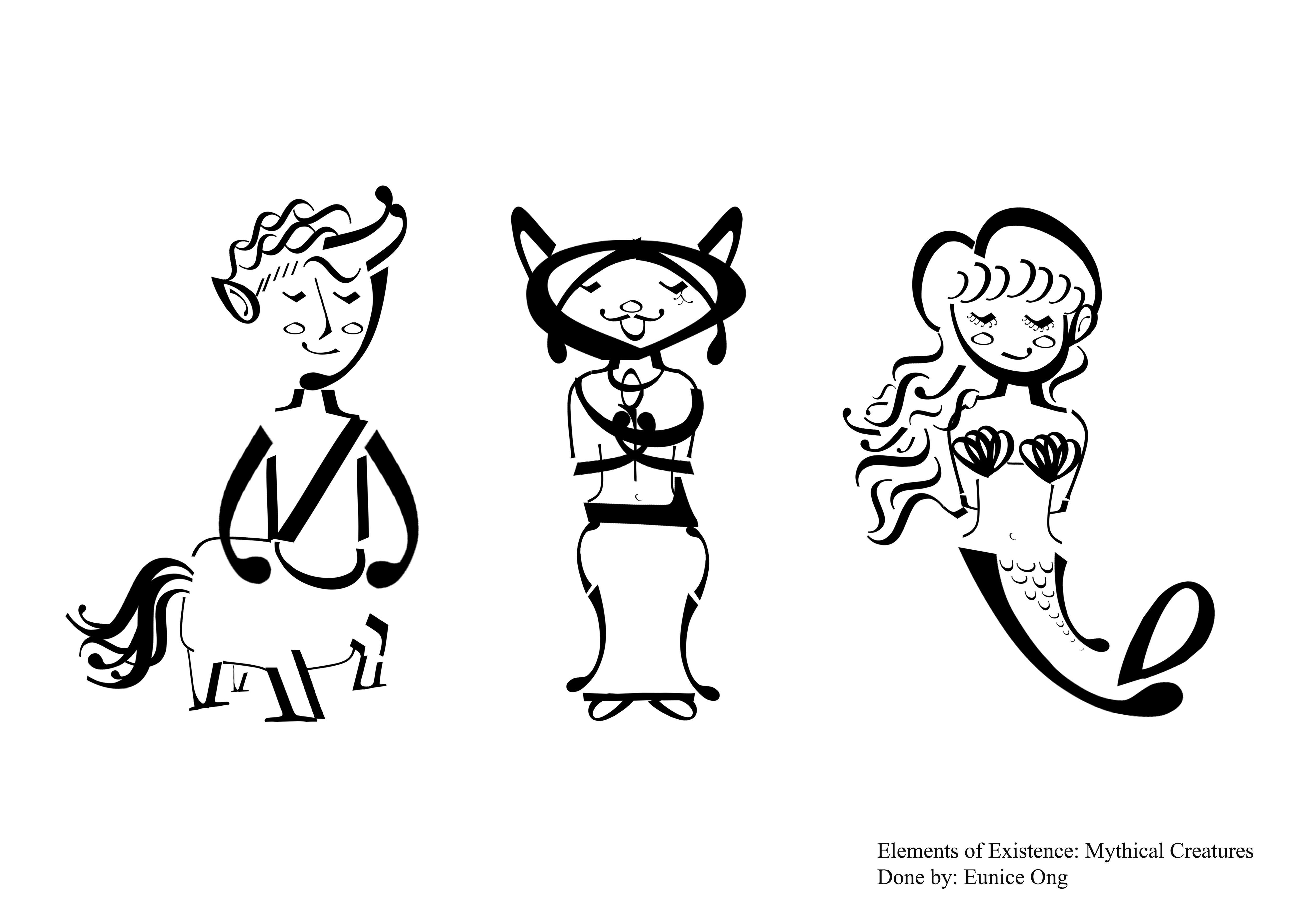
Nyonya and Baba portraits

Digital sketches. Font: Libre Baskerville
General idea for these pieces are silhouette portraits of a woman and man (much like the victorian ones) formed by letters of my name.
Creating the portraits digitally was more convenient that simply sketching with pencil/pen. It allowed me the flexibility and freedom to edit without consuming a lot of time.
These sketches will later be drawn onto paper and inked. I’m also considering combining other elements with these portraitures for elevation; maybe combining other significant elements of the culture?

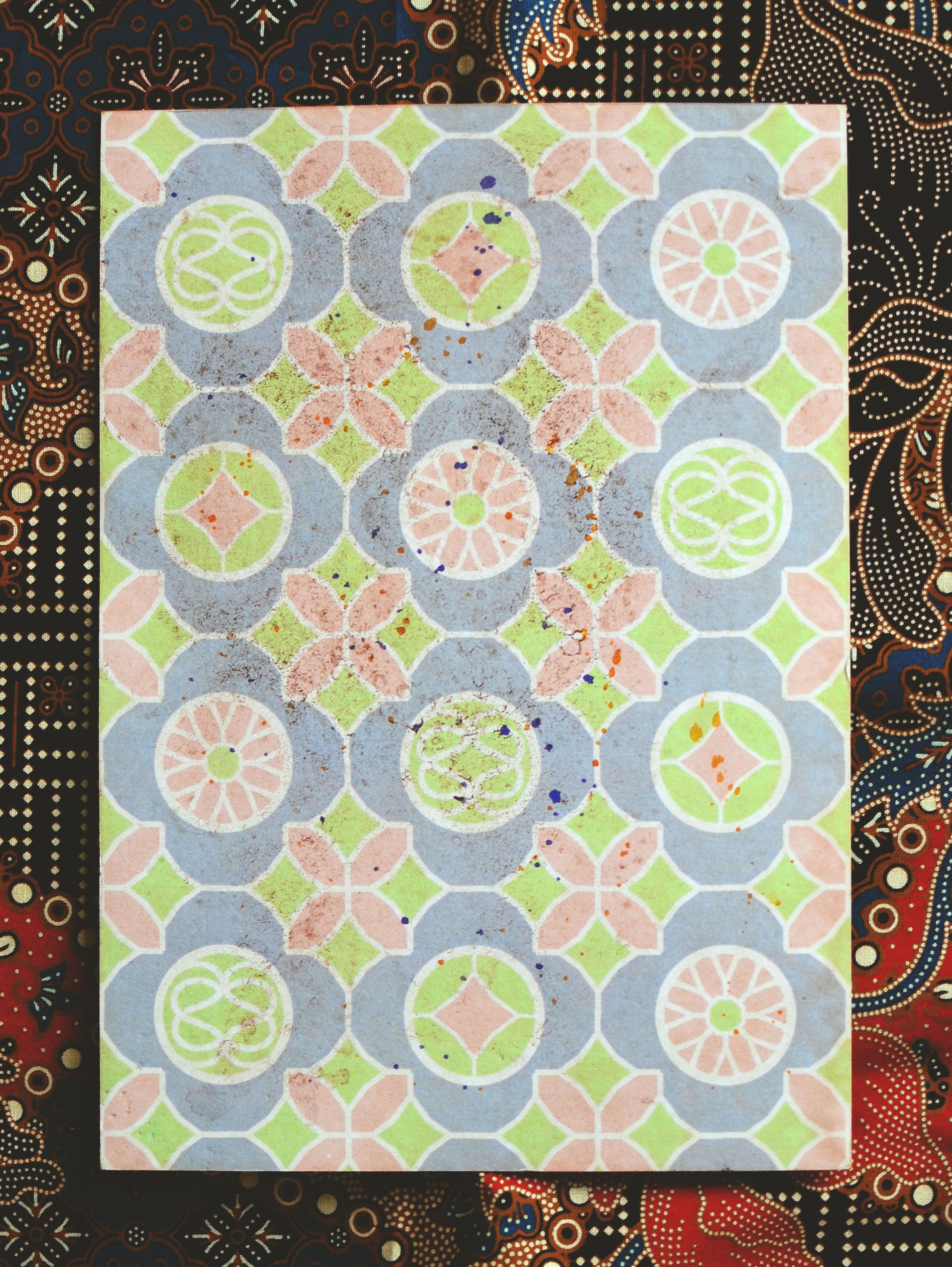
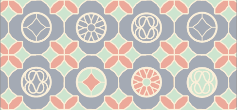
Rough colour schemes
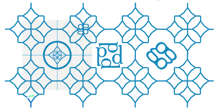
Patterns
 Playing around with fonts and silhouettes.

Y, D, U, Y

d, E, S, g

EGO, Y, g, i

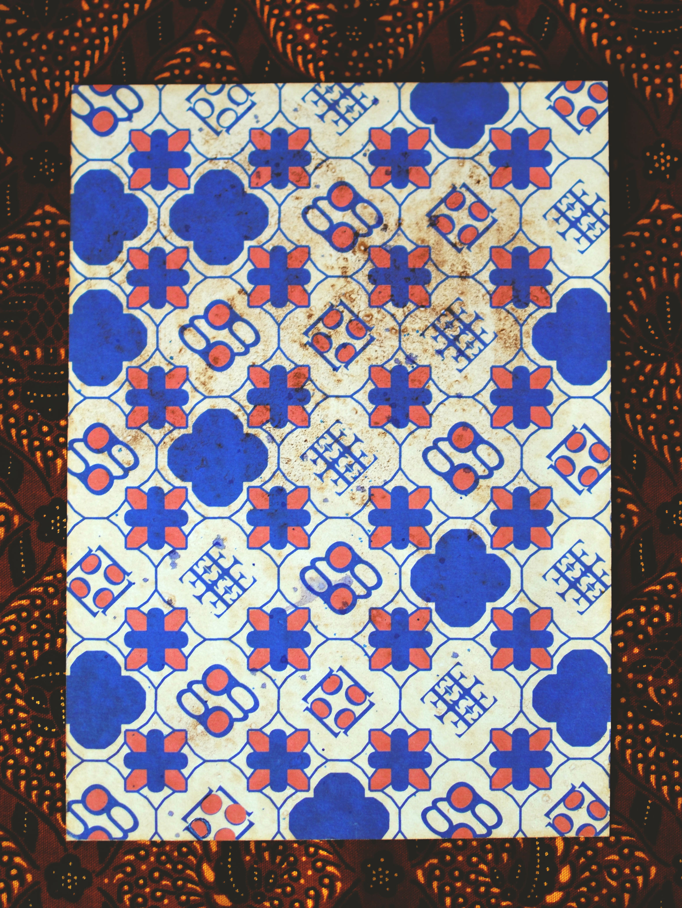
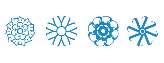
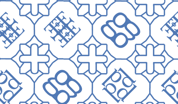
Emblems

Ideation – Putting emblems into patterns

Testing patterns with colours
Taking inspiration from Peranakan tiles, I combined various letters and used repetition to give it a sense of rhythm. Each individual emblems created has a story/secret bounded within their lines – it’s up to the audience to interpret what they are!
While the fonts themselves form the intricate pattern work, I’m also thinking about how I can play around with the geometric shapes formed by the negative space created.

Applying glue to act as a resist against watercolour
With the digital sketches done and a clearer idea in mind, I began to draw the patterns out on the tone paper by hand. After some experimentation, I realised that watercolour reacted differently with the coffee-stained paper; though the paper did absorb the paint, it did not allow it to spread or blend and I could hardly get clean lines.
For this reason, I decided to use transparent glue to mark out all the negative spaces (the outlined typography work) in hopes that it would stop the paint from from appearing to look too blotted.
Alternatively, perhaps I might print the graphic sketches out first before dying them with coffee to get a more crisp and geometric effect as intended.

Draft 2

Draft 2’s emblem in colour