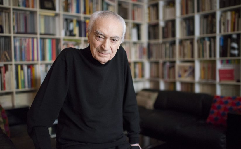
Typographer of the week: Massimo Vignelli

I would like to start off this reflection by saying I admire how firm he is in his ideals and his emphasis on creating works that are clean and concise. To strip all things ornamental and to create a piece of work that focuses purely on communicating the message clearly is not something every designer is able to do, for the fear of being boring. And I do agree with the line “The content, not the designer, is what is screaming for attention.”. It brings to mind another manifesto that several designers adhere to, which is “Form follows Function”. The designs produced would then be consumer-centric, practical and timeless. Until maybe someone else comes up with a more refined design. 

However, I do not agree with how strictly Vignelli adheres to his ideology and criticises styles that do not follow his ideology. No doubt, content is king when creating designs however, it does not hurt when the designer puts in their own take on things. If a designer’s signature style of, say for example layouts, help to further drive the message home, it is not a bad design neither it is it junk or trash. Also, I do not really agree with his limited font choices. Sure, the fonts he listed are very good fonts, well designed and versatile. However, at the same time, they are too neutral and may not always help to further emphasise the message. Furthermore, take into consideration if we are designing for specific target audiences in mind. When designing for younger children, would Futura really be the best font to use? 

I do understand where Vignelli is coming from though. One must understand the history and how design came to be at where it is right now. Once must also know the rules before they come in and attempt to break them. I myself use the grid system when it comes to doing layouts and I find it immensely useful. Having a grid system in place might be seem as limiting but it helps guide new designers along. Also, it provides some kind of a boundary that forces us to think out of the box, to create designs that are interesting and exciting, 
First Impressions? – Typography I

I honestly did not know what to expect when coming into Typo I because my knowledge about typography is pretty limited. If anything, the only thing I hoped to learn by the end of this module would be to understand what differentiates are good typeface from a bad one (and therefore learn how to defend my font choices because I always stumble with that when presenting my works to my lead designer at my previous workplace). 

So far, after the first couple of lessons, I think I am probably going to achieve what I had hoped to achieve by the end of this course and learn a lot more along the way? I guess in some sense I also forgot to take into consideration how types were created and it is pretty cool that for our first assignment, we would be researching on a particular typeface, learning about how it was created and how it affected society. I guess by the end of the whole semester, I would also learn to be a lot more sensitive as to how type is being presented. 

On the topic of the group presentation, our group is called Spaghetti Italy and we will be presenting on Comic Sans 😀

Typographer of the week: Jan Tschichold

Strangely enough, I have never heard of Jan Tschichold but I have seen the diagram of his canon for book design and had it explained to me before. The lead designer (basically the only full-time designer there) from my previous workplace had shown me a picture of this diagram and gave me a quick run-down on editorial design before tossing me an editorial project to work on. At that point in time, I had no formal education in design (I was basically on Google and Pinterest for tutorials all the time) so that had been an eye-opening experience for me. 

Anyway, back to the main topic.

It is amazing to learn of his history and how he got started in calligraphy, typography, and layout. Despite the fact that the essays are written and published in the 1930s, what Jan Tschichold wrote about is still applicable today and the influence of his works can still be seen in the work of designers today. 

It is also worthwhile to note his willingness to experiment and innovate: having been bored with the norm and sick of seeing the same layout everywhere (even if the trend only came about months ago and originated from him!!!!), he kept challenging himself to come up with more unique layouts. Perhaps this is something that we, as designers, should all adopt and work towards, constantly challenging the status quo and coming up with more new and exciting ways to do things. 


Type in the Wild

So uhm, the “place” in which I would be exploring the variety of type classification available is onboard a cruise ship. My parents had decided to bring me along for their short weekend getaway why not make full use of my time and complete this assignment while I am there?

While I would have thought that there would be a wide variety of typefaces being used onboard a cruise ship, the result is that there aren’t as many different type classification as I thought there would be. As seen in the poorly taken photos above, most of the typefaces found onboard can be simply classified as serif and sans serif (with more san serif typefaces), as well as a few decorative typefaces. From the signages around the ship to the ship programmes brochure (which I forgot to take a photo of oops), most san serif typefaces classifying under grotesque and humanist sans.

A possible reason as to why this is so might be because of when the particular place was discovered or built. In this case, this particular cruise ship is a relatively new one, having only been commissioned in 2013 and finished building in 2016. The heavy usage of san serif typefaces does reflect the current trend where san serif fonts are more popular and are seen as more modern as compared to serif fonts. Furthermore, the design of the interior of the ship would need to be cohesive and having a wide variety of typefaces might not allow for that to happen. Therefore, as compared to a place say maybe NTU or like Jurong Point, the variety of type classifications would definitely be a lot lesser. 

Media Art Nexus Group Presentation

To summarise our presentation (because I realised we did not include our explanation in the slides above), we wanted to use the ensō as a symbol for music because we draw parallels between the two.

The ensō is Japanese for circle and has its root in Zen Buddhism. The practice of drawing an ensō expresses a moment where the mind is free to let the body create. The ensō itself represents both the universe the mu, the void. Similarly, this is how both Amber and I interpret music to be: both sound and silence. 

To see the reference gifs actually move (For the elements and art style slides, most of the images are actually gifs :’)), kindly click here to be redirected to Google slides.