The Crystal Goblet or Print Should be Invisible

Beatrice Warde uses a pretty interesting metaphor in her essay, comparing the craftsmanship of a crystal goblet to typography and printing. In the essay, she uses the aforementioned metaphor to bring her point across, on what is her definition of good typography and the sort of mindset a good typographer should have. And I do agree with her, for the most part. 

Typography does require a lot of attention to detail and precision, particularly so when dealing with editorials, or any collateral that has a fair amount of text. Besides having to take into consideration the overall aesthetic of the layout and whether or not everything is consistent, the designer has to ensure that the text is laid out in a legible and readable manner, so as to ensure that the reader will not struggle to read nor get bored while reading the text. At the same time, whatever creative execution the designer does in the end must not distract the reader from the message of the text. As Warde puts it, “Type well used is invisible as type, just as the perfect talking voice is the unnoticed vehicle for the transmission of words, ideas.”, this I think is particularly apt., especially so for one is dealing with content-heavy collaterals. 

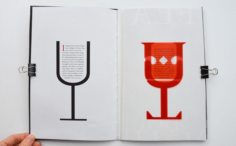
Warde also then goes on to describe the book typographer’s job as that of “erecting a window between the reader inside the room and that landscape which is the author’s words” and and further goes on to emphasize her above idea by saying “I have a book at home, of which I have no visual recollection whatever as far as its typography goes; when I think of it, all I see i the Three Musketeers and their comrades swaggering up and down the streets of Paris.”, this I still agree for the main purpose of a book is to convey the author’s ideas and the book typographer’s creative decision should not be obvious, at least not to someone who has no sensibilities about typography.

What I do not agree with is her point “it is mischievous to call any printed piece a work of art, especially fine art: because that would imply that its first purpose was to exist as an expression of beauty for its own sake and for the delectation of the senses”. This is not necessarily true as fine arts, while it had originated from a place of focusing on “aesthetics for aesthetics’ sake”, has gone on to take more meaning. Fine arts may have existed as merely an expression of beauty for its own sake back in Warde’s time but in modern day context, may not be true anymore. Furthermore, Warde goes on to say “the type which, through any arbitrary warping of design or excess of çolour, gets in the way of the mental picture to be conveyed, is a bad type.”. I agree that while warping and too much colour can prove to be a distraction, it really depends on what is the function of the piece of text, as well as the message behind it. Sometimes, these warps and excessive usage of colour can help for viewers remember the message much better. Take for example comic sans, where its unevenness makes difficult to read. This forces the reader to slow down, so as to better be able to absorb the text, allowing them to remember more. 

All in all, Beatrice Warde makes an interesting and compelling point about good typography and printing, most of which are still relevant today. However, there are certain points that may not be as relevant to us anymore, due to the changes in society and the changes in trends in art and design. 

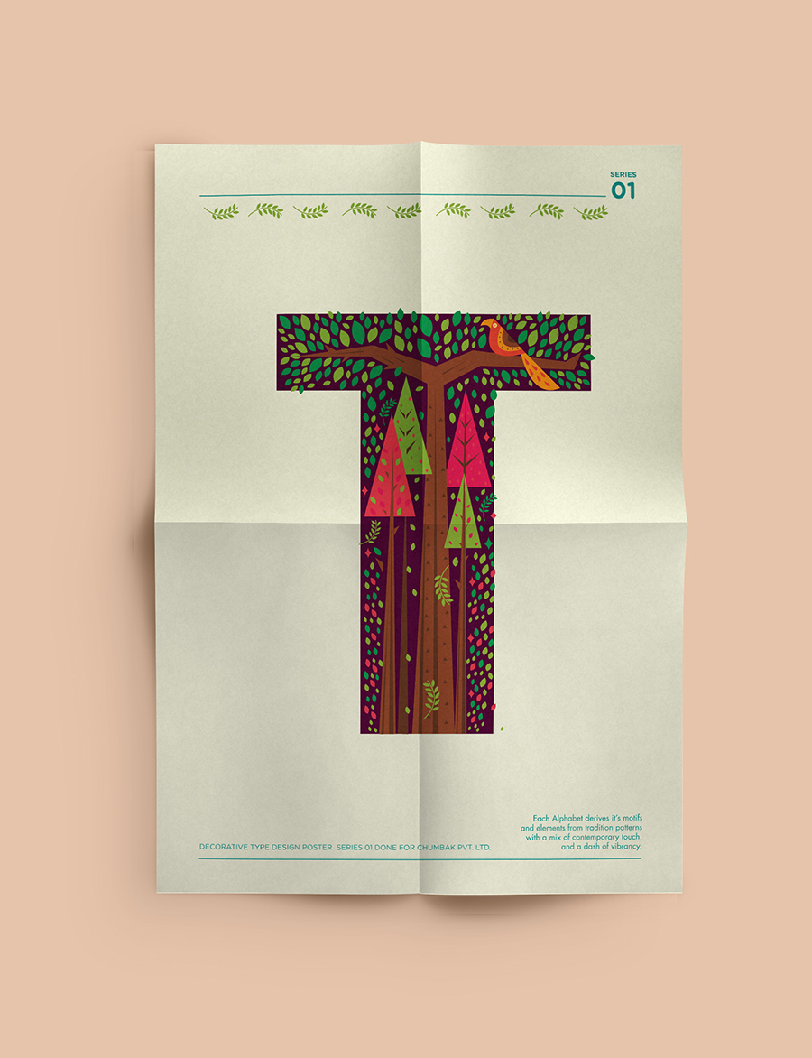
Once again, credit must be given when credit’s due. The cover image is taken from here and was created by Samuel Gorham

Typographer of the week: Jan Tschichold

Strangely enough, I have never heard of Jan Tschichold but I have seen the diagram of his canon for book design and had it explained to me before. The lead designer (basically the only full-time designer there) from my previous workplace had shown me a picture of this diagram and gave me a quick run-down on editorial design before tossing me an editorial project to work on. At that point in time, I had no formal education in design (I was basically on Google and Pinterest for tutorials all the time) so that had been an eye-opening experience for me. 

Anyway, back to the main topic.

It is amazing to learn of his history and how he got started in calligraphy, typography, and layout. Despite the fact that the essays are written and published in the 1930s, what Jan Tschichold wrote about is still applicable today and the influence of his works can still be seen in the work of designers today. 

It is also worthwhile to note his willingness to experiment and innovate: having been bored with the norm and sick of seeing the same layout everywhere (even if the trend only came about months ago and originated from him!!!!), he kept challenging himself to come up with more unique layouts. Perhaps this is something that we, as designers, should all adopt and work towards, constantly challenging the status quo and coming up with more new and exciting ways to do things. 


Type in the Wild

So uhm, the “place” in which I would be exploring the variety of type classification available is onboard a cruise ship. My parents had decided to bring me along for their short weekend getaway why not make full use of my time and complete this assignment while I am there?

While I would have thought that there would be a wide variety of typefaces being used onboard a cruise ship, the result is that there aren’t as many different type classification as I thought there would be. As seen in the poorly taken photos above, most of the typefaces found onboard can be simply classified as serif and sans serif (with more san serif typefaces), as well as a few decorative typefaces. From the signages around the ship to the ship programmes brochure (which I forgot to take a photo of oops), most san serif typefaces classifying under grotesque and humanist sans.

A possible reason as to why this is so might be because of when the particular place was discovered or built. In this case, this particular cruise ship is a relatively new one, having only been commissioned in 2013 and finished building in 2016. The heavy usage of san serif typefaces does reflect the current trend where san serif fonts are more popular and are seen as more modern as compared to serif fonts. Furthermore, the design of the interior of the ship would need to be cohesive and having a wide variety of typefaces might not allow for that to happen. Therefore, as compared to a place say maybe NTU or like Jurong Point, the variety of type classifications would definitely be a lot lesser. 

Graphic Form Assignment 1 – Research

To be honest, I do not really do research when I design things. Which is probably not a very good thing. I do, however, go online to look for references and to hunt for colour schemes so I guess that works as some kind of research I guess.

I kicked off the whole research process by going onto Pinterest and just doing a general scan to see what kind of interesting typefaces have already been created. And also to take a look at how other people might combine illustration and typography. I found quite a lot of interesting references that may or may not be able to be used for this project but I’ll list them here anyway because I might be able to use them in a future project. 

Animal Type by Amalteia #36daysoftype

The above is a project done by Amalteia, an aspiring illustrator from Portugal. Her illustrations caught my eye because of colour and textures she used for the illustrations give them a very whimsical feel. Another thing she tries to do is to have the animal representing the letter/number be somewhat related to the letter/number itself. For example, the ‘B’, she uses a bear and for ‘8’, she uses an octopus. 

Decorative Alphabets by Shaivalini Kumar

Another work that I liked was this one by Shaivalini Kumar, a designer based in Copenhagen. I like the use of the green and reddish-pink which contrasts quite nicely with each other. 

Print by Wesley Bird

I like how quirky this print is and thought this might be pretty close to what Shirley wanted so I decided to take this image as a reference. The image seems rather simple with very few details but it does send the message across clearly and that is something that I hope to be able to emulate in my work later on. 

Another thing I tried to do some research on was for the jobs. Shirley emphasized that she wanted “out-there jobs. The more out-there it is, the better.”. I do understand why Shirley asked us to do that (because then the element representing the job would be so unique such that people would be able to get the job pretty quickly, hopefully?) but that kind of threw me off and I initially could not really think of anything interesting so that’s why I decided to rely on good ol’ Google. The first off the search result list was this article by on Business Insider titled ’17 Weird Jobs You Probably Didn’t Know Existed’. While it was a pretty interesting read, I did not really connect with any of the jobs listed in there and could not really think of any way to present those jobs in a typeface. 

It wasn’t until I overheard Shirley suggesting to a classmate that he could just add an adjective to the job that everything kind of started to move forward a little faster. For example, the job could be a table-tennis player and the adjective could be ‘shakey’. This way, the job will become a lot more interesting. Also, instead of looking for existing jobs, I decided to reflect and think about the weird little quirks that I have that could actually be turned into jobs. From there, I managed to come up with a couple of jobs: 

  • Grass eater (something that my relatives often say to me when they find out that I am currently studying art and design :’))
  • Notebook collector/hoarder (the name is pretty self-explanatory)
  • Sock hoarder/collector (inspired by a close friend. It was through her that I started to buy and wear quirky socks)
  • Dog/cat/rabbit cuddler (I love animals)
  • Creeper (Like the type of plant? Geddit geddit? HAHAHAHAHAH)
  • Stuffed Toy Killer (I roll around in my sleep a lot and because of that, I sometimes do some preeettty bad damage to my stuffed toys)
  • Broken graphic designer (Probably how I will be in the future when I am so sleep-deprived and tired but I still have to go to work)
  • Line drawer (I was quite done with technical drawing when I thought about this job. I am sorry Jason.)

After doing a bit of sketching and rough brainstorming, I decided to narrow the list down to the following jobs: Sock Model (adapted from sock hoarder), Stuffed Toy Killer, Glitchy Designer (adapted from broken graphic designer) and Memphis Art Collector.

2D Assignment 3: Ego – Let the research begin!

WE FINALLY GET TO WORK WITH COLOUR???

And I just figured out how to change the font on OSS. Good job Louisa. After 13 weeks of school and only now you find out you are able to change the font. Still not able to change the really wide leading though hmm. 

In any case, let’s talk about the research done for Assignment 3: Ego!
I was quite excited to start on this project because it seemed like such an interesting project. And finally, we have to use colour in this project, which makes it both easier and a little bit tougher at the same time. This assignment started off with a little bit of self-reflection: What could I possibly use to represent myself? Then I went on to think about the colours I could potentially use to further emphasise my point. More about the thought process on that in my process posting. For this research posting, I will be talking about my adventures on Pinterest. 

Ah Pinterest, how easy it is for one to get lost in the wormhole that is this community-based platform. I started off my research process by going on to find the type of illustration style I would like to adopt for this assignment. I know that I am not able to produce very realistic drawings or illustrations. I tend to go for flat vectors: simple and minimal, bordering on the edge of being too simple and minimalistic. I wanted to go for something with very simple lines but with textures to make it more interesting. Or since we were able to use colours this time around, maybe playing around with different coloured lines. Below are some of the inspiration I found off Pinterest.

http://nimuradaisuke.tumblr.com/post/114382237058/lovers-hymn-2

http://nimuradaisuke.tumblr.com/post/95748917948/neck-n-neck

http://nimuradaisuke.tumblr.com/post/71783616647/あけましておめでとうございます-2014-①

The above illustrations is from Japanese illustrator Nimura Daisuke. I like the fact that his illustrations are clean and minimal yet have so much character to them. #goals
His illustrations uses a limited colour palette, usually sticking to mainly black and white or at most, two to three colours. This is something I can think about and could possibly try to apply in this assignment. As someone once mentioned to me, it is always easier when you are given complete creative freedom to do whatever you want. However, true creativity is when you are given a set of restrictions and yet be able to find a way to create something that fits or even go beyond the client’s expectations and satisfy you as a creative individual at the same time. Or something like that. [Shoutout to Ms Eve Loh at this point, thank you for giving us the opportunity to go to DDB for your module. It was really fun and I really did learnt a lot from all the mentors that you had assigned to us but the McDonald’s assignments kind of scarred me for life :’)]


https://dribbble.com/shots/2987172-Our-Team. Illustration done by Alberto Saenz, Art director and Animator based in Mexico City.

An example of what I meant when I mentioned the use of coloured lines to introduce colour into the illustrations. Once again, the illustrations are not the most detailed but each illustration captures the essence of each of the people he was illustrating. The colours that he used is interesting as well, with the red contrasting with the green but both colours working well together with the blue. 

“The warmth of my body”, a part of The Rest series by Elda Broglio

Her illustrations in this series is beautiful. Especially so in this particular illustration. I love the minimal use of lines and just how she uses colours and textures to differentiate the different objects in the piece. 

Current state of my inspiration board on Illustrator

There are so many other illustrators that I really admire but for now, these 3 works (or technically 2 works and 1 illustrator) are the ones that I feel the most inspired by for this particular assignment. It is time to move on to the drawing of my illustrations woohoo.