
To be very honest, I did not do these compositions with any design principles in mind. I did not study design before and what skills I have with regards to Photoshop, Illustrator and the likes of these softwares, it was gained through a combination of Google, Pinterest and my six month internship at a creative agency. In any case, let’s attempt to break down on what possible design principles I can apply to the following design compositions.
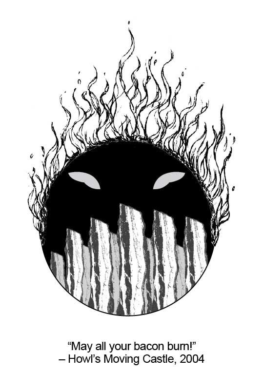

Starting with the first composition, this design is based on the quote from Howl’s Moving Castle, “May all your bacon burn!”. I repeated the bacon image at the bottom part of the composite to create the effect of there being a lot of bacon at the base. The bacon image also serve as a sort of leading line, leading the viewer’s eyes to the oblong shapes above, representing Calcifer’s (the fire demon that utter this line in the movie) eyes. I also used a black background behind the bacon to create some sort of contrast between the bacon and the background.
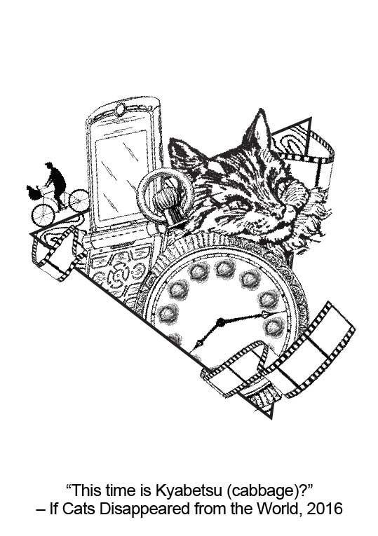
Moving onto the next design, based on the quote “This time is Kyabetsu?” from If Cats Disappeared from the World. I went with a triangular background that is tilted at an angle to make it more asymmetrical and dynamic. There is a sense of movement as the elements are arranged in such a way that they seemed to be moving out of the triangular “portal”. Also, with most of the elements being squeezed together like so, the emphasis is already in that particular spot where all the elements are as the eyes will be instantly drawn to that particular busy part as compared to the white spaces surrounding the design.
For the second design for the same quote, located just below the “May your bacon burn!” quote design, by layering the cat with a lot of details, over the cabbage print with wider lines and more negative space, the image of the cat pops out, placing an emphasis on the cat. By using images with different degrees of darkness and details, we are also able to create the effect of there being layers to the design.
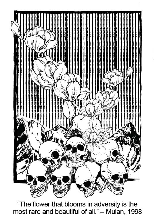
Finally, the final design based on the quote “The flower that blooms in adversity is the most rare and beautiful of all.”. The lines in the background are mainly for aesthetic reasons and to create some sort of contrast against the flowers in front. The mountain and the skulls also take up one-third of the space, leaving two-thirds for the flower and the lines, thus utilising the golden ratio theory.
All in all, this project has been a fun one and I got to learn a lot of things, especially about silkscreen printing. Looking forward to assignment 3, whoop!