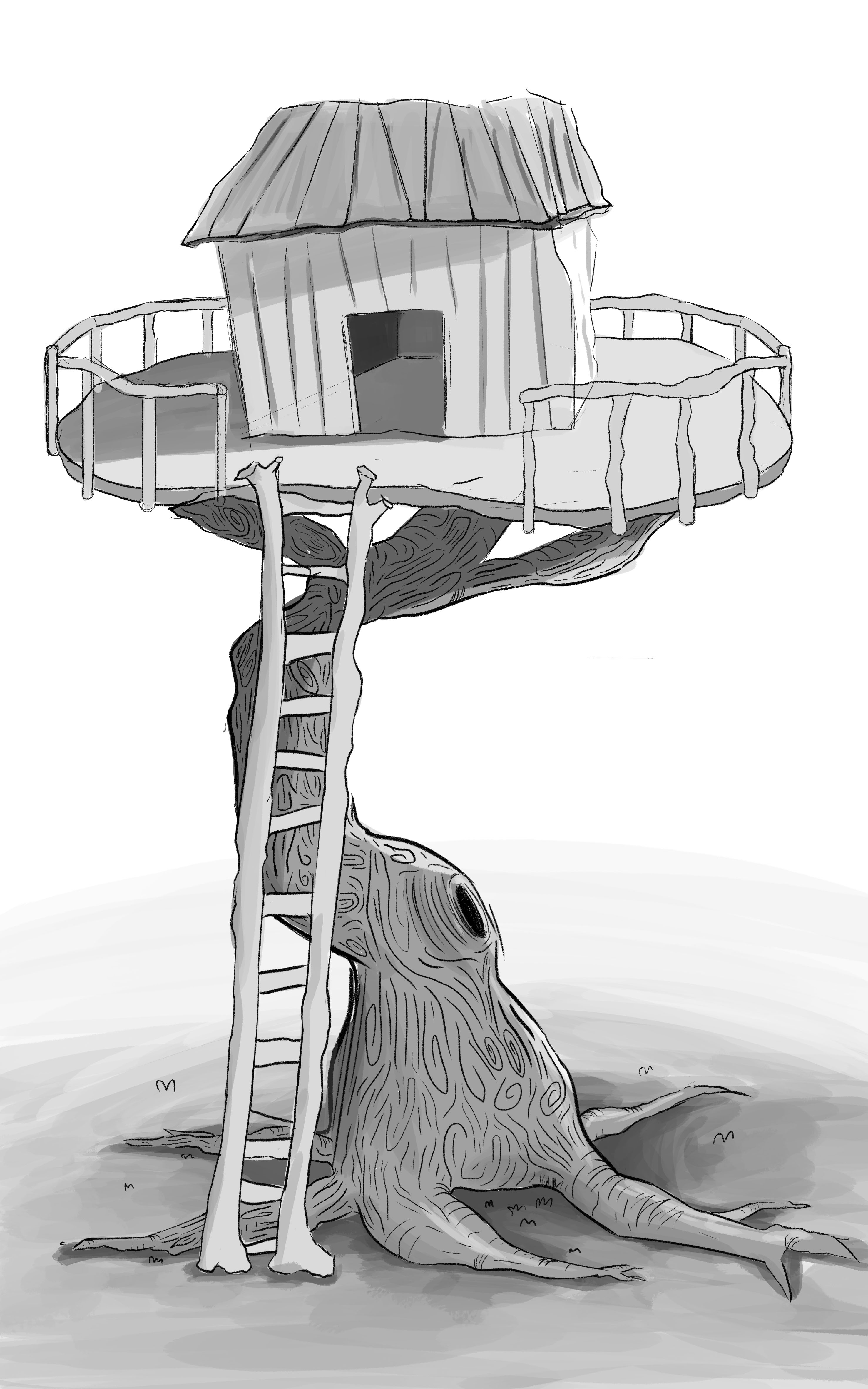
Character Design
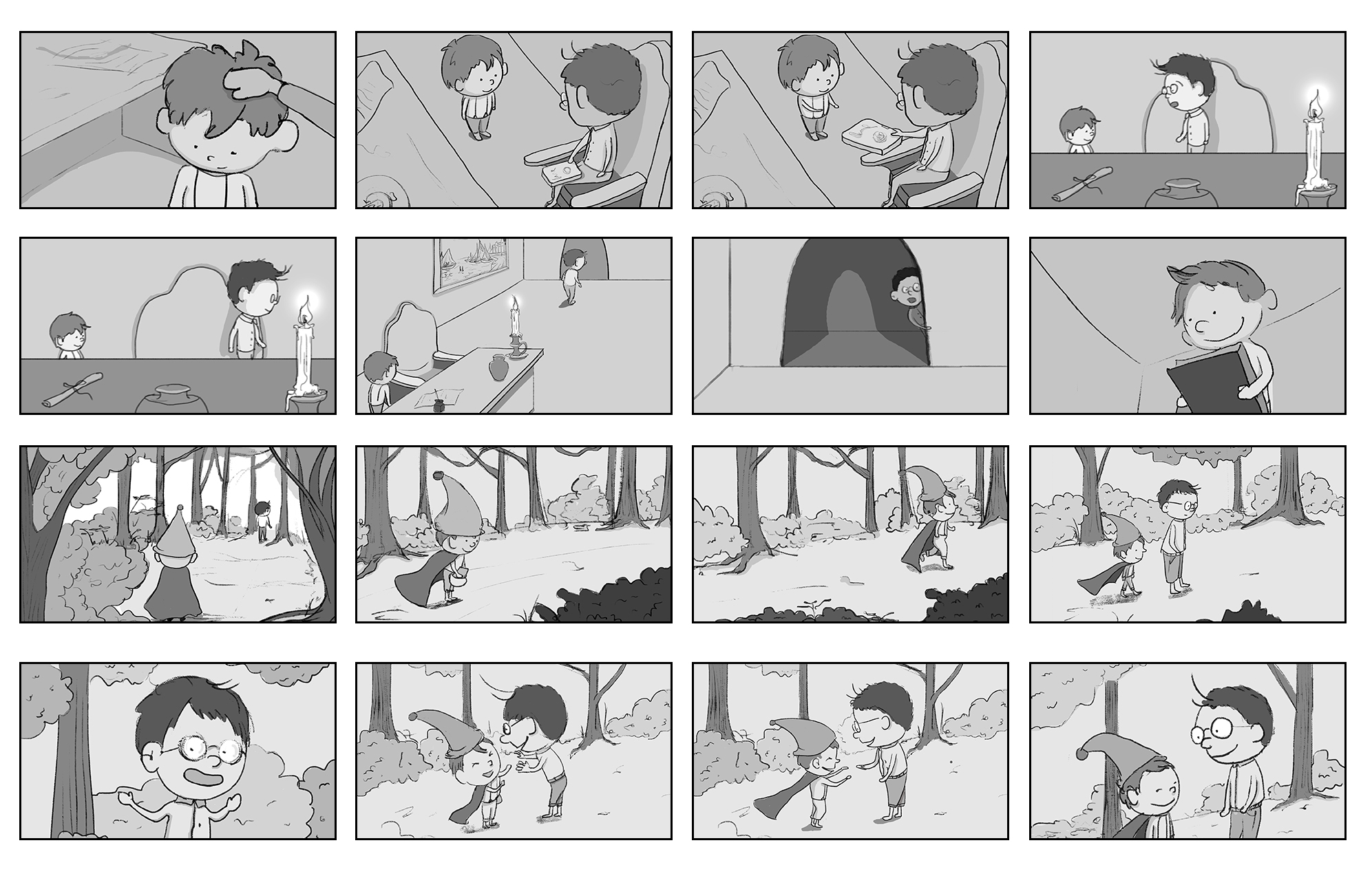
Storyboards
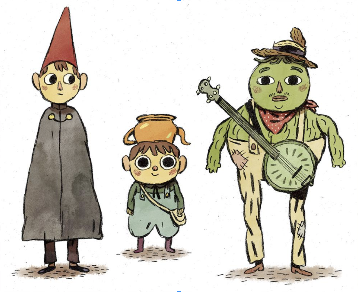
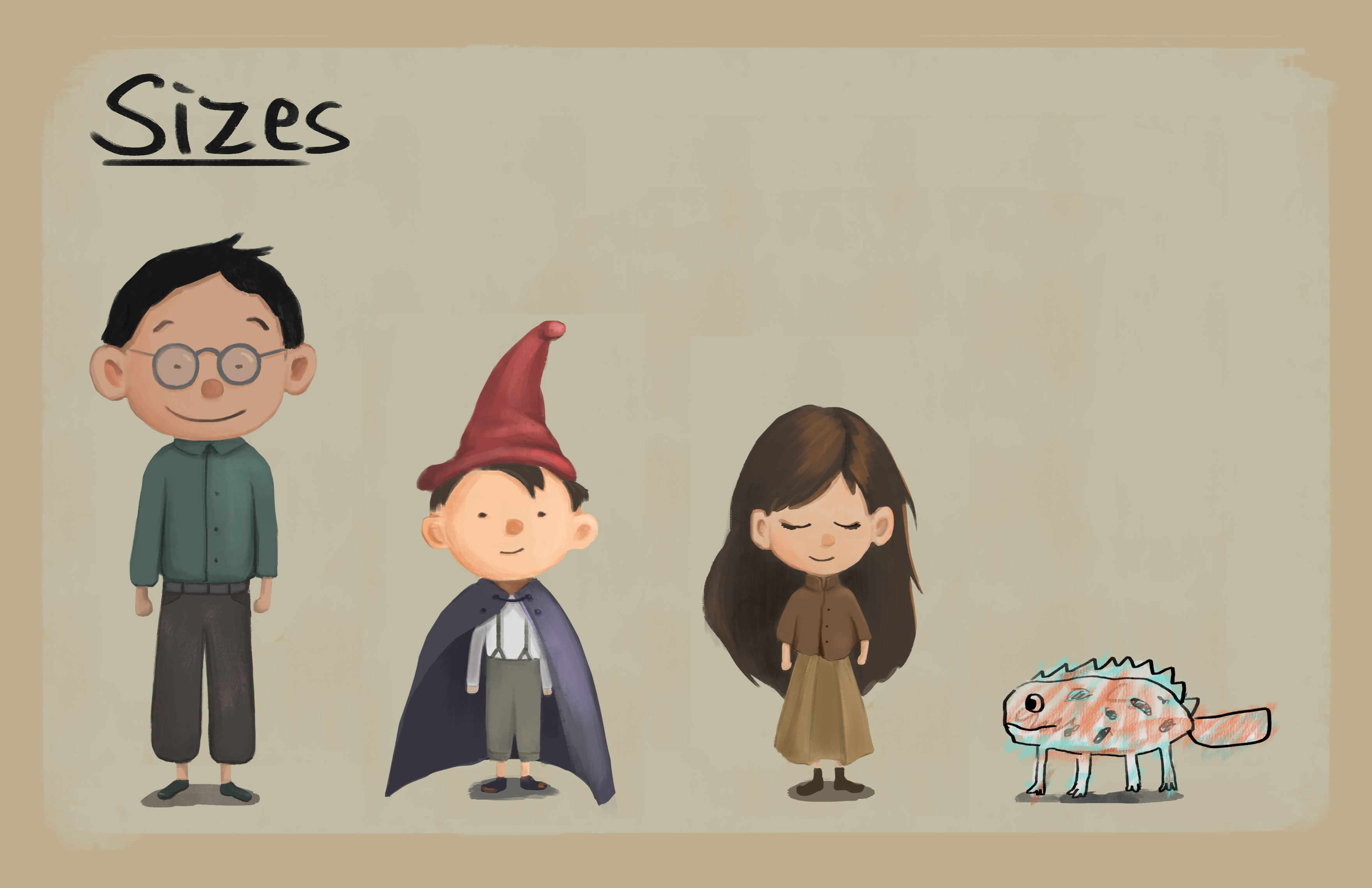
Kou Ying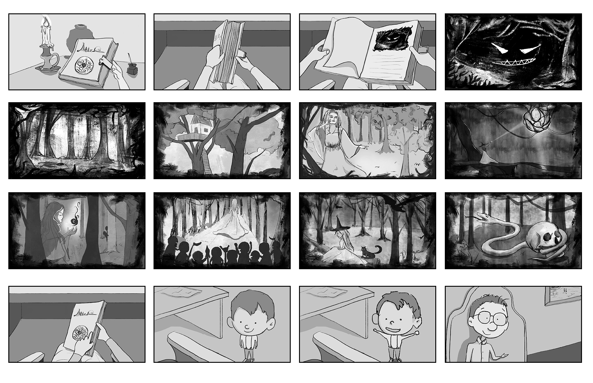

Logline
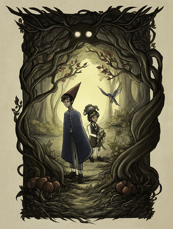
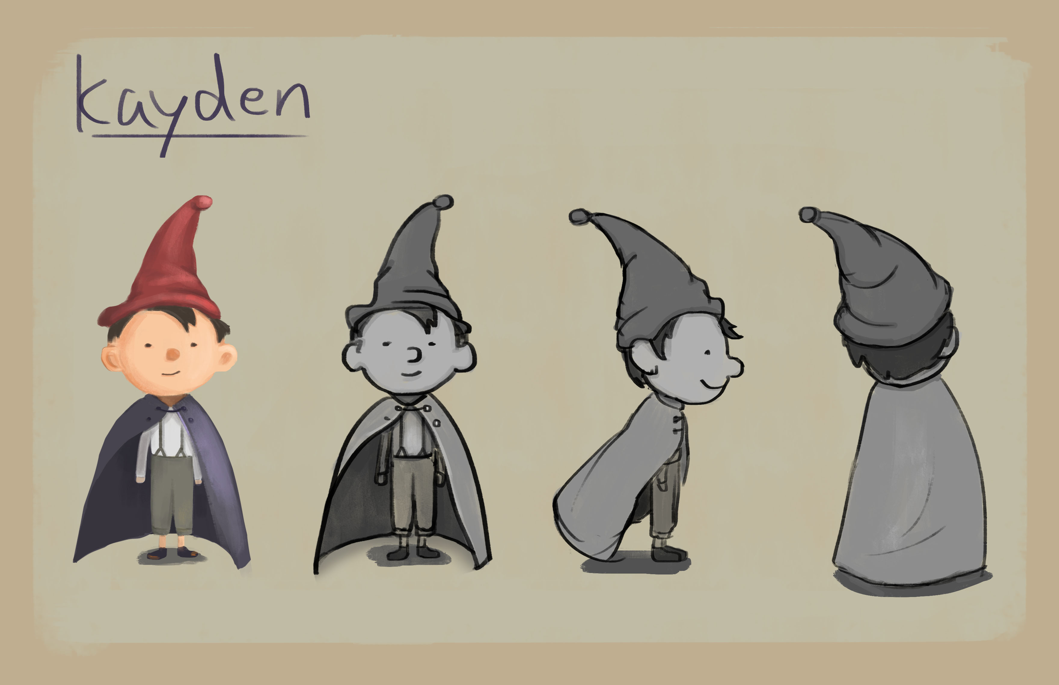
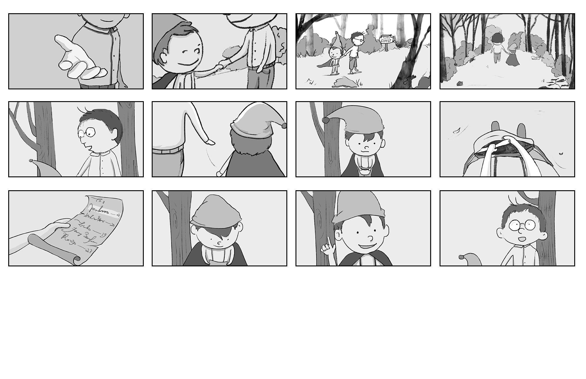
A little boy, Kayden, gets lost in the forest and encounters a mysterious being in the woods, a legend that was well known in the villages.
Synopsis
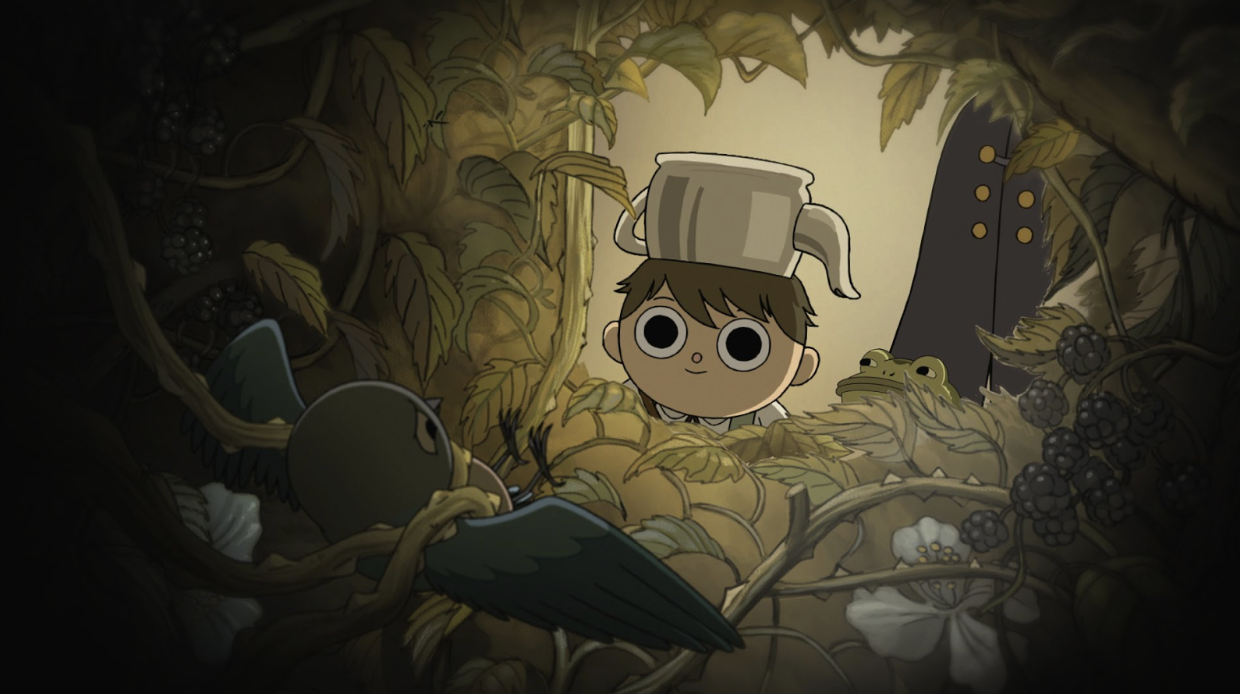
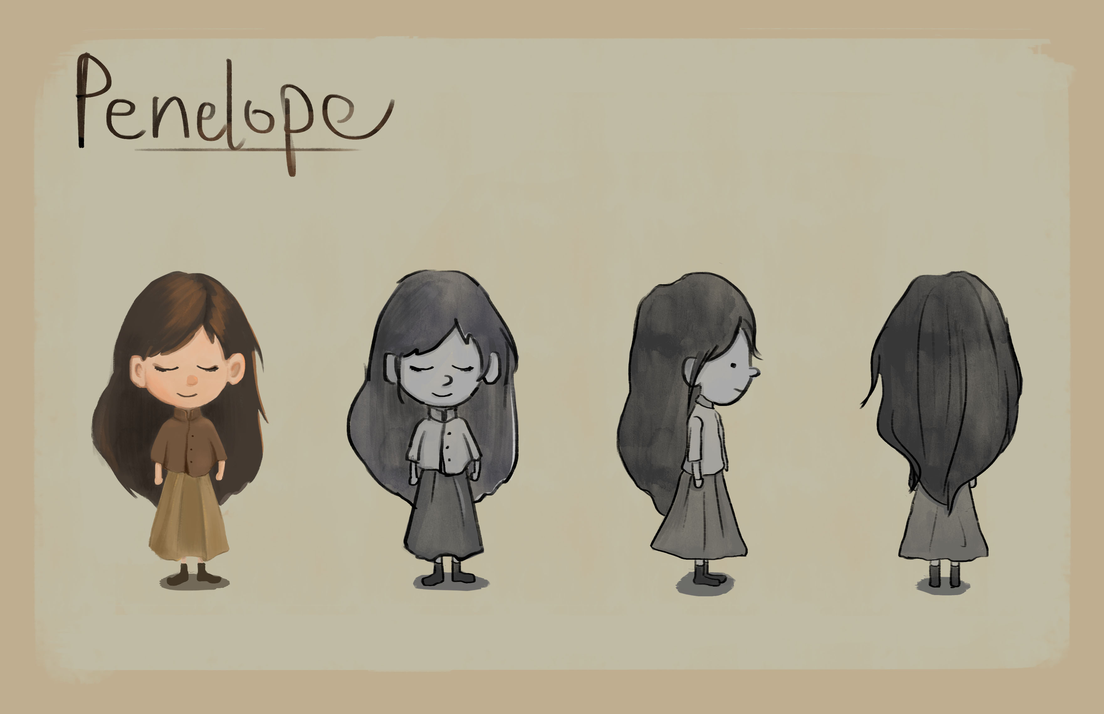
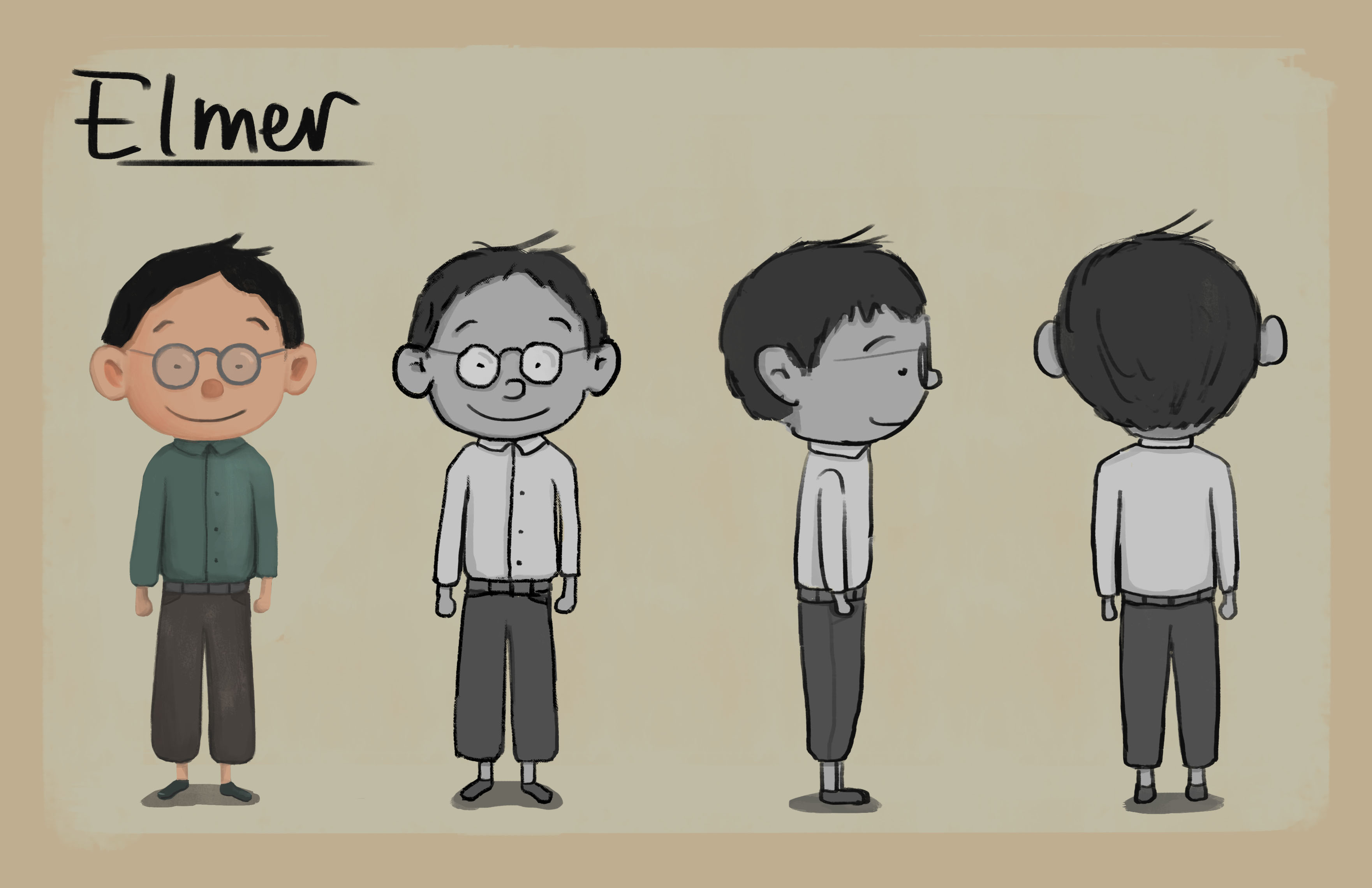
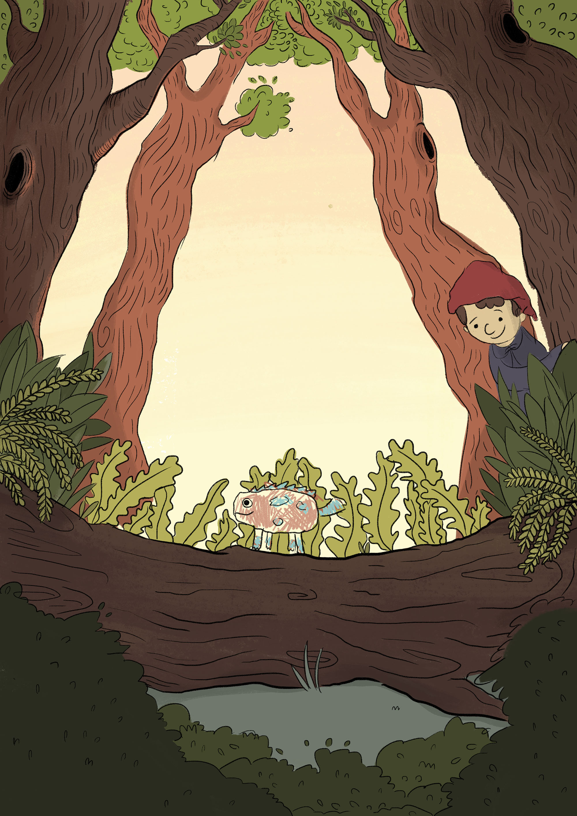
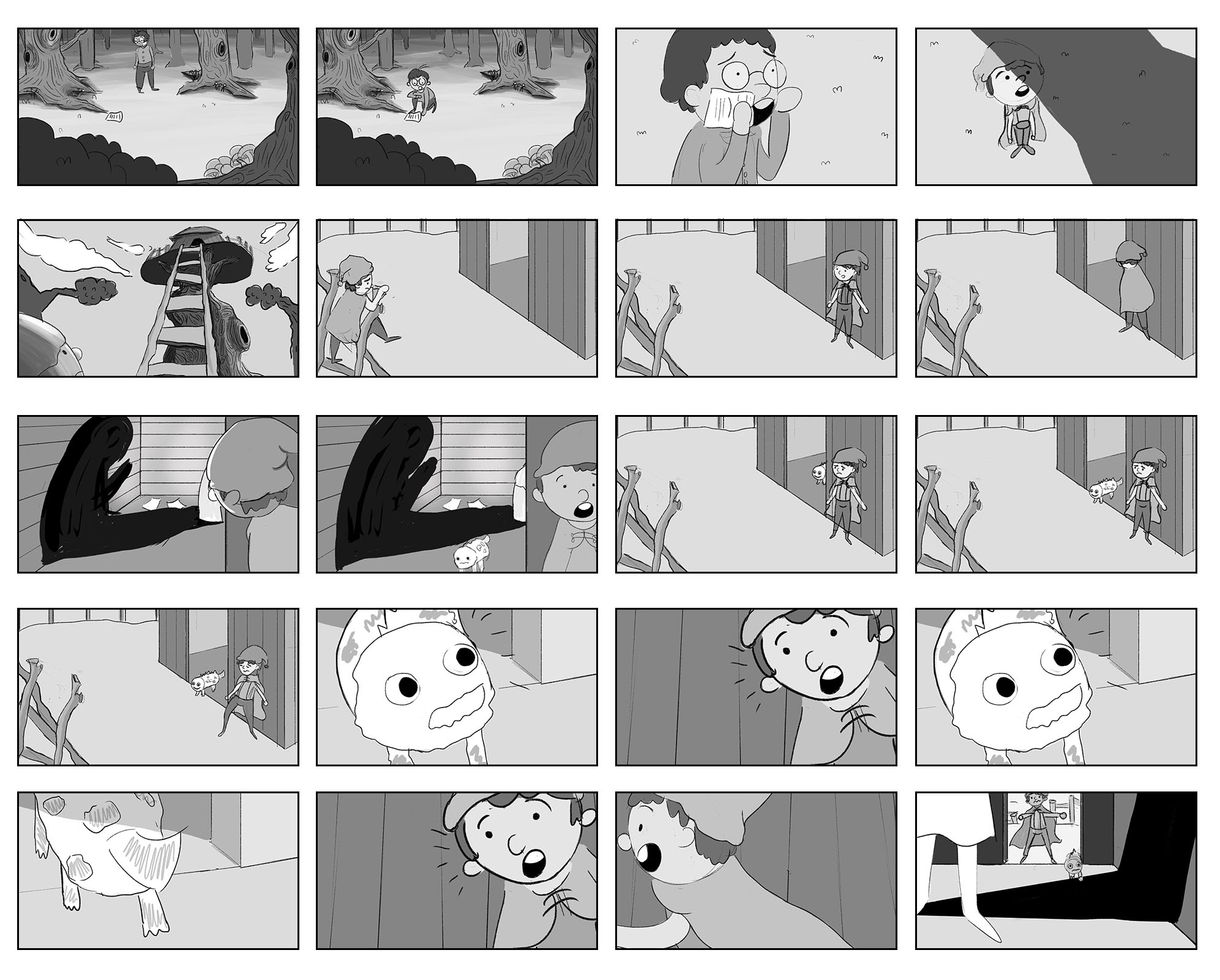
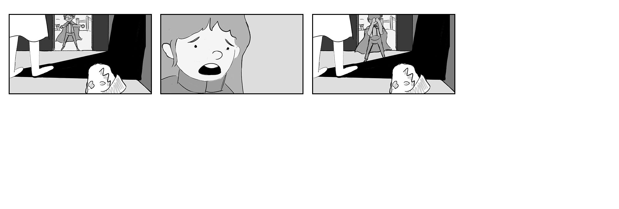
It is believed by the villages, that deep within the forest, witches live. One day, a little boy Kayden and his older brother, Elmer, both venture into the forest, in search of herbs and other ingredients. Kayden who was so caught up in the task of finding mushrooms, unknowingly drifts from Elmer. He spots an unusual creature in the distance and realizes that it reminds him of the legend his brother told him about. Filled with curiosity, he follows the creature, leading him to a treehouse. Hiding outside of the treehouse, Kayden peers in and to his horror, sees a menacing shadow looming against the wall. Frightened out of his wits and assuming it is a witch from the legend he has heard, he attempts to escape. However, just as he was about to leave, the creature comes out of the treehouse and both Kayden and the creature gets shock, alerting the Penelope, a little girl in the treehouse.
Final Animatic
Hey lovely story with life lesson not to stereotype witches or people. I like how the intro has the dark brush texture frame cos its telling a storybook! The surrounding darkness also helps highlight whats in the frame, like the viney ball or the snake and skull. The art there is very detailed and well drawn, almost like concept art already. Like the mystical feel. For the second part the clear tonal values really help us see the focus of each frame, like the character or the pet. The frame where he find the witches treehouse is also good use contrast. And with the charming music and nature theme it reminds me of studio ghibli style animation. Good use of various camera angles like top down(looking in bag) and bottom up(picking mushrooms) The darker foliage help frame the space in the center, where the characters are. The third part could use some tones to help clarify the line drawings, but the drawings are still easy to understand.
Overall its has a charming childlike feel 😉
I generally agree with Nicholas that the mood of the piece is very well-defined. The music as well as the aesthitic style (of the brush stroke frame) adds greatly to its atmosphere. At 0:31, when talking about the “evil” witch, the trees in the foreground slight obstructs the witch and adds a sense of mystery.
There’s a good range of compositions like high-angle shots and low-angle shots. This was particularly well-employed at 4:20, when Kayden looks up at the towering treehouse. This choice of angle makes the treehouse seem huge and magnificant!
There is also an over-the-shoulder shot at 3:52, that leads to the light at the end of the tunnel. This, coupled with high constrast, seems to pull the reader through the tunnel and composition.
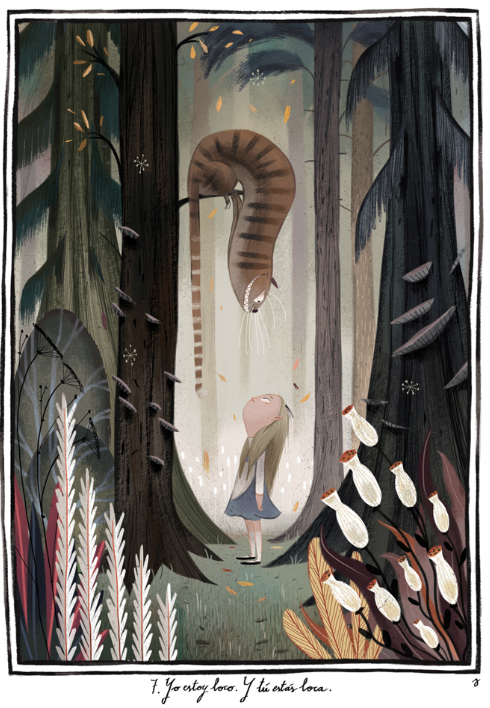
Another great composition is the triangulation of characters (Kayden, Penelope and the magic creature) that occur at 4:45. It’s a very compelling shot that has the light in the doorway constrasting with the diagonal shadow of the witch.
However, I think a little more can be done to convey mood through the composition as well. In the second part (around 4:11) when Elmer realises that Kayden might be in danger, there is a central, medium shot. These shots give a sense of ease and stability which might not fit the rising action of the narrative. Perhaps a dutch angle could be used instead to increase drama?
Overall, I think the story and presentation is lovely! Would really love it if y’all manage to continue with it ^.^
Hey guys! Great job on the storyboards and animatic! (Yes, Over the Garden Wall is very awesome, hehe)
Some comments…
I was actually kind of thrown off by the board in 2:07, where Elmer holds out his hand towards Kayden. For some reason, this moment appeared to me as incredibly ominous? Coupled by the “It’ll be fine…” it was quite unsettling, oops. I’m not sure if it was a moment of foreshadowing? Generally, if a character’s eyes are obscured + hand reaching out to a person, it implies deception! Might want to have omitted this angle if that was not the intention.
The panel between 2:37 and 2:38 (the moment where the brothers part ways and Kayden is officially lost) was a bit confusing though, because it looked like Kayden was travelling back to where they parted ways, rather than forward/away/ahead from Elmer.
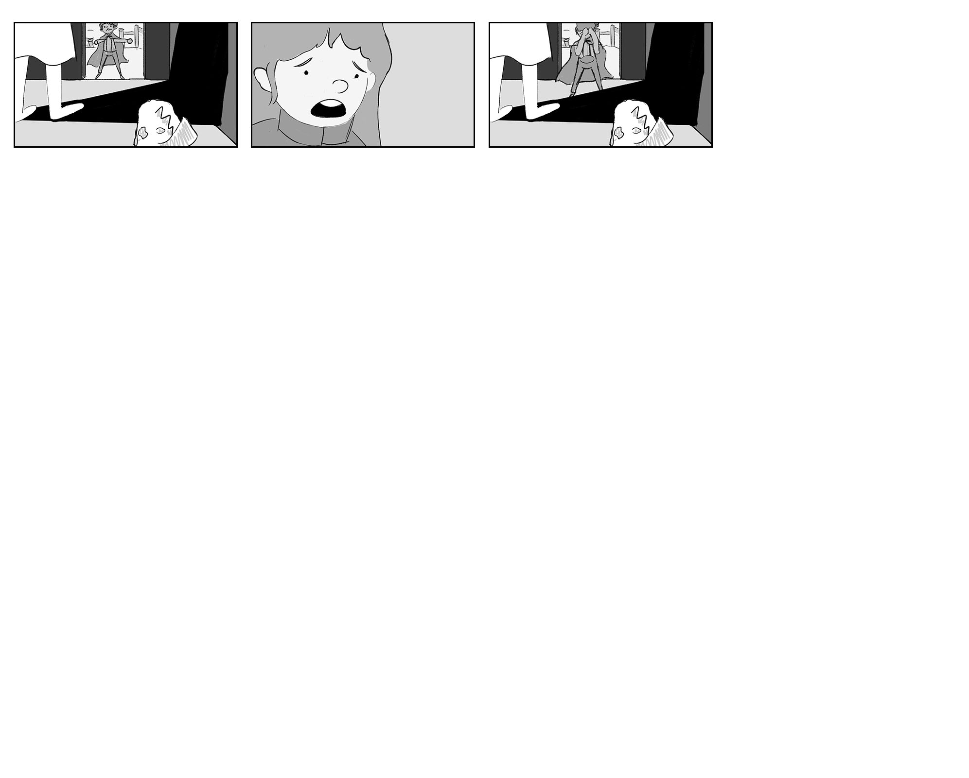
Another odd moment was in 5:06, where the panel was unexpectedly comical (when Penelope thrusts the paper back at Kayden) – Penelope seemed less genuinely anguished and more dramatic in gesture, which didn’t quite suit the mood! Also, the sudden lack of mid-tones…….. eh, yeah.
However…! All in all, I felt that the animatic was well done, with great pacing and storytelling! 😀
Especially loved the beginning where you guys used a different style to draw the legend out. The space surrounding the characters had been clearly established and a lot of different camera cuts were used. Besides the moment in 2:37-38 that I mentioned, the rest of the story proceeds in a way which the characters’ movements are quite clear!
Great job you guys!! Loved it! 10/10 would watch the entire thing if it was a real movie
Comment part 2 haha
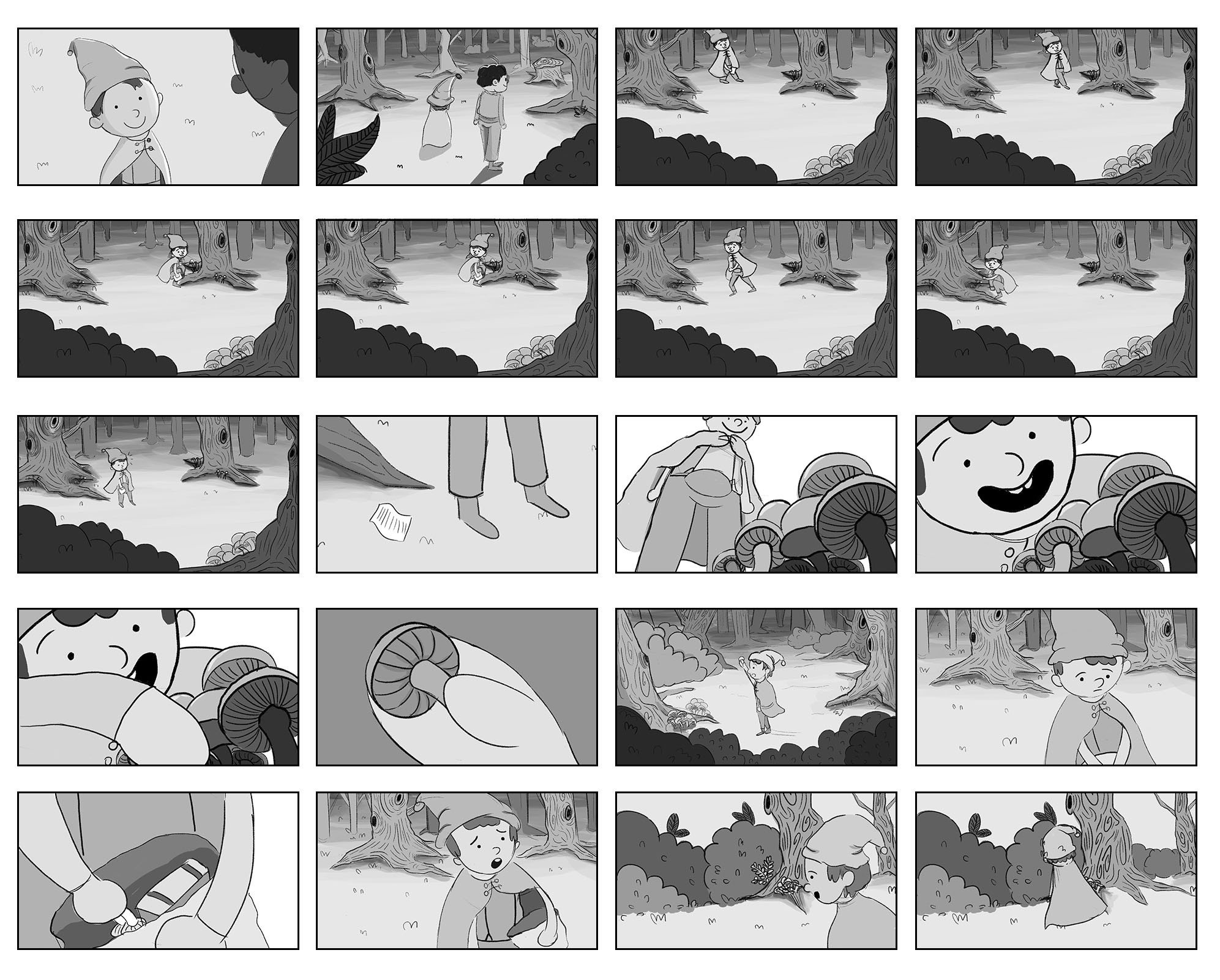
1. The first sequence that I felt worked really well was the progression where Elmer follows the creature to the treehouse. The right –> left side scroll format clearly shows Kayden’s journey; the “tree house in the distance” also had very clear tonal values and helped to demonstrate depth and a sense of space.
On the other hand, the sequence that I felt needed a bit more work was the scene where Elmer got separated from his brother (as I mentioned in my previous comment – just gonna copy it here:) The panel between 2:37 and 2:38 (the moment where the brothers part ways and Kayden is officially lost) was a bit confusing though, because it looked like Kayden was travelling back to where they parted ways, rather than forward/away/ahead from Elmer.
2. I felt that the composition that most successfully and artfully illustrates the story was the shot where Kayden looks up at the treehouse, and the looming shadow obstructs half of his face – despite not seeing the treehouse itself, I grasped a sense of eminent foreboding/anticipation and the largeness of the treehouse (physically and metaphorically). Great job on this shot!
3. One series of focal point arrangement that I thought was successful was at the start, where Elmer(?) is conversing with Kayden. Kayden is clearly positioned on the right side of the screen while Elmer(?) is on the left, demonstrating that the two are talking to each other. The focal point from cut to cut was also clear in that first sequence, but with a good sense of composition and diagonal space, showing the relationship between characters and the space as well.
4. I think that all in all, especially for Gloria and Kou Ying’s parts, there was good use of tonal values – I admit that I actually did not realise that the parts had been done by different people, haha. Kou Ying’s part is missing whites, thought – most of it was in grey tone. I felt that she could have used the white to allow the characters to stand out from the environment!
Special mention for the part where Elmer sees a dark shadow after he climbs up the treehouse, done by Gloria! Really felt that the moment set the mood and tone of the moment.
No tonality at Shi Jun’s part, haha. Understand that he might have run out of time or something, but tonal values are quite important in describing space and story, so it would be great to include it next time despite time limitations.
5. Besides Shi Jun’s part (without tones and background), the sense of space was well established, as well as the progression on the part of the characters. In my earlier comment I mentioned that Kayden’s “getting lost” part can be a bit clearer, but otherwise good job on the whole thing 🙂 Love the forest!
Hmm… actually I realise, since your group’s inspiration was Over the Garden Wall, OTGW was really good with creating the sense of depth in the forest – the foreboding feeling that is the fear of the unknown (reference/pun not intended) combined with the fantastical that is Greg’s whimsy and the lighthearted moments (which also seesaw straight into the Twilight Zone… but yeah). Perhaps more study could have been done on the reference, like taking scenes from it as reference/inspiration!
But overall, GREAT JOB Y’ALL C:
6. Overall, for sound design, I felt that it was well done. The soundtrack matched the mood and tone of the story, helping to carry and add to the atmosphere of the story, and was not jarring. One moment I felt could have been better was when Kayden realises that he’s lost – a foreboding soundtrack could have been added to intensify the fear of being separated and lost. Otherwise, it was great! Special mention for the soundtrack where Penelope and Kayden first meet, it really suits the moment!
(Also, Jesse said not to comment on the acting but I thought you all did a great job hahaha)
Again, really loved watching :^) All in all, amazing job!
Synopsis and Sequence
The sequence of events are well structured and it has a smooth transition from one event to another.
Focal Point and Composition
I find the composition at 3:49 is quite interesting because it is like a three point perspective where the treehouse was not in the middle but it was near towards the middle. Thus, this decreases the number of match cuts and shows how much perspectives and camera angles you are using which is good exploration. By having this three point perspective, we are still able to be drawn by the treehouse because of how the diagonal pathways lead us to where the treehouse is. Even though tree house is placed at a distance but you managed to made it look much clearer to us by shading it black and this became the focus for the composition.
Tone and Space establishment
I could clearly see three tones for most of the images except for the ones at 4:48 onwards. The use of tone could have been improved at 0:11 because you probably wanted to show a forest that is deep in the woods. You could draw more trees and maybe shade the ones further away darker to show a sense of depth and establishing a forest deep in the woods.
As for the scene in 4:47 onwards, tonal values would help to indicate that the characters are inside the tree house having that conversation. Especially for 4:47, if you were to show that perspective, make sure to create some tonal values so we can distinct the characters from the place.
However, the tones established at 3:49 was well done because it does show depth and separation between spaces so we could tell where the character is and where he is heading to.
Sound effect
The opening sound effect works well because it shows a very mystical and wizardry atmosphere and it does bring out the theme of your story. The sound then transmits from the dark and mystical sound to a more cheery music which changes the mood of the scene and also helps us to understand that this is another scene and group of characters we are looking at.
@ 0:26 the composition is great. there’s good use of lighting. The focus is clear and I liked the way the maiden point the torch towards the main focus in this frame. the other ‘vignetted’ frames were just as good, but i think this one is the best so far.
@0:34 I like the use of tones here, there’s appropriate lighting and i liked the shadows you used to portray the two main characters there. this could be a potentially good story beat!
@1:10-1:32 Sequences are good because frames matches the dialogue. There’s one frame at 1:23 where I think if this was zoomed in it would be better. They are still conversing so it would be better to get a more midshot or close-up shot, instead of a faraway shot. the table appears to block the viewers from listening in to the convo.
@4:03 the tones used are well developed. I like how there’s attention paid to lighting in most of your sequences and it really does create a mysterious fantasy mood, which I assume you were tryna portray.
@4:20-4:30 the sequence of frames are good in the treehouse scene. the way you composited the treehouse scene from the ground and it leads up to kayden sneaking around the house was well established. at 4:32. I wish there was more detail, or some objects near the mid part of the frame because it looks empty at that area. maybe if i were you id change the angle to a sideview, instead of diagonal, so that kayden takes a significant portion of the frame, so there’s no empty space, and we can engage with the character as well. additionally, the tones used are there, but since kayden is leaning against the wood, perhaps it is necessary to create shadows behind him.
@4:50 onwards I liked how there’s use of facial expressions and hand gestures to portray the characters emotions. It would be nice to see more of that in a few more cuts, because in every frame, the gesture changes to a different set. But when matched with the dialogue, each frame matches the dialogue really well.
hope i helped. 🙂
Very cool story. It has that very enchanted feel and by looking at your references, you managed to get that feel that you wanted. The enchanted music also helps portray the tone of the story at the beginning.
There is overall good use of tonal values. There are plenty of frames with a lot of tonal contrast, going full blacks such as when the boy is entering the ‘cave’ at 3:50.
There are also extreme close ups to bring us to look at important objects or details like the mushroom at 2:55.
The shot of the outreached hand at 2:07 is also a unique perspective that isn’t seen elsewhere in the story and the change of perspective from the previous wide shot is effective in communicative that the elder boy is leading the younger one into starting an adventure.
The view of the boy as he looks up at 4:19 is nice too, to illustrate not just the scale of the treehouse but make it look grand too.
Something I felt a little odd about at the start: I don’t know if the perspective in the sequence from 0:40 to 0:48 was intentional. The lady looks really large in scale compared to the silhouetted figures at the bottom of the frame who are chasing her away, which makes the proportion look like as though the silhouettes at the bottom are actually people in a cinema watching the animatic which is pretty funny 😀
Good job on this!
Nice story! Totally something I would watch at the cinemas:D
I really like the opening sequence where Elmer tells the story to Kayden. The brush strokes creates some sort of framing and the music really gives the effect of those enchanted fairy tales. The frames are also well-drawn. I feel that the sequence that needs improvement is around 2.37. As mentioned by Natasha, I was a bit confused in the direction that Kayden is heading.
The composition that works best for me is 4:20. I really liked how Kayden is looking up at the treehouse and also the camera angle used in this shot. It shows some sort of power/fear as mentioned during the beginning storytelling sequence where Elmer tells Kayden about the witches. I also liked the composition at around 3:50, where the caves sort of frame the treehouse. This also helps in creating the focal point for that particular composition and helps lead the eyes towards the treehouse.
Generally good use of 3 tones except the last part. Also, sense of space is well-established for parts where the 3 tones are used; can tell the relative positions of the characters.
Good use of sound to bring out the mood and atmosphere of the story.
Overall great job! Really enjoy watching it:)
Hi guys! Really interesting world that you all came up with, I thought the story was really nice and holds a lot of potential to develop into something really great.
1. Most of the sequences flowed very well and conveyed enough information for the viewer to understand the movement or transition of cuts. The sequence at 4:33 – 4:37 worked very well in conveying their emotions and interaction, as well as the hilarity and urgency of the situation to the viewer. However, between 2:34 – 2:42, the environment or sequence structure did not change enough for me to understand that Kayden had drifted very far from Elmer. The first time I watched it, I thought he had walked back towards Elmer’s direction. To counter this, I feel that maybe the environment could have been designed differently with different foreground or Kayden can push through some bushes or crawled under something.
2. I really enjoyed the opening sequences as a backstory to the world that you guys created, I felt the realistic style of the witch worked in conveying the magical legends that are witches to this world and I love how it juxtaposes with the character of the young witch that the story actually follows. The textured framing also helps the audience understand that this is a flashback or retelling of sorts rather than the present. 2:07 had a nice shift in perspective where we zoom into Elmer’s outstretched hand, it created a Z-axis that also conveyed emotional association of warmth and protection of someone being there to protect their loved one.
3. Most of the focal points were well-matched, with every shift having at least the next one matching to create a seamless flow of images. However, from 2:19 – 2:35, every focal point was in the center and this could cause the focal point to be a bit stagnant and boring after some time. A suggestion I have would be to shift Kayden to the left of the screen and Elmer to the right to create a sense of rallying when they are having a dialogue. The list could also be received by Elmer so that a focal point can travel across the screen and be more visually interesting for the viewer, while also providing more interaction.
4. The three tones were very well utilized in this animatic, I felt most of the different focal points in all scenes were well separated with the contrast and the viewer’s eye was led easily by the high contrast. The tones also helped to create depth in the scenes set in the forest (3:46 is a good example) and create a Z-axis in separating foreground, midground and background. One of the scenes that really got my attention was 0:27 where the usage of tones helped to emulate light emitting from its source. I felt that this was artfully done and very easily understood.
5. Space is generally well-conveyed in most of the scenes. However, at 1:26 I felt the table was a bit strange in terms of size and length and took up a large portion of space that may be too unrealistic.
6. Sound design helped to convey the atmosphere of the scenes, but at some parts the music overwhelmed the narration and the words became unclear, audio balancing would help or maybe some fades where narration begins and music lowers in volume. The sound at 3:55 is unfamiliar and I could not recognize what it was meant to represent.