Mysterium Veritatis

Screen Shot 2015-12-14 at 5.18.13 pm

Screen Shot 2015-12-14 at 5.20.27 pm

Screen Shot 2015-12-14 at 5.18.43 pm

Screen Shot 2015-12-14 at 5.18.53 pm

Just a little book layout/experiment I decided to do. I’m basically almost done with the skeleton of the Paul/Pollux story, so I’m trying to come up with ideas about how to present the world I’ve built without spoiling the story. The plot twist (i.e. Paul = Pollux) can be made rather obvious and chronological, which is not exactly what I want.

At the moment I’m packaging the entire volume as part of something released by an organization called The Mystery Guild (I used this as a frame for my calendar project. I’ve been working on designing a proper logo for TMG to use in the project). The text in this InDesign document is mostly finalized, but the images are all fillers (just ignore them. Even the logos are just fillers I took from the Internet to act as visual placeholders before I finish the final logos and images).

Right now, I am working on

  • typography selection for main book (ignoring process book for now)
  • page layout for main book (paper size, grid, hierarchy)
  • format for main book (i.e. books within books, translucent pages)
  • typographic approach for Pollux’s story
  • how to tell the two stories side by side???
  • mini branding for The Mystery Guild (logo mostly)

Some ideas I have for the main book

  • translucent overlays of bone structures printed on tracing paper (or something similar) to be overlaid on anatomical drawings of creatures within Paul’s diary [if you read the previous post you know that Paul is a broke surgeon who makes cryptids for a living, just explaining this in case]
  • hardcover to be embossed with gold foil and book to be coptic bound so it can flip open easily
  • one colour accent within the book pages – not going full-colour at the moment as it doesn’t seem necessary
  • process diary look and feel will probably be informed by the main book, but the aesthetic for the process diary is going to be comparatively more raw (intended because it’s sort of a sketchbook/work-in-progress companion to the final space + book)

I’m going to work on the FYP Report only after I produce more work and experiment more. I haven’t yet found a good way to synthesize all the research I have such that it’s easily understood because I went all over the place with regard to what I was looking at and I’m not entirely sure how to organize it. After I work on more of the book (and do some test prints to see how the layout is shaping up), I’ll start on my report. By then I should be much clearer on how I want to proceed.

PS: Mysterium Veritatis is Google Translated Latin meaning ‘the secret truth’.

The Girl Who Was Plugged In/ Łódź Book

The Girl Who Was Plugged In is a work of sensory fiction designed by students at MIT. The book is accompanied by a vest that creates physical sensations (i.e. inflating to create a feeling of tightness in the chest to mirror unhappiness in the narrative’s protagonist) that mirror the emotions evoked in reading a work of fiction.

I was looking at different kinds of creative book design and stumbled across this one. I don’t think I want to do anything of a techie nature because I’m an analog girl, but I think this is an example of really effective book design in terms of achieving an emotional or thematic purpose.

lodz 1

lodz 2

lodz 3

lodz 4

I found this project on Behance. This is the final project of Joasia Fidler-Wieruszewska for her Masters degree, a book about her home city of Łódź. Łódź was historically inhabited by four different peoples, thus the form and language of the book follows its content. I love the insertion of different ephemera to express the history of the city. This is something I want to do as well in my own book, which will reflect the thematic concern of duality.

Inspirational book covers

IMG_0306

IMG_0307

IMG_0308

IMG_0309


There’s a particular aesthetic in the book covers I’ve been looking at for inspiration that involves embossed hardcovers, wraparound covers that add texture and depth and the use of gold foil on black. I’m going to use the second semester to research on where I can get this produced. I don’t really want to take the risk of doing the gold foil detailing on my own unless I can guarantee a good and crisp result.

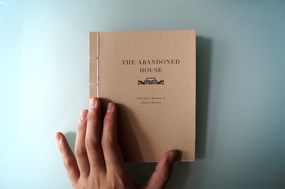
Documentation: The Abandoned House

DSC00604 copy

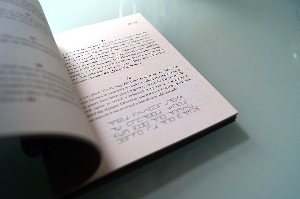
DSC00608

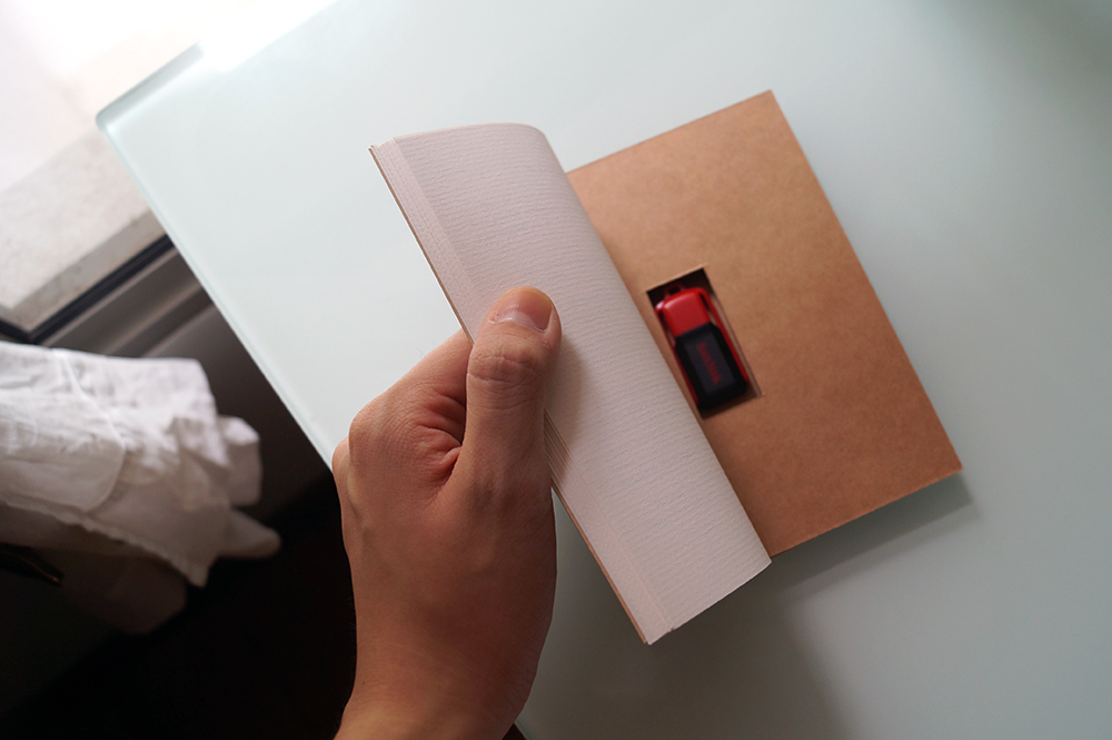
DSC00610


I know I’m making a book for FYP, and I knew this way back during the summer when I was deciding what to make for B’s birthday. I decided to kill two birds with one stone and make him a book that I could also use as a personal experiment for a possible FYP outcome.

This project, part birthday present and part FYP experimentation, is called The Abandoned House. It’s a simple empty mansion story in the style of the choose-your-own-adventure Fighting Fantasy series. It incorporates puzzles to solve and codes to break to reach the goal, which is a thumb drive containing an EP of song covers I recorded with a couple of friends for him and a behind-the-scenes video of how the four of us recorded the mini album.

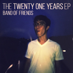
Album art


I even bothered to make album art for the mini album using a candid photo of B which I took before the semester started. I had a lot of fun making this and I wanted to bring the same spirit of fun to my FYP by reflecting on my making/conceptualizing process. I noticed that when I was working on The Abandoned House I paid very close attention to the details of my bookmaking and my narrative and even though I experienced so much frustration making sure the paragraphs of the story were all properly linked, it was a very conscious process with quite a rounded and rich outcome compared to when I tried to lock myself into my old FYP idea last month.

One of the main takeaways I have from this project is the feeling that it may not be such a bad thing to incorporate tech things into my outcome after all. I showed my mother The Abandoned House after I finished binding the pages and cover and she liked the idea of the embedded thumb drive. (I built it the same way I built my Dictionary last semester.) She suggested that I could use QR codes in my FYP to make the experience more interactive and immersive.

I’m an analog girl but I think I should challenge myself and keep up with the evolving pace of mixed media art especially with regard to book design. I’m really horrible at logo and brand design but I feel like all the books I’ve been making lately have an element of my personal touch to them that my branding work lacks. After two years I have learnt that I don’t enjoy brand design.

I was also reading Xiao Yan’s FYP report about her bookmaking/narrative-making process and it reassured me that I’m on the right track. I’m going to post again later today about book design ideas I have for my FYP. There’s a certain look and feel I’m moving towards and it involves gold foil.

Helen Friel’s The Imp Of The Perverse

HelenFriel_ImpPeverseCoversClose

HelenFriel_TheImpofthePeverse


A short story by Edgar Allan Poe, The Imp of the Perverse discusses the voice inside all of us that makes us to do things we know we shouldn’t do. Each page is perforated in a grid system with sections of the text missing. Readers must follow the simple instructions to tear and fold specific sections to reveal the missing text. Books are usually precious objects and the destruction is engineered to give the reader conflicting feelings, do they keep the book in it’s perfect untorn form? Or give into the imp and enjoy tearing it apart?

from HelenFriel.com

I think I’m starting to get into a mild state of panic about what to do for FYP and how to go about producing a final work, so I’m looking at zany book designs to try and figure out what to do about what I’m going to do. I really like how Friel’s book design is spot-on for the book’s contents.

(I honestly don’t like the way the book is presented in the photos but these are the only ones available and I understand the concept well enough.)