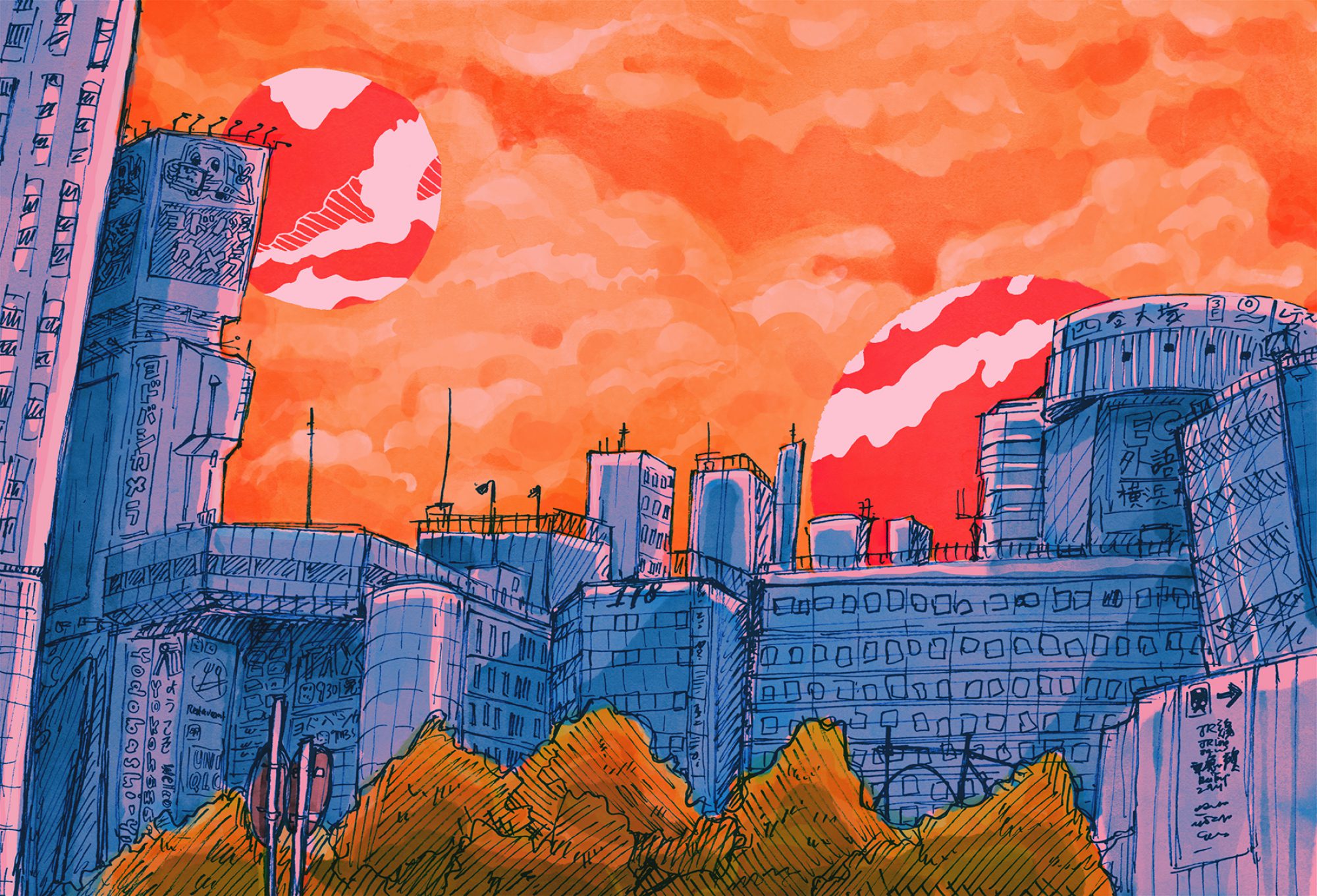
Hey yalls!! Here is my post on my process of analysing my favourite and most hated scents, and translating them into a physical and tangible sculpture. The scents that I picked were:
[ G O O D ] My Jacket 🙂
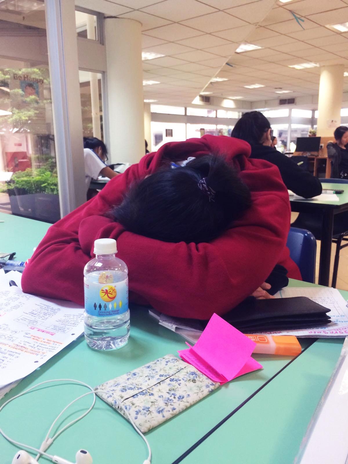
Me in Taiwan wearing The Jacket circa 2015 🙁 help my glasses are so bad HAHAMe sleeping in the AJ library in The Jacket during A Levels studying period circa 2016 :’)
My jacket!! I don’t wear it outside, only in hall and at home because it’s kinda worn out and lupsup and I’m afraid of losing it/losing the smell. I bought it for a trip to Taiwan in 2015 and after that I just constantly wore it until it started having a particular smell (smells like me?? but stronger), like what Singaporeans usually call a chou chou/bantal busuk. The memory I associate it with is one of the A Levels study period. I brought it to school everyday cos the library was uber cold and eventually when I took naps in it after studying, the smell was really comforting especially to an over stressed mind. :’) Also, I made really good memories (even though studying was hell) with some of my closest JC friends during that time and I think the jacket also kinda reminds me of them as well. 🙂
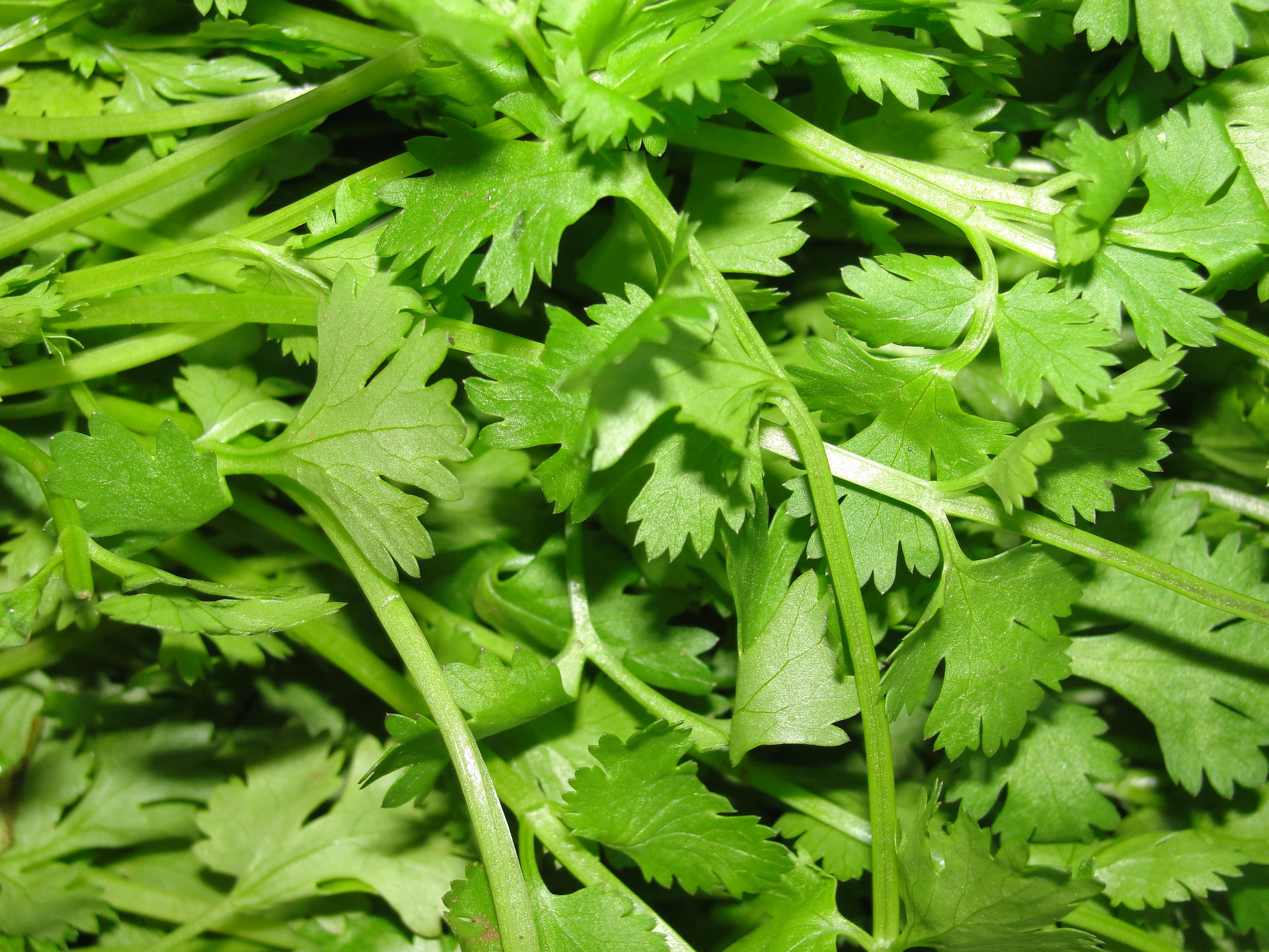
[ B A D ] Coriander >:(
Honestly looking at this picture already makes me feel like I can taste the coriander???? Ohmagod ew help
The smell of coriander. Like eeeew have you smelled that shit. Even worse EATEN IT >:( Ok there are a lot of people that disagree with me on this point (including much of my family and I’m looking at you, Dhanu), but I just can’t find any love at all in my heart for this herb. It smells so strong and has this intense and nasty flavour?? Like you took 300 leaves from a random tree and you put all that nasty flavour into ONE LEAF. I spend too long picking it out of my food and the worst experience is when I mistake it for the spring onion and eat it and then it literally ruins my whole meal ohgad uughghughggh
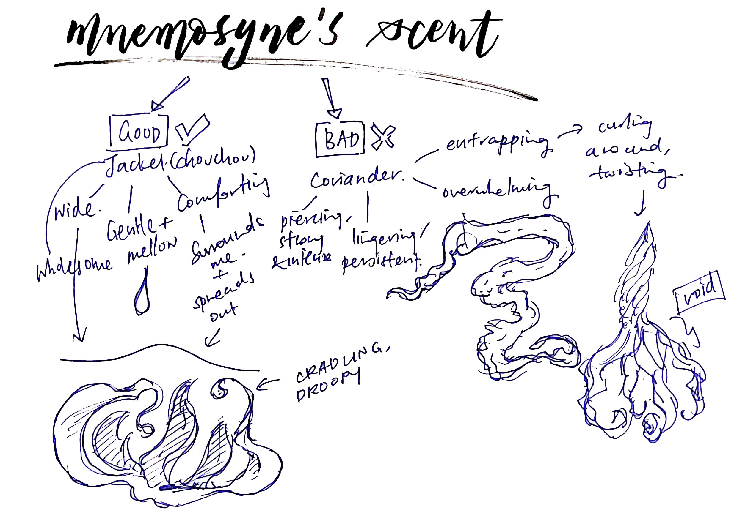
We were then asked to describe our scents using physical attributes like enveloping, wide, flat etc. Here’s my mind-map and imagining of what the plastic sculpture could look like:
Mnemosyne’s Scent Mindmap
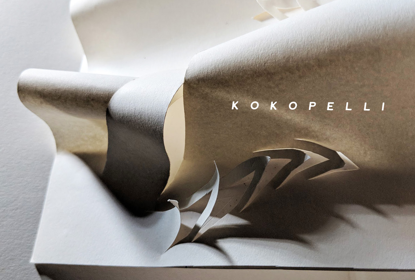
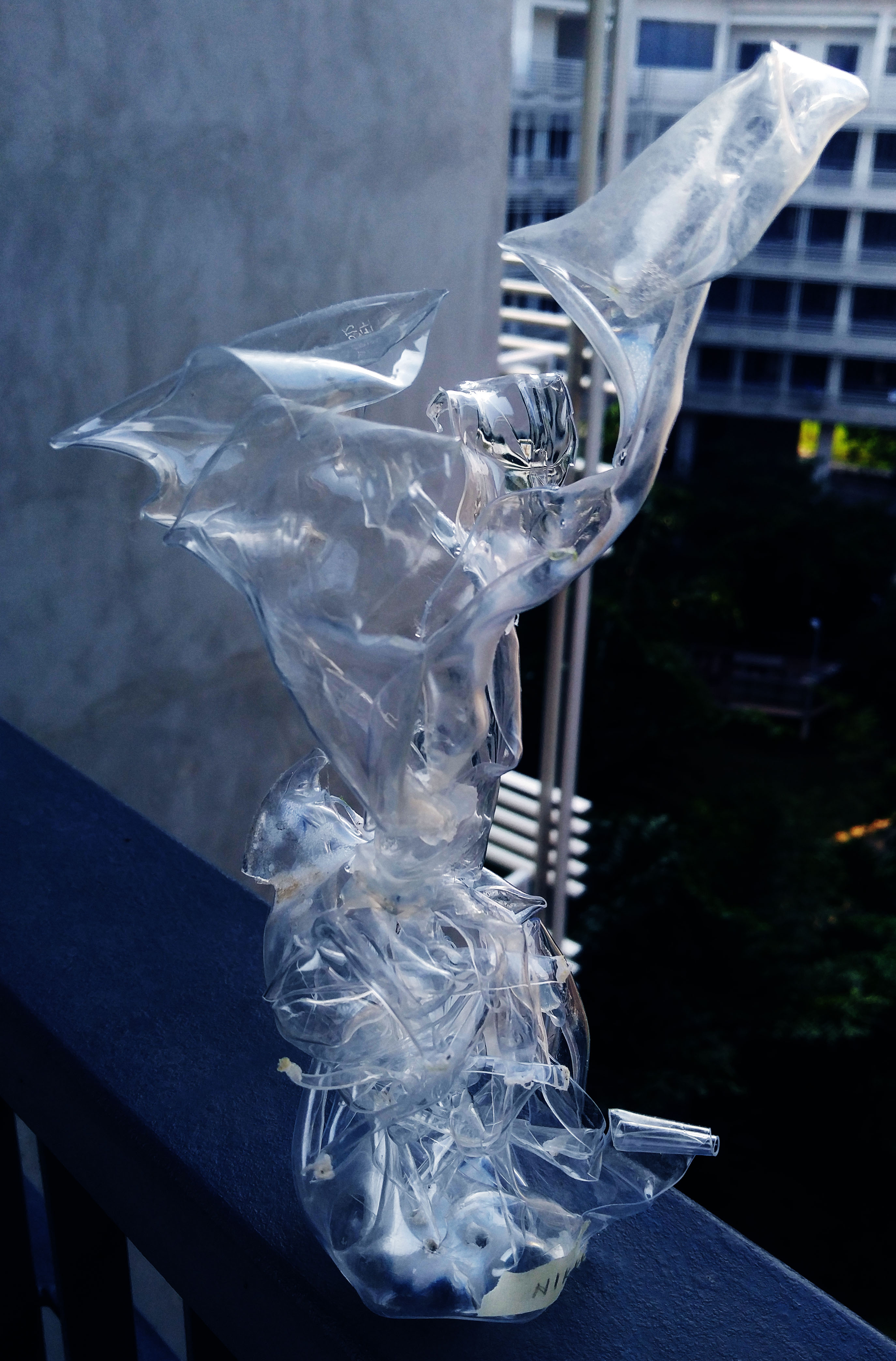
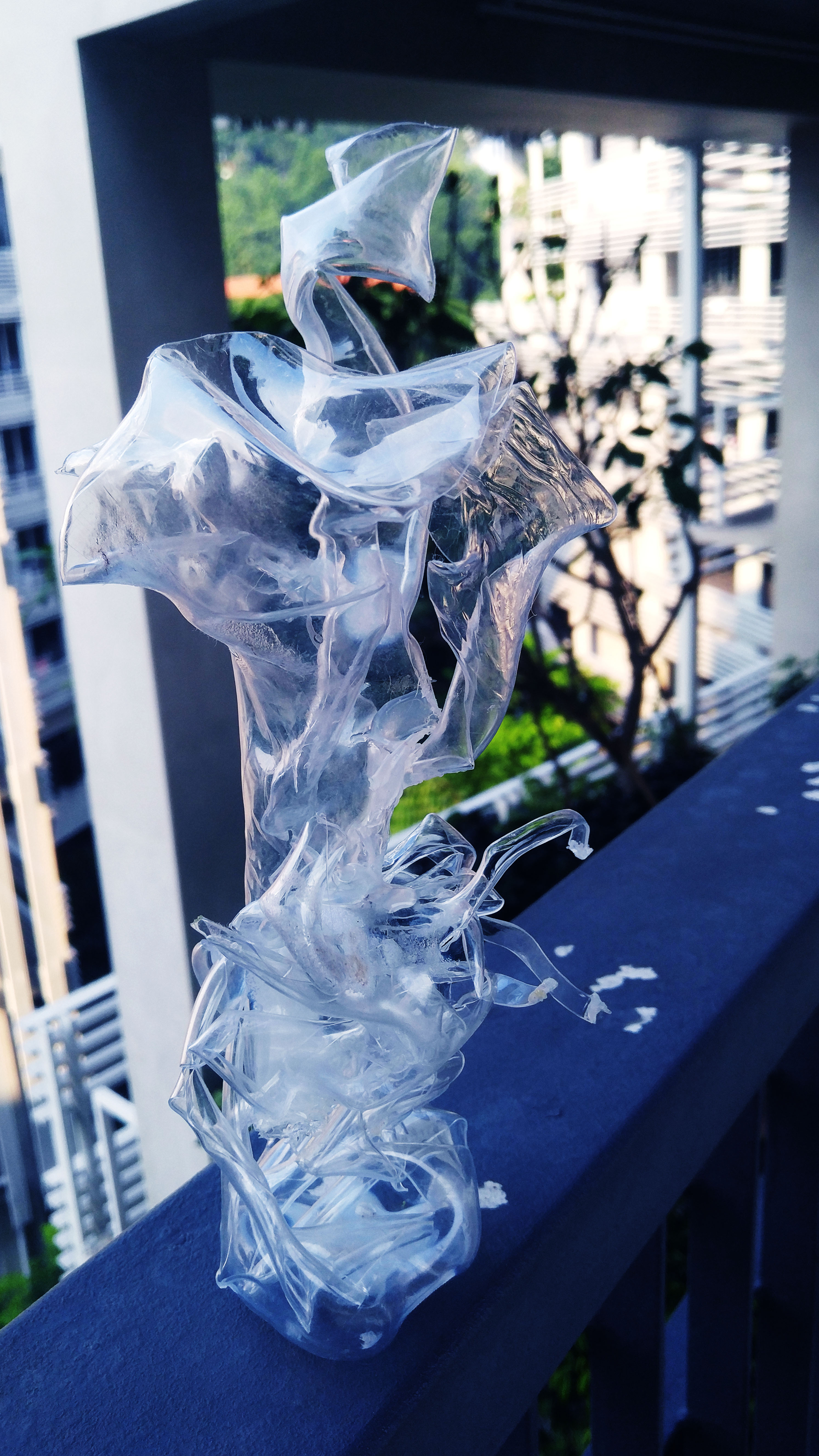
[ FINAL SCENT SCULPTURE ]
For the final sculpture, we made them out of PET bottles by applying heat using hot air guns and soldering irons to bottles that we cut up. Sounded easy enough until I actually tried it. 🙁 Turns out it’s really really hard to manipulate the plastic into a shape that you want, and it’s more of a process of making something and then working backwards or trying your best to make something that resembles your original idea from there.
Here’s mine in full view!
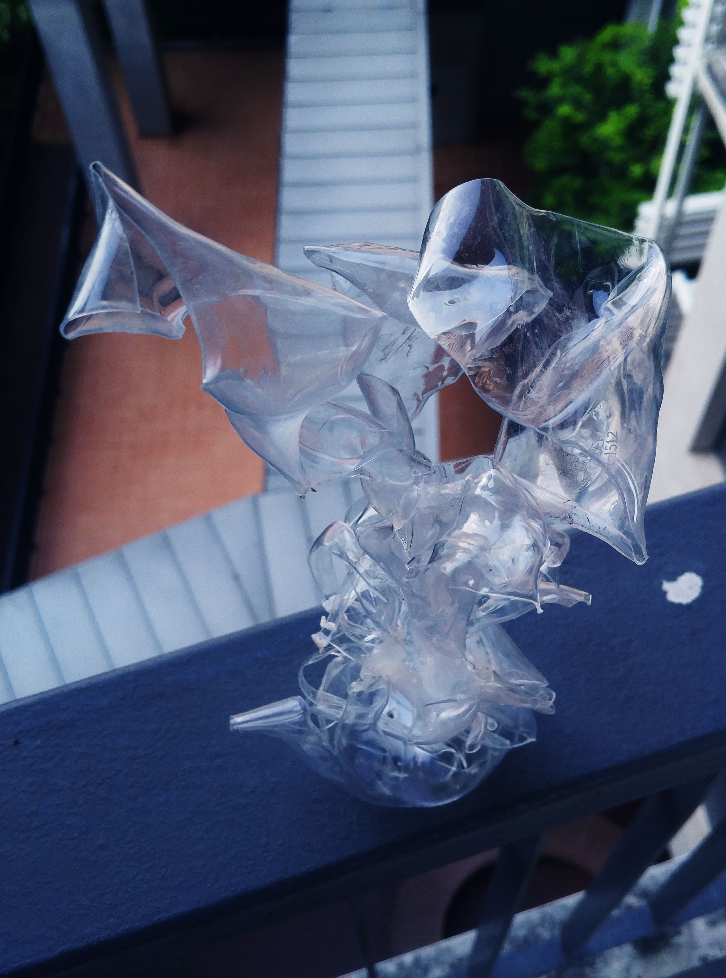
The upper portion is my good scent, the jacket, which I envision to be something that is cradling and at the same time has this feeling of floatiness and grace. I wanted the top part to look pleasant, almost like the unfurling of flower petals, so I cut out petal-like shapes in the pet bottle and warped them with the hot air gun.
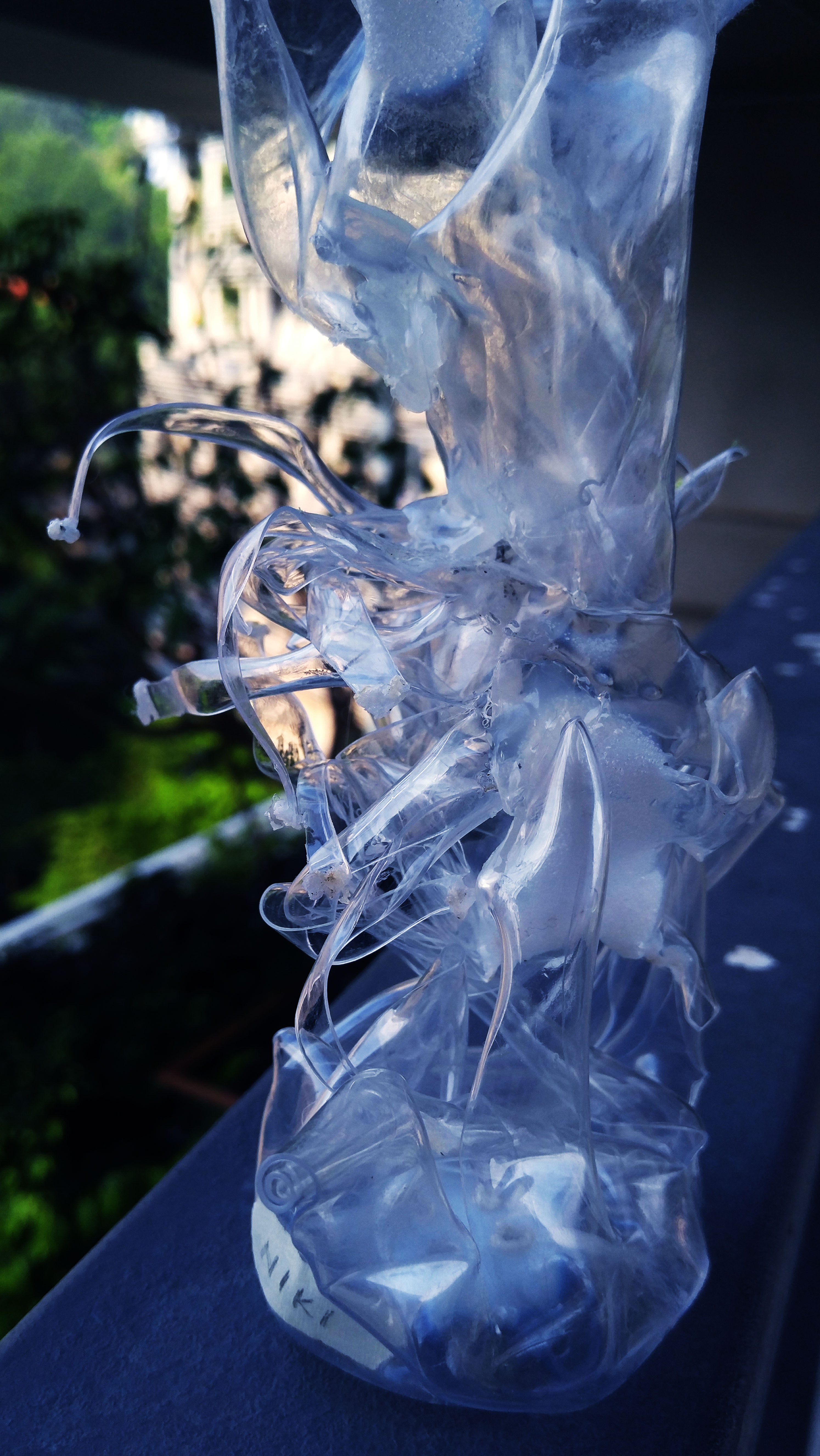
The bottom portion is my bad scent, coriander, as I also wanted to show a wrapping kind of scent, except it was strong and concentrated and nasty and basically was like a trap. So I had cut up the edge of the PET bottle into tiny strips and applied heat till they all curled in on themselves and entangled and twisted into this interesting shape.
I positioned them this way as I wanted to convey a feeling of the jacket’s scent emerging from the scent of the coriander as a ‘free’ entity again instead of being trapped in the nasty scent, like a place of refuge.
Mnemosyne’s Scent Sculpture, Full Front ViewMnemosyne’s Scent Sculpture, Full Side ViewMnemosyne’s Scent Sculpture, Back view
Particularly like the last picture because the light is cast so that it coincidentally falls on the good scent whereas the bad scent is in the shadows?? Hehe.
Overall feedback I got was that the shapes and lines were interesting, especially the bottom portion, the coriander, as the twisting gave off a creepy vibe. However, the positioning of the two scents was off as it simply looked like one was placed on top of the other. Cheryl suggested for the jacket smell to expand in scale and instead wrap around the coriander with a big void for breathing space.
Ultimately, this was a really interesting experience, especially looking into the different scents everyone had and for the first time, trying to translate a scent into visual terms. From here on though, the challenge changed drastically into one involving fashion. But that’ll be for next post, so see yall!! 😀
Hi yall! Last week after the 2D sketch model run-through, we had to take the boxes that we had brought to class and create a ‘Pandora’s Box’, a 3D sculpture made out of 3 boxes of varying sizes (to represent the dominant, subdominant and subordinate relationships), each with a theme assigned to it! My theme was ‘Complementary’, and after a lot of fiddling with masking tape and boxes, here are my two 3D Sketch Models.
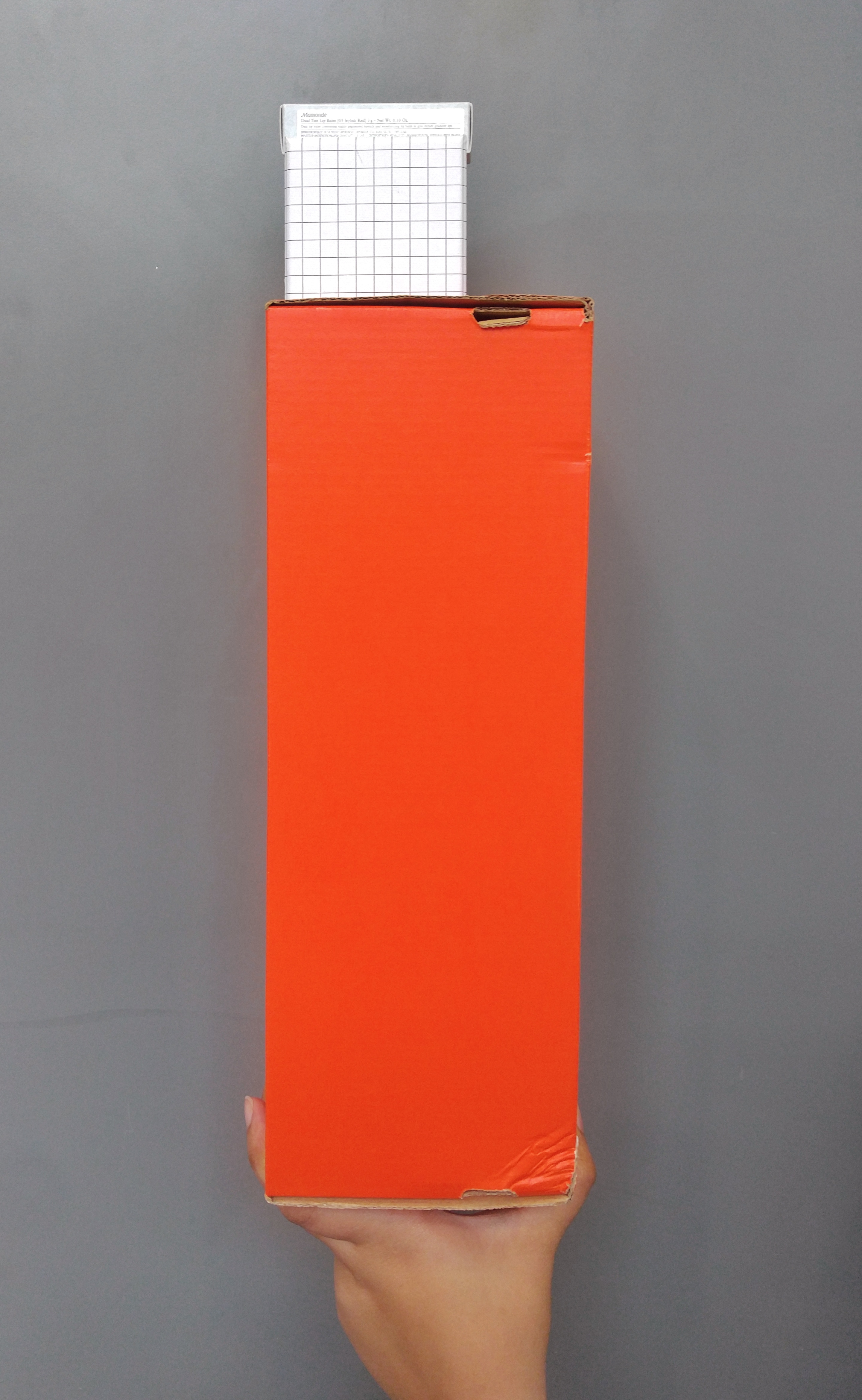
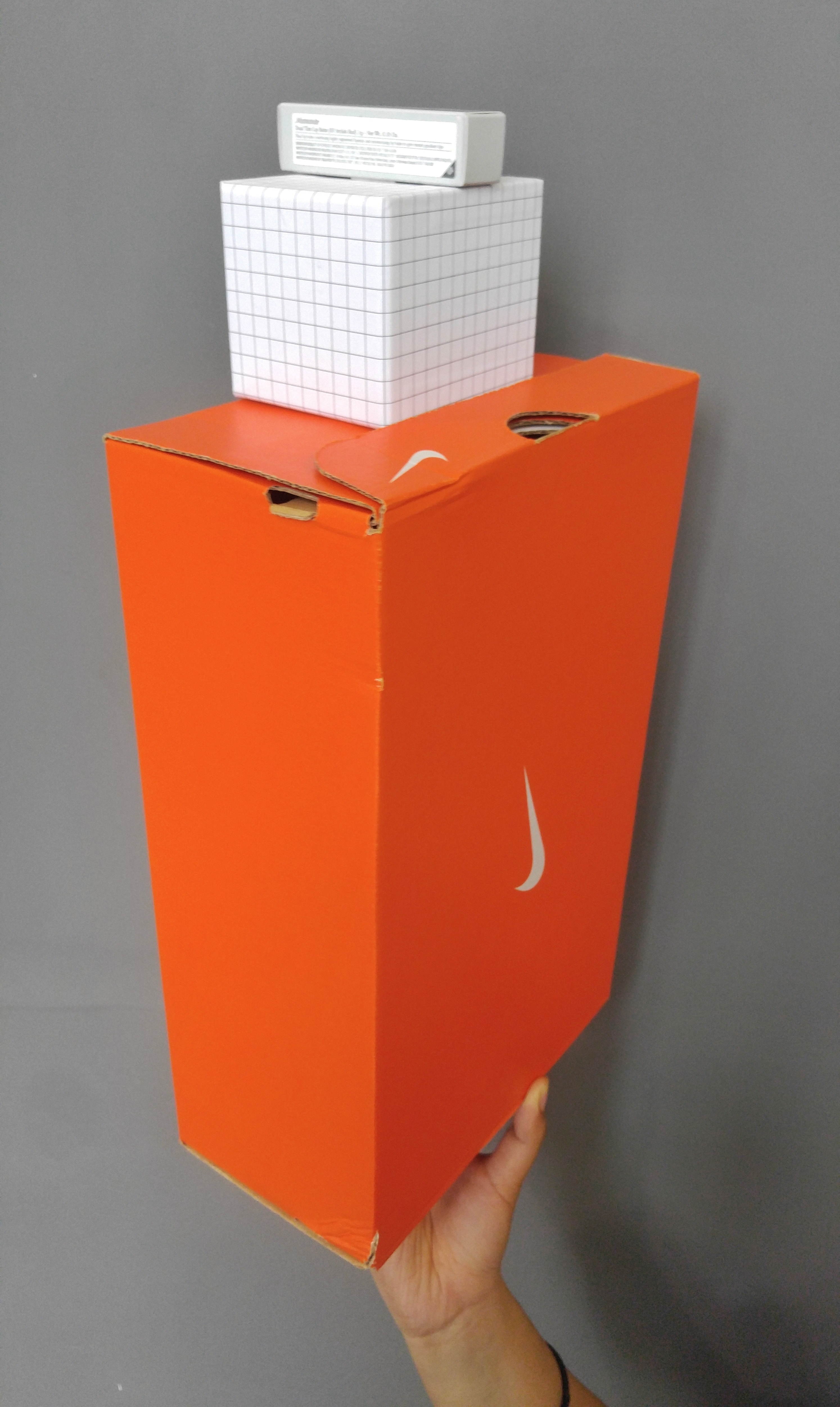
Here is the first one:
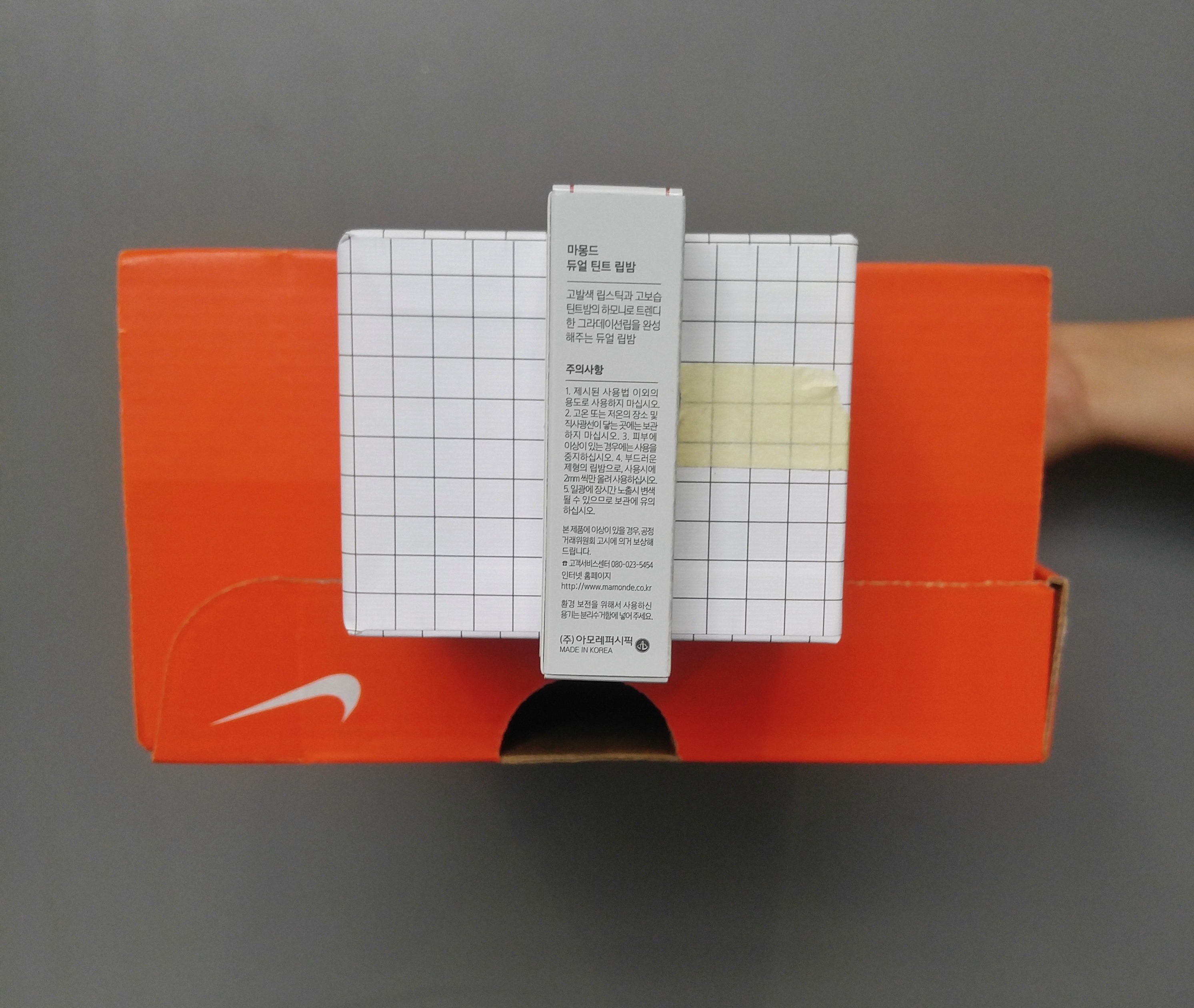
3D Sketch Model: Complementary A, Front view3D Sketch Model: Complementary A, Side view3D Sketch Model: Complementary A, Top view3D Sketch Model: Complementary A, Top left view
Complementary: combining in such a way as to enhance or emphasise the qualities of each other or another.
For this sculpture, I was going for a more organised look with the pattern of the boxes. So I thought of arranging it such that the boxes were all plain colours and patterns such that there wouldn’t be anything clashing, with the solid orange Nike box, grid patterned pen holder and the plain white lipstick box all on top of one another. I also tried to make it such that they were stacked from large to small, to go with the flow of the boxes’ sizes, of the dominant orange box, the subdominant grid box and the subordinate white box. I wanted it to be such that the idea of ‘stacking’ could emphasise on the different sizes of the boxes to bring an idea of support and harmony. Also, apart from the stacking, I selected the boxes to show roughly the ‘Rule of Thirds’ in the sculpture, with the smaller boxes being one-third of the length of the bigger boxes, and situated in the middle. With this, I hoped that the sculpture managed to convey a sense of compatibility within the three boxes!
However, I feel that the sculpture could be improved on if I perhaps wasn’t limited to a white and orange colour palette, and perhaps could work with other warm colours that could complement the orange even better, like yellow or red. Also, while I tried to stick to the ‘Rule of Thirds’, the top box still seems too small, and I feel that the small box on the top could stand to be more eye-catching to compensate for its size. Hopefully I’ll be able to address these issues next lesson!
Okay then, moving on to the next sculpture:
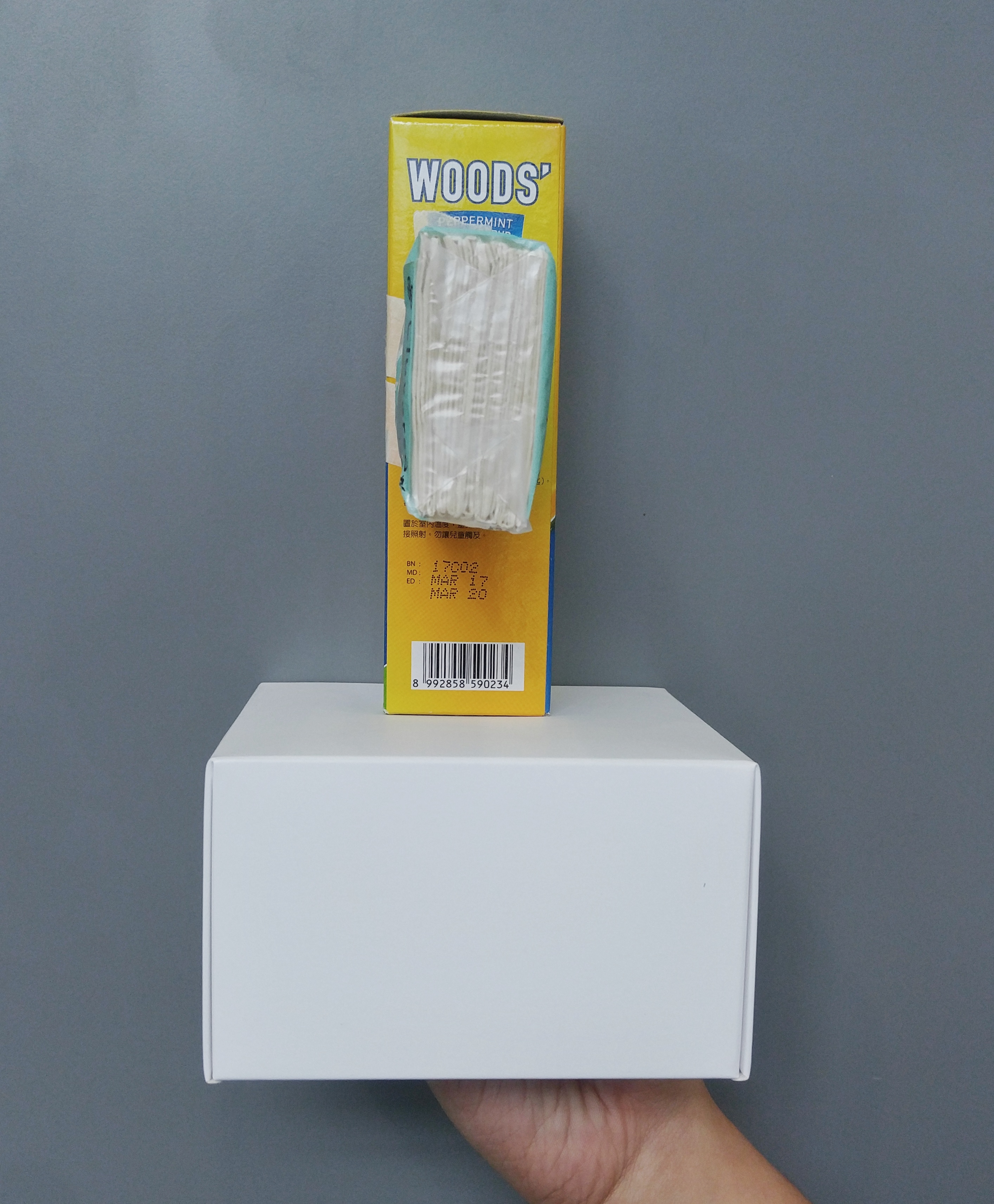
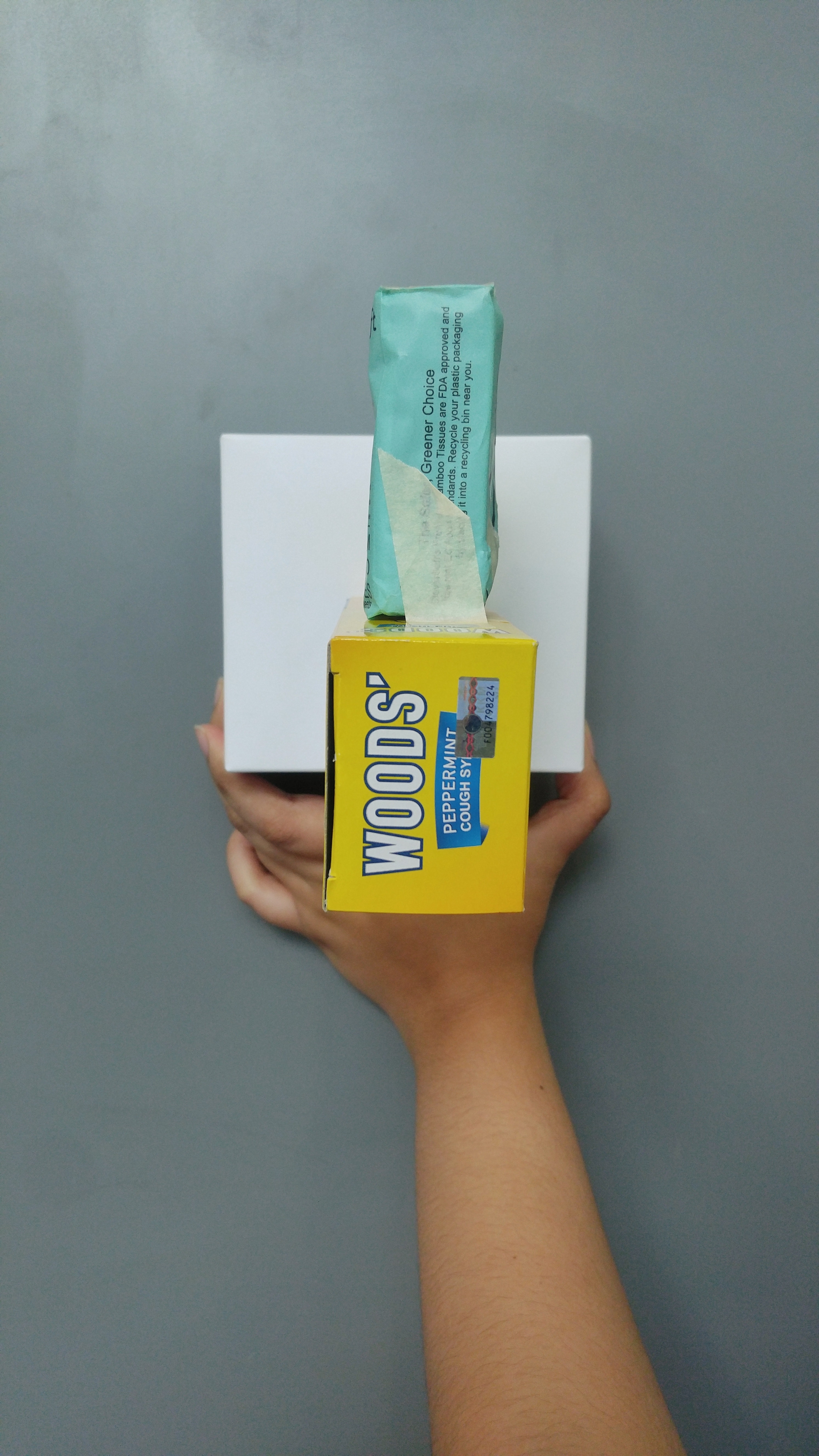
3D Sketch Model: Complementary B, Front view3D Sketch Model: Complementary B, Side view3D Sketch Model: Complementary B, Top view3D Sketch Model: Complementary B, Top left view
For this sculpture I decided to go for a more colour-based idea! To be honest the theme of ‘Complementary’ was sorta hard because we were supposed to isolate the boxes from their colours and work with their shapes alone, and without colour I was completely stumped on how to complement shapes, so I don’t think I executed the idea very well for the second sculpture. But anyhow, I tried to do it such that the yellow and blue scheme of the Woods’ box matched the blue and yellow of the base box’s yellow and blue label, and same goes for the blue tissue packet with the box’s blue label. I also tried to arrange the blue tissue packet such that it helped to counterbalance the Woods’ box more elongated shape by sticking it onto the other side to weigh the Woods’ box down.
I think there are many ways I could be improving on this sculpture, first with the problem that I don’t think it’s very clear which box is the dominant or subdominant, as both the base and the Woods’ boxes stand out. I will probably need to get a bigger base box! Also, I feel that the overall arrangement of the boxes don’t really indicate that there is any harmony going on. It feels really random and misplaced. Hopefully I can find a better way to arrange my boxes or find better boxes for this second sculpture.
Anyway, I hope to be able to expand on the meaning of ‘Complementary’ next week, instead of just using colours and patterns, and to be able to actually use the boxes’ shapes and arrangements as more solid evidence for the theme. See yall next post!!
Edit: Also creds to Fiza for helping me hold my boxes HAHAHA hand model 10/10