Reflection: Information Arts – Intersections of Art, Science and Technology

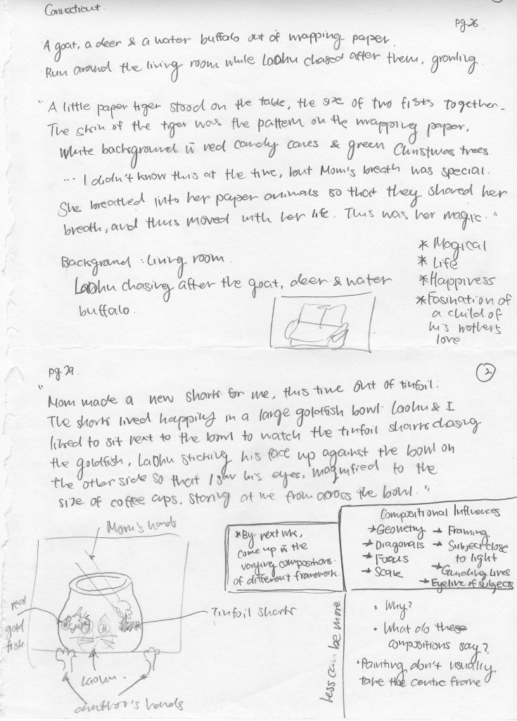
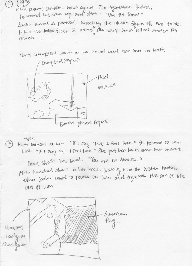
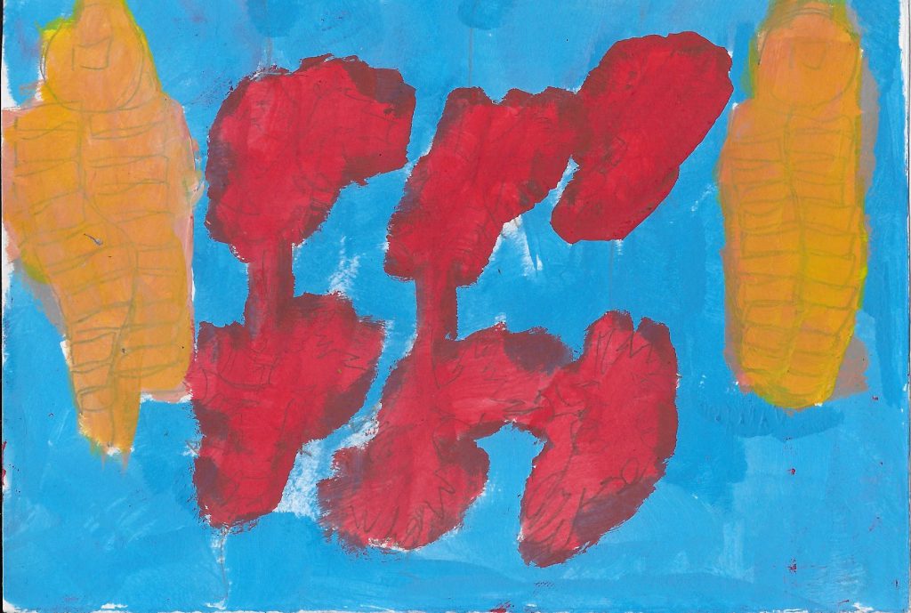
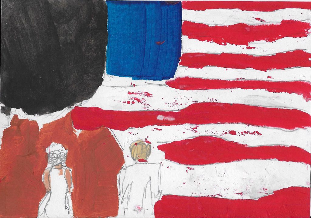
Reading Assignment (II) for DM2000: Interactive I 

  • Book Title: Information Arts – Intersection of Art, Science and Technology
  • Author: Stephen Wilson 
  • Year of Publication: 2002
"Technological imagination and scientific inquiry were themselves a kind of poetry – a revolutionary weaving of ideas and a bold sculpture of matter to create new possibilities." – Stephen Wilson

Information Arts by Stephen Wilson is a book which examines the relationship between the arts and scientific and technological research. It seeks to draw a mutually beneficial relationship between the two fields – the arts, and science and technology, through existing works of artists, and establishes this relationship’s high propensity of proposing new frontier creative innovations.

Historically, the arts and sciences were united. Leonardo da Vinci is an example of an art-science practitioner pre-Renaissance.  It was only during the Renaissance (15th and 16th century) period that specialization was introduced in the West. This era of specialization segregated the arts and the science. Specialization was then further enforced by British Scientist C.P. Snow in the 1960s, who developed his influential “Two Cultures” theory.

Even before I read Information Arts by Stephen Wilson, I always had a keen interest in exploring the intersection between what is conventionally known by the modern world as mutually exclusive fields – the arts and the science. I struggled to have to identify myself as an ‘either or’ student of the arts or the science. Rather, I identified myself as both.

I thought ‘Why can’t one be good in both the arts and science?’ ‘Why can’t one learn from both areas of ‘specialization’ and create something that uses the expansive knowledge of these two fields?’

Information Arts is a book that comforts my thoughts. It encourages me that this intersection is not impossible. In fact, research, studies, and real-world application using the combination of these two fields have already started.

The content of the book allows me to see more in-depth from an academic perspective on how one can use and start to bring back the original complementary relationship of the arts and the science. It proposes the similarities of these two fields in the modern world:

  • Both value the careful observation of their environments to gather information through the senses
  • Both value creativity
  • Both propose to introduce change, innovation, or improvement over what exists
  • Both use abstract models to understand the world
  • Both aspire to create works that have universal relevance

(Similarities of the arts and science taken from Information Arts, pg 18)

One artwork cited which stood out to me in Information Arts was Placeholder (1993) by Brenda Laurel and Rachel Strickland (click here to watch Installation Video):

Placeholder by Brenda Laurel. (Image Credits: Artlink)
Placeholder by Brenda Laurel: Participant wearing a head-mounted display

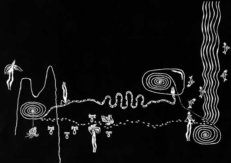
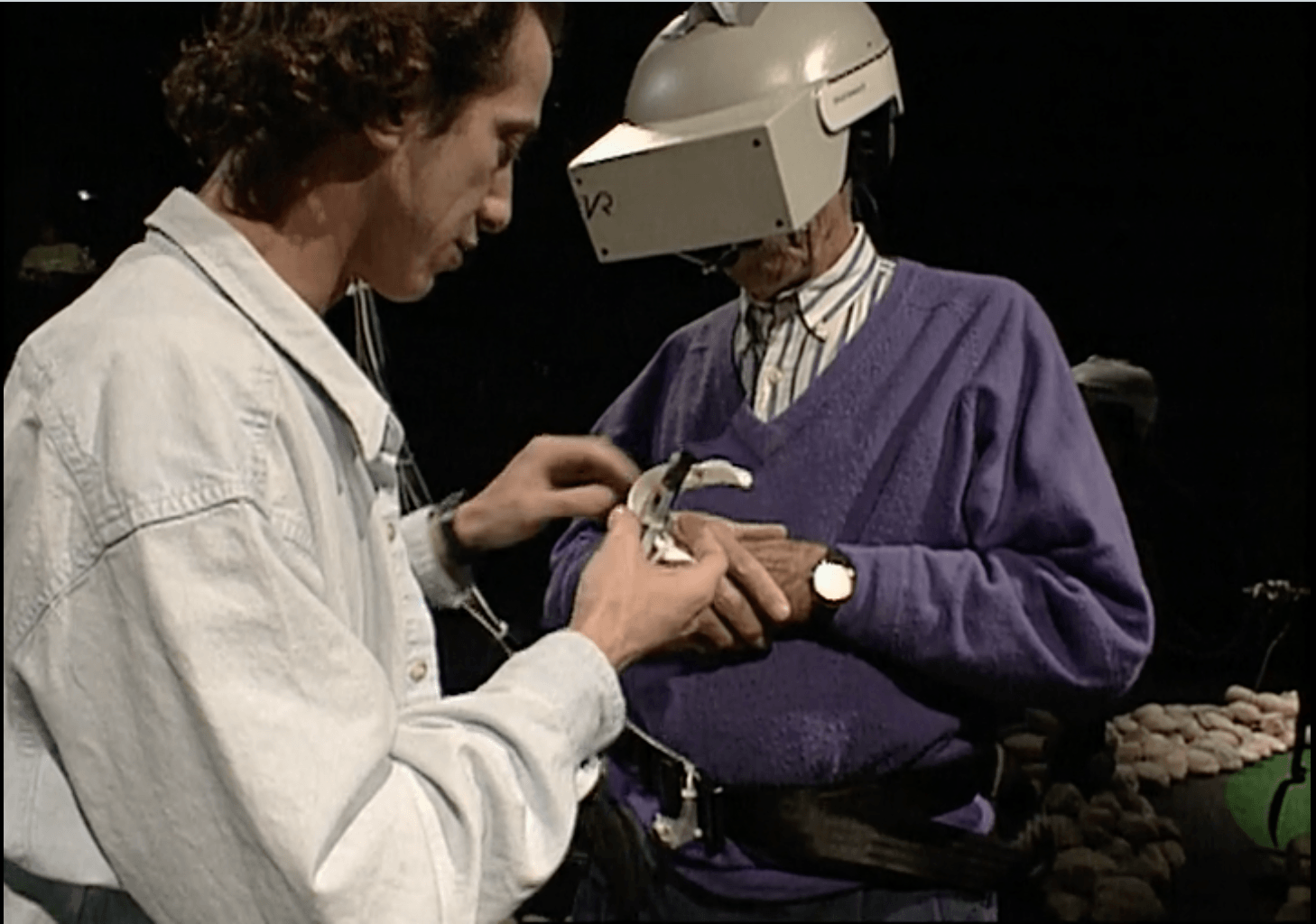
Placeholder was an installation which explored narrative action in virtual elements. The geography of Placeholder took inspiration from three actual locations in the Banff National Park – a cave, a waterfall, and a formation of earthen spires overlooking a river. Three-dimensional videographic scene elements, spatialized sounds and voices, and embodiment as petroglyphic spirit animals were employed to construct a composite landscape that could be visited concurrently by two physically remote participants wearing head-mounted displays.

(Description of Placeholder taken from Intersection Art, pg 695)

Laurel and Strickland based their VR work on complex understandings on how humans organize space… Their research include multiple simultaneous points of view, 3-D sound’s role in creating a sense of space, and the leaving of “markers” as a way to define space.

(Description on the methodology of Placeholder taken from Intersection Art, pg 696)

Placeholder stood out to me because what was art using the research of science and technology in the 1990s, became a commercial product that is used in households and industries for varying purposes such as leisure (in the form of gaming), or interaction (video calling). This commercial product is known as a Virtual Reality Headset.

Virtual Reality Headset (Image Credit: Tech Radar)

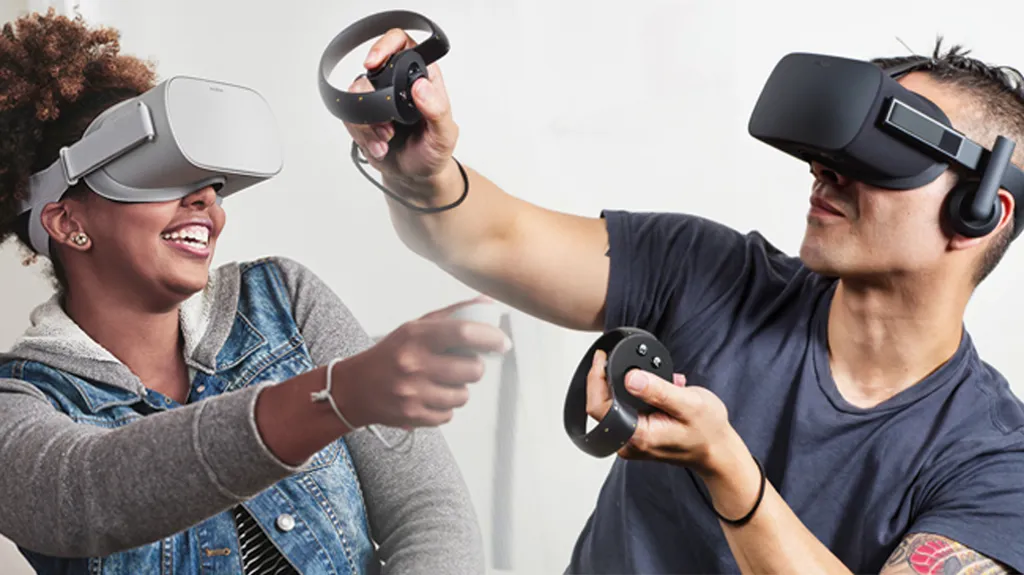
VR is but one of the many art-science installations that became a commercially viable product for the masses in the market. There is both art and science involved in the creation of the electronics, the user experience, and the plethora of services that could be based off it – different game environments, video calling platforms to bridge the geographical gap between loved ones, visualization of architecture et cetera.

"Artists should be hungry to know what researchers are doing and thinking, and scientists and technologists should be zealous to know of artistic experimentation. The future will be enriched if this expansion of zones of interest becomes a part of the definition of art and science." - Stephen Wilson

I agree with Wilson. When both the arts and science come together in agreement and unison, there will be even greater creative innovations and forms of expression created.


References: 

Information Arts – Intersections of art, sciences and technology. The MIT Press. (2002) Stephen Wilson.

“Tenderness Chain” (Cadena de Ternura) by Milka

Inspiring Example of Interactive Media Art:

  • Name of Interactive Media Art: Cadena de Ternura (“Tenderness Chain”) for Milka
  • Country of Exhibition: Argentina
  • Production Year: 2013
  • Creative Directors: Joaquin Cubria & Ignacio Ferioli

Translation* for Spanish Copy written in the Production video:

*Translation is done using Google Translate service. 

‘Cadena de Ternura’ (Tenderness Chain) for Milka is an inspiring and thought-provoking example of Interactive Media Art to me because it spurs human interaction and a spirit of togetherness in the age where smartphones and the digital world are increasingly occupying humans’ attention and replacing human interaction.

Input-Processing-Output: 

  • Input: Power Supply via a ‘Human Chain’ formed by people holding hands to a ‘bridge’ to transmitting electrical current from the Cow to the Vending Machine
  • Processing: Low-Voltage Electrical Current is passed from the Cow to the Vending Machine via the electrostatic energy present in humans
  • Output: Free Milka Chocolate from the Vending Machine
‘Tenderness Chain’ formed by two people when the Cow is nearer to the Vending Machine

Similar to the exhibition: Lights Contacts (Senocosme) introduced during Lecture on Week 4, Cadena de Ternura requires people in the Plaza – where the Interactive Media was placed, to engage, communicate, and work with one another to power the vending machine. The interesting aspect of this exhibition, though, was that an instruction manual or preliminary ‘how-to’ guide was not given to anyone beforehand. I.e. The people had to figure out what the exhibition was about, how to get it to work, and discover the outcome of their experiments.

‘Tenderness Chain’ powered by a human chain that stretched across the plaza

The Cow is also not static. It is moved further at possibly different times of the day, or the magnitude of the crowd present, to encourage a longer human chain (more human-interaction and collaboration).

Participants enjoying the Cadena de Ternura exhibition experience

The common goal of getting a free chocolate from the vending machine unites strangers together and helps build some degree of trust between one another to join hands.

I enjoy reviewing the experience of this Interactive Media Artwork as the artwork is simple yet meaningful and strong in bringing Milka’s message across to its participants: “Dare to be tender”. It evokes elements of fun, laughter, joy, and conversations in the participants (as seen in the above picture). It is also a commercially viable Interactive Media Artwork, related to experiential marketing, displayed in a public space which allows for more public, non-exhibition goers to interact with it, compared to artworks which are placed in a museum traditionally.

Public reception towards this Interactive Media Art seems positive – both from the reactions of the users in the Production Video and online articles written about it. The following are articles (linked) published in response to Cadena de Ternura:


Copyright: All images found in this post are from the Production Video embedded above. 

TVÄRS IKEA LAMP Analyses

For our DA3000 – Thinking and Communicating Visually III class, we were taught to use Autodesk’s Inventor to create a 3D image of an IKEA TVÄRS Lamp, Keyshot for rendering, and tasked to do 4 posters as follows: 

IKEA TVÄRS LAMP Deformation
IKEA TVÄRS LAMP Semantics Analysis
IKEA TVÄRS LAMP Pragmatic Analysis
IKEA TVÄRS LAMP Syntactic Analysis

The posters are arranged in descending order. Syntactic Analysis was done first, followed by Pragmatic then Semantics Analysis, and finally a Deformation of the lamp where different possible shapes were explored.

Peter the Rabbit: Unfolding the tale

DA2000 – Final Project.

The tale of Peter Rabbit final composition 01

“FIRST he ate some lettuces and some French beans; and then he ate some radishes; AND then, feeling rather sick, he went to look for some parsley.” – The tale of Peter Rabbit

The tale of Peter Rabbit final composition 02

“…Peter wriggled out just in time, leaving his jacket behind him. AND rushed into the toolshed, and jumped into a can.” – The tale of Peter Rabbit

The tale of Peter Rabbit final composition 03

“Mr. McGregor caught sight of him at the corner, but Peter did not care. He slipped underneath the gate, and was safe at last in the wood outside the garden… PETER never stopped running or looked behind him till he got home to the big fir-tree.” – The tale of Peter Rabbit

The first composition shows Peter’s mischievousness and greed – for entering Mr. McGregor’s garden and devouring all the vegetables he can find/ possibly likes to eat.

The second composition depicts fear. Notice Peter is without his blue jacket because he abandoned it while making his escape from the gooseberry net. Peter is hiding in a can which is in a toolshed observing Mr. McGregor turning items around in a bid to look for Peter.

The last composition shows how Peter makes his great escape back home – never stopping to turn or look behind him till he’s safe and sound.

Overall, it has been a fun, though a little intense, experience creating these final compositions. Instead of sticking to something (relatively) tried-and-tested, I wanted to try my hand at experimenting with mixed mediums – watercolour, acrylic and ink. I also wanted to experiment with illustrative, picture-book-styled compositions instead of familiar art styles such as impressionism and symbolism. When creating these compositions, I envisioned these paintings to go along with texts from the story such that both mediums – verbal and visual storytelling, complement each other.


Reflection:
DA2000 has been an interesting and an enjoyable class. It made me learn to appreciate the purpose and beauty of colours, as well as practice making decisions to solve design problems. I learnt that meaningful art is one with a purpose, one which tells a story, one which is more than an aesthetic piece, and one which evokes emotions. The permutations and combinations of colours are seemingly infinite, and a colour palette is subjective to the creator of the works. While the little details and subtleties of a composition are essential, the whole may be greater than the sum of its parts.

Thank you everyone for the exciting Thursday evenings for the past semester, and may you have a great Summer hauls ahead!

Cheers.

Peter The Rabbit: The Journey of telling the tale

DA2000 – Final Project.

For our final project, we were given the choice of doing painting compositions or linocut printing. I chose painting because I wanted to learn the different painting techniques – such as layering, water colour, dry brush, inking with a pen, and I wanted to tell the tale of Petter the Rabbit in an illustrative manner.

Composition Sketches

The tale of Peter Rabbit Composition Sketches #01
The tale of Peter Rabbit Composition Sketches #02
The tale of Peter Rabbit Composition Sketches #03
The tale of Peter Rabbit Composition Sketches #04
The tale of Peter Rabbit Composition Sketches #05
The tale of Peter Rabbit Composition Sketches #06
The tale of Peter Rabbit Composition Sketches #07
The tale of Peter Rabbit Composition Sketches #08
The tale of Peter Rabbit Composition Sketches #09.

After experimenting with different compositions for telling different parts of the story, and with the different colour compositions, I decided to do my final pieces on the compositions found from the coloured sketches in #04 and #05, and the last composition in #09.

Final Composition Progress

Final Composition #01 progression
Final Composition #02 choice of colours
Final Composition #03 progression

Finding a story (Part II): The tale of Peter Rabbit

DA2000 – Final Project.

As stated in the post that precedes this, I did not choose to tell the story of The Paper Menagerie as part of my final project. Rather, I decided on a classic tale that is short and simple: The tale of Peter Rabbit by Beatrix Potter

This American literature classic tells the tale of a naughty and greedy rabbit, Peter, who went against the warnings of his mother and enter Mr. McGregor’s garden to have a feast of radishes, lettuce and french beans. Spotted by Mr. McGregor who was out to nab him, Peter ran and hid away in fear. The story had a happy ending in that Peter managed to make a successful escape back home.

The tale of Peter Rabbit personifies animals as its main characters, and is staged in nature – Mr. McGregor’s farm, produce from the farm, a big fir tree as Peter’s home et cetera.

The following are images I took throughout the course of working on this project which could help examine/ visualise the scenes in the tale:

Possible reference for the Fir tree in the story.
Reference for a vast field.
Reference for root of the tree.
Possible reference for the tool shed.
Reference for colour choice.
Possible reference for the doors to Peter’s house.
Possible reference for illustrating the personified rabbits.

Aside from using the photos I took as reference, I searched online for other photo references that would help with the creation of compositions. Some examples include:

Screenshot of Google search: Fir Tree
Screenshot of Google search: Rabbit eating
Screenshot of Google search: Rabbit illustrations
Screenshot of Google search: Peter Rabbit illustrations
Screenshot of Google search: Tool shed

Finding a story (Part I): The Paper Menagerie

DA2000 – Final Project.

Finding a story for our final project was a little tricky, if I were to use a word to describe it. We were tasked to create compositions which tell the tale of a story focusing on the composition angle, perspective, and colour choice. Not only must we create compositions that tell the story, we were challenged to create compositions which evokes emotions, compositions which suggests a mood and leave an impression.

The story which I first chose was The Paper Menagerie by Ken Liu which sheds light on the theme of identity and familial ties. Do click the link via the title of this short story if you’d like to give it a read. I think it is a story which pokes at the heart and causes one to reflect, not exactly because of relatability but rather the themes the author explore, his choice of dictions and the flow of the story itself.

In the initial stages of planning, I explored different parts of the story to place emphasis on. The following are the documents to support the process of thinking and planning:

The Paper Menagerie composition brainstorming #01.
The Paper Menagerie composition brainstorming #02.
The Paper Menagerie composition sketches.
The Paper Menagerie Colour Sketch #01.
The Paper Menagerie Colour Sketch #02.
The Paper Menagerie Colour Sketch #03.
The Paper Menagerie Colour Sketch #04.

After exploring the different compositions – varying the perspective of the same scene and exploring the choice of colour, I felt that The Paper Menagerie is better told using film. Static compositions may not do the story’s rich emotions justice. Rather, when accompanied by dynamic film movements, varied cuts, scripts, movements and sound, the meaning behind The Paper Menagerie would be better brought forth.

Thus, I decided not to embark on this tale for my final work.

Linocut

The Garden of Eden composition sketch 01.
The Garden of Eden composition sketch 02.
Rubber stencil of Linocut – phase 1
Rubber stencil of Linocut – phase 2
Linocut print #01
Linocut print #02
Linocut print #03
Linocut print #04
Linocut print #05
Linocut print #06

Gouache Painting

Gouache Painting – First Attempt
Gouache Painting Final Piece

22 March 2018.

In this week’s class, we were tasked to paint a scene in school using gouache, making a conscious effort to use one of the hue harmonies taught in class.

For my first attempt, I wanted to play around with colours and use colours which are not conventionally symbolic of the objects themselves. For example, using blue as the casing of the fire hose reel box in place of the commonly known colour: red.

For my final piece, I decided to try my hand at tetrad harmony (also known as ‘double split complementary’). As part of using tetrad harmony, the main colours chosen for my final piece are blue, purple, and yellow, though only hints of yellow can be seen in the trees (greenish-yellow) and walkways (pale-yellow). A brown undertone is also used, possibly adding to the slight sense of melancholy in this composition. Can you guess which part of NTU this is?

Our Box Project II

For the second part of Our Box Project, we were tasked to create two colour compositions of varying perspectives on our box. The colours need not be identical to the box sculpture created. This exercise taught us how to practice simplifying our painting and experiment with different brush techniques – such as dry brush, to create textures.

Our box project composition #01:

Our Box Project Composition #01

For this composition, I decided to experiment with colours which are more mellowed and hushed – a stark contrast from the actual colours of the box: bright and vibrant.

Our box project composition #02:

Our Box Project Composition #02

In creating composition #02, I decided to accentuate the actual colours used for the box sculpture.

Viewfinder’s perspective of the box:

Composition #01 viewfinder’s perspective.
Composition #02 viewfinder’s perspective.