I’ve always been interested to explore deeper into the world of Typography. As a Design Art student, knowing the importance of typography and having an understanding of its use in your designs is crucial to produce a harmoniously synergised artwork.
Therefore, I was quite elated when I found out that our first project would allow us to dive into this aspect of design!
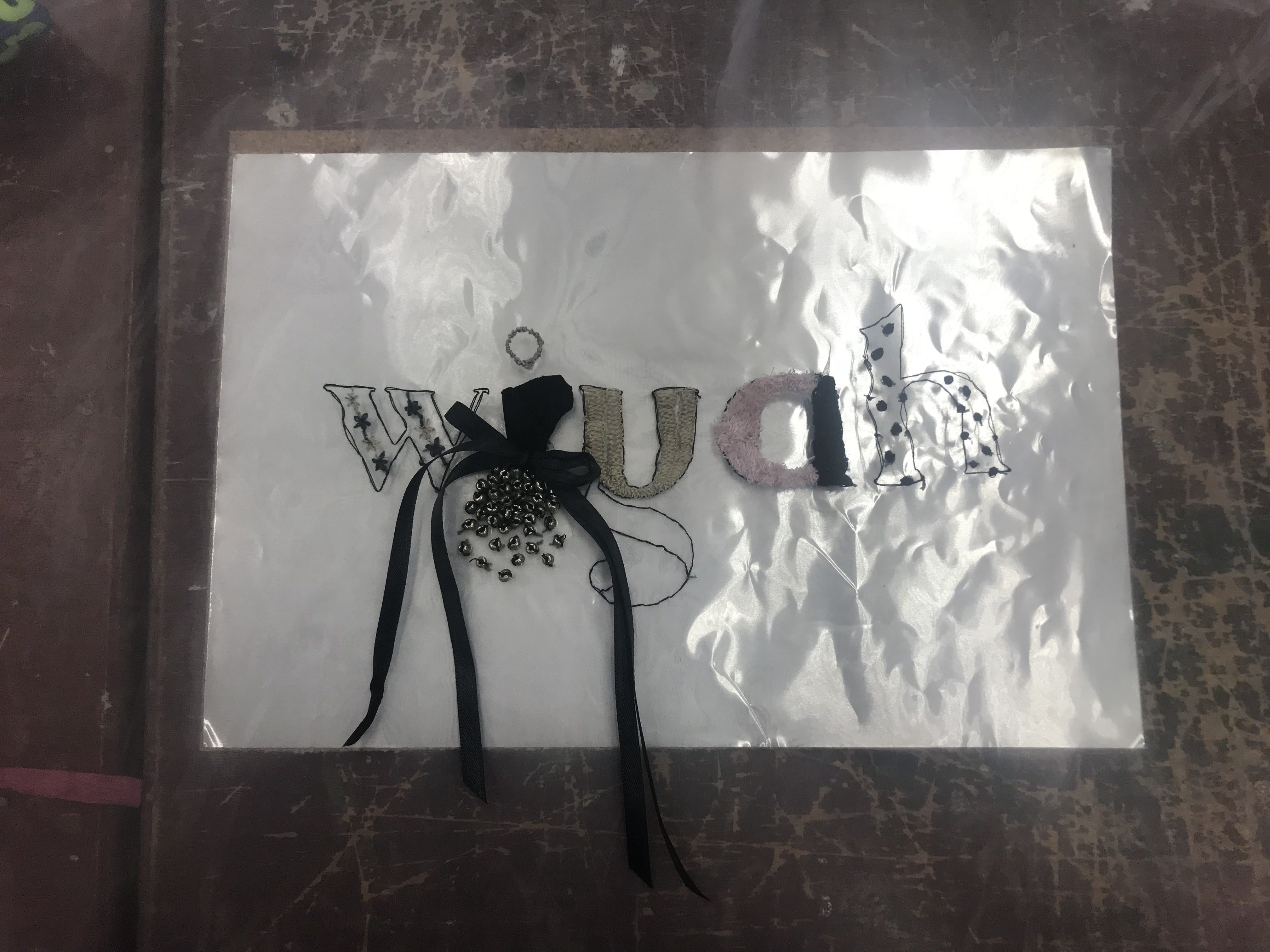
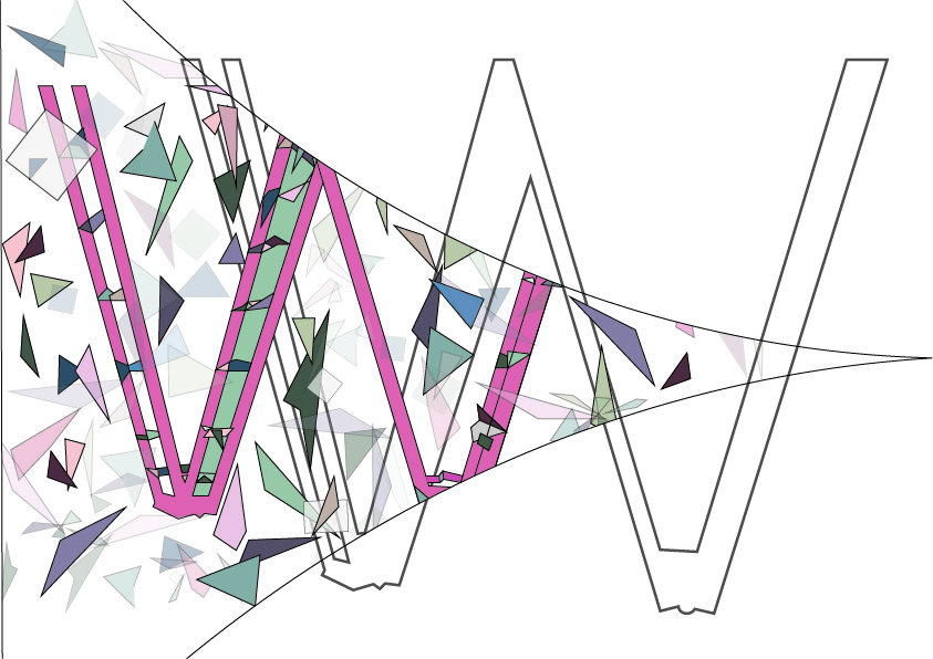
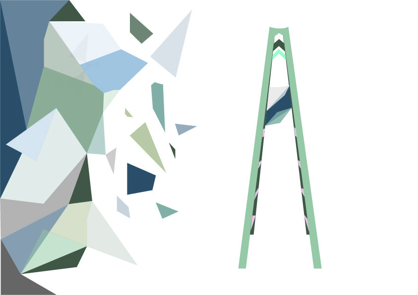
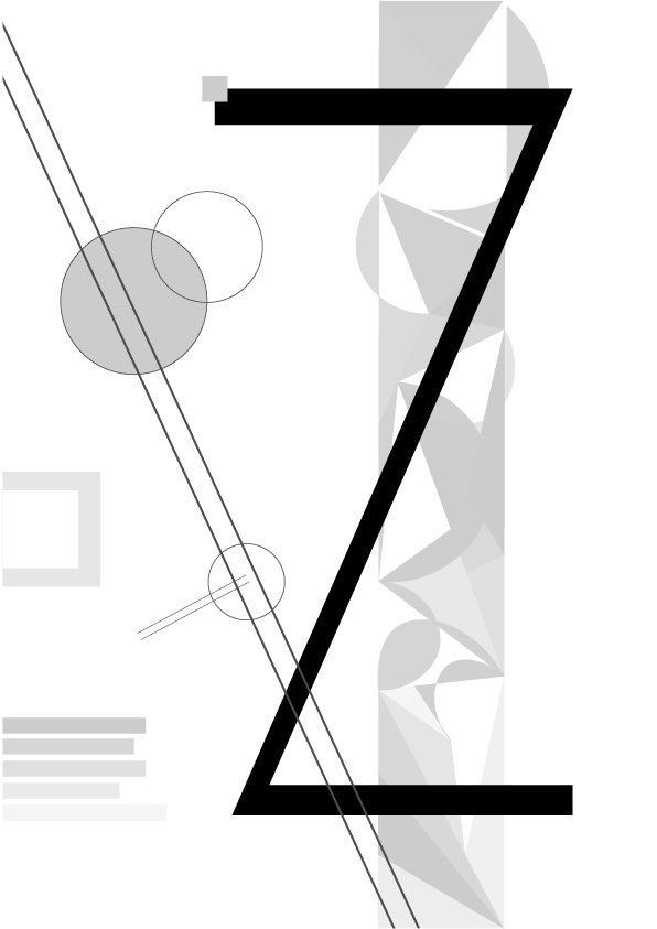
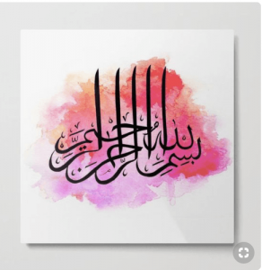
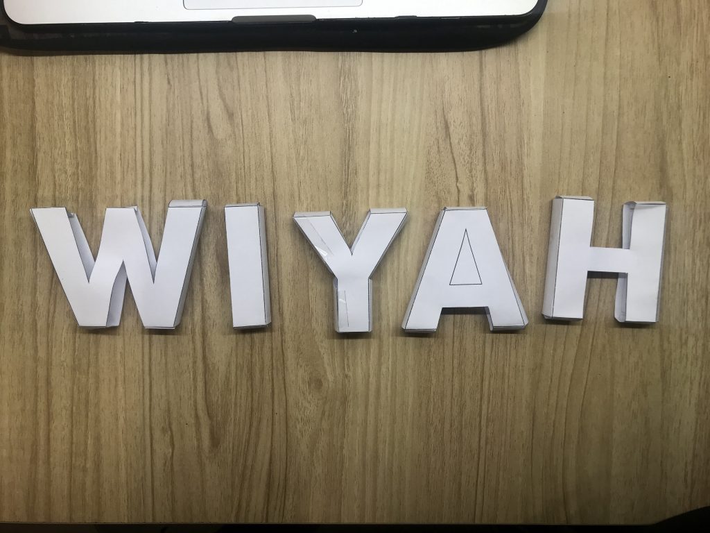
Before that, Mimi mentioned that we should attempt to create compositions with the influence of Cubism from the #ispotalphabets in-class assignment.
Here’s my attempt:
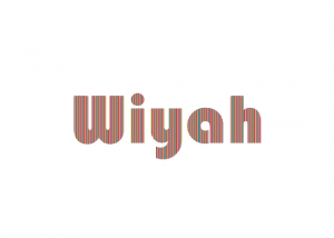
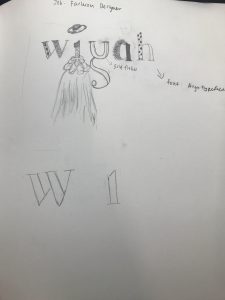
Name used: Wiyah

My call-name within my family, extracted from my name, Alawiyah.
RESEARCH & PROCESS
As soon as I got to know about our project, I kickstarted it early via brainstorming on the different ideas of careers I would like to have.
In the very beginning, I approached the project in a more thematic-based way where I explore concepts of careers in a more surrealistic manner.
First Brainstorming Session:
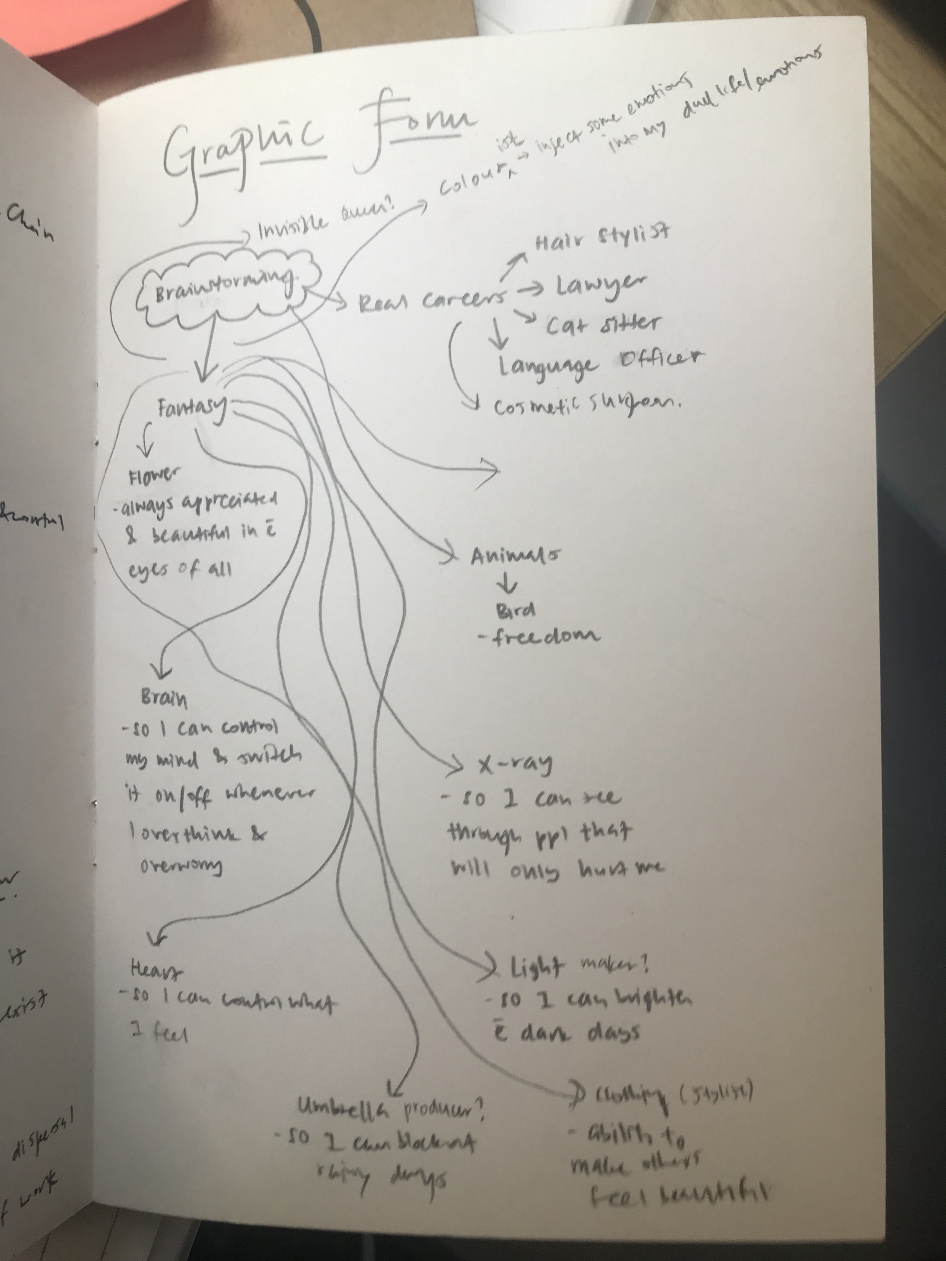
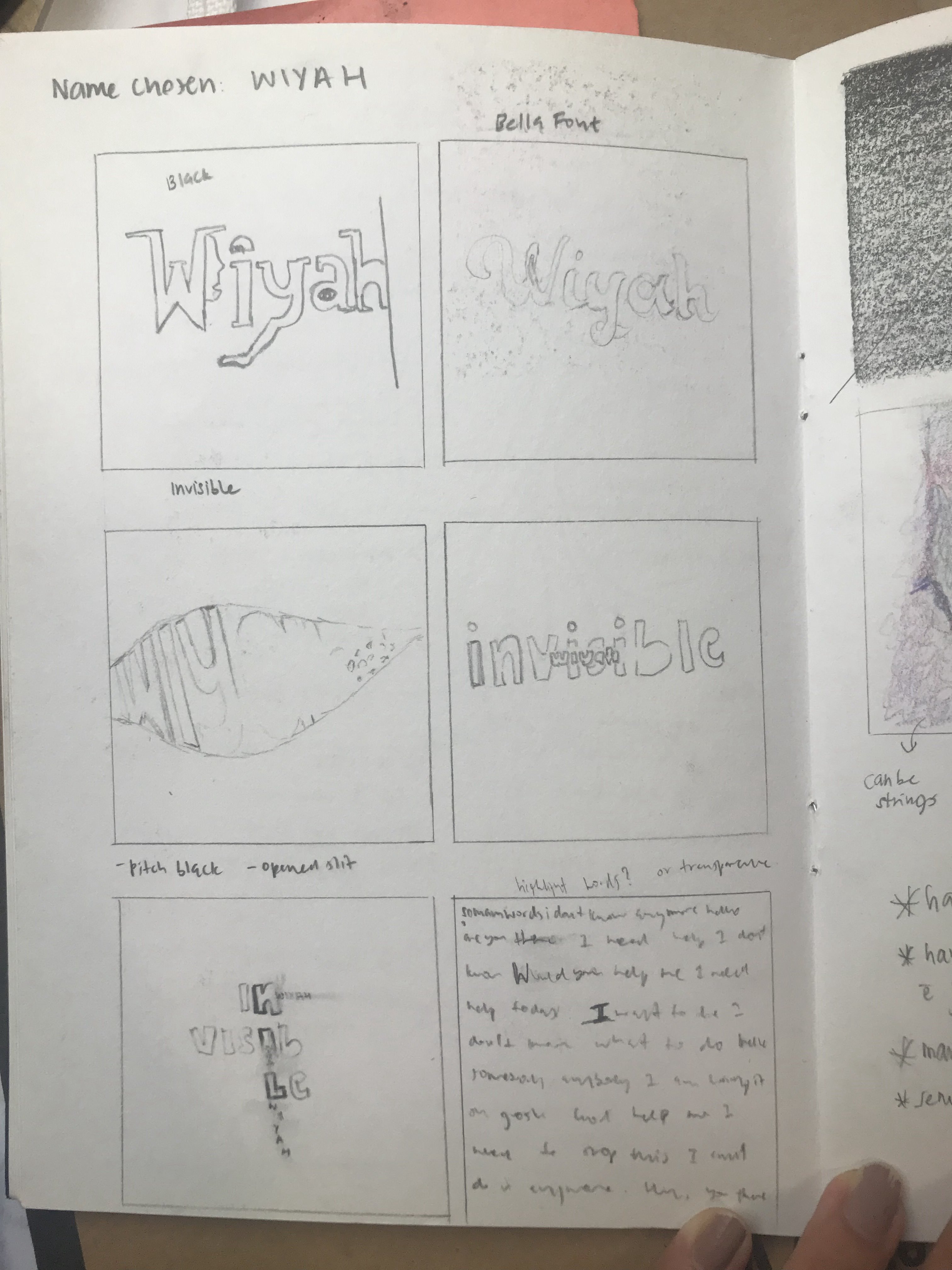
Career:
My name is Wiyah and I’m a…
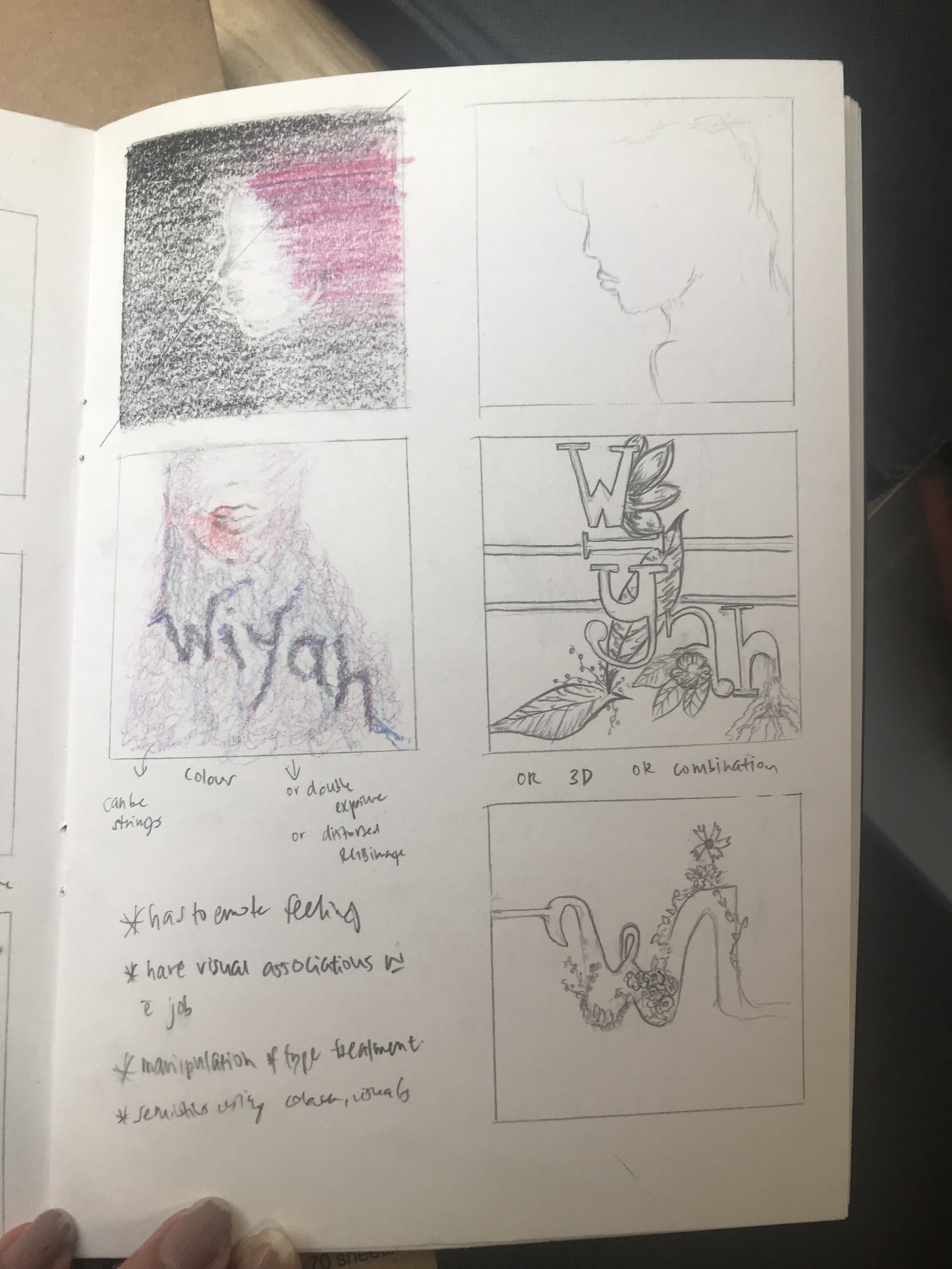
1. Flower – so I can always be appreciated & be seen as beautiful in the eyes of all
2. Brain – so that I can control my mind ands switch it on/off whenever I overthink or over-worry
3. Colour – so that I would be able to inject emotions into my dull life
4. Heart – so that I can control what I feel
5. X-ray – so that I can see through people that will only hurt me
After the first feedback from Mimi, I decided to change my vision to something more basic so that I could attempt analog experimentation. I thought too much before and that restricted my creativity. Hence, after watching the videos that Mimi had shared in class, it really sparked my interest to attempt to have analog elements in my project (which in turn led to most of my Project 1 being done in analog). I figured experimenting with different forms, visuals and materials might create more interesting and unpredictable outcomes.
Hence, I started off fresh and brainstormed for ideas once more.
Second Brainstorming Session:
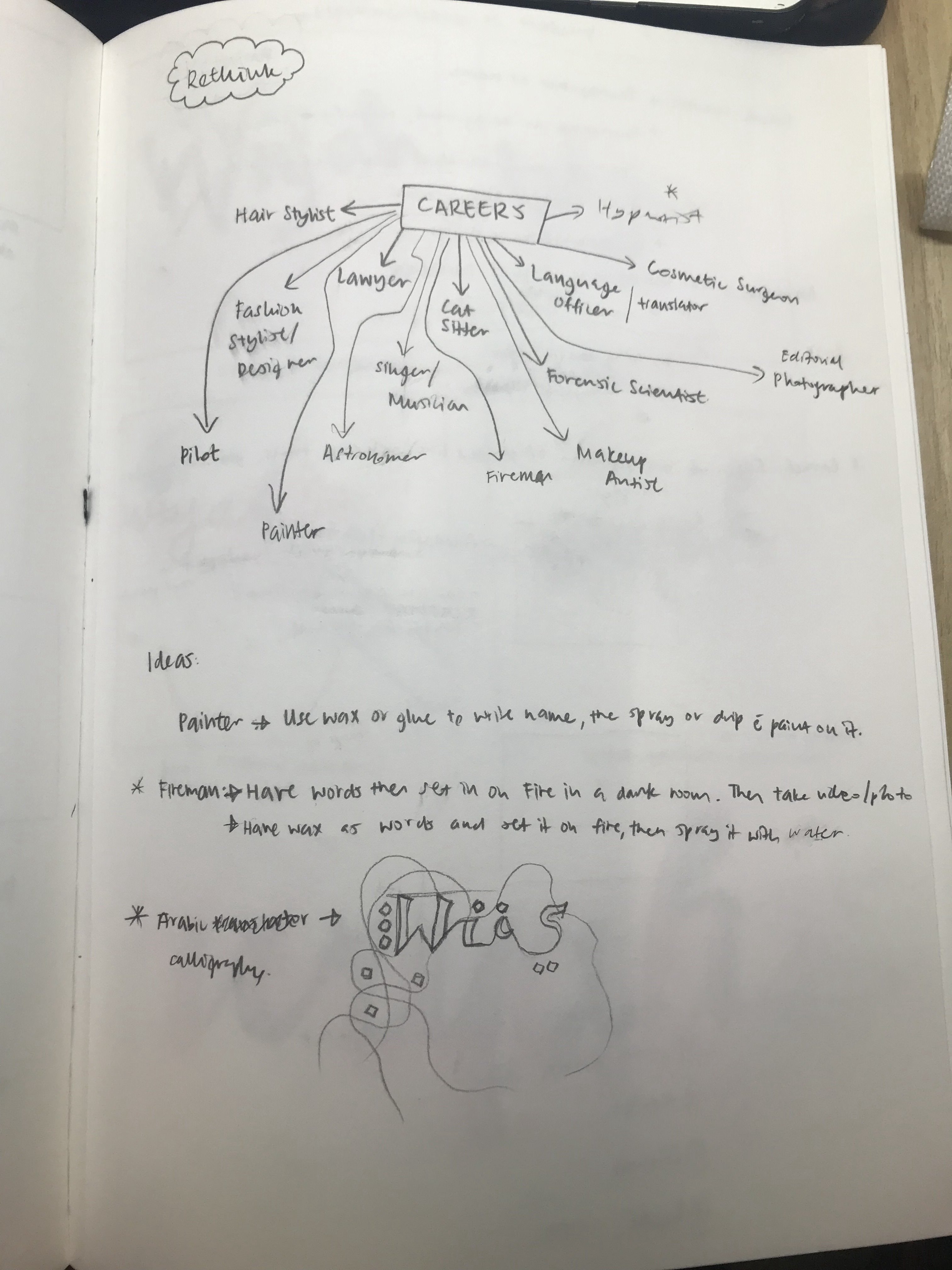
After several rounds of elimination, I narrowed down my choices to these few:
Career:
My name is Wiyah and I’m a…
1. Makeup Artist
2. Photographer
3. Arabic Calligrapher
4. Firefighter
5. Hypnotist
6. Fashion Designer
7. Astronomer
I started off by watching several videos before attempting them on my own to get inspiration.
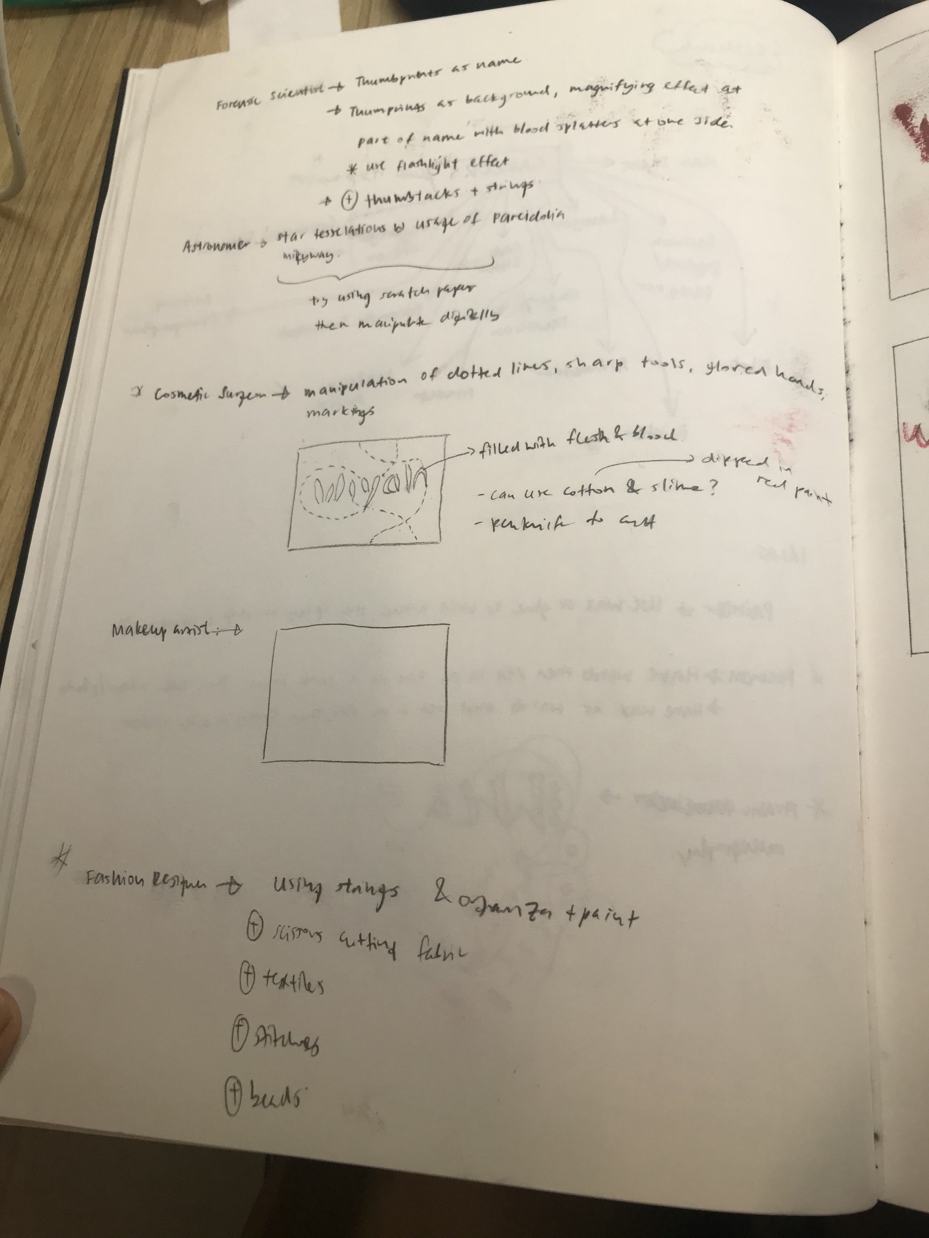
1. Career: Makeup Artist
Upon researching further, I found this link of makeup done with art: https://www.buzzfeed.com/alannaokun/incredible-paintings-made-out-of-makeup
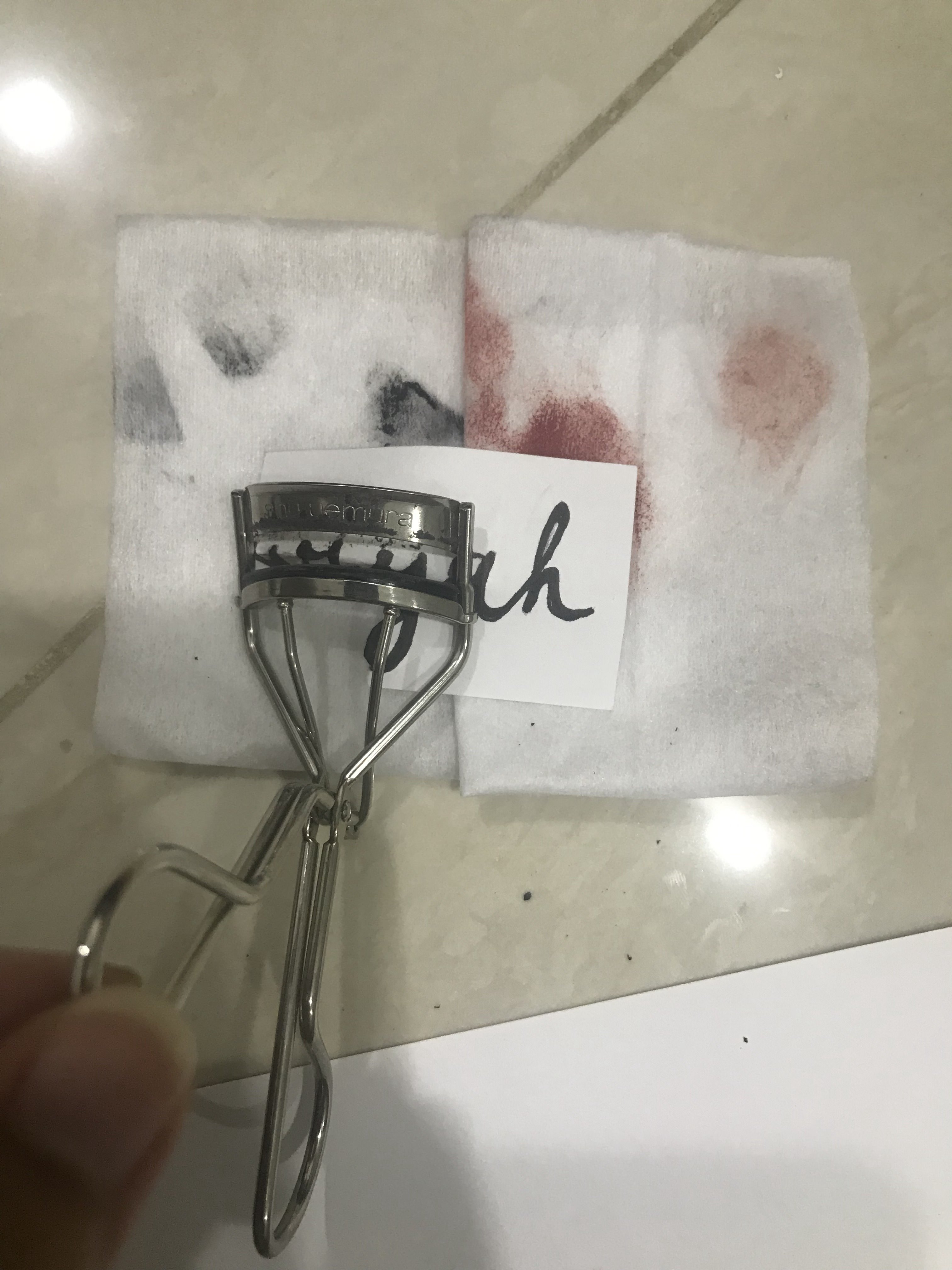
I attempted to play around with makeup, mindlessly, just to see how it works in terms of texture, colour, harmony of texture and the different forms of makeup .
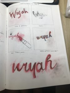
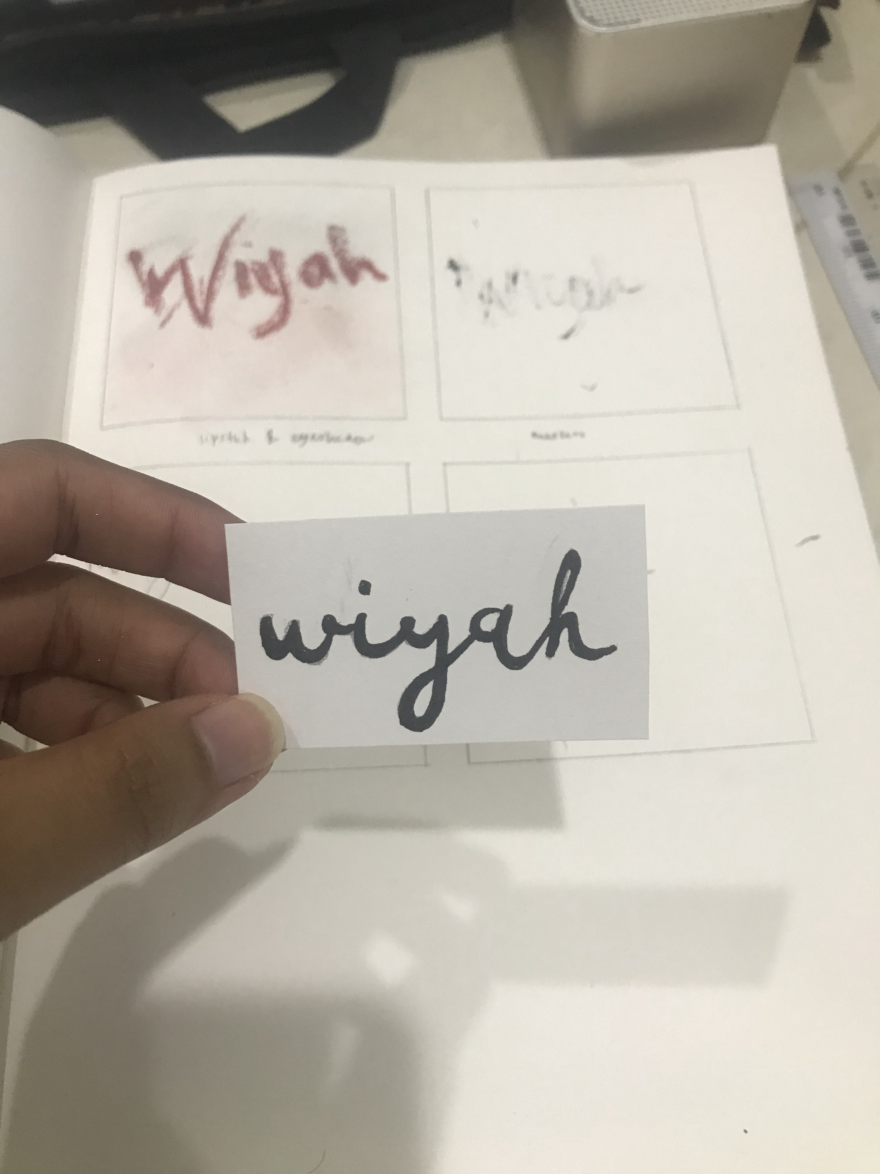
(1st box, LEFT): Done with lipstick and eyeshadows.
(2nd box, RIGHT): Done with mascara
(3rd box, LEFT): Done with lipstick, eyeliner and pencil.
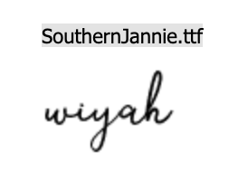
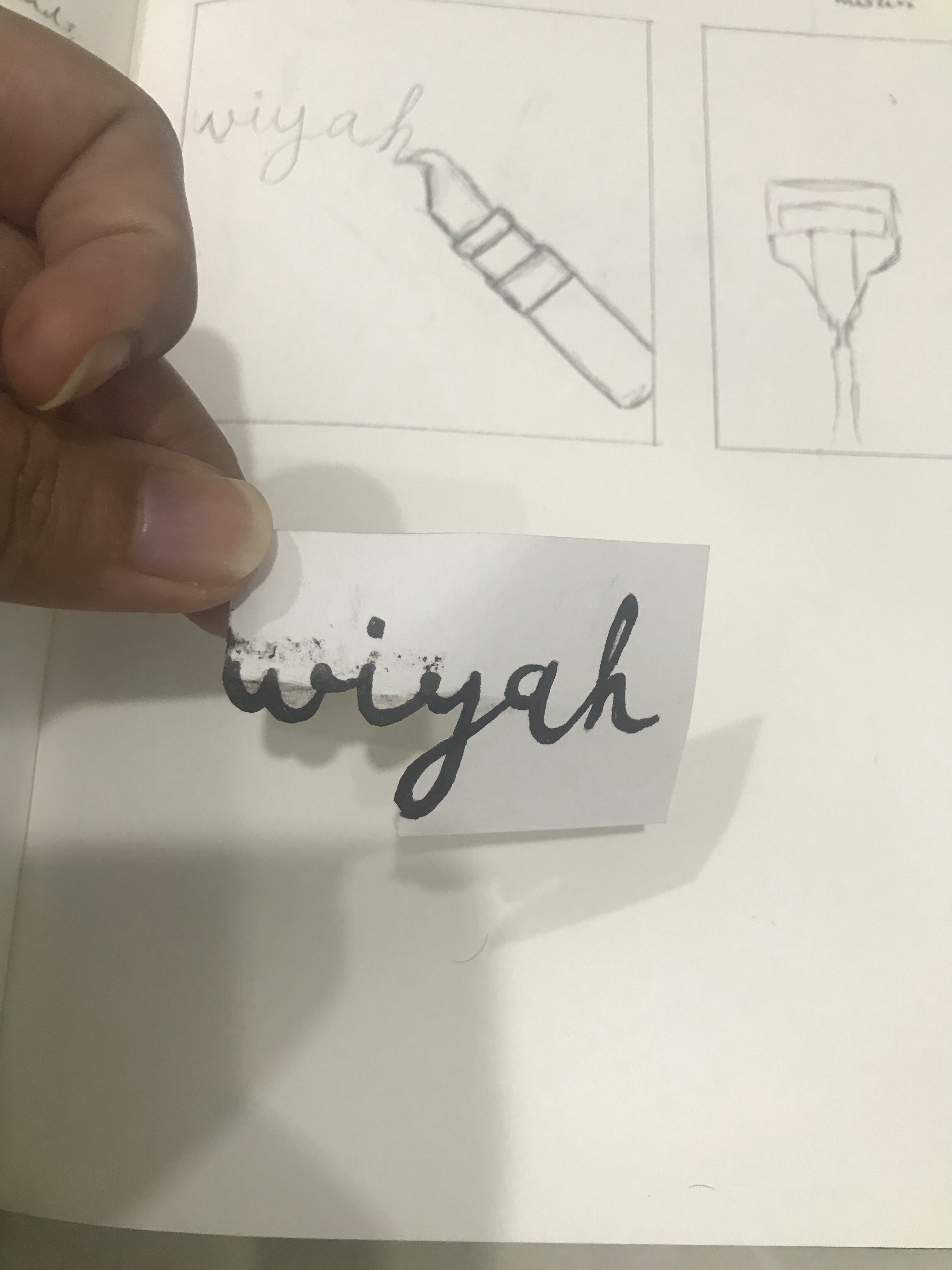
(4th box, RIGHT and BOTTOM): Done with lipstick and eyeshadow, brush, colour pencils. In this particular one, I imitated the font of Southern Jannie.
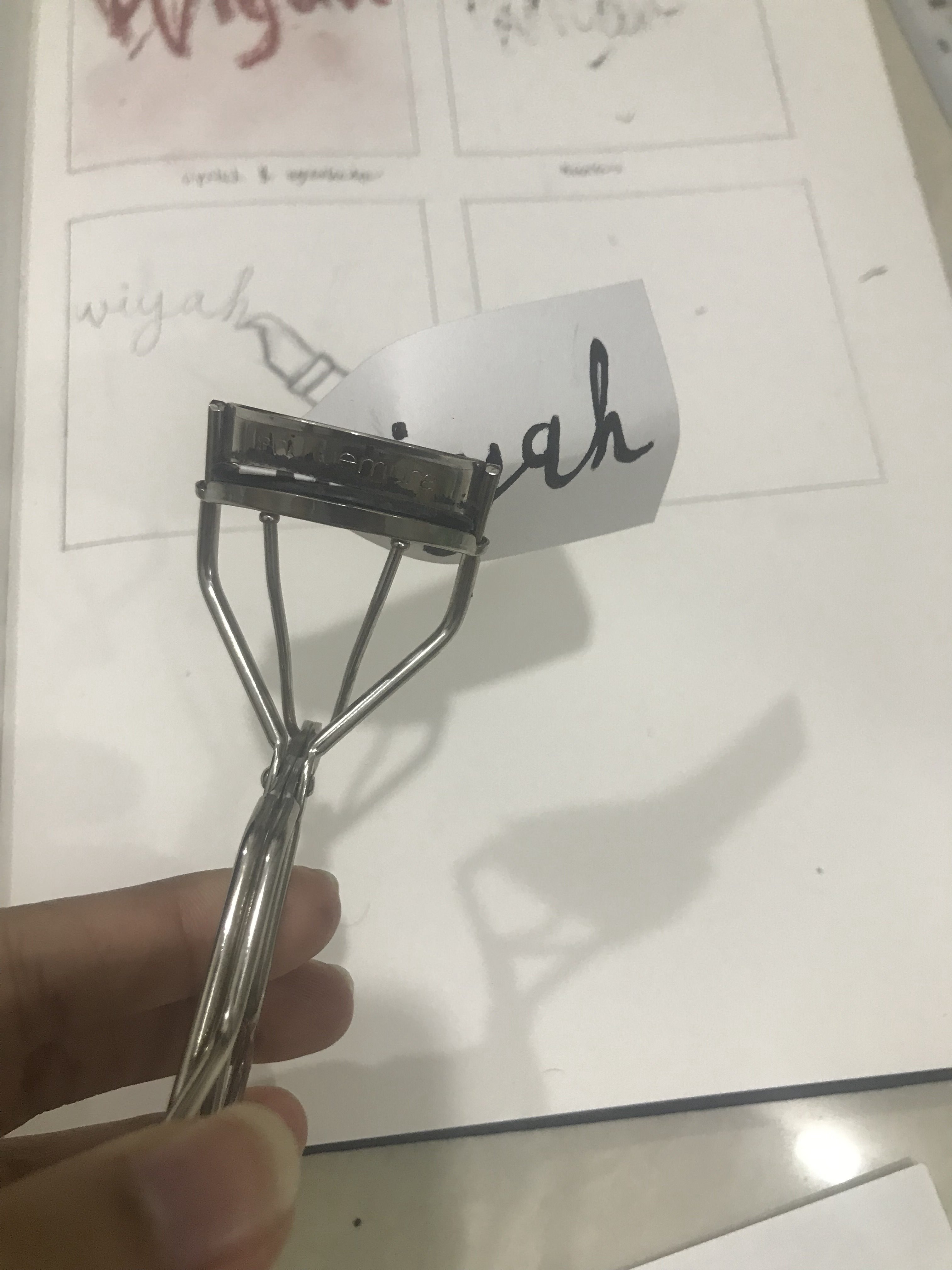
Upon further development, I had the idea to use an eyelash curler to manipulate the font shown in the photo above. The text was written with eyeliner.
After exploration with makeup, I figured that I wasn’t too keen on the idea of it and moved on to explore the other careers.
2. Career: Photographer
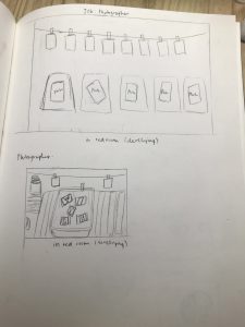
I had the idea of it being in the red room where items would be arranged to simulate the red room, then photographed and manipulated digitally to add red light effect, etc. I toyed with the positioning through sketch to generate a sense of composition. However, after thinking further, again, I wasn’t too keen on the idea and moved on.
________________________________________________________
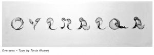
3. Career: Arabic Calligrapher
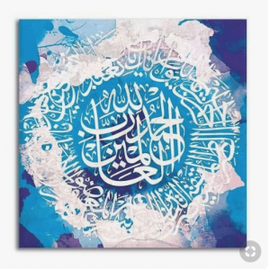
I toyed around with the idea of the calligraphy being in origami, wire or paper mache but soon realised that this does not really portray the fluidity of the lines created by calligraphers.
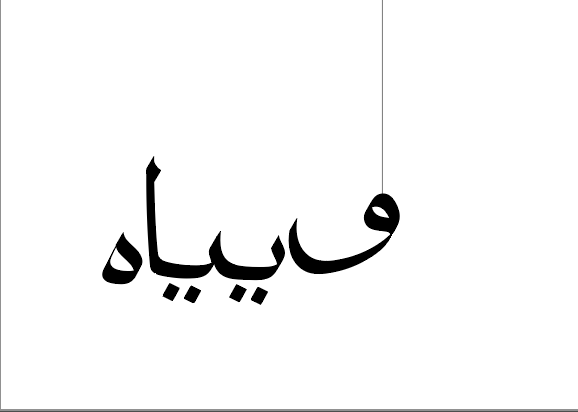

Hence, I attempted to write the arabic letters using a customised digital calligraphic brush in Illustrator. I tried to rearrange the composition of the letters to create more interesting shapes.
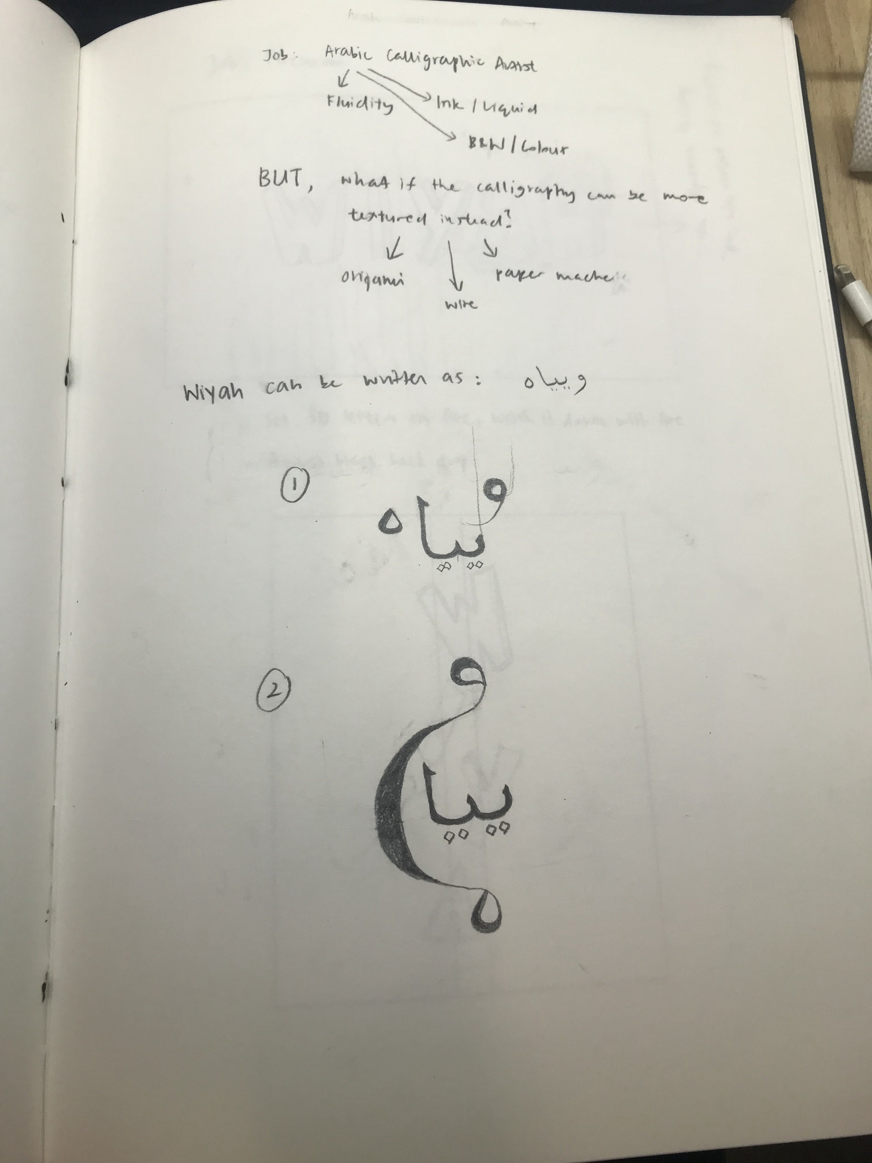
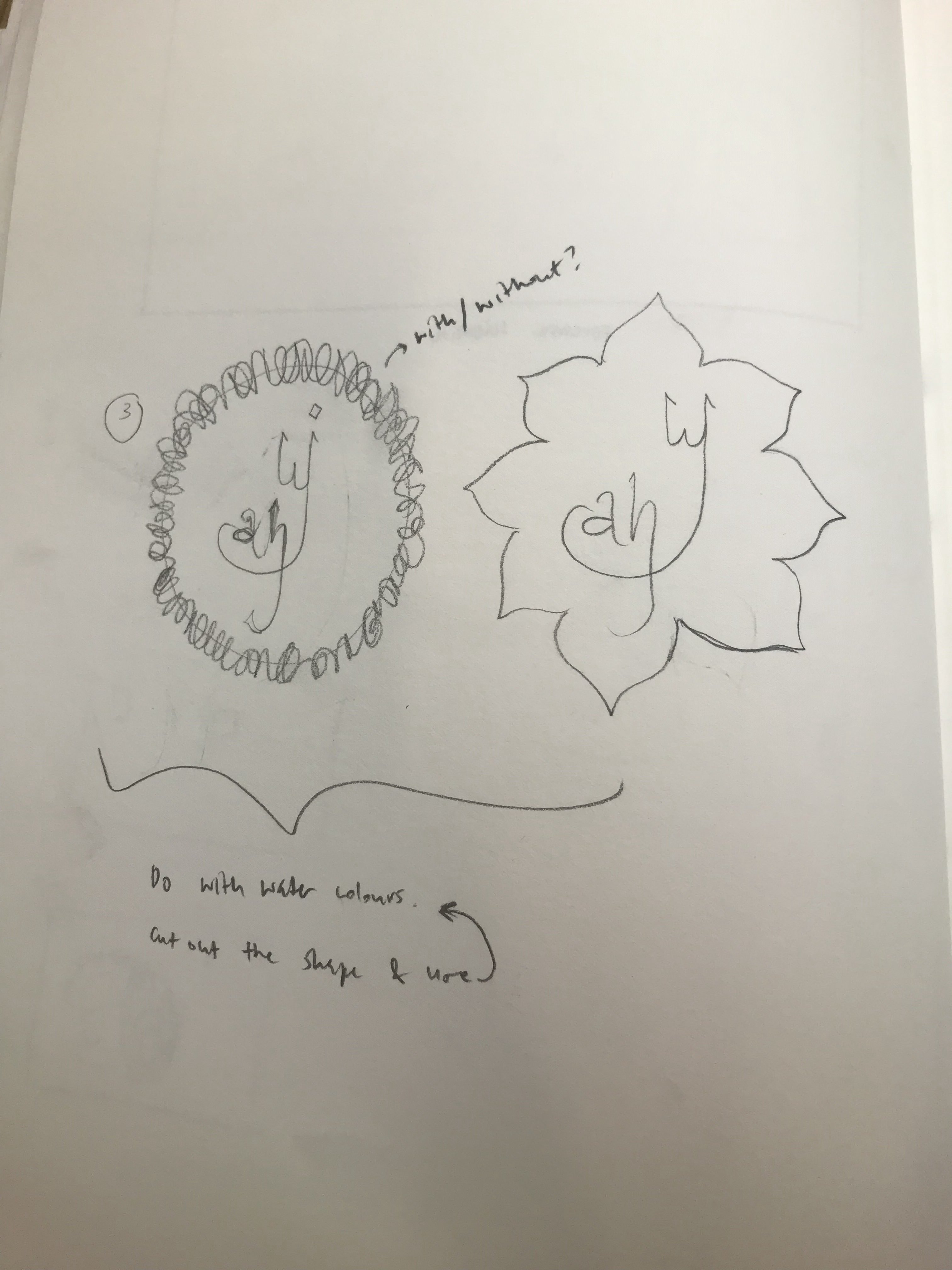
I then applied the influence of these arabic letters to the “English” version of my name. I also added the shapes used in the Arabic calligraphy art such as the flower and the circle made of words.
I had the intention of doing all these on water colour paper with watercolour paint. For some reason, there were a lot of modern calligraphy art that are done on watercolour background which influenced my decisions.
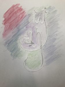
Playing around with colour pencil that can be converted to watercolour with cut out of text
Unfortunately, I didn’t stick by this idea due to development of other ideas in other careers.
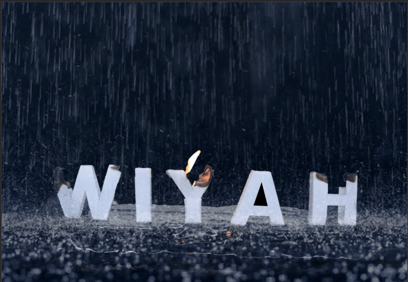
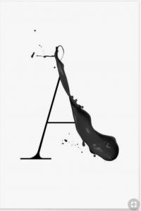
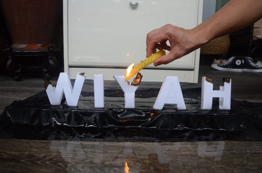
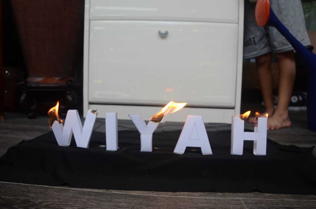
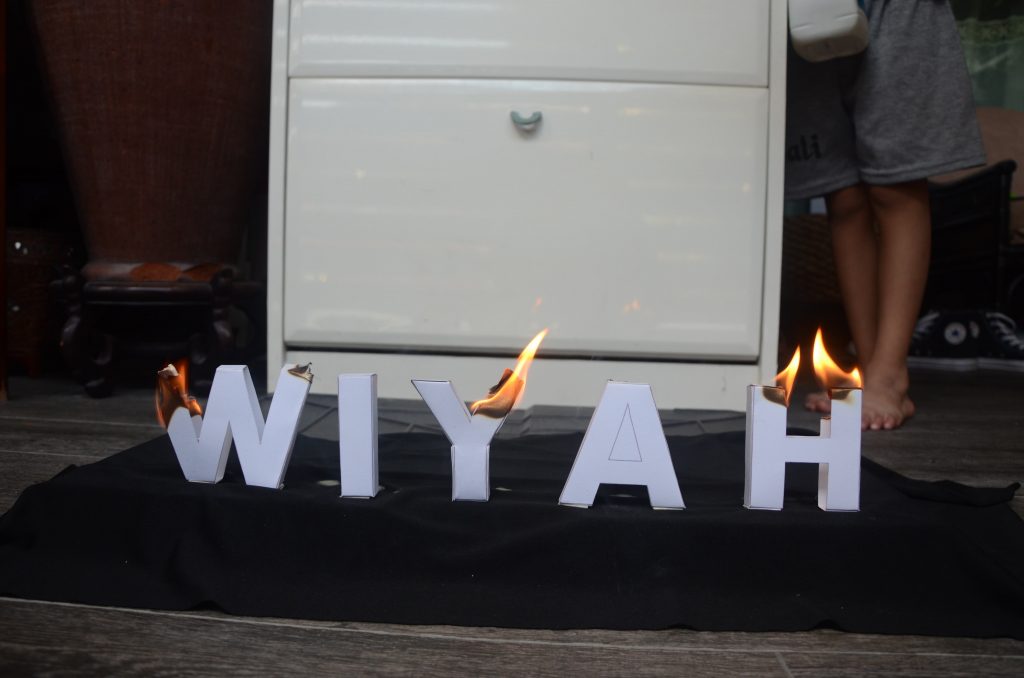
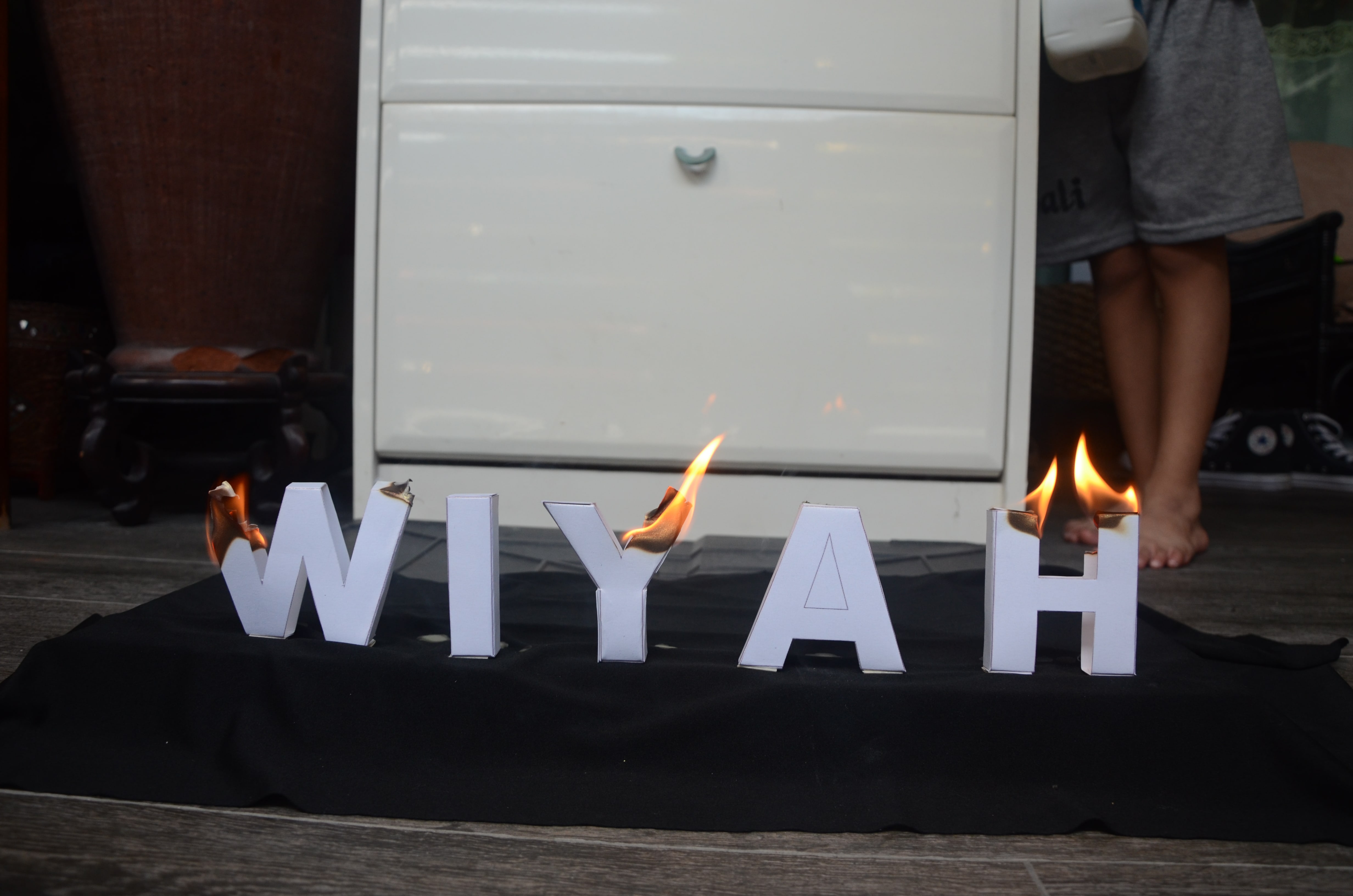
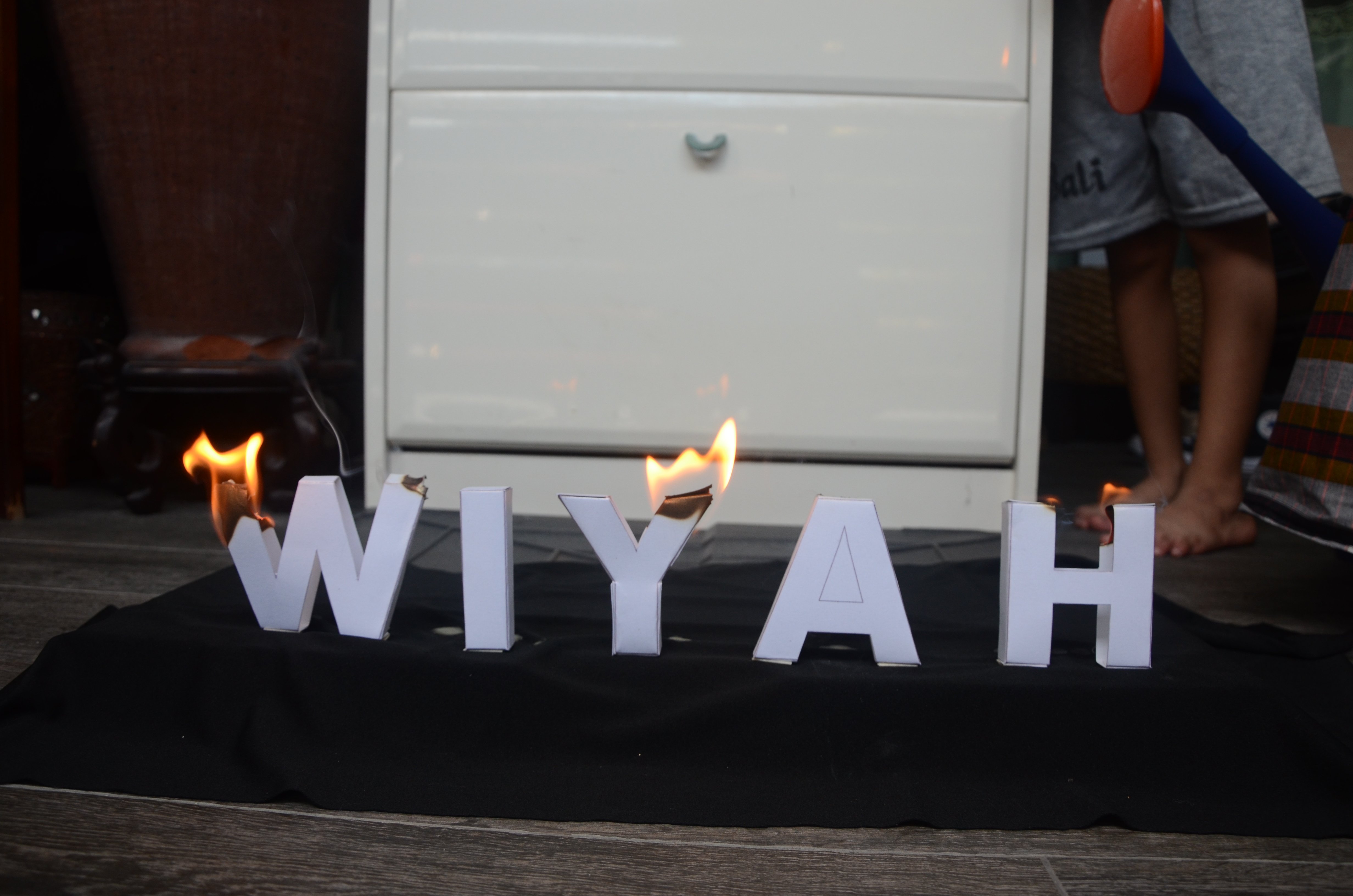
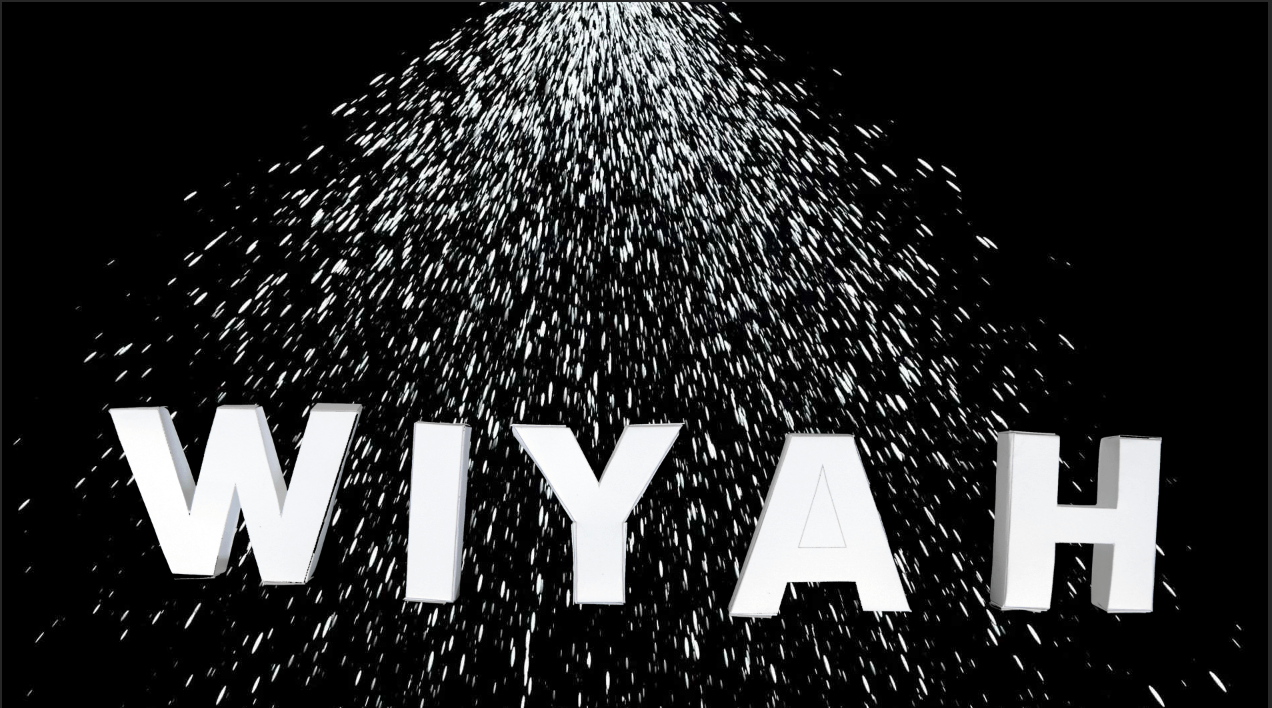
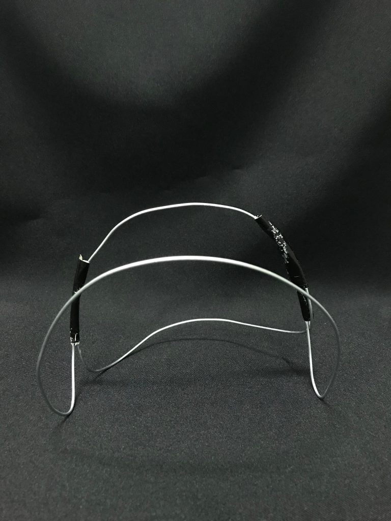
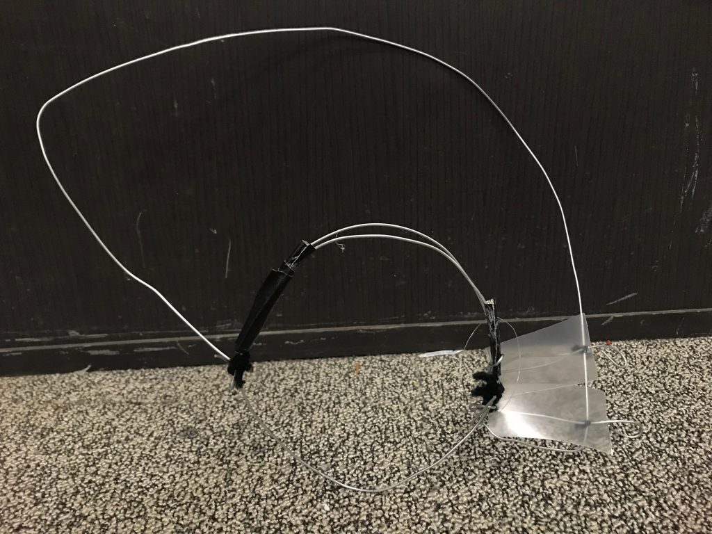
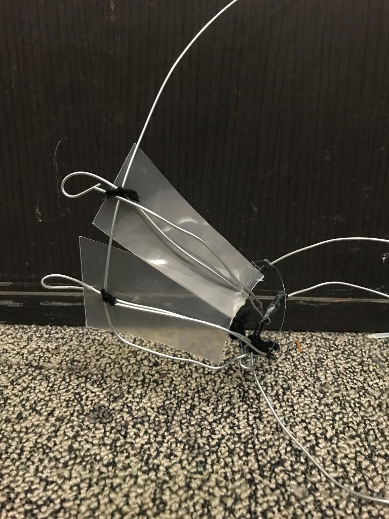
4. Career: Firefighter [Confirmed Image]
PICTURES OF SKETCHES FROM BOOK
Started out with sketches on how I wanted my image to be. For this particular career, I had my vision set out for it to be done via photography and digital manipulation.
Inspiration Photos:
But the above photos were not suited to my career and does not much visual association related to my career and therefore would not create a universal understanding of the visual representations of the career.
Therefore, upon further research, I found the photo below which resulted to being my main inspiration.
I envisioned 3D block letters in Sans Serif with no decorative features, to be physically burnt and being put out by fire, against a black background.
I did not want any decorative font because it would be too distracting and would not complement my idea very well. With Sans Serif fonts, it would look clean and minimal which suited what I was going for.
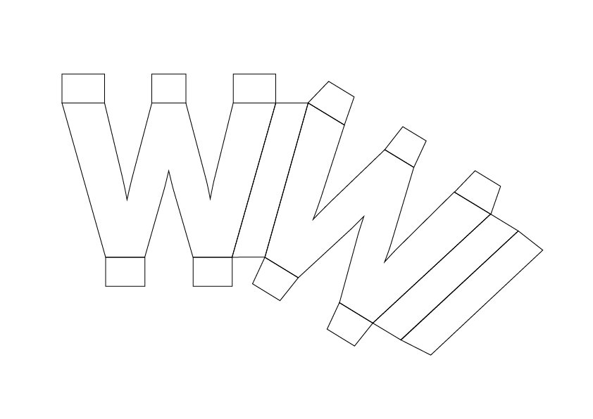
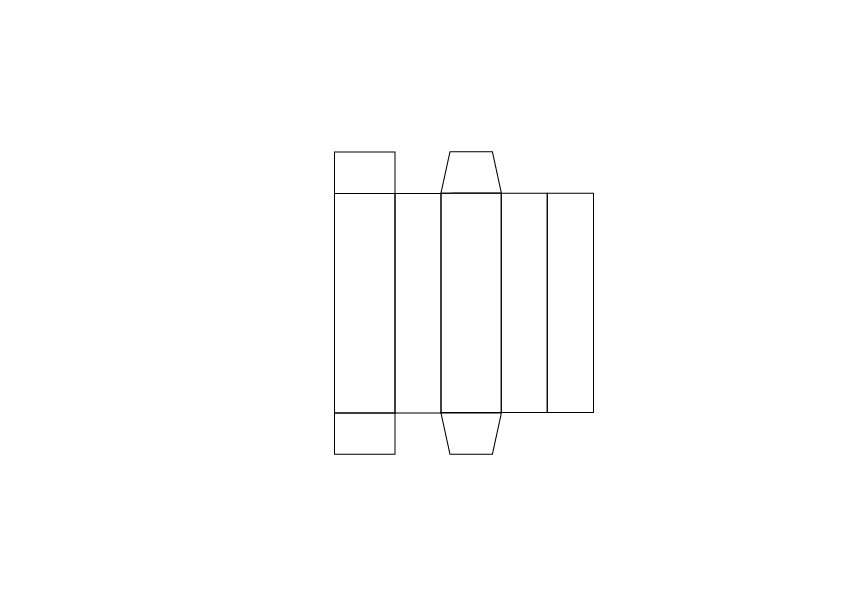
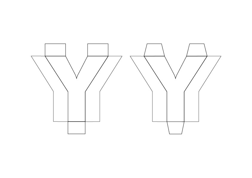
Therefore, I started off by making templates for these 3D block letters of my name with Illustrator.
Reference: https://www.youtube.com/watch?v=fFhd5g87R2Y&t=65s
With regular copier paper, I attempted to fold and glue the 3D block letters into place. I attempted this twice (due to a mistake I made in templates for more complicated letters) before moving on to a thicker art card to achieve a more solid built that would photograph better.
-
- Failed first attempt
-
- 3D letters attempt
Paper used:
Template I came up with for 3D letters:


Since the Career is Firefighter, it is clear that the first thing that comes to mind would most likely be Fire and Water. This sparked the idea of having it done in an analog manner where I would burn the letters and have it be put out by water.
The challenge I had during this process was lighting the block letters. Turns out that the paper I used was too thick and had a glossy, metallic effect that hindered it from being lighted easily.
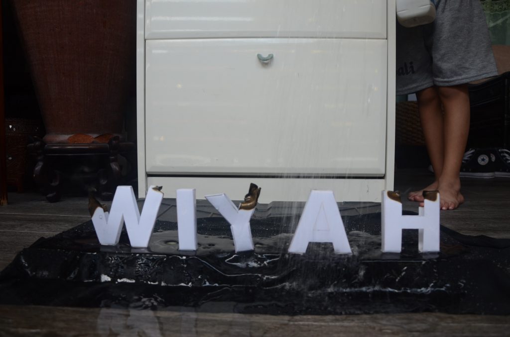
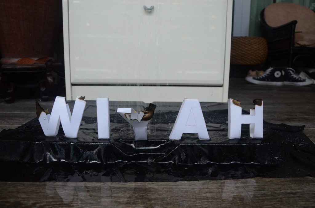
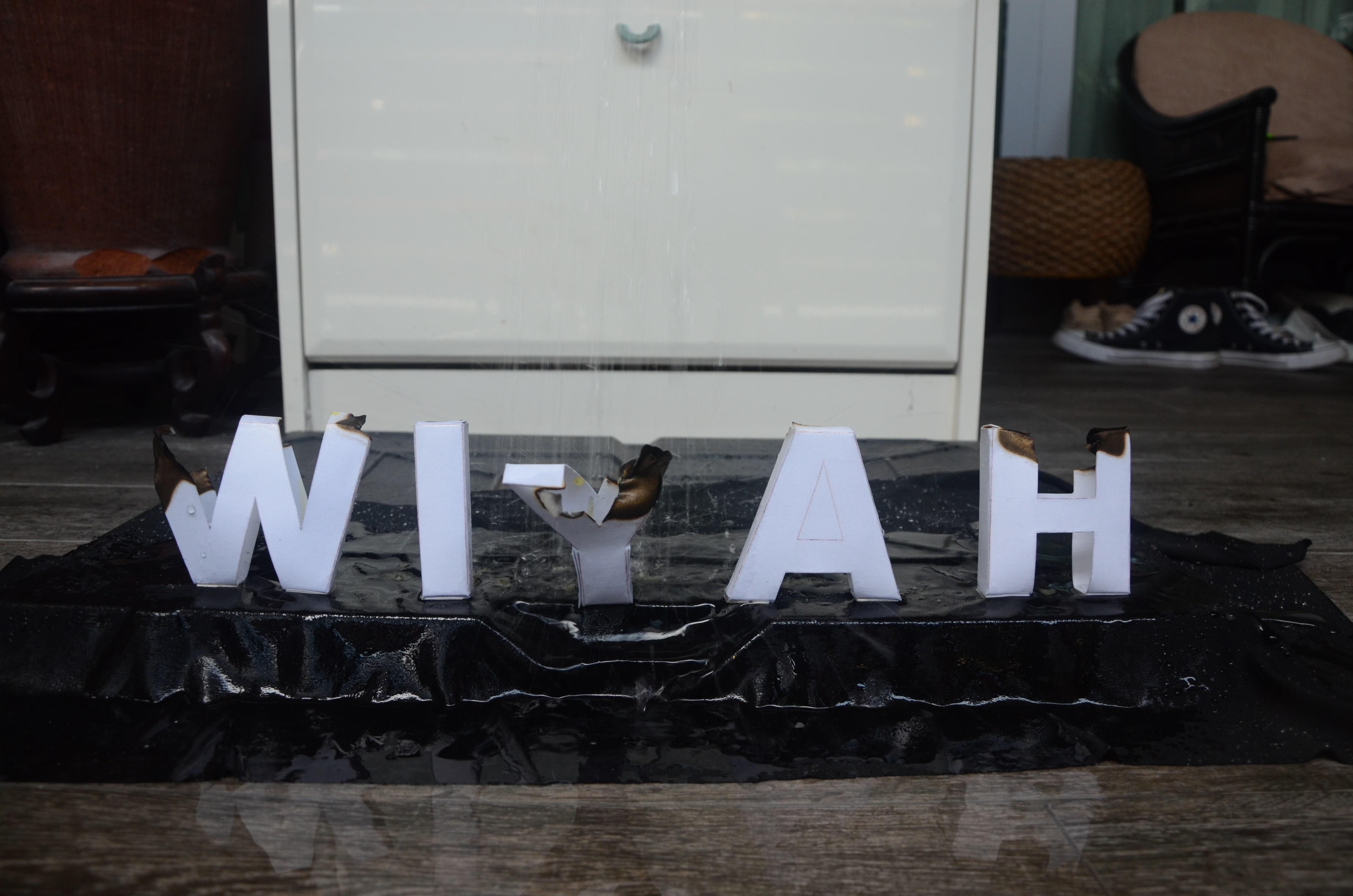
Another challenge was that when I had my dad pour water over the letters so that I could take the shots, the letters kept toppling over due to the pressure of water. Also, the water was not really captured in the shots.
-
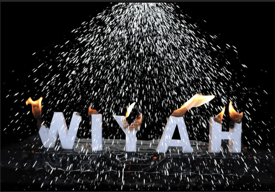
- Selected Image

-
- Attempts

-
- Attempts
-
- Attempts

-
- Attempts
-

- Attempts
I decided that this had to be heavily manipulated digitally to achieve the effect that I want. Therefore, I first had to remove the the background (leaving the raised platform) to achieve the dark effect that I envisioned using Quick Selection Tool in Photoshop. I then filled the empty space with black with the Paintbrush Tool.
Afterwards, I decided to photoshop flames and burnt areas from other shots into my chosen shots so that every letter would be on fire to create a more dramatic effect. I also added reflections of the flame on the raised platforms.
-
- Selected Image
-
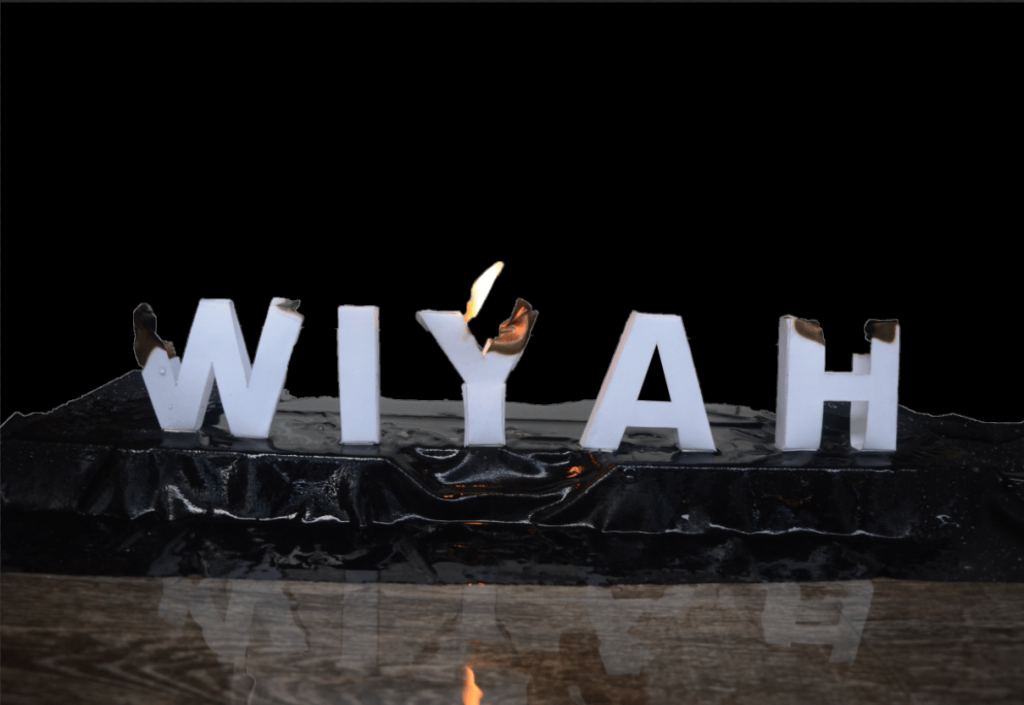
- Removed Background

-
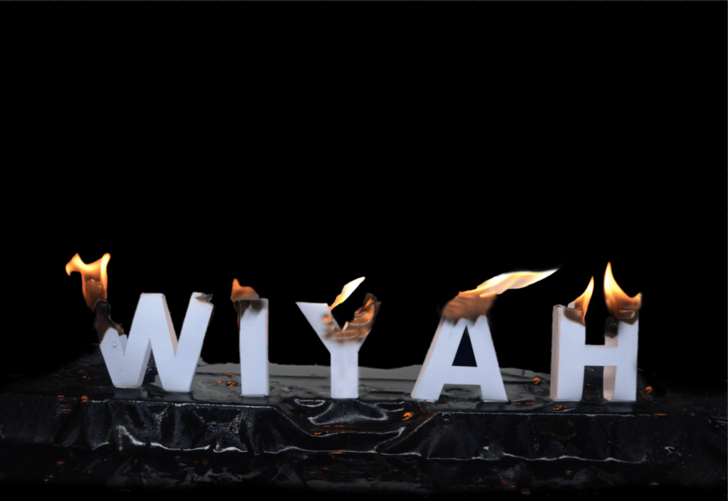
- Further Enhanced with photoshoped flame, burnt effects, reflection of flames

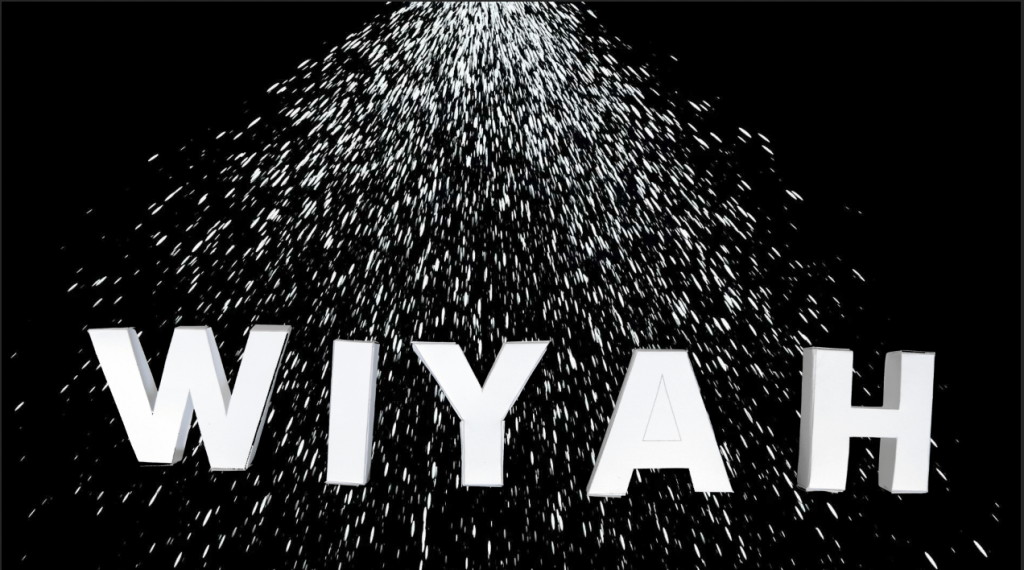
The next step was to add the water that would put out the fire. From the photo attempts above, it was almost impossible to isolate the water from the background and it wasn’t very obvious either. Hence, I had to add it digitally.
It was difficult finding the misty water that I was looking for hence, it required several attempts. I blended the mist I found to the photo using Screen in Photoshop. I also had to photoshop the flames in the middle (Y & A) to have flames that looked more swayed to make it more realistic due to the pressure of the water that I added in the middle. The water effect added was intentionally misty as I attempted something normal water effect but it looked more like rain (as seen below), which didn’t portray what I was going for.
The final outcome was also edited further in Lightroom to increase contrast, lower brightness and increase sharpness.
-
- Attempt
-
- Attempt
Mists/Water References:
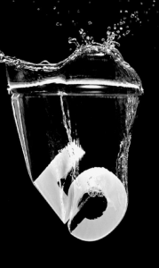
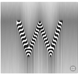
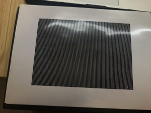
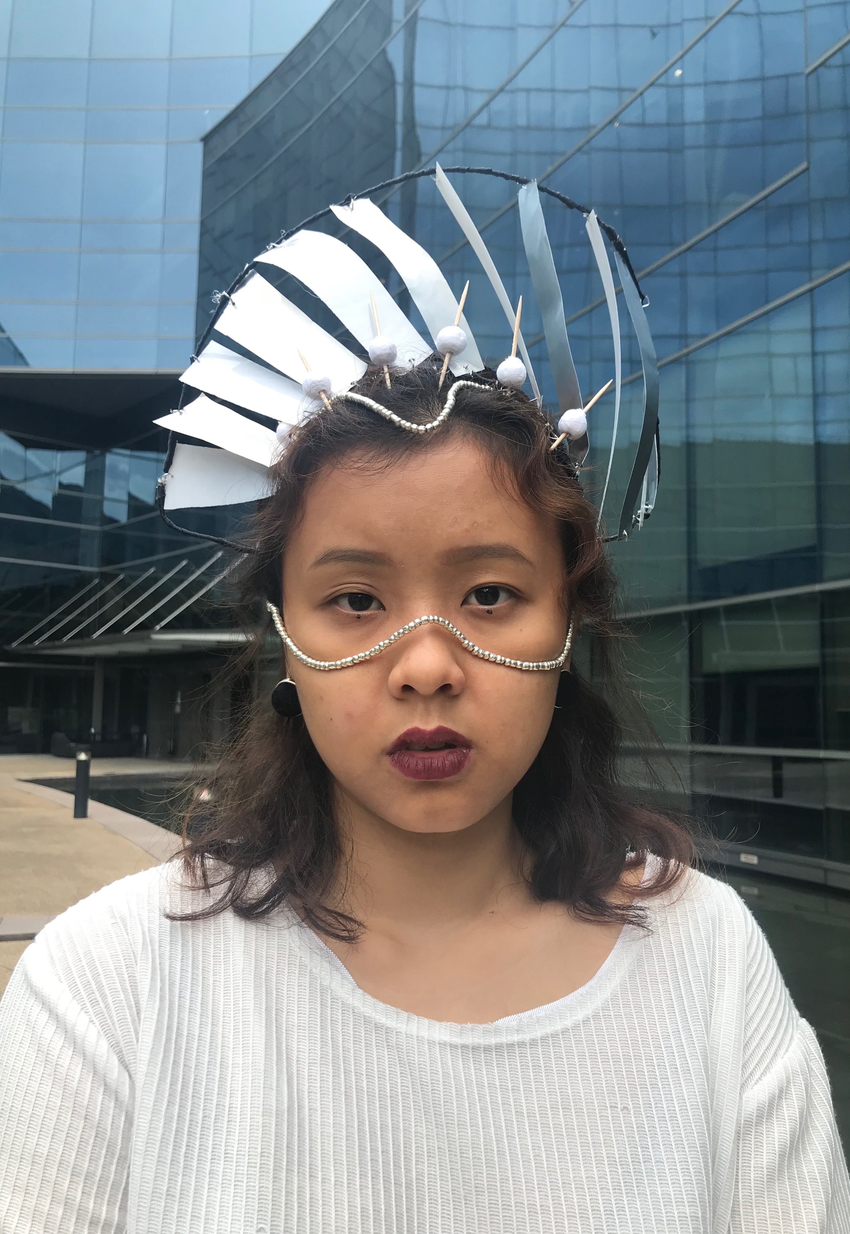
5. Hypnotist [Confirmed Image]
I’ve always found hypnosis intriguing and therefore the career choice. With this, my vision went straight to illusion-related images with lines and distortion.
Influences:
I then explored the idea of having a raised text with lines with Typography and whilst researching, I found a video that shows exactly that. The problem with this is that it required an older version of software.
I researched further and found a video on Youtube that created Animated Optical Illusions:
It was extremely interesting and I wanted to attempt it. It was quite complicated to understand how it worked so I had to cross-refer to many videos.
Once I saw this, it was apparent that this was the perfect optical illusion that I could use to apply it to the typography for hypnosis. It was very trippy and requires extreme focus to make out what the image is when you slide the black bars across the text.
According to Wikipedia, the definition of Hypnosis is as follows:
Hypnosis is a state of human consciousness involving focused attention, reduced peripheral awareness, and an enhanced capacity to respond to suggestion. The term may also refer to an art, skill, or act of inducing hypnosis.[1]
Therefore, I felt that this was apt for my Career Choice of Hypnotist as I am mimicking the effect of hypnosis for the audience.
Main Video Reference:
I used Sans Serif font so as to not distract from the message of the text too much. I used Upper Case and Lower Case for my First attempt then changed to Lower Case completely as I felt like it complemented my design better. The font I used was also more rounded in nature which suited the design rather then angular fonts.
First Attempt:
I used Colours instead of Positions (like video) to create the animation on paper.
It looked very stagnant and did not portray the image I had in my head.
Second Attempt: Becomes my final outcome
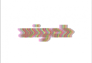
For this, I decided to distort the text and make it wavy using the Warp Tool. This is another visual association I added to the hypnosis effect. When you think of hypnosis, it’s all about illusion and all things trippy and spinning. Hence, the wavy texted added to that effect and created more movement in the animated illusion text that I created.
Video Reference:
Third Attempt:
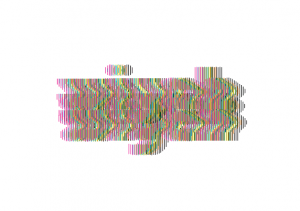
I distorted the image further by adding another row of the text below the already distorted image. However, it looked rather complicated and illegible which defeated the purpose of this Project. Mimi’s feedback on it confirmed my thought exactly. Hence, I went with the second attempt instead as my Final Outcome.
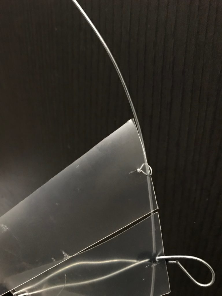
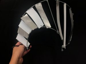
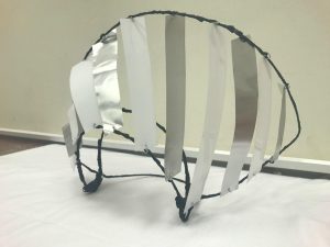
I printed the black bars on transparent paper. This is the crucial part of making it an animated image.
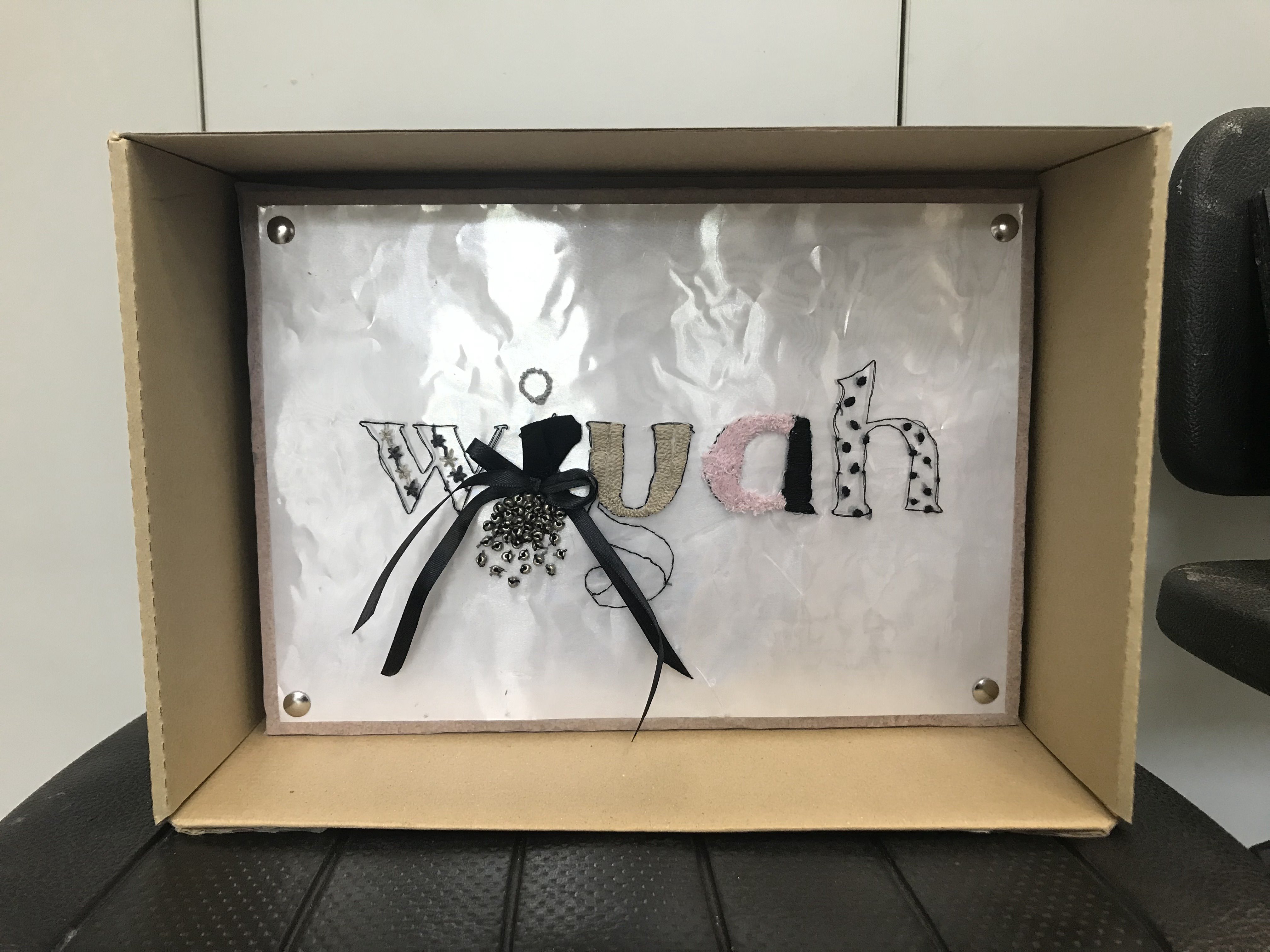
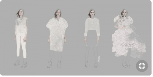
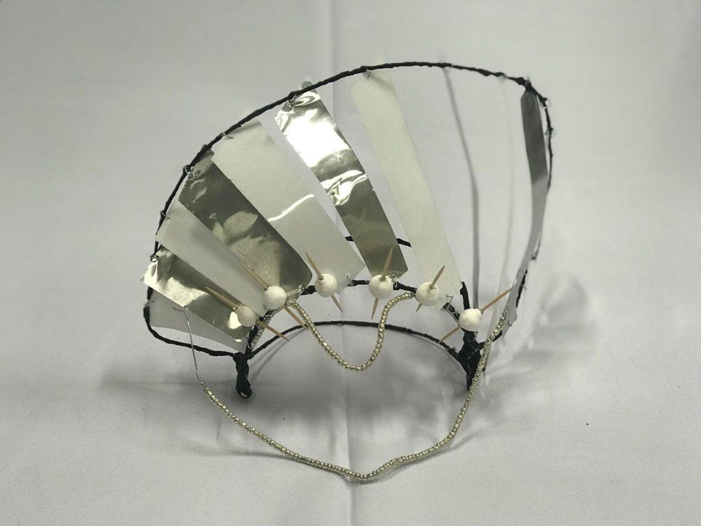
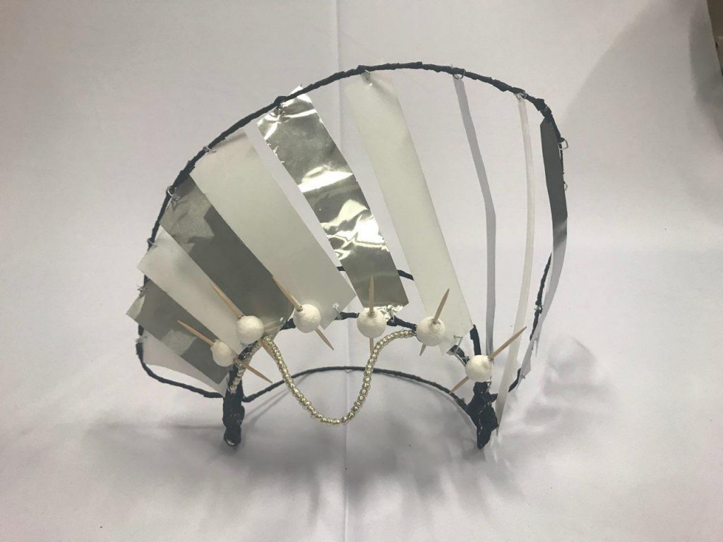
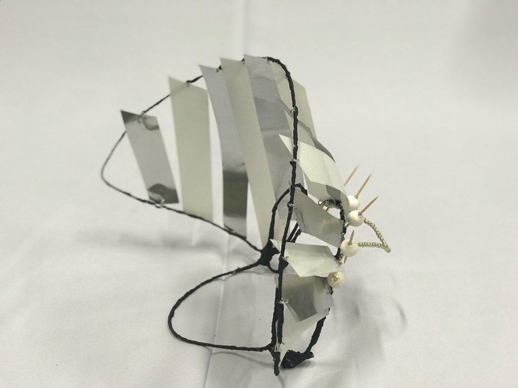
6. Fashion Designer [Confirmed Image]
I’ve always enjoyed looking at clothes and finding clothes as they’re a form of identity for me. Ever since I was a child, this was a form of my creativity since I was a very quiet child. I also enjoyed how different vibes of clothes allowed me to embody different personas.
When I was researching for this, I saw a lot of pictures online that served as inspiration for me. Initially, I wanted to attempt analog methods for this.
However, after considerations, I realised that it would take a lot of hours into me learning new skills of sewing and embroidering to be adapted into my typography designs. It required a lot of time to research for the methods too.
Therefore, I resulted to digital methods using manipulation of images.
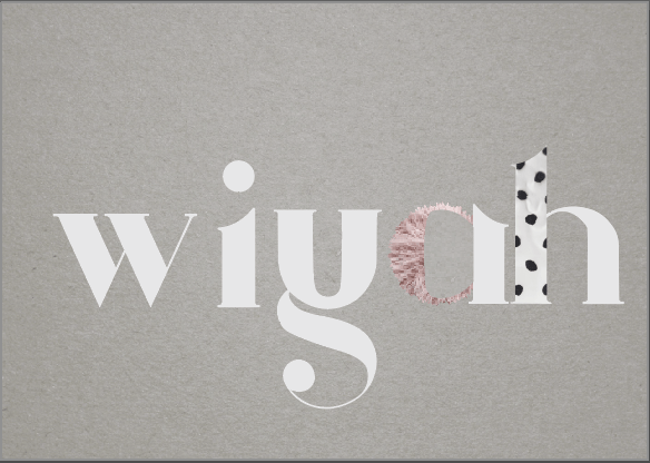
I used Argo, a Serif typeface. This is a decorative font and I was inspired by editorial layout designs like such. I also went with all lower-case typeface as it made the piece look more united.
Upon attempting a digital approach, I realised that it didn’t really tie in to my whole concept of literal experimentation of typography.
Hence, I decided to go ahead with my original idea of doing it by hand. I used fabric, thread and beads. I retain the idea of using the same Argo typeface.
Through research, I was drawn to this String Art..
but I was already going to do String Art for another one of my idea. Hence, I wanted to explore other methods. Also, I felt like it would not have created as strong a visual association to the career of fashion designer.
Other inspirations:
Hence, I decided on another method. I, first sketched out the idea on paper to have a rough creative direction.
As for the methods, I figured things out along the way through experimentation on a separate piece. I tested out patterns and silhouettes on there too.
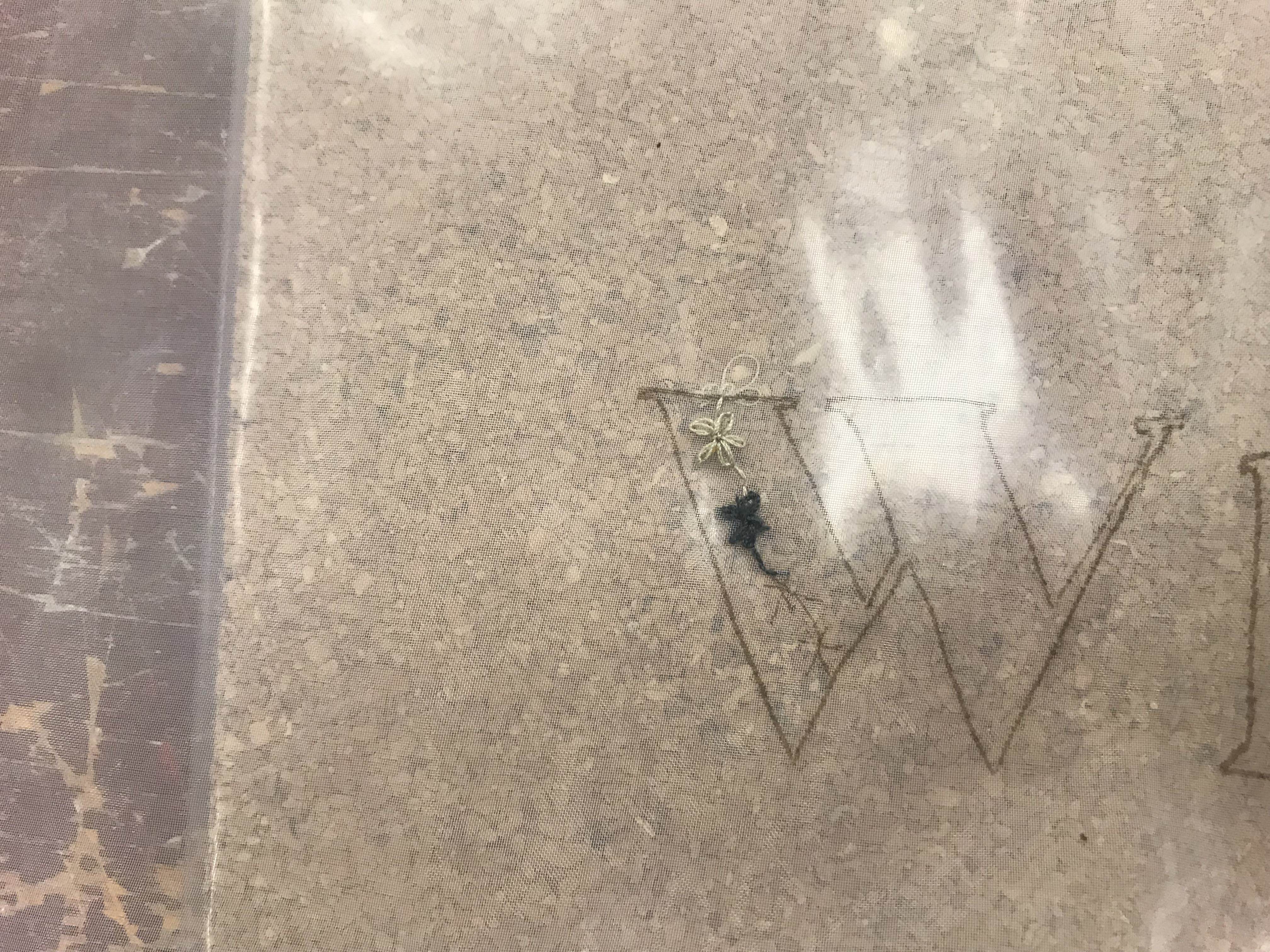
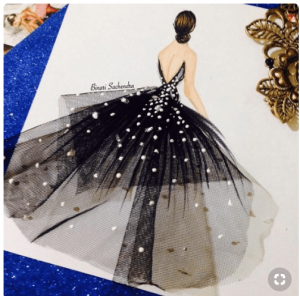
Originally, I wanted to just sew on different fabrics onto the typeface using organza (with end product looking like the photo below…
Fabric Type by Tania Alvarez
..but I felt like it would not portray the idea well. I also wanted to attempt embroidery on the whole typeface but Mimi’s feedback said that it could easily look like my career was to be an embroidery artist.
Hence, I opted to combine the two ideas and creating interesting silhouettes of the typeface.
I wanted the whole composition to have a harmonious feel to it and for it to be viewed as a collection, resembling what is released in runways. Therefore, I made sure to use threads that are off the same theme of colour with a pop of pink. I played a lot with texture too through embroidery and fabric.


A reason why I chose Organza as my backing fabric is because I felt that organza had the feeling of elegance and is often associated with girly fashion as it is used to create tulle skirts.
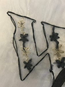
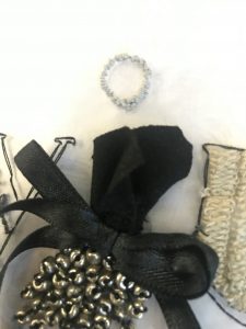
LETTER ‘W’:
I created daisies and attached them together with alternative colours as I felt that it looked more interesting with alternate colours rather than just one dull colour. It also helped tie in my “collection” together with the use of the neutral and the dark colours.
Reference Video:
Detail of my embroidery:
LETTER ‘I’
Inspiration:
I used fabric, ribbon and beads for this and created a silhoutte of a dress. I added embroidery knots along the dot above I in a neutral colour, again playing with the idea of a harmonious collection to ensure that it delivers the association to runway fashion designs. The silhouette resemble a model wearing my “piece”, dot above the silhouette also resemble the head of the model to emphasise the idea.
Detail:
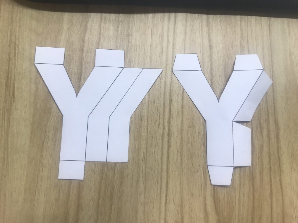
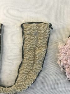
LETTER ‘Y’
For this, I wanted it to be filled with interesting embroidery to insinuate a fabric type. I learnt am embroidery technique called, Braid Stitch or Cable Plait Stitch.
Reference Video:
I tested it on the separate piece of organza before attempting it on the final piece.
Details of my embroidery:
LETTER ‘A’
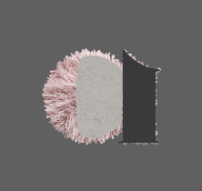
I decided to have a pop of pink colour to represent my personality and identity to my “collection” since I do love the pale-pink colour.
I cut out the fabric from my fuzzy socks to retrieve a furry fabric. This also added texture to my “collection” to make it more interesting and appealing to look at. I stitched the fabric to fill in the curved part of the A.
As for the stamp of the letter, I used linear stitching of fabric. To create a raised texture, I added more thread through the needle. This is to match the fuzzy fabric of the curved part of the letter.
Details:

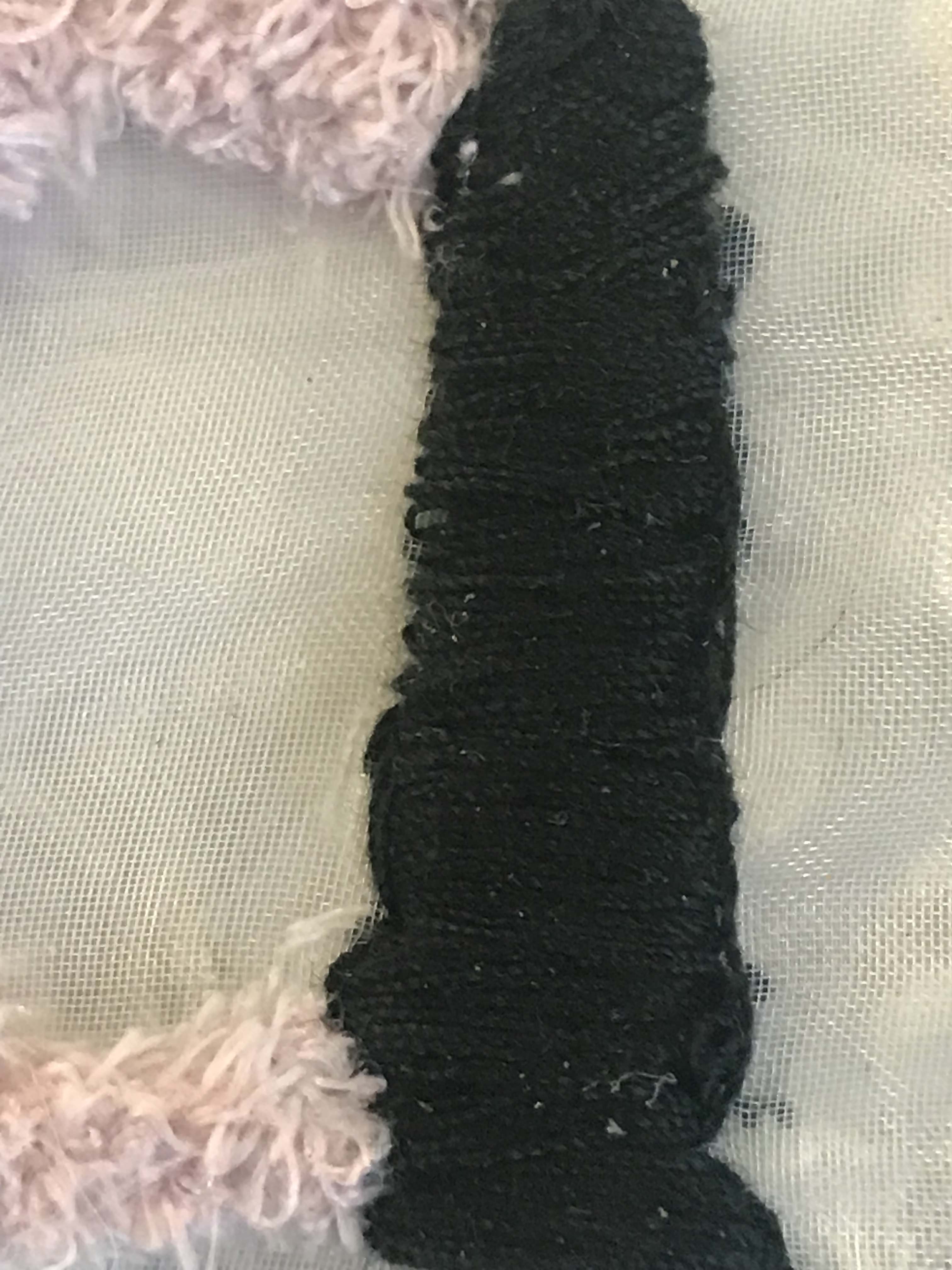
LETTER ‘H’
Finally, I decided to add polka dots to the letter H with black thread, again using the idea of having a unified “collection”.
I drew circles, stitched around it and filled it in with thread. This was also teted beforehand on the separate piece of organza.
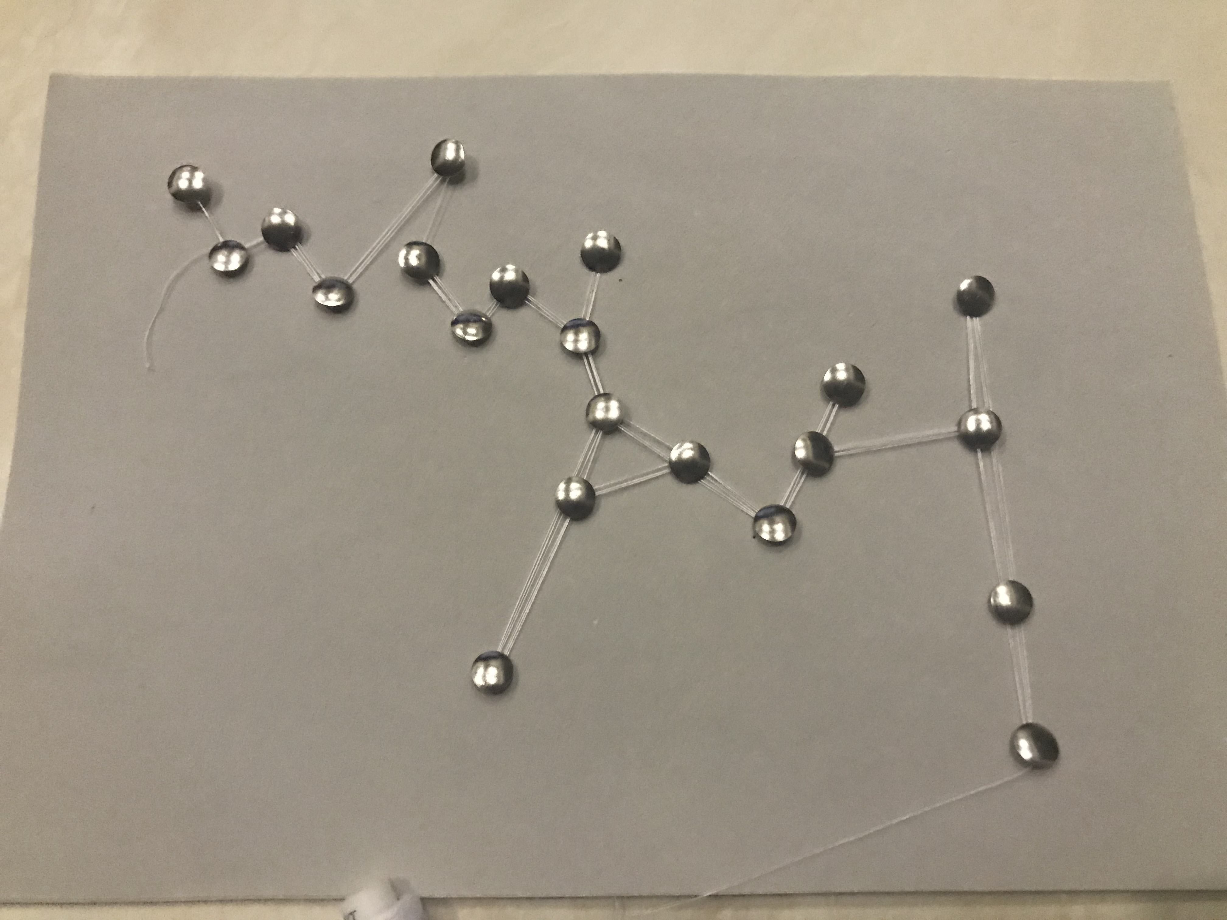
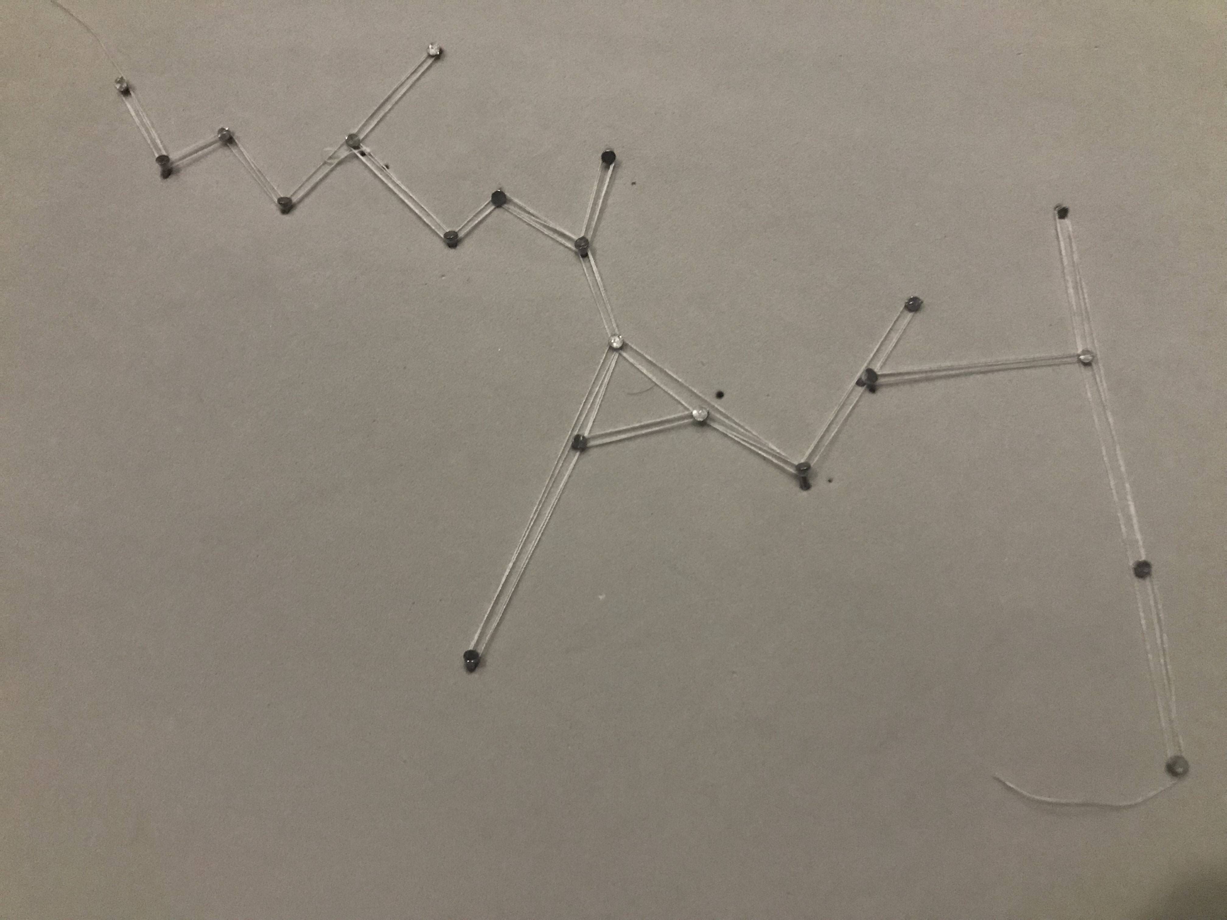
7. ASTRONOMER [Confirmed Image]
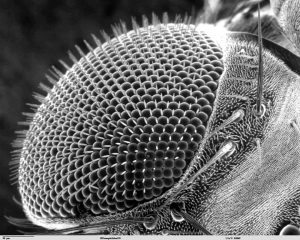
For this, I played around with the idea of constellations. I’ve always been drawn to stars and what’s beyond the Earth, galaxies, etc. I asked around and generally, people do agree that constellations do make them think of the galaxy.
In definition from Wikipedia,
An astronomer is a scientist in the field of astronomy who focuses their studies on a specific question or field outside the scope of Earth. They observe astronomical objects such as stars, planets, moons, comets, and galaxies – in either observational (by analyzing the data) or theoretical astronomy.
Therefore, creating visual associations using constellations would infer the world of Astronomy.
Whilst researching, I already had an idea in mind where I wanted this to particularly be string art to project constellations.
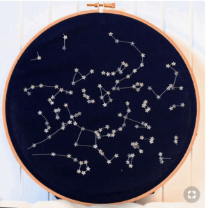
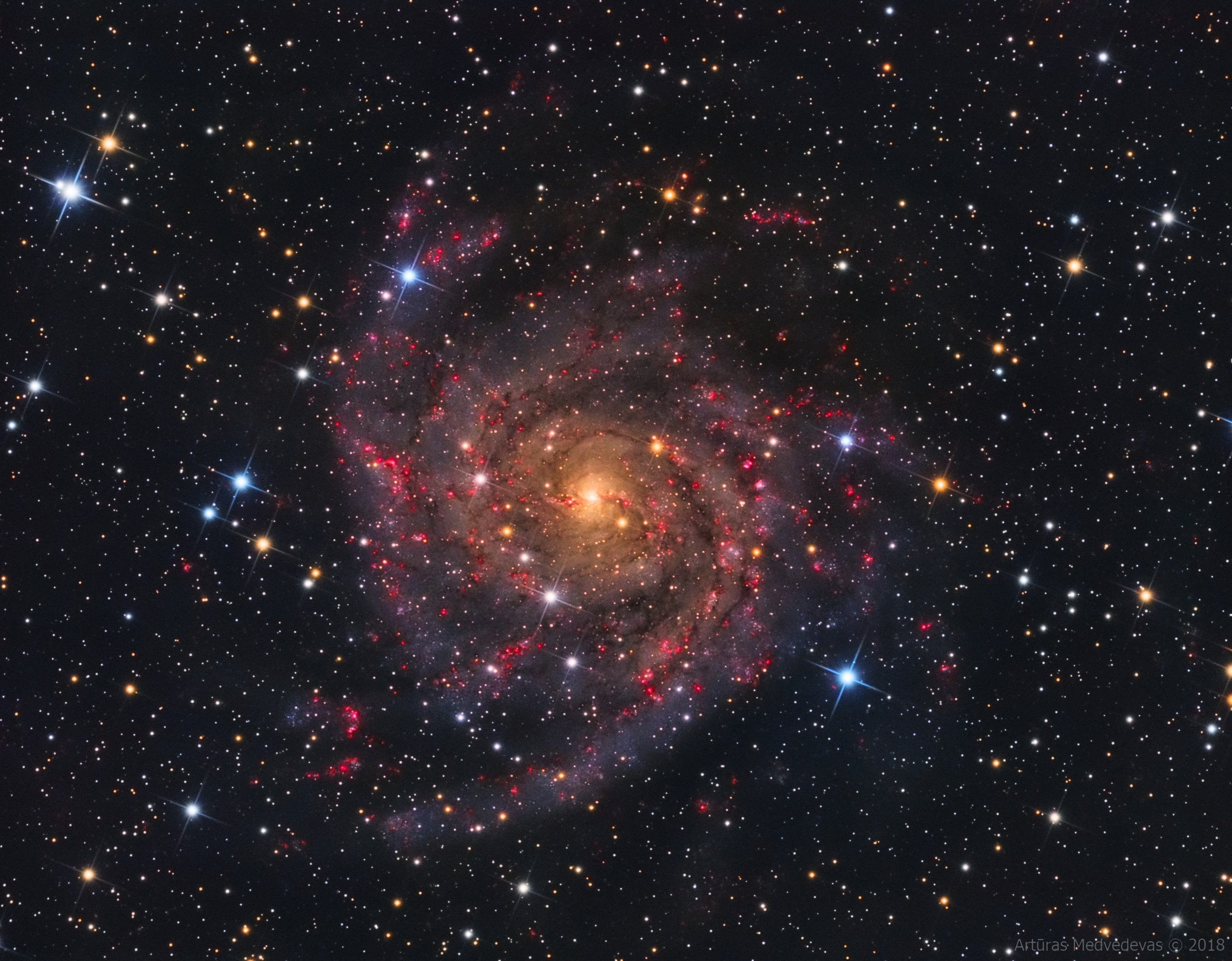
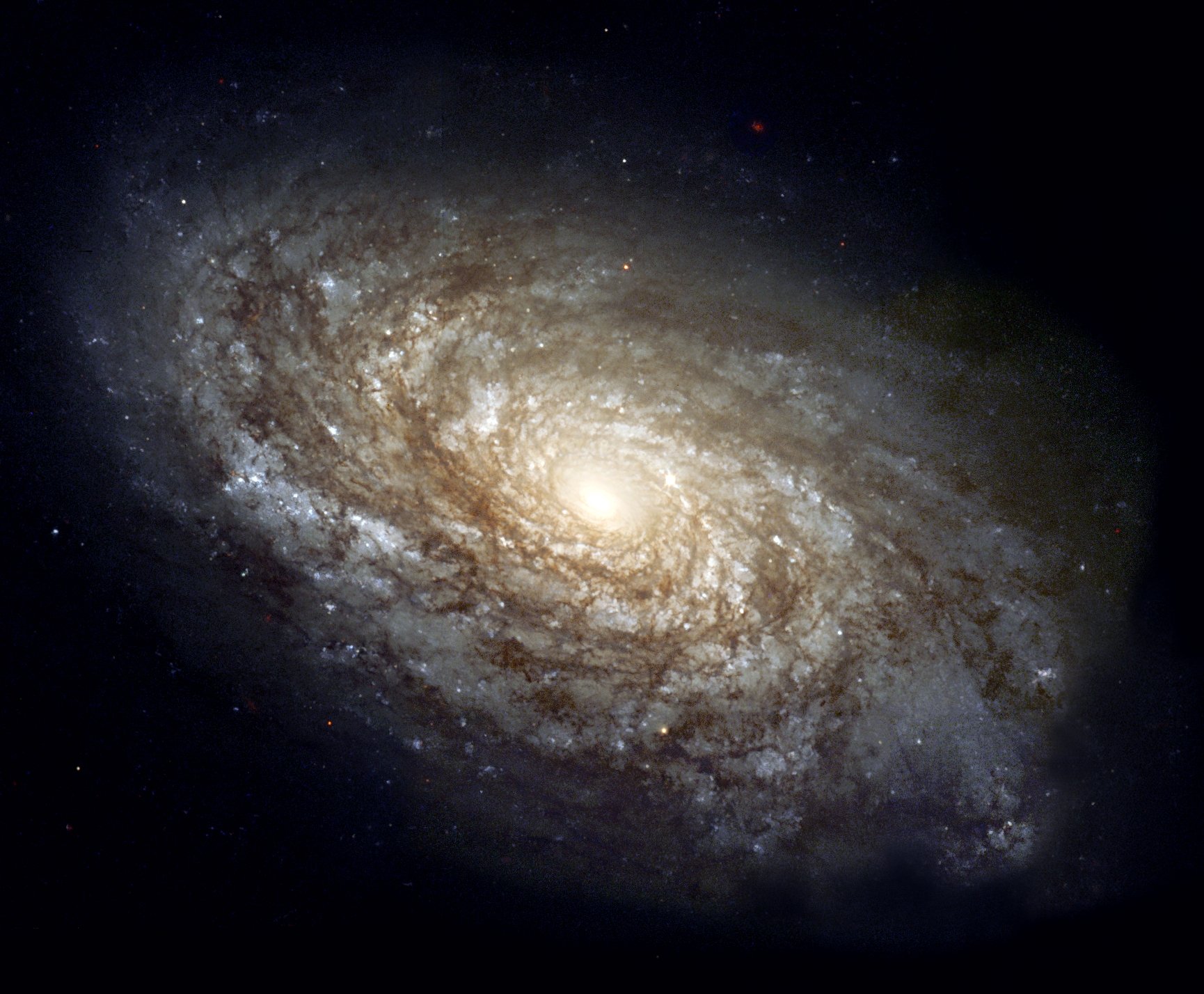
Inspirations:
I started sketching different compositions as follows:
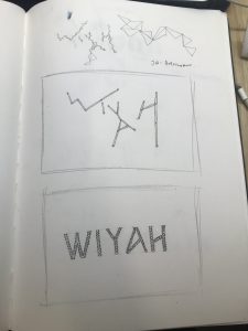
Upon consultation with Mimi, I decided on the 2nd sketch as it looked more interesting and customised in composition and type. For this image, I did not have any font references. I decided to have it all in upper case as they look more angular which served this purpose (string art) best.
References:
Links:
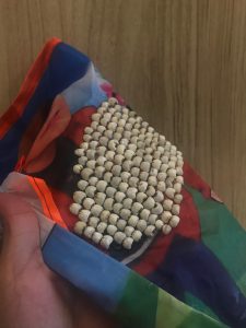
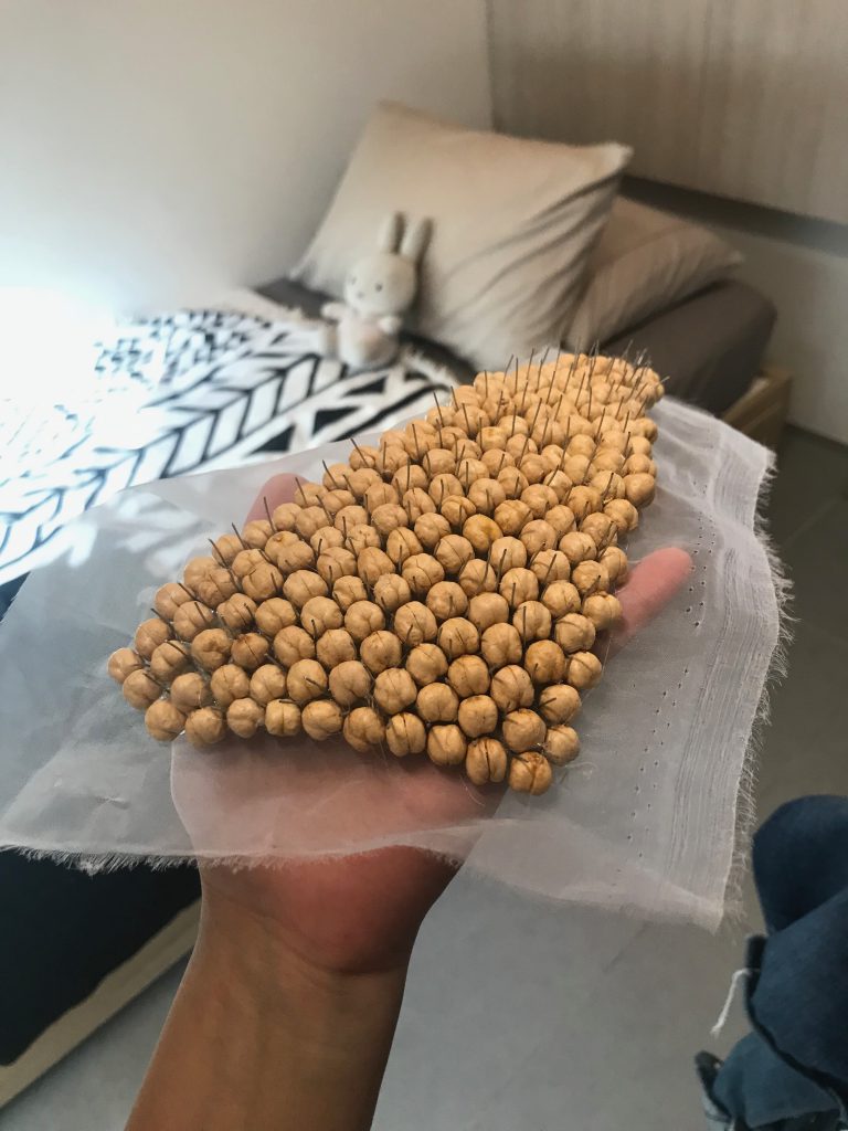
I practiced on felt board to see how my idea would’ve worked out. I used thumbtacks and realised it was far too big to execute my idea. Hence, I changed to regular screw pins.
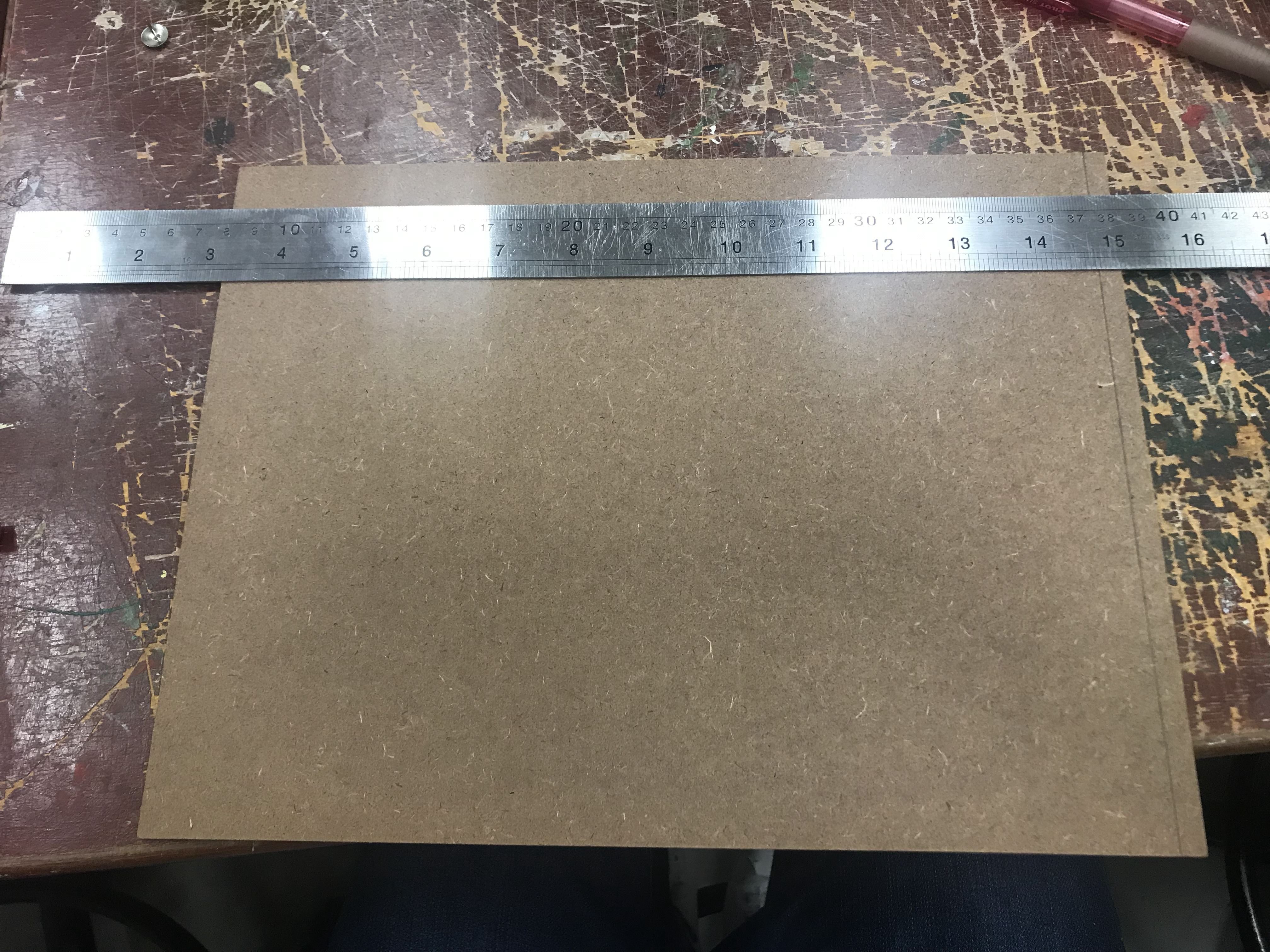
I got an MDF Board and had to cut it down to size and file to create a smooth outline. After which, I painted it black. The reason is because the Galaxy is known to be very dark, almost black (as seen above).
13a7e7c5310e430cbcfef85953fab176
-
- Cutting
-
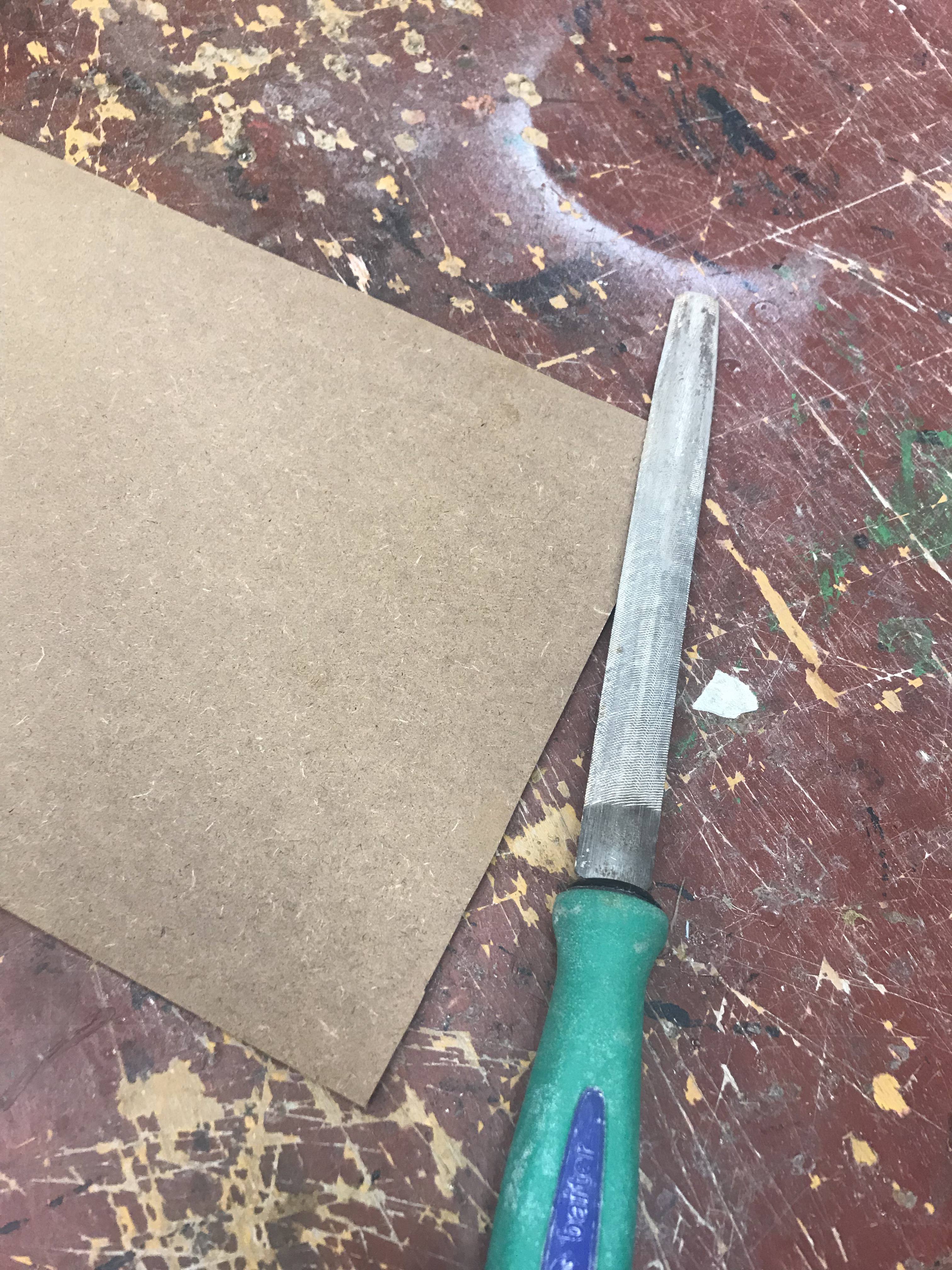
- Filing
-
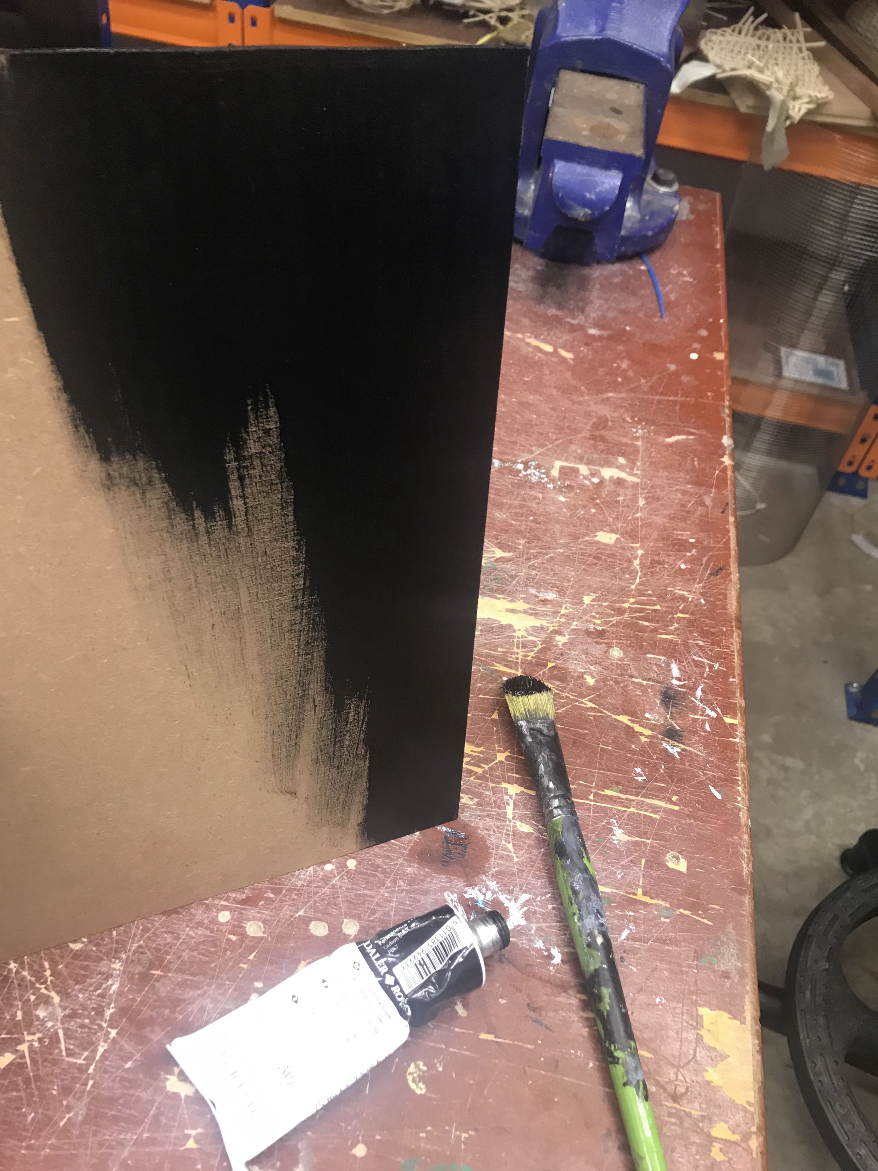
- Painting
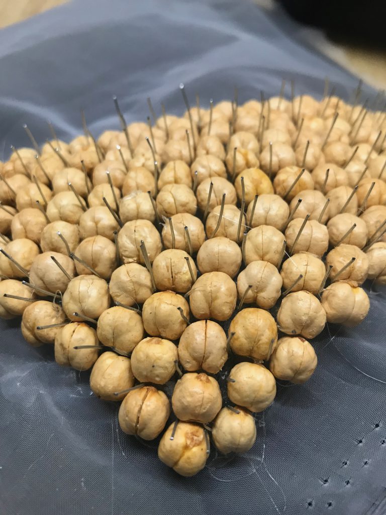
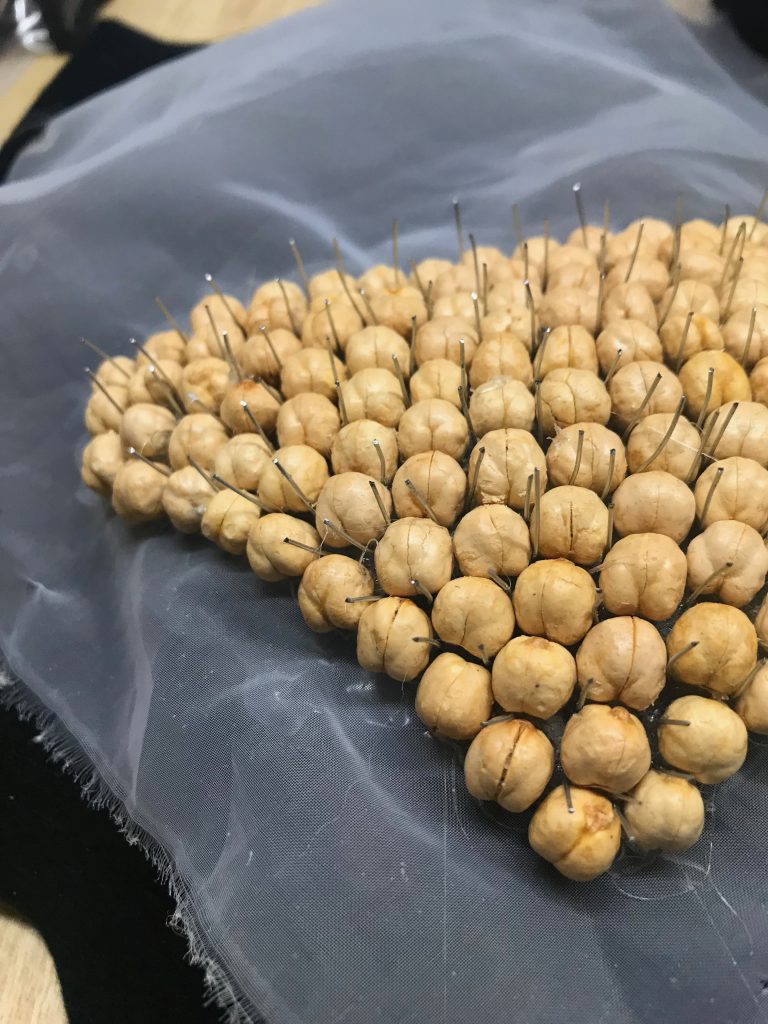
While waiting for it to dry, I cut down a foam board that I bought to act as base for the MDF board. Two A4 pieces were stacked on top of each other. This is to allow the nail to push through and not land on the other side of the board which create a neater finish.
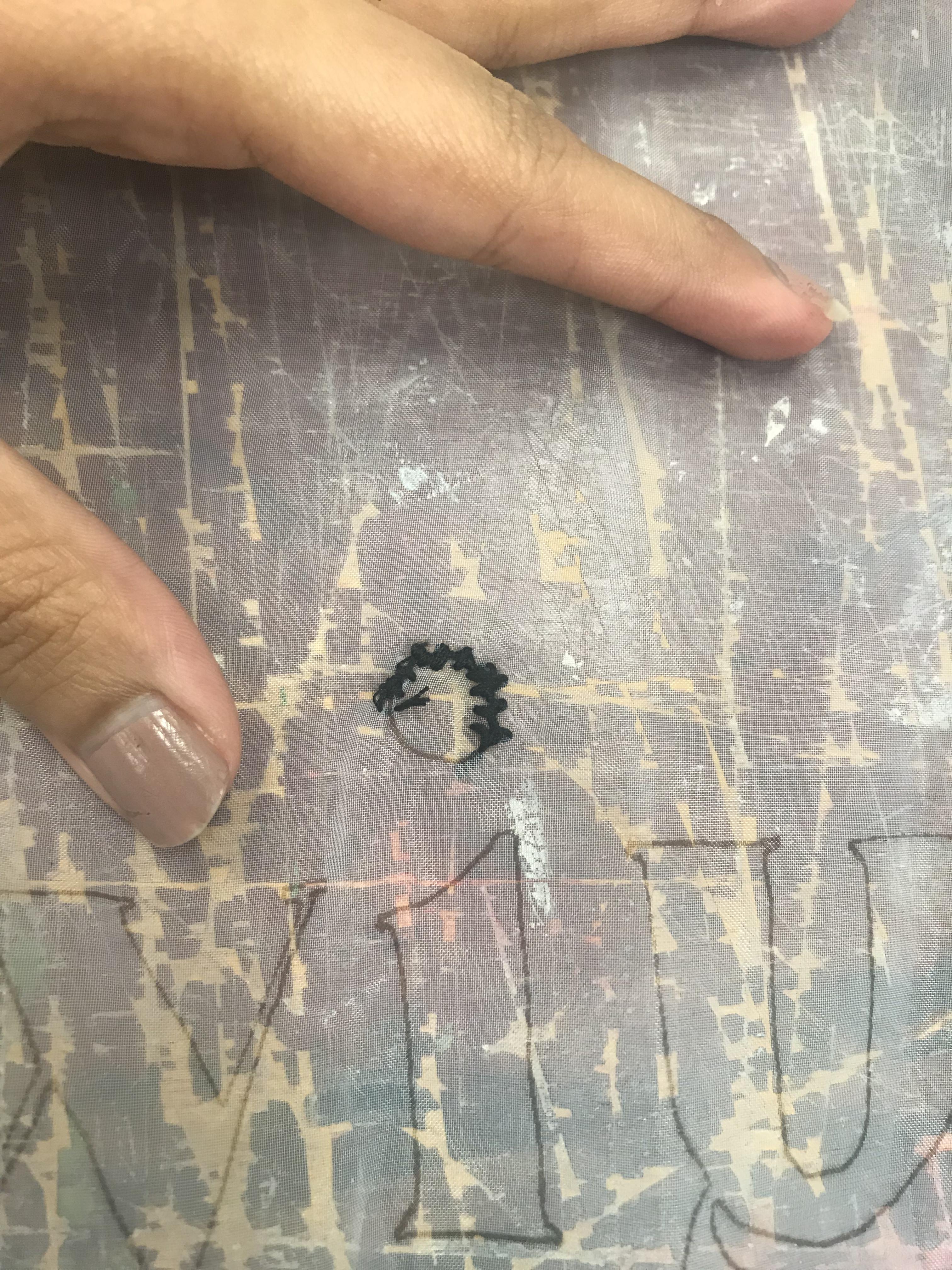
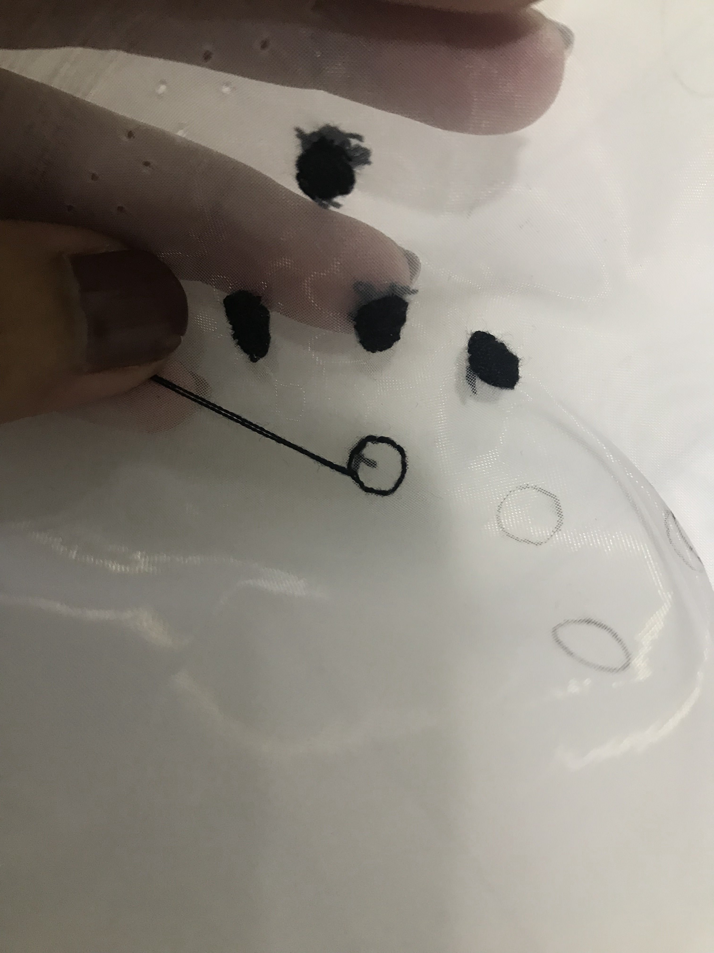
After which, I proceeded to mark the areas I wanted to hammer nails in. This was a challenge because the placements of the points were purely instinctive.
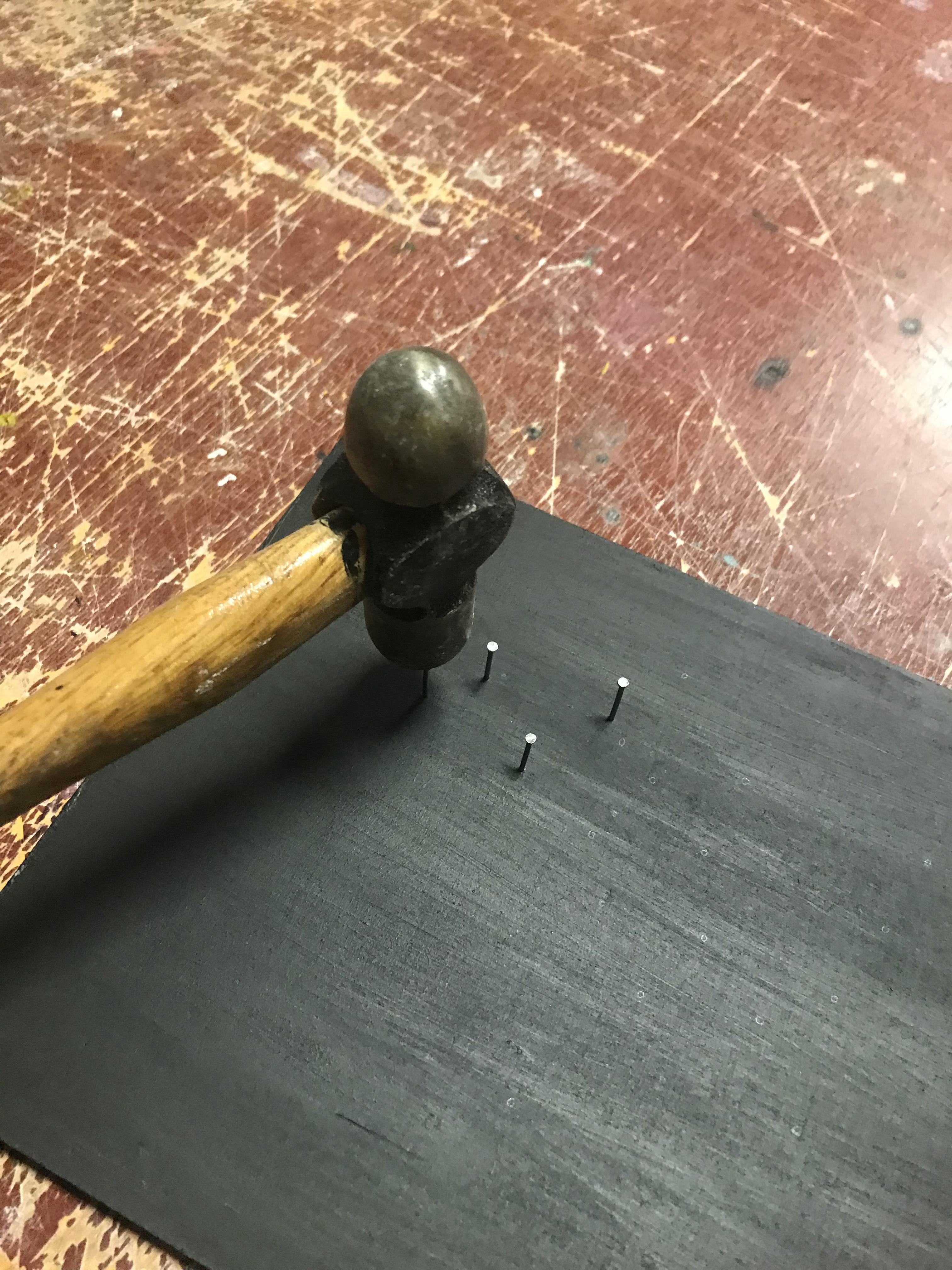
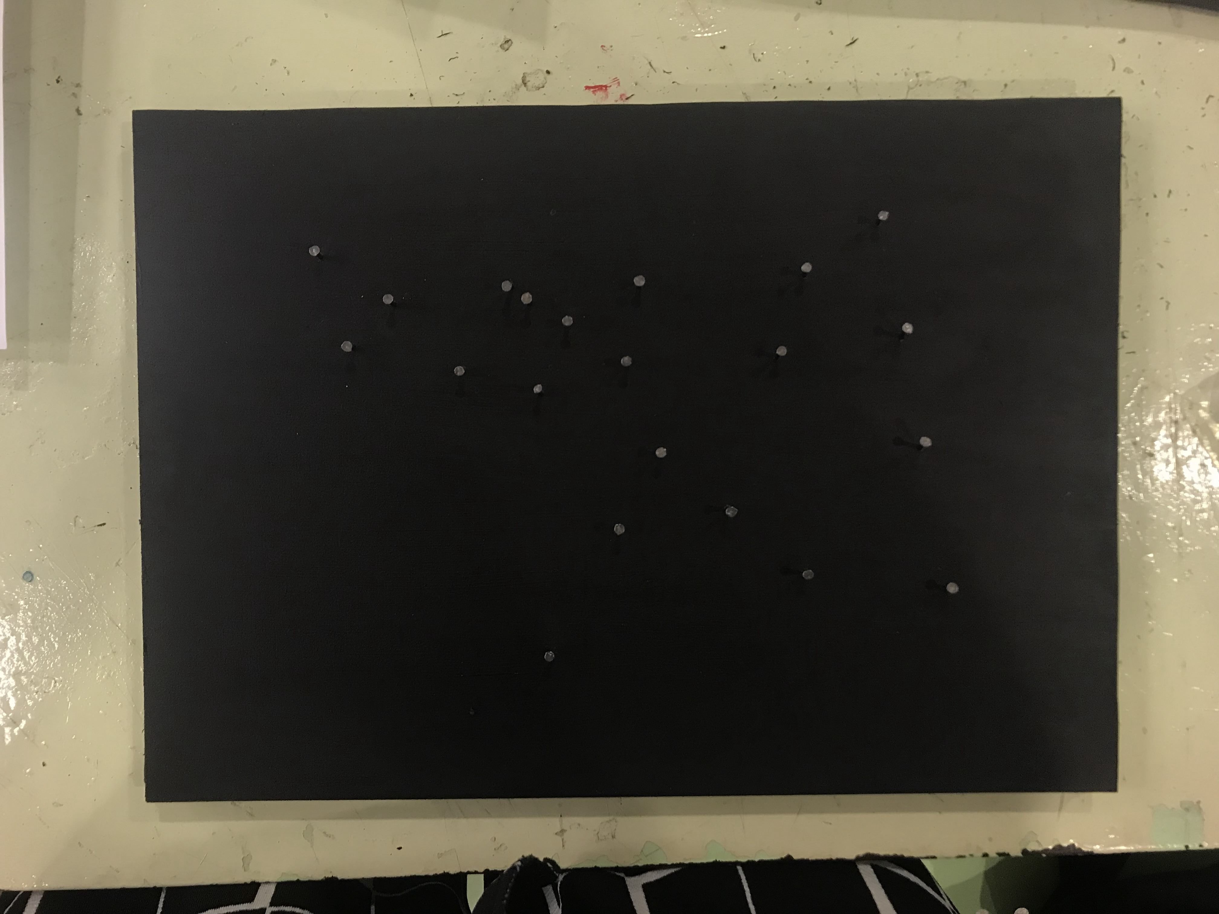
I then coiled regular sewing thread around the points and this was coiled a couple of times to make it slightly thicker than I originally planned.
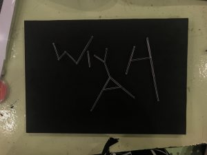
I wanted this to go minimal in design for this but this turned out to be way more plain that I had anticipated. Therefore, I decided to add specks of white and blue paint as the background to create depth. These mainly act as the millions of stars seen in galaxies.
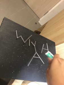
I tested the use watercolour and flicks of the toothbrush on a black surface. When I was ready, I started doing it on the board. This helped to amplify the idea and imagery of galaxy which relates back to Astronomy., together with the constellation of my text.

Recent Comments