Zine – Newton

A comic! That was what I wanted to do for my Zine for the town of Newton.

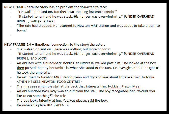
Above is the basic storyline I had drafted out for my Zine when I decided to do a comic. I also decided to use an illustration style based on my inspirations which I will talk about below.

Other simpler scrapped ideas

Inspiration / Artist References

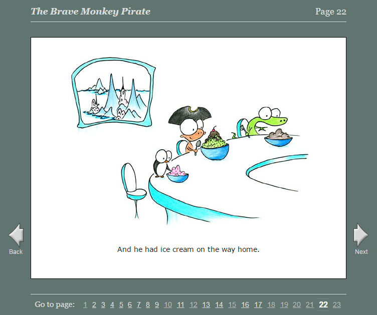
During my first consultation I was told that I could look at children’s storybooks such as the Ugly Duckling and the like. I thought it’d be interest to go back to not just see how these stories were crafted but also see how they were drawn and illustrated.

So I visited this website: http://www.magickeys.com/books/

It’s an online website of various children storybooks. I was amazed. My favourite book is ‘Brave Monkey’ because it has a very meaningful story and that was what I wanted to do for my Zine as well, something meaningful. Aside from looking at their art style, I was also looking at how they used their text and the placement of it. I wanted to see how they did their layout.

I wasn’t able to think of a story very easily since while the place itself was interesting, they were all fragmented events – eg touting, renovations, they were events that were either too short or boring to develop into a concrete idea. So I decided to draw from my experience – the kindness I experienced from the old lady who talked to me and even treated me to drinks and a meal later, as well as how closely knit the community is for the Auntie. As such, I decided to do something that revolves around the compassion of the people there and write a story about kindness, which is something I felt about the auntie on my visits there and how helpful she was. So that was my theme for my zine – kindness, with a quote that I wrote down to inspire myself:

“in one way or another, we are all looked after”

Draft comic in early stage

So I got my first story draft, but the story was very lame and underdeveloped.

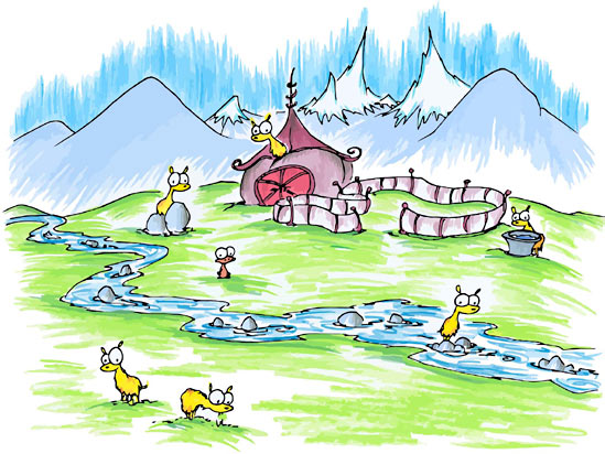
That was before I got into reading deeper into children storybooks and also taking a look at Little Big Books to see if I could get inspired too. I note down stories that made me interested and emotionally invested in the characters. For example, on that website, I noted these two stories:

  • Invisible Alligators – has a morale, and lovely ending statement
  • Wolstencroft – Very touching ending that is very rewarding because the story really exaggerates the problem

I saw that the stories there have a main character that guides the story along. They also presented their main character with a problem that they had to solve, something which my story did not initially have, making the world a little too ‘perfect’ for my character.

So I added new frames to add a little more depth to the story.

Colours / Drawing

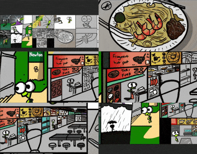
The colours I used were mostly extracted from the original images I had. I bumped up the saturation so it would look more attractive and colourful, especially for the food and also to go in line with my inspiration. However, looking back, I think I could have used colours a lot better for some of the frames.
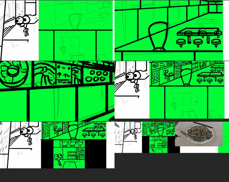
I also kept in mind what I learnt with how the Pingu character was drawn in the previous semester so it’s great to be able to link with previous assignments.

Converting live images to illustration Printing Process
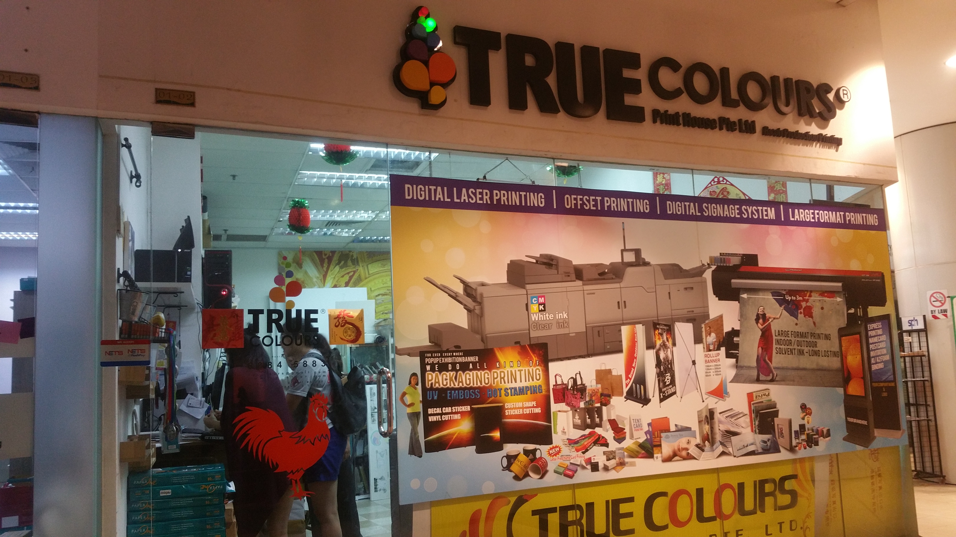
I went to TrueColors at Bugis to get my Zine printed. It was quite a nightmarish process for me actually. I believe for most of us this is our first time printing Zines but I felt a little less unprepared for it than I could have. Problems I faced with printing zines were aplenty.

My first printout was actually in A3 because of miscommunication. I passed the person in the printing shop A3 paper, but they thought that I wanted an A3 size booklet. This was also my fault as I did not set a correct resolution in photoshop. The size I had set was incorrect and I had used the wrong DPI for my photoshop file, leading to the size of the zine being closer to A3 than it was to A4. Thankfully I could still fix this.

The second mistake I made was that some of my text were too close to the edge of the paper so when my zine was printed and cut, some of the text were actually cropped off! It was my mistake as I had not thought about how close the text was to the edges.

I went to edit my Zine on the spot to change the affected text, but for some reason, the cutting was inconsistent and another part of the Zine now had their text were very close to the edge even though it was previously okay. At this point I had already printed three copies and spent $12 so I decided to just deal with it as the cutting was a little inconsistent and I didn’t want to risk it getting worse.

The final mistake I made was realised only on the day of presentation itself that my paper was actually not the 80 gsm that was listed on the store. I had somehow gotten 250 gsm paper? Which had me totally shocked and caught me off guard. I guess this is a huge lesson for me to check carefully and also perhaps bring a sample of 80 gsm paper along for me to compare so I know how to feel the difference.

Despite all this, I am really thankful to the staff at TrueColours. It was really late at night when I went there. Even though they kind of scolded or chided me for coming so unprepared, I think they’re really kind to help me despite them being so busy. I am really thankful that they helped me get my Zine printed wonderfully. Then I went to have my dinner at McDonald because no place was open that late.

Just a coincidental photo I took. There you can see my Zine on the table behind my late night meal

So nevertheless even though I actually wanted to raise my hand when the question “Who regretted their choice of paper?” was asked in class, this is just a very good experience for me to see for myself the different types of paper to print Zines on as choice of paper had never been something I considered much before and something I had always overlooked in previous assignments.

Reflection

I think one way I was really hoping to learn by the end of this module (Foundation 2D) is how it actually ties in to our careers. Unfortunately, I wasn’t able to link many things to Animation or Interactive media, my first and second choice of major respectively and am as such left with plenty of questions as to how this will help me develop as an artist in those aspects. Definitely I learned something along the way of course, but I still feel a lot of wasted learning potential. I could have learnt so much more if I knew what to look out for and what will help contribute to my career so that I can focus and improve my learning experience in my 1 year in foundation term as I still feel there is much I need to do to prepare myself before streaming into our majors.

Overall, printing this zine (along with the typography assignment) was a good learning experience for me and after 1 year of foundation, we are now going to stream into our majors. I am curious to see what awaits us.

Thank you Mimi for guiding me through my first and most important foundation year!

A Dream – Picture Story

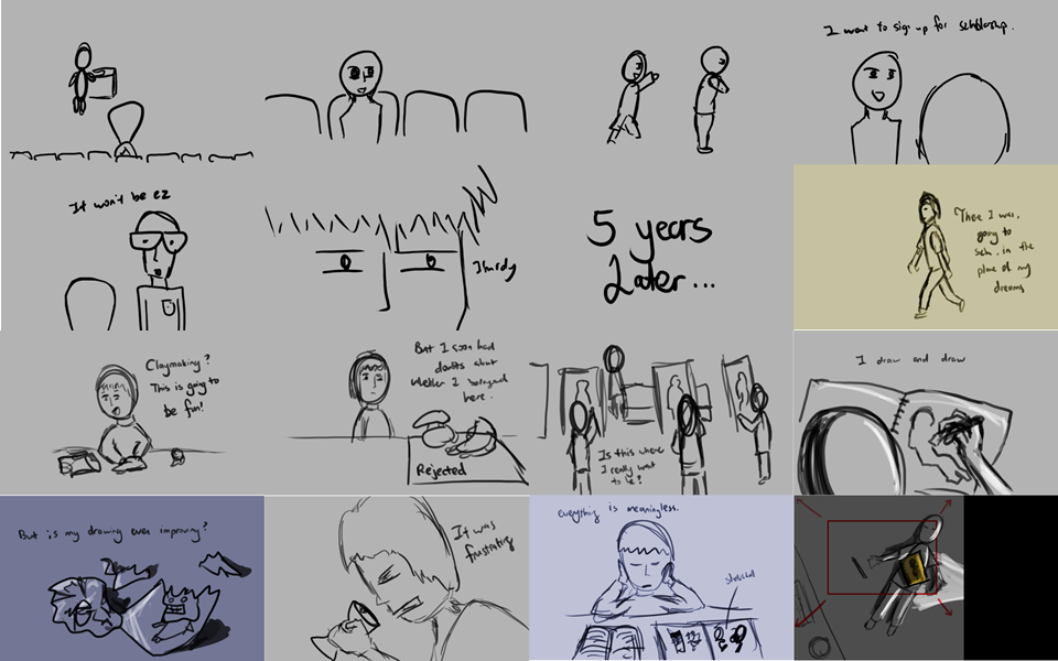
This is a short picture story about a kid with a dream. I made this and chose this story in hopes that it will be something that people can relate to, whether you are studying in the arts or not – as everyone has a dream that is greatly linked to one’s motivation.

A Hero’s Journey

The story follows the Hero’s Journey and 3 ACT structure:

3act

Prior to learning about the Hero’s Journey, I had a rough story that I had drawn the storyboard for. But after taking a look at the 3 ACT structure and the Hero’s Journey which we had learned, I made changes based on it to improve the story, like adding in another layer of ‘problems’ that the main character (hero) would have to face and resolve, to raise the stakes and to give the story more depth than before.

Visual Structure

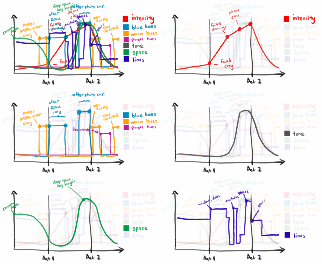
I also saw how a story can be communicated more effectively through visual structure.

story-visual-structureHues

I used warm hues to represent the happier moments in the story -when the hero first enters his dream university (ADM) in ACT 1, when he sees his turtle at the end of ACT 2, and for his final resolution in ACT 3.

I used blue hues for moments when the character is feeling  depressed and at his lowest point (after he receives a phone call that he is going to lose his scholarship and school placement).

Lastly, purple hues represented the flashback scene.

Tone

I also used tone, something which I had not explored previously. I increased the contrast gradually as the story’s intensity increased, and is most noticeable in the chiaroscuro lighting used in the drawing scenes.

Space

I also wanted to use deep space to represent that the character was in deep thought, when he looks back at the school that he is about to be expelled from in ACT 2.

Lines

Finally, I used horizontal lines to imply tension -seen in lines in the curtain and the staircase. I think this is a detail I could have explored more and trained my eyes to notice when shooting pictures for my story.

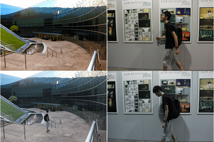
Lastly, I also played with repetition, by repeating the same scene in a different act of the story (ACT 1 vs ACT 2), to show the contrast in the character’s mood (motivated vs demotivated) and exaggerate the difference between the scenes.

image-1

Storyboard

boardofstories boardofstories2

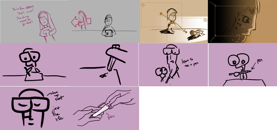
A storyboard that I had drawn, highlighting in colour tones I wanted for certain scenes.

Research

As for research/inspiration, I remembered that in class, there were mentions of directors who turn to real life to get story inspiration as they are very close to the heart and are thus very authentic in the emotions they can evoke. Thus, this was how I decided to get my inspiration for the story I had created for my hero – A Hero’s Journey.

Credits

Additionally, here are some extra credits to thank the following people who appeared in the video and were not mentioned in the video’s credits (my apologies!):

Nevin as Niven

Ruyi as Yiru Secondary School

Thank you for watching my picture story!


A Turtle on the Beach

This story is about an object that is close to my heart, and the object is none other than a turtle.

IMG_1681
Say Hi

But this turtle is more than just an object, it is a representation of something bigger.

When I was young, in Primary 4, they used to have these “assemblies” on Wednesdays where everyone in the school would gather in the hall, and usually someone from outside would present on stage to us – the items vary a lot and usually have no relation to school – from sex education, to performances.

One day there was man who came in, and a huge projector screen draped down behind him. He sat in front of the projector and he took out a sheet of blank paper.

He took out a pencil and we all could see on the screen what he was drawing – and it was a turtle. Turns out the guy is a cartoonist!

He began to draw another variation of the turtle, explaining “If you want to make the character cute, you draw the head bigger than the body”.

I was fascinated.

He then continued to draw more turtles, illustrating how changing the eyebrows and the eyes convey different moods and emotions.

Around me, people were getting bored, but I was just sitting there listening. I took out my book and I remember trying to follow his drawings and taking notes. “Head bigger than body”

When I got home, I started to draw turtles, inventing my own emotions and style. I started with characters, then I would cut out these characters and form a story with the different turtles – a turtle was happy, he met a girl turtle, he got rejected, he became sad, then he went on to train up and be strong, but the girl found another turtle. I started to draw comics based on these and I still am drawing comics now with turtles as my characters. Since then I’ve used turtles as characters in comics and even in games that I made.

So this turtle is a representation of me. Without it, I would be a very different person and I might even question whether I would be here at ADM.

It’s all thanks to the cartoonist and his turtle that made me the way I am today. I still draw turtles today, and use turtles in the comics that I draw and even used a turtle as a main character in a story driven game I had made.

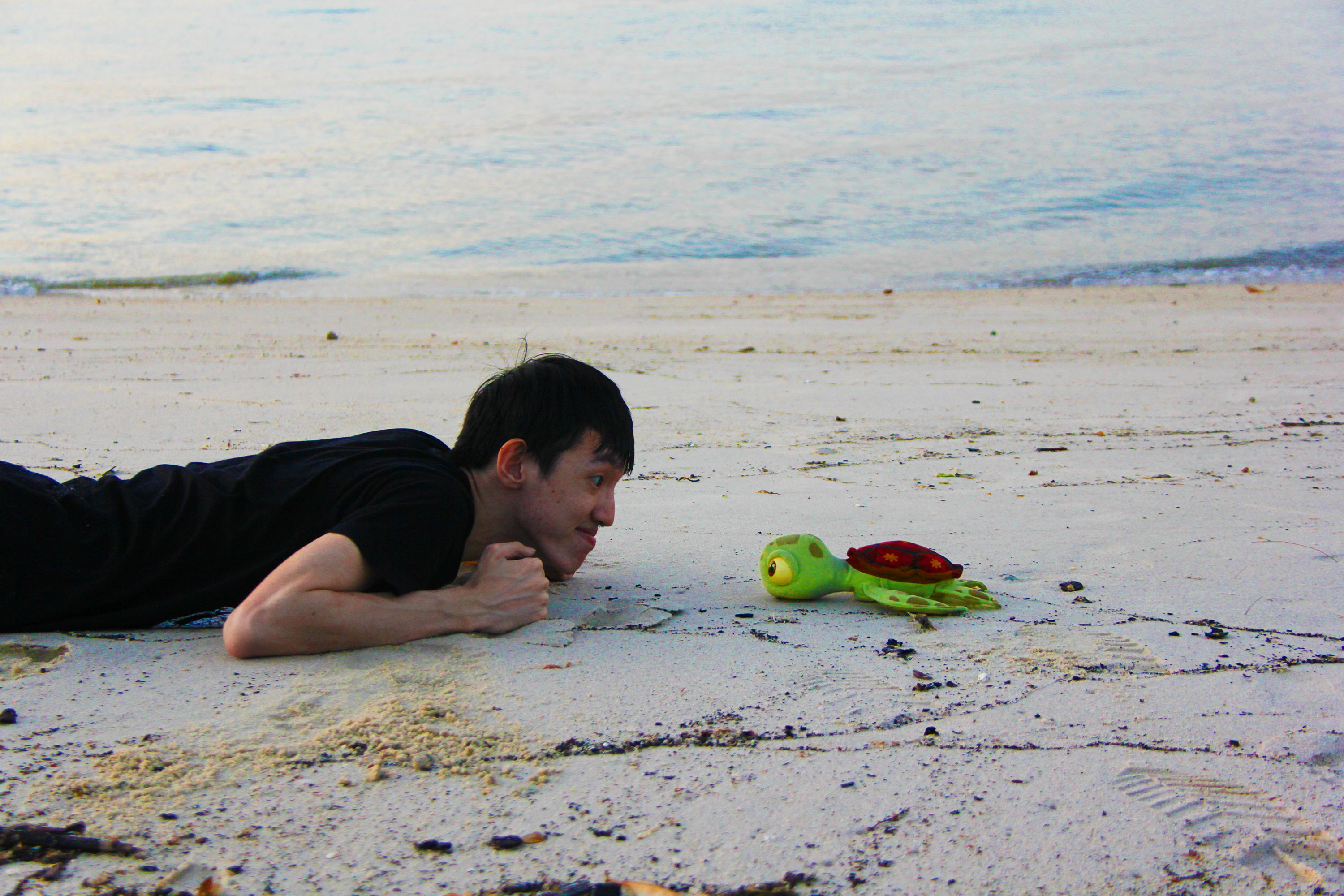
And so, on my trip to the beach recently, I decided to bring my little friend along.

Object_01_V2
I think back to the time we first met each other, curious and excited.
Object_02
And the strong friendship we had forged in the time that we had spent together.
Object_03
It has been years but here we are. There were tough times, but together I believe we can conquer what is to come!

The Beach

MyWorld_001

The beach had always been a kind of peaceful retreat for me. When I was really young, my parents would bring me to the beach and some of my childhood memories came from that place. I remember there was one Art and Craft activity in Primary School where the teacher wanted us to draw a place based on what we feel. I said I was going to draw a beach and the teacher presumed that I was happy and joyful, which wasn’t wrong. To the teacher, the beach is a lively place where families spend time together, being happy and together. But my impression of the beach is more like a haven that I go to spend time with myself. A place where I can be alone. The beach and the sea is a very unique place and I believe everyone has different interpretations of the beach.

On the beach, I feel carefree, and when I’m there, I allow myself to not worry about the problems of life or its stresses. I can sit in the sand and just reflect endlessly. I clear my thoughts and get rid of a lot of “junk” in my head. Because I hadn’t gone to the beach in a long time (and actually failed to plan a trip there prior to the start of Uni), when I was actually there I saw kids building sandcastles and I actually had the urge to build sandcastles, just to go back to those happy childhood times.

MyWorld_05

And here are some of the pictures I took when I was there.

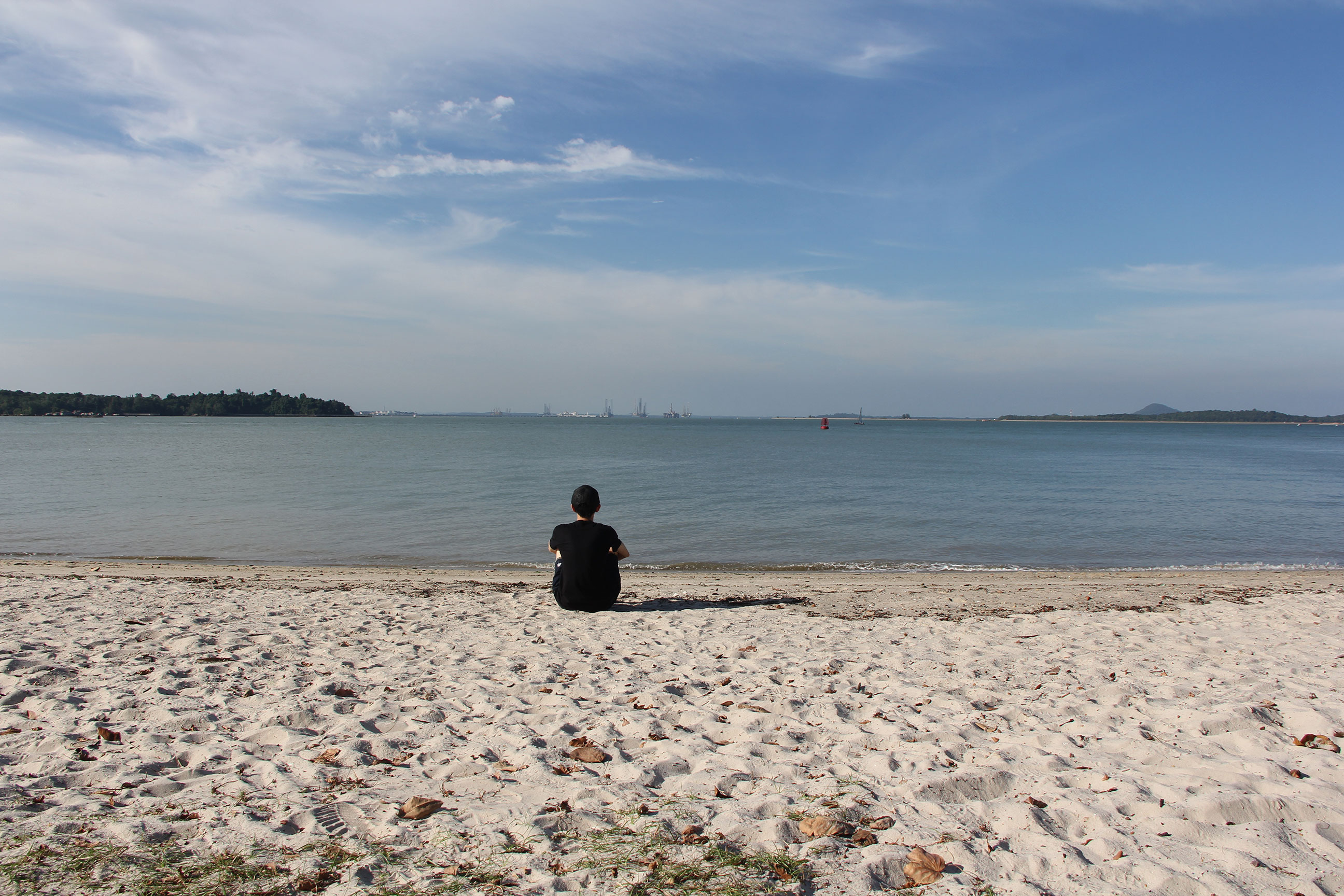
The sea is a magnificent place. It has several different interpretations to people, just like how it was for my Arts and Craft teacher years ago. To me, I wanted this shot to show the vastness of the sea and how I can sit there reflecting and thinking endlessly.

MyWorld_04
Watching the sun set timelessly

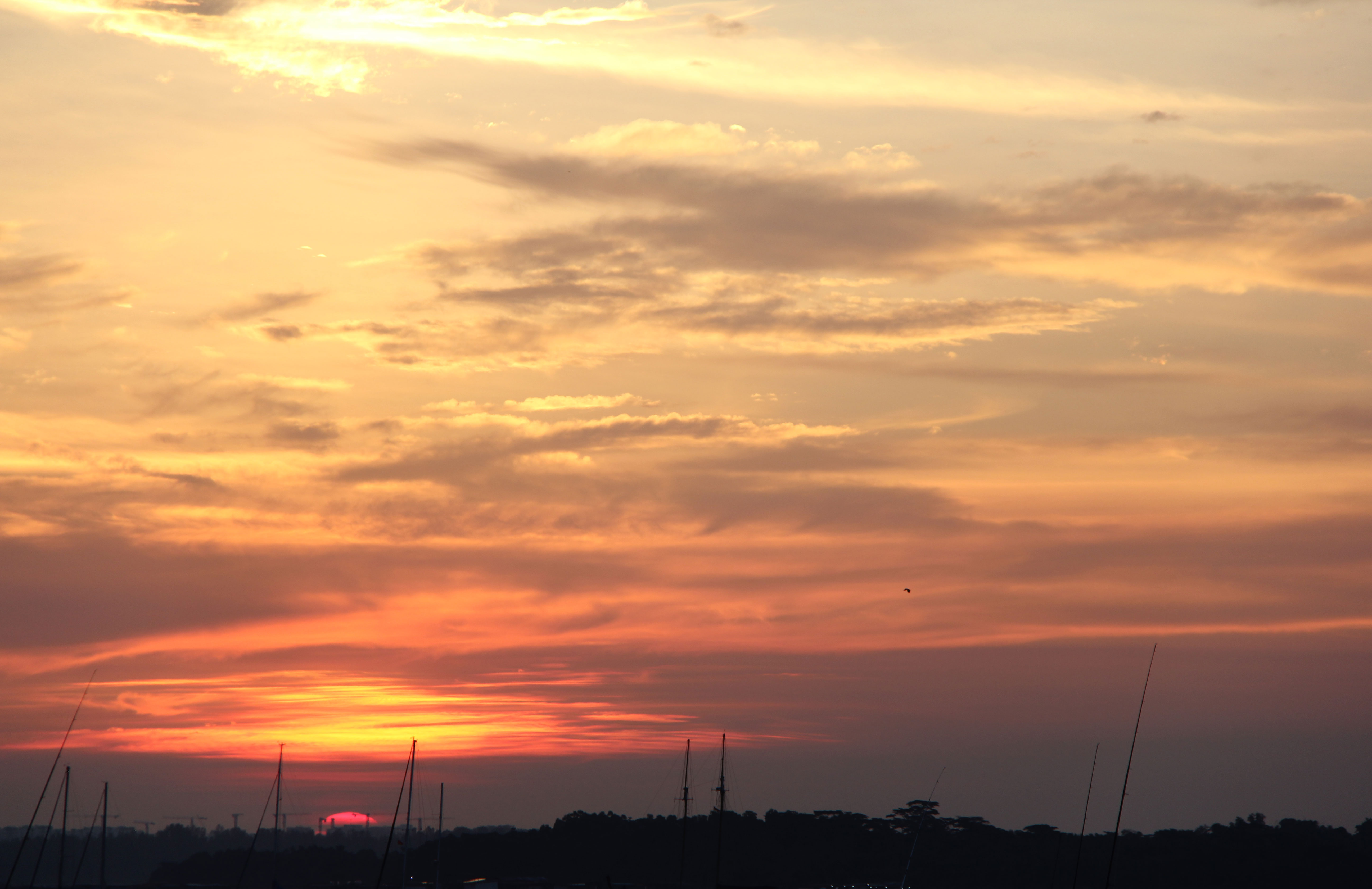
Sunsets are special. They leave us in awe, are inspiring and the colours just evoke special emotions within us. While I was there, capturing other photos of the beautiful sunset, so were other people. The sunset is a timeless moment that suspends us. To me, looking into the sunset is like taking a peek into the future – it’s magical and you never know what will happen tomorrow and what possibilities await you.

MyWorld_03

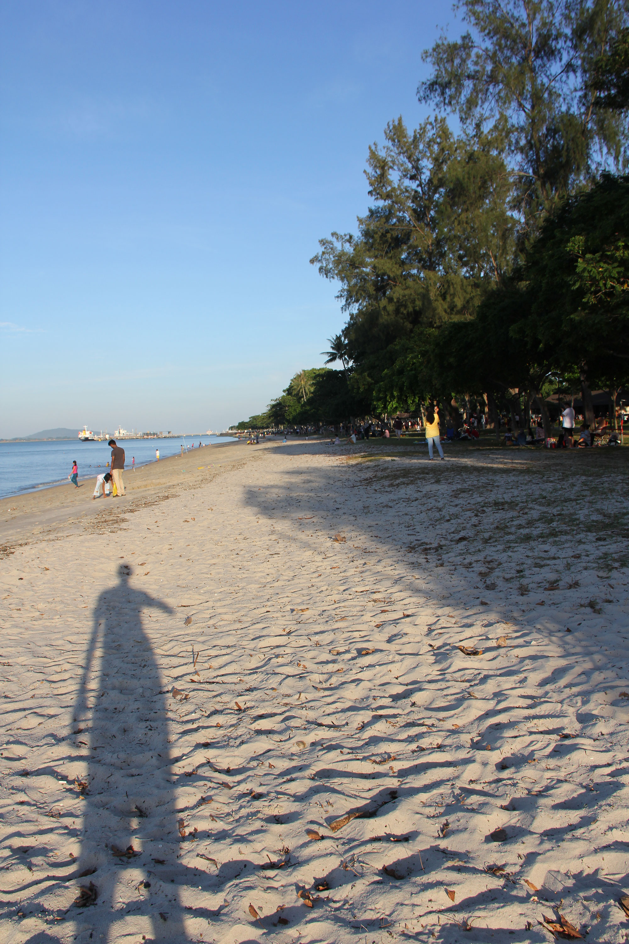
The final photo is of me looking back into my past which I have chosen to present with a long shadow that drapes behind us when we turn back.

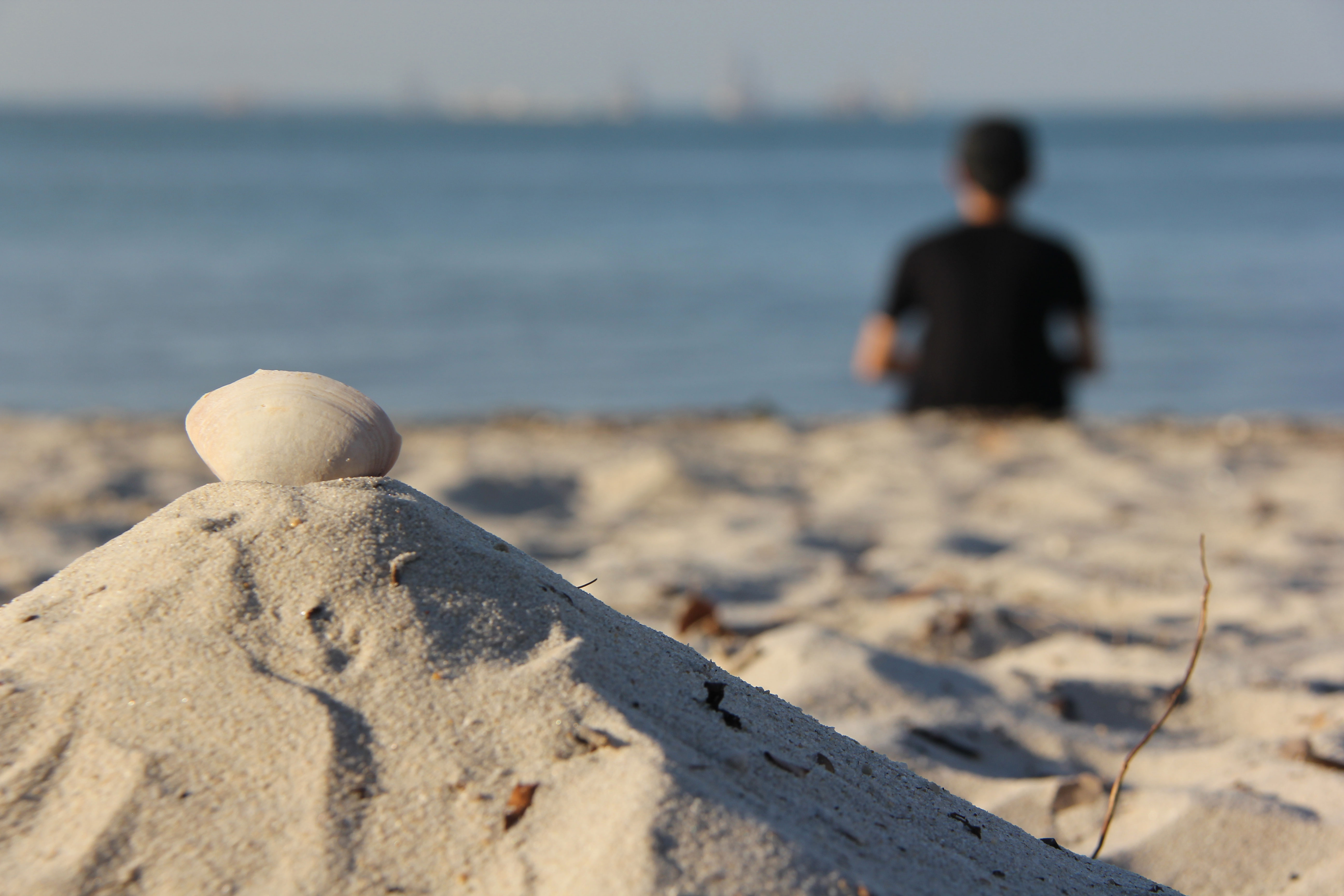
Just to end off, this was a bonus picture I was taking, just out of fun:

MyWorld_02

I was playing with depth of field with this one. I personally liked it but I felt that it might not fit the assignment brief of it being “My World” as the world was not being made the focus enough.

Shoes

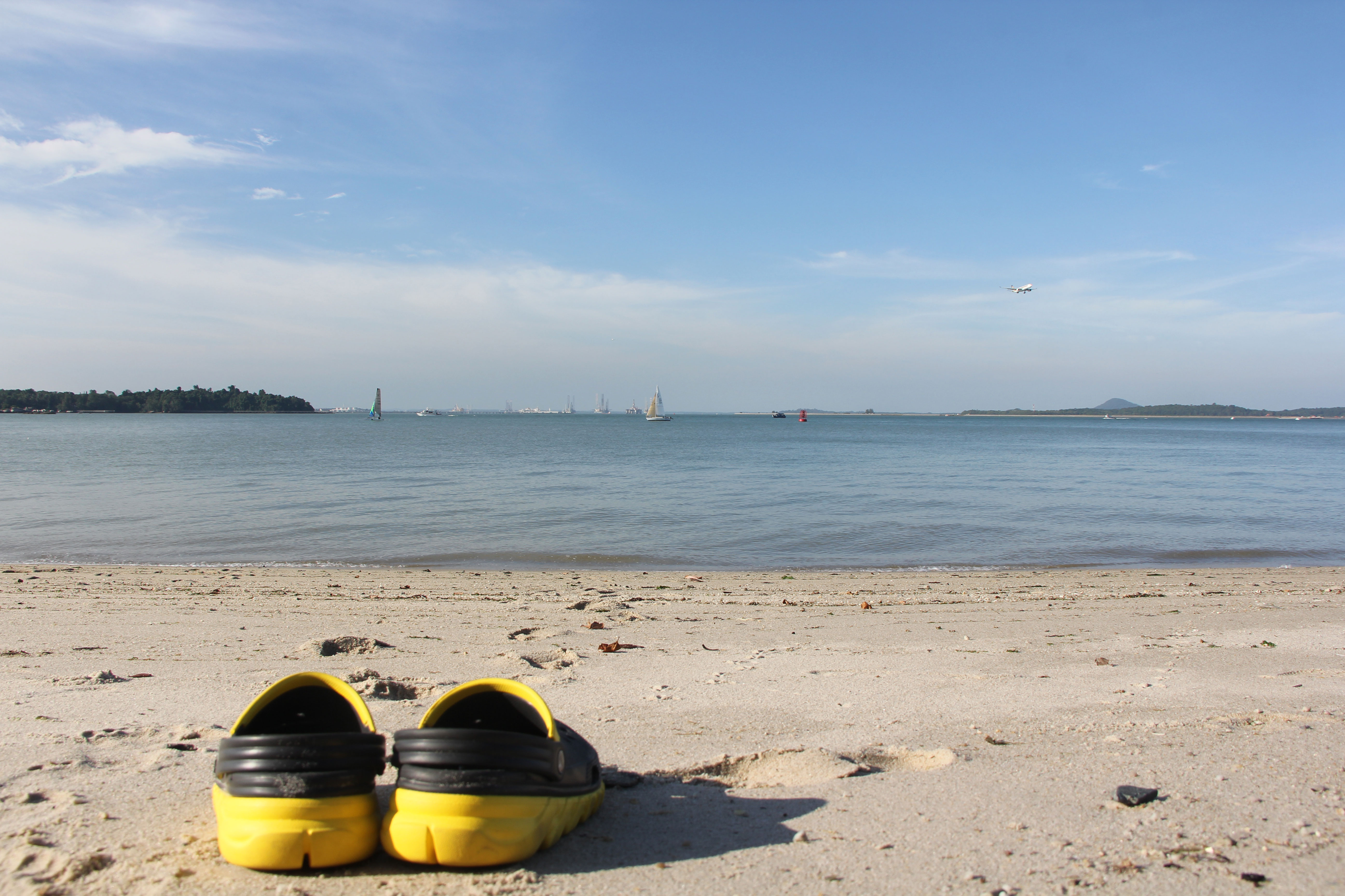
Above is also another shot omitted from the final three I had chosen, composing of a pair of brightly coloured flocks as the focal point and subtle footprints in the sand leading out from it toward the sea.

Learning Outcomes

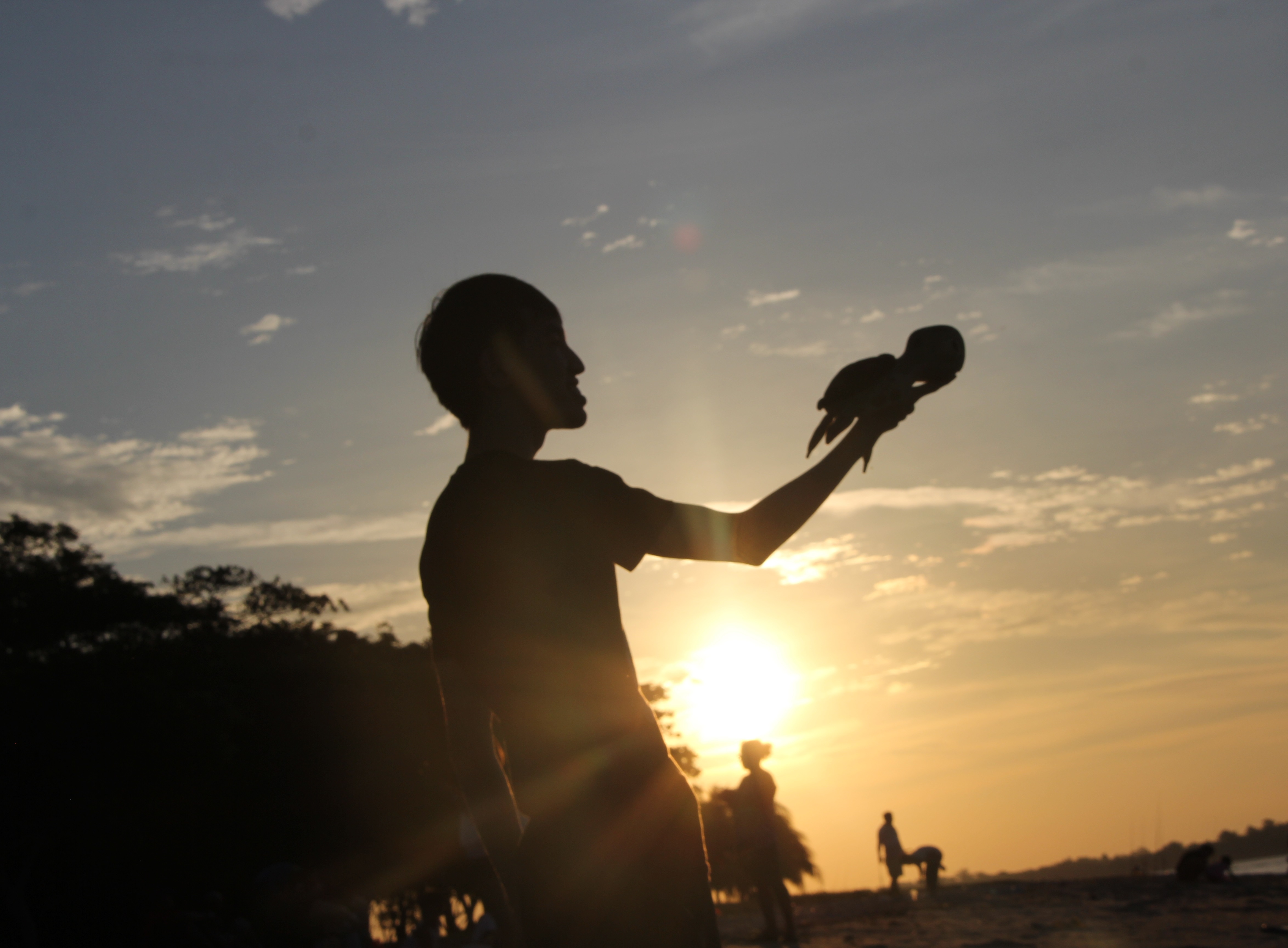
This assignment made me learn that body language plays a big role in portraying a particular message, such as using it to convey friendship in the 3 pictures with my turtle.

Looking at some of my peers’ work and references below, I also saw how colours could be used to bring out and stir certain emotions within us, and how a colour palette can even be used to give your work a certain style or flow. It was definitely helpful and insightful to look at everyone’s work pinned up in a gallery-like way and see the different thought processes put into them.

References

To help me in my process and also post review work, I decided to look up some references on how I can improve myself. I looked at animated films for this work.

Pixar-Turtle
That turtle is famous, dude!

I had done some research and above you can see how the colours used in a Pixar film like Finding Nemo are more bright and vibrant to appeal to its target audience. After reviewing my original photos, I had realized that my colour palette was not sufficiently vibrant so I had to improve it.

LionKing_LiftingSimba

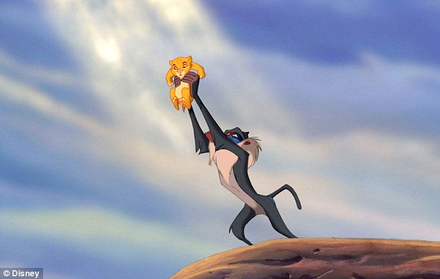
Above is a famous scene from Lion King when Simba is lifted into the air. You can see the reference in the third picture with my turtle where I lift my turtle into the air against the grand sunset.

As a reward for reading all the way to the bottom, I leave you with this (hopefully) inspiring picture of the sunset which I had taken on the beach on my trip there!

Sunset
Best reward ever, agree? No? Alright…

I was a little late and had to run with my tripod and camera so I had missed some potential shots with the sun higher up before setting below the horizon.