Zine – Newton

A comic! That was what I wanted to do for my Zine for the town of Newton.

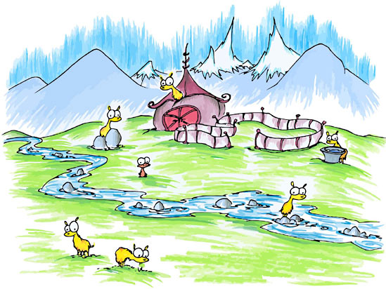
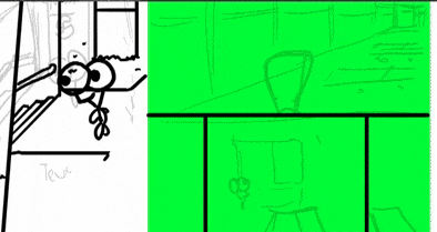
Above is the basic storyline I had drafted out for my Zine when I decided to do a comic. I also decided to use an illustration style based on my inspirations which I will talk about below.

Other simpler scrapped ideas

Inspiration / Artist References

During my first consultation I was told that I could look at children’s storybooks such as the Ugly Duckling and the like. I thought it’d be interest to go back to not just see how these stories were crafted but also see how they were drawn and illustrated.

So I visited this website: http://www.magickeys.com/books/

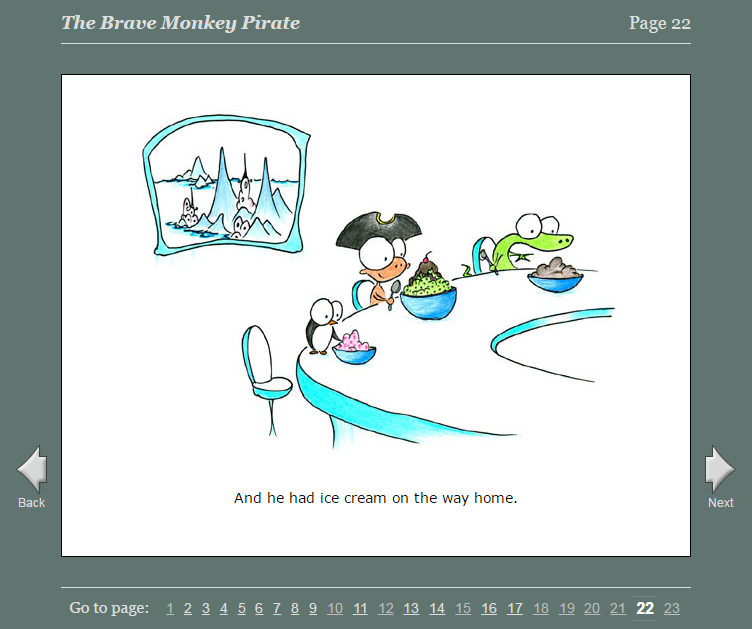
It’s an online website of various children storybooks. I was amazed. My favourite book is ‘Brave Monkey’ because it has a very meaningful story and that was what I wanted to do for my Zine as well, something meaningful. Aside from looking at their art style, I was also looking at how they used their text and the placement of it. I wanted to see how they did their layout.

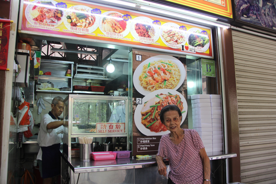
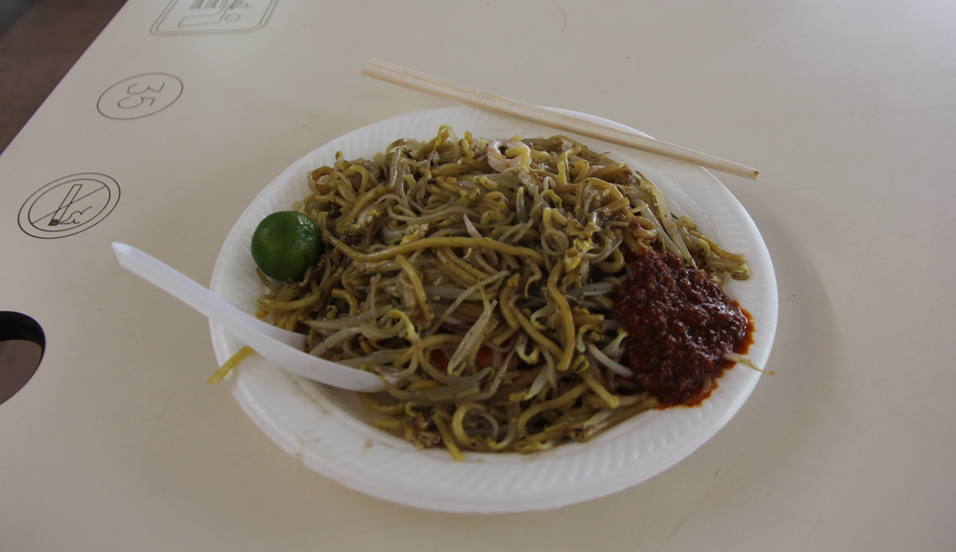
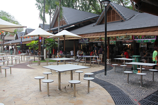
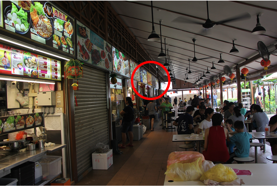
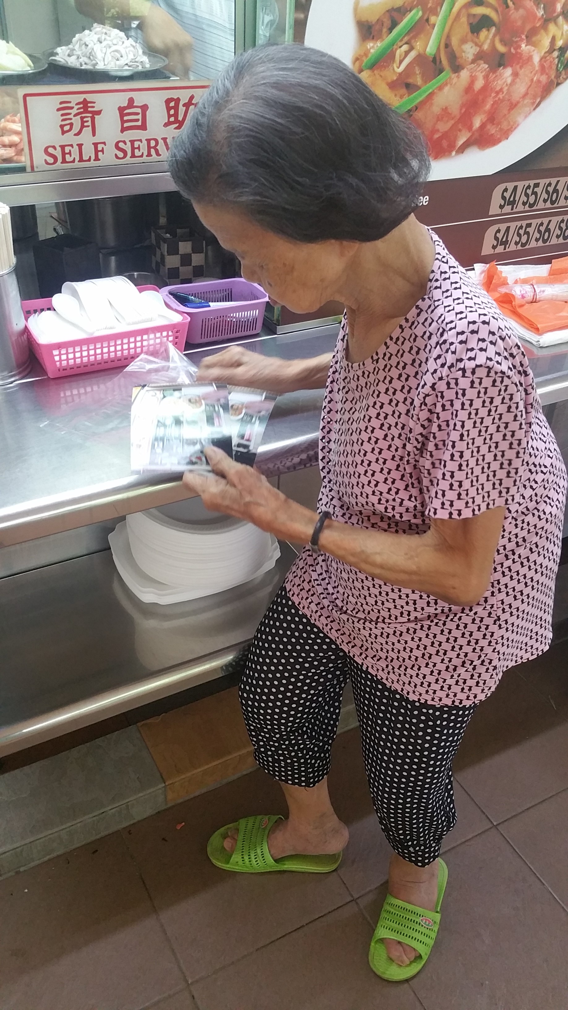
I wasn’t able to think of a story very easily since while the place itself was interesting, they were all fragmented events – eg touting, renovations, they were events that were either too short or boring to develop into a concrete idea. So I decided to draw from my experience – the kindness I experienced from the old lady who talked to me and even treated me to drinks and a meal later, as well as how closely knit the community is for the Auntie. As such, I decided to do something that revolves around the compassion of the people there and write a story about kindness, which is something I felt about the auntie on my visits there and how helpful she was. So that was my theme for my zine – kindness, with a quote that I wrote down to inspire myself:

“in one way or another, we are all looked after”

Draft comic in early stage

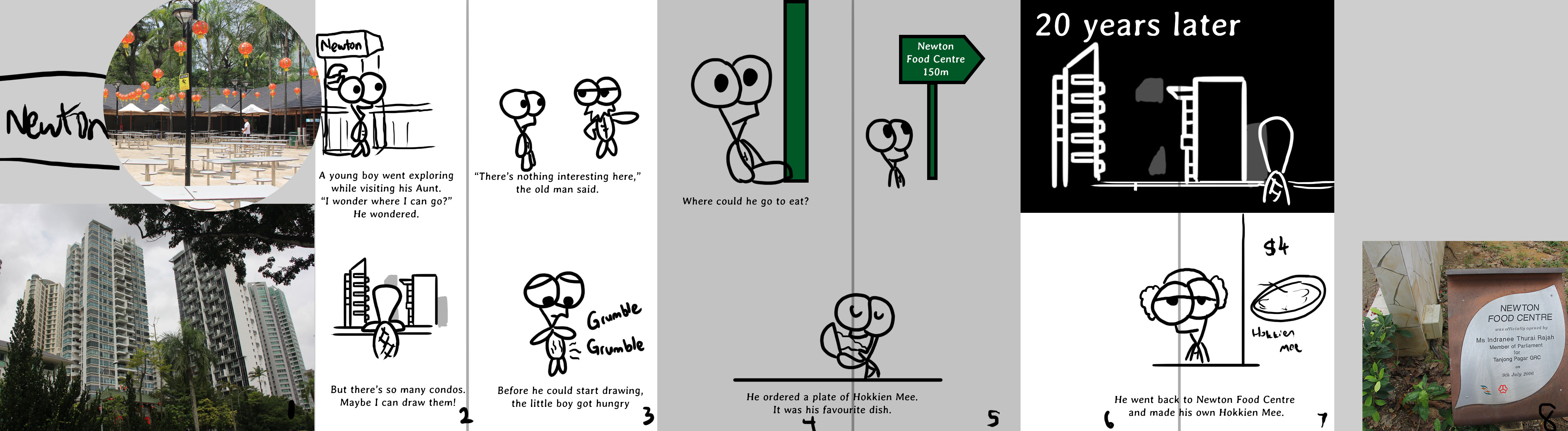
So I got my first story draft, but the story was very lame and underdeveloped.

That was before I got into reading deeper into children storybooks and also taking a look at Little Big Books to see if I could get inspired too. I note down stories that made me interested and emotionally invested in the characters. For example, on that website, I noted these two stories:

  • Invisible Alligators – has a morale, and lovely ending statement
  • Wolstencroft – Very touching ending that is very rewarding because the story really exaggerates the problem

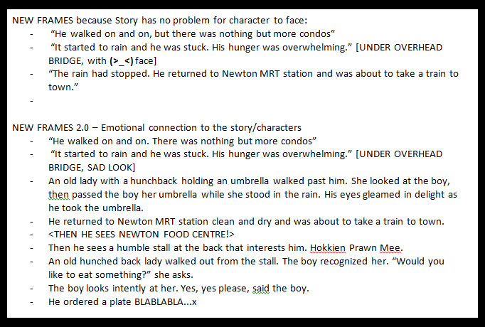
I saw that the stories there have a main character that guides the story along. They also presented their main character with a problem that they had to solve, something which my story did not initially have, making the world a little too ‘perfect’ for my character.

So I added new frames to add a little more depth to the story.
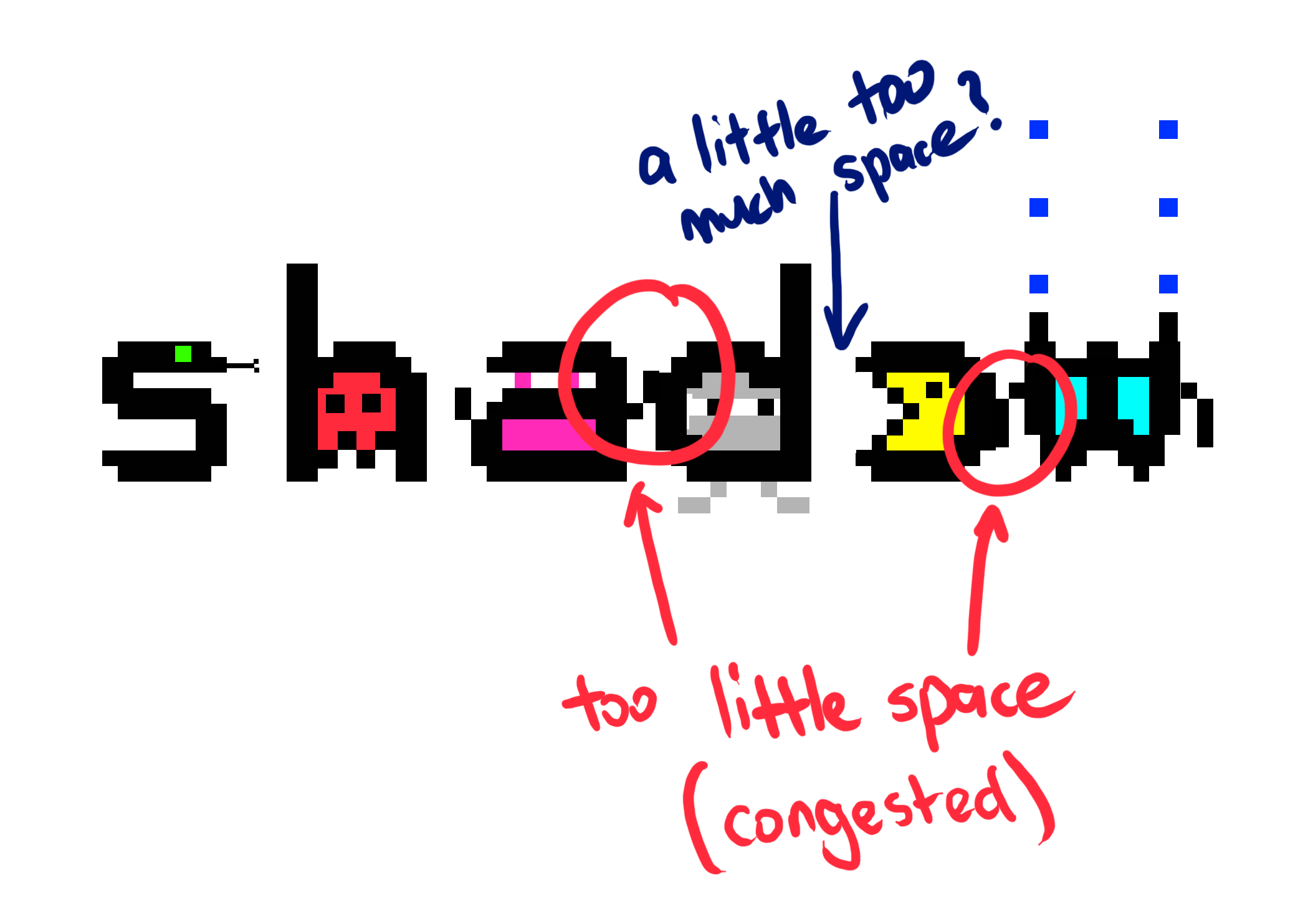
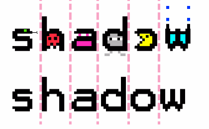
Colours / Drawing

The colours I used were mostly extracted from the original images I had. I bumped up the saturation so it would look more attractive and colourful, especially for the food and also to go in line with my inspiration. However, looking back, I think I could have used colours a lot better for some of the frames.

I also kept in mind what I learnt with how the Pingu character was drawn in the previous semester so it’s great to be able to link with previous assignments.

Converting live images to illustration Printing Process

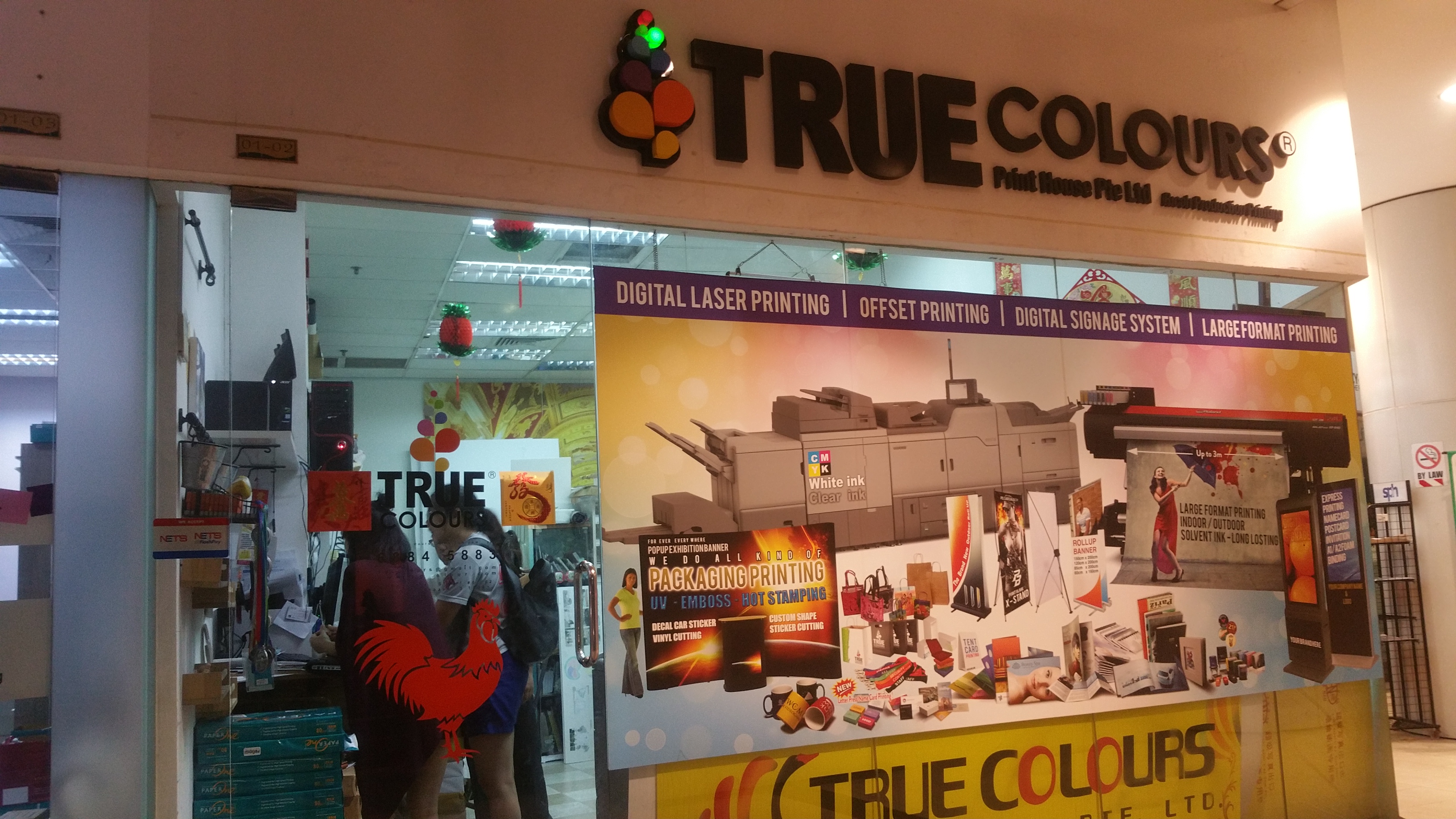
I went to TrueColors at Bugis to get my Zine printed. It was quite a nightmarish process for me actually. I believe for most of us this is our first time printing Zines but I felt a little less unprepared for it than I could have. Problems I faced with printing zines were aplenty.

My first printout was actually in A3 because of miscommunication. I passed the person in the printing shop A3 paper, but they thought that I wanted an A3 size booklet. This was also my fault as I did not set a correct resolution in photoshop. The size I had set was incorrect and I had used the wrong DPI for my photoshop file, leading to the size of the zine being closer to A3 than it was to A4. Thankfully I could still fix this.

The second mistake I made was that some of my text were too close to the edge of the paper so when my zine was printed and cut, some of the text were actually cropped off! It was my mistake as I had not thought about how close the text was to the edges.

I went to edit my Zine on the spot to change the affected text, but for some reason, the cutting was inconsistent and another part of the Zine now had their text were very close to the edge even though it was previously okay. At this point I had already printed three copies and spent $12 so I decided to just deal with it as the cutting was a little inconsistent and I didn’t want to risk it getting worse.

The final mistake I made was realised only on the day of presentation itself that my paper was actually not the 80 gsm that was listed on the store. I had somehow gotten 250 gsm paper? Which had me totally shocked and caught me off guard. I guess this is a huge lesson for me to check carefully and also perhaps bring a sample of 80 gsm paper along for me to compare so I know how to feel the difference.

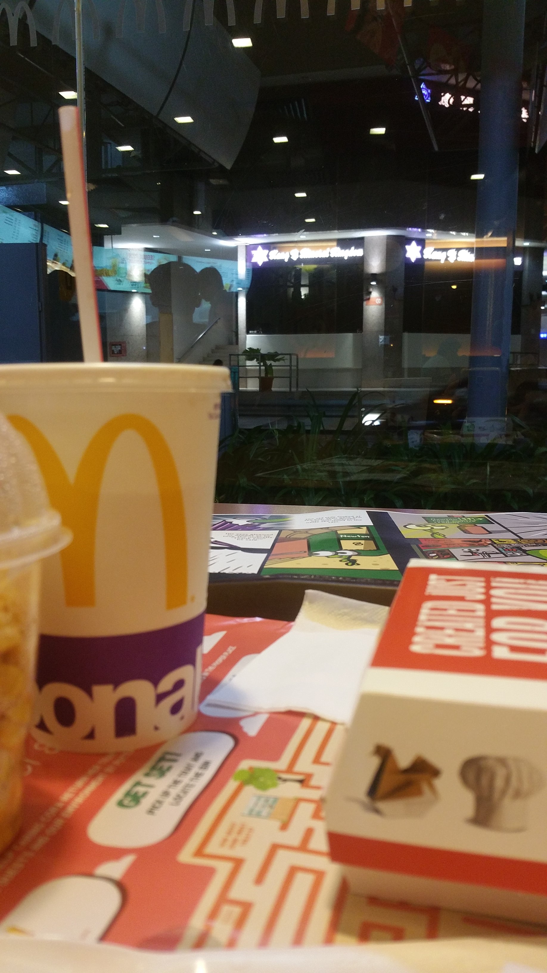
Despite all this, I am really thankful to the staff at TrueColours. It was really late at night when I went there. Even though they kind of scolded or chided me for coming so unprepared, I think they’re really kind to help me despite them being so busy. I am really thankful that they helped me get my Zine printed wonderfully. Then I went to have my dinner at McDonald because no place was open that late.

Just a coincidental photo I took. There you can see my Zine on the table behind my late night meal

So nevertheless even though I actually wanted to raise my hand when the question “Who regretted their choice of paper?” was asked in class, this is just a very good experience for me to see for myself the different types of paper to print Zines on as choice of paper had never been something I considered much before and something I had always overlooked in previous assignments.

Reflection

I think one way I was really hoping to learn by the end of this module (Foundation 2D) is how it actually ties in to our careers. Unfortunately, I wasn’t able to link many things to Animation or Interactive media, my first and second choice of major respectively and am as such left with plenty of questions as to how this will help me develop as an artist in those aspects. Definitely I learned something along the way of course, but I still feel a lot of wasted learning potential. I could have learnt so much more if I knew what to look out for and what will help contribute to my career so that I can focus and improve my learning experience in my 1 year in foundation term as I still feel there is much I need to do to prepare myself before streaming into our majors.

Overall, printing this zine (along with the typography assignment) was a good learning experience for me and after 1 year of foundation, we are now going to stream into our majors. I am curious to see what awaits us.

Thank you Mimi for guiding me through my first and most important foundation year!

Trip to Newton

When I came to Newton, I was expecting to see many Condos, which I did, and wondered if perhaps I should do something about condos since Newton had many of them – Newton One, etc. Even the research I did prior to my visit confirmed that Newton had many condos (and in fact, just mostly condos).

Then I came to Newton Food Centre to have my lunch and bought a plate of Hokkien Mee. With my camera, I took a picture of the stall and the auntie, an old elderly woman who is the stall owner.

Upon seeing me take a picture and ordering from her, she said to sit down in front of her stall to have my meal.

It was a Saturday afternoon and there were fewer people. The seats were only half filled and it was a very relaxing place. Everybody was just having a good time.

The lady I had ordered my food from sat in front of me. She asked if I could send her the photo I had just taken, and that she would pay for it whatever the price is.

We ended up having a conversation and I asked her a great many things about Newton. We had problems communicating as we both only had Mandarin as our common language, and it was neither our main spoken language. She was very friendly. I was very surprised that I ended up starting a conversation with her and we talked for a good hour. She asked about my school, what assignment I was doing (and I shared with her about 2D), and then I asked how her life was like. She told me about her children and how they have grown, and it was just a fairly relaxing conversation on this cool Saturday afternoon.

On one rainy, cold night, I went to Newton to visit her a second time. I went to the same stall, only to see its shutters were closed and the old lady was gone.

I was sad that I didn’t get to taste her delicious Hokkien Prawn Mee.

When I visited her again with her photos a third time, it was on Saturday, at around the same time. I went there to have lunch intentionally and we met. I ordered the same dish from her. She rejected my $4 and told her husband not to accept it when I tried to give it to him. She then bought sugarcane from the neighbouring stall for me, to have with my meal.

Here is a picture of her when I passed her my photos. I had printed two photos coincidentally – it was just a feeling that I wanted to have one extra, and I passed her both and it turns out her husband was there so she gave one copy to her husband so they both have the photo. I was really glad to be there and have patronized from their stall.

Her hokkien mee + a sugarcane drink she treated me! So sweet of her…

Overall, it was a very heartwarming experience for me, one that I never expected to get. I thought I would just come to this place and leave after exploring, but I never expected that I would form a bond with someone here or even see myself coming back to have a taste of her Hokkien Mee again.

Que sera, sera Process 4 – Guess this?

My profession for this design is actually *spoilers* a Pianist.

So for this design, I looked at musical notes and piano sheets.

Image result for piano typography

6da2901f71cfff5d0ae262fb8738c76d_musical-notes-clip-art-sheet-music-with-no-musical-notes-clipart_3658-2437
Close up of musical notes on piano sheet

This inspired me to use musical notes as a typography for my design.

pianist2
Design #1

I designed the letters in my name to look like musical notes and as a background, I used the lines of a piano sheet, which is a familiar representation to most people. I threw in various musical notes along with it, but at a lowered opacity so it does not distract the viewer from my name.

But I wasn’t very confident about stopping with just this idea. I wasn’t sure how to move forward with this profession, so I just kept it and now the task was to try to make it more interesting.

Here is another image of musical notes I found, but the artist had made it more dynamic by introducing elements of scale and giving it a flow, so it looks more fluid like and less symmetrical.il_fullxfull-224312765

I tried to apply these techniques to my work. But I think it still did not look very good or inspired.

Adding flow and direction
Design #2 – Adding flow and direction
Adding scale
Design #3 – Adding scale

I had yet to clean up the design, but just by looking at it, I think it looked worse than the first design honestly. So I was back to the drawing board.

I then had a breakthrough when I looked at the work of other artists:

Image result for piano typography
Research inspiration #1
Image result for piano typography
Research inspiration #2

I then decided to try experimenting with merging piano and typography. And this was my first design:

Design #4
Design #4

I wondered about applying negative space but I wasn’t too creative with going about it so I just kept working on it.

Design #5
Design #5

I then tried focusing on using the black keys as the main typography, having letters in them.

Design #6
Design #6

Then I thought, why not just make the typography as the actual black keys? I played a bit with the rotation of one of the white piano keys to create the letter ‘A’ with the negative space, and modified the black keys a bit to show the other letters.

Design #7
Design #7 – Final outcome

I couldn’t decide which design emoted better. I felt like the first design was more clean and simple, but the second design was more clear and direct.

Que Sera Sera – Final Reflection

This assignment exposed me to typography and how we can use it to communicate ideas. It really made me think about how we perceive things – like when I think about gardening, what’s the first thing that comes to peoples’ minds or my mind? We all have different perceptions of things, but sometimes there are common things or objects that pop up in our heads when we hear about something.

So aside from learning about typography, it made me think about how we perceive things, and how we associate images with objects or ideas, or semiotics in other words.

As for typography, I learned more about using kerning and tracking to make my typography look better, either more dense or less cluttered, which I applied in one of my designs (see Process #3). We can play with the distance between the alphabets, change the way the text is displayed – make it curvy and playful, or make it straight. It’s almost as though we were giving the text itself a character.

I also learned that there are different styles to typography. Some designs are more image-based, while others are more on the typeface.

We can make our own fonts, or we can use others’ fonts and modify them. Not only that, we can even add designs into the typeface itself. We can subtract or add negative space, play with lines and shapes to communicate an idea through the words.

I also learned about how colours can help in communicating with the typography. Using green as a background helped to assist the typography and show that it is something plant-related (Gardening). Of course, this only works if the typography itself is already able to communicate Gardening very closely. The colours merely help to confirm that idea, strengthening it so that the audience won’t be too doubtful.

Oh, one more thing I learned was that ideas can still change during execution. While executing my piano design, I was constantly changing and tweaking things digitally even when I had sketched out my rough idea. I think this applies to a lot of the work we do here. We may think we have a very clear idea in our minds, but when we actually execute it, we may find a lot of things that we can improve on, flaws in the design that we may have never thought about until we make it and show it to other people. So yes, the design process is full of iteration, as people say.

I suppose that’s all for this assignment. As a bonus, I actually stumbled into this really interesting article which made me really eager to learn more about typography.

Que Sera Sera – Bonus Research?

This is actually part of Research but I did not know where to put it, so here it is!

Image result for game logo typography

Above are the concept designs for Folk Tale, a game. I have never played the game, but came across their design process while researching about typography.

Four fonts communicating very different things
http://www.gamasutra.com/blogs/SimonDean/20130425/191184/Designing_Game_Logos.php

This forum post by the game developers talks about how they designed the game logo, and it inspires me as a game developer because I had to create game logos as well, but back then I had no prior knowledge about typography.

Their post is very informative, and it goes through how they added an outline to increase readability, how they removed foreign elements that distract the viewer. Moreover, they talk about how they manage to convey the art style of their game through the design of their logo, as well as how the addition of a ‘sword’ portrayed the genre of their game (adventure).

It really wow-ed me, and I think this is a very good post that I think aspiring game artists should read. I hope that we will get to come across more of such material because it’s interesting to look at the processes of other people too and learn from them!

Que sera, sera Process 3 – I make games

In this post I will talk about how I decided on the font, colours, and symbols for my 3rd design.

When I was looking for fonts for my designs, I accidentally stumbled across this font.

pixelfont3

I immediately knew that this was going to be the choice of font for my next occupation, which is a game developer. I liked the blocky clean feel and the lack of anti-aliasing, which gives this font a very pixel-art feel which is representative of olden retro games.

I did some experiementation on how the font would look like under different settings, where I modify its size and scale effect.

pixelfont1

A smaller font size at high scale results in more ‘pixelation’. But when overdone, I feel it decreases readability.

pixelfont2

On the other hand, a lower scale effect coupled with a high font size results in a more cleaner and sharper appearance. But it may look too close to a normal font as the eye will not be able to tell apart the individual pixels making up the typeface.

After some experimentation with how ‘retro’ and ‘pixelated’ I wanted the font to be, I found a suitable size and stuck with it. It was easily readable, unlike the extremely pixelated version. So it was neither too pixelated nor too clean, and I decided to work on this sizing for my design.

Symbolism

invader_1-512Here is a sprite from the game “Space Invaders”, a very classic old retro game that was very famous back in the dawn of arcade games, one of the earlier forms of video games that reached out to the masses.

And of course, there’s Pacman which everybody is able to recognize.

pacmanThese are the elements and shapes that the general audience recognizes as video games.

Colours

I next looked at colours. Because I am doing the style of old classical retro games (and not recent hyper realistic games), I look at colours used in olden games, way before even Mario.

Space Invader enemy sprites
Colors used in Space Invader enemy sprites

Because of the limitation of technology, the colours used back then were very limited. The more commonly used colours are composed of ‘pure’ colours in the 8-bit spectrum like cyan, magenta, red, green and blue. So unlike the games we see today, older games didn’t really go all out with a variety of colours because they had a limited colour palette. Nevertheless, they could still be very colourful, I just had to know what colours to use.

So for my design, I decided to restrict the colour palette that I had. But of course this does not mean I will just be restricted to just black and white.

As such, for my design, I decided to use extremely saturated colours (100% saturation). colorpalettegame

The downside is that these colours are usually overly bright and glaring as they are very striking colours, just like how Space Invaders looked.

Image result for space invaders

Learning about Tracking vs Kerning

I also had to take note of spacing between the letters. This was the first time I was actually looking into tracking or kerning for typography as it is something I never thought about. We always take such things for granted when we read typography. I also found out that they are two different things, and learning that was something very new to me.

Coming from a game developer background, I did a little bit of reading into this topic, which got a little technical. I know that to display bitmap numbers in games, there are different “widths” assigned to each number, as certain characters are wider than the rest.

Image result for kerning bitmap font
Overlapping effect for various spacings

But back to typography, adjusting the tracking of a text can create an overlapping effect, or extend the spaces between too closely spaced alphabets to make the typography less dense.

Why I adjusted kerning and not tracking

I could also use tracking to make the typography more spaced out overall, BUT the reason I did not adjust the tracking is because my intention was to only give more space to specific letters, and not the entire typography as a whole. Changing the tracking would overdo the spacing for certain letters, making the spacing very uneven across the typography. Nevertheless, I did play around with ‘tracking’.

image-2

In my case, because I was adding graphics to the side of the letters ‘a’ and ‘w’, it had the unintentional effect of squishing my typography and make it look overly dense. It did not look very good:

Consistent tracking issue

So I had to play with the kerning and customize the distance between these letters where appropriate, while keeping the kerning of the other letters the same.

image

There are two versions of the same text above. At the bottom is the old typeface with its default kerning, and on top is the adjusted typeface where I spaced out the letters ‘a’ and ‘w’ because of the extra detail I added at the side of the letters. This gives those letters more room to ‘breathe’. It’s a subtle change to make the typography more readable.a3_gamedeveloperMini reflection:

I think it’s great that I finally not only understand what the terms ‘tracking’ and ‘kerning’ mean, but also know their differences so that I won’t be so new to these terms if people mention them.


Que sera, sera Process 2 – I am one with the force

I am one with the force, and the force is with me. That is a memorable quote from the latest Star Wars movie, Rogue One, and it’s about what went through my mind when I worked on my next typography, which clearly is something fictional, yet rather cool to be if it could be a reality.

There’s tons of cool Star Wars typography, even in merchandise. Here’s a Star Wars pendant:

Here’s one that I really like:

Ackbarpography
Ackbarpography

The title of the work is “Ackbarpography” and it was created by artist Carl Mitchell, a designer and illustrator. What I found cool was that the words in the typography is a memorable quote said by this character in the movies, and has a little bit of comedic value to people who have watched the movie and recognize this character/quote. I’ve looked at ton of Star Wars typography while working on my own design because it is interesting, though most of them do not fit what I am looking for.

Image result for star wars typography
Silhouette of Darth Vader, an iconic character, with typography
Image result for star wars typography
A stormtrooper’s helmet, made using symbols/characters

(too many to list them all here)

But enough of that, back to the assignment!

I started off by looking up on how space looks like in Star Wars. Unlike the colorful space photos provided by NASA, which shows the Milky Way, or some distant colourful galaxy or nebula, space in Star Wars is very simple and classic. It’s just stars shining on empty space. It’s very clean.

Image result for star wars space stars
How outer space is portrayed in Star Wars

So I followed this simple design and chose it as the background for my typography.

Image result for first star wars logo

The very first Star Wars movie is a very classic movie with a very simple story, and I wanted my design to convey that simplicity and classic style too. So I then emulated the font used by the Star Wars logo, which you can see above, to produce this:

shadowjedi1I used negative space to imply the beam of the lightsaber, cutting through the words, and added the silhouettes of Anakin and Obi-wan Kenobi fighting each other on the top. Both characters are (or were) Jedi, and their lightsabers clashing convey the occupation perfectly.

The idea of Jedi is that at the bottomline, they are powerful warriors who use swords. However, apart from the silhouettes of the two Jedi, this design did not seem to communicate the idea of “warriors” very well as the main focus is on the typography.

So I began working on another design. The trademark of Jedi is their laser swords, also known as lightsabers. It is something easily recognizable, and it conveys the idea of Jedi being fighters/warriors very well.

Lightsaber beams without their handles

I did a simply draft, using just the lightsaber beams. It looked a little bit too plain, and I wanted to give the idea of them being fighters. In Star Wars, there are Jedi and Sith, the good and bad guys respectively. They use different coloured lightsabers, so I decided to add colours to denote that there are two sides – the bad guys (represented by red lightsabers) and the good guys, represented by green and blue.

Good vs Evil
Good vs Evil

The idea is to make the lightsabers of different colours clash with each other. Now it was time to add the lightsaber hilts.


Lightsabers
Lightsaber hilt types

Most people recognize the simple, single beam lightsaber, but there are actually different lightsaber types (S-shape, C-shape, T-shape) that can be combined to produce the typography I want. Of course, being a Star Wars fan, I already knew that there were different shaped lightsabers, but I still went on and researched about the different lightsaber types anyway, so that I can produce interesting typography with it.

By combining the different lightsaber hilts and beams, I can produce a believable typeface made of lightsabers.

More lightsabers
More lightsabers

In the end however, it was commented that this design looked rather childish, and I also felt the first design looked more classic and professional, so I went back to touching up and improving the first design.

The comment I got was that the lightsaber beam isn’t very obvious even though the negative space implies it is there, it looks more like a black lightsaber, so I went back and filled it with an actual beam. I also added some planets which kind of look like the Death Star in the movie, but that’s just a secret reference for those who know Star Wars anyway!

Final Design
Final Design

Que sera, sera Process 1 – I’m a bad gardener?

As per title, this post is about my process for my first design, the gardener profession. I’ll start off with my artist research.

Artist Research

1721983ea18bb9848048846c888fe7fe-650-80
Sabeena Karnik

The work above is by artist Sabeena Karnik who uses both typography and paper art. Karnik is skillful in paper sculpting and uses paper to produce astonishing work. The work above captivated me because it reminded me of one of my professions that I am trying to do, which is Gardener. However, this design may be too flowery and it may end up being mistaken as a florist so I also look at other designs by other artists.

Sabeena Karnik

Above is another one of Karnik’s work, which was created with the theme of Christmas and New Year.

After looking at other artists, it was time I created my own typography. This was my very first design:

shadowgarderner1It uses what we know about gardening – with shapes like leaves, flowers that are extruded from the text ‘Shadow’, which is my nickname. Another design I came up with is this:

shadowgarderner2I had letters seemingly growing out of the ground in an attempt to communicate the idea of things sprouting up from the soil. It was actually inspired by this work:

9512a6ad77174acdaec7e24690499a90-1

Unfortunately the comment I got was that it wasn’t clear enough and the choice of font I had used was just too common (and thus possibly overused). So I went to look in a different direction.

13-typography

This is a typography by a different artist that looks like it could fit a gardener. I liked how the typography is composed of vines and made up of these little things that sprout around. I decided to use this to create my next typography, by using vines and other gardener-like shapes (Leaves, Seeds, Stems) to make up my typography. So I got to work and produced something. Below is one design I had done for my gardener typography:

gardner3_whitebg

Aside from looking rather plain, I realised that I could try to apply a suitable background to enhance the typography.

Next, I looked at how backgrounds assist to communicate its theme or message.

Image result for gardener typography
Gareth the Gardener (http://leard.co.uk/gareth-the-gardener/)

Gareth uses bold typography with witty copy and simple photography as the background for their gardening business. Looking at the typography above, it shows how much the background enhances the typography.

I tried a realistic looking background like Gareth but it obviously did not fit well in terms of the style as it did not match, so I did some experimentation.

gardner3_outlined

I then tried something simpler, just having two very distinct colours to represent the grass and the soil. Then I added a bit more detail (lights and shadows) to the typography to make it stand out more. It made the typography better. The comment I got from this design was that it did not really communicate the idea of gardening very well. Even though I used twigs, leaves and seeds or vines, which to me seemed like gardening-like items, it was not very clear overall. Ultimately however, I decided to see if I can push myself to come up with something better, so I tried to look at other artists and references.

Below is another typography inspiration that I spent some time looking at:

14-typography
Image from http://webneel.com/typography-inspiration

I thought it was great to use a tree. I felt it represented gardener much better than a mix of flowers and various plants that may make it look too flowery and distract the profession from gardener.

I also liked that it looked as though the typography itself was really sprouting up from the soil.

I wanted to execute something similar, but tweak it so that the typography is merged more into the tree rather than as alphabets that are floating above and not really part of the tree aside from colour and style. So here was the first draft I made.

garderner
Design #1

I made the typography not only seamlessly stick out from the branches as part of the tree, but made it similar to the bark and colour of the trunk.

garderner2
Design #2

Here is another version of the same design, but this time I wanted to incorporate the idea of it sprouting from the ground, and when people think about gardening, one of the most common terms that come up is “seed”. When you are a gardener, you plant seeds that sprout into trees, so I put a seed there. However, the comment I got for this second design is that the seed is too distracting from the typography, and draws attention away from it. It also makes it look like the tree is just planted out of nowhere, with nothing to really anchor it down. So I went back to the first design.

The comment I got from the first design however, was that the tree looks very barren. It looks as though I was a really terrible gardener to have created something like that. It looks as though the tree was dying rather than flourishing. And that’s why the title of this post is as such.

“Why does your tree look so barren? It makes you look like a bad gardener!” – Mimi (2017)

So I added some leaves!

gardernerv1
Design #3 – Overlapping leaves

Now I really look like a gardener! And a good one at that, because my tree does not look like it’s about to die. But everything blends it a little too much – the leaves and its branches might be a little too similar in colour. I wasn’t sure if the typography would stand out enough.

At this point, I looked at colours. Now what are some gardener-like colours? I wondered. So I went to research.

Image result for gardener
Image from https://pace.oregonstate.edu/catalog/master-gardener-online

I managed to find this image of a person gardening and I felt that the striking colours really made the image stand out. Because of the style I used, I think it is better to use such colours, and make the tree look more saturated.

I remember a comment I got was that the typography looked like it was like a children’s book illustration, like a tree that is associated with a kind of fairy tale, so I believe going with that idea, bright saturated colours would help enhance this effect and enhance the visuals. So alas, my final design:

gardernerv3
Design #4

I tweaked the background to be a little more dull than the previous (just subtly), so that the typography stands out against the background rather than the other way around.

That is all for the gardener profession. Hope you like it!