
As per title, this post is about my process for my first design, the gardener profession. I’ll start off with my artist research.
Artist Research

The work above is by artist Sabeena Karnik who uses both typography and paper art. Karnik is skillful in paper sculpting and uses paper to produce astonishing work. The work above captivated me because it reminded me of one of my professions that I am trying to do, which is Gardener. However, this design may be too flowery and it may end up being mistaken as a florist so I also look at other designs by other artists.

Above is another one of Karnik’s work, which was created with the theme of Christmas and New Year.
After looking at other artists, it was time I created my own typography. This was my very first design:
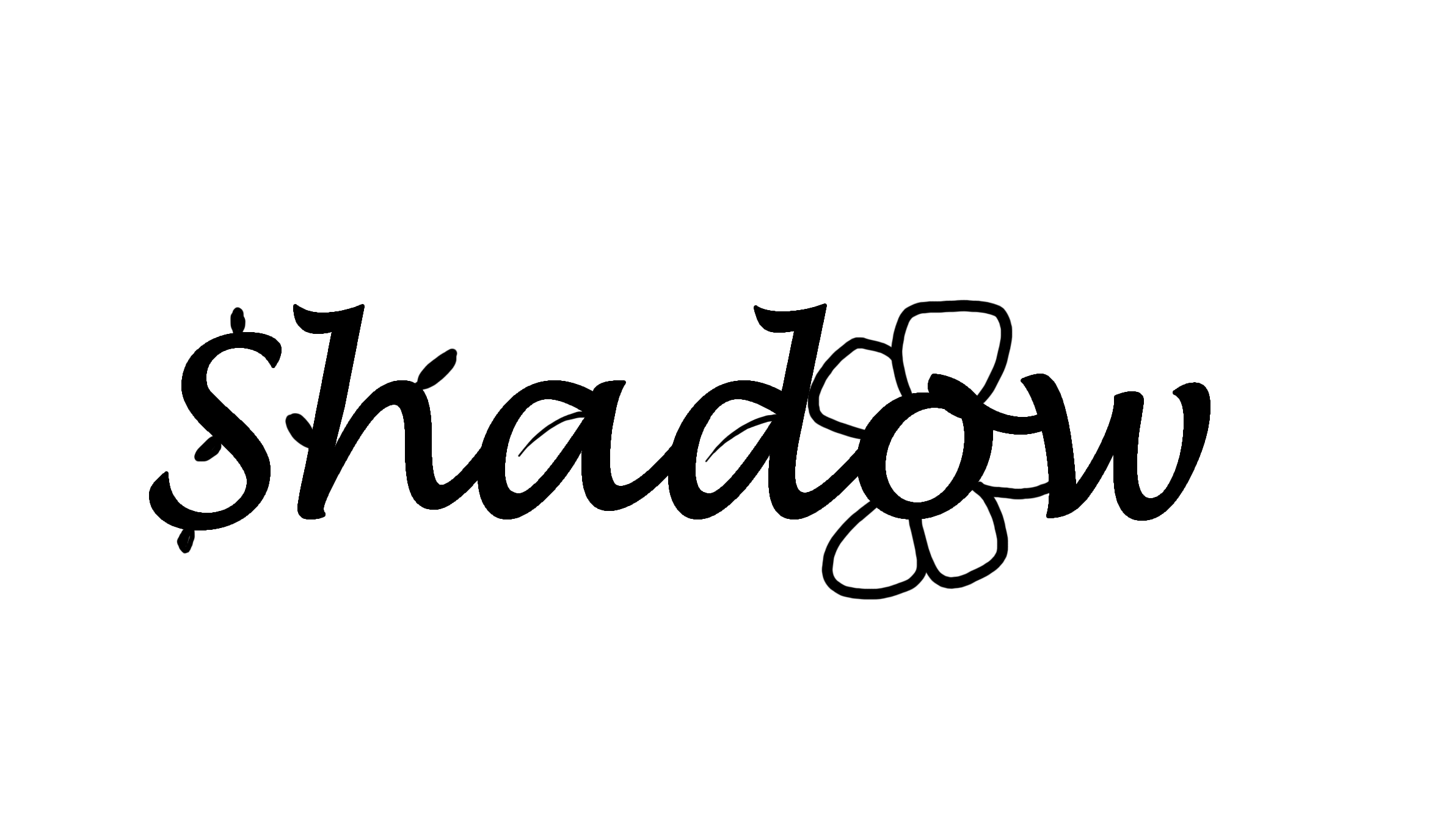 It uses what we know about gardening – with shapes like leaves, flowers that are extruded from the text ‘Shadow’, which is my nickname. Another design I came up with is this:
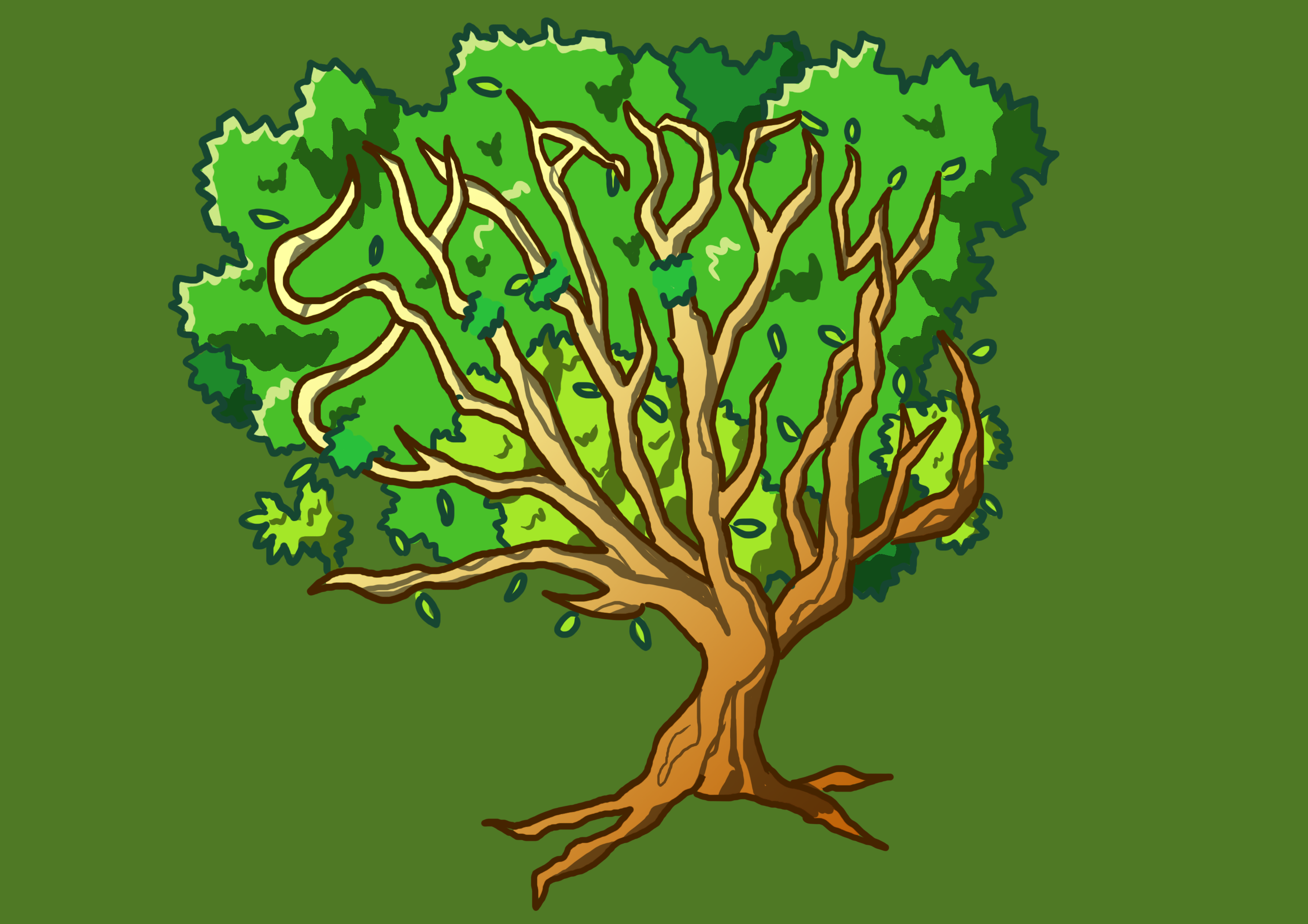
 I had letters seemingly growing out of the ground in an attempt to communicate the idea of things sprouting up from the soil. It was actually inspired by this work:
Unfortunately the comment I got was that it wasn’t clear enough and the choice of font I had used was just too common (and thus possibly overused). So I went to look in a different direction.

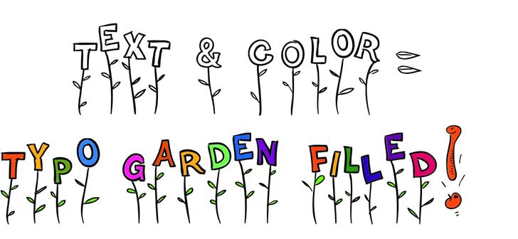
This is a typography by a different artist that looks like it could fit a gardener. I liked how the typography is composed of vines and made up of these little things that sprout around. I decided to use this to create my next typography, by using vines and other gardener-like shapes (Leaves, Seeds, Stems) to make up my typography. So I got to work and produced something. Below is one design I had done for my gardener typography:
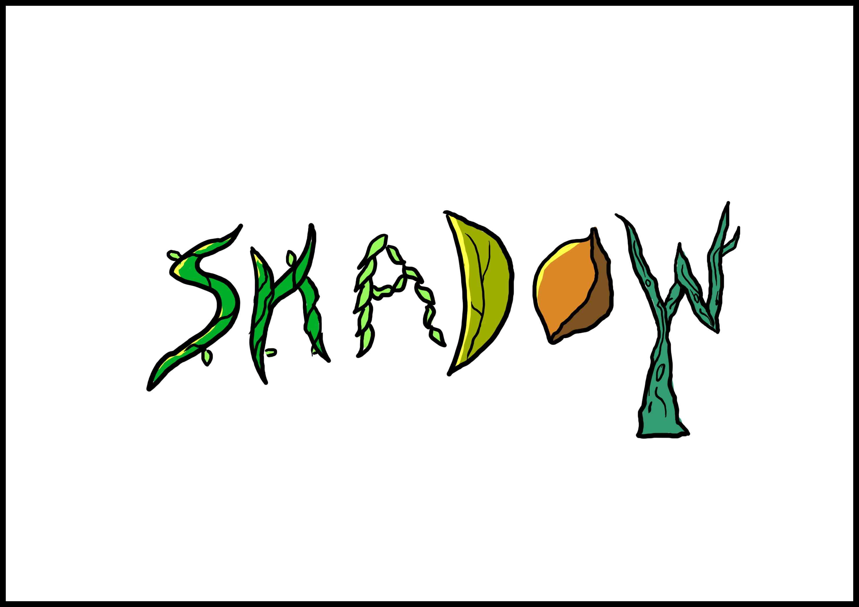
Aside from looking rather plain, I realised that I could try to apply a suitable background to enhance the typography.
Next, I looked at how backgrounds assist to communicate its theme or message.
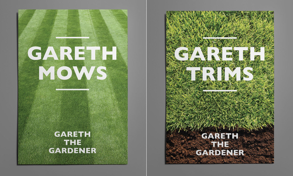
Gareth uses bold typography with witty copy and simple photography as the background for their gardening business. Looking at the typography above, it shows how much the background enhances the typography.
I tried a realistic looking background like Gareth but it obviously did not fit well in terms of the style as it did not match, so I did some experimentation.

I then tried something simpler, just having two very distinct colours to represent the grass and the soil. Then I added a bit more detail (lights and shadows) to the typography to make it stand out more. It made the typography better. The comment I got from this design was that it did not really communicate the idea of gardening very well. Even though I used twigs, leaves and seeds or vines, which to me seemed like gardening-like items, it was not very clear overall. Ultimately however, I decided to see if I can push myself to come up with something better, so I tried to look at other artists and references.
Below is another typography inspiration that I spent some time looking at:
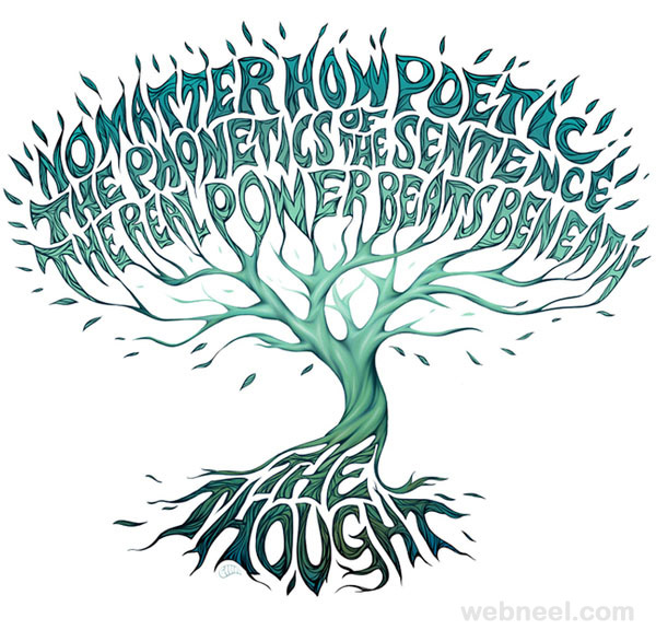
I thought it was great to use a tree. I felt it represented gardener much better than a mix of flowers and various plants that may make it look too flowery and distract the profession from gardener.
I also liked that it looked as though the typography itself was really sprouting up from the soil.
I wanted to execute something similar, but tweak it so that the typography is merged more into the tree rather than as alphabets that are floating above and not really part of the tree aside from colour and style. So here was the first draft I made.

I made the typography not only seamlessly stick out from the branches as part of the tree, but made it similar to the bark and colour of the trunk.

Here is another version of the same design, but this time I wanted to incorporate the idea of it sprouting from the ground, and when people think about gardening, one of the most common terms that come up is “seed”. When you are a gardener, you plant seeds that sprout into trees, so I put a seed there. However, the comment I got for this second design is that the seed is too distracting from the typography, and draws attention away from it. It also makes it look like the tree is just planted out of nowhere, with nothing to really anchor it down. So I went back to the first design.
The comment I got from the first design however, was that the tree looks very barren. It looks as though I was a really terrible gardener to have created something like that. It looks as though the tree was dying rather than flourishing. And that’s why the title of this post is as such.
“Why does your tree look so barren? It makes you look like a bad gardener!” – Mimi (2017)
So I added some leaves!

Now I really look like a gardener! And a good one at that, because my tree does not look like it’s about to die. But everything blends it a little too much – the leaves and its branches might be a little too similar in colour. I wasn’t sure if the typography would stand out enough.
At this point, I looked at colours. Now what are some gardener-like colours? I wondered. So I went to research.
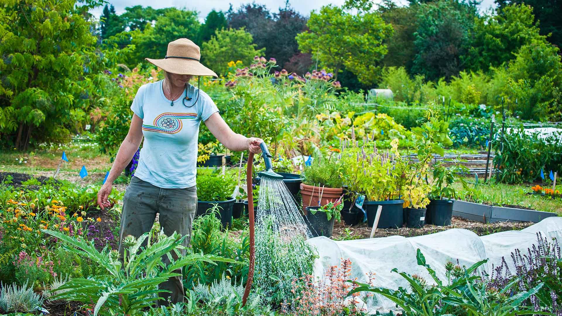
I managed to find this image of a person gardening and I felt that the striking colours really made the image stand out. Because of the style I used, I think it is better to use such colours, and make the tree look more saturated.
I remember a comment I got was that the typography looked like it was like a children’s book illustration, like a tree that is associated with a kind of fairy tale, so I believe going with that idea, bright saturated colours would help enhance this effect and enhance the visuals. So alas, my final design:
I tweaked the background to be a little more dull than the previous (just subtly), so that the typography stands out against the background rather than the other way around.
That is all for the gardener profession. Hope you like it!