Group members: Yi Xue, Yenee, Amanda, Gwendolyn, Ashley, Daryl (Will be split into groups of 3 later)
Objects: Hands, Garment, Dandelion, Cup
PDF for presentation: Sem Proj
Group members: Yi Xue, Yenee, Amanda, Gwendolyn, Ashley, Daryl (Will be split into groups of 3 later)
Objects: Hands, Garment, Dandelion, Cup
PDF for presentation: Sem Proj
Individually Together
Individually Together is a project that showcases the creation of participants in a way that connects all of them together. In order to do that, participants are given a template to fill in that is created by me. How they want to fill in the spaces is all up to them!
The base video is made (shown later) in order to determine the total number of frames needed to create the final piece. The total duration of the video is 20 seconds and played at 3 frames per second, so the total frames needed are 60 frames. They are then split into sets of 4, which requires me to find 15 participants.
Once participants are willing to take part in this project, they will receive a zipped folder containing: A “Read me” image containing the instructions, A “Final Photos” folder, and A “Frames” folder containing the frames/templates to be drawn on.
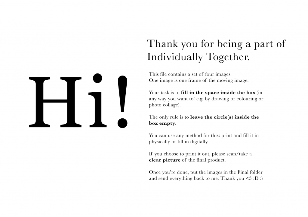
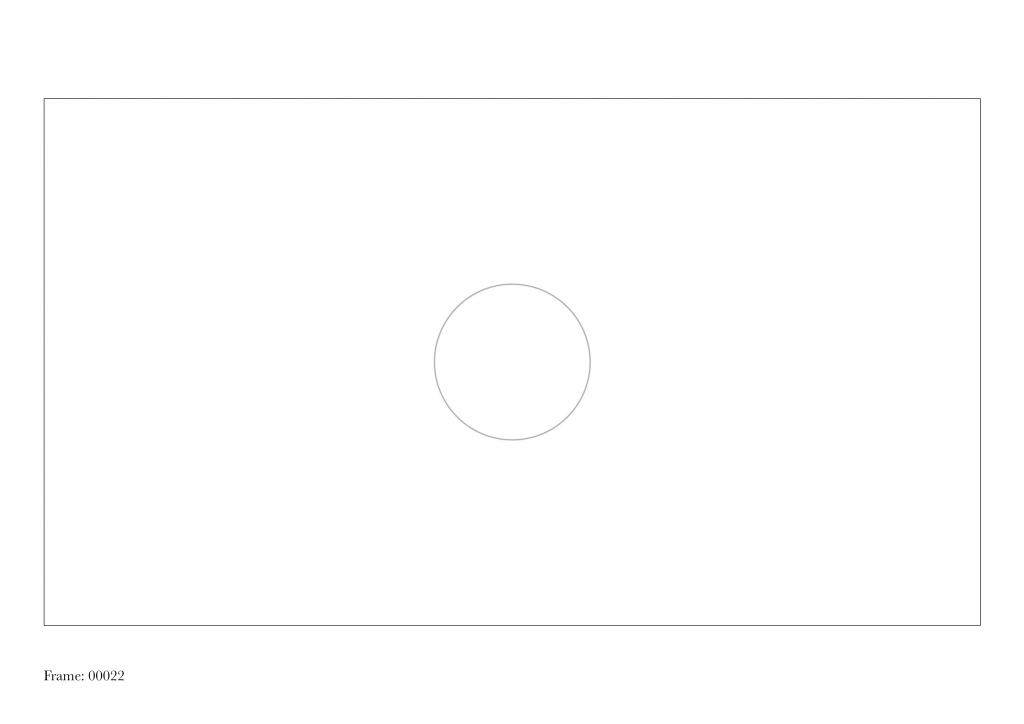
Participants are given 5 days (Wed to Sun) to fill up the spaces and send them to me once they are done.
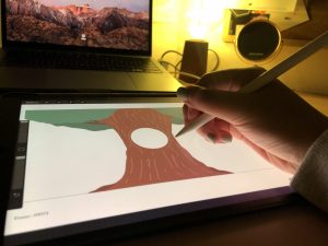
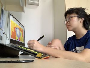
Some process photos by the participants!!
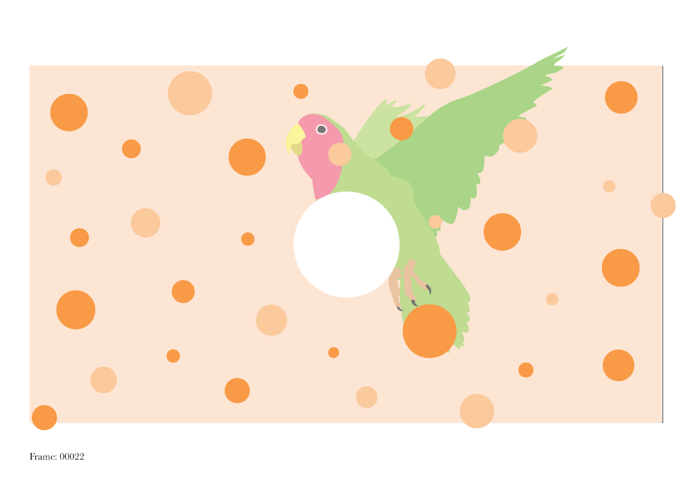
The final frames given by the participants are all unique and personal to them. The participants also had a fun time guessing who drew which frame after they have seen the final video as they could identify the creator’s personality/style through their creations.
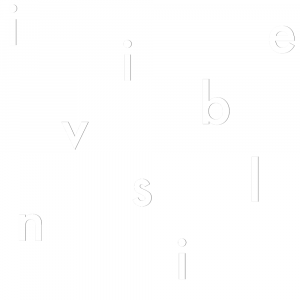
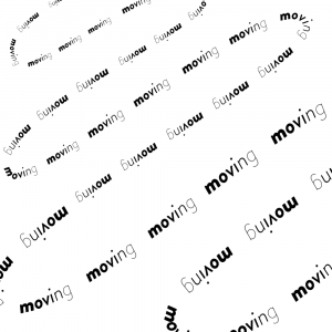
Final Video
Version 1
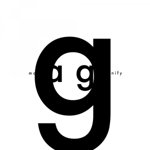
Final Version



Sketch
During the circuit breaker period, people were sending food to each other using food delivery apps like Grab to show appreciation/love/encouragement for each other. Since we can’t be physically there for each other and we were always video calling each other, I thought it would be fun to make use of the green screen function from Zoom to make it seem like we are physically together.
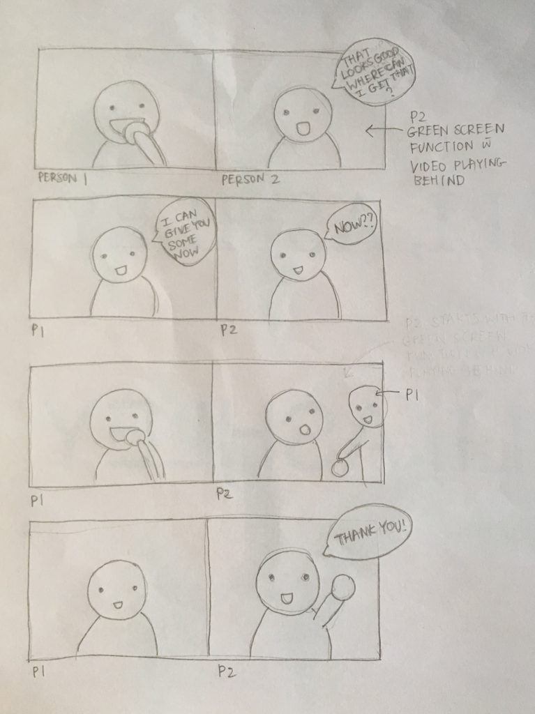
Person 2 will use the pre-recorded video as their green screen background, and Person 1 (the one eating) will appear in the middle of the video to share the food with Person 2. This looks as if Person 1 is physically present at Person 2’s location and as if Person 1 cloned and teleported herself. Person 2 has to act that Person 1 is actually there to respond to the pre-recorded video.
Final Performance with Daryl & Gwendolyn
“Stop motion” performance with Yixue
Letter Croppings
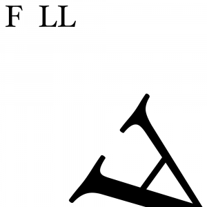
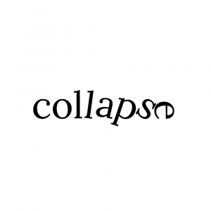
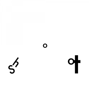
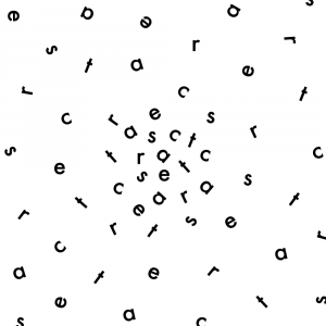
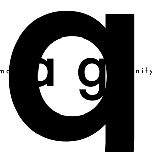
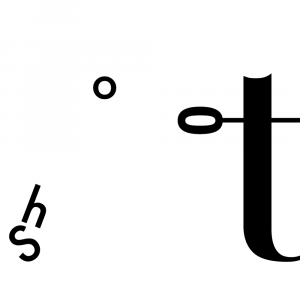
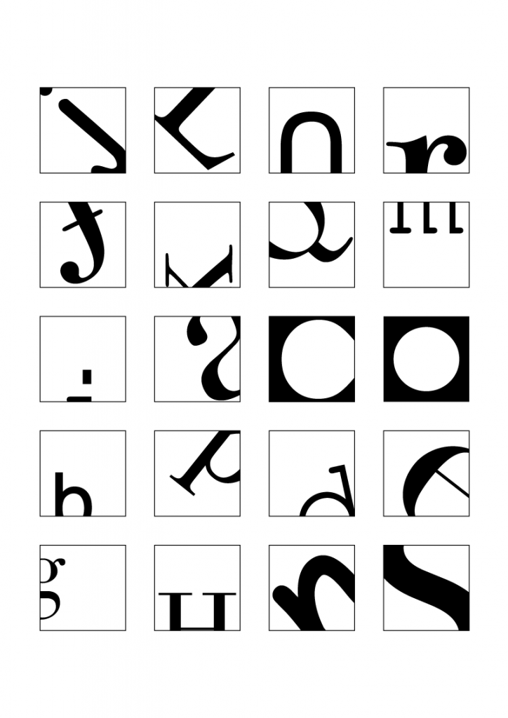
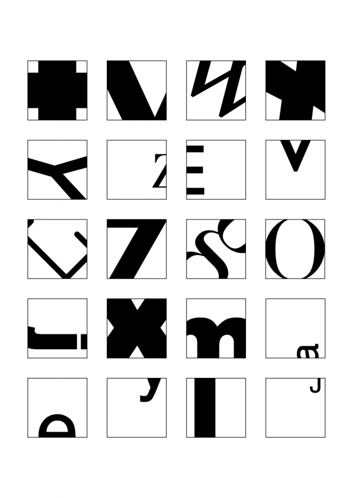
Cropping letters to the point before they become illegible! I tried to show the unique characteristics of each letter, e.g. the tail/descender for the letter ‘p’, the arc for the letter ‘m’, and the vertex for letter ‘v’.
Typefaces used: Arial Black, Bodoni 72, Comic Sans MS, Courier New, Didot, Futura, Gill Sans, Helvetica, Myriad Pro, Times New Roman (randomly picked haha)
1st Version
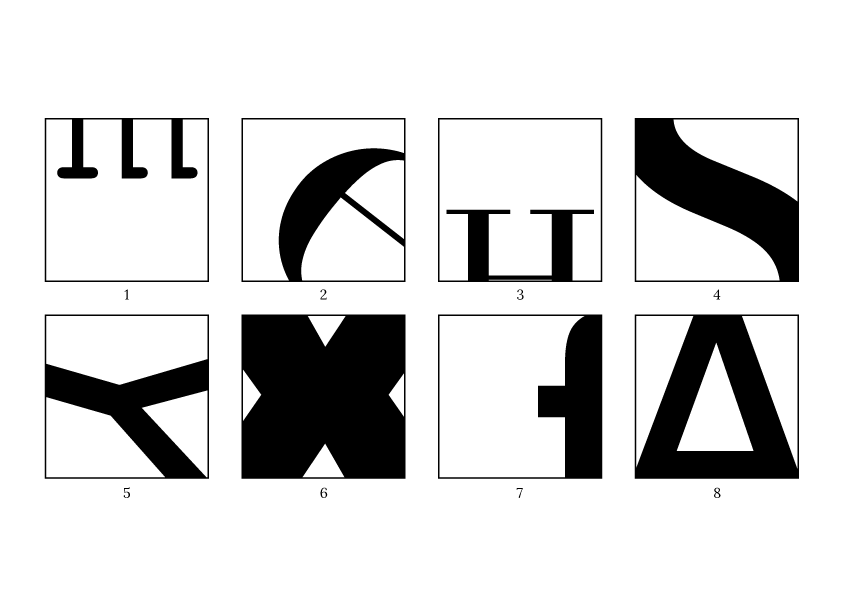
1 (m), 2 (e), 3 (H), 4 (s), 5 (y), 6 (x), 7 (f), 8 (A)
1 (m), 3 (H), 7 (f): has too much white space at the bottom/side
Final Version
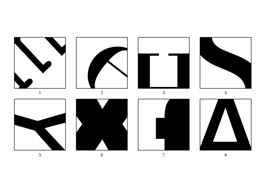
1 (m): Cropped m even further. Kept the serifs of the “m” visible to indicate that it is neither “w” nor “E”
3 (H): Scaled up “H” to reduce white space
7 (f): Scaled up “f” to reduce white space
References:
Letter Drawings
Some observations I have made while drawing my name in both serif and sans serif styles:
Serif: Serifs, thick and thin stroke weight/width for different strokes
Sans Serif: No serifs, same stroke weight/width throughout
Both: Has the same cap height and baseline since it’s all capital letters, different kerning (space between letters?) between each letter and each word
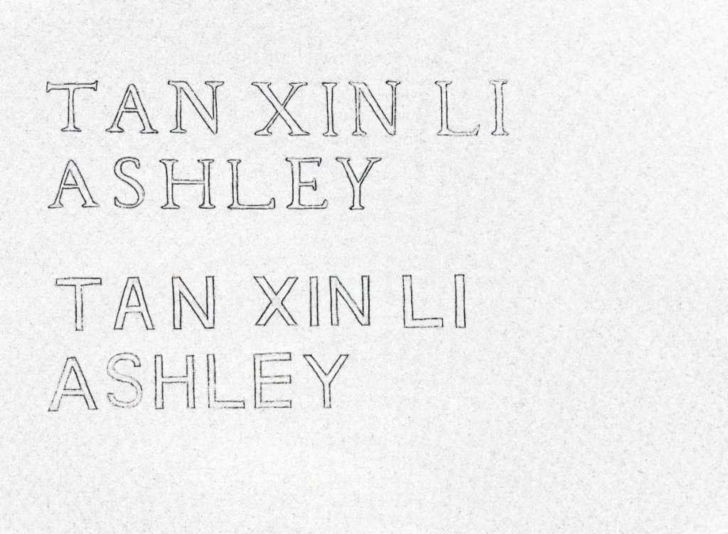
Transitional typeface: extremely thick and thin stroke weight, the contrast of stroke weight is higher
References:
Website
Link to website: https://3rpproject.wixsite.com/3rp-project
(Not available on mobile yet)
Features

Home page: Landing page + Brief Introduction + Blog

About page: What is 3RP? + Why should you recycle?

Recycling kit: Recycling guide + What’s in the recycling kit?

Recyclable or not?: User can key in the item to see if it’s recyclable or not (Key in “wood” or “plastic bottle” to see how it works)

Plastic alternatives: Link to environmentally friendly stores + List of brands/stores that can return the packaging back e.g. lush, Innisfree

Blog: Content about recycling properly

Process

Coloured certain parts of the monster to visualise some of the data.

Changed the layout from the “monster” being in the centre to being a little out of frame to emphasize the size of the monster and also to show it coming into frame.

Tried different visuals for the bottom part of the poster.

Showed this for the first class feedback/critique session.

The final version presented in class.
Changes made:

Changes made:
The objective of the survey
This survey was conducted to gain insights about:
A total of 50 responses were collected and the results are presented below.
Brief summary
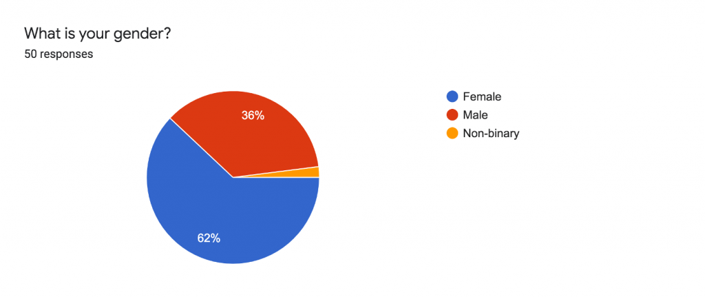
Demographics of respondents
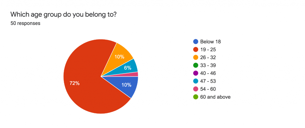
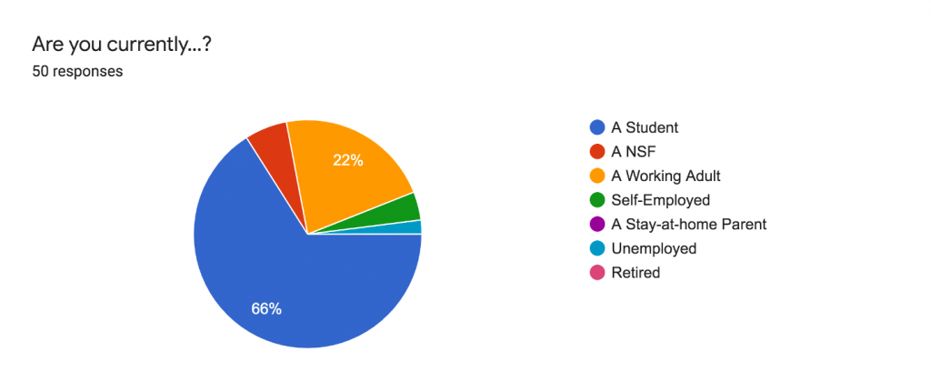
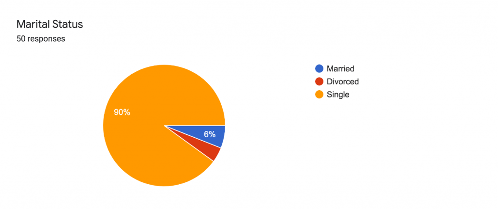
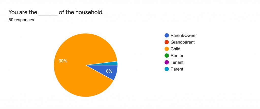
I tried to have a mixed group of respondents from different age groups, life stage (different employment status), and the role they play in the household.
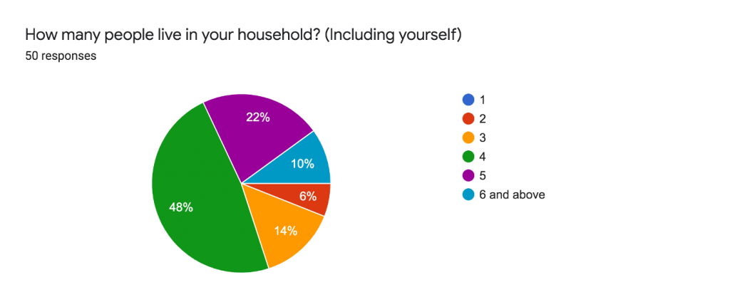
Respondent’s general recycling knowledge
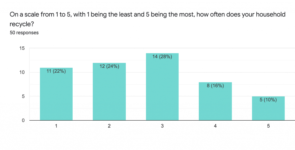
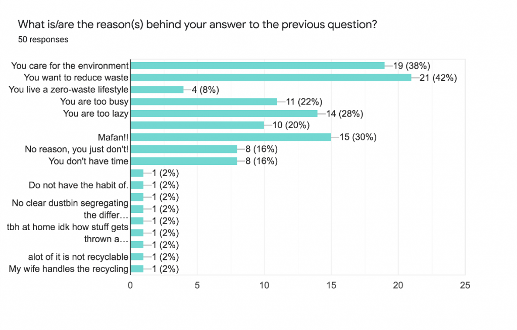
Among the 16 respondents who were working, only 6 had the motivation to recycle because they cared for the environment or wanted to reduce waste. The majority of them did not recycle because they are too busy, lazy, or find it too troublesome to recycle. Some gave their own comments that they did not know how to recycle properly or there isn’t a system in place for them to recycle easily.
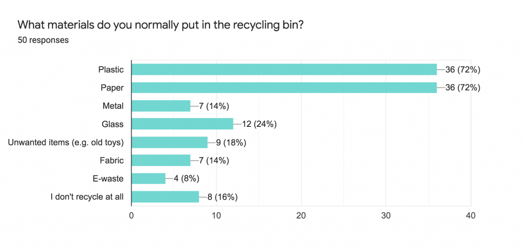
Although most of the respondents already have the habit of putting the right recyclables in the recycling bins, there is still a minority that thinks that fabric or unwanted items can be recycled which can increase the workload for sorting out the items in the recycling bin.
Respondent’s plastic recycling knowledge
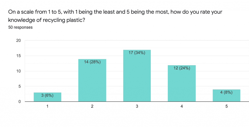
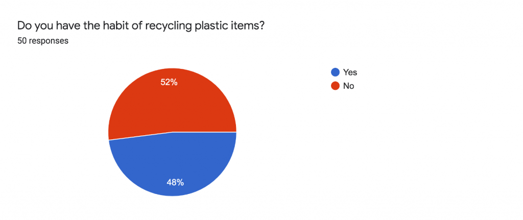
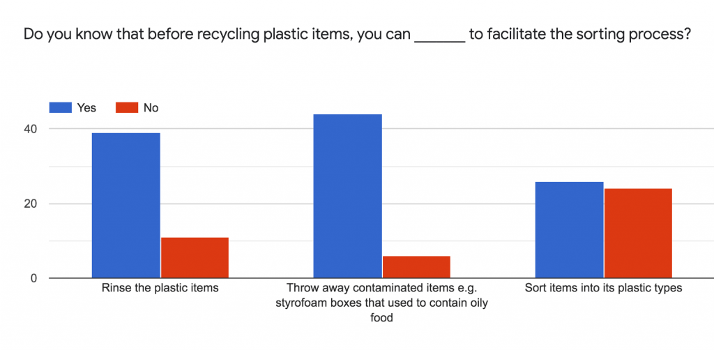
It is good that around 80 – 90% of respondents knew that they had to rinse the plastic items and throw away contaminated items. However, in reality, 10% is already enough to contaminate the whole recycling bin that causes the other recyclables to become general waste.
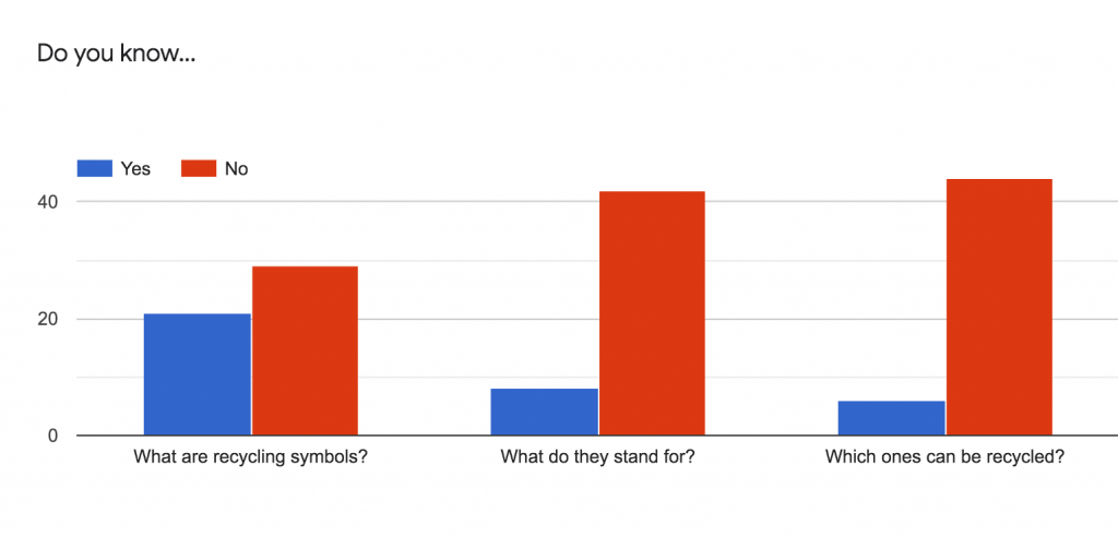
The majority of the respondents did not know the purpose of the recycling symbols which can indicate that the symbols have not been useful or there hasn’t been enough education to teach the public about these recycling symbols.
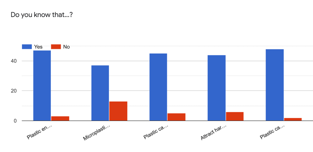
Respondent’s perception of current recycling strategies
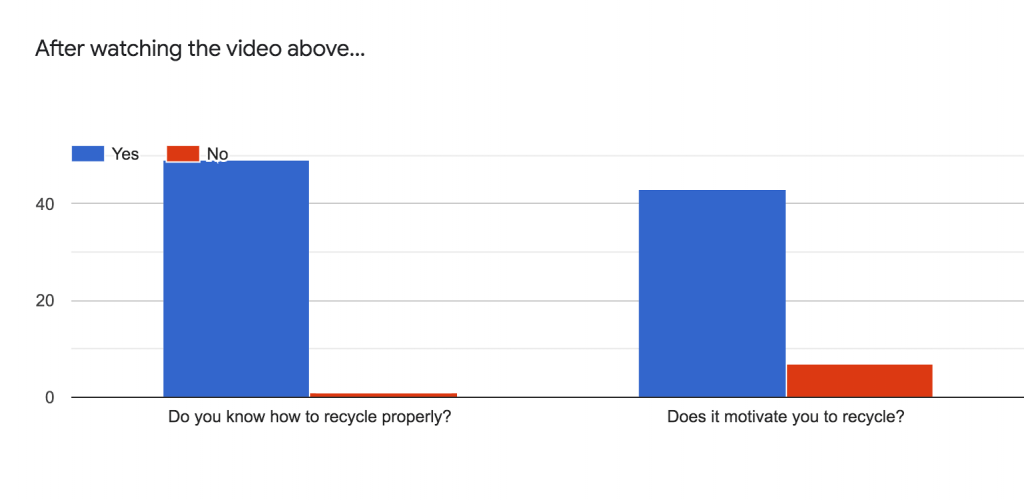
Some of the positive comments were:
Some of the negative comments were:
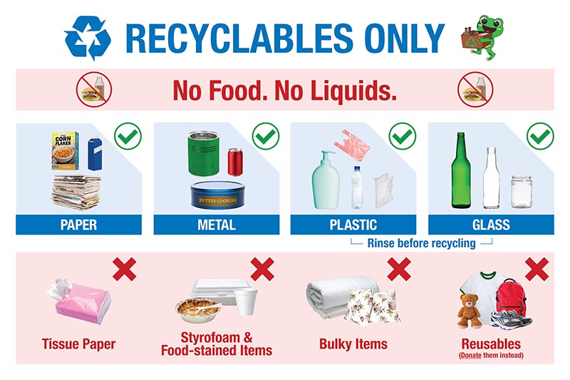
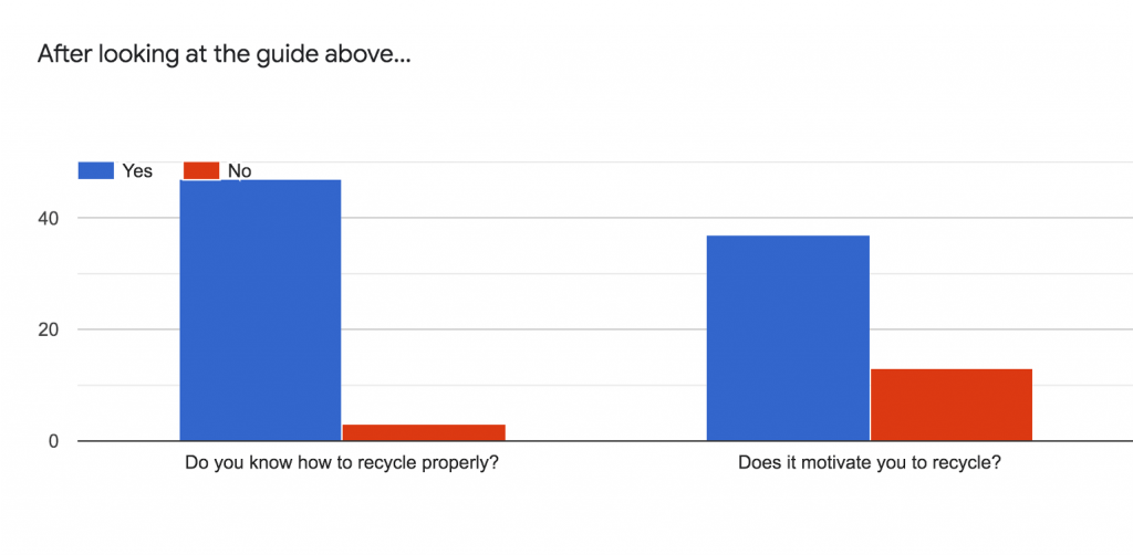
Some of the positive comments were:
Some of the negative comments were:

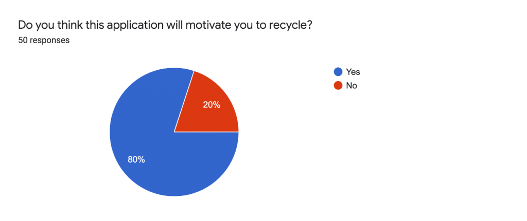
What will motivate you to recycle more plastic/recycle properly?
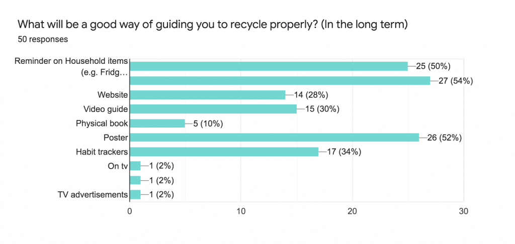
Takeaways
I think one of the solutions to increase the recycling rate and reduce the contamination rate for plastic is to create something that is more practical and tangible e.g. guides that people can follow easily without much trouble. People want things to be simple, they may not want to go too much out of their way just to recycle. Although monetary rewards can incentify their efforts, I think that it may not be sustainable and they may stop the habit of recycling if the rewards stop. E.g. the reverse vending machine.