
Typography Research
Typography is the visual art of creating written words.

5 types of typefaces

Serif | Traditional, respectable, stable
Serif fonts carry a distinguished feeling of heritage and pedigree. They make a brand feel respectable and reliable, instilling the audience with a sense of comfort that they’re in the hands of someone reputable and stable.
Serifs are super easy to read because those little feet create a subtle visual connection between the letters. This readability makes them great for paragraphs of text.

Sans serif | Simple, straightforward, sensible
Audiences perceive sans-serif fonts as clean and simplistic in a modern way. They allow the message to speak for itself without hiding behind a façade—straight and to the point in an objective way. Designers for the web often use sans serif fonts. They carry a reputation for being contemporary and current no matter what decade you use them in.
Sans Serifs are usually clean and geometric, which makes them easiest to read when they are either really large or really small. Sans serifs are often used for headlines, captions, and short descriptive texts.

Display | Friendly, quirky, unconventional
Display fonts are meant to be displayed at a large size (generally 14 pts. or higher). So, display fonts tend to have big personalities in order to draw an audience. Display fonts have to be a little on the loud side, so they’re often friendly or amusing and grab people’s curiosity.
A display typeface is a typeface that is intended for use at large sizes for headings, rather than for extended passages of body text. Display typefaces will often have more eccentric and variable designs than the simple, relatively restrained typefaces generally used for body text.

Script | Personal, feminine, fancy
Script fonts (and by extension most handwritten fonts) inspire feelings of elegance, grace, and femininity. We often use handwriting in expressions of affection. Because of this, audiences perceive these typefaces as personal, creative and genuinely heartfelt.
These typefaces have lots of swoops and curls and sometimes even look handwritten. Script typefaces look awesome for logos, large headlines, and for little details to give something a nice handmade touch.

Inspiration/Styles/References
I thought that the type for this image was very interesting as it acts as both “H” and “h”. The letter “I” is also seen at the side. Even though the type is a little confusing to understand (to see “H”, “h”, and the element of “I” at the side), I feel that this is what makes the typeface more complex, inviting the viewer to “solve” the puzzle of finding the different sides. I was intrigued to the design of this type which influenced my design for my Cloud Curator job typeface.
I thought the usage of textures of the typefaces in this photo set was quite realistic, therefore used it for reference.
I thought warping/liquifying of typefaces was a really cool idea so I added this two photo sets as reference.
Job research
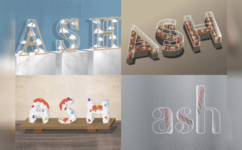
Cloud Curator
Cloud: a visible mass of condensed water vapour floating in the atmosphere, typically high above the general level of the ground.
Elements: Cloud, Sunny, Rainy, Lightning?
Curator: a keeper or custodian of a museum or other collection. (According to the video below, a curator is someone who 1. cares for something, 2. is a specialist, and 3. is presenting a collection. They bridge the gap between the material they are presenting to the person they are presenting it to.)
Elements: Museum, Frames, Exhibitions, Hands? (to care for), Display boxes, Barricades
Sweet Sushi Chef
Sweet: a small shaped piece of confectionery made with sugar. (or anything sweet)
Elements: Sweets, Gummy bear, Jelly, Jam, Candy Strips
Sushi: a Japanese dish consisting of small balls or rolls of vinegar-flavoured cold rice served with a garnish of vegetables, egg, or raw seafood.
Elements: Fish, Rice, Seaweed, Tamago, Soy sauce
Chef: a professional cook, typically the chief cook in a restaurant or hotel.
Elements: Sushi knife, Sushi rice bucket
Genealogist
Genealogist: a person who traces or studies lines of family descent.
Elements: Anything related to chemistry (Microscope, Petri dish, Flasks, Test tubes, Pipette, etc.), Family tree, DNA (genes)
Floriculturist
Floriculturist: focuses on the cultivation of flowering and ornamental plants for gardens, floral industry and for export. They also develop new varieties. (Grows, cares, maintains, manages, harvests flowers.)
Elements: Flowers, Farming, Garden tools (Scissors, Gloves, Watering-pot, etc.), Greenhouse, Irrigation system, Outdoors
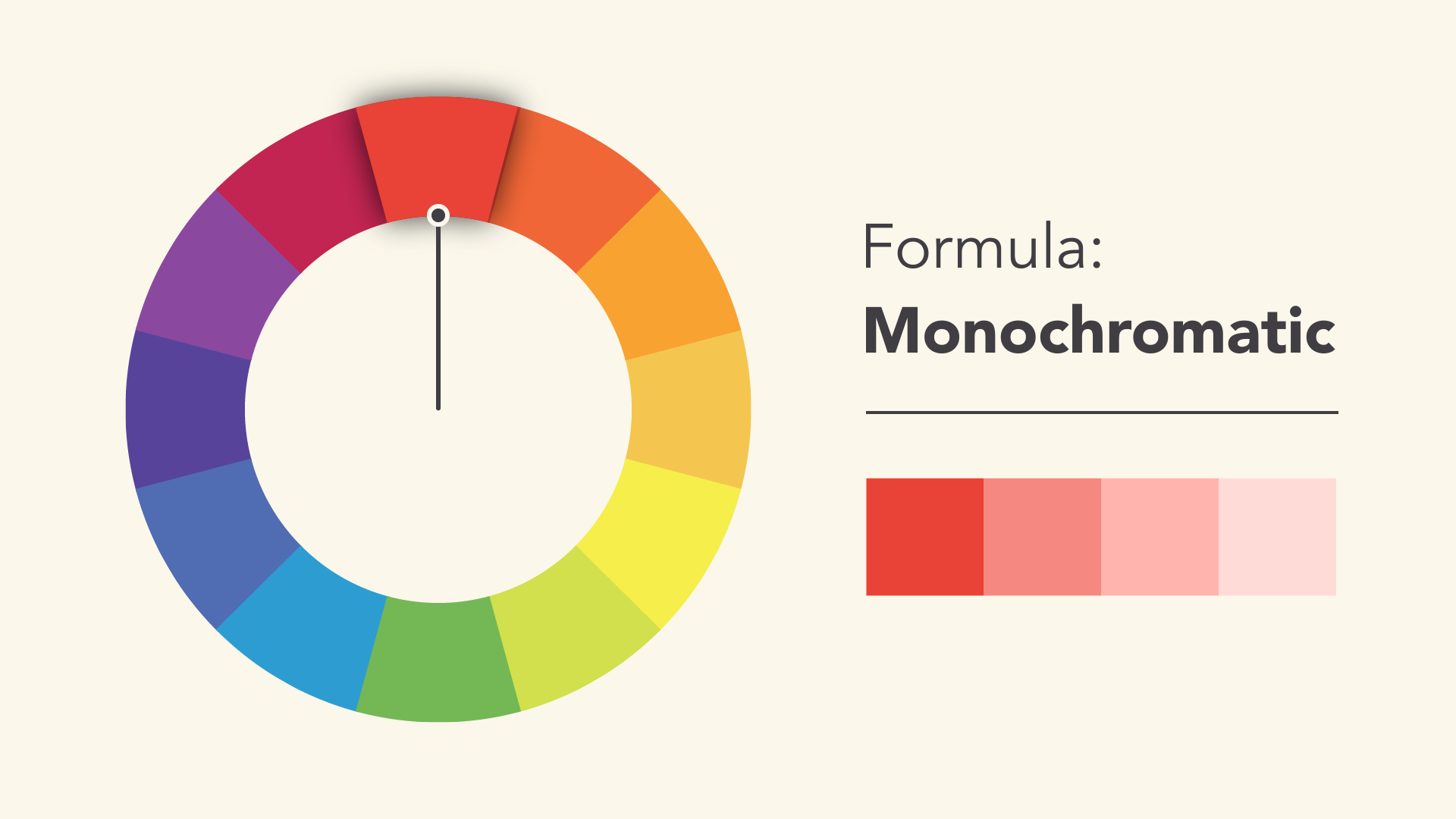
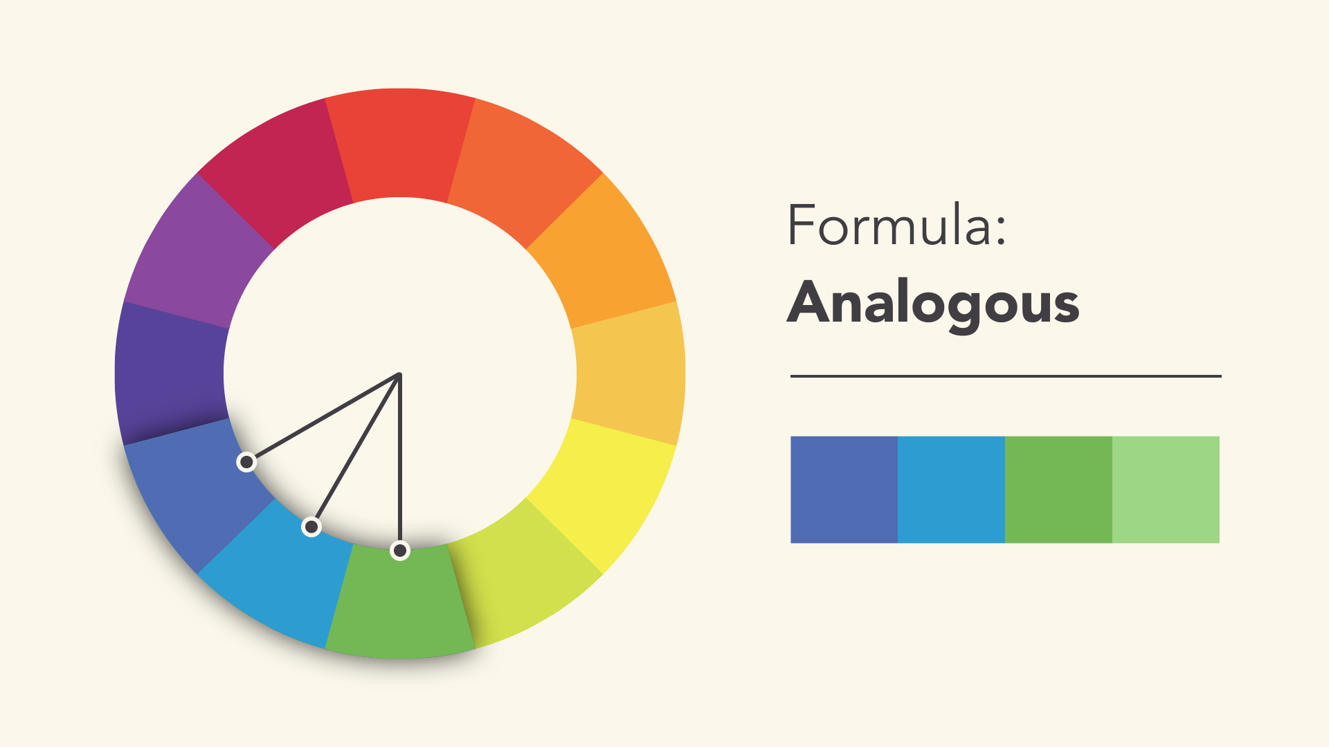
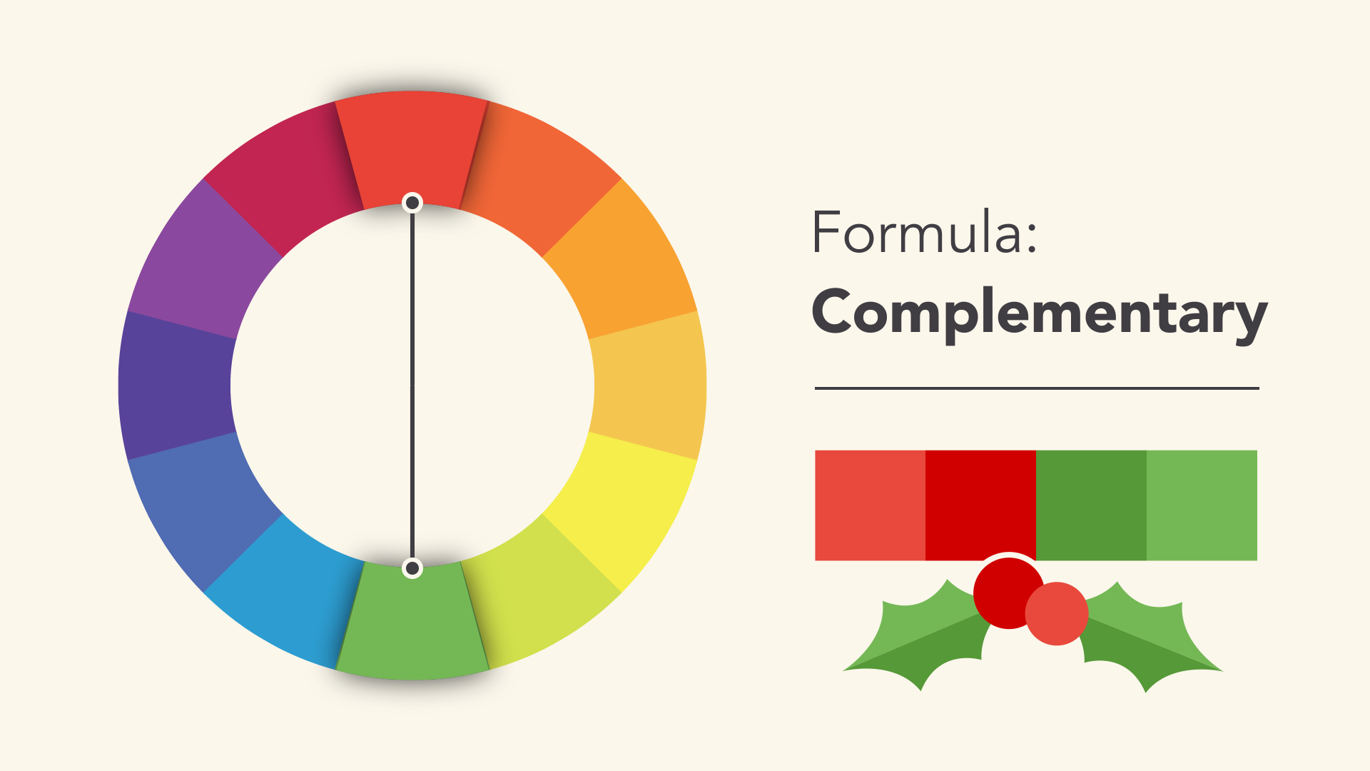
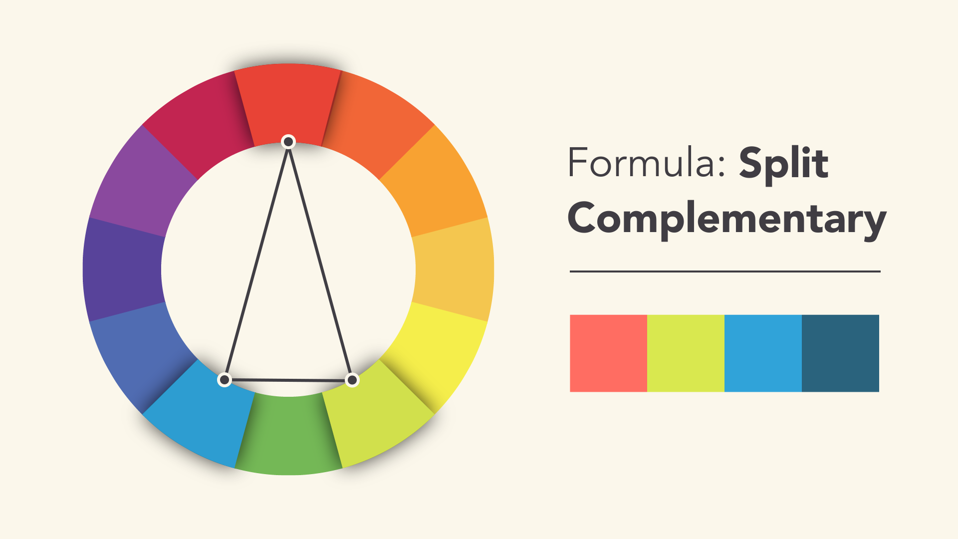
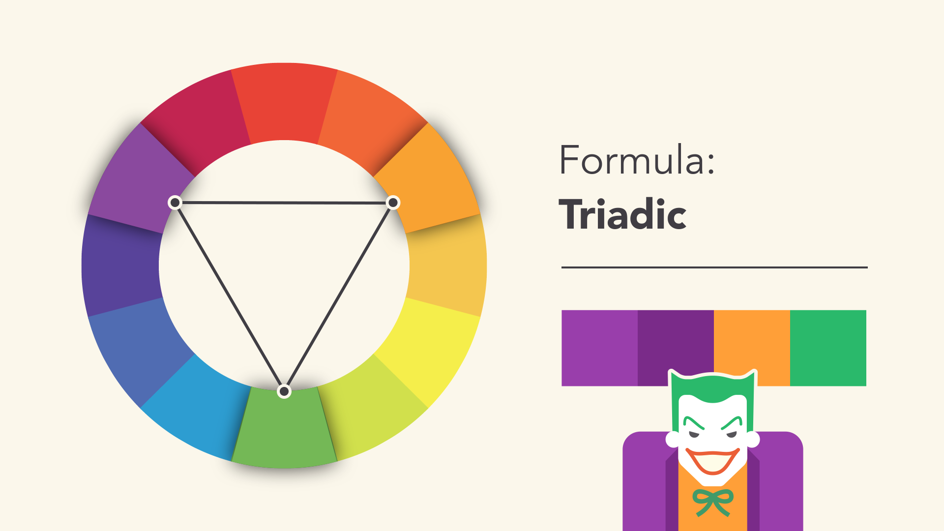
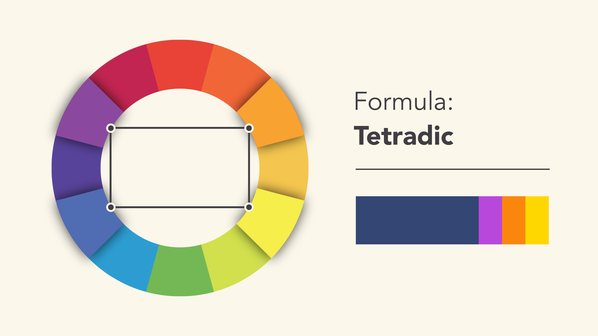
Colour Harmony
Some research about colour harmony from the previous assignment, Ego.
I will cover more on the ideation, process and different versions of these 4 jobs in my process post: https://oss.adm.ntu.edu.sg/a180062/project-1-image-making-through-type-process.
The final outcome is shown here: https://oss.adm.ntu.edu.sg/a180062/project-1-image-making-through-type-final
Sources:
http://westchicagoprinting.com/fonts-feelings/
https://edu.gcfglobal.org/en/beginning-graphic-design/color/1/