Sound Art

I am not a fan of Sound Art but what interests me in this area would be the ability of sound waves to move objects or substance.

This is an example of using sound waves to change the colour and height of the flames. This is resulted from the pressure variations from sound waves affecting the flow rate of the gas.

I think that it would be a really interesting sight and sound experience should they combine it with popular songs. Also, the use of water as a medium could be possible, and the sound waves could be seen through the ‘jumping’ of the water.

Chosen Library Work

IMG_0152

This is my chosen idea but in a different location. The reason for the changes was due to the light from the windows not being able to give off the effect I wanted, so I decided to use glow sticks instead and chose the darkest spot I could find in the library.

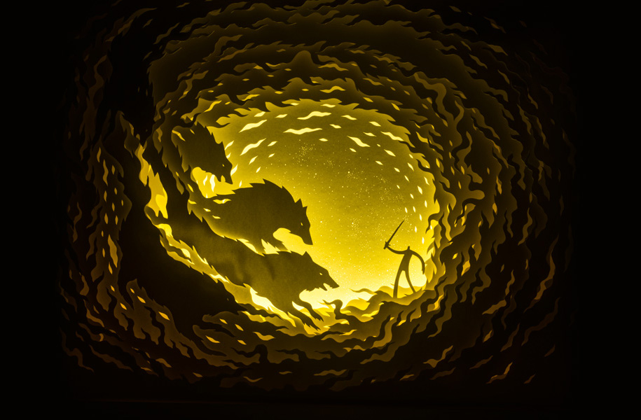
This work can be found in the shadows of the book shelves. I think this place is apt as it kinda showed how people have stories that they do not wish to share with others, so they hide it from other people. Like how this work is hidden, it shows my own personal story of struggle and support relating to my CCA, dragon boat. The works show a person trying to tame a dragon but fails to do so and falls into darkness. But the stars (that have always been there) lights up and congregates around the person to form wings to help lift the person out of the darkness. This is based on a true story of how I fell into the darkness after sustaining a back injury and not being able to row in a race I really wanted to row with my fellow batch mates. I remained in the darkness for around two weeks, pretending I was okay as I did not want to let my friends see the weak side of me. But I broke down one day and my friends made a lot of effort to cheer me up and bring back my drive to do better for the sport.

And for that, I am forever grateful and this work is dedicated to them (though they do not know lol).

Library Ideas

I had two ideas in mind, each at two different locations.

Location 1: Windows

cut-paper-light-boxes-hari-deepti-1

The windows are huge and a large amount of light is let in through these windows. The first idea would be to utilise the light that is coming through to create an artwork, which reminded me of the use of paper cut outs and light to create a layered, shadow artwork. This idea is inspired by Deepti Nair and Harikrishnan Panicker’s works. The images portrayed could be a scene, story or architecture from ancient civilisations to educate viewers about Art history, given the library contains many books related to that topic.

Location 2: Long study tables

For this location, I was planning to put several jars containing different types of sweets or snacks from different locations or tallying with the theme, and each jar containing a small fun fact about that chosen place. For example, if space was one of the chosen locations, there would be a tag containing a fun fact about space and the food inside the jar would be the Milky Way chocolate. The main purpose of this idea was to let people know more about the world and at the same time enjoying the food inside the jars to help them study better.

Reflections

Our group, The Tranny Diaries, focused on the transformation of Guanyin from male to female and how the current context parallels this transformation.

For me, I found it really interesting to be working on this topic about transformation and linking it to the transgender community in today’s society as my knowledge about these people are very limited. When I look at the non-straight people, I would just categorise them into either gays, lesbians or bisexuals. To be honest, I didn’t even know what the ‘T’ stood for in LGBT until I was working on this project. So this project has given me insights to how transgender people act and dress.

With each layer of transformation, I found out what each layer symbolises to the transgender people. The further we researched for this project, I found out how these people were being treated by society all over the world. I had initially thought that they were widely accepted due to the gays, lesbians and bisexuals being more accepted and supported in our community. However, it turns out that they are being treated by how society views their physical gender to be instead of who they really want to be. I’ve always thought the topic on LGBT to be fascinating, but this project has really broadened my perspective on things which I was ignorant of.

At the start, I was worried about our project as during the presentation of ideas, we still weren’t sure about what our end product would look like. We only had a rough idea but it was confused with our chosen subject, the transformation of Guanyin, and our main aim, touching on the LGBT groups in modern society. However, after a final round of discussions we came up with a concrete plan and I was really relieved that we could start on the end product already for our next meet up.

The photoshoot was a lot of fun as it was my first time helping someone to put on make up. It wasn’t a stressful serious meeting but more of an exploration of tools and poses. However, the best part was when we were finished with the taking of photos because that meant one less load off our shoulders.

Overall, this experience has taught me that ancient religious art can be linked to issues of modern society in ways that we may not think is possible.

Singapore Diary Video

This is my video for the Singapore Diary project. I wanted to show the culture of Dragon boat as not many people are familiar with the sport. Also, given that it is a tough sport and considered more suitable for males rather than females, I wanted to show why some women still choose to do the sport despite the tough trainings and high level of commitment required.

Zine process

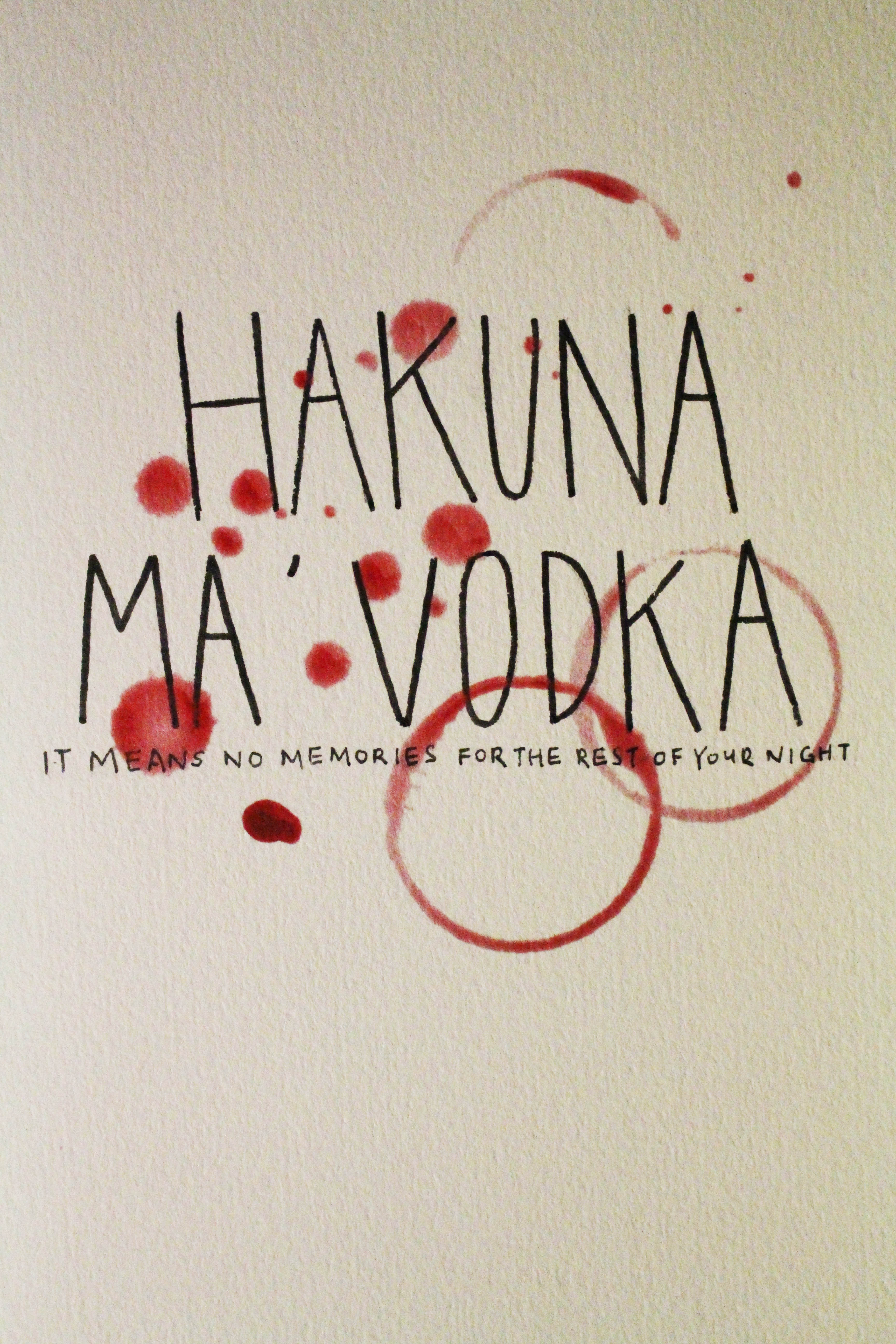
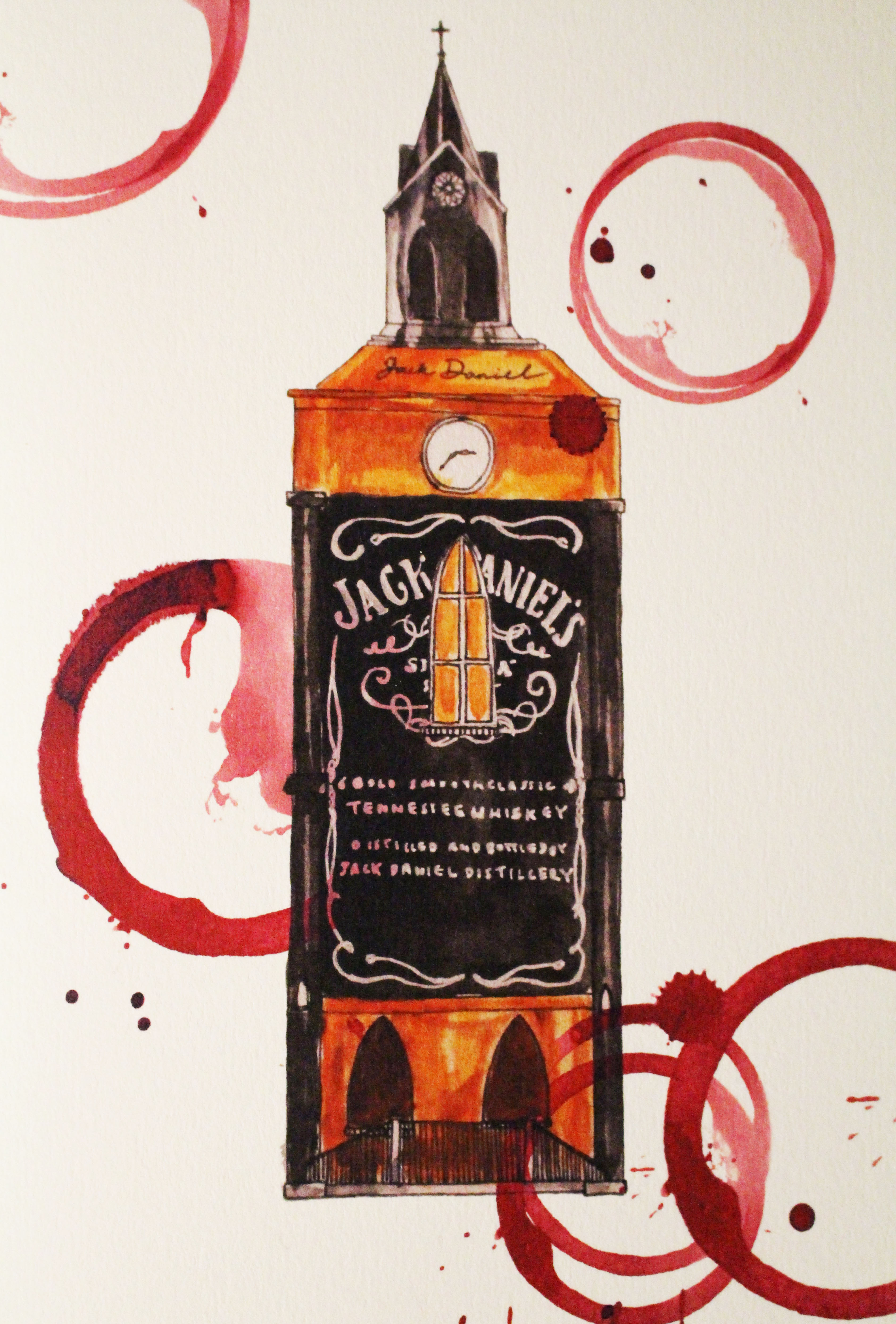
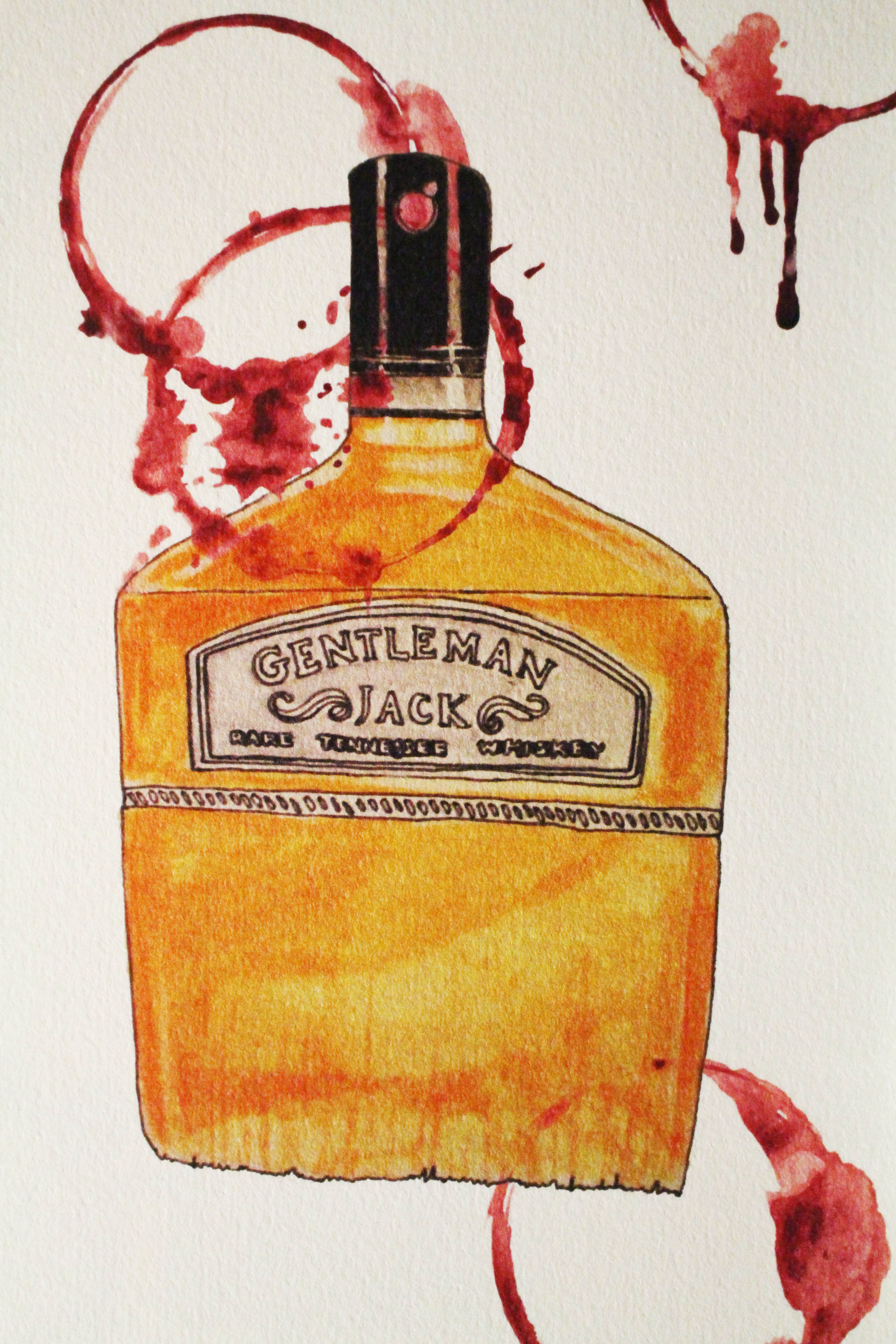
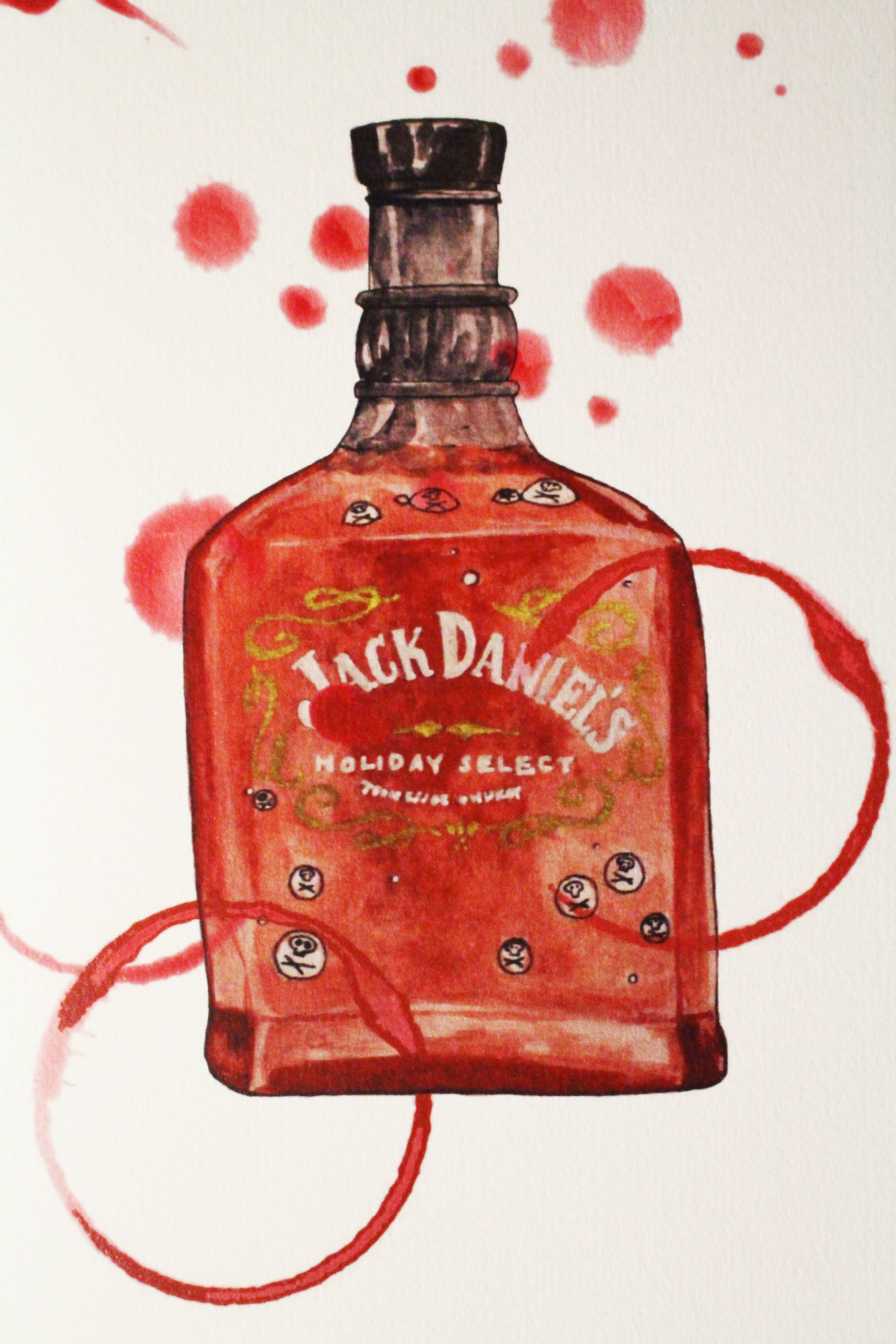
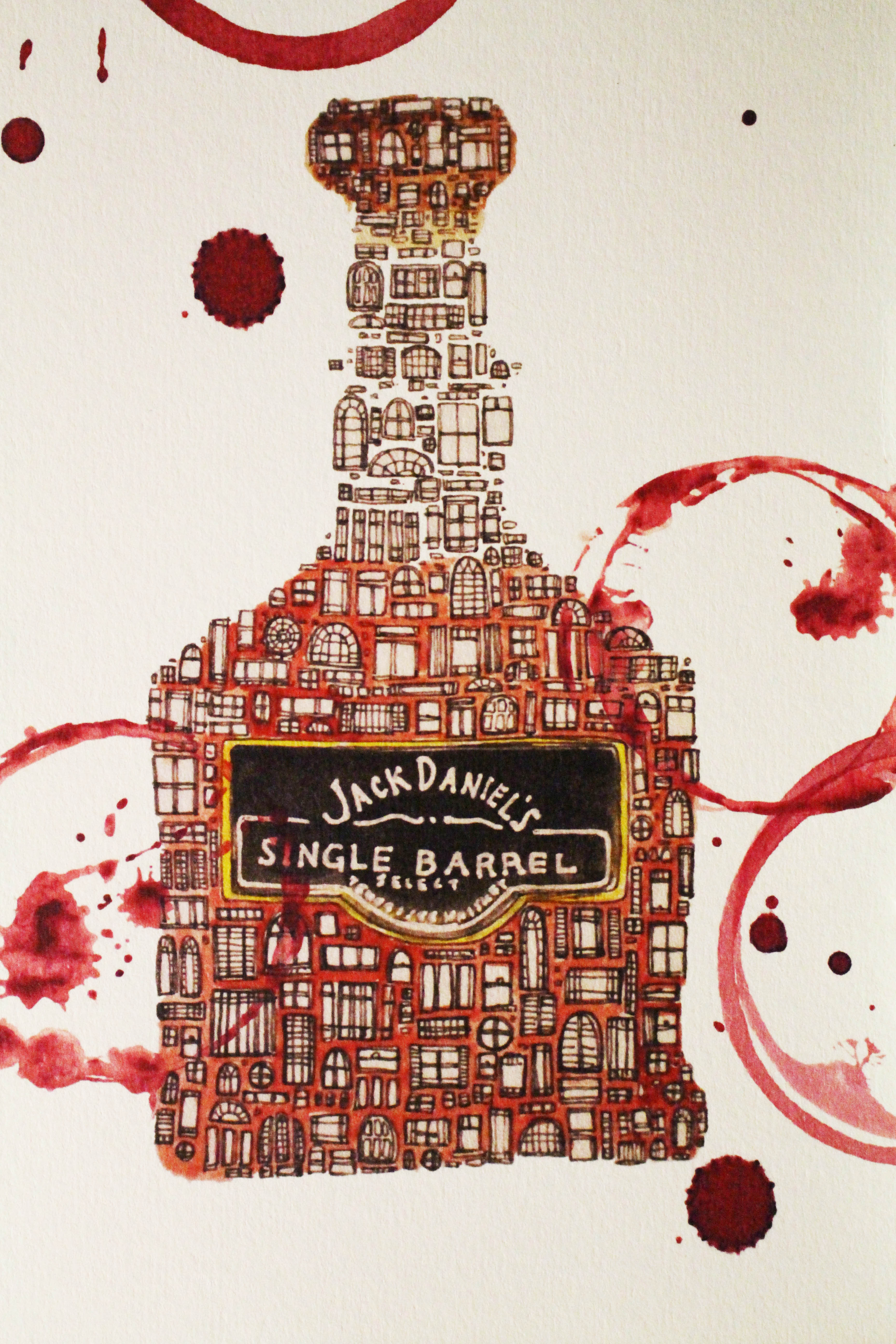
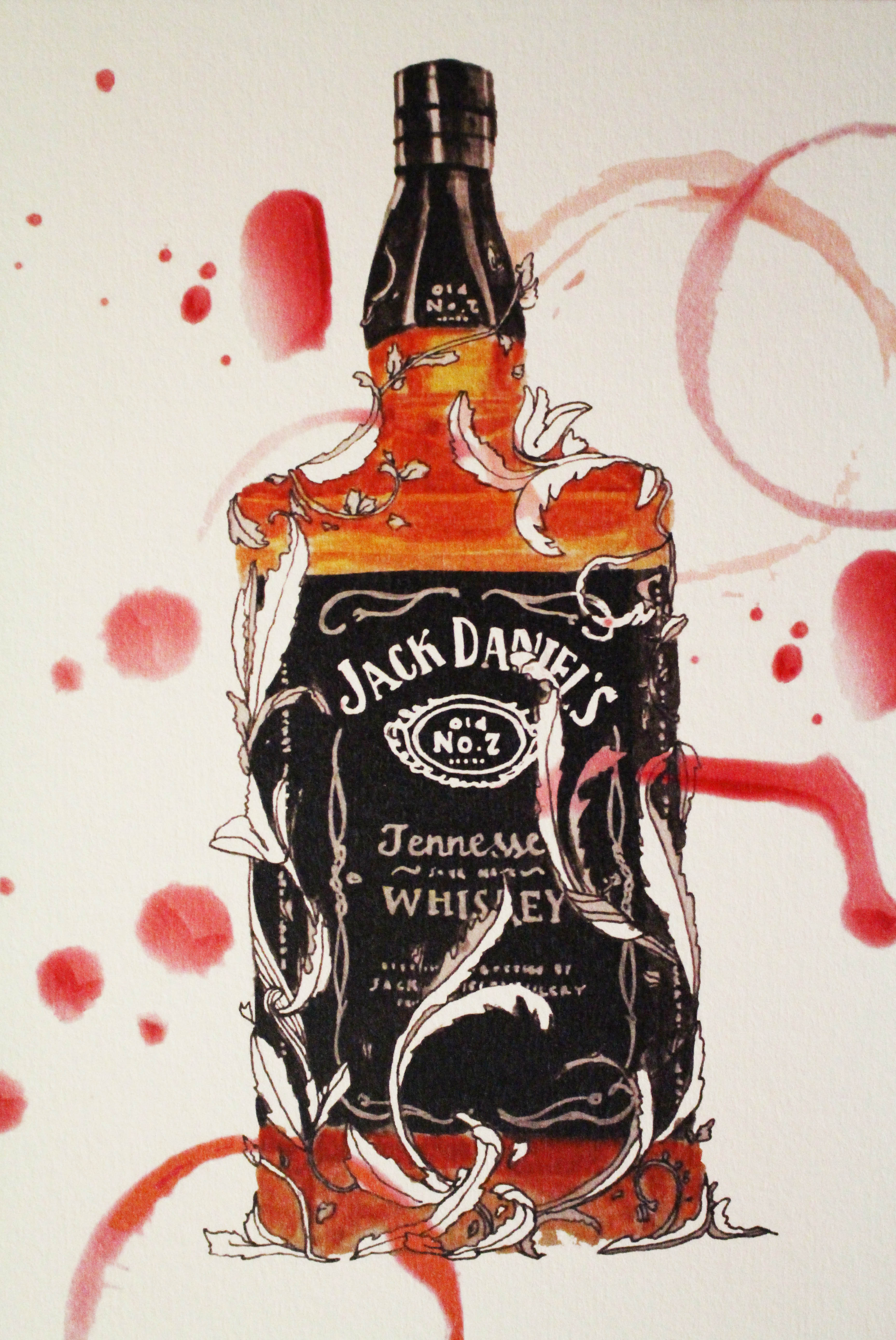
Actually I had trouble coming up with a common theme for my zine because the main topic for it was alcohol. I wanted to do something similar to my research, such as the pop ups or the different shapes layout for my zine, but it was hard to implement them in the context of alcohol. There wasn’t any inspiration for the cut outs.

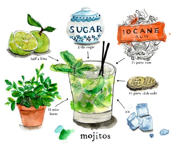
19c9dd00302a622296b13cf6866d2be1

I came across this image, and I thought about illustrating in the same way the ingredients of different alcohol, but given that mine was more towards beer rather than cocktails, it seems a bit out of context plus I did not know the ingredients of Jack Daniel’s alcohol.

Given I did not want to make it too complicated, I decided to settle for alcohol spills as my overall theme. It easily conveys the idea that my zine would be about alcohol as when people see the marks of red circles, they would relate it to alcohol spills made by glass cups.

Zine research

I was pretty clueless about what’s a zine and how it looked like and how to go about doing it, so I went to pinterest to hopefully clear my doubts and pretty much, I found some zines that were interesting to me.

7d4268df417d9083b4f25fa47e87b4ac

What interested me in this bee design was that while most zines were basically rectangular in shape, this was designed in the shape of honeycombs. It led me to think that the zine could be shaped in a certain way to better covey or complement the idea.
c4df8e1f89fd2798d3daed47de7f7046

For the second one, I liked how blue and orange were constant themes in the zine, and also the interactivity of it. There were pop ups, layouts and paper art that I found were really lovely and how these were also able to better explain or make an idea more interesting.

f48c68f77c1fe1570223b1672d2b364f

For the last design, I really loved the intricate paper cut outs and how each page was cut in consideration to the adjacent pages. I thought I could do something like this but sadly my paper cutting skills are of novice levels so I kinda did not go with the idea.