
feedback from last week:
- many of the structures proposed the previous weeks were too complex and dominates over the shadows i.e. viewers focus on the form rather than the shadows
- keep the structure of the installation simple
- use a combination of opaque and translucent material instead of only translucent to show more contrast
references
James Turrell


Felice Varini

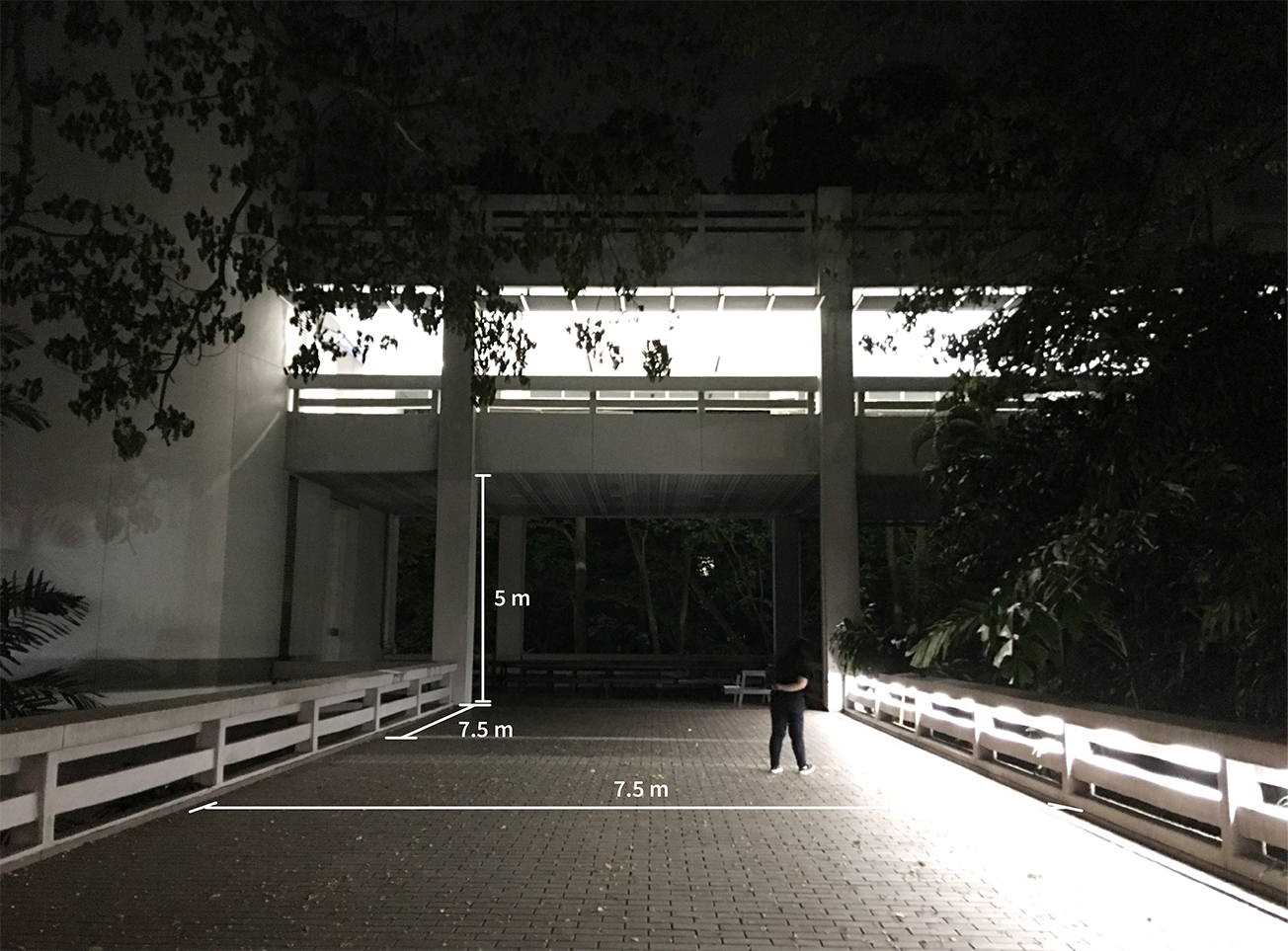
on-site measurements

existing canopy (with similar shadow effect)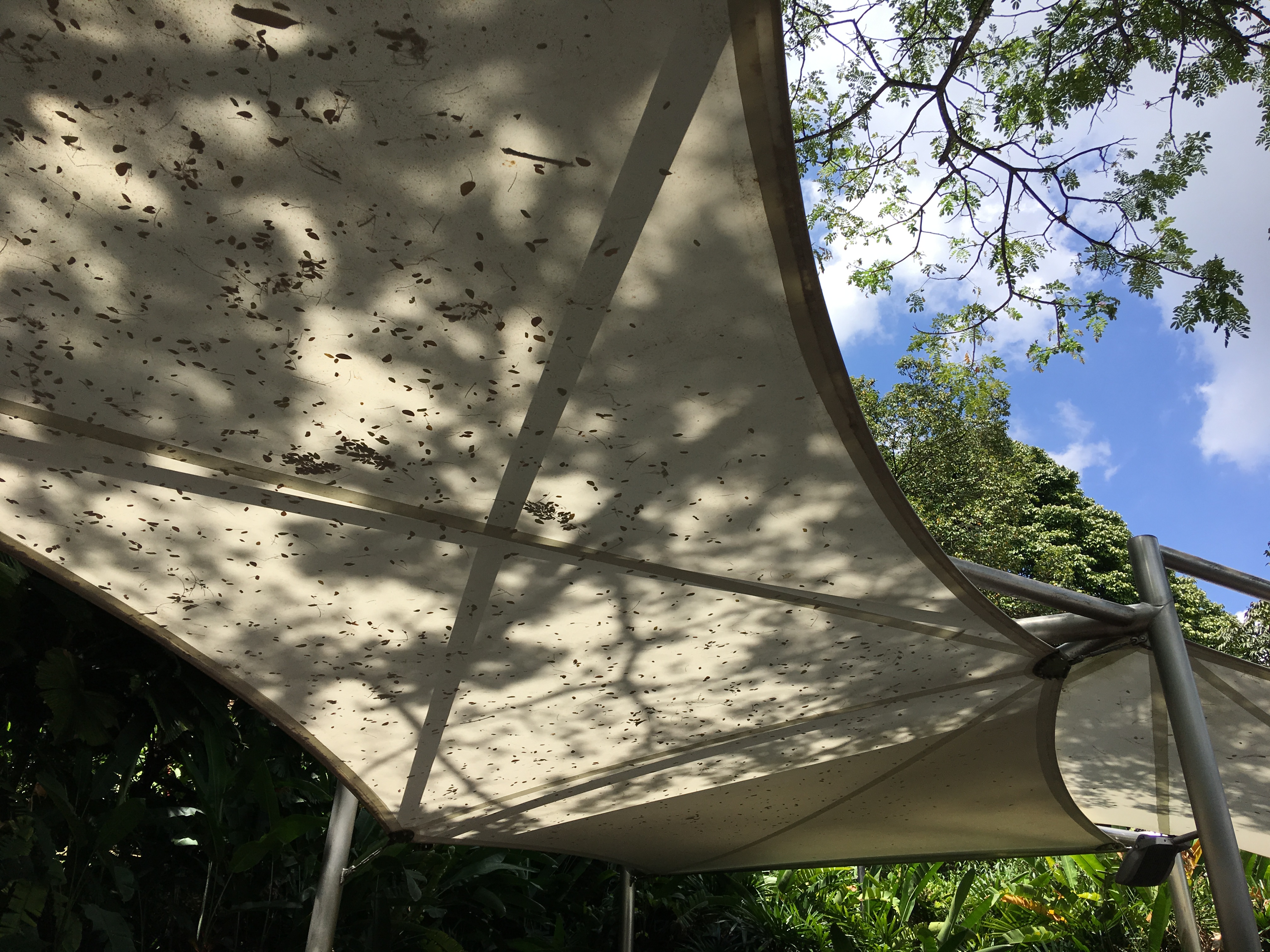
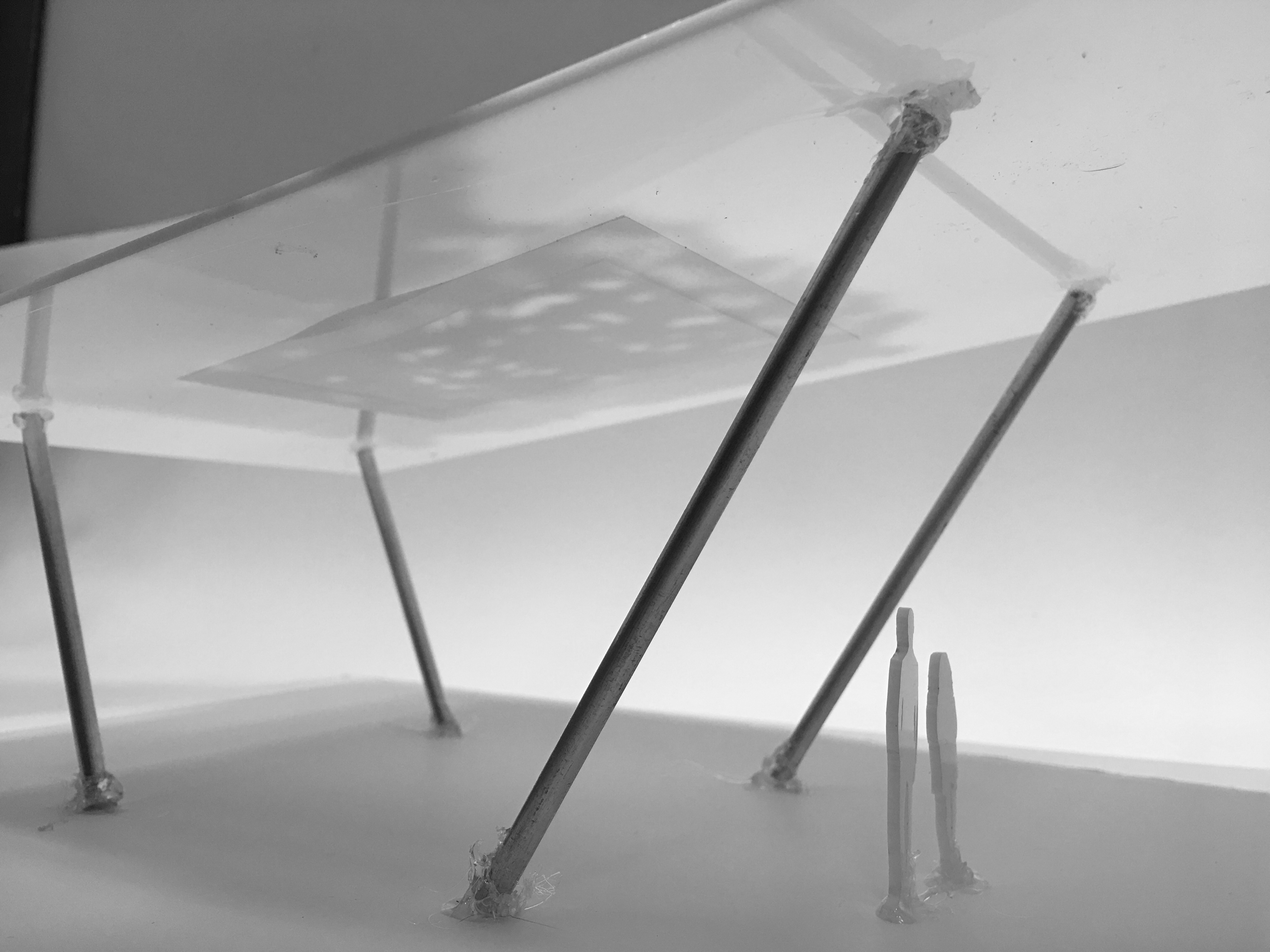
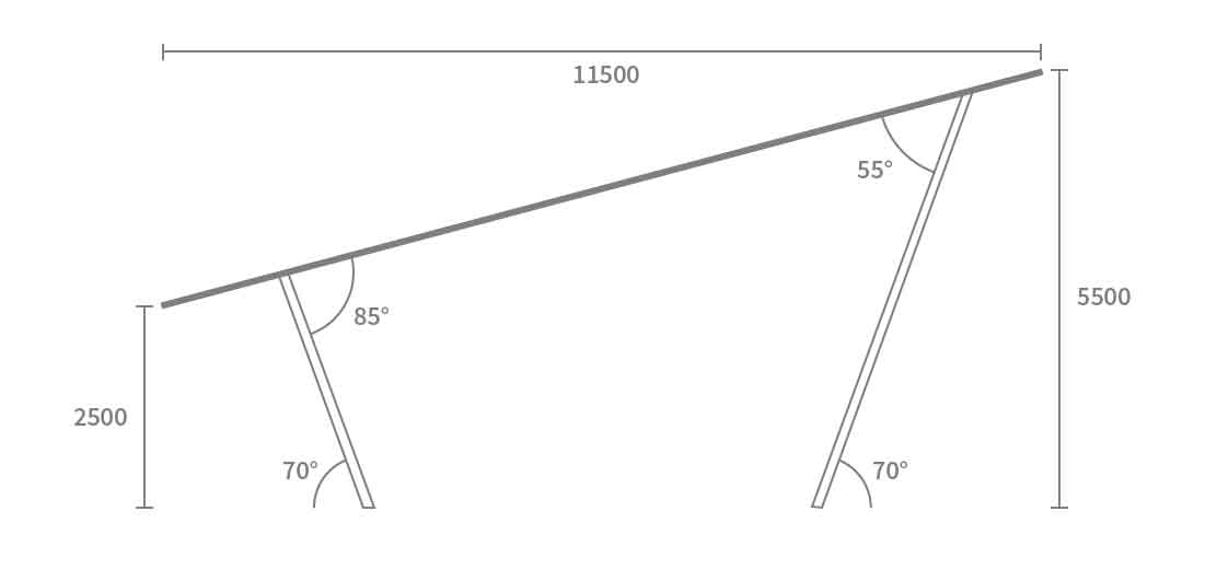
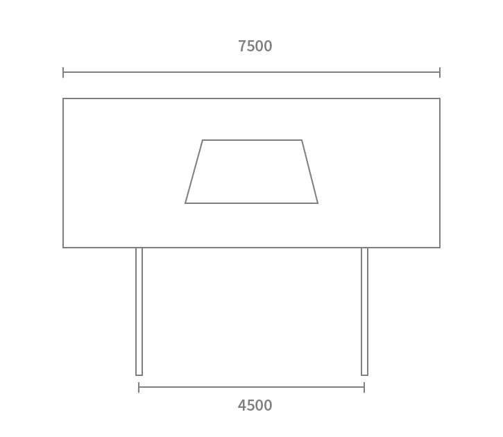
proposal
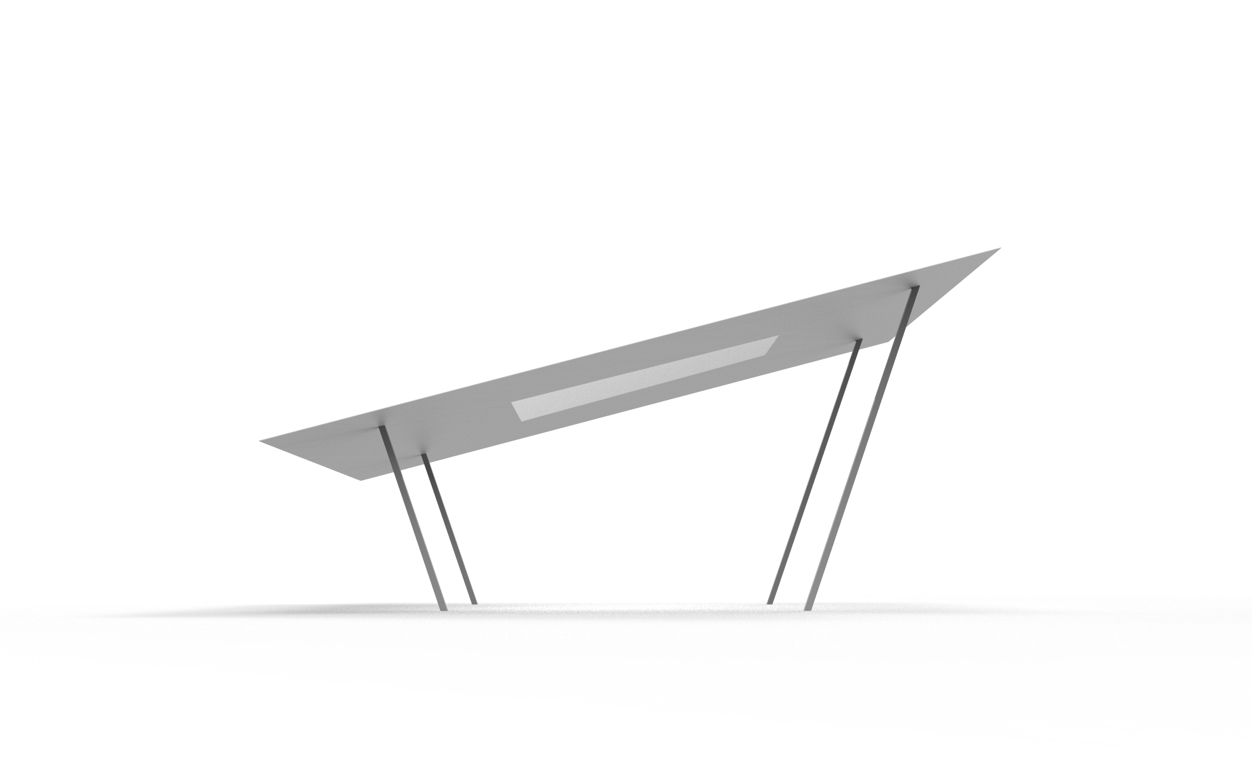
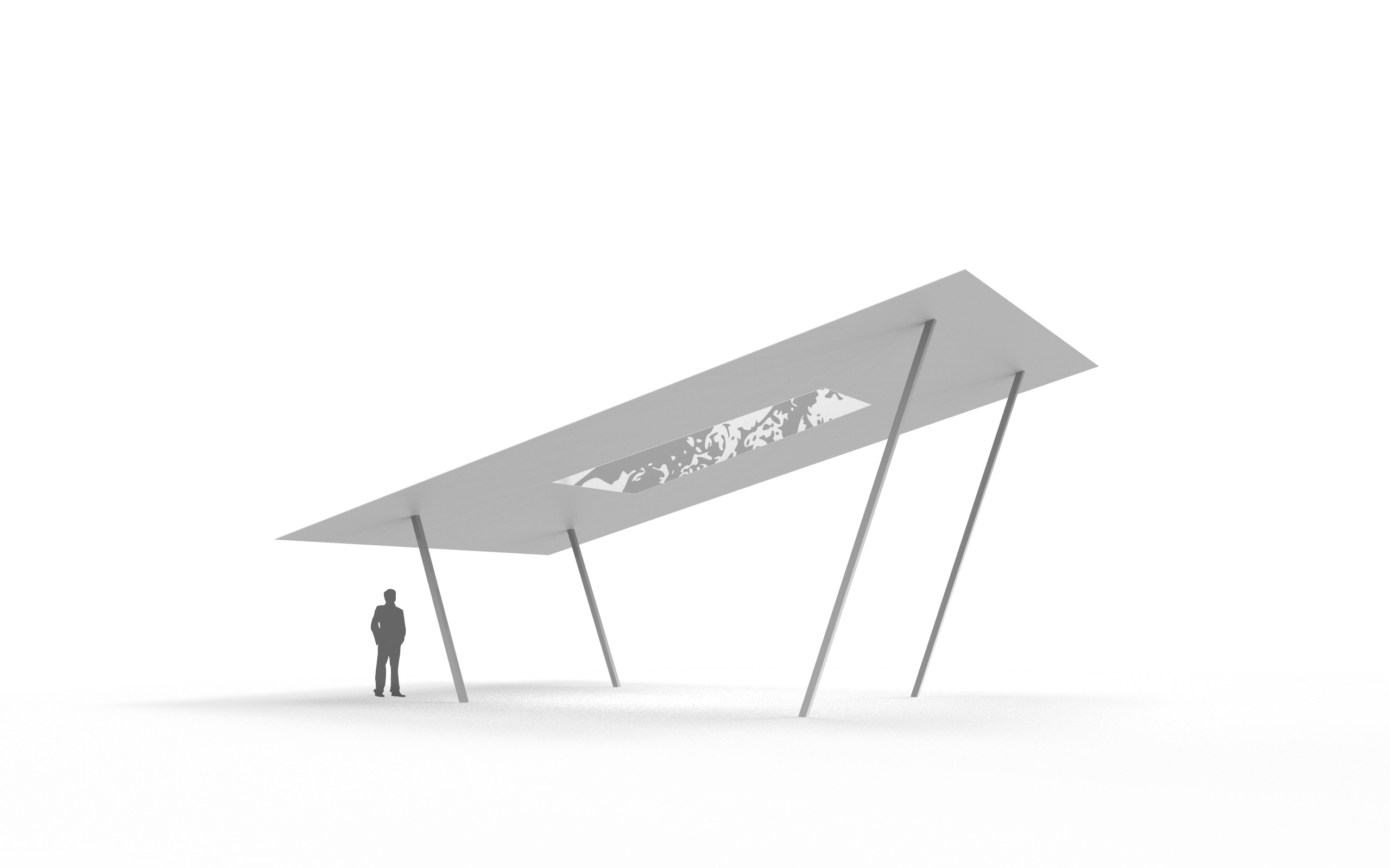
- by pushing the supporting structure towards the inside, it creates a cantilever effect and viewers are more inclined to look upwards
- the structures are angled so that the form does not blend in with the surrounding and overlooked, and does not look like the existing canopy
- the panel is angled slightly on one side for easier viewing
- the panel is inclined in this direction as it catches most of the sunlight, thus shows the most amount of shadows throughout the day
- the size of the panel is set such that it covers the whole width of the corridor so that no shadows of the foliage shows at the edges, while maximising the stretch of the site
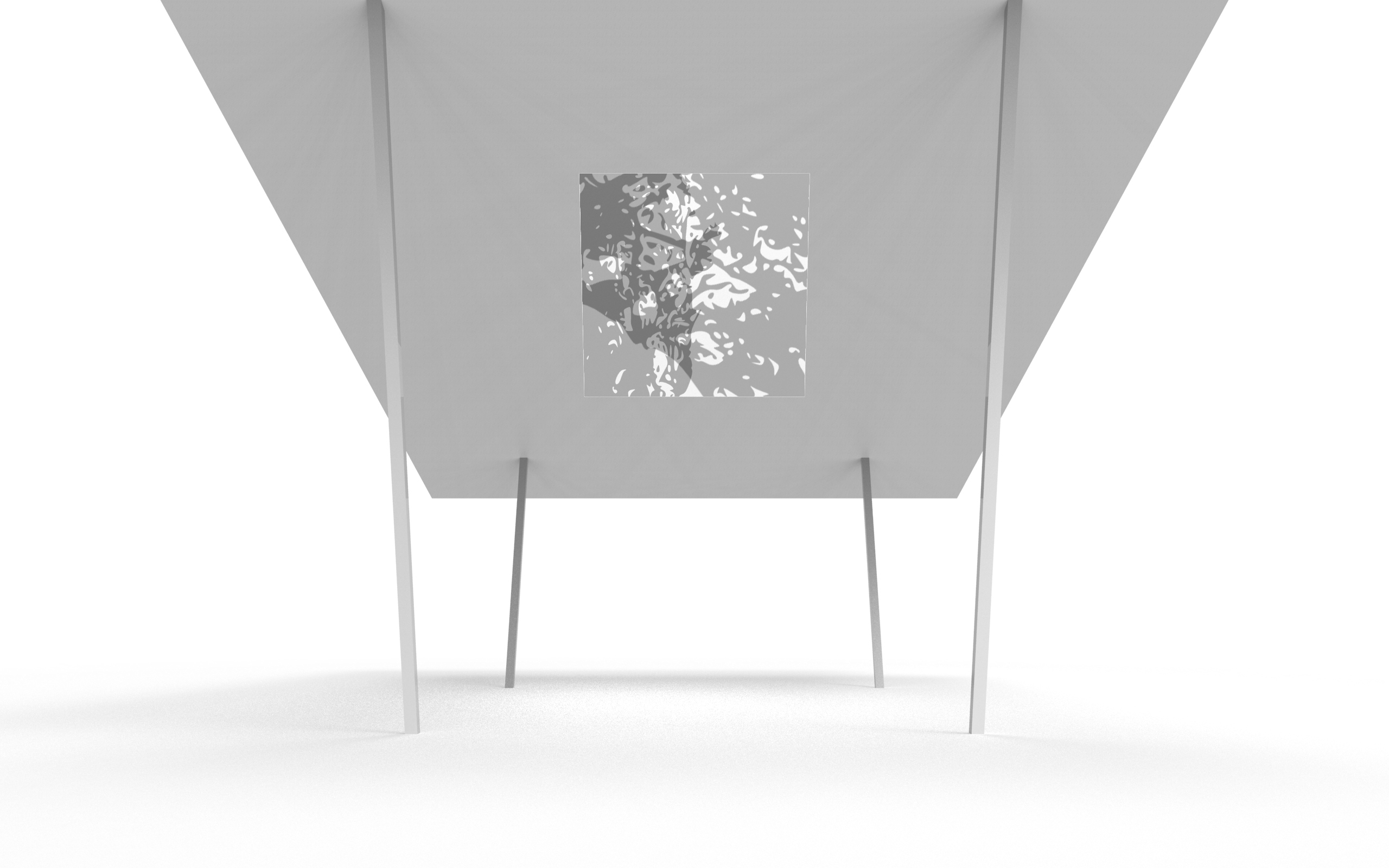
- the shape of the translucent material in the middle plays an optical illusion such that it looks like a square from certain perspectives
simulation
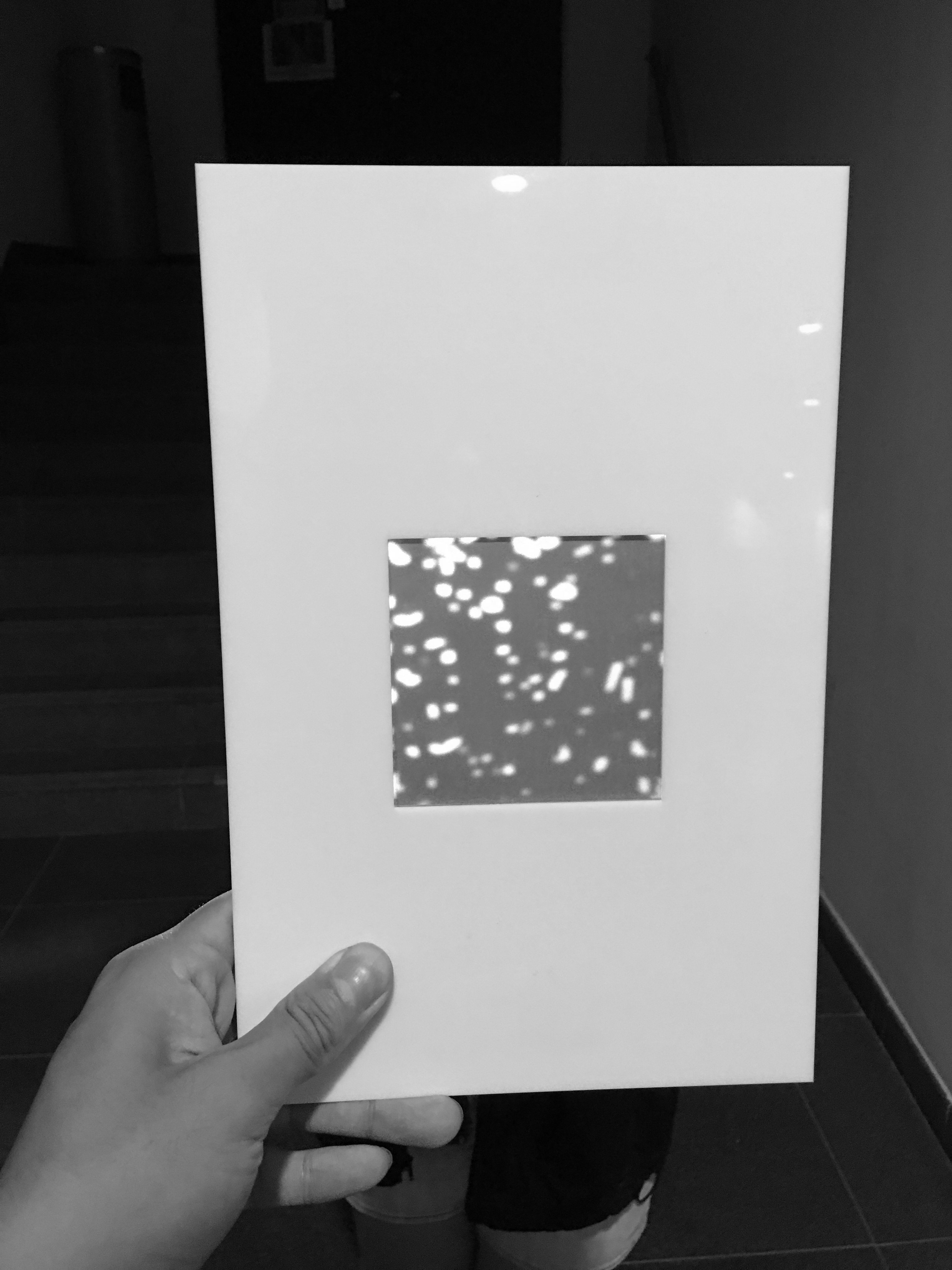

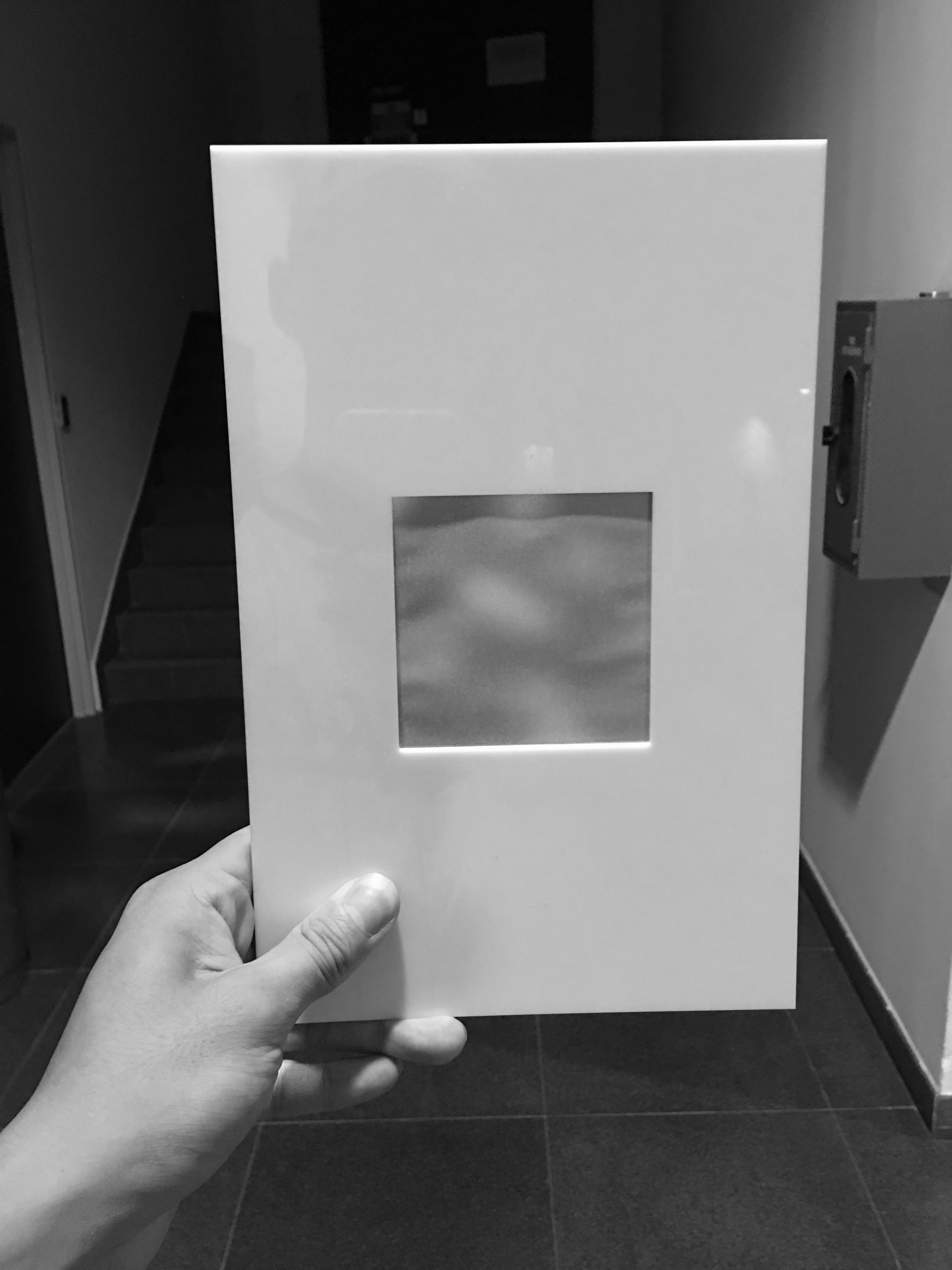
simulation of material and distance.
from top to bottom, the distance between the light source and the panel increases, the shadow cast gets more blurry and less distinct.