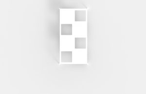
edited final illustrations after critique session
jack of all trades. i make things.
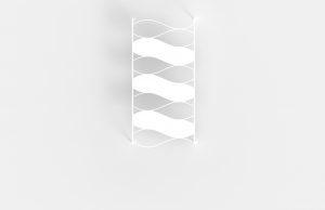
edited final illustrations after critique session
feedback from last week:
Rabbit and the Tortoise collection by Studio Juju

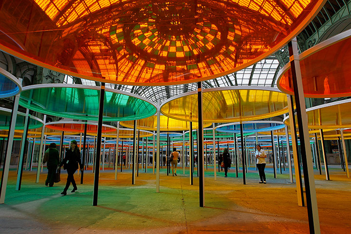
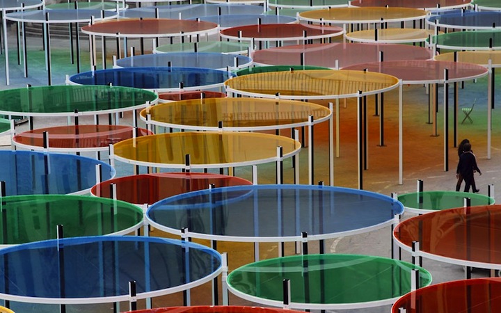
Manta by Ross Lovegrove
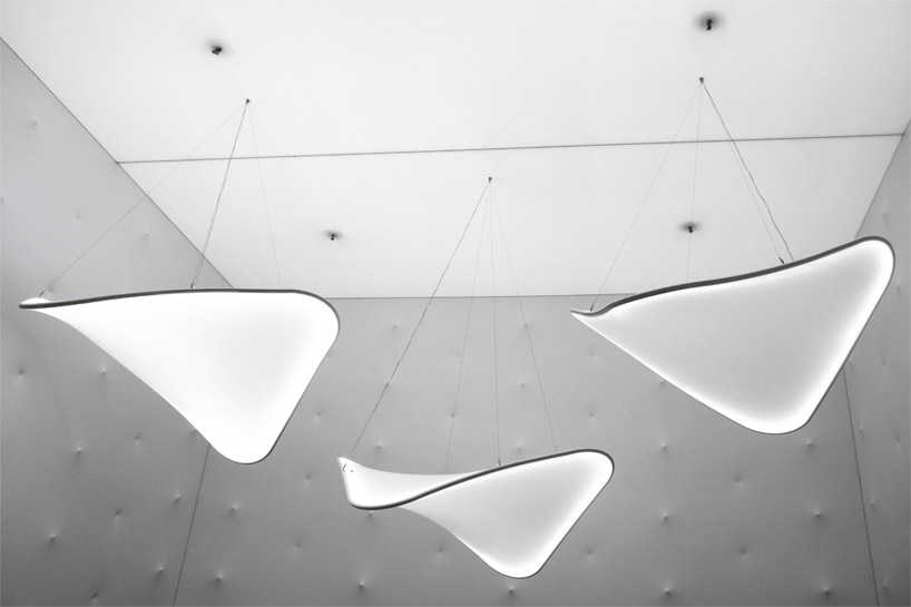
Fata Morgana by Teresita Fernandez

La Pineda by Javier Mariscal

Playground for Machida Kobato Kindergarten by Etre Design

1 fluorescence
Fluorescence is the emission of light by a substance that has absorbed light or other electromagnetic radiation.

In most cases, the emitted light has a longer wavelength, and therefore lower energy, than the absorbed radiation. The most striking example of fluorescence occurs when the absorbed radiation is in the ultraviolet region of the spectrum, and thus invisible to the human eye, while the emitted light is in the visible region, which gives the fluorescent substance a distinct color that can only be seen when exposed to UV light.
Fluorescent materials cease to glow nearly immediately when the radiation source stops, unlike phosphorescent materials, which continue to emit light for some time after.
type: luminous
characteristic: lightly visible under sunlight, no effect in the dark or at night
2 phosphorescence
Phosphorescence is a process in which energy absorbed by a substance is released relatively slowly in the form of light.

/GettyImages-594838193-566744f95f9b583dc3ab08c3.jpg)
This is in some cases the mechanism used for “glow-in-the-dark” materials which are “charged” by exposure to light. Unlike the relatively swift reactions in fluorescence, such as those seen in a common fluorescent tube, phosphorescent materials “store” absorbed energy for a longer time.
type: luminous
characteristic: clear in the day, visible in the dark or at night
both fluorescent and phosphorescent effects can be achieved by luminous paint – easily found in Singapore paint shops, Art Friend, Spotlight, Lazada
3 photochromic
Photochromic materials are colorless in their inactivated state and become colored when exposed to an ultraviolet light source. They will respond to natural sunlight, and darkens as the light level increases.
Common applications of photochromic materials include sunglasses and spectacles.
type: darkening/colour-changing
characteristic: visible under sunlight, clear in the dark or at night
effect of photochromic ink
online products:
Solarmax Series ink (used in the video)
SFXC UV photochromic plastisol
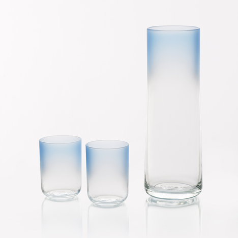
4 coloured glass
Colour Glass collection by Scholten & Baijings for Hay
coloured glass suppliers in Singapore:
https://www.carltonglass.com.sg/painted-glass
http://www.synergraphic.com.sg/synergraphic/public/productMain.jsp ???


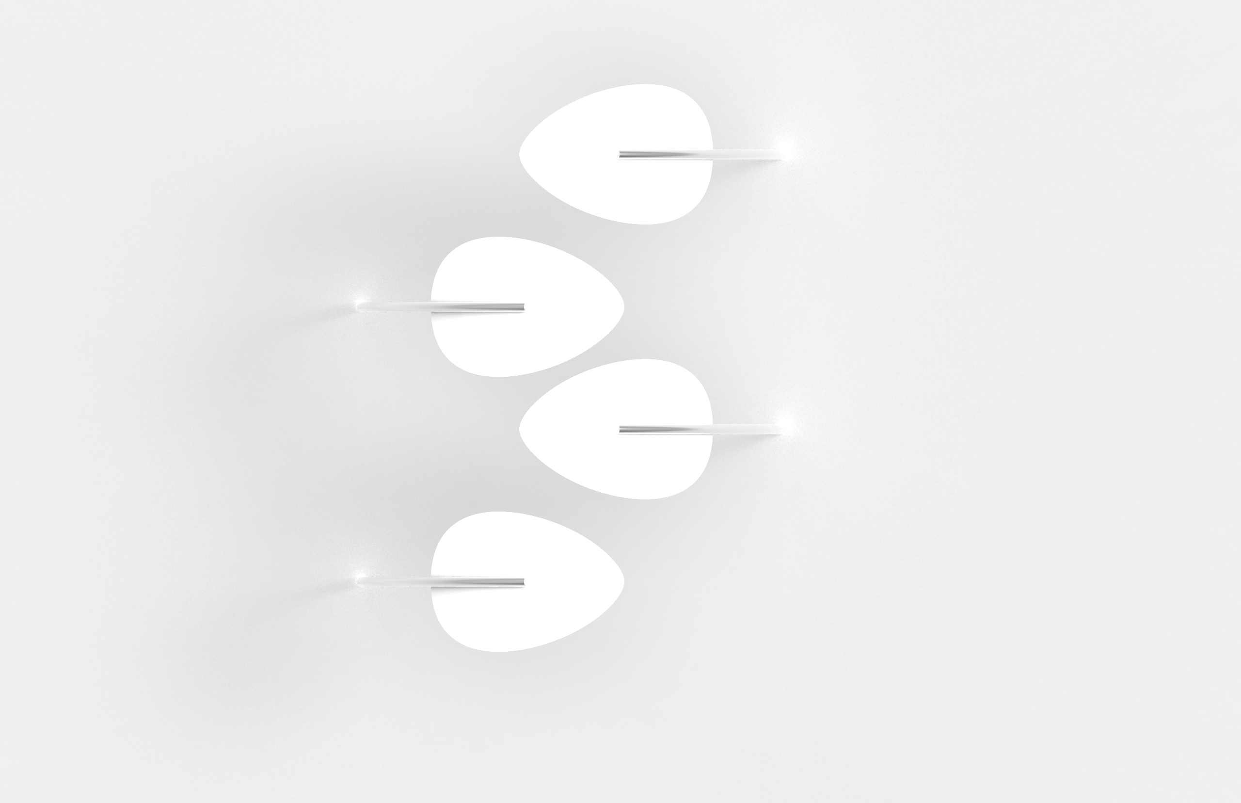
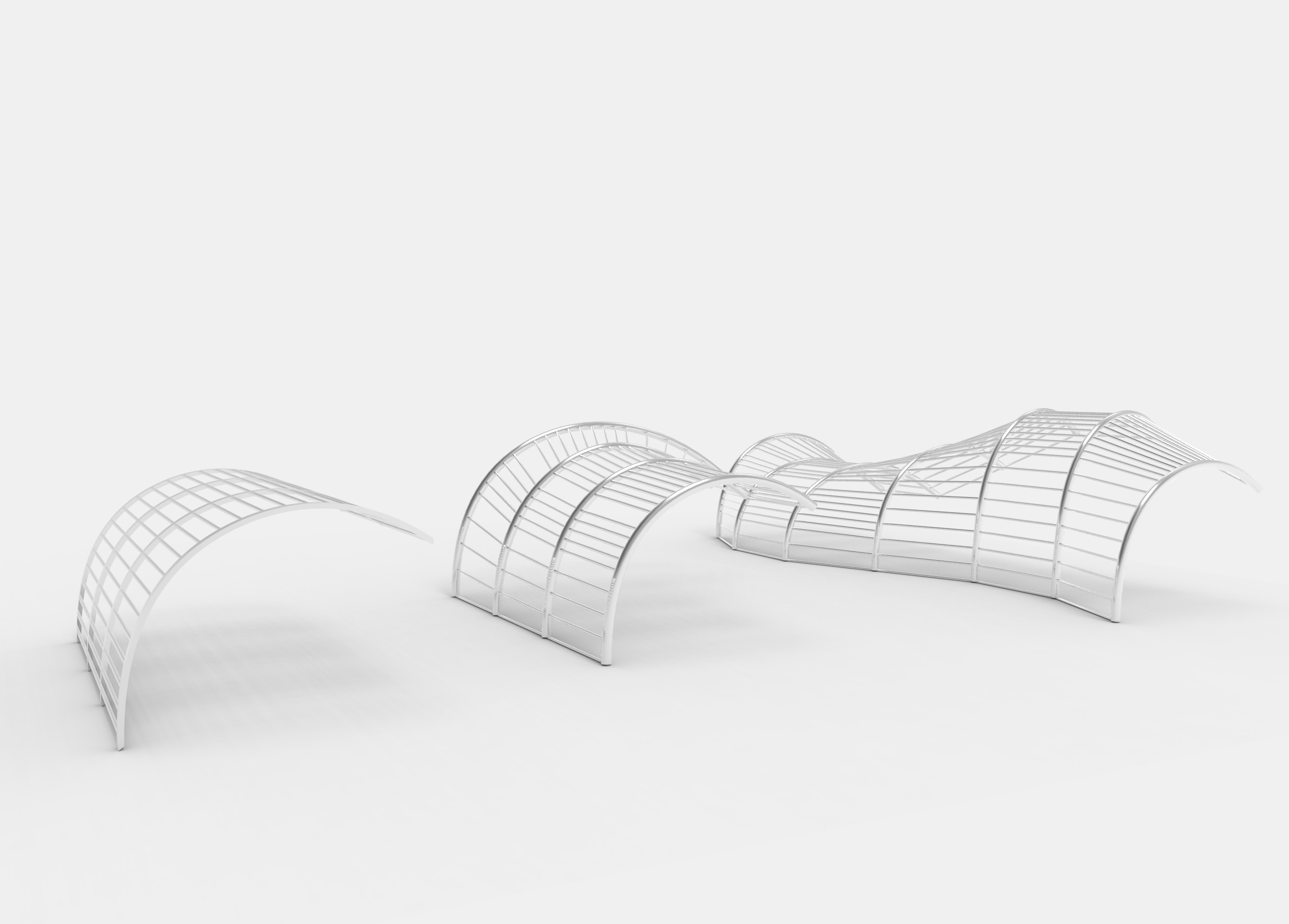
similar concept to last week’s, but the shape is curved upwards to make the form more intentional and deliberate, unlike conventional shades


irregular and organic forms intentionally designed so as to not resemble a conventional shade/canopy


reference photo for proposal above:


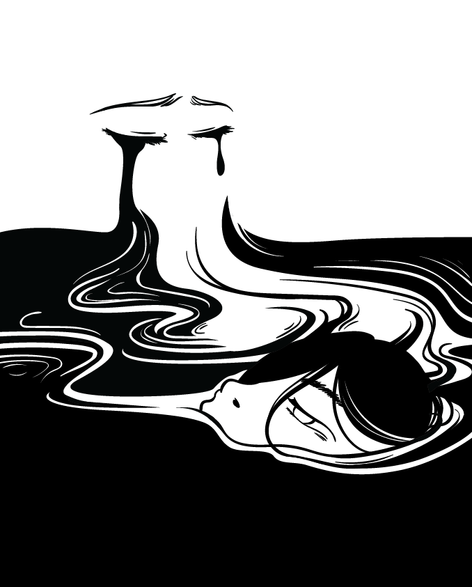

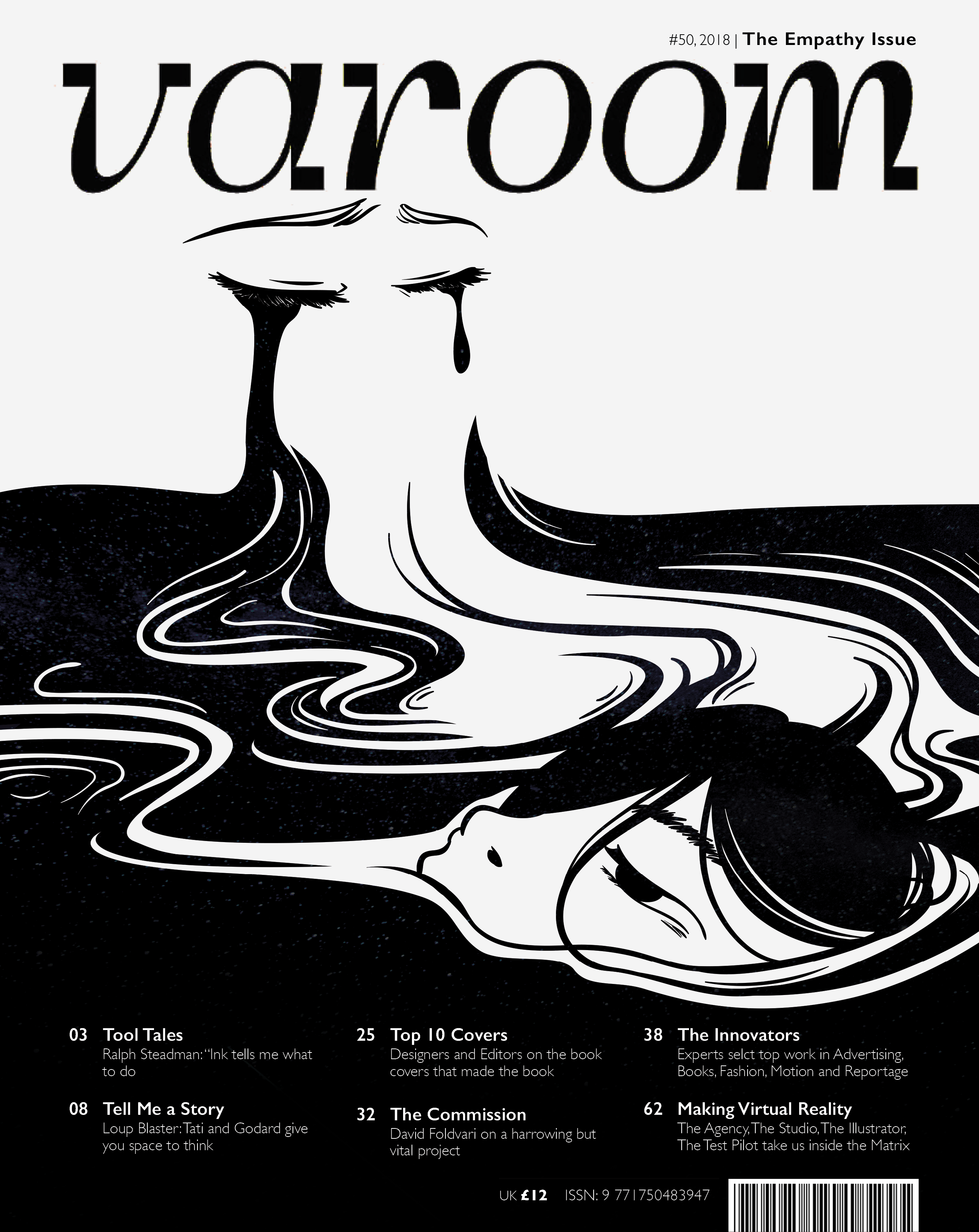
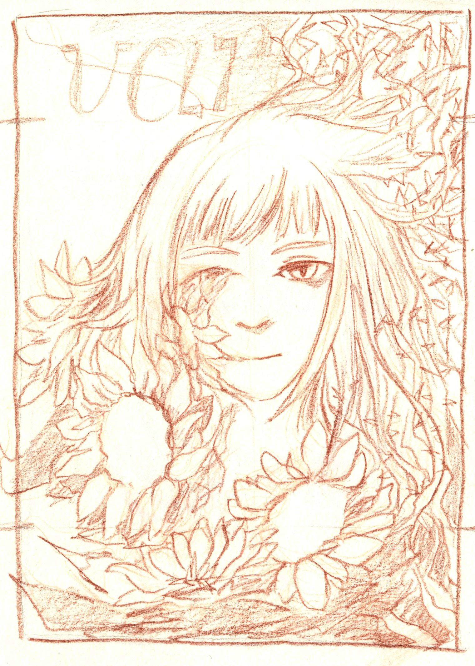
kind of found this effect (above) by accident while playing around with the layer modes and it was something i was looking for, so that the floating face stands out more. so i tweaked the effects a little to get to the final piece.
also i found the face too much of flat white so i coloured her eyes
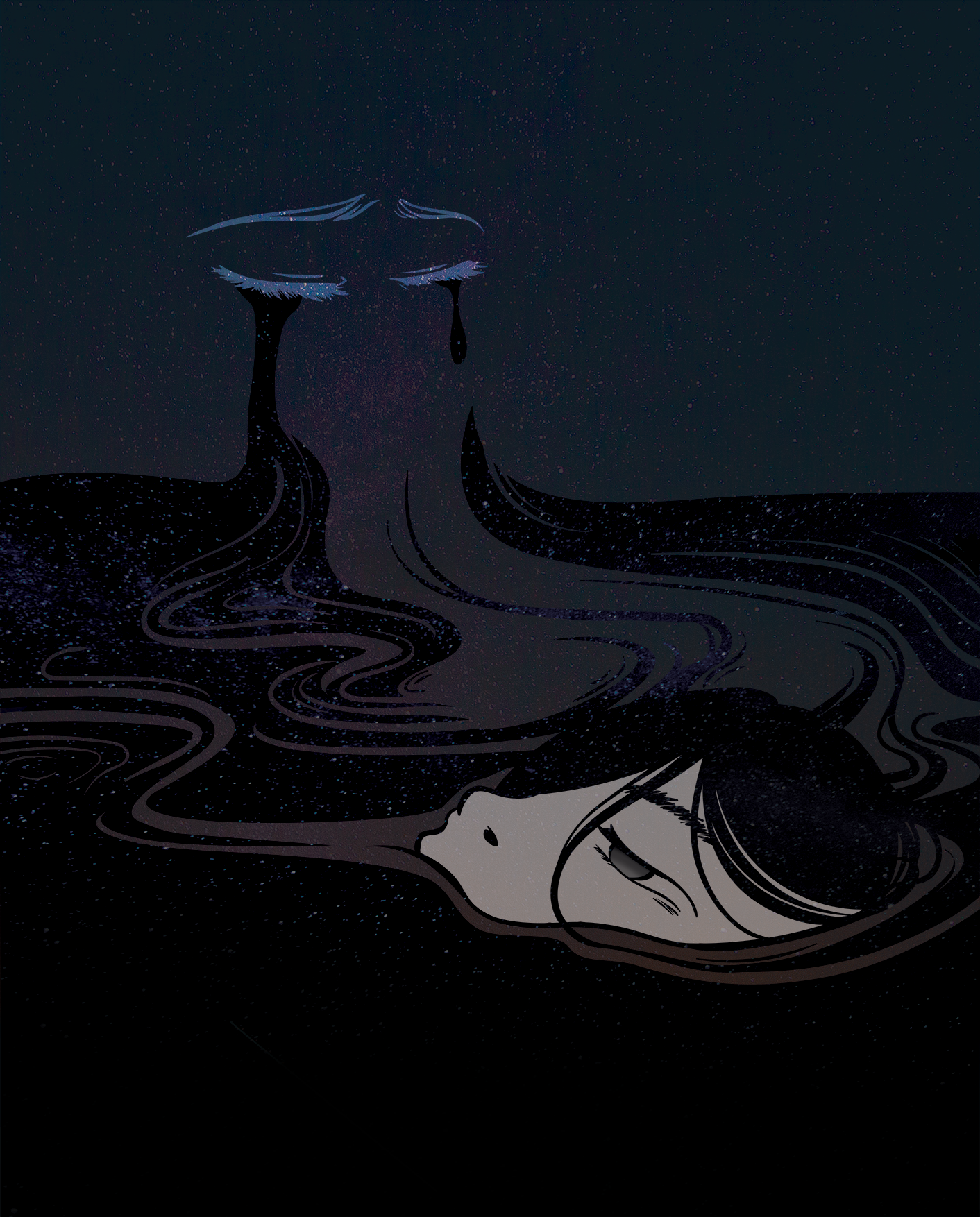
edit: okay SO after the critique session, i received feedback from Lisa and a few peers that the contrast between the black and white in the first outline-only composition works far better and conveys the message clearer as well.
so i shall edit the final piece and update this post later!
lesson learned: stop adding too many things :’)
feedback from previous weeks:
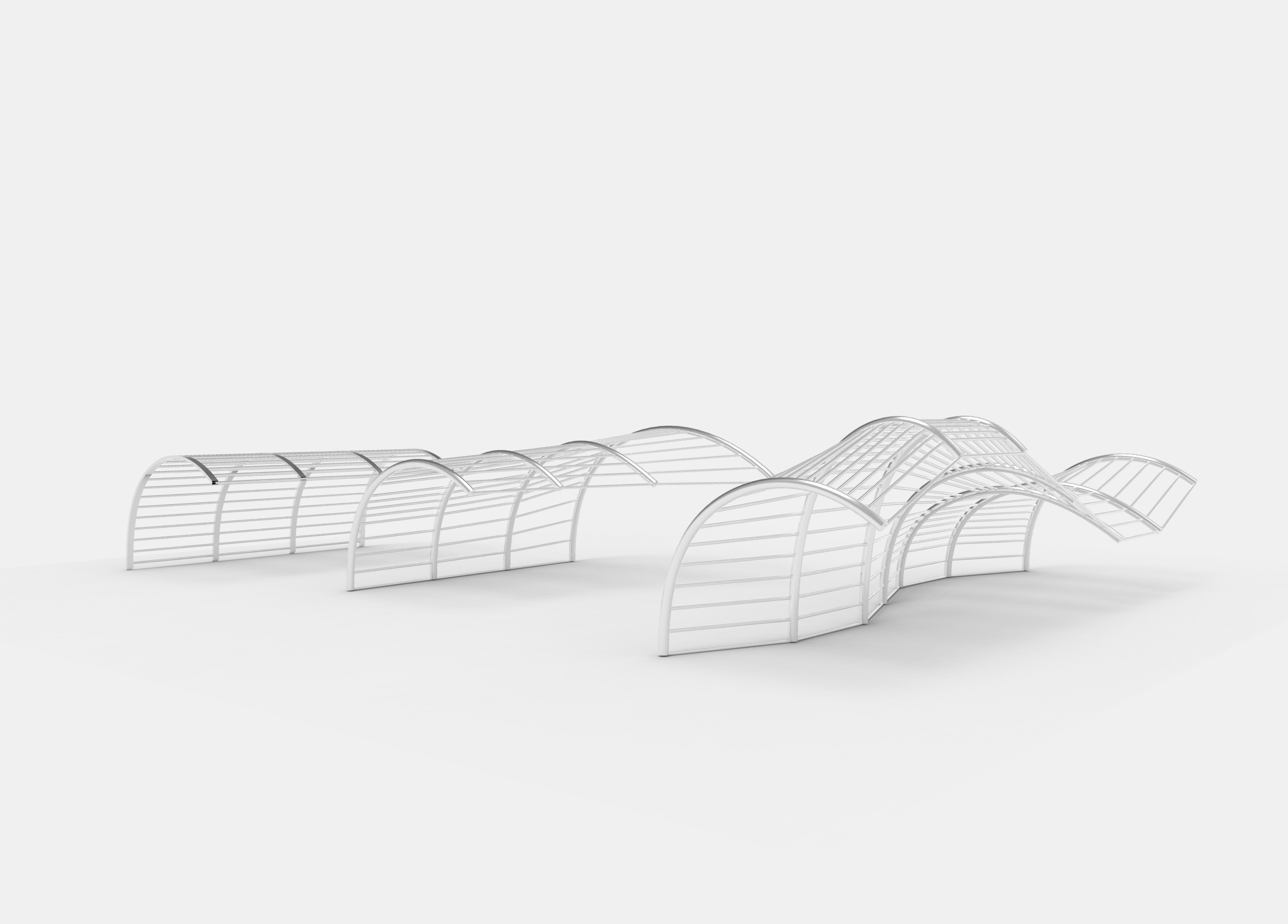
when developing forms and functions for the installation, we were stuck on the idea of having the passerby notice the shadows (forcing it on them). benefit of doubt that the users see what we intend to do. so we decided to leave it open-ended.
we clarified that there are two directions we could take to use the shadows in the environment:
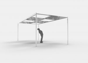
1 define a space. because the environment chosen is a common area and is too noisy, the aim of the installation is to tone down and create a neutral space. some examples of forms the installation could take are canopy, architectural pieces, tunnel, partition.
2 define a three-dimensional object. by placing an object that is out of context and stands out from the environment, people are more inclined to look at them as individual objects rather than objects that blend in the background to only serve a purpose (e.g. shelter)
another point we clarified was also to use simplified forms, because the aim of the installation is to make use of the shadows surrounding the site, and a form that is too complex will simply overshadow and dominate the shadows. at the same time, it cannot be too simple; it needs to have a character and intentional so that it does not blend in to the background.
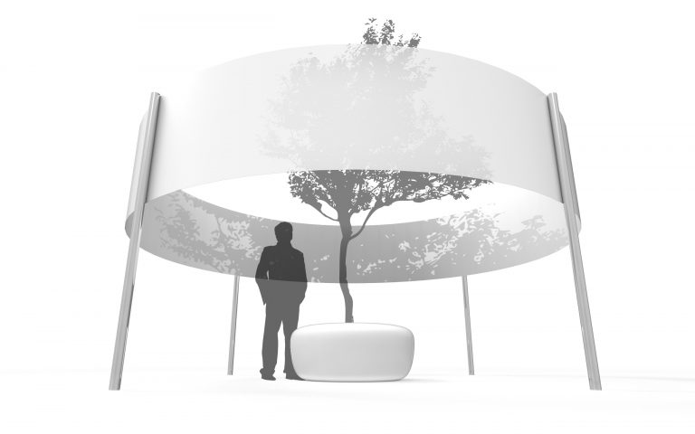
curating light through space and architectural structures
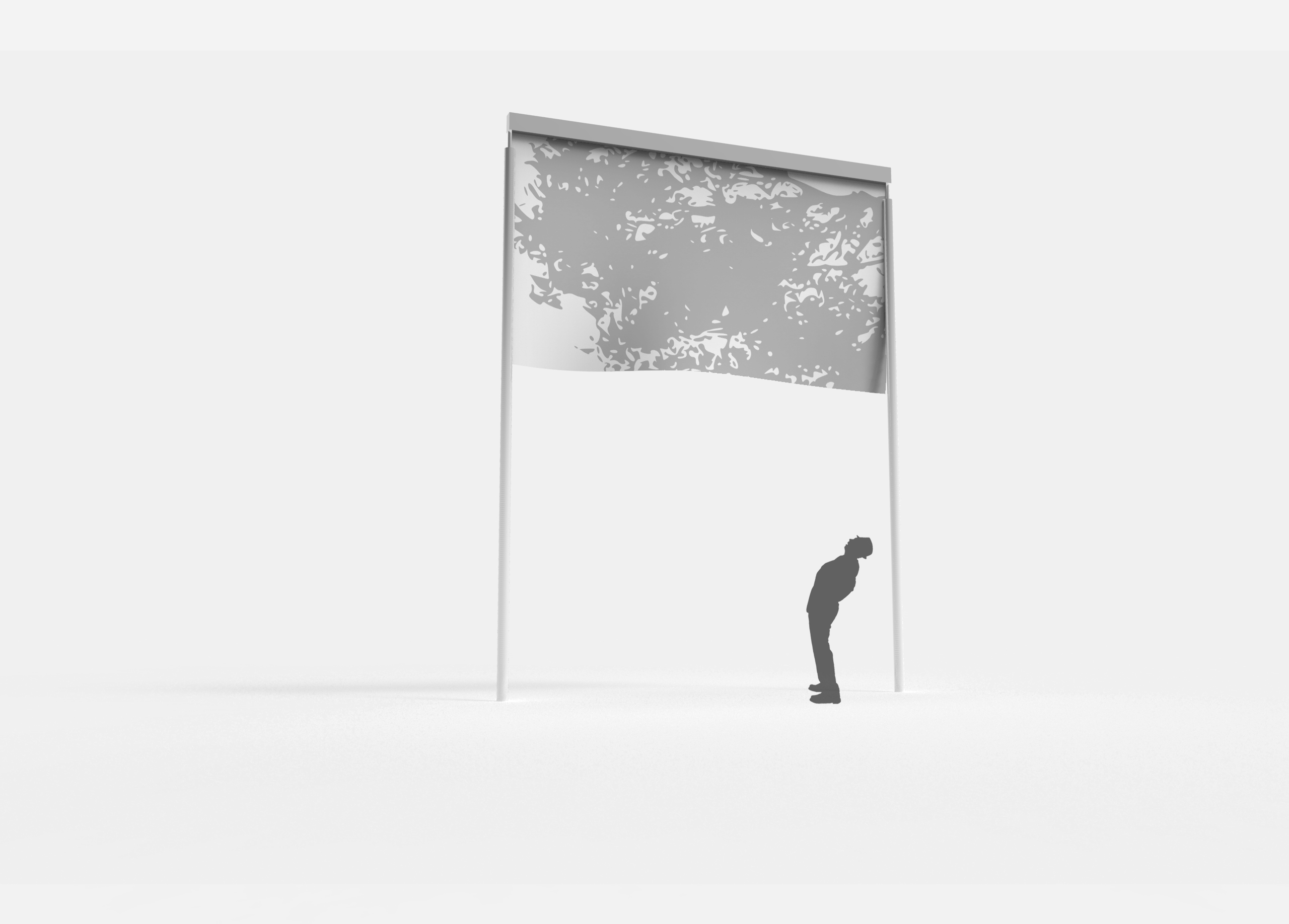
(above) 5-metre tall structure with hanging polyester mesh. interacts with the wind and serves as a big canva for the shadows to cast and interact on. the takeaway of this structure is that it is simple yet the size makes it eye-catching, and does not take away from the shadow.
shade structures by MDT-tex
Excentrique by Daniel Buren
Le Refuge by Marc Ange

Virgin Lounge Melbourne by Tonkin Zulaikha Greer Architects

1
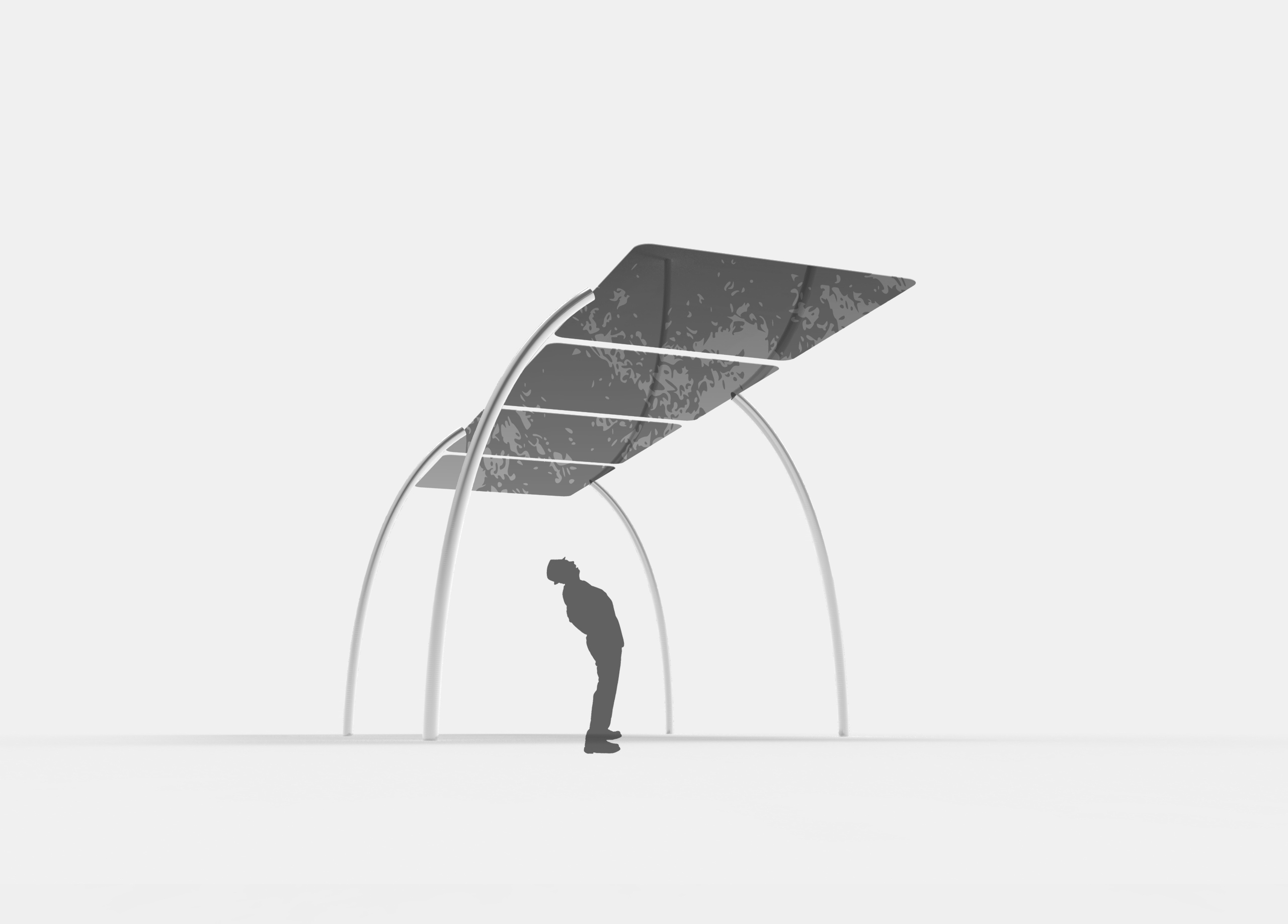

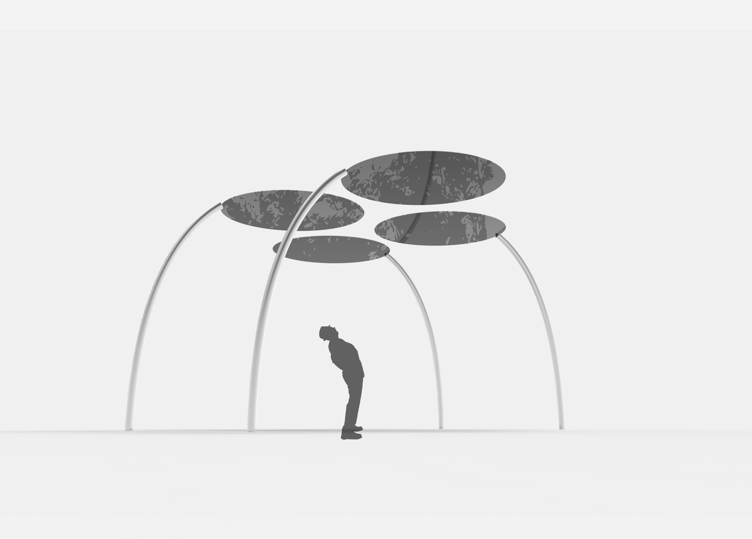


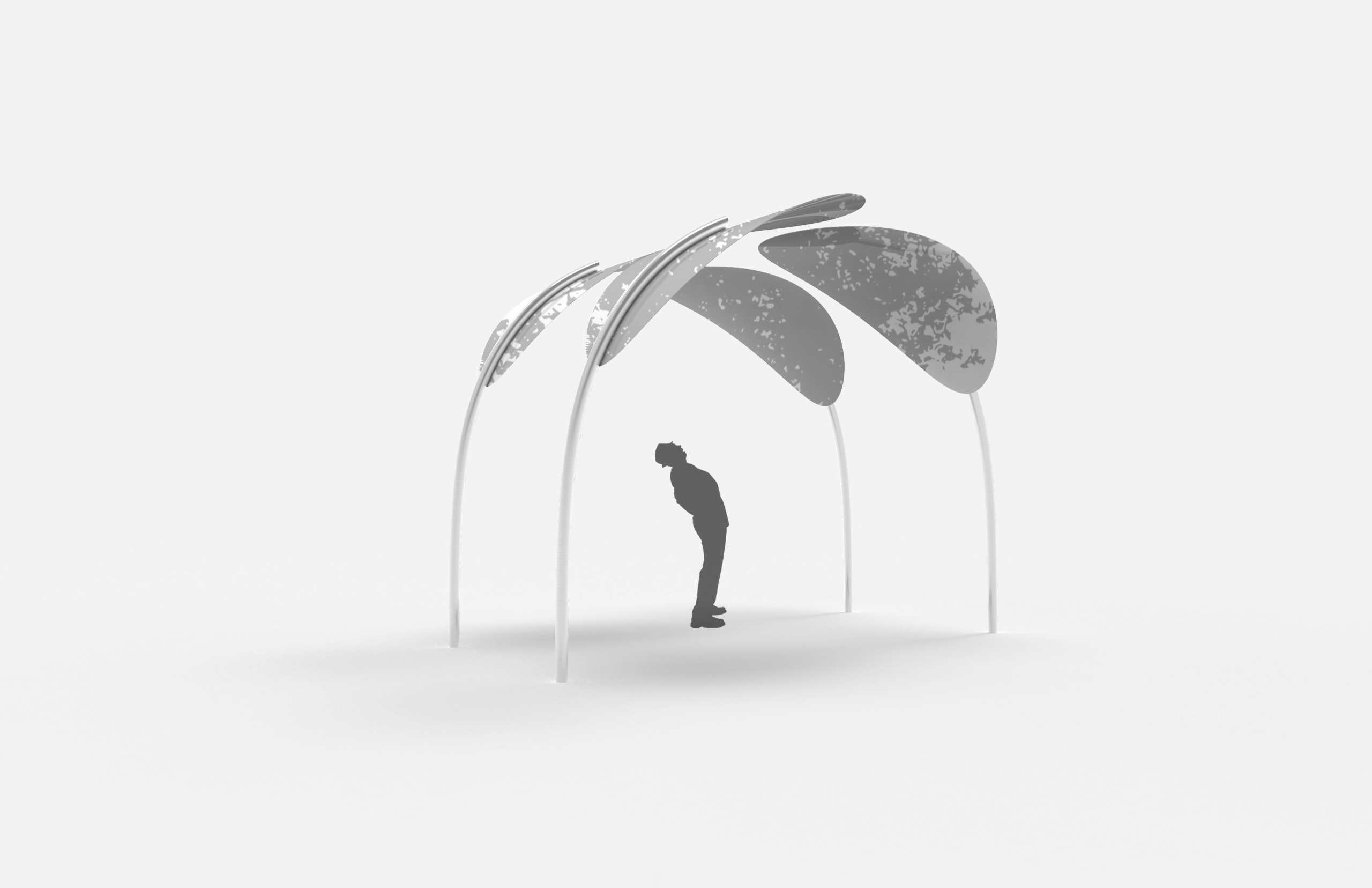

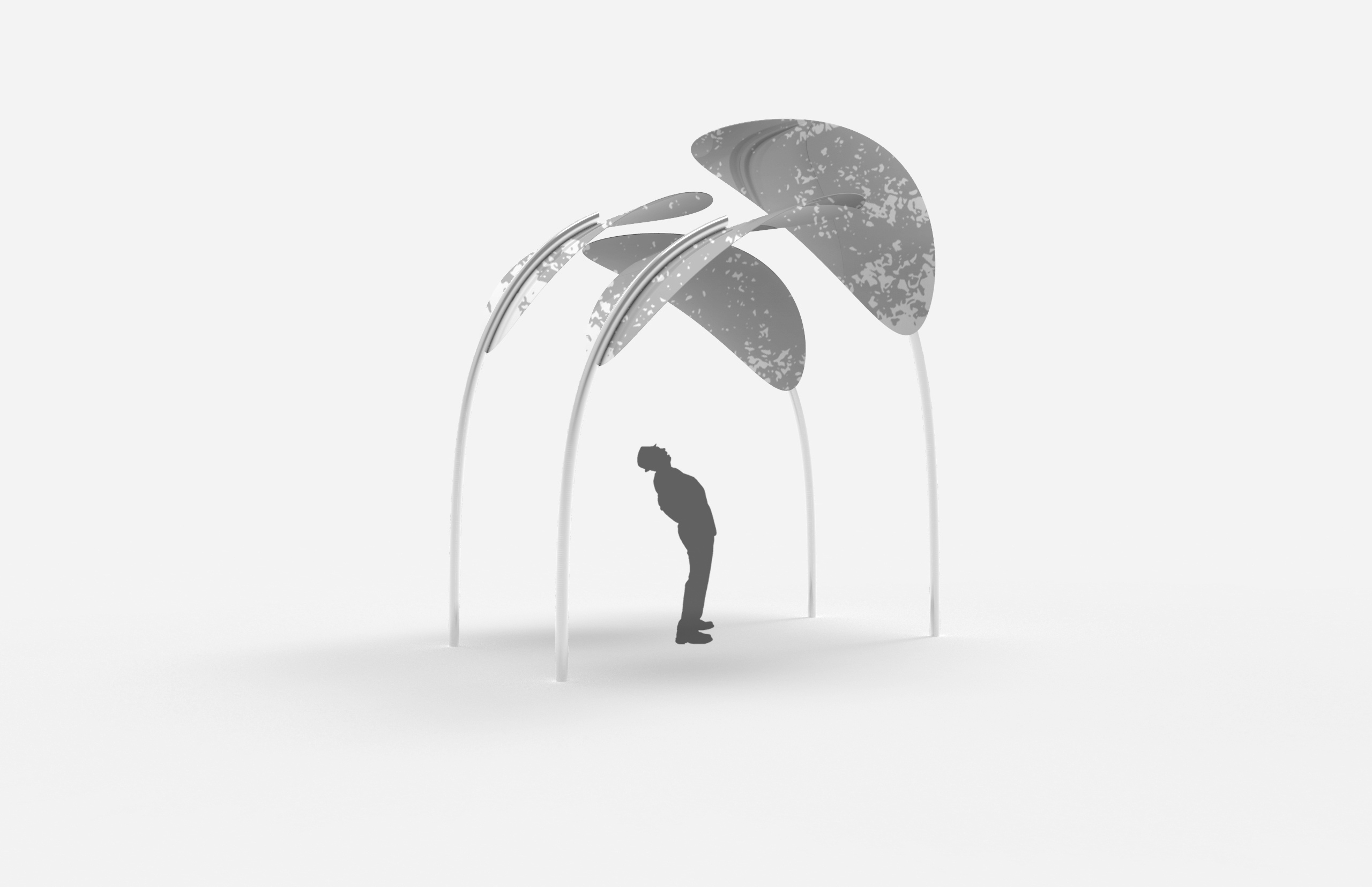

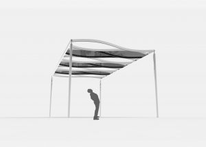
in regards to the character and intention, the curved structure vs the rigid structure of the existing canopy suggest that there is an intentional design process. it does not look like an off the shelf structure, but a one-off, customised, curated and specific.
material: polyester mesh, stainless steel structure to foundation
height: 3-4 metres
can be duplicated/arrayed along the stretch of the walkway
possibility of using colours for material
2
reference:

different from the previous idea in which we are framing the shadows in the environment, the second idea is more curated towards creating shadows with the installation. the installation provides a structure for vines and climbing plants to grow on them, where the structure creates rigid shadows while the plants curate more organic shadows.
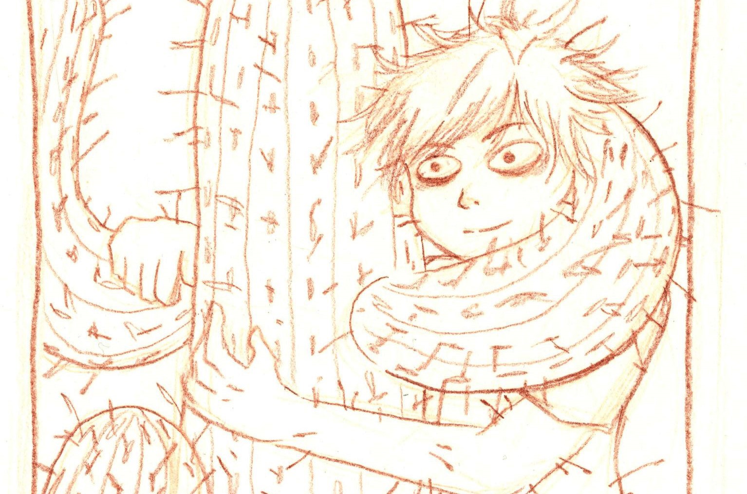
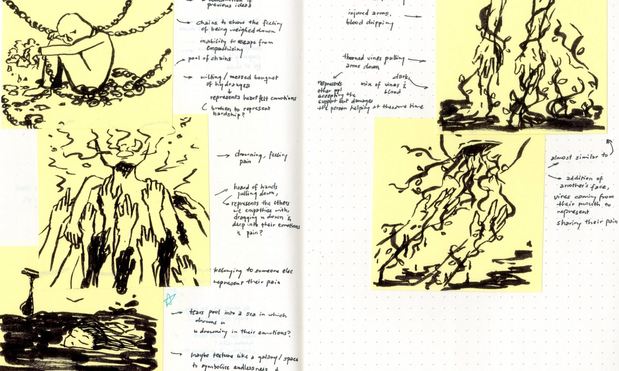
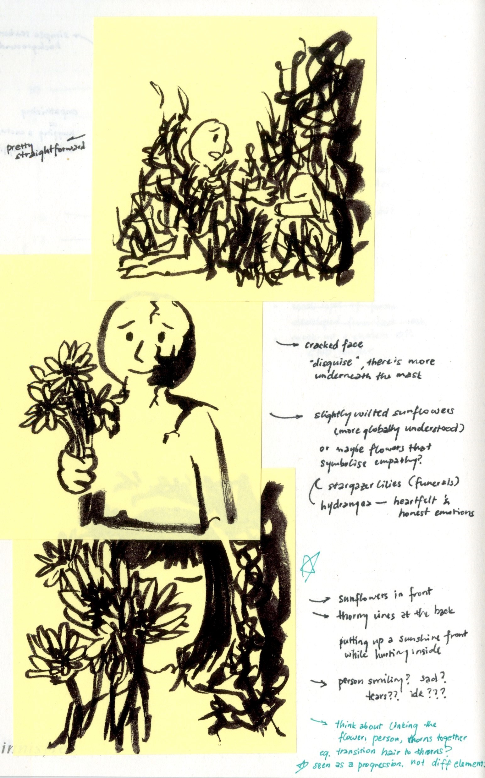
concept: negative impacts of empathy
1
idea 1 is revolved around the idea of putting up a sunshine front (hence sunflowers) when empathising; but too much empathy hurts yourself in the process, thus the thorns at the back
2 (two versions)
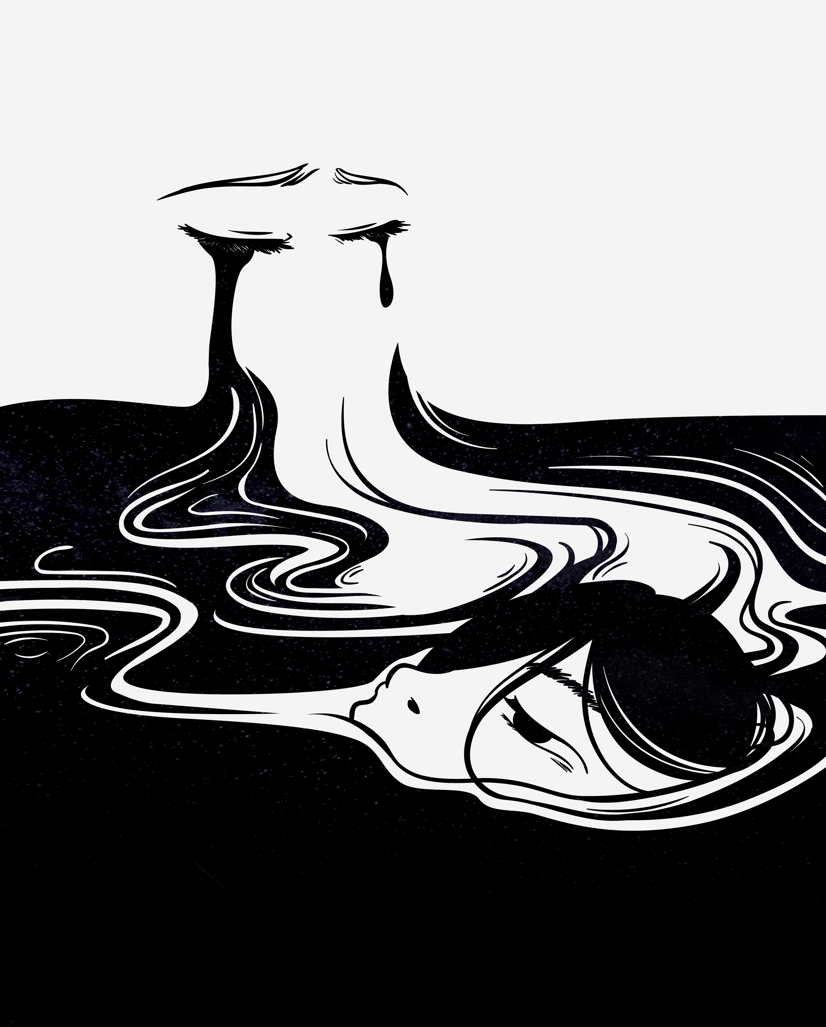
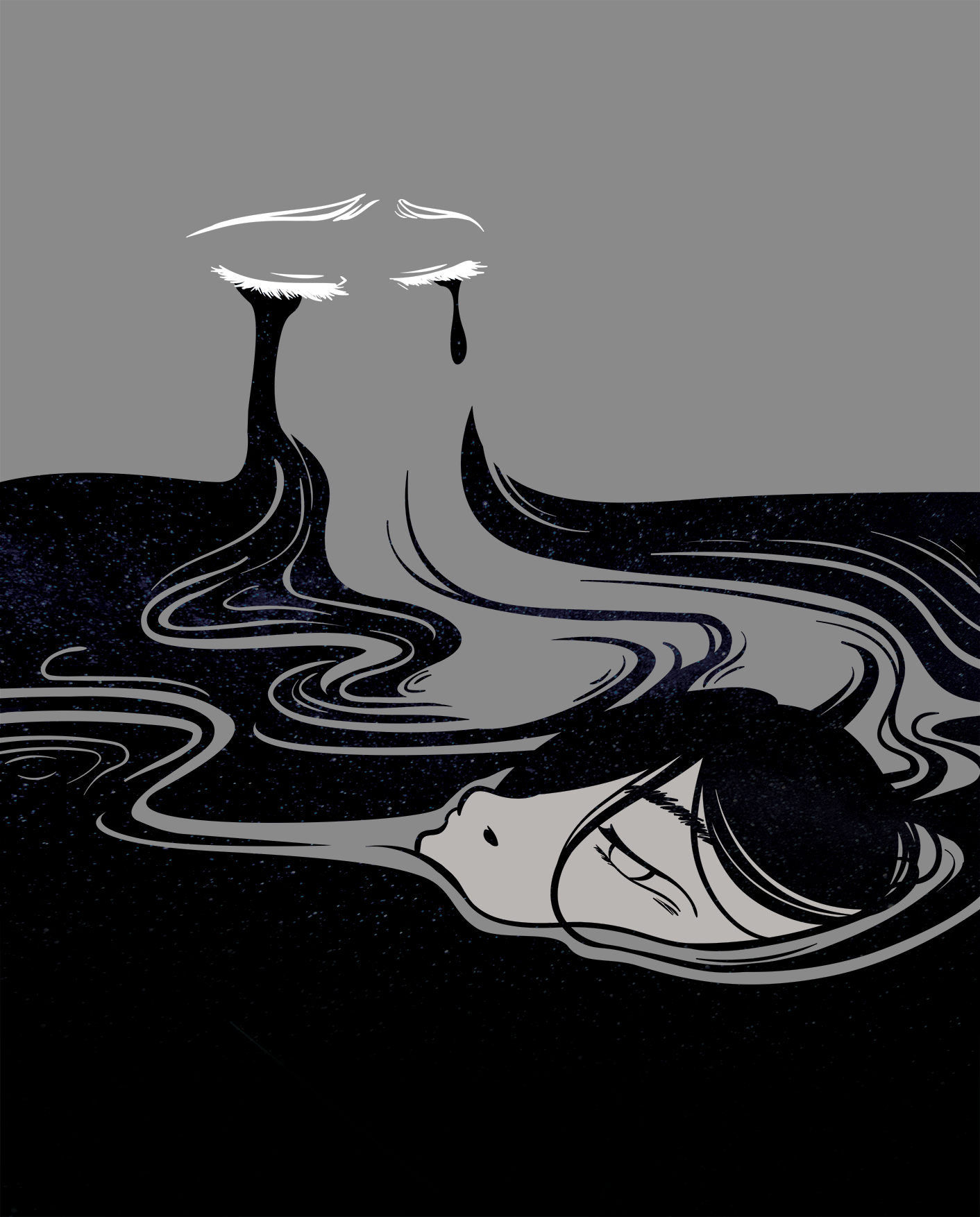
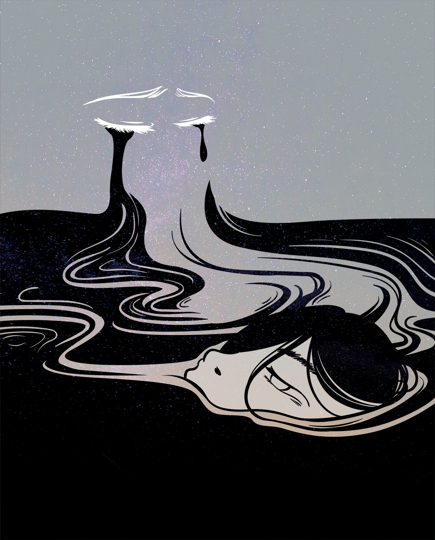
the theme for idea 2 is “drowning in another’s emotions” when empathising with them
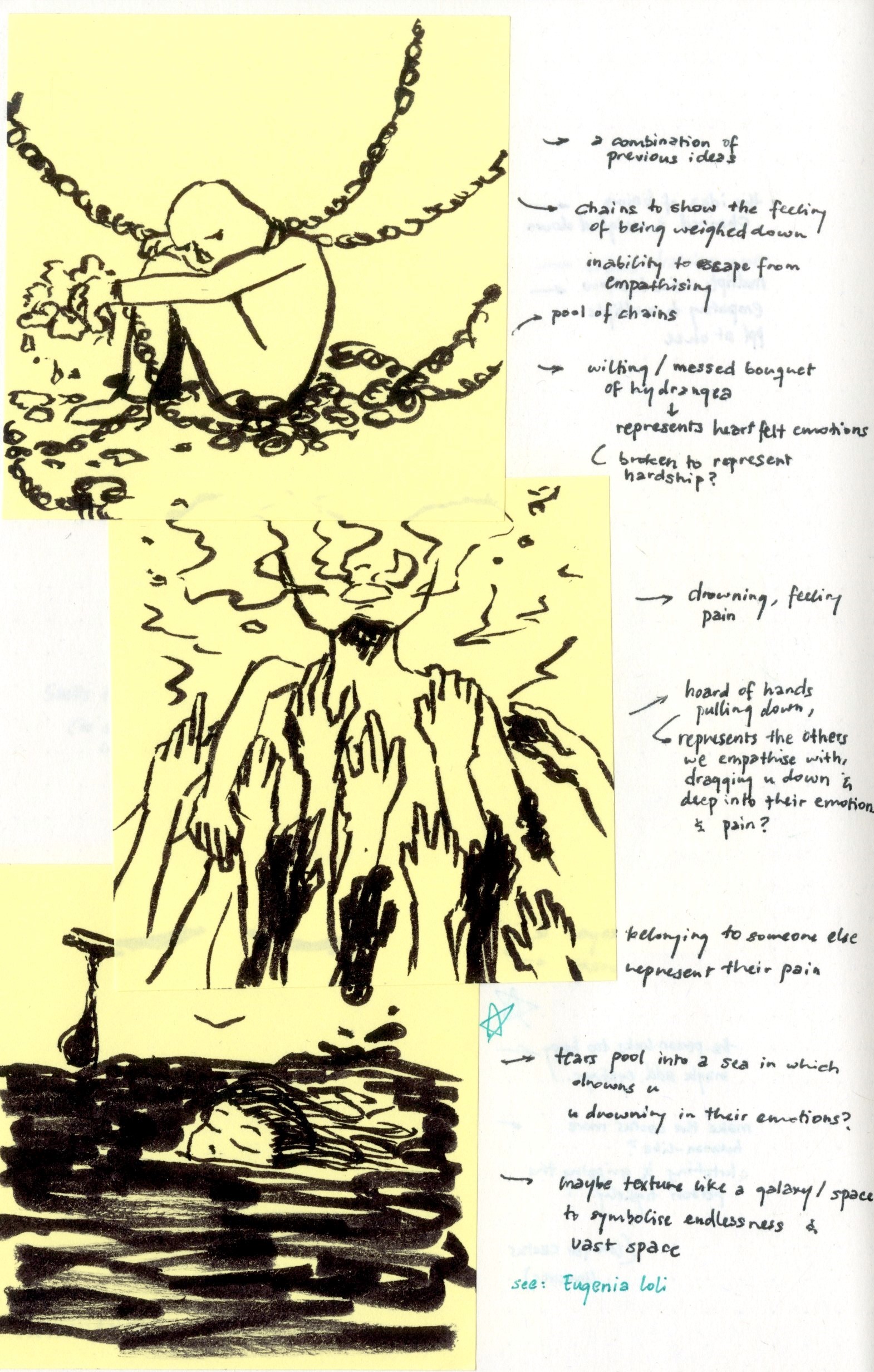
also not shown in the sketch, but i’m thinking of doing a constellation/galaxy texture for the ‘water’ to show vast space and endlessness of empathy
3
idea 3 is more of a dark humour. hugging a cactus pretty much defines empathy; you willingly put yourself in pain, just to comfort another (even a cactus…)
and to top it off, a haggard but still smiling face 🙂
i’m not so sure which direction to take right now…
i guess i’m leaning more towards the first idea since it fits my initial moodboard and artist reference (written on this oss post) but the other pieces might convey the message of negative impacts of empathy better
any feedback is appreciated!!
i shall also ask around to see which sketch conveys the concept best hahaha
concept: negative impacts of empathy
(disclaimer: a lot of these sketches are just me vomiting out what i have in my head so some are not as refined or well-thought, and i have no idea what they really mean lol)
1A midst of thorns and vines
1B going through thorns and vines
1C a refined version of 1B???

2A similar to 1B, more straightforward with the addition of another person i.e. the person one is empathising with
2B a cracked face to represent the positive front we put when empathising; sunflowers to symbolise happiness, some are slightly wilted to show crumbling resolve
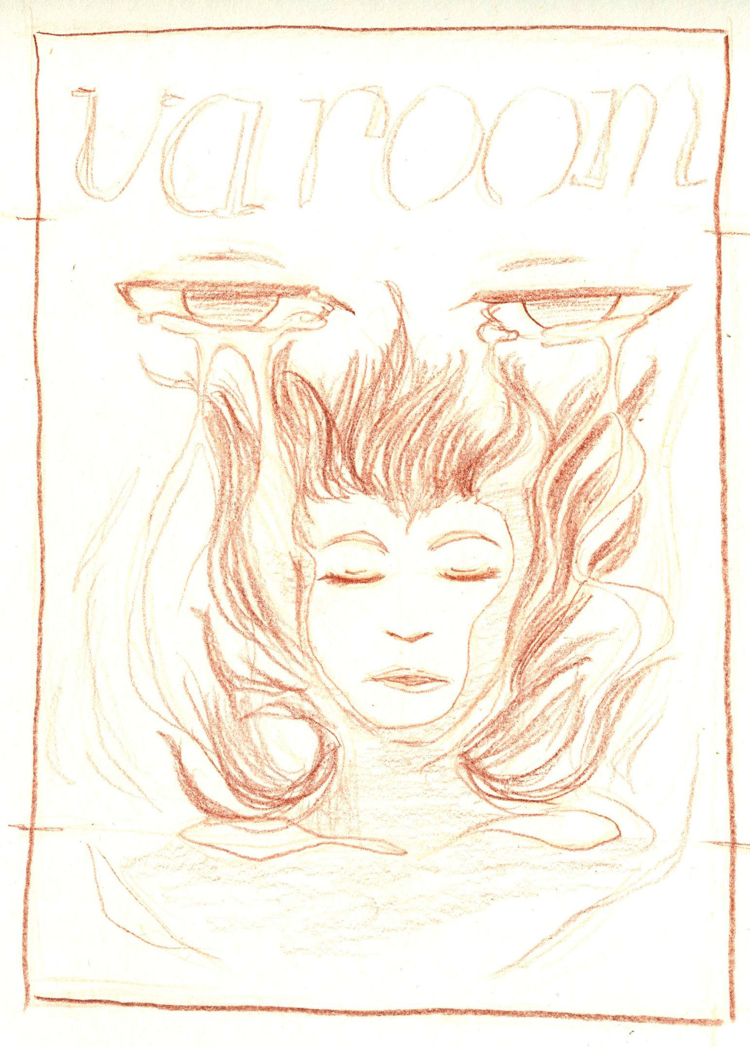
2C sunflowers in the front, a person in the middle, and thorns at the back
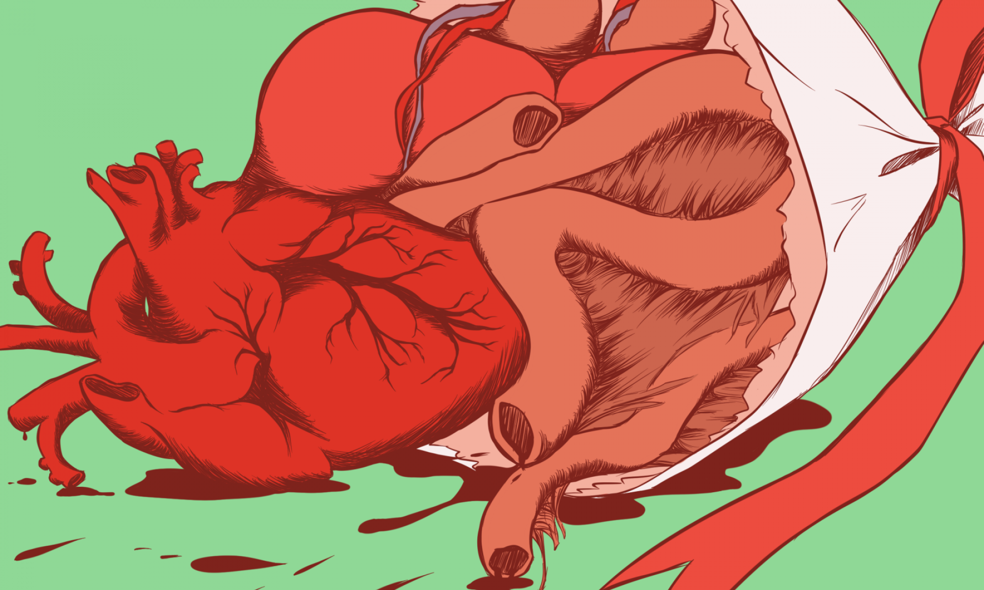
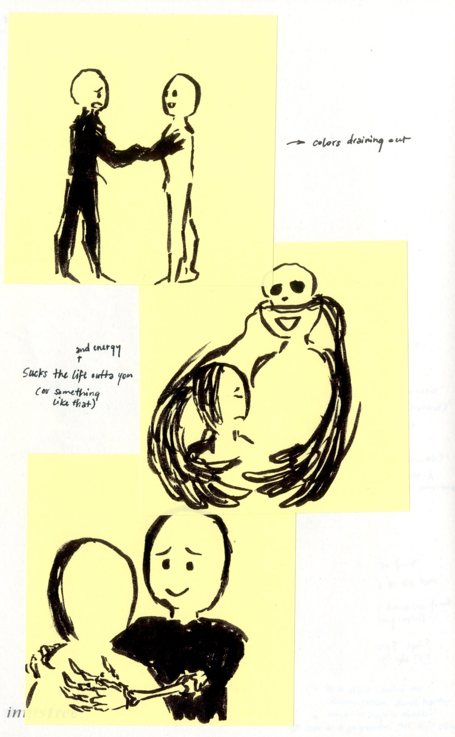
3A sucking the energy (colours) out of you
3B & 3C sucking the life out of you (quite literally put)
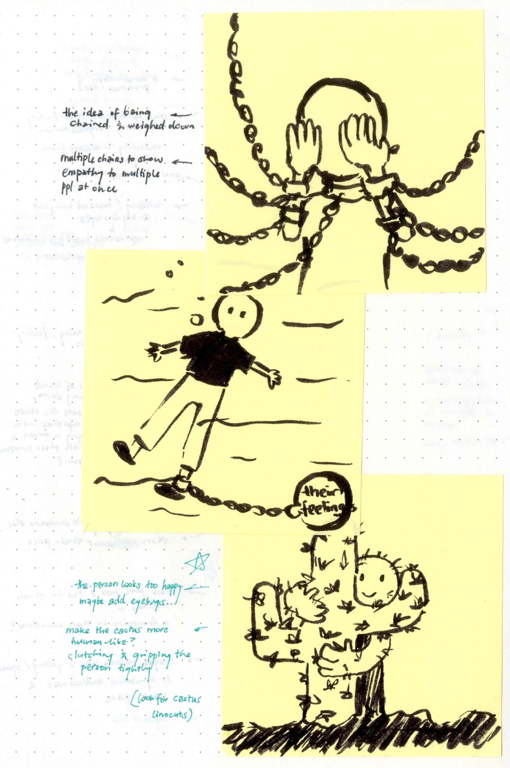
4A chained down; multiple chains to show empathy to multiple people at once
4B a more straightforward version of 4A; drowning
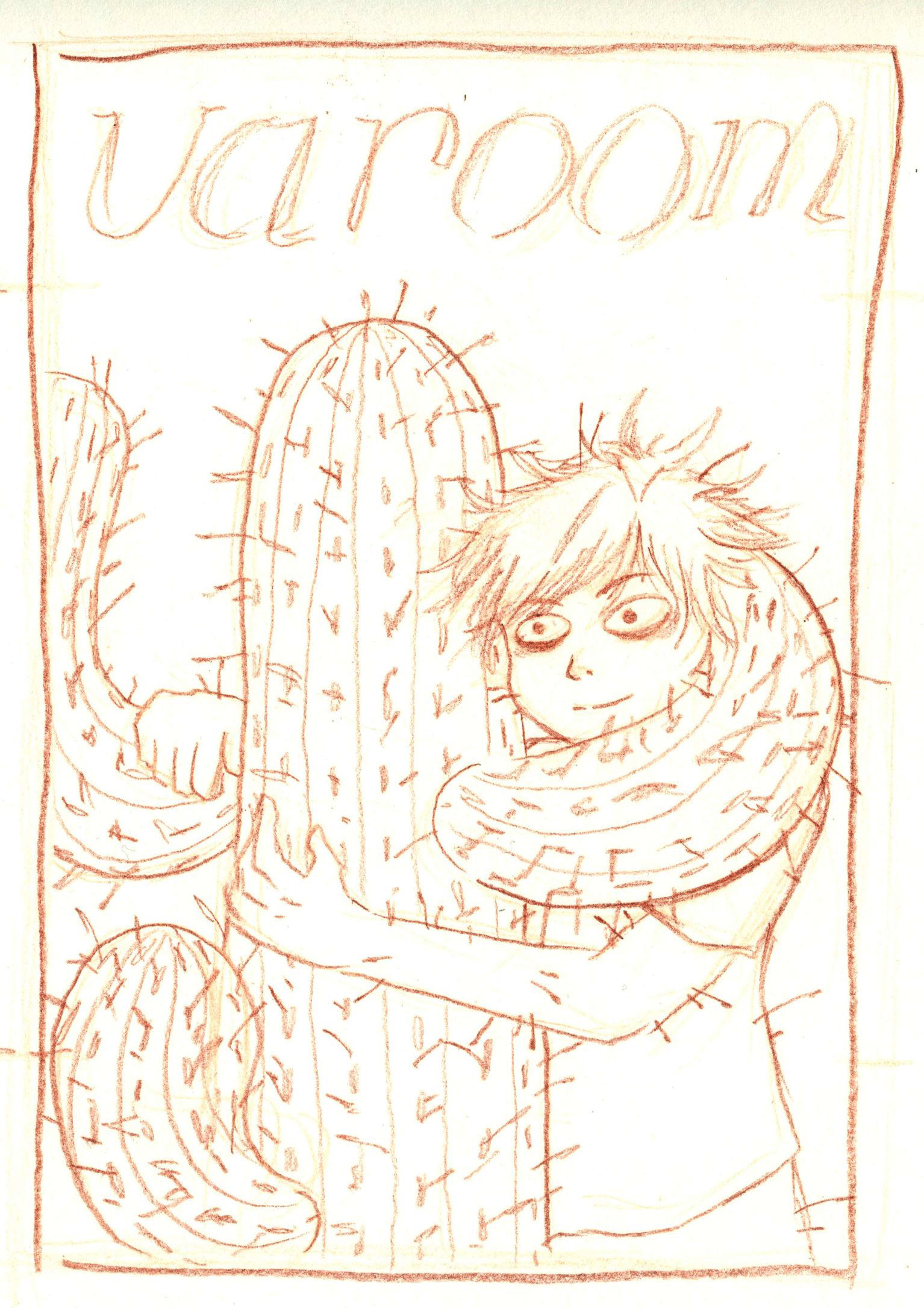
4C hugging a cactus
5A combination of previous ideas; chained down; holding a wilting/messy bouquet of flowers
5B dragged down and drowned by hands
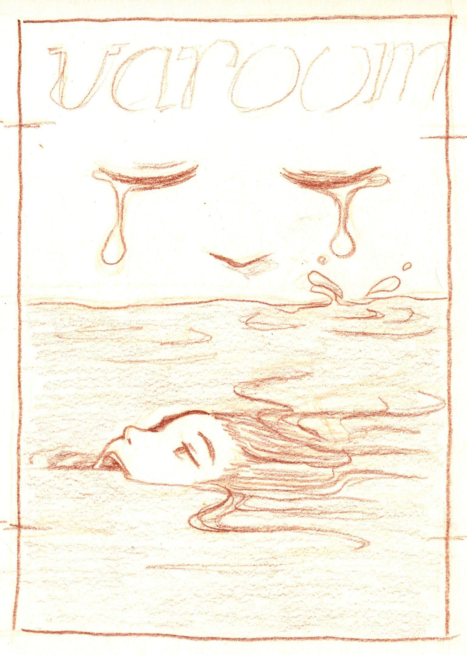
5C eyes crying out into a pool, where you are drowning in
6A hands reaching out as support; vines grasping at the arms and thorns cutting the skin
6B hands reaching out as support; vines and thorns coming out from someone else’s mouth injuring the arms instead
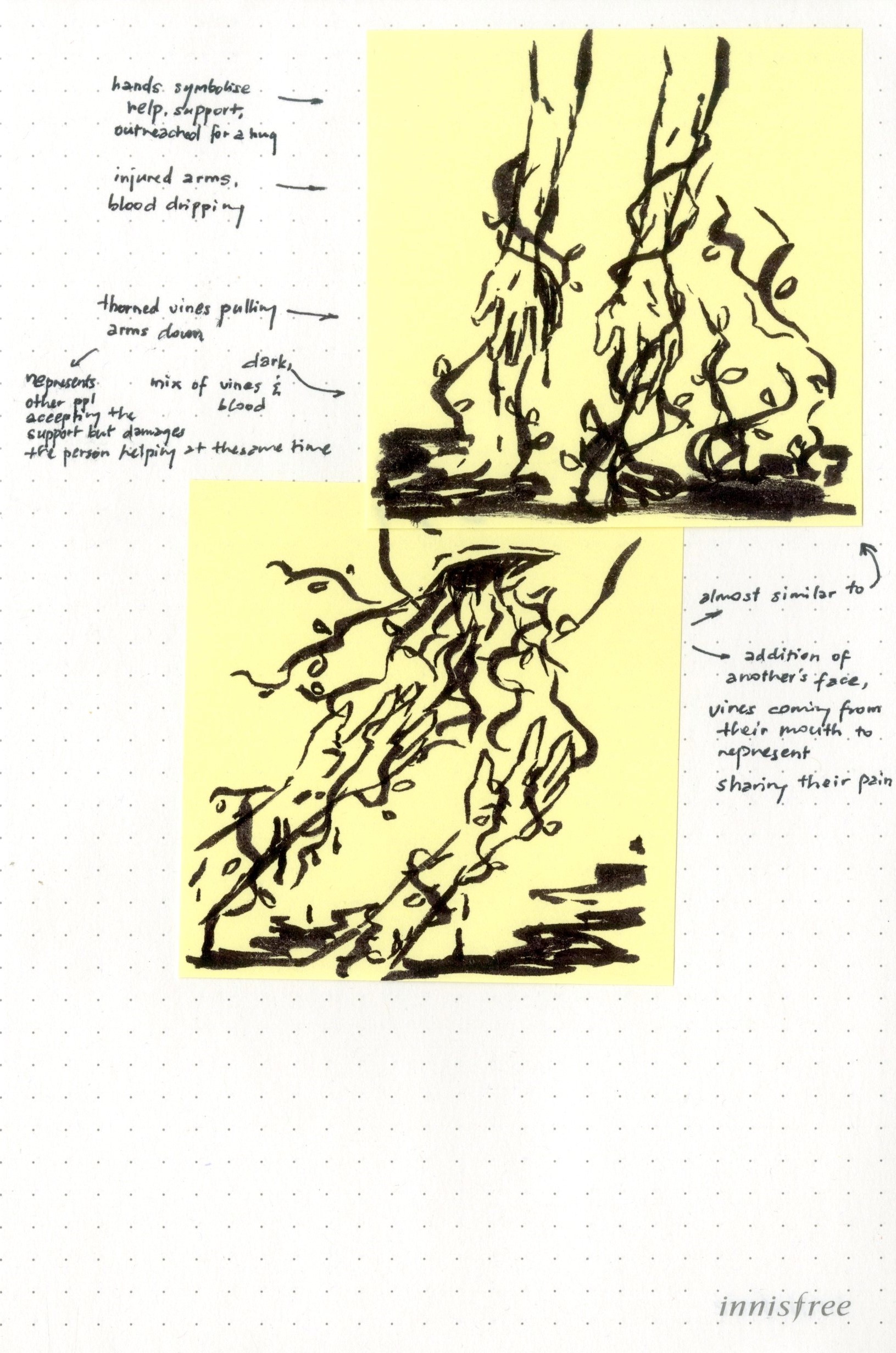
after consultation, i decided to develop further ideas 2C, 4C and 5C into more refined pencil compositions
feedback from last week
site observation
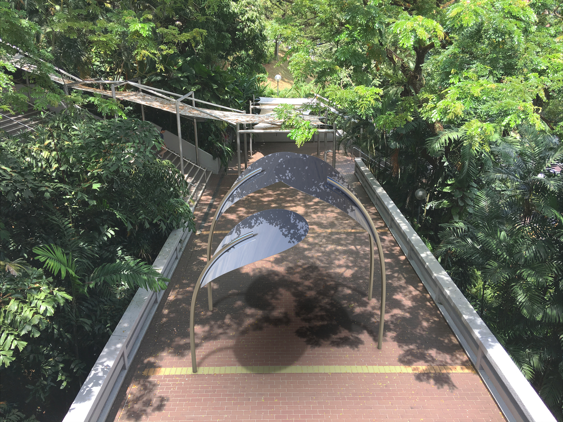
chosen site: stair linkway between North and South Spine
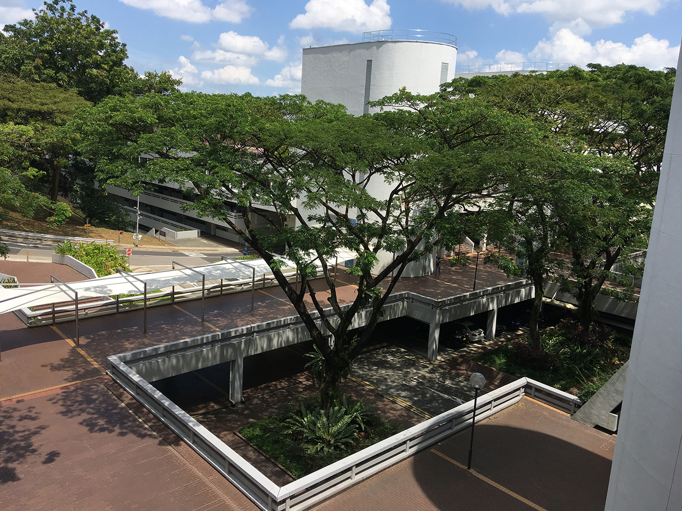
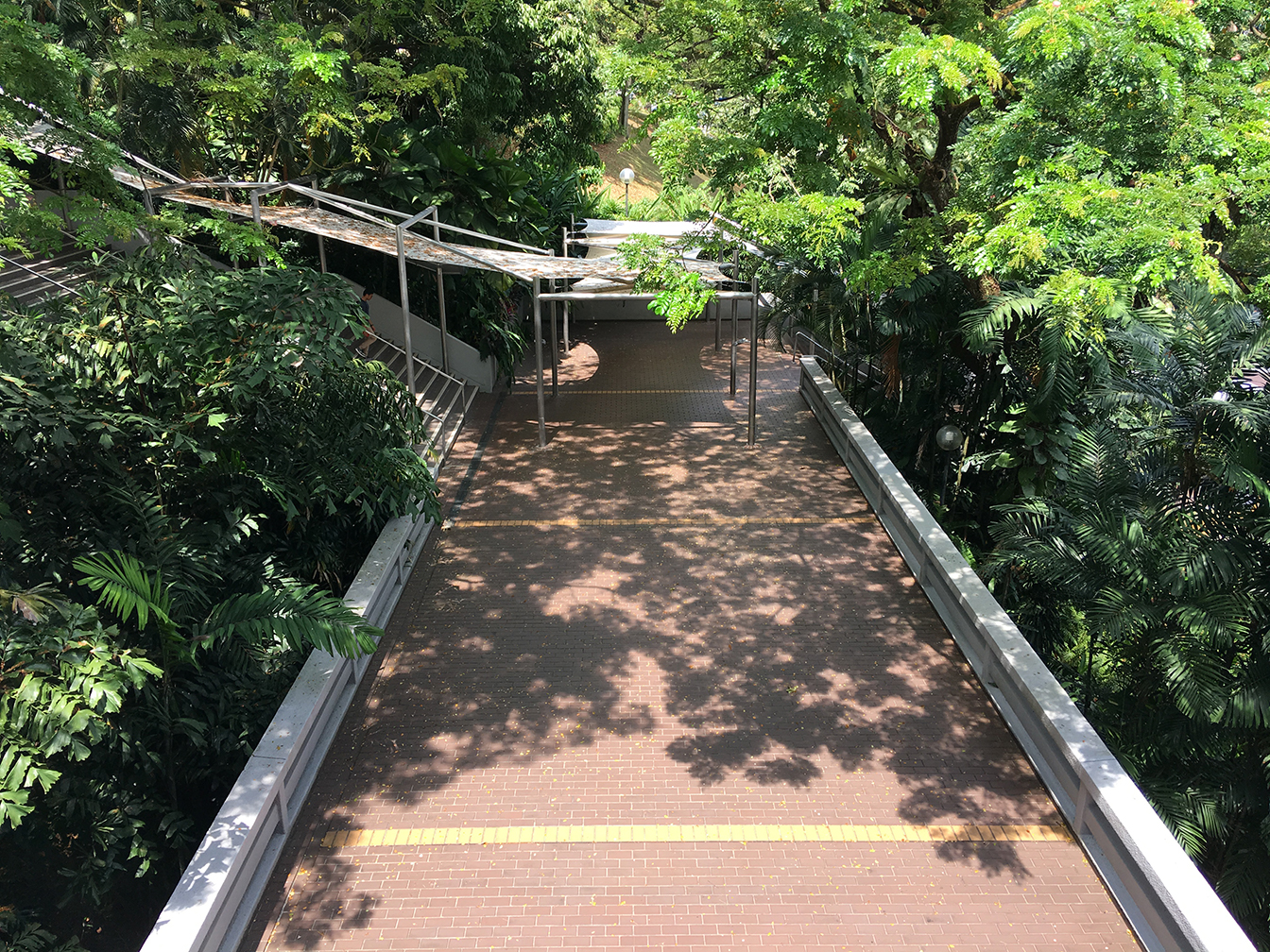
shadow time-lapse (11.30 – 15.30)


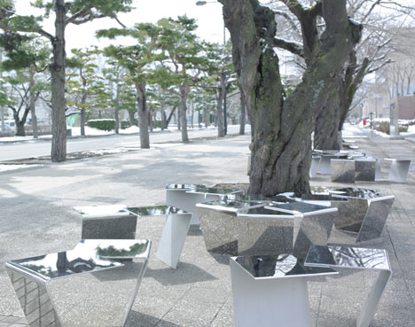
material exploration
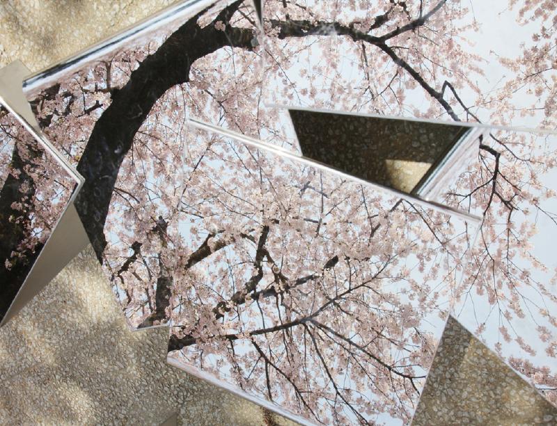
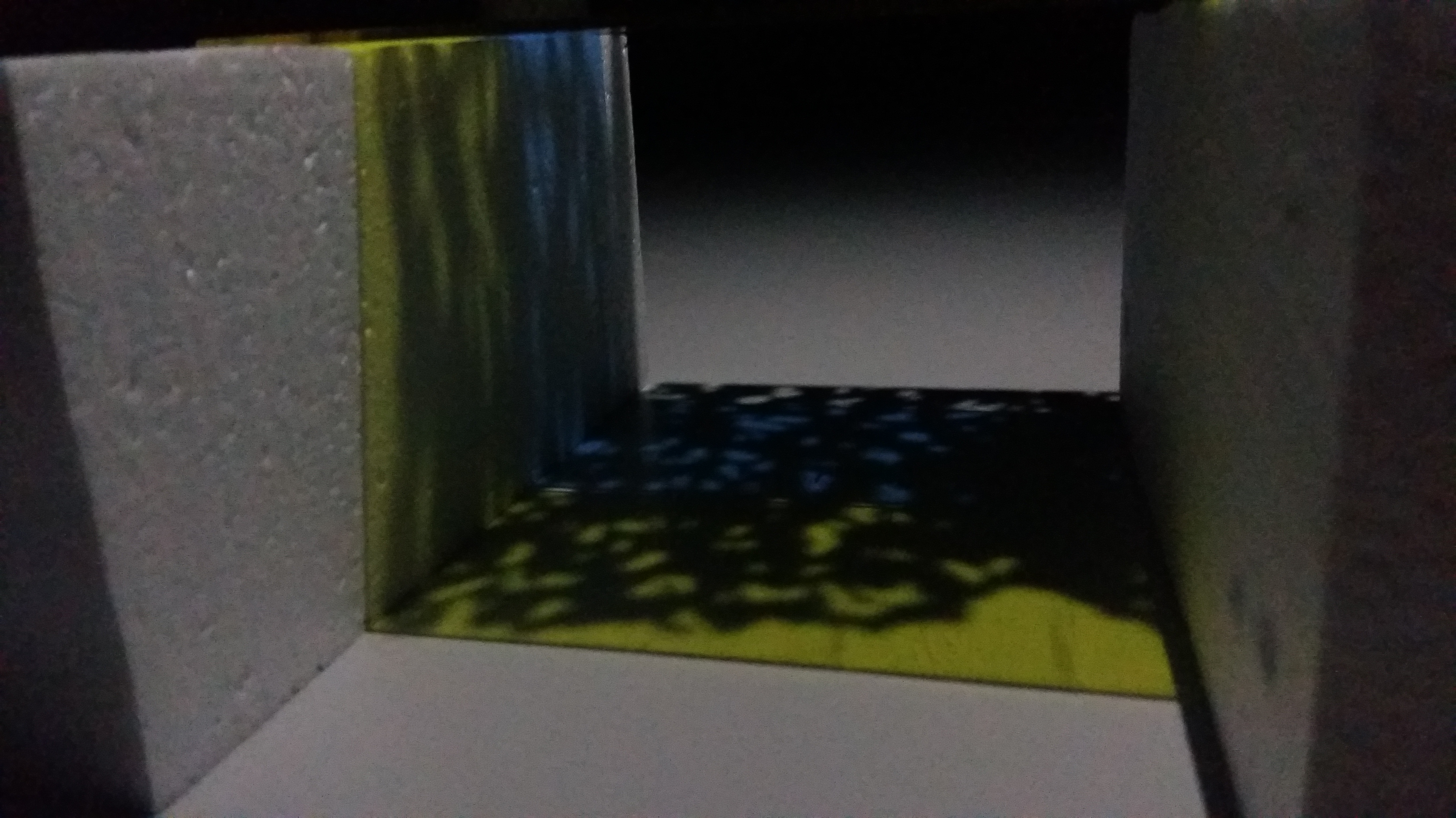
in relation to last week’s first form exploration (mirrored seat), thus we tested out reflective materials and how they interact with the shadows


(left) brushed aluminum sheet
(right) polished aluminum sheet


(left) reflective paper sheet
(right) glossy plastic sheet
interesting distortion effect of reflection on glossy plastic sheet, which reminds us of the shadows on the ground
references
Tom Fruin

Catherine Losing

In Flakes by Mount Fuji Architects Studio
further exploration and development
1
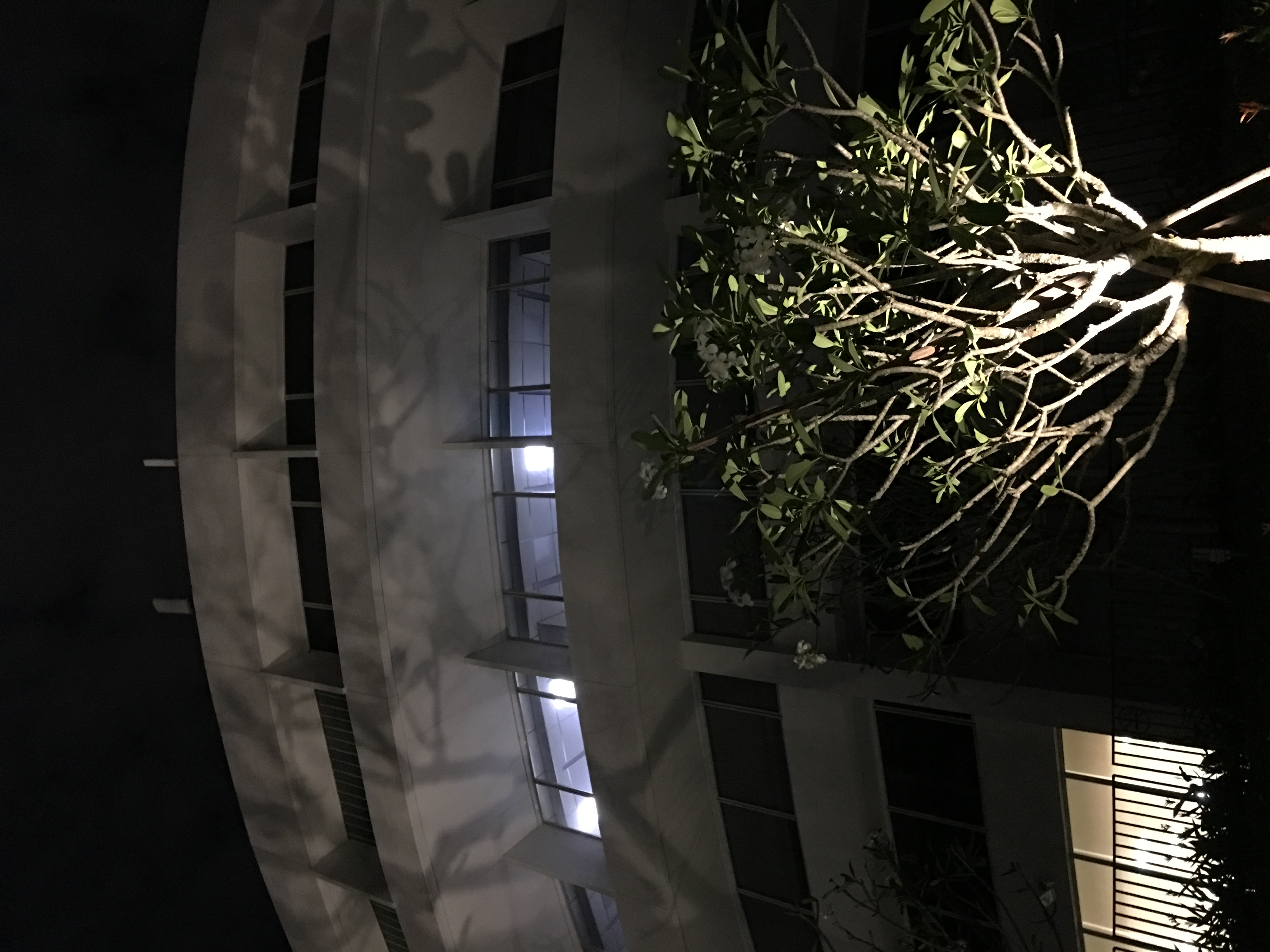
new light features from newly upgraded school infrastructure in North Spine
the shadow cast is an inspiration for our updated proposal found below, which is also relevant at night
an update from last week’s second form exploration with nighttime consideration of installation
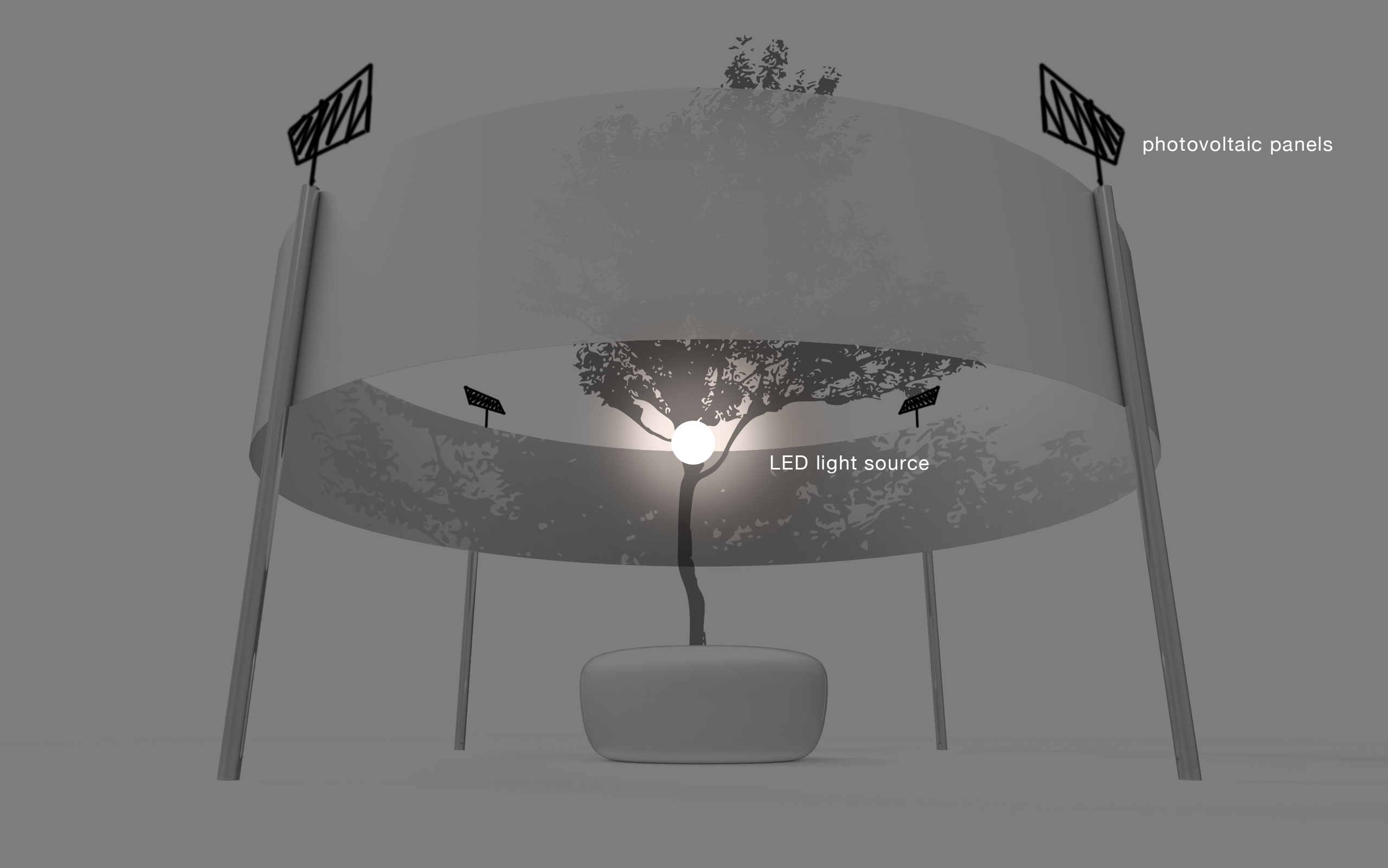
2
emphasis on shadow
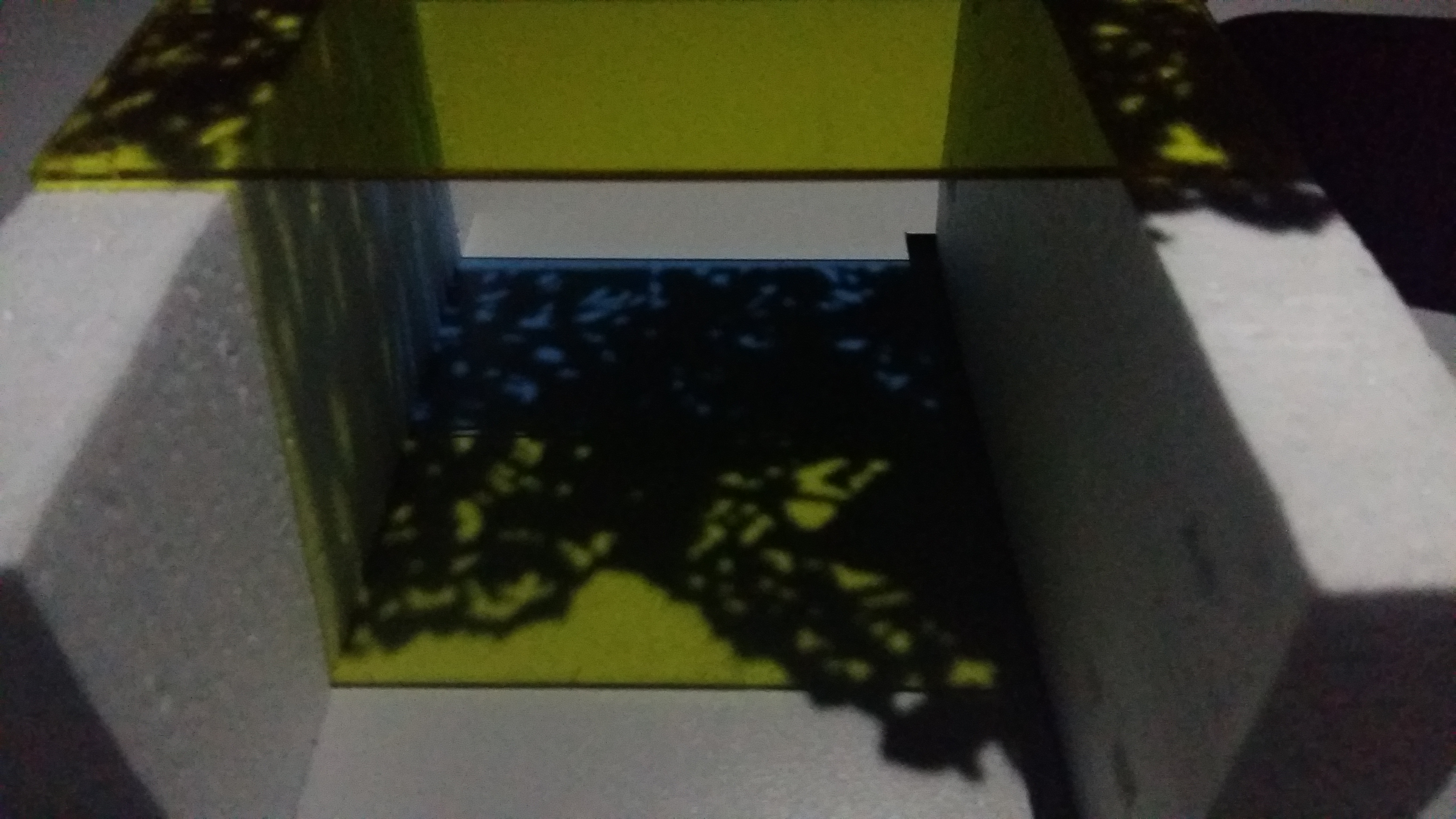
using coloured acrylic to cast colourful highlight, making the effect more noticeable
framing the shadow with the use of the coloured acrylic
next step