editorial illustration: references and moodboard

references

John Holcroft
conceptual and editorial illustrator

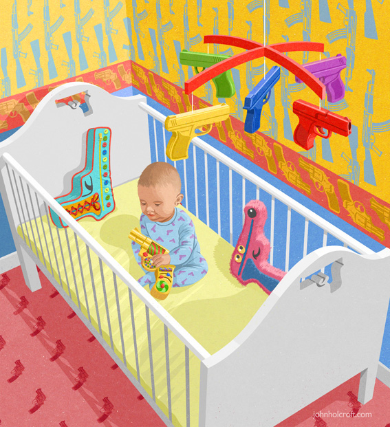
i love how Holcroft illustrates controversial concepts in an interesting manner, letting the audience view his take on certain ideas. for this assignment on editorial illustration, i would like to illustrate key points of the theme in the same manner as Holcroft, using unique analogies that quickly and effectively relate the message.


Yuko Shimizu
editorial illustrator

Shimizu’s works are beautifully illustrated, carefully inked, and finished with muted yet eye-catching colours. i like how her style is a fusion between american pop illustrations and japanese manga styles. being heavily influenced with japan’s manga illustration styles myself (and finding it a little hard to break out of the habit of drawing in that style), i find Shimizu’s style inspiring as she did not shy away from her roots nor ignore the style she often sees in her environment, and instead incorporated them both into her illustrations to make her own unique style.

(also her use of dynamic brush strokes is similar to what i am used to, so i would like to use her ink art as reference)
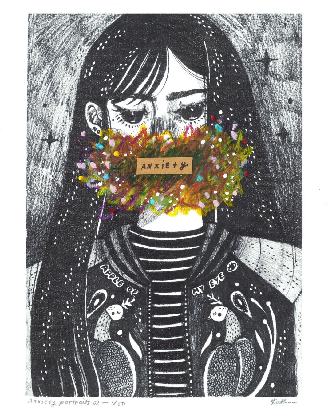
 

Akiya Kageichi
illustrator

words cannot even describe how much i find Kageichi’s style stunning and mesmerising. from the composition and the amount of details put into each piece, to the minimal colours and textures used. though some of his works look a little chaotic, a good few are framed beautifully and lets the viewers’ eyes move across the illustration.


style-wise, i am still unsure which direction i want to take: either something minimal and effective like Holcroft’s illustrations, or detailed and impactful like Kageichi’s. (or perhaps even something in between like Shimizu’s artworks.) so i created two moodboards with different keywords, just to keep my options open.


moodboard 01

keywords: dark, delicate, layered, intricate, muted
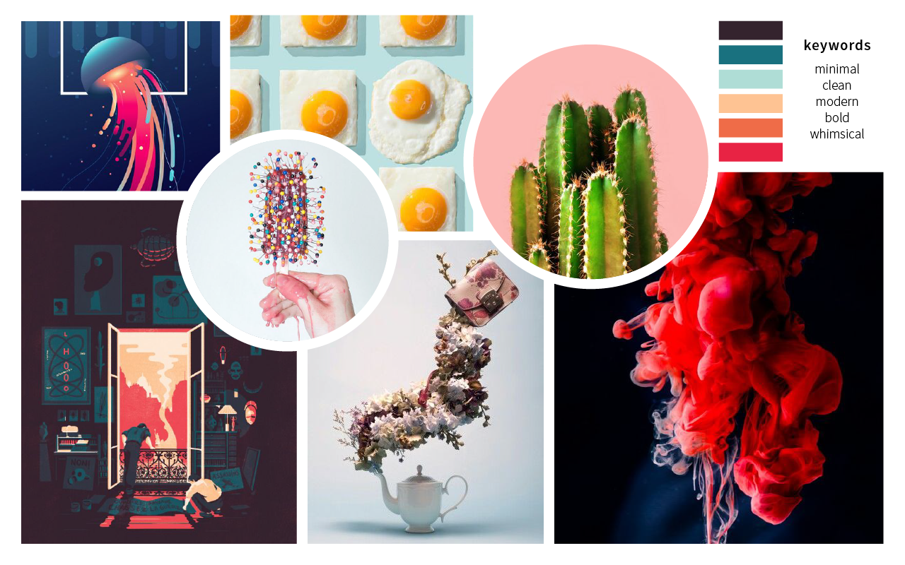
 

moodboard 02

keywords: minimal, clean, modern, bold, whimsical


editorial illustration: user persona

basic demographic of Varoom consumers:

  • 18 – 30 years old
  • aspiring students and graduates, workers in the creative industry, has immense interest in the creative works
  • probably has money to spare
  • familiar with design, music, fashion, or one of the art fields
  • seeking for deeper insight of the creative industry, as well as know-hows from interviews of employees of the industry

[i made two user personas because i’m still contemplating whether i want to illustrate a sad-funny analogy of the theme, or in a serious style. the two personas help me gauge the spectrum of Varoom consumers and maybe decide which style i would like to use]

user persona 01: janine

Janine is a 26-year-old social media manager of a well-established magazine company. she enjoys aimlessly scrolling through Pinterest and sarcastic jokes.

likes both basic and quirky aesthetic // witty // creative // a little emotional // busy // always in it for the gram


user persona 02: Troy

Troy is a 28-year-old sound designer with an interest in illustrations and graphic design. He occasionally splurges on whimsical things that interest him at that moment in time.

spontaneous // playful // creative // open-minded // does not care much for social media // well-informed


anti-persona: Walter

Walter is a 37-year-old telemarketer who only cares about three things: his family, his lunch break, and pleasing his boss. He spends most of his free time watching mindless shows on the television.

efficient // detail-oriented // serious // dislikes changes // wishes to retire with valuable assets to be passed to his children

editorial illustration: research

Varoom

content includes comments and discussion on contemporary illustration from a global audience, as well as interviews with illustrators, image-makers, designers

[source: Association of Illustrators (AOI)]


editorial illustration

Across the spectrum of print and online publications, art directors rely on illustrators not only to create beautiful and attention-getting images, but also to help impart information and express complex ideas. Editorial illustrations bring stories to life and entice readers to engage with content.

— Jenny Carless (Adobe Create Magazine)

what is an editorial illustration?
an engaging visual representation of the accompanying article that clearly tells a story or convey a concept to the readers


two elements of editorial illustration:
concept and style

these two go hand in hand. a successful illustration can illuminate the essence of an idea effectively through the use of a fitting style to convey the mood; is it humourous? serious? thought-provoking?


empathy


definition

psychological identification with or vicarious experiencing of feelings, thoughts, or attitudes
[source: dictionary.com]

putting yourself in another’s shoes and/or experiencing from another’s point of view; not necessarily having experienced the feeling yourself
[source: self interpretation]


the three types of empathy

cognitive empathy “THINK IT”
understand what another is thinking or feeling

emotional empathy “FEEL IT”
put yourself in another’s shows and feel their emotion that may lead to pain and burnout

compassionate empathy “BE MOVED BY IT”
feel concern about another’s suffering, but from a distance and with the desire to help (positive feedback that relates to motivation and reward)


from personal experience

being quite an emotional sponge myself, i tend to absorb another’s emotions relatively easily – i would feel their suffering if they are in pain, their anger if someone irritates them, or even their excitement if they look forward to something. i do enjoy listening to their tales and rants. but sometimes… they get a little too overwhelming. most of the time? my positive energy gets sucked out and i end up feeling numb.

people say that empathy is an exceptional skill to have, not only personally, but also socially and career-wise. but for some (like myself) who do not know when to stop sharing the same thoughts and feelings as another, it can get very exhausting… especially when the other spouts nothing but negative remarks.

thus for this editorial illustration, i narrowed the theme down to

the trials and tribulations of having too much empathy

(to put it a little dramatically)


some negative impacts of empathy:

  1. feeling the pain and experiences of another; indirectly inflicting the pain and negativity on yourself
  2. always having to put up a positive front
  3. feeling burdened (especially when you don’t have anything substantial to make the other feel better); the idea of it weighing you down
  4. TIRING; burnout

wk6: site and form exploration

feedback from last week:

two ways going about it;
CASTING: creating an object/sculpture to cast shadows
FRAMING: using elements around us (nature and sunlight) and framing/emphasising their shadows


material consideration
polyester mesh; white translucent cloth; paper; frosted acrylic; polished aluminum

NB. we were thinking if there is any material that is photosensitive i.e. absorbs light in the day and emits fluorescent light at night — trapping the shadows


experimentation and observation

two ways of seeing how shadow interacts with the medium:

direct light

View post on imgur.com

back light


in back light, the effect between light and shadow is attenuated/toned down


site consideration

1. stair linkway between North and South Spine


2. NIE entrance


3. entrance of the Quad


based on the feedback, we wanted to look into how we could frame existing elements. hence we looked for light/shadow-abundant areas. also taking into consideration the possibility of constructing an actual installation at the location


references

Le Banc de Nelge (the Bench of Snow), Atelier Pierre Thibault


City of Hope Kaplan Family Pavilion, AHBE


Tree, Myoung Ho Lee


Wall in Blue Ash Tree, Letha Wilson


installation for Noisily Festival, Rupert Newman


temporary pavilion by students of Bezalel Academy of Art and Design


White Extension, Sasa Ciabatti, Bilyana Asenova and Archistart


The Gates, Christo and Jean Claude

mass-void theory


form exploration

01

version 1

follows contour and path of the shadow as it moves throughout the day

version 2

using a geometric shape such as a circle (as shown) or a rectangle, it contrasts with the organic forms of the cast shadow, allowing the white to be a ‘frame’ or ‘canvas’. the bench distorts the cast shadow and creates a new perspective to the flat white; it also defines a volume of the object whilst emphasising the effect.


version 3

the use of reflective material reflects the cast shadow, duplicating and emphasising them; the top reflects the foliage above, offering a new perspective and prompting viewers to look up. viewers can differentiate between the colourful reflection and the monochrome shadow on the white background, emphasising the beautiful effect of the shadow.


02

technically can be placed in any open space; not site-specific

includes a small tree inside a pot/bench. throughout the day, shadow is cast onto the white circular screen (light material which will add movement when wind blows)


03

version 1


version 2

floating sculpture that allows audience to view shadows of trees and objects in the environment cast onto the material. the shape invokes curiosity so people passing by are interested in approaching and viewing. the sculpture could be hanging down from branches of trees around the area or infrastructures


things to keep in mind:
how do you make users/audience notice the shadows? (importance of framing)
cannot be too simple, needs to have an intention, needs to stand out from the environment, should not blend in, should not be infrastructural


wk5: defining spaces

Continuing from our concept of observing the ordinary in NTU and the inspiration of the rays of light caused by the dense morning fog and the trees around the campus, we decided to forgo our original idea of using fog as a medium and focus on the use of light as a material instead.

Focus

Interplay between light and shadow to create spaces

Spaces around the campus are molded by the lush greenery prevalent in the campus area. Layers of foliage is an everyday occurrence in NTU—we see them everywhere—but even something that we see everywhere everyday can be beautiful.

Purpose

Emphasising beauty of the mundane

Initially inspired by the light broken down into rays of light by the foliage of the trees, we are looking into using the tree as a form exploration through natural stylisation. We found the rain tree in particular to be interesting. The rain tree can be found not only in NTU but island-wide, and is well-known for its wide canopy that serves as great shade. Another fun fact about the rain tree: the leaves of the rain tree close just before sunset and open again as the sun rises. This little feature could also be incorporated into our installation in creating movement and dynamism in the changing shadows.


References

Forest Shadow, Tomohiro Hata and Takashi Manda

in the middle of the flood of color, what about we imagine a colorless space? only shadows of the trees exist in the world. music of birds what we didn’t take notice may come to ears of us who have enjoyed by our visions. various fragrance of nature may come to our nose. our skin may feel gentle breeze. on the contrary, because of such a vivid season, we propose a place where our senses slightly shift to other one in exception of our visions.”

tomohiro hata + takashi manda: forest shadow

Stereographic Projection, Henry Segerman and Saul Schleimer

https://www.theguardian.com/science/alexs-adventures-in-numberland/2014/oct/30/pumpkin-geometry-stunning-shadow-sculptures-that-illuminate-an-ancient-mathematical-technique

https://www.arch.nus.edu.sg/news/light.html#


Louis Kahn on The Power of Shadow

“As identified by Leonardo da Vinci, we often encounter three types of shadows: Attached shadow, shading and cast shadow. The attached shadow falls on the body itself – like a cantilever roof causing a shadow on the façade. The second type belongs to bright and dark contrasts, which are inherent to the form and depend only on the source of light, e.g. a ball shaped pavilion, which even under a cast sky shows a darker zone in the lower part. The third, cast shadow, could be the result of a high house generating shadow on the street due to the projection of the building outline.”

https://www.archdaily.com/362554/light-matters-louis-kahn-and-the-power-of-shadow


Sublime Light, Anila Quayyum Agha


Photographic Exploration

self portrait: final

Final piece


Alternate renditions

Fixed the lighting level on the face itself to be slightly brighter. Tried to cast an overhead light over the face but found it to be too dramatic (which opposed my initial intention) so I decided to just add reflections on the glasses to draw the audience’s eyes more towards the face and give the overall composition a better sense of harmony.

self portrait: working towards the final

a documentation of the process towards the final piece, and some feedback

Process
  1. Painting on Photoshop. One component I wanted to implement in the final piece is clean outlines. Initially, I used a Photoshop brush to outline the painting. However the line weight was not as varied as I would have liked them to be, and they looked a little too artificial. In the next rendition, I decided to use traditional methods to ink the drawing and transferred the outlines to Photoshop.
  2. Transferring traditional medium to digital. The messy scribbles on top was created using acrylic paint on canvas paper. I only realised a little too late that I only had acrylic tubes of the basic colours of red, yellow and blue to work with, so I had a lot of colour-tweaking to do on Photoshop. Nevertheless, I found the texture created to look better and more genuine than if I would have done the same thing with Photoshop brushes.

    what the colours actually looked like…
  3. Additional elements. Aside from the mess of rainbow puke, I also wanted to include the things I hold dear—Skink my pet lizard, Charles the succulent and Mei the tiny cactus—and some of my favourite things on the side. I attempted the same method of using traditional inking and digital colours for these elements, however they looked terribly out of place and the colours did not harmonise well with the overall composition.


(not so) Final Composition


feedback after critique
  1. The negative space in the middle of the jumbled mess is a little too jarring and could be reduce a tad bit. As how it is now, the eyes are attracted towards the negative space too much.
  2. As this is a portrait, it is still possible to emphasise more light on the face while still keeping the concept of using subdued colours to represent the calm and stoic atmosphere.
  3. One suggestion offered in relation to the second point is that the bright mess could cast light on the face instead—something just as subtle as a yellow light cast as a reflection on the glasses.


wk3: references and development

Continuing off from the previous week’s inspiration of the morning sun rays,  we developed our concept from there and narrowed down the purpose of our installation proposal.

Emphasise the unseen and let others
appreciate the mundane

As our inspiration was a repetitive occurrence that is something that can be seen everyday but is not usually noticed, we wanted to emphasise this event—the light and fog—to allow other people to view and appreciate it.

There are three elements to implement into the installation—the light, fog, and structure. Because we are attempting to mimic the light rays in the morning in NTU, we also decided to include movement into the structure of the sculptural installation to let the light rays change forms depending on the movement of the structure.


Artist References

Chris Fraser‘s light installations

“My light installations use the camera obscura as a point of departure. They are immersive optical environments, idealized spaces with discreet openings. In translating the outside world into moving fields of light and color, the projections make an argument for an unfixed notion of sight.”


Light Barrier (2014)

The light installation creates floating graphic objects which animate through space as they do through time. This system creates volumetric projections which can define 3 dimensional forms in space.


Feedback

Upon looking at Chris Fraser’s light installation, it seemed like something that people would not notice at first glance or would be too distracted to look at. Because the aim of our installation is to let people see the unnoticed, there would be no point in constructing an installation that would not be noticed in the end either. There has to be a particular context, mood and venue to set in place: how would people appreciate the piece? How do you make people transit from the realm of their phones to notice the installation?

Another feedback is to perhaps project fog and materialise images (almost like the second reference) and just let people walk through the mist.

self portrait: conceptualisation and references

In-class exercise: Portrait

some takeaways:

Sketching a portrait was more intimate than I thought ; it was different from the usual live drawing sessions where I had to focus more on the model’s dynamic postures rather than their faces, and it definitely got a little awkward (perhaps because my ‘model’ was also drawing my face, so we were just… stealing glances at each other.)

Looking back at my illustration, I think I would have preferred to use a wider range of line weight as well as stylise certain facial features to make it look less realistic.


Assignment 1: Ideation and Initial Sketches


some things about myself I decided to focus on:

  • forgetful; just really terrible memory
  • the first one is due to my head being a jumbled mess
  • i always look calm; people say this often but sometimes i might just be internally dying
  • some things i hold dear: my succulent (Charles), my tiny cactus (Mei), my ex-pet (Skink)


Initial sketches; throwing random ideas out to portray both my forgetfulness and the juxtaposition between a calm exterior and messy interior. Eventually I went with the one on the most right, where it shows a messy scribble around my head to represent the many things I think about. I also decided to use subdued colours for my face, and bright, noisy colours for the scribbles to show the contrast between what is expressed on my face and what actually goes on in my mind.

Final composition; sketched a small thumbnail of my desired composition to visualise better. Decided to draw myself looking down instead of up; I found it to represent myself better because I tend to look at the ground (whether it be when I am walking or thinking).


Assignment 1: Reference Artists


Gabriel Picolo


Brilliant use of subdued colours with minimal bright accents; clean lines and smooth gradated colours


Carlos Villarreal Kwasek

Absolutely beautiful colour palette; subtle use of texture (not too overwhelming but still gives a nice effect)


Kathrin Honesta

This series in particular inspired me to use similar techniques for the colourful scribbles (will try to use acrylic paint instead)

wk2: the infra-ordinary

Early mornings are one time of the day we are familiar with as students of ADM (not because we wake up early; rather, we find ourselves staying awake until ridiculous hours). As Jeremy and I live in halls on campus, we often walk back to our rooms at these hours.

One interesting point we noticed about NTU is that during the wee hours of the morning, the environment around the campus tends to be surrounded with a beautiful, mysterious morning fog. As the morning light shines through the foliage abundant around the area, and breaks through the mist, it creates an effect where the light rays become visible to our eyes. It is a normal, everyday occurrence, yet it is because it is happening everyday that we do not notice it.

How are we to speak of these ‘common things’, how to track them down rather, how to flush them out, wrest them from the dross in which they remain mired, how to give them a meaning, a tongue, to let them, finally, speak of what is, of what we are.

Inspired by Georges Perec‘s extract on The Infra-Ordinary, Jeremy and I decided to base our concept around this occurrence.