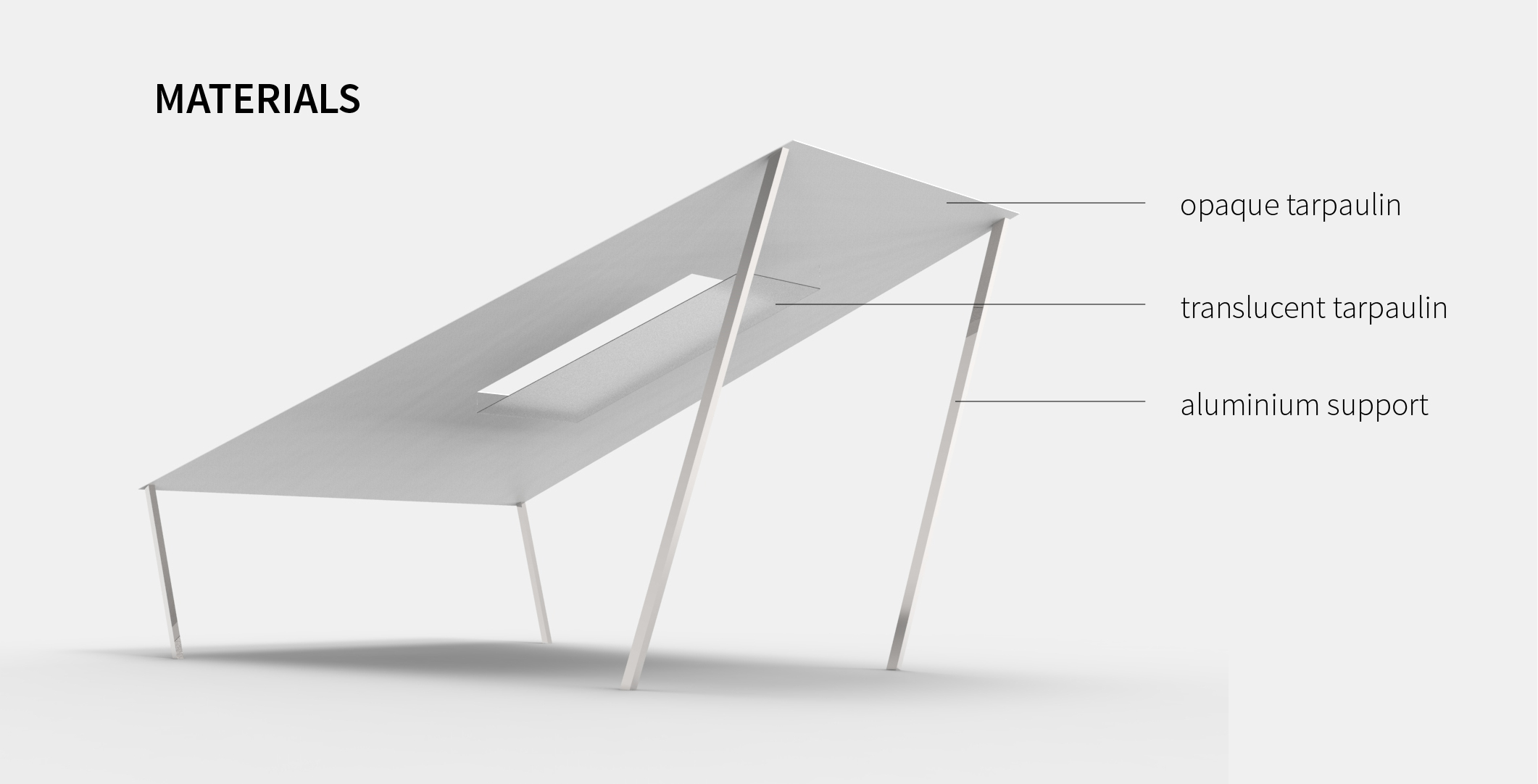
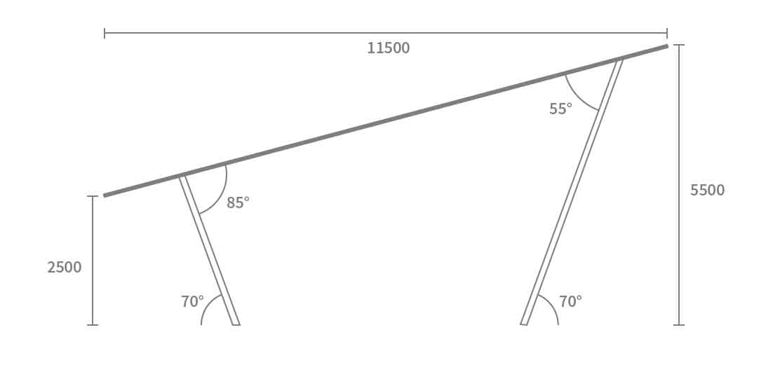
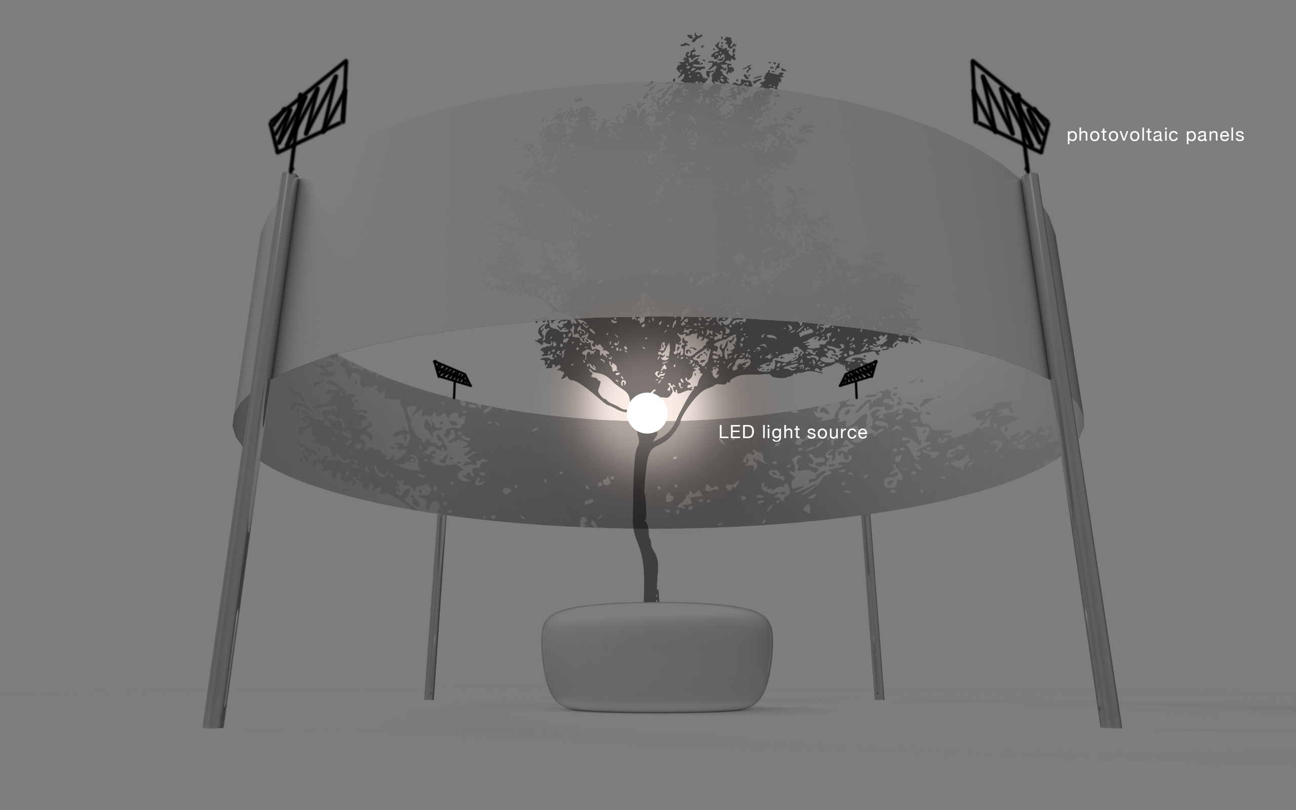
angles and proportions need to be justified and measured properly
think more specifically about the choice of material
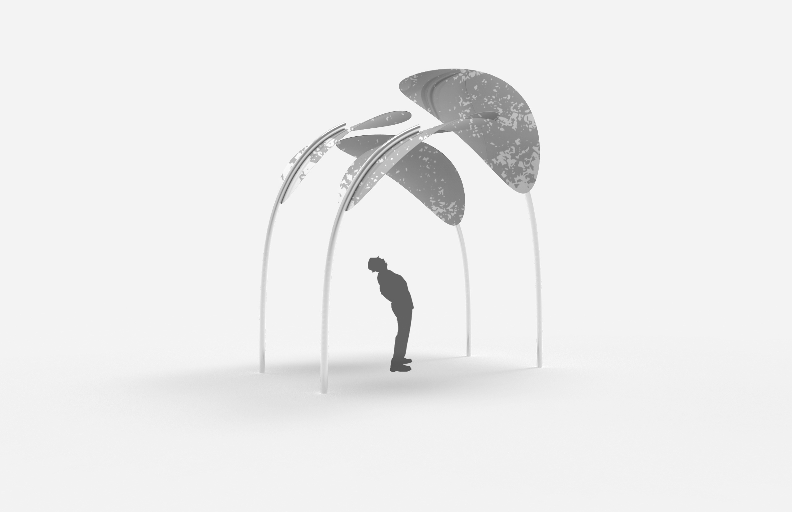
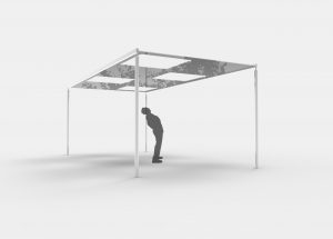
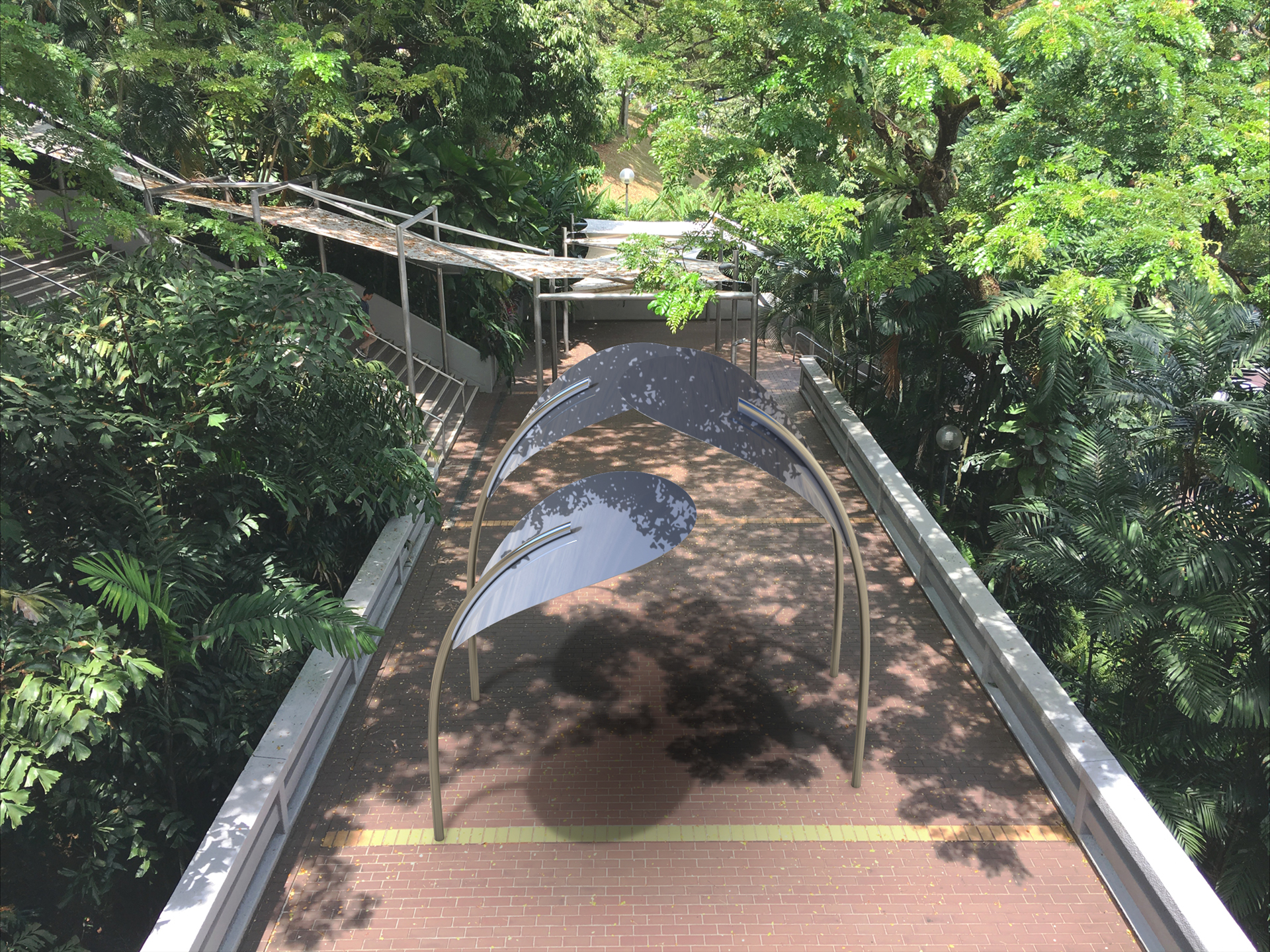
revised proposal
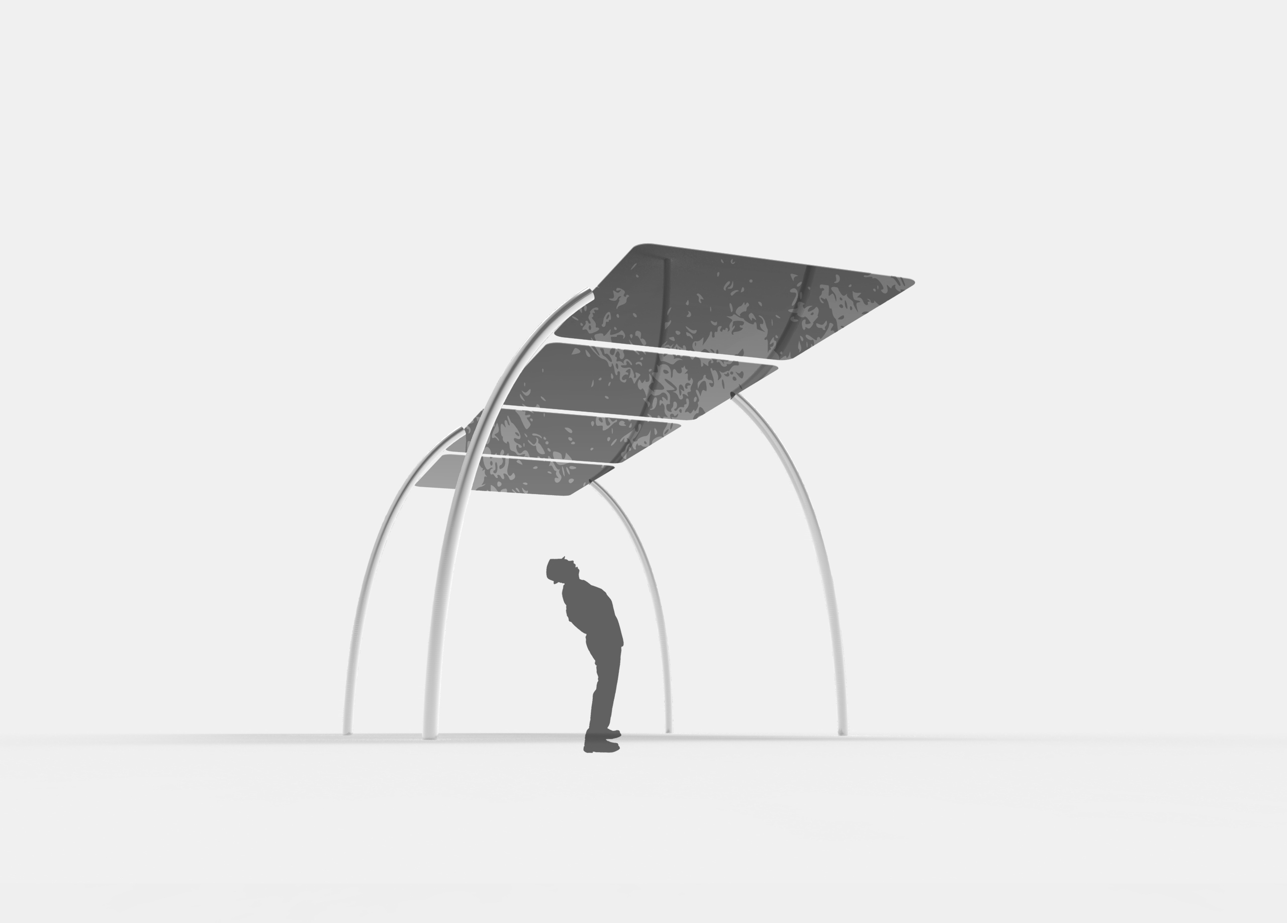
1
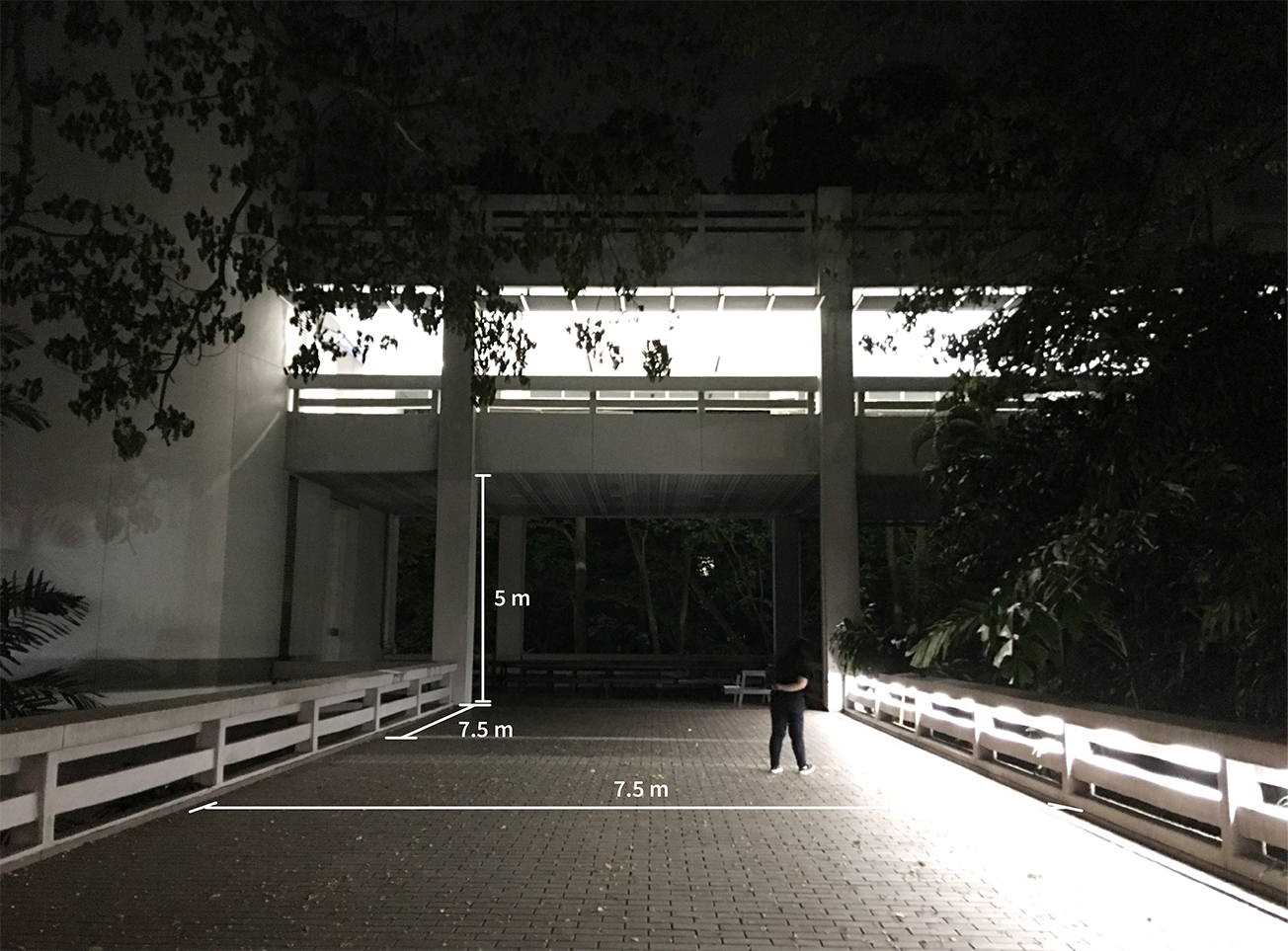
optimal viewing distance: 5 metres
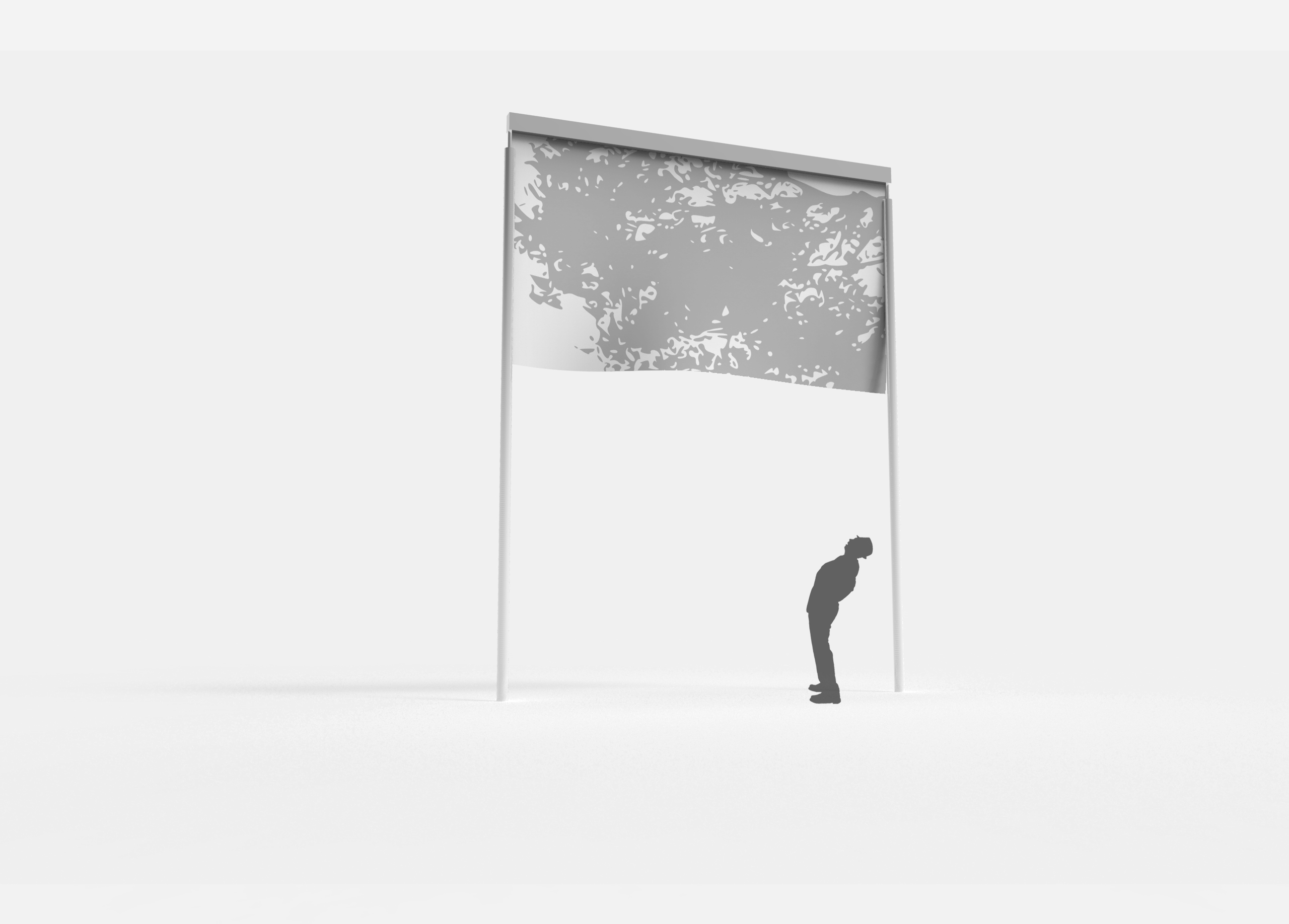
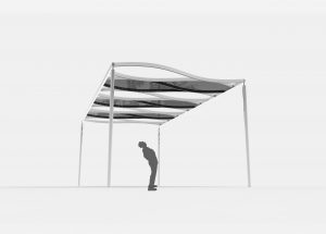
proposal 1 is true to size and accurately depicts the distorted perspective. we found the proportions to be too jarring, so we tried to minimise the angle in the next proposal.
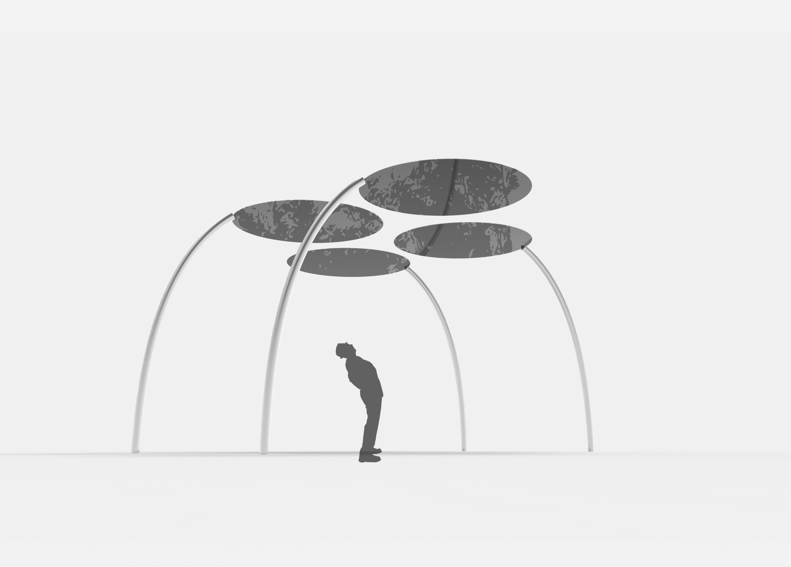
2
optimal viewing distance: 15 metres
for both proposals, the metal structures are positioned and angled in such a way that when seen from the optimal position, they align with the edges of the canopy and the two poles behind are hidden by the front two.
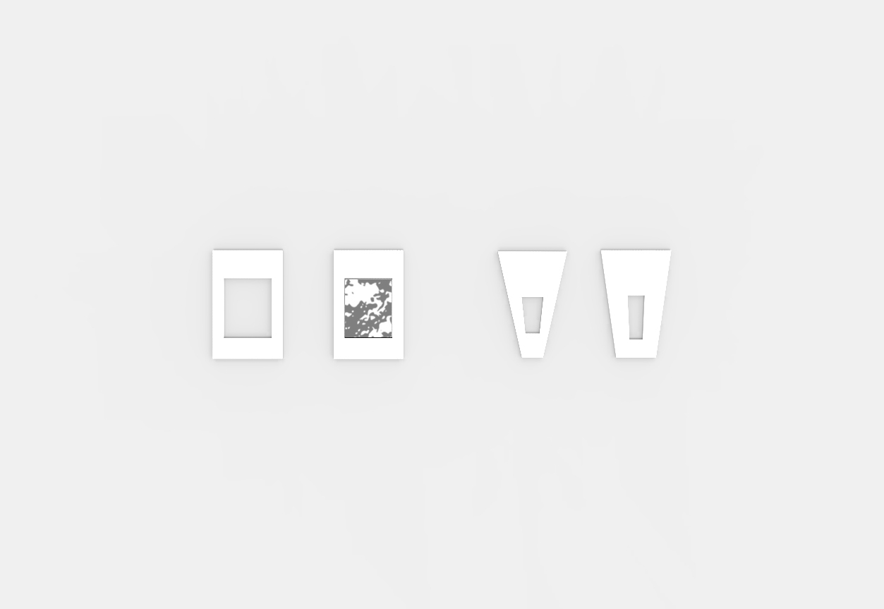
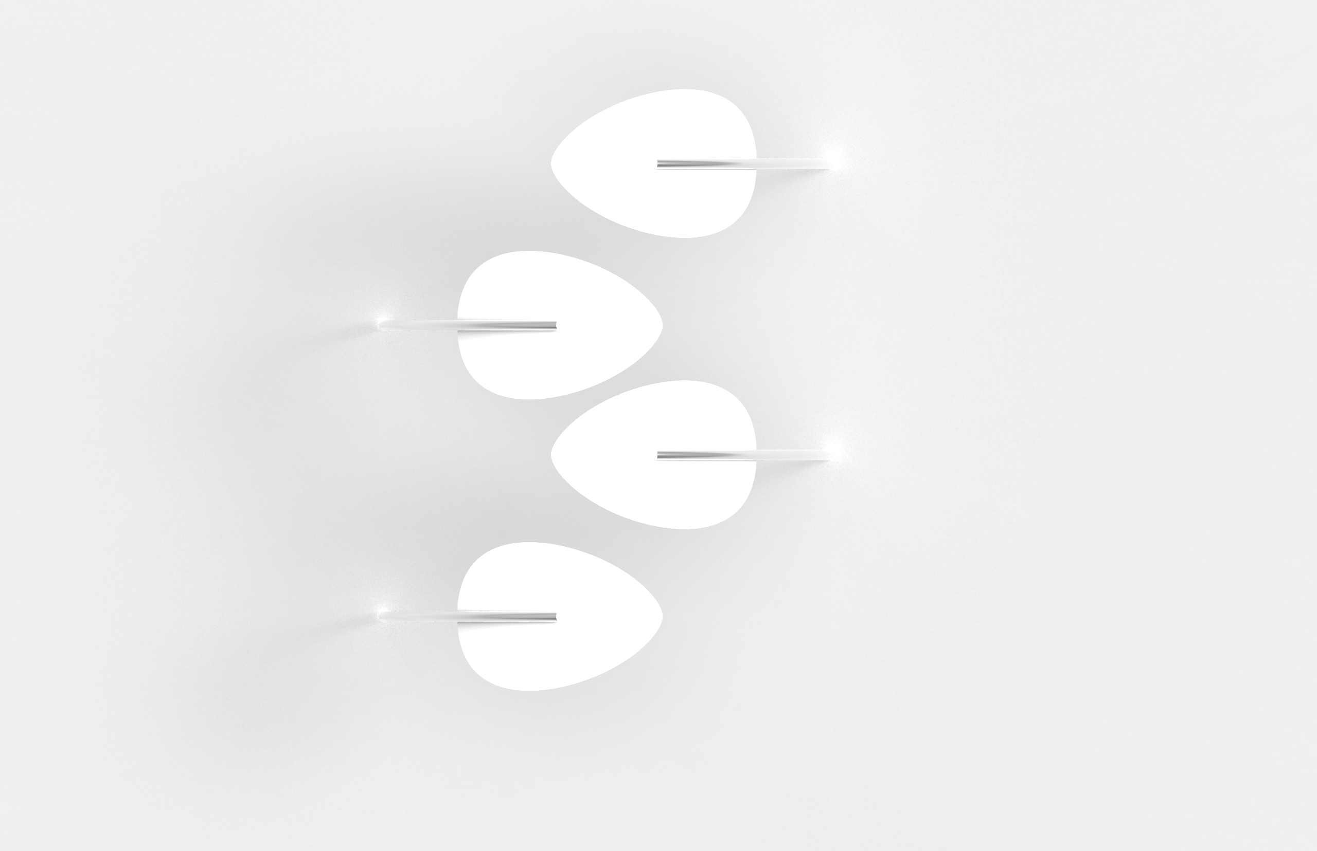
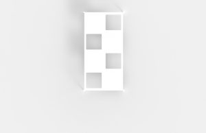
vinyl stickers/indicators
different variations of indicators for optimal viewing position. echoes the shape of the structure
many of the structures proposed the previous weeks were too complex and dominates over the shadows i.e. viewers focus on the form rather than the shadows
keep the structure of the installation simple
use a combination of opaque and translucent material instead of only translucent to show more contrast
references
James Turrell
Felice Varini
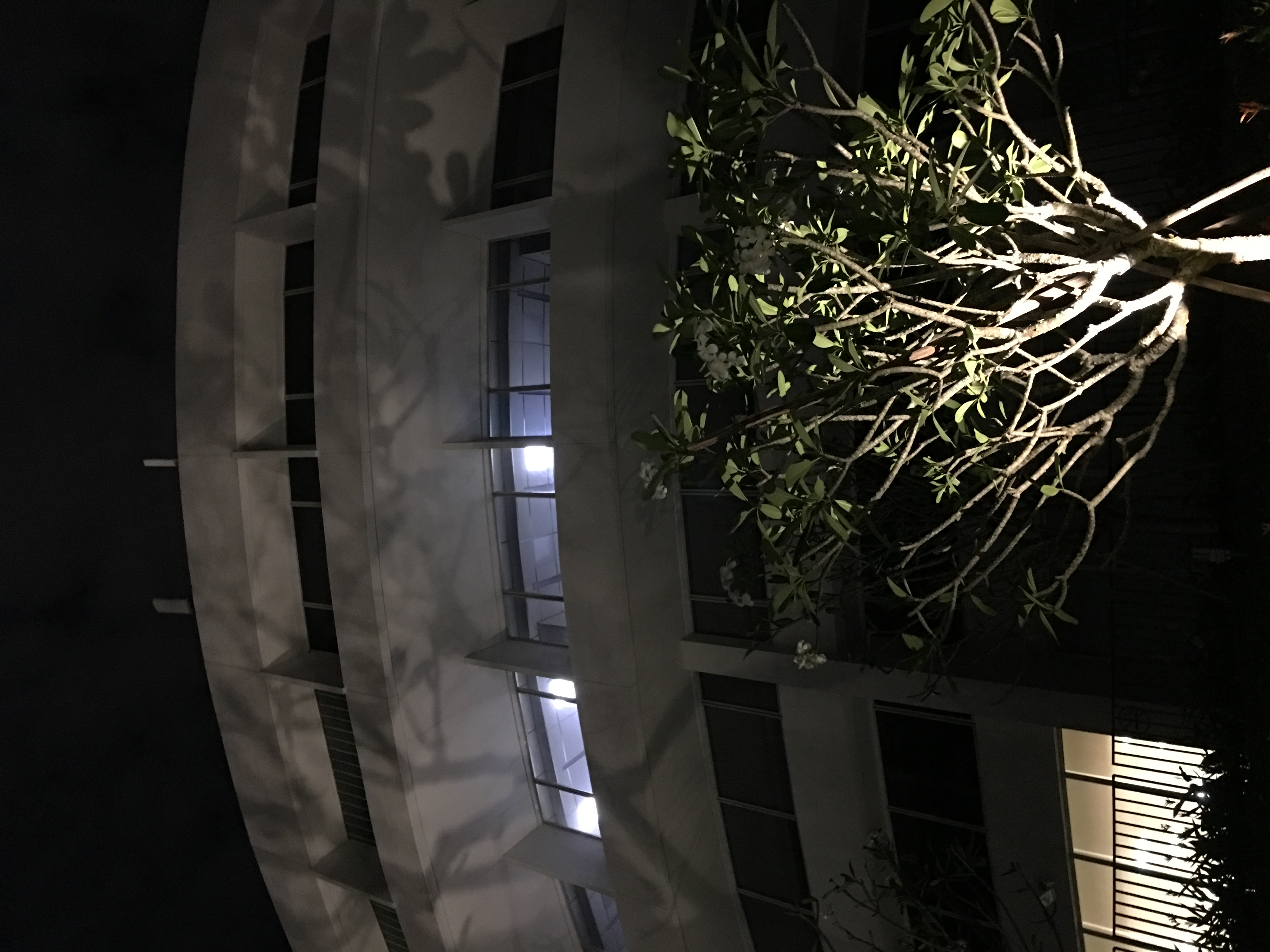
on-site measurements
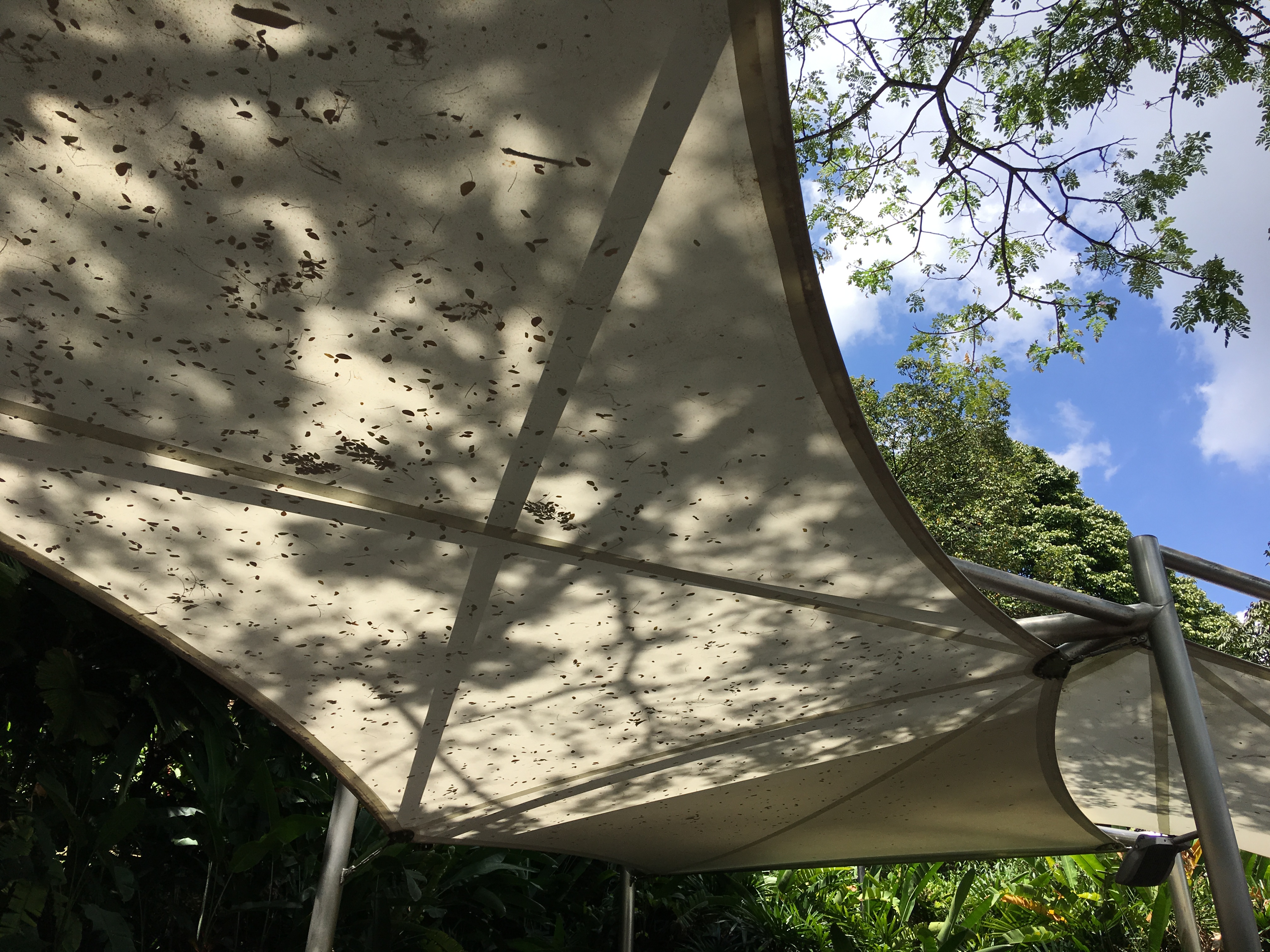
existing canopy (with similar shadow effect)
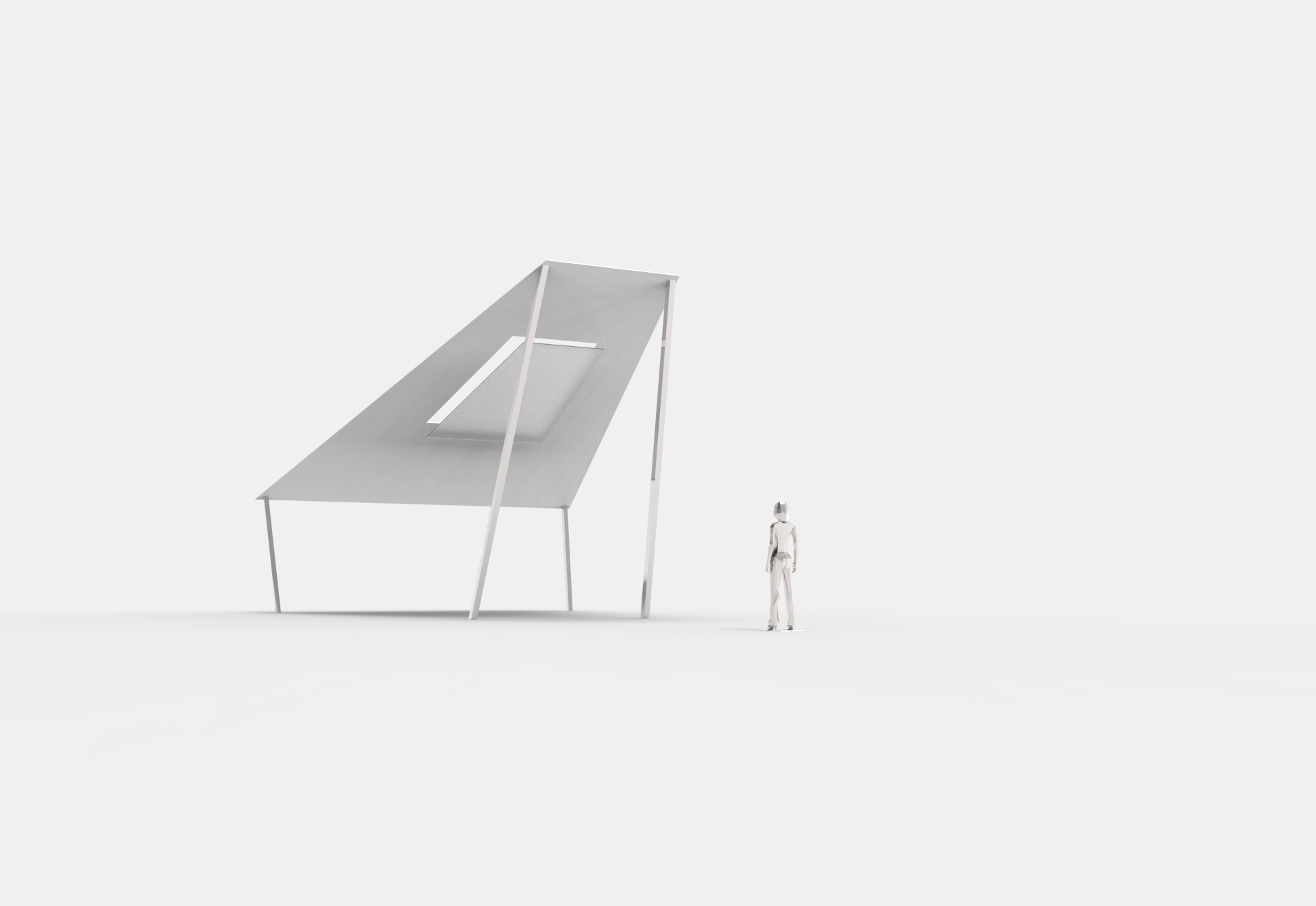
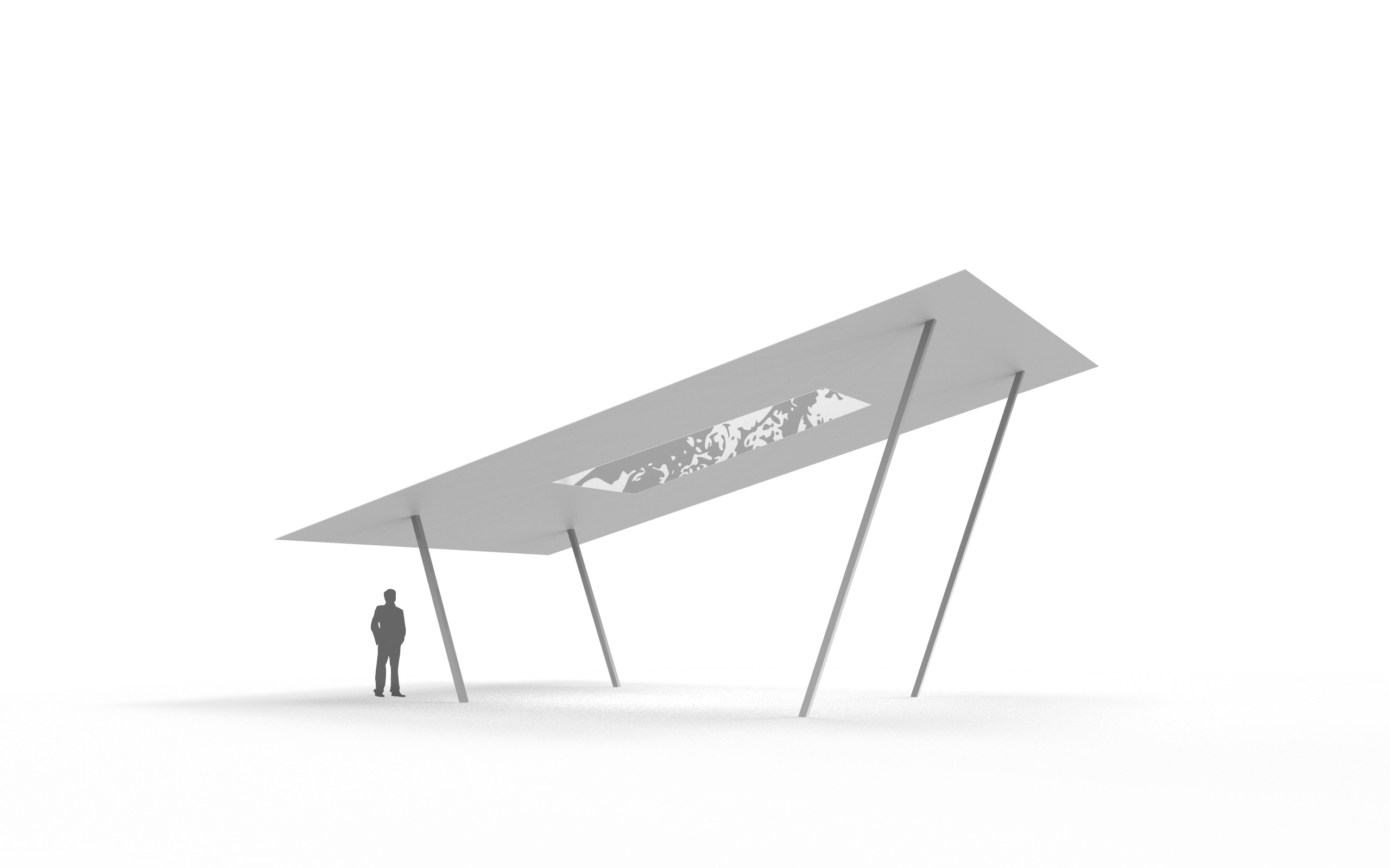
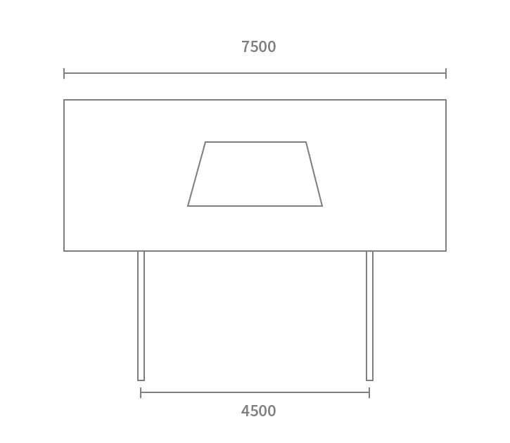
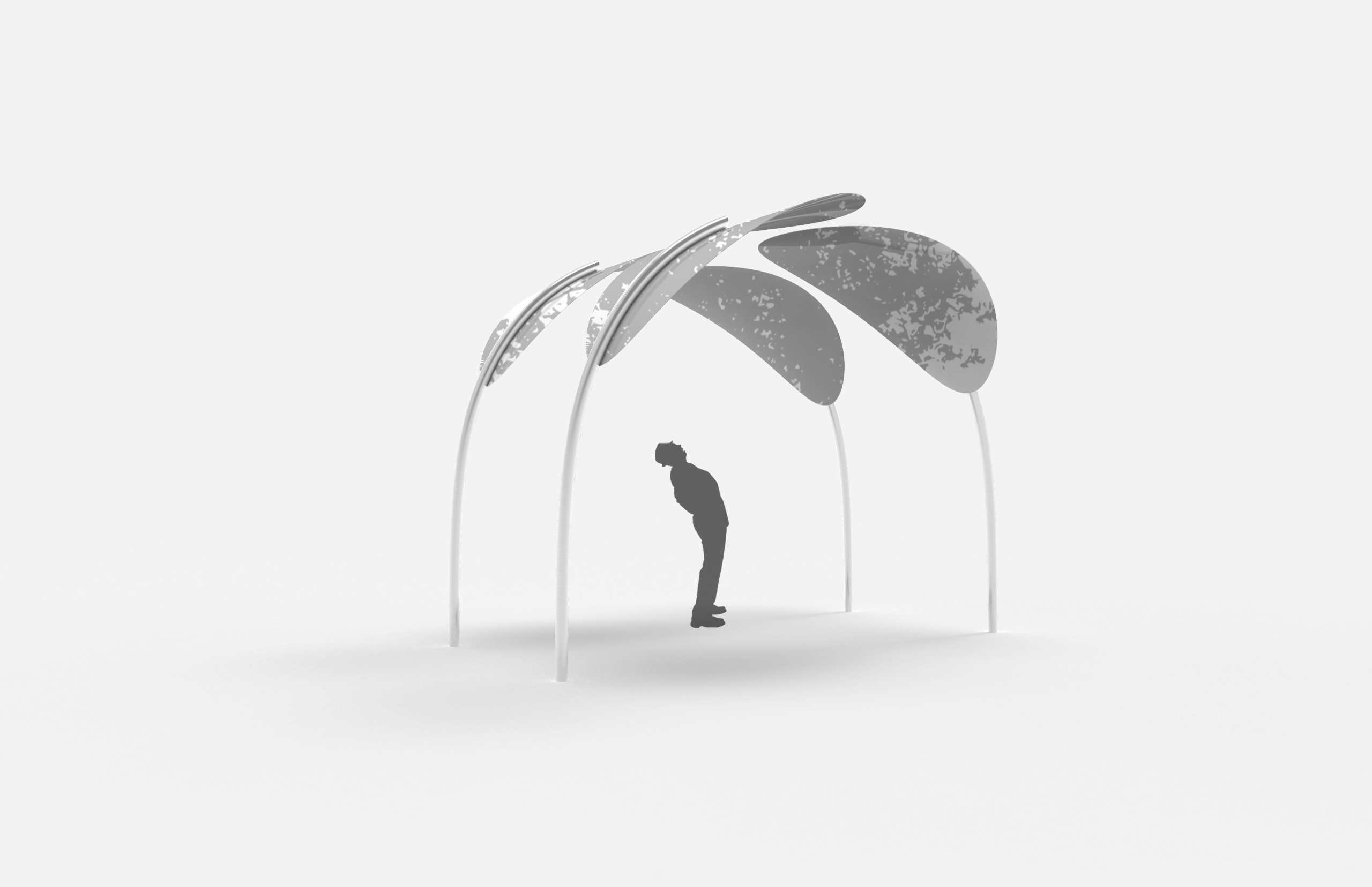
proposal
by pushing the supporting structure towards the inside, it creates a cantilever effect and viewers are more inclined to look upwards
the structures are angled so that the form does not blend in with the surrounding and overlooked, and does not look like the existing canopy
the panel is angled slightly on one side for easier viewing
the panel is inclined in this direction as it catches most of the sunlight, thus shows the most amount of shadows throughout the day
the size of the panel is set such that it covers the whole width of the corridor so that no shadows of the foliage shows at the edges, while maximising the stretch of the site
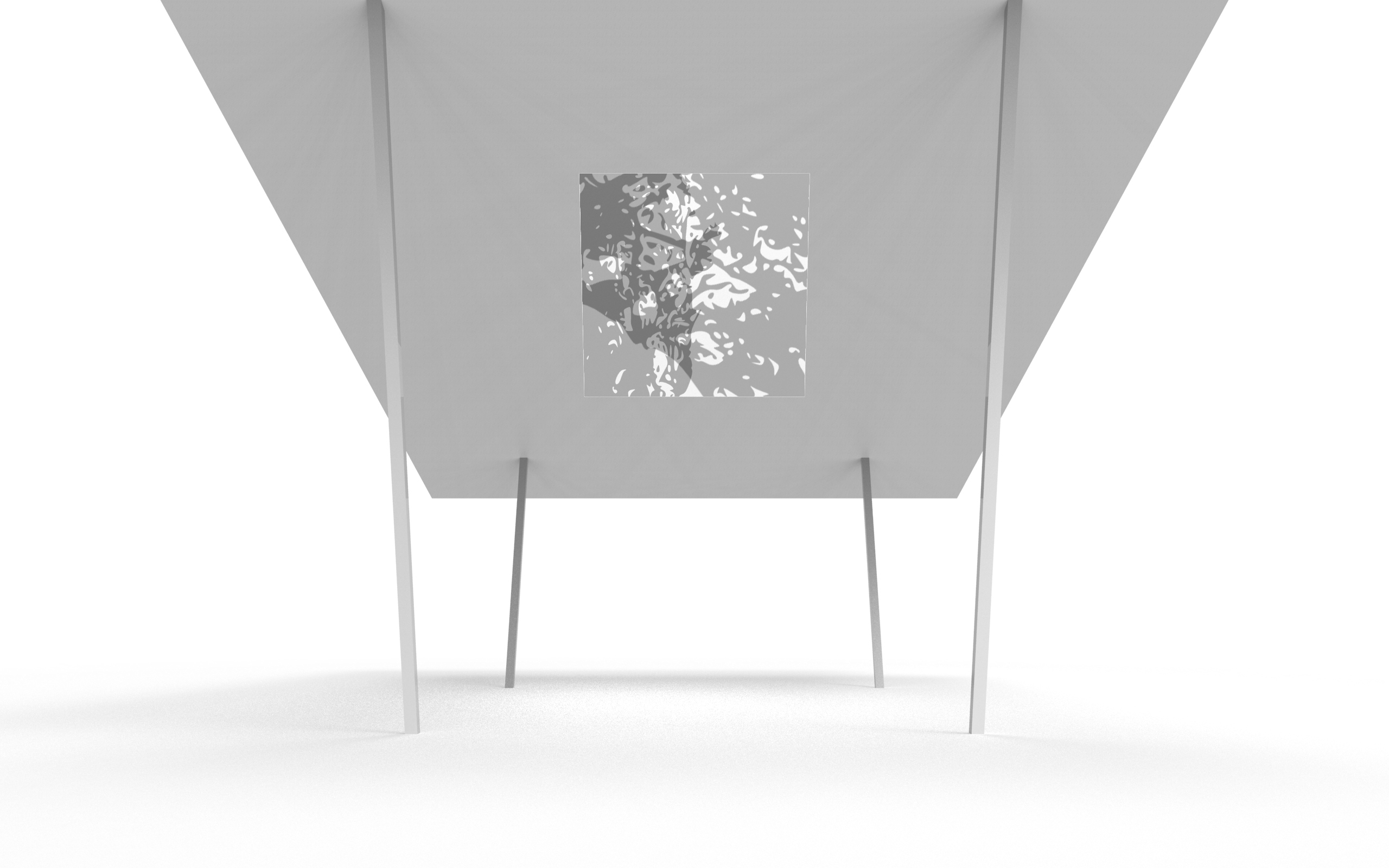
the shape of the translucent material in the middle plays an optical illusion such that it looks like a square from certain perspectives
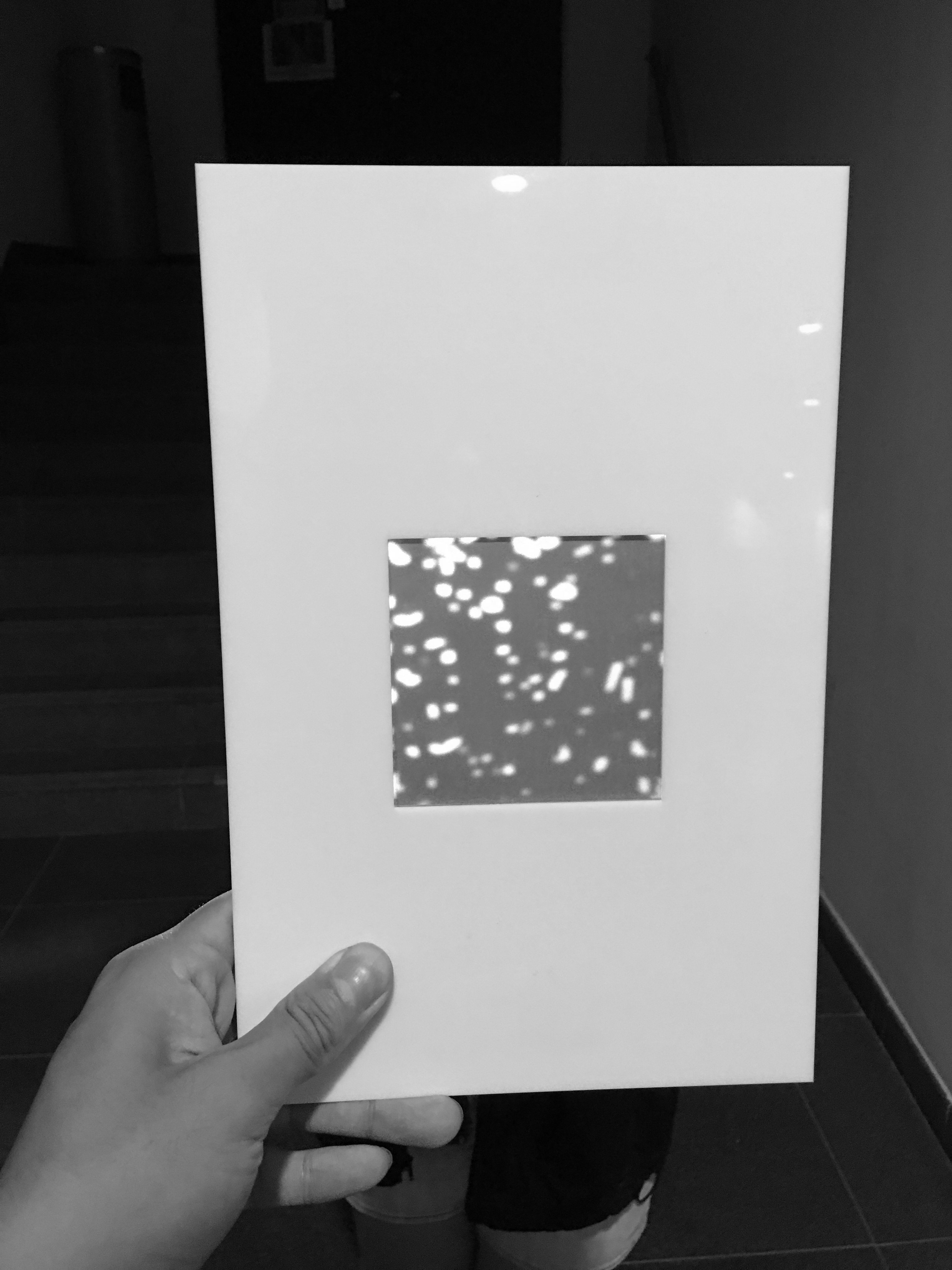
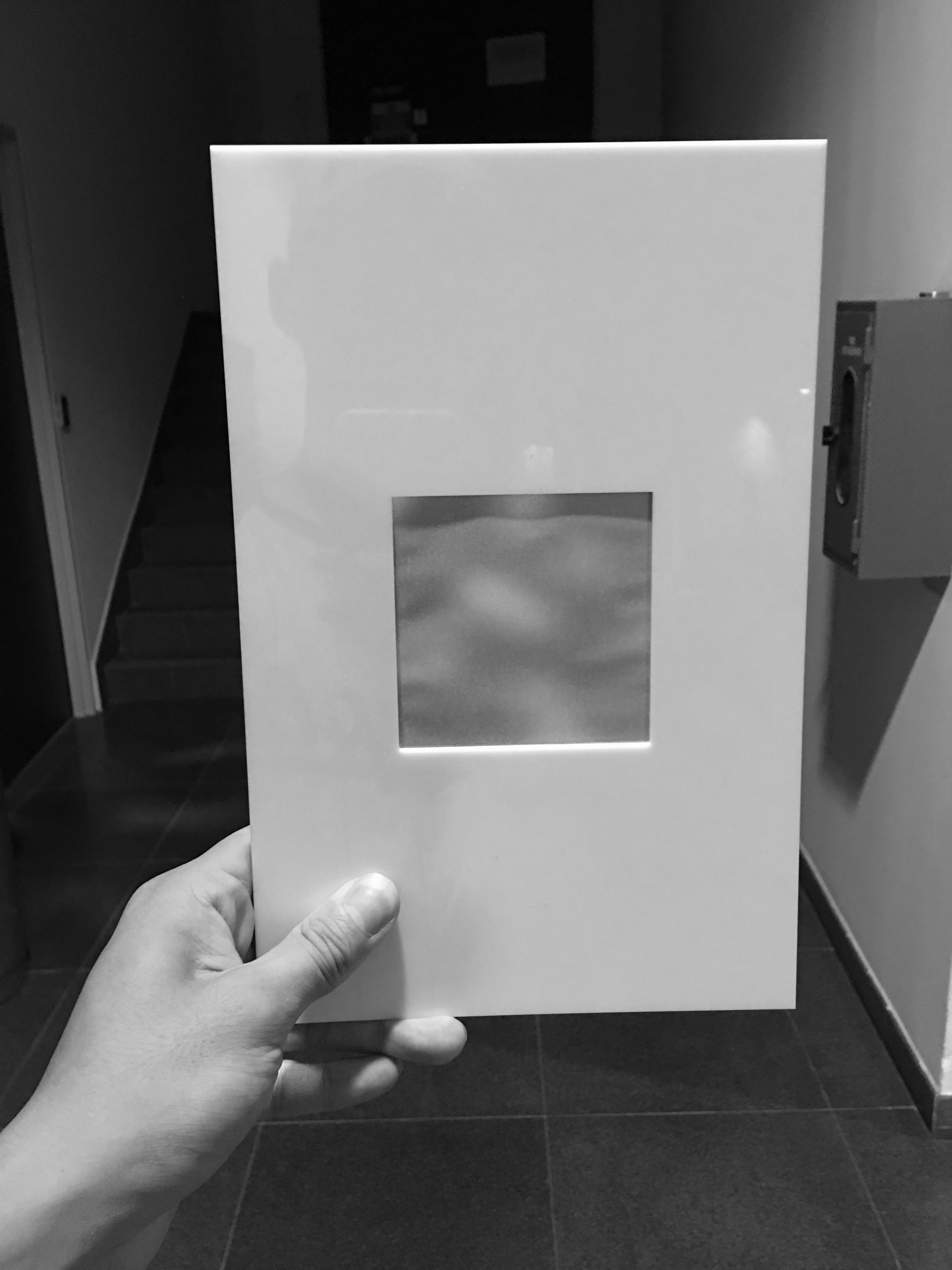
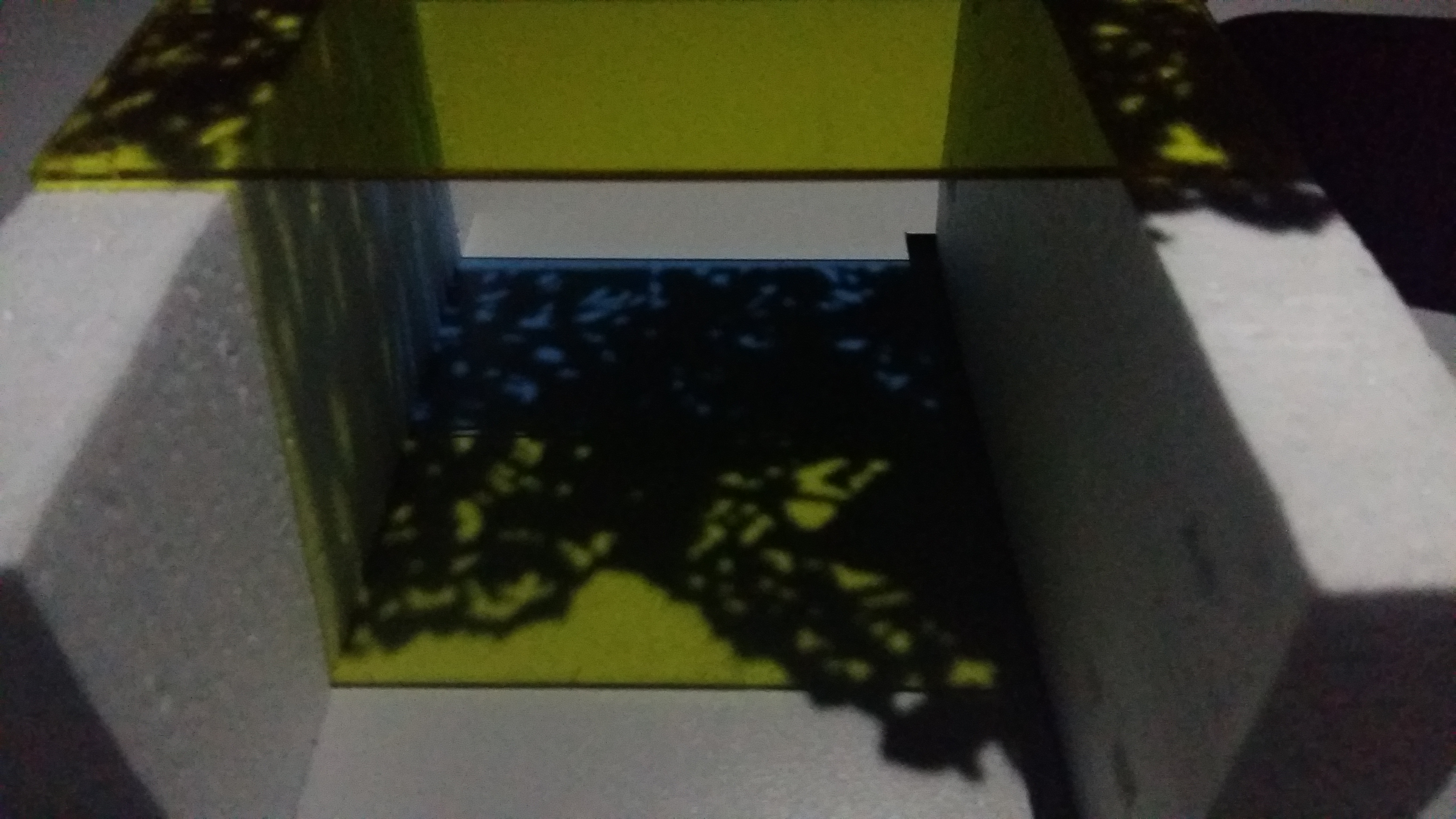
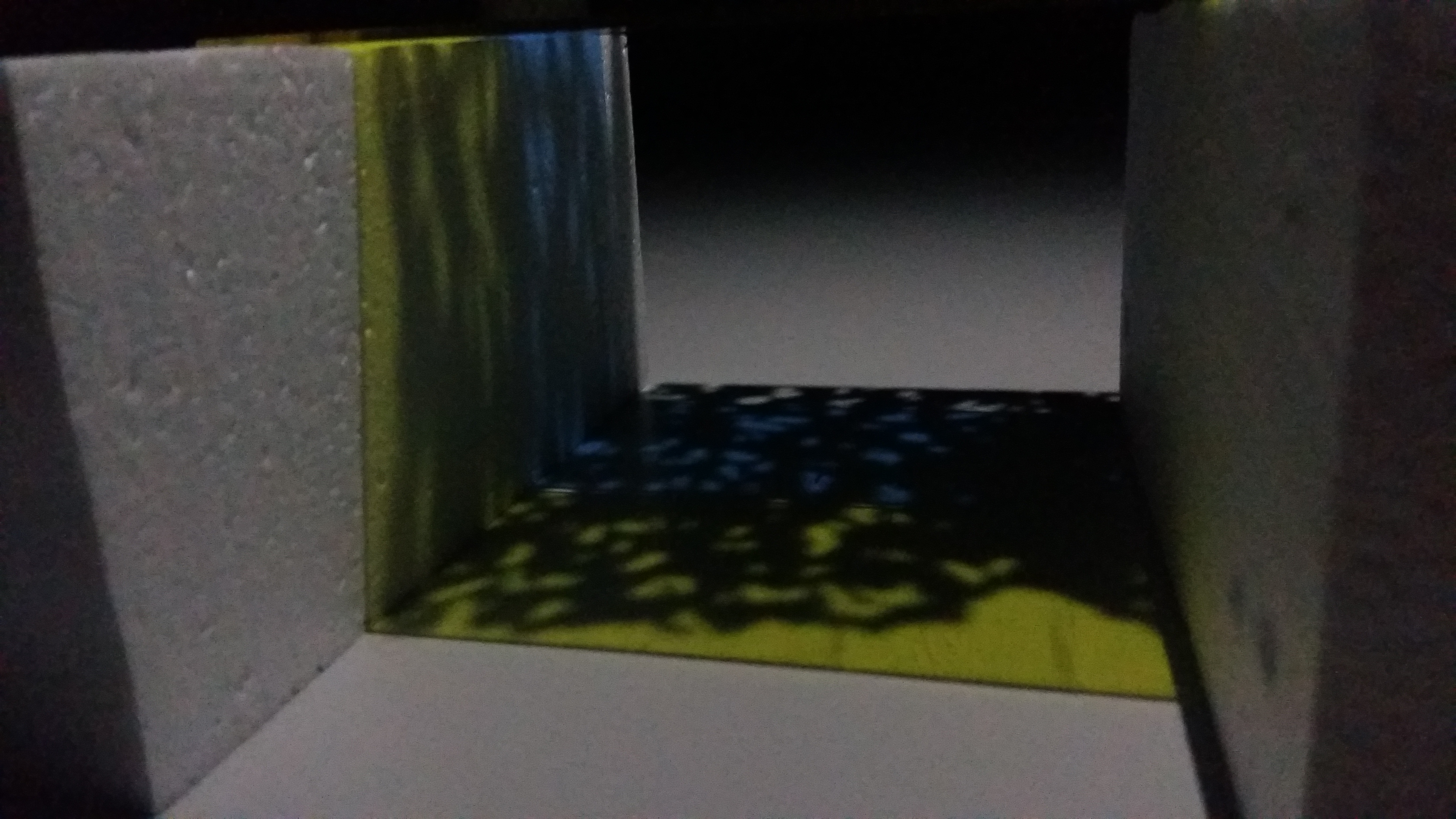
simulation
simulation of material and distance.
from top to bottom, the distance between the light source and the panel increases, the shadow cast gets more blurry and less distinct.
18 – 35 years old (students and/or working adults)
well-informed or at least aware of current situation on environment; a bonus if environmentally conscious or cares for animal rights
care to make a change for future generations??
probably with higher-paying occupations
user persona 1: Nyle
the one in front in grey…. maybe
Nyle is a 25-year-old travel agent, though he doesn’t like planning trips for himself and prefers to spontaneously find places to visit. he likes nature walks and long hikes with good company. recently, under his girlfriend’s influence, Nyle has made efforts to be more environmentally-conscious, starting small such as bringing his own tumbler and refusing plastic bags when not needed.
spontaneous // expressive // well-informed // open-minded // likes to engage in meaningful conversations and discussions
user persona 2: Marie
Marie is what you would call a typical 47-year-old ‘auntie’. she is a stay-at-home mother of two children and professional nagger. when something is broken, she doesn’t bother to fix them and would rather skip all the hassle by just getting a new one (courtesy of her husband’s income). she spends half of her time at home watching Taiwanese dramas.
stubborn // impatient // fixed mindset // wants to live a peaceful life // but makes sure everyone else doesn’t have a peaceful life by nagging at them
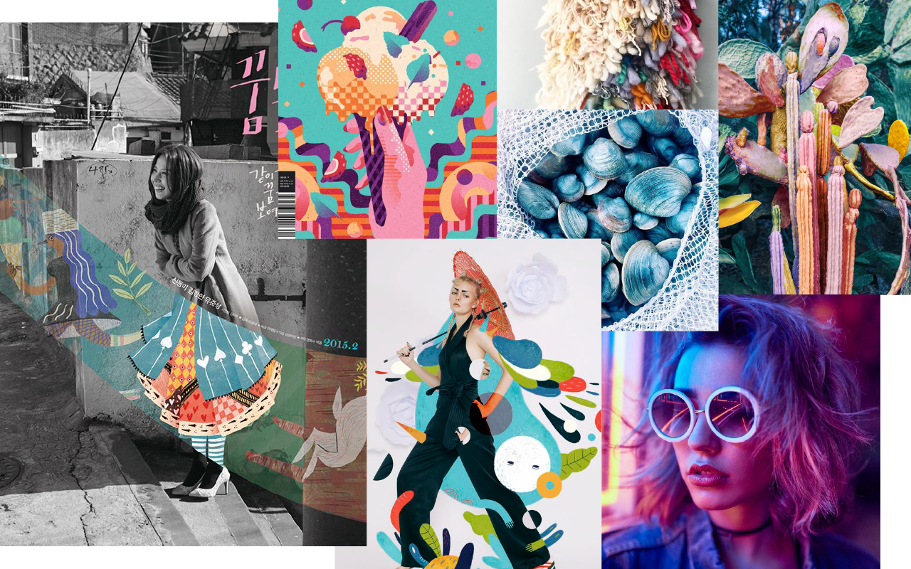
moodboard
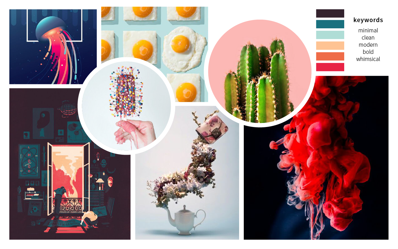
i had a few choices of colour palettes, but since the last two assignments i worked with muted and much darker tones, i think i’ll try to take the challenge of incorporating bright colours instead. also the brighter tones fit my concept and keywords better.
references
Juliette Oberndorfer
i love how the colours in which the artist uses in these illustrations doesn’t conform to the real world, making the composition seem more fantasy-like. the bright and saturated tones also adds to the fantasy effect, almost as if they came out of Harry Potter.
Mark Conlan
what draws my attention to Conlan’s works are the ‘strips’ of imagery that leads the viewers’ eyes across the composition. the juxtaposition of colours and contrast also gives them a dream-like effect.
Lieke van der Vorst
this illustrator makes effective use of monochrome, sketchy drawings of animals with the combination of cleaner, brightly-coloured elements around the animals. the colours surrounding the monochrome subject of illustration makes the animals pop out even more.
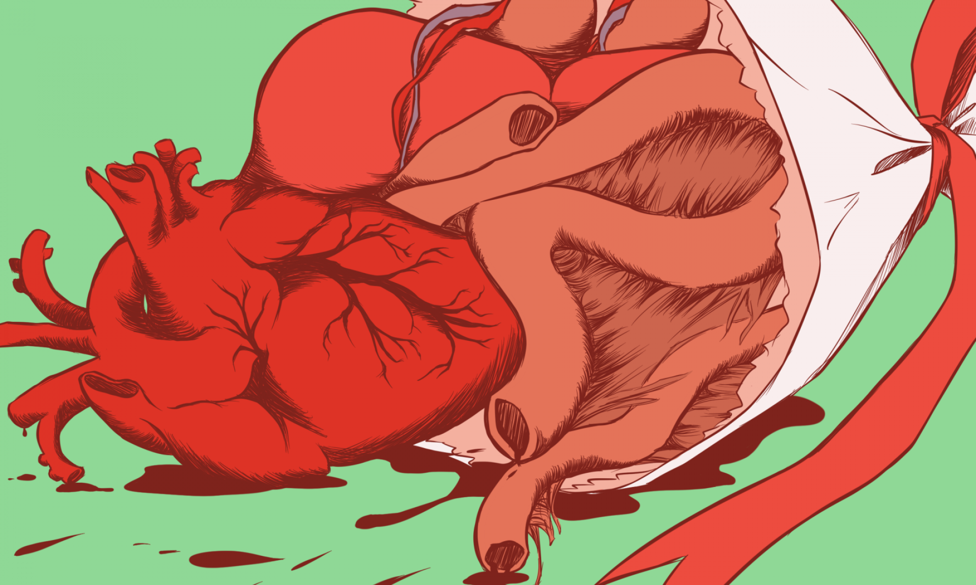
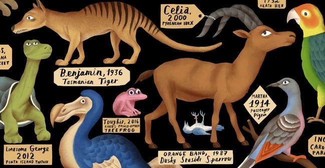
two weeks ago, i saw a few posts on instagram about the passing of Sudan, the last male northern white rhino, and this got me interested in delving deeper into this topic! so i started digging around for more information on extinct animals, or more specifically individuals like Sudan who are the last member of their species.
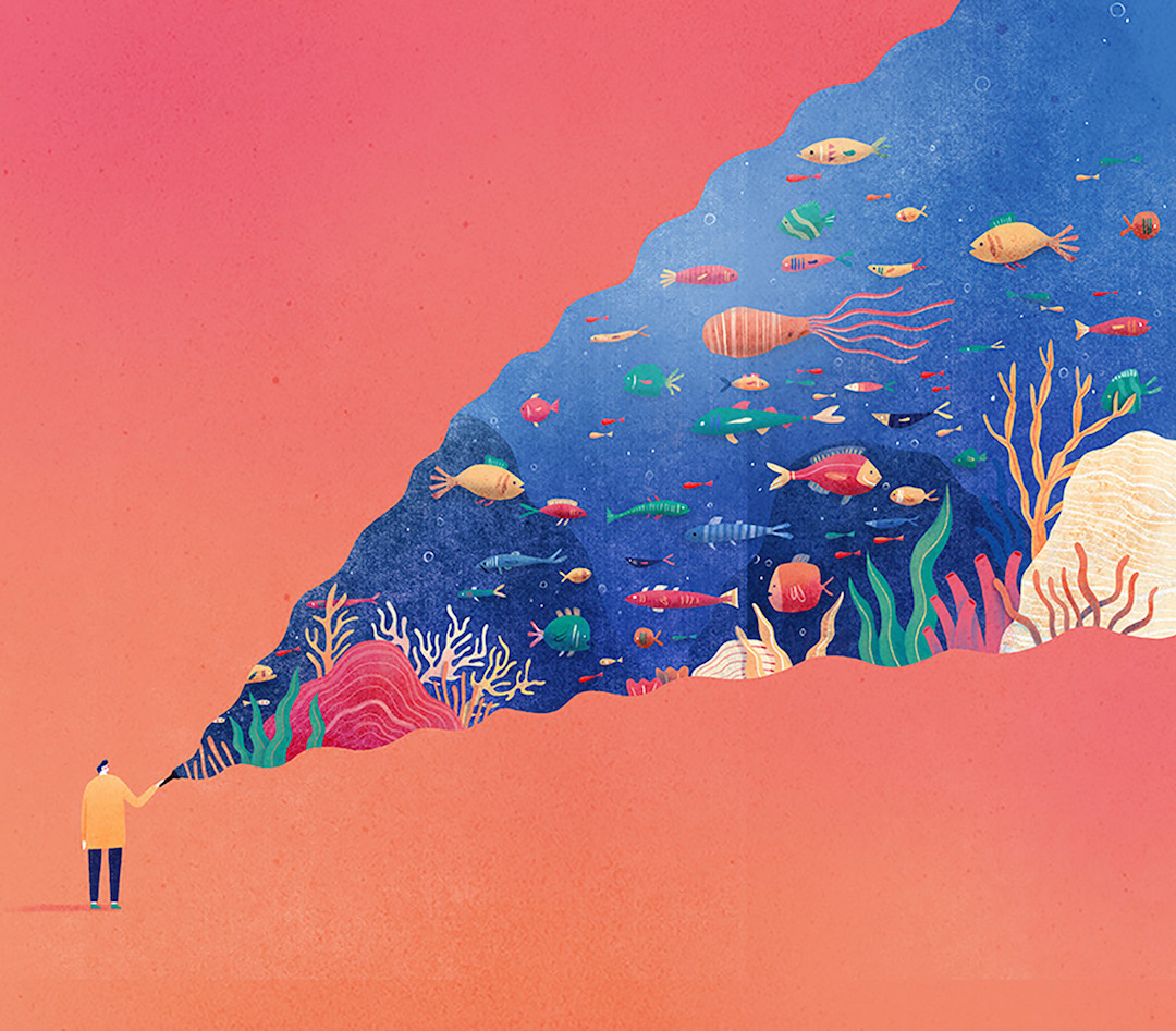
my concept is basically a fundraising / charity event to prevent endangered and threatened species from becoming extinct, by putting these survivors of their entire species in the spotlight and gain empathy
endling
after some digging around, i found that there is a term used to call these creatures who are the last survivors of their species: endling.
endling was coined in the mid-1990s by Robert Webster. there were also alternatives such as ender or terminach. but none of these terms are used often or even listed on the dictionary, so people are unfamiliar with these words.
i wanted to try changing that. i want to let more people learn about the term endling, and maybe from there learn more about the endling situation! i was thinking of using the term explicitly for the event name, like “The End of Endling” or “An Ending to Endling” and maybe use them as a hashtag as well to raise awareness of the term, at the same time tying it back to the event
inspiration
i found an article that became the base of my inspiration. it was such a good read, very well-written, and gave me new insights that i think more people should know about!
to summarise, the text lists a number of endlings with their own sad stories, which would be my main inspiration for the campaign posters. they had also described the story of Celia, the last Pyrenean Ibex, and her last moments, as well as how scientists had tried to bring back Celia’s taxon from extinction. one quote within the text struck me:
“At this very moment, brave conservationists are risking their lives to protect dwindling groups of existing African elephants from heavily armed poachers, and here we are in this safe auditorium, talking about bringing back the woolly mammoth; think about it.”
this statement is the reason why i want to dedicate the fundraising event to endangered and threatened species instead of bringing back what we have already lost.
concept: fact or fiction?
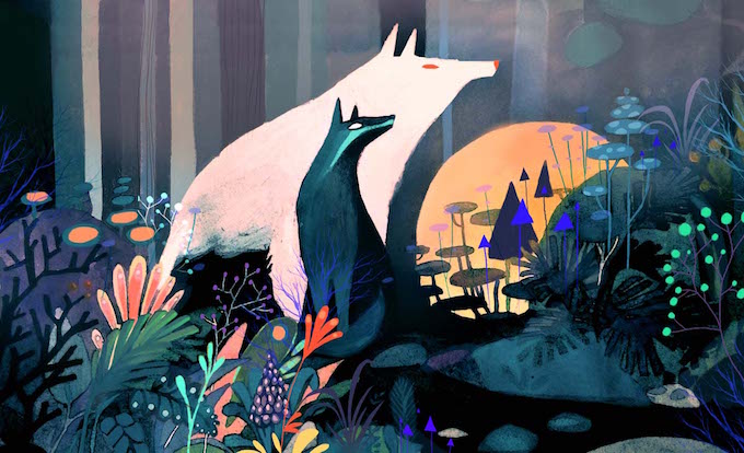
as i was looking for images of endlings and a few extinct animals, i found some of them looked like they were mythical creatures of some sort?? like they weren’t actually real.
especially the Tasmanian tiger!! (above)
so i was inspired to play with the concept of fact or fiction, history or myth, real or fantasy. there is also the underlying message that if we don’t put a stop to endlings now, these common animals (like the rhino) to our grand-grand-grand-children will look as if they are mythical creatures too!
to bring forth the idea of these creatures as mythical, i want to try using bright and fantasy-like colours (deep purple, bright pink, neon blue, saturated lime green) to depict these endlings. i’m also trying to play around with the idea of using juxtaposition between accurate, anatomical drawings in monochrome, and fun, playful illustrations in bright hues (see examples below)
the items
some ideas of possible illustrated items for the fundraising event:
campaign poster
banner (describing the event details) maybe??
thank you card… maybe?
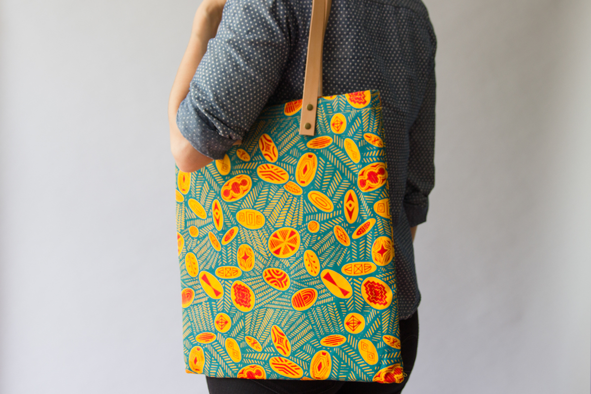
tote bag
misc souvenirs, like postcard, badge, sticker, magnet, coaster, pouch, notebook, etc.
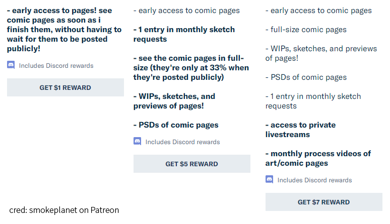
i was thinking of using a Patreon-style system, where you can donate a certain amount and the items you get accumulate depending on how much you pay (kind of like the one below!)
as for the choice of items to be given out, i think i’ll create a user persona first to decide what type of things the target audience would be interested in getting!
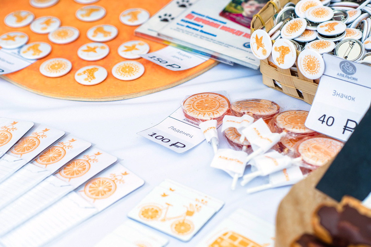
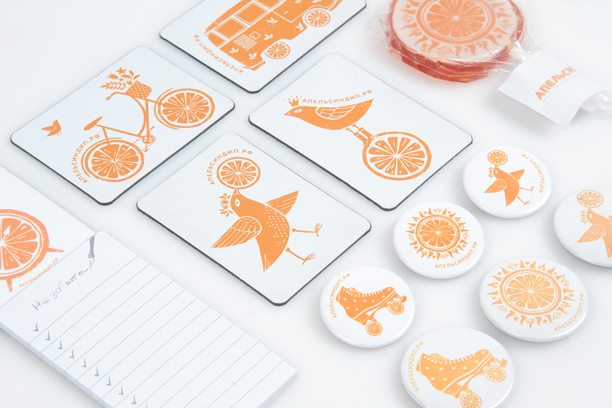
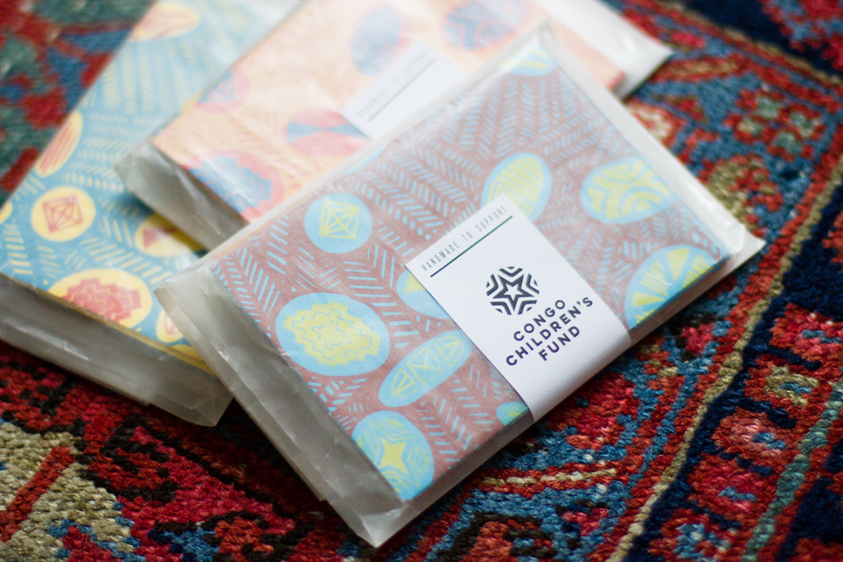
research on fundraisers
for now, these are a couple of examples of fundraising events that i can reference a variety of souvenirs from!
the proposal last week was too much like a shelter; not intentional enough; people passing by will look at it as a ‘shelter’ and not a medium to frame the shadows
suggestions: maybe add holes or use repetitive shapes, something that is more intentional and will let people think that it’s not just a shelter
how do you utilise holes without them blocking the shadows?
another suggestion: research more into interesting materials that possibly interacts with the light
references
Rabbit and the Tortoise collection by Studio Juju
Manta by Ross Lovegrove
Fata Morgana by Teresita Fernandez
La Pineda by Javier Mariscal
Playground for Machida Kobato Kindergarten by Etre Design
material research
1 fluorescence
Fluorescence is the emission of light by a substance that has absorbed light or other electromagnetic radiation.
In most cases, the emitted light has a longer wavelength, and therefore lower energy, than the absorbed radiation. The most striking example of fluorescence occurs when the absorbed radiation is in the ultraviolet region of the spectrum, and thus invisible to the human eye, while the emitted light is in the visible region, which gives the fluorescent substance a distinct color that can only be seen when exposed to UV light.
Fluorescent materials cease to glow nearly immediately when the radiation source stops, unlike phosphorescent materials, which continue to emit light for some time after.
type: luminous
characteristic: lightly visible under sunlight, no effect in the dark or at night
2 phosphorescence
Phosphorescence is a process in which energy absorbed by a substance is released relatively slowly in the form of light.
natural phosphorescence
This is in some cases the mechanism used for “glow-in-the-dark” materials which are “charged” by exposure to light. Unlike the relatively swift reactions in fluorescence, such as those seen in a common fluorescent tube, phosphorescent materials “store” absorbed energy for a longer time.
type: luminous
characteristic: clear in the day, visible in the dark or at night
both fluorescent and phosphorescent effects can be achieved by luminous paint – easily found in Singapore paint shops, Art Friend, Spotlight, Lazada
3 photochromic
Photochromic materials are colorless in their inactivated state and become colored when exposed to an ultraviolet light source. They will respond to natural sunlight, and darkens as the light level increases.
Common applications of photochromic materials include sunglasses and spectacles.
type: darkening/colour-changing
characteristic: visible under sunlight, clear in the dark or at night
when developing forms and functions for the installation, we were stuck on the idea of having the passerby notice the shadows (forcing it on them). benefit of doubt that the users see what we intend to do. so we decided to leave it open-ended.
we clarified that there are two directions we could take to use the shadows in the environment:
1 define a space. because the environment chosen is a common area and is too noisy, the aim of the installation is to tone down and create a neutral space. some examples of forms the installation could take are canopy, architectural pieces, tunnel, partition.
2 define a three-dimensional object. by placing an object that is out of context and stands out from the environment, people are more inclined to look at them as individual objects rather than objects that blend in the background to only serve a purpose (e.g. shelter)
another point we clarified was also to use simplified forms, because the aim of the installation is to make use of the shadows surrounding the site, and a form that is too complex will simply overshadow and dominate the shadows. at the same time, it cannot be too simple; it needs to have a character and intentional so that it does not blend in to the background.
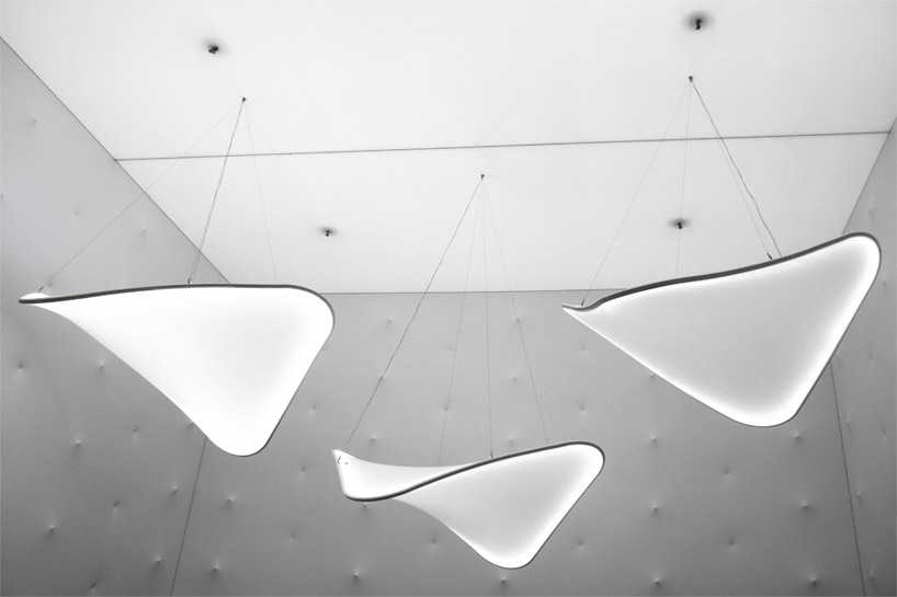
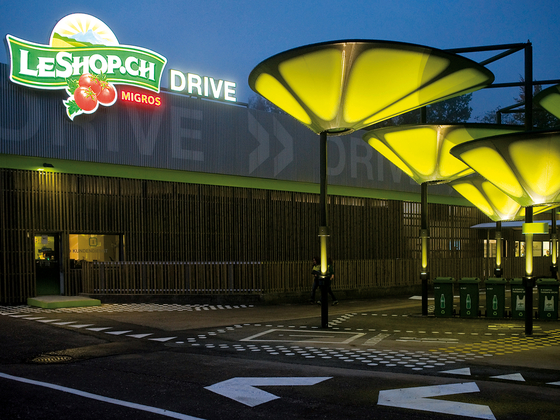
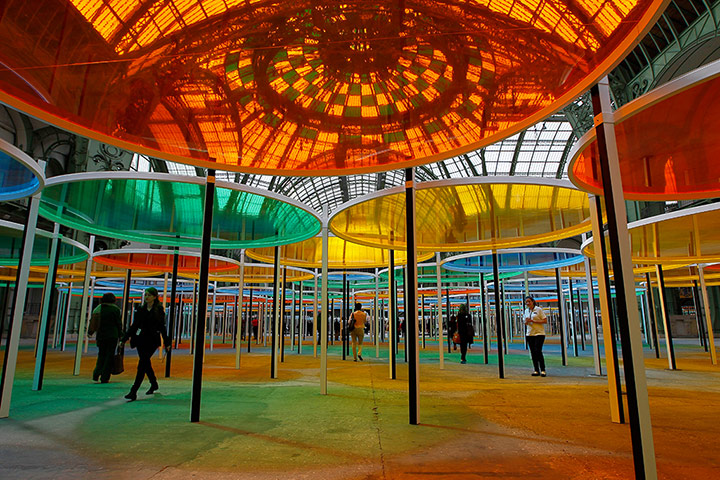
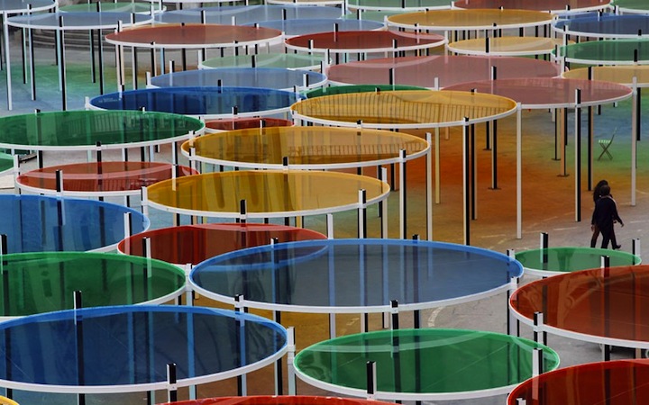
curating light through space and architectural structures
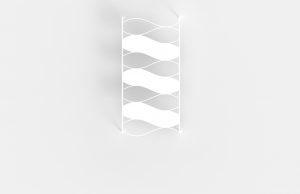
(above) 5-metre tall structure with hanging polyester mesh. interacts with the wind and serves as a big canva for the shadows to cast and interact on. the takeaway of this structure is that it is simple yet the size makes it eye-catching, and does not take away from the shadow.
references
shade structures by MDT-tex
Excentrique by Daniel Buren
Le Refuge by Marc Ange
Virgin Lounge Melbourne by Tonkin Zulaikha Greer Architects
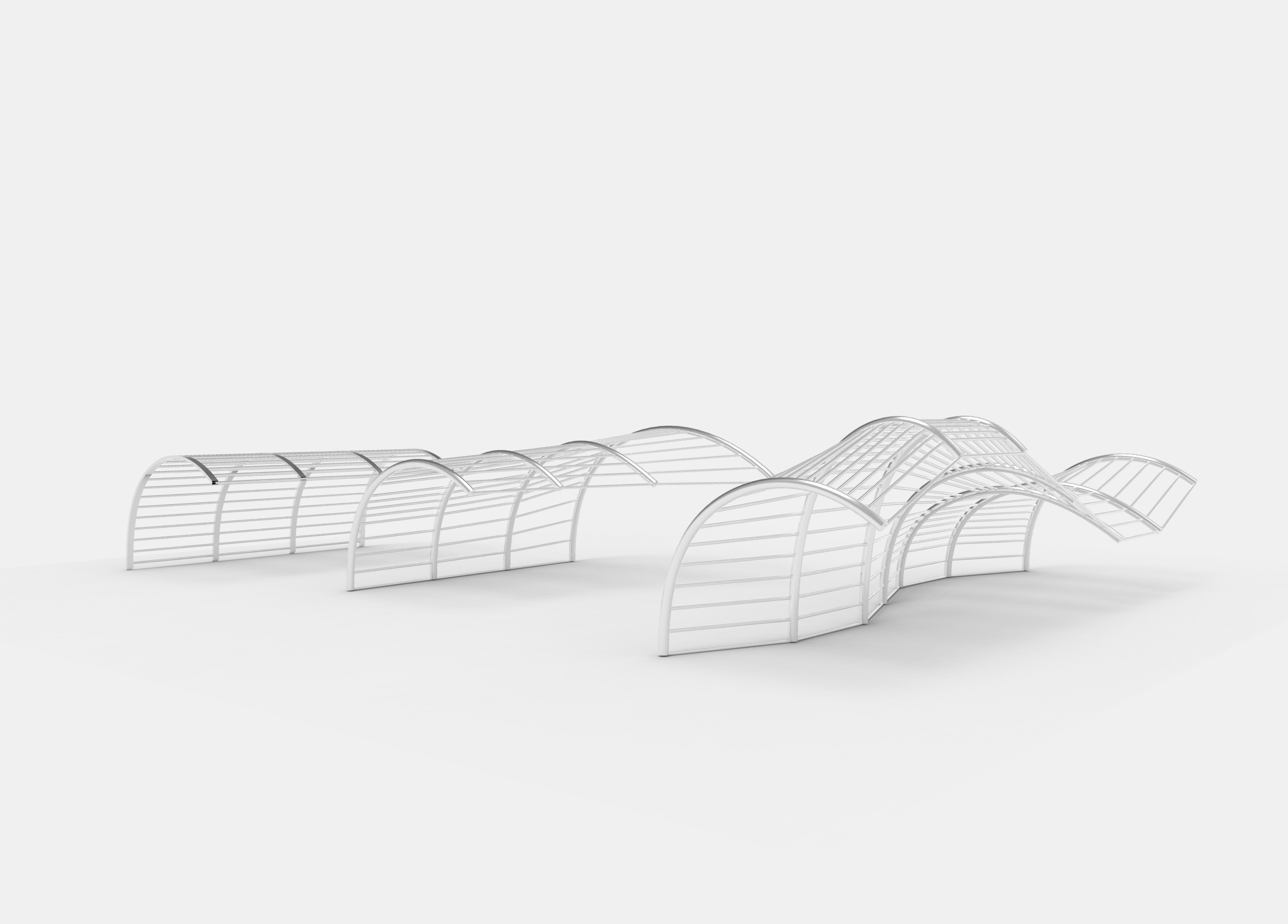
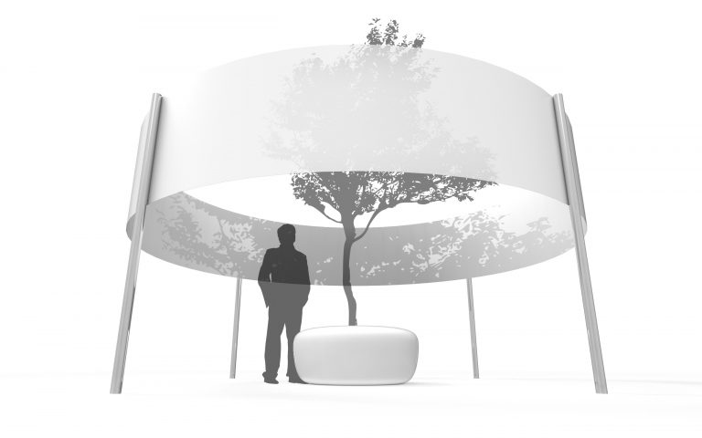
proposals
1
in regards to the character and intention, the curved structure vs the rigid structure of the existing canopy suggest that there is an intentional design process. it does not look like an off the shelf structure, but a one-off, customised, curated and specific.
material: polyester mesh, stainless steel structure to foundation
height: 3-4 metres
can be duplicated/arrayed along the stretch of the walkway
possibility of using colours for material
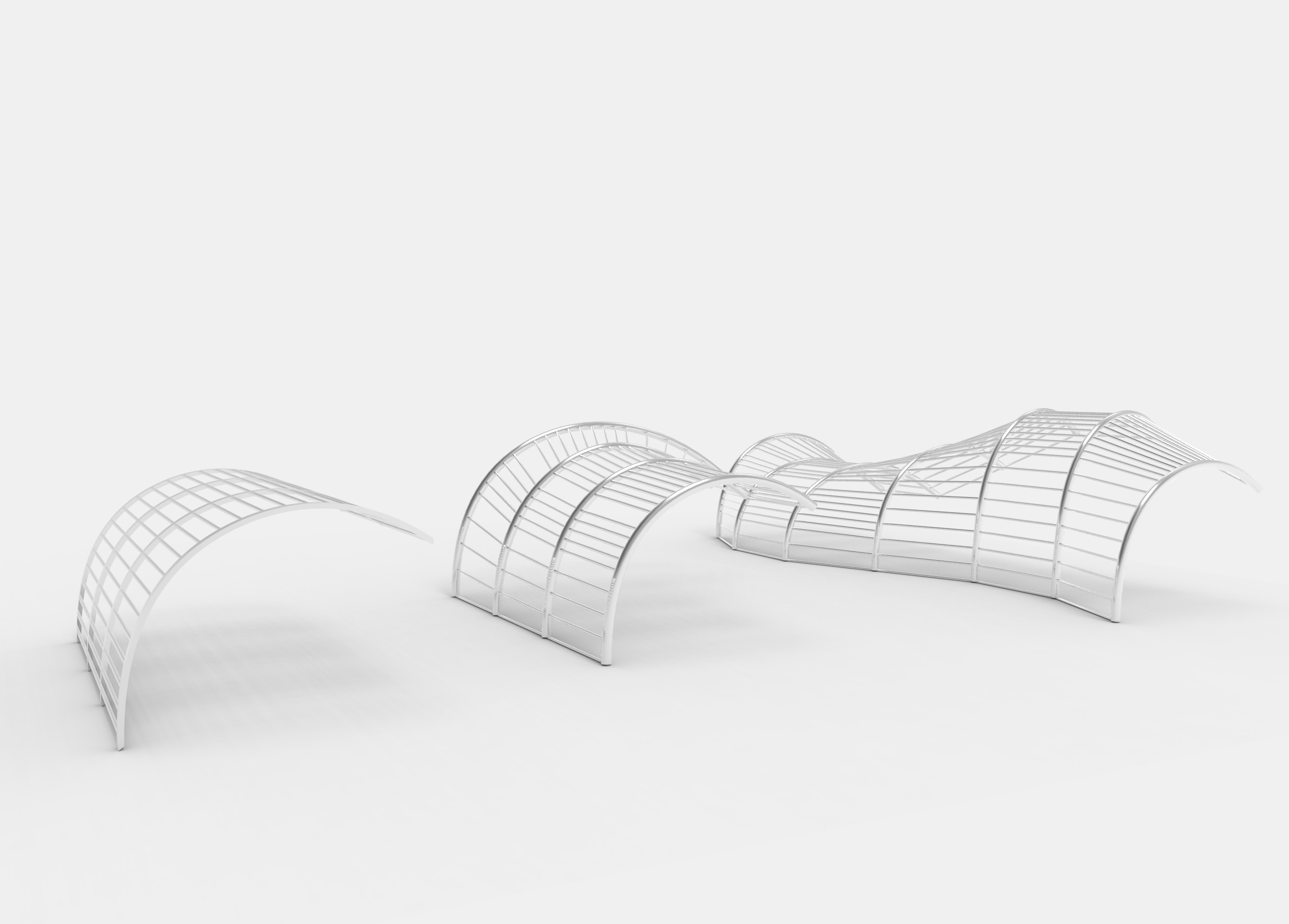
2
reference:
different from the previous idea in which we are framing the shadows in the environment, the second idea is more curated towards creating shadows with the installation. the installation provides a structure for vines and climbing plants to grow on them, where the structure creates rigid shadows while the plants curate more organic shadows.
consider using textures or 3D forms so shadow is distorted and cast at different angles, playing around with the 3D volumes instead of a flat plane
think about the fallen leaves and how to get rid of them; the leaves may make the installation blend in more with the environment and less noticeable to passerby
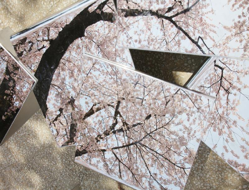
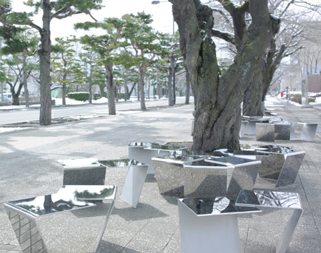
reflective material – must be above waist level; cannot be seats
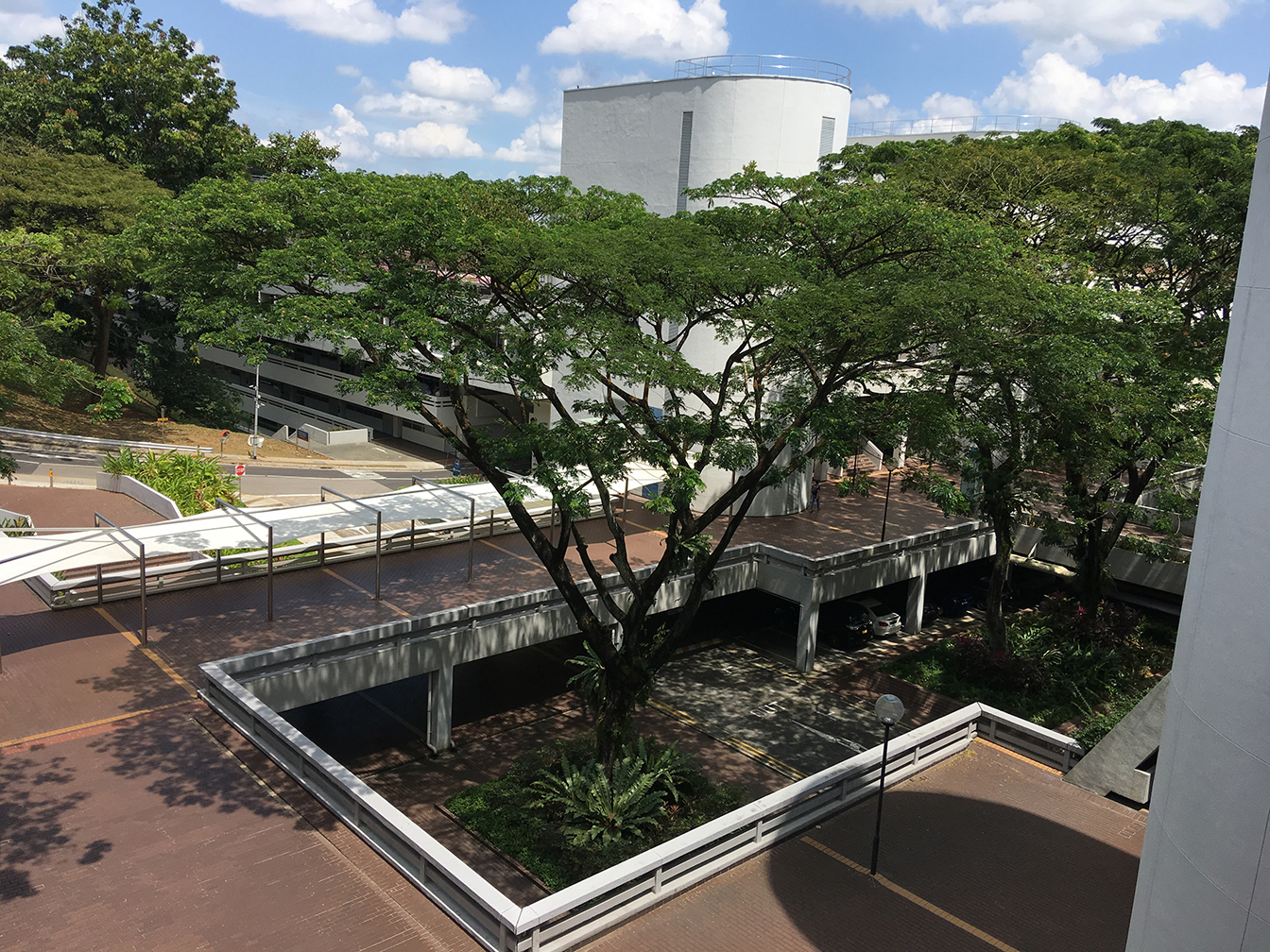
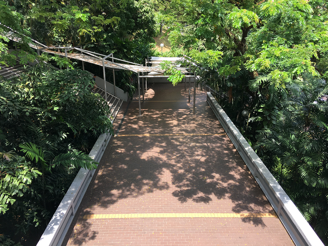
site observation
chosen site: stair linkway between North and South Spine
shadow time-lapse (11.30 – 15.30)
material exploration in relation to last week’s first form exploration (mirrored seat), thus we tested out reflective materials and how they interact with the shadows
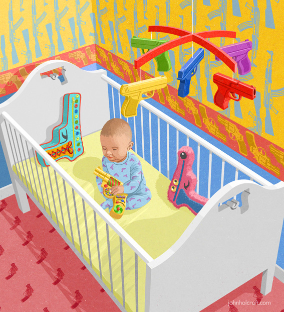
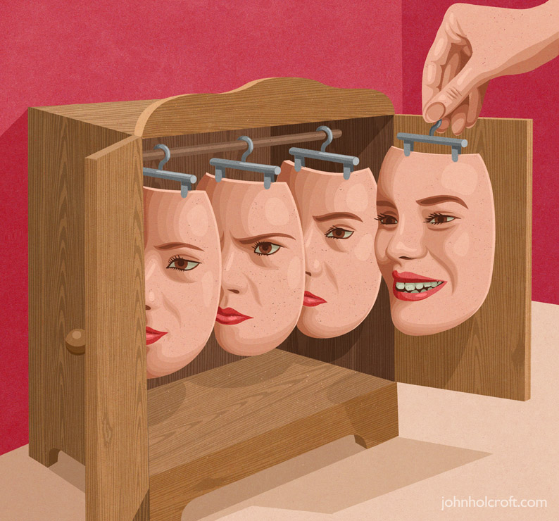
i love how Holcroft illustrates controversial concepts in an interesting manner, letting the audience view his take on certain ideas. for this assignment on editorial illustration, i would like to illustrate key points of the theme in the same manner as Holcroft, using unique analogies that quickly and effectively relate the message.
Shimizu’s works are beautifully illustrated, carefully inked, and finished with muted yet eye-catching colours. i like how her style is a fusion between american pop illustrations and japanese manga styles. being heavily influenced with japan’s manga illustration styles myself (and finding it a little hard to break out of the habit of drawing in that style), i find Shimizu’s style inspiring as she did not shy away from her roots nor ignore the style she often sees in her environment, and instead incorporated them both into her illustrations to make her own unique style.
(also her use of dynamic brush strokes is similar to what i am used to, so i would like to use her ink art as reference)
words cannot even describe how much i find Kageichi’s style stunning and mesmerising. from the composition and the amount of details put into each piece, to the minimal colours and textures used. though some of his works look a little chaotic, a good few are framed beautifully and lets the viewers’ eyes move across the illustration.
style-wise, i am still unsure which direction i want to take: either something minimal and effective like Holcroft’s illustrations, or detailed and impactful like Kageichi’s. (or perhaps even something in between like Shimizu’s artworks.) so i created two moodboards with different keywords, just to keep my options open.
aspiring students and graduates, workers in the creative industry, has immense interest in the creative works
probably has money to spare
familiar with design, music, fashion, or one of the art fields
seeking for deeper insight of the creative industry, as well as know-hows from interviews of employees of the industry
[i made two user personas because i’m still contemplating whether i want to illustrate a sad-funny analogy of the theme, or in a serious style. the two personas help me gauge the spectrum of Varoom consumers and maybe decide which style i would like to use]
user persona 01: janine
Janine is a 26-year-old social media manager of a well-established magazine company. she enjoys aimlessly scrolling through Pinterest and sarcastic jokes.
likes both basic and quirky aesthetic // witty // creative // a little emotional // busy // always in it for the gram
user persona 02: Troy
Troy is a 28-year-old sound designer with an interest in illustrations and graphic design. He occasionally splurges on whimsical things that interest him at that moment in time.
spontaneous // playful // creative // open-minded // does not care much for social media // well-informed
anti-persona: Walter
Walter is a 37-year-old telemarketer who only cares about three things: his family, his lunch break, and pleasing his boss. He spends most of his free time watching mindless shows on the television.
efficient // detail-oriented // serious // dislikes changes // wishes to retire with valuable assets to be passed to his children
content includes comments and discussion on contemporary illustration from a global audience, as well as interviews with illustrators, image-makers, designers
[source: Association of Illustrators (AOI)]
editorial illustration
Across the spectrum of print and online publications, art directors rely on illustrators not only to create beautiful and attention-getting images, but also to help impart information and express complex ideas. Editorial illustrations bring stories to life and entice readers to engage with content.
— Jenny Carless (Adobe Create Magazine)
what is an editorial illustration?
an engaging visual representation of the accompanying article that clearly tells a story or convey a concept to the readers
two elements of editorial illustration: concept and style
these two go hand in hand. a successful illustration can illuminate the essence of an idea effectively through the use of a fitting style to convey the mood; is it humourous? serious? thought-provoking?
empathy
definition
psychological identification with or vicarious experiencing of feelings, thoughts, or attitudes [source: dictionary.com]
putting yourself in another’s shoes and/or experiencing from another’s point of view; not necessarily having experienced the feeling yourself [source: self interpretation]
the three types of empathy
cognitive empathy “THINK IT”
understand what another is thinking or feeling
emotional empathy “FEEL IT”
put yourself in another’s shows and feel their emotion that may lead to pain and burnout
compassionate empathy “BE MOVED BY IT”
feel concern about another’s suffering, but from a distance and with the desire to help (positive feedback that relates to motivation and reward)
from personal experience
being quite an emotional sponge myself, i tend to absorb another’s emotions relatively easily – i would feel their suffering if they are in pain, their anger if someone irritates them, or even their excitement if they look forward to something. i do enjoy listening to their tales and rants. but sometimes… they get a little too overwhelming. most of the time? my positive energy gets sucked out and i end up feeling numb.
people say that empathy is an exceptional skill to have, not only personally, but also socially and career-wise. but for some (like myself) who do not know when to stop sharing the same thoughts and feelings as another, it can get very exhausting… especially when the other spouts nothing but negative remarks.
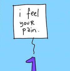
thus for this editorial illustration, i narrowed the theme down to
the trials and tribulations of having too much empathy
(to put it a little dramatically)
some negative impacts of empathy:
feeling the pain and experiences of another; indirectly inflicting the pain and negativity on yourself
always having to put up a positive front
feeling burdened (especially when you don’t have anything substantial to make the other feel better); the idea of it weighing you down


/GettyImages-594838193-566744f95f9b583dc3ab08c3.jpg)


