I made a trip down to the very ulu RJ Paper on Monday and was highly impressed by the wide variety of papers that were available. Alas, I picked three to do my print on, Munken Polar, Monet and Maple White.
These were the outcomes:
The Maple White and Monet were similar in off-white colour and in the end I will submit the Monet copy cause the lower grammage of 115gsm felt more organic.
The Sunken Polar was simply too white but I bought it just for variation.
The was a fun project and I couldn’t be happier with the brief and how this was the closing assignment for 2D Year 1. I enjoyed doing photography and stand by my design choice of the zine. By wanting to put a focus on the narrative and photography, I felt that any more design elements would simply by adding more ‘noise’ to the message and weaken it.
And so our video installation came into fruition but before you watch the video, take a look at the behind-the-scenes to see what was put into the making of this piece:
Password: spaces
As lighting designer, I faced the challenge of creating interesting shadows and black and white looks. I looked to numerous film noir styled videos for example the various scenes in Beyoncé’s Dance For You video. As a team we felt that this enhanced the mood of our film and definitely pushed the boundary as it was a style we had never tried before.
In this video you’ll see stuff we tried to emulate like the fan shots:
And also the selective lighting and shadow play:
This was the final outcome (three different screens merged into one video):
The execution of our installation was a gamble as we were not sure if the Crit Room was being used that morning. It fit our theme however and was the best place to use that was still available. Though we had to rush out the moment we were done presenting, the space worked in our favour to create a very clean and isolated atmosphere.
Here’s a video of audiences entering the space:
And here’s a short video of them watching our film:
In the midst of post-production, I also whipped up some post-cards/marketing collateral that we used ti decorate the 3 podiums our projectors sat on. We aso blacked out the windows at eye level to prevent as much light from getting in.
Reflection:
All in all, I think this final project was a very enriching one. Having to come up with a concept and factor in the multiple screens was challenging at first but I’m satisfied with the way everything came together. We did our best and there is nothing I would change about this final piece. I hope to have more experiences with film in the future and definitely have learned a lot from this semester of Foundation 4D and have acquired new knowledge and skills that I will be able to use from now onwards.
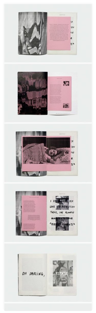
So after my first consultation I had some changes to make, the most important one being a change in font from hand-written to something more clean. These were my variations for my cover design as Mimi said she wanted to see more bleed and less borders to fully appreciate the photography.
Indeed Mimi was right and a fully bled picture made more sense and I liked the way the title of the zine was subtle and did not overpower the front cover. I also like how the photograph kinda drew the eye into the zine and thus I felt it made a powerful cover photo.
This was my spread at a glance:
But it still felt like I was cramping too many photos into the zine and it felt that each photo was not getting enough time to shine. After the next consult Mimi suggested that I cut down the images and, you guessed it, enlarge and let the photos bleed to give it a more open feel. I decided to also let the photos go past the centre margin so the layout didn’t feel so rigid.
I also shifted one of the photos from the centre spread to the back page and I think it worked perfectly.
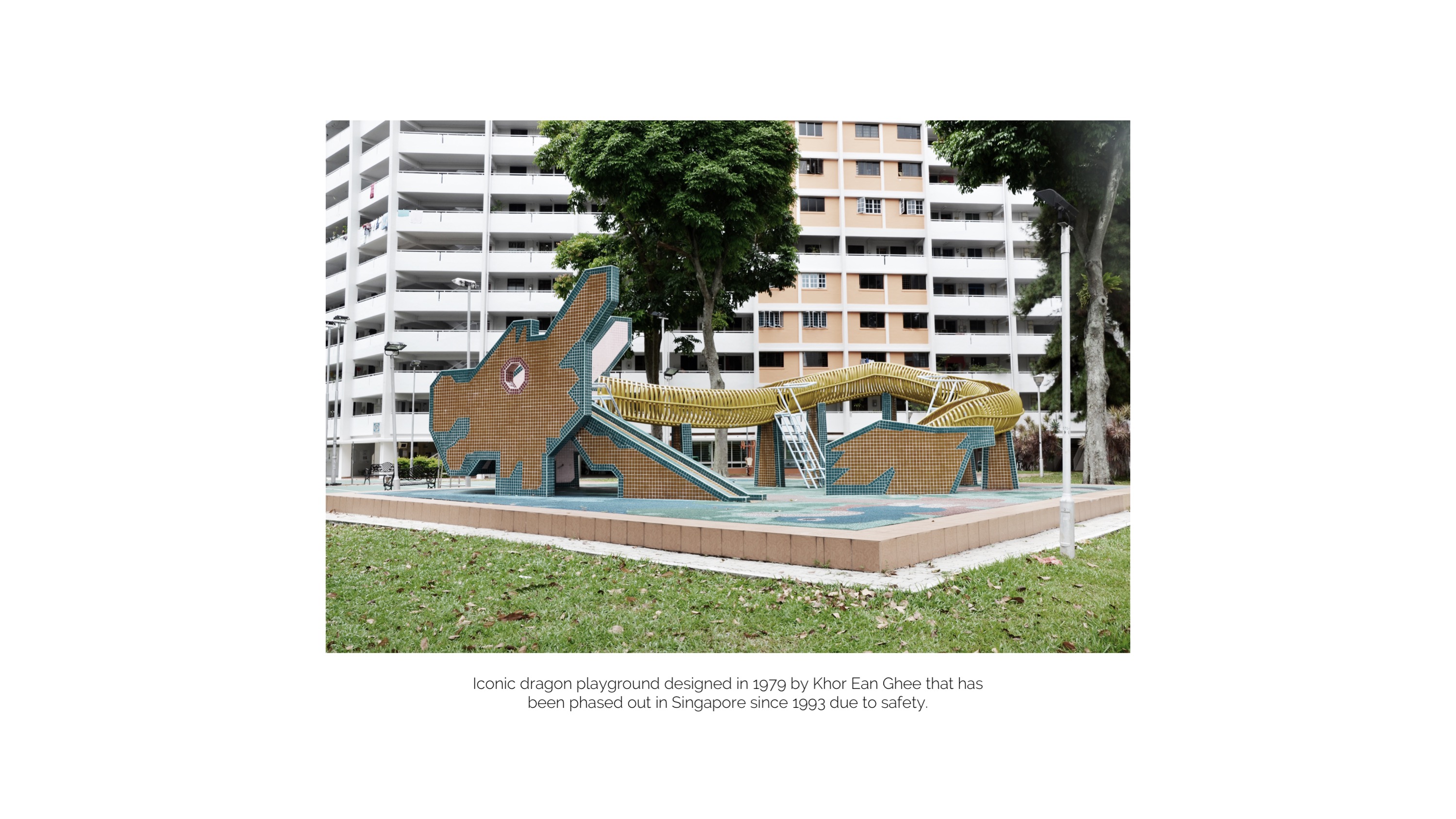
The photographs in my zine maintain a washed out look with a pink hue and this is done on purpose to match the pink tiles on the dragon playground.
The next step would be to go to print so stay tuned for the final print out and submission!
The first exhibition I’m going to cover made its appearance at the Singapore Biennale 2016. Being my first time to the Singapore Art Museum and always seeing so many posts at the museum’s very famous chapel, I was pleasantly surprised when I took the stairs up and saw Noah’s Garden in its place.
Deng Guoyuan, China Noah’s Garden II, 2016
Aluminium alloy steel frame, mirror glass, LED lighting, real and artificial plants and rocks
1160 × 650 × 320 cm
Noah’s Garden was a massive kaleidoscope of mirrors and the spinning middle mirror panel immediately drew me in. It looked like one of those fairground funhouses you see in movies that meant to distort what was real and that was exactly it’s intention.
Here is a short video I recorded while I was inside the installation:
The first thing you would notice upon stepping into Noah’s Garden would be the neon-coloured plants scattered around the space. At first I thought the artist had wanted to create a scene from outer space. The plants looked out-of-this-world and it was upon further reading that I realised the plants were “referencing classical Song Dynasty representations of particular flora, but coated in vibrant colours, assault the senses and blur the lines between the real and the artificial.”
The effect of the mirrors were successful in creating a sense of distortion and augmented reality. Especially when I looked down, I indeed felt a sense of infinity and how I was standing on nothing. Using colours from traditional maps, the artist desired to challenge the validity of map-making and wanted to “create” a world while destroying it simultaneously and with the effect of the turning mirror, I think the effect was very well achieved.
Perhaps what could’ve been done better was a more interesting lighting design. I felt that the repetition of circular LED light sources were boring after awhile so maybe a play on shadows and colours could further enhance this mythical world and increase the distortion and distraction in the installation.
The next exhibition I will be covering would be one from FutureWorld at the Singapore Artscience Museum. The installation/exhibition was closed however when our class went down for our class excursion so I will be using pics from my previous visit there (I’ve been there a total of 3 times heh).
Crystal Universe was an installation that took my breath away the moment I set eyes on it. I had seen many Instagram posts about it but seeing it in real life gave me literal goosebumps.
The idea behind Crystal Universe is to use a compilation of light points to create a immersive sculpture just like how dots in pointillism can form an image. The end effect was a three-dimensional plethora of lights that allowed audiences to walk into and experience from many angles.
The interactive element in Crystal Universe allowed audiences to download an app and choose what type of light formation they wanted to see. This was in the shape of stars and areas of the galaxy. About 170,000 LED come together to form this dazzling light display.
With the intention to put astrophysical phenomena such as planets, galaxies and even gravitational waves on display, I think the installation did a good job and making the audience feel the same and feel small within the exhibition. The use of mirrors also extended the installation and turned it into an ‘infinite’ light display. The installation also made me realise how small each of us are within the universe.
The use of sound for example the wind effects heard in the above clip also promotes this idea of space and the vastness we are surrounded by. All in all I think this installation fully embodied a 4D installation, heightening senses of sight and sound to fully allow audiences to experience the work.
After putting together the first draft of my zine, one major obstacle I faced was the lack of pages for this assignment. I did not want my narrative to seem rushed and I still wanted to retain the minimalist quality to my work so this will be an ongoing challenge.
These were some of my design inspirations going into my first draft:
Here is my first draft with Mimi’s general comments below:
I decided to go with hand-written typography to give my text a more authentic and personal feel. I also tried to give the whole zine a more open look limiting my spreads to having not more than two photographs. Here are the main points I gathered from today’s consultation:
Mimi felt that I should explore on using fonts instead of handwriting because she loved the font used on the back page.
The photos are not being given enough airtime because of their size so perhaps I could explore letting some of them bleed to the edges.
The cover image could be stronger and we discussed doing a swop of images that will be applied to my next draft.
Mimi was not here for the centre spread on pages 3 to 4 so I will rework that.
Today’s Sunday, 19th March 2017, and I finally made my second trip to AMK. The purpose of my trip was to find more interesting photos and angles I could take of the dragon playground and boy was I inspired.
For starters, I found a piece of cake someone had irresponsibly disposed beneath the playground:
This gave me inspiration for more narratives and dialogues about letting something/someone eat away at something that mattered. The destroying of something once perceived as beautiful or perfect.
I took out my macro lens and got to work. I haven’t decided yet however if these new photos will fit into my zine’s concept.
Which brings me to my next point:
CONCEPT
Based on my previous post, I decided to do a narrative on a relationship going sour which will be accompanied by images from the playground which will act as a motif or juxtaposed and symbolic scene where it all takes place.
After coming home with my new photos, I tried to begin writing my narrative but somehow it all sounded very forced. I did however come up with a title:
This is Where We Fell in Love
Here is a concept I came up with for my previous 3D assignment which was shelved completely due to a lack of resources. The text in this document came from authentic message exchanges and I decided to use these to form my narrative. This was way more personal and bore more meaning to me.
I will continue to work on my layout and weave the copy into the images I have of the dragon playground. I have begun the process tonight and it truly is a very slow and reflective process that I find is mildly therapeutic.
Our second 4D assignment proved to be one of the most tiring projects yet! Over two weekends, my team and I worked tirelessly to come up with a concept and script, shot/equipment list, cast actors and even do a re-shoot as we were unable to capture everything we needed during the first filming date.
Here’s a look behind the scenes (filled with some shots/locations that were not used in the final cut):
In case you were wondering why there was a need for a character in drag (although who wouldn’t want a character in drag?), we felt it provided some subtext. The character was distraught and left to wonder what his ex (Isaac) saw in Isabel that he could not provide or embody. He therefore ‘get pretty’ and dolls himself up for the big day and is in search for some sort of resolution.
In the end, he decides to let go and walks away.
After production came post where my teammate Vanessa and I went through the tedious task of recording foley for our film. Here are some snippets from the night:
Dripping water onto a plate to create the sound of water dripping from Isaac’s face (0:15-0:16)
Overlaying the sound of the makeup brush being taken out of a jar (0:41-0:43)
Wetting the rim of a plastic container to make the sound of the tap squeaking shut (0:14-0:15)
To see a full list of the foley sounds we recorded click here
“The name Ang Mo Kio in Hokkien literally translates to “red-haired man’s bridge”, where ang mo is a colloquial term for a Caucasian person. The maps showed John Turnbull Thomson’s bridge over the Kallang River, near what is now the junction of Upper Thomson Road and Ang Mo Kio Avenue 1. With the clearing of the land, several villages sprung up, which eventually became known as Ang Mo Kio.”
After doing much research on Ang Mo Kio, I decided on my angle:
Pursuit of a New Ang Mo Kio
This title ignited thoughts of finding the modern-day bridge that tied the people of AMK together and also possibly discovering a bridge that has stood the test of time and can link us to the past.
Bridges bear so many meanings in today’s context. In this zine, we will explore the various bridges that have connected and continue to connect the people of Ang Mo Kio, both to one another and with the rest of Singapore.
Bridge Symbolism: Connector, transition, bridging a gap / gaining new information
I had shortlisted four places to go to, namely:
AMK’s famous dragon playground – one of the two left in Singapore
The AMK junction where the original ‘Ang Mo Kio’ once stood
An old underpass that connected Ang Mo Kio to Hougang/Serangoon Gardens
AMK Town Centre
However, because of my busy schedule and having the bad luck of recent rainy days, I only managed to go to the dragon playground but that got me super inspired.
In terms of zine content, I decided I wanna go with a photo-oriented zine that interplayed between imagery and poetry (that I intend to write). I feel the bridging theme coupled with images of the past and the many mysteries they conceal or reveal is an interesting concept that i would like to work and develop on. Stay tuned for the next update 😉