Deciding on the final direction I wanted to go with. There were so many ideas I had that it seemed such a pity to just focus on one but due to practicality and time constraint, I eventually settled on what I feel I could do.
Technical skills could be improved. I feel that I’ve learnt quite a bit about drawing on Photoshop through this assignment and aim to improve my knowledge.
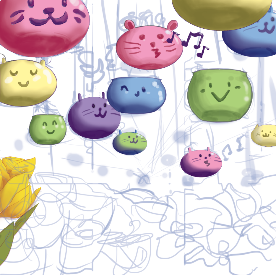
Choosing of colours: I wanted to go with colours that would pop and be pleasant to the eyes hence the choice in pastel colours. The flowers had their own colour schemes too which made having a library in Photoshop a godsend.
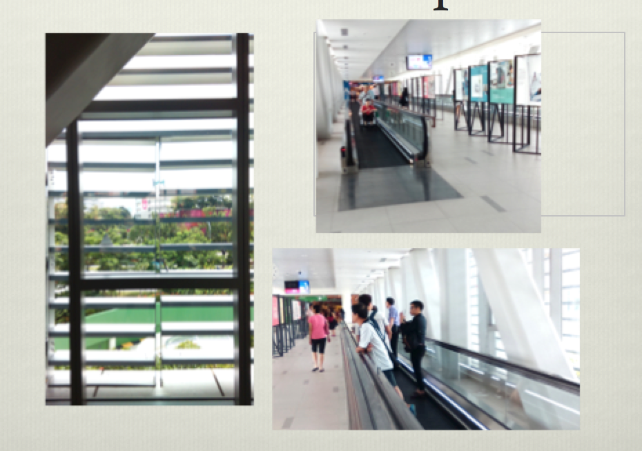
In our first class, we received out brief: Create something that would fit on the glass window of the hospital and consider its relationship with the viewer, that’s what we would tasked to do. During the field trip to the hospital, here are the things I noticed about the space we were supposed to design for.
The space was airy and large but seemed a little cold because of the monotonous colour usage.
Some windows were blocked by grilles which provided a limited view of the outside.
There was light coming in from all side and shadows were very diluted.
People were mostly zoning out or looking at their phones. Most of them were staff and some of them were patients. Some patients and their presumed relatives seemed worried or tired.
Through this observations, I thought about the function of my graphics and wanted them to be positive, light-hearted, and have the ability to provide a moment of happiness for the viewer. Since the location is only a place that links people to other parts of the building, they only have a few minutes to spare which is the only time I have to capture the attention of the people.
Initial imageries I wanted to play with were plants, for the soothing atmosphere it provides and its link to the outside of the hospital, or patterns with colours, that would invoke an emotional response in viewers.
The initial ideas I had were:
Create 3D interactive pieces that viewers can interact with. e.g plants made out of cotton wall.
Stickers with fun designs to be pasted on the wall. This opens up a lot of opportunity to play with the light coming through the window. Also there is a possibility of creating a suggested space where viewers can imagine the stickers as items that sit on the window ledge.
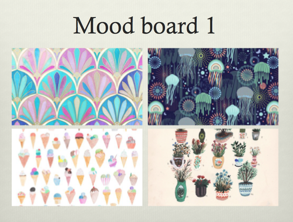
After learning that this was a purely 2D project, I decided to focus on the second idea. I then came up with 3 mood boards.
Patterns and colours form a soothing designPapercut-like designs- nature and floral motifsDesign of plants with cute graphics. Creation of a garden within the space of the window.
Throughout this three mood boards, I decided to work on the third idea and came up with some rough sketches. Before working on the rough sketches I decided to research on the function of a garden and the meaning of flowers which I was going to introduce to the design.
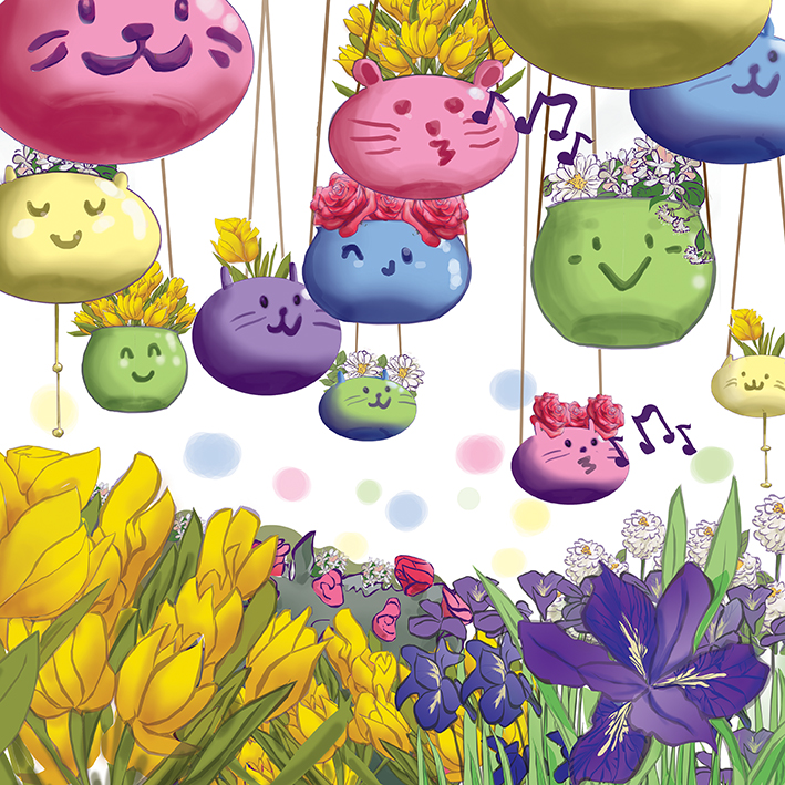
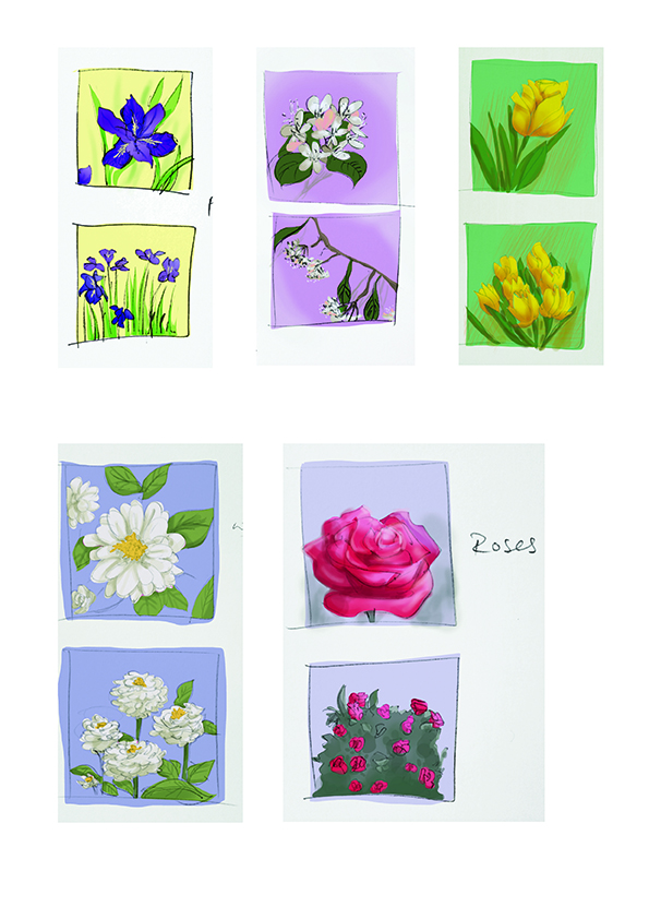
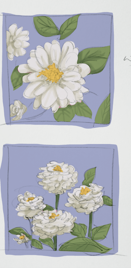
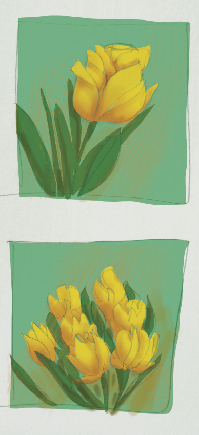
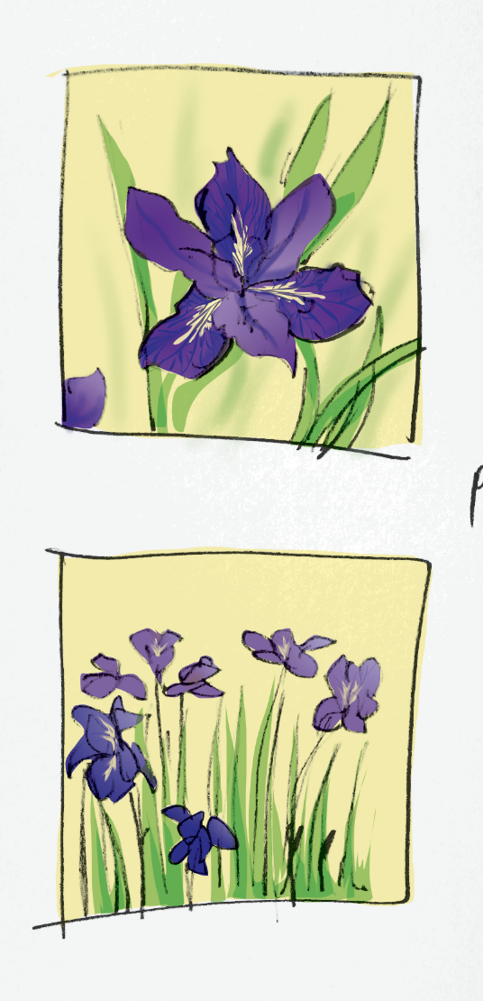
The flowers were limited to just 5 different kinds with varying colours.The flower language of white zinnia is goodness.The flower language of yellow tulips is sunshine in your eyes.The flower language of smilax is loveliness.The flower language of iris is hope.The flower language of pink rose is sweet thoughts.
The flower language of all five flowers form a bouquet of good thoughts and well wishes which I attempted to convey through the array of colours and graphics.
I went to reference books on landscape design after to understand what the best way to design a garden was. Some tips I took away and decided to utilise were:
A well-equipped garden will revitalise us
The presence of plant life in a confined area inspires a feeling of satisfaction
Garden as a place for leisure
Perspective can be used to make a garden seem larger
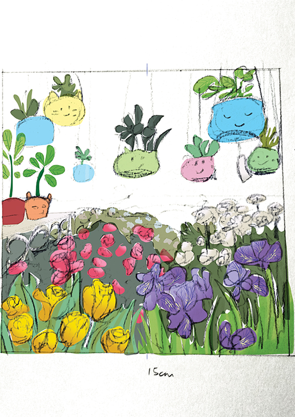
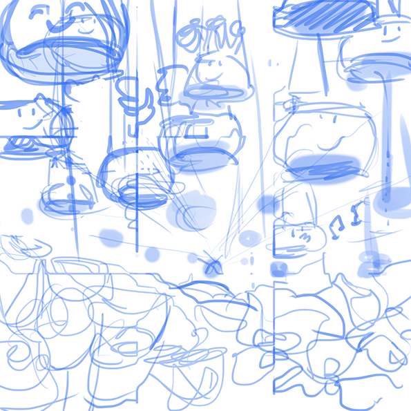
Rough sketches:
Incorporating the flowers and pot graphics into a designAnother perspective but instead there are shelves.
After the consultation with Michael, our lecturer, and the class, there were suggestions that the garden could be less dense while the flowers in the foreground could be larger to suggest that the garden is closer. The floating flower pots and its almost fantasy-like nature received favourable comments. Since it was a personal favourite too, I decided to keep it.
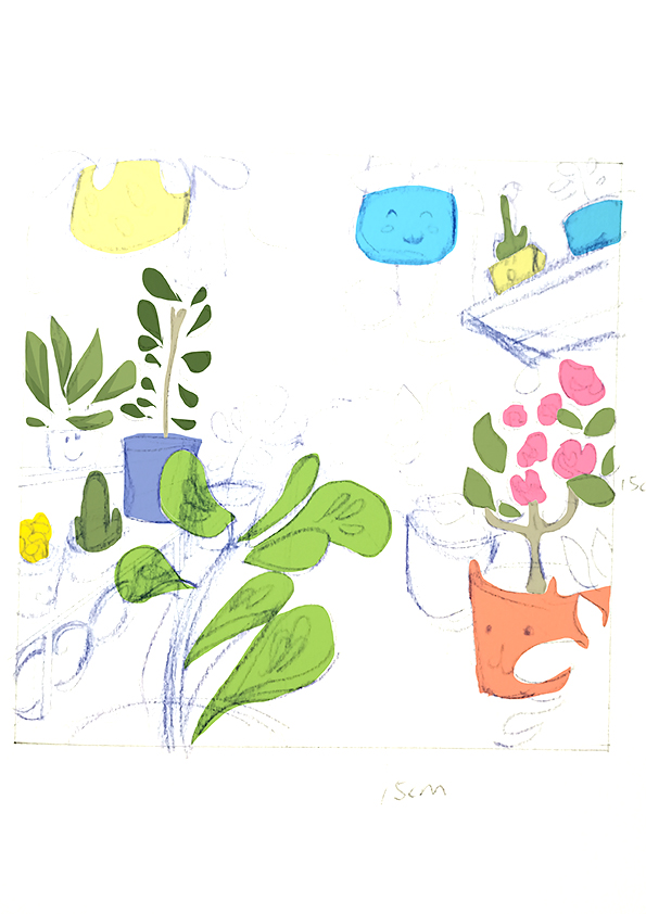
Second draft:
Using one point perspective helps lead the eye in and create a suggested space. The pots seem higher and seem to float above the viewer.
Stages of development:
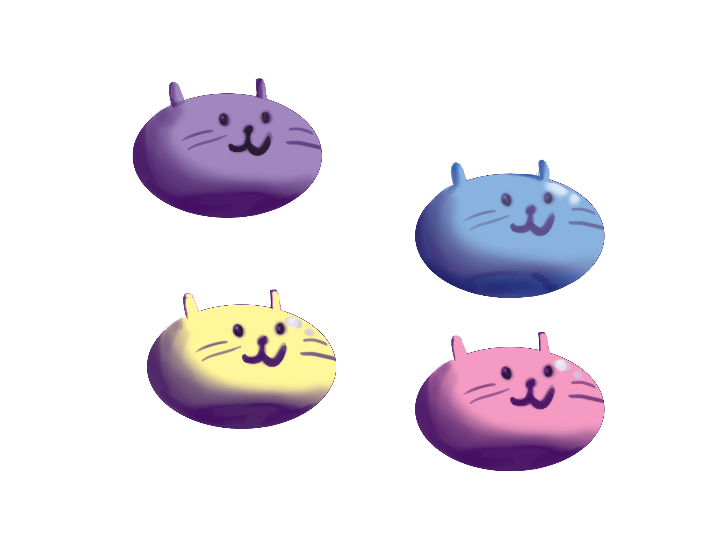
Other ideas for design of potsColouring the pots.In-progress. Pots and flowers coloured.
Front of cardBack of cardFront detail of card with die-cutFront detail (2)Back detail with die cutInterior of card
There were certain challenges that I faced along the way which I feel helped me grow as a designer. Some of the challenges and solutions are as below:
Designing the folds before imagery. Also thinking that folds had to be extremely elaborate for it to look nice which isn’t the case. A simple one fold can still look good. The thing that has to match and be considered is the combination of card fold and design. How does the design relate to the fold? How does the viewer interact with the card? How do they approach the card and what visual cues can we give them for a better experience on their side? These user-oriented questions would be better instead of self-oriented questions.
Clarity of design. We need to ensure that the potential viewers understand what they are looking at before we can call the design a success. One good way of gauging is to show a mock up to people of the same age group as your potential client. They will be able to give indicators if the design is working.
Pushing your design is needed. When you have an idea and it’s working out fine, what we can do next is how can we further push the design?
Printing! This was a major problem because the alignment between both sides of the card had to be precise, which it wasn’t. I had to go back to the printer’s a second time after editing the design at home and check the alignment on the spot again. Upon seeing that there was still a small margin of error, I came up with a blue gradient on the outside of the design so that it would not look like it was a mistake. Also when printing, considering the card weight is important too.
I did learn quite a lot from the assignment and hoped that I would continue adding on to the knowledge as I continue on with my studies!
The assignment started simply enough- create folding and perforation lines to make a 3D card out of a single sheet of paper. Unfortunately I have never been too good at 3D materials but I am interested to see what I can do. Here we go.
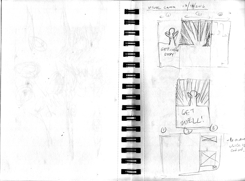
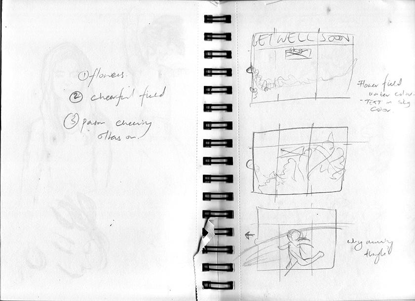
When reading about the brief, where we have to explore possibilities in creating a get well wishing card, the first thing I did was think about the folds I wanted to use. I went through card pieces I saw online and at Art Friend and played with the idea of different folds to create.
Sketches for card graphics and foldOther exploratory sketches
I wanted to card with two folds that folded on top of each other. There were two ways that it could go then:
A person raise their hands in triumph while the second layer forms a sunburst design. Both layers would be cut out with a die cut. The last layer would be a background upon which the first two layers would rest and together they would form a completed image of a person in a dynamic pose and cheering the viewer on.
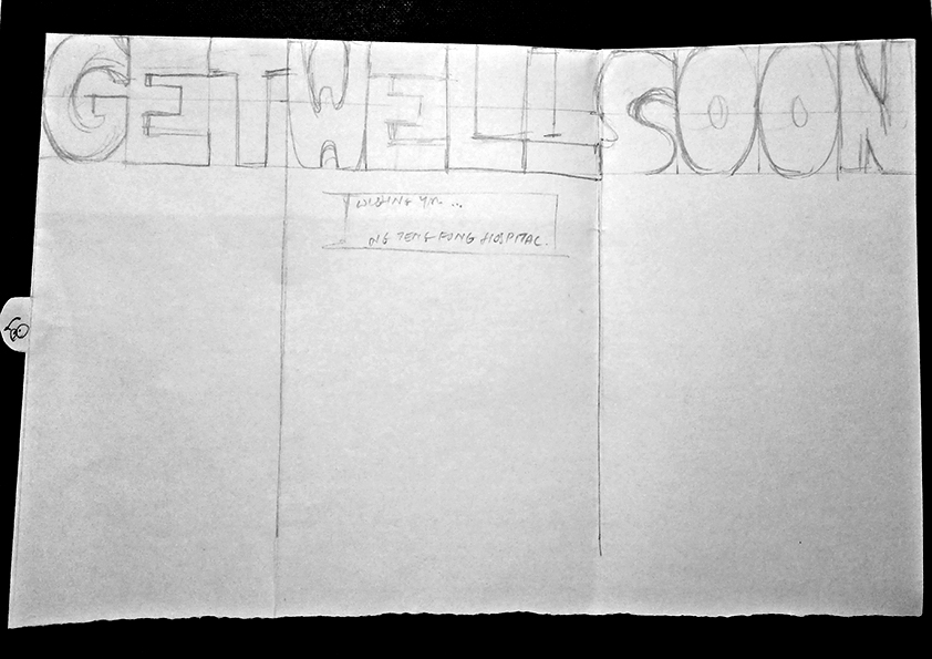
Words on top divided into three portions according to the fold of the card. The words say “Get Well Soon”. The imagery for this is undecided.
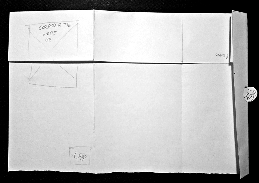
Front of mock up.Back of mock up with box for corporate text and logo.
At the end of the first consultation, Michael, our lecturer, suggested that the image be the focus before thinking about the folds we want to use. It was the complete opposite of what I had been doing which made me panic for a moment. Then it was back to the drawing board.
When I think about graphics, I also think about what I am capable of currently. If 3D isn’t my thing, then I can focus on creating good graphics. What I wanted the viewer to get out of the card is happiness and a sense of warmth. Hospitals can be rather cold places, with their bare walls and rooms devoid of personal items. The card should aim to provide some warmth and convey the sense of love that people are giving when they give a card.
I focused on the graphics and thought if I wanted to do it digitally or traditionally. The things I thought of were flowers or colourful designs so I went to look for images online.
At this point, I just looked for images that interested me visually but had no idea yet how to apply them to the final product. Also I then came up with more sketches focused on interaction with the viewer.
Sketches and character sketches
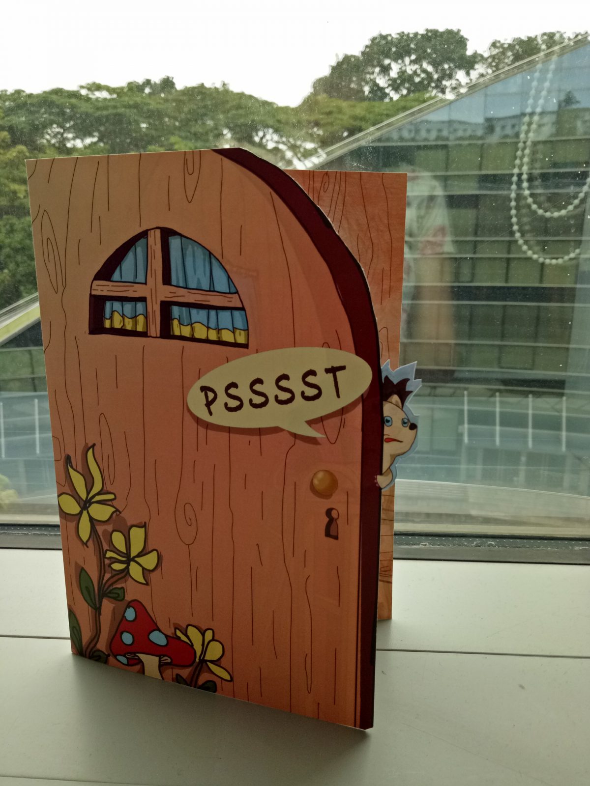
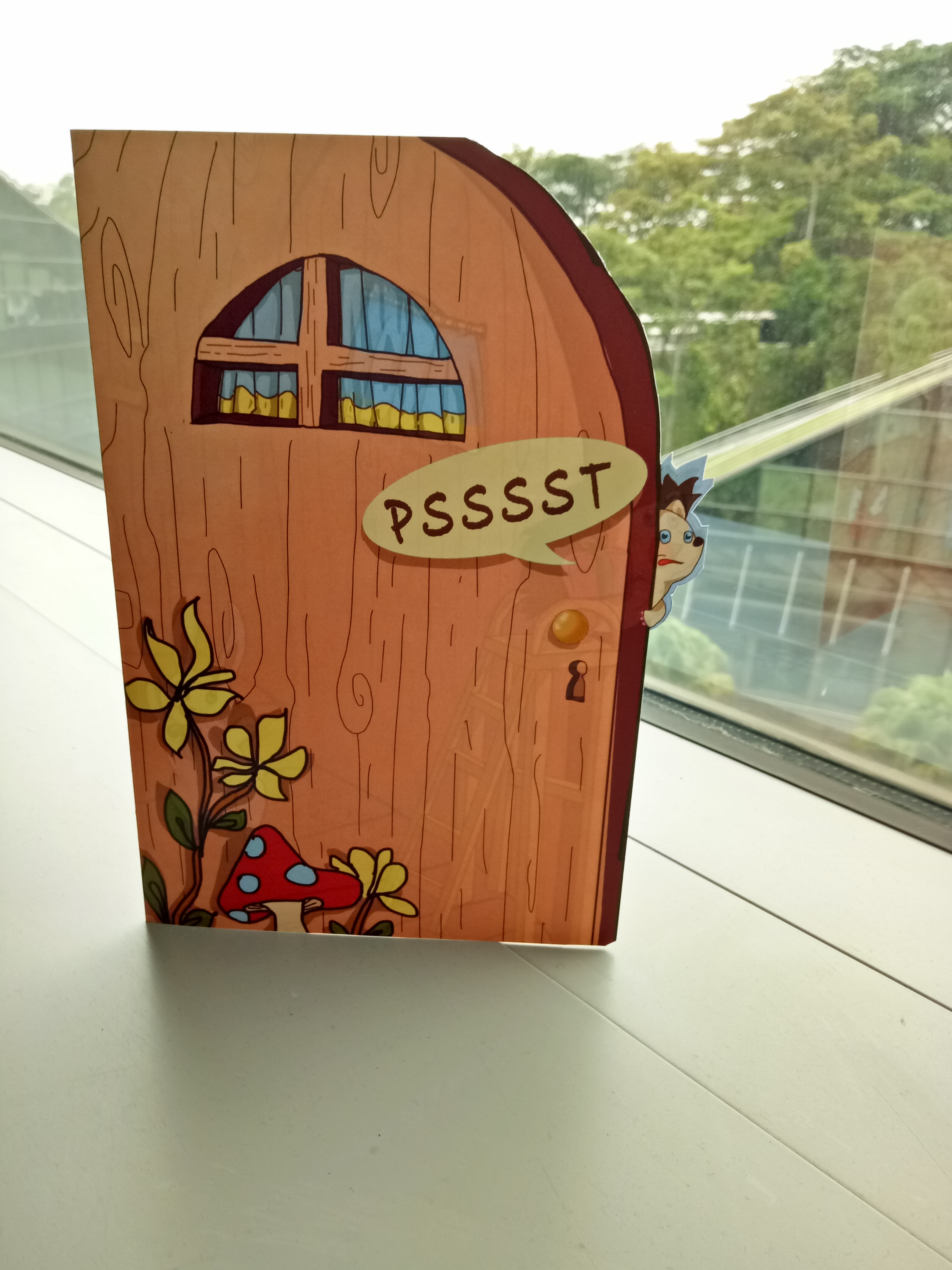
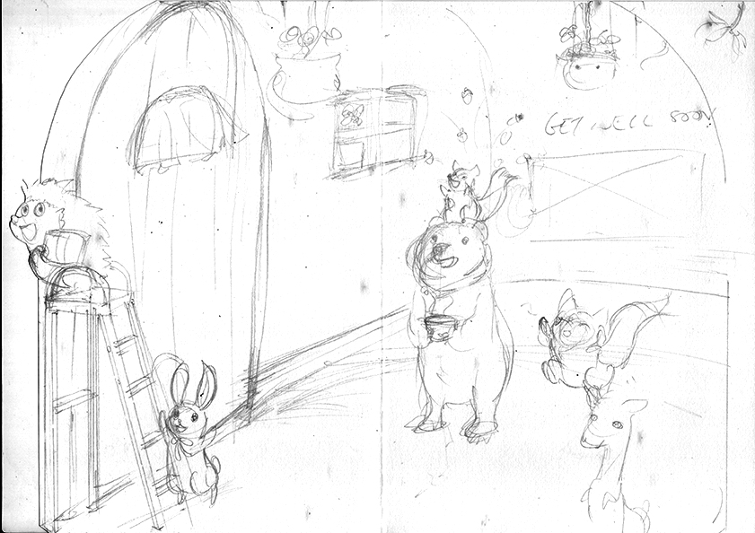
3. The woodlands creature idea involved the inside of the card being a suggested space where woodland creatures come up to surprise the viewer with their cuteness and well wishes. I was still thinking of using the two fold design. So the first layer would be a door which would open up to an interior where the characters would give the surprise.
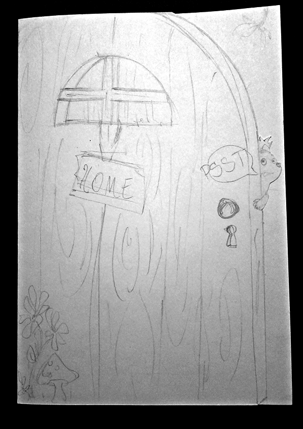
At the second consultation, we then discussed about the possibility of doing away with two folds and bringing it down to one fold where the first layer would just act as a door and the act of opening the card is akin to opening a door. Michael also suggested doing away with the “Get Well Soon” words at the top and creating a die cut with a character at the front, which will correspond to the design at the back.
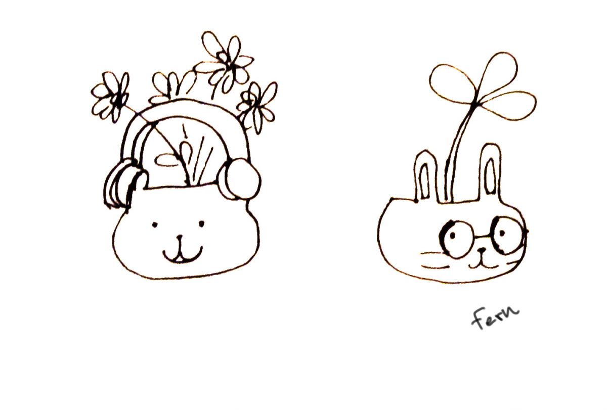
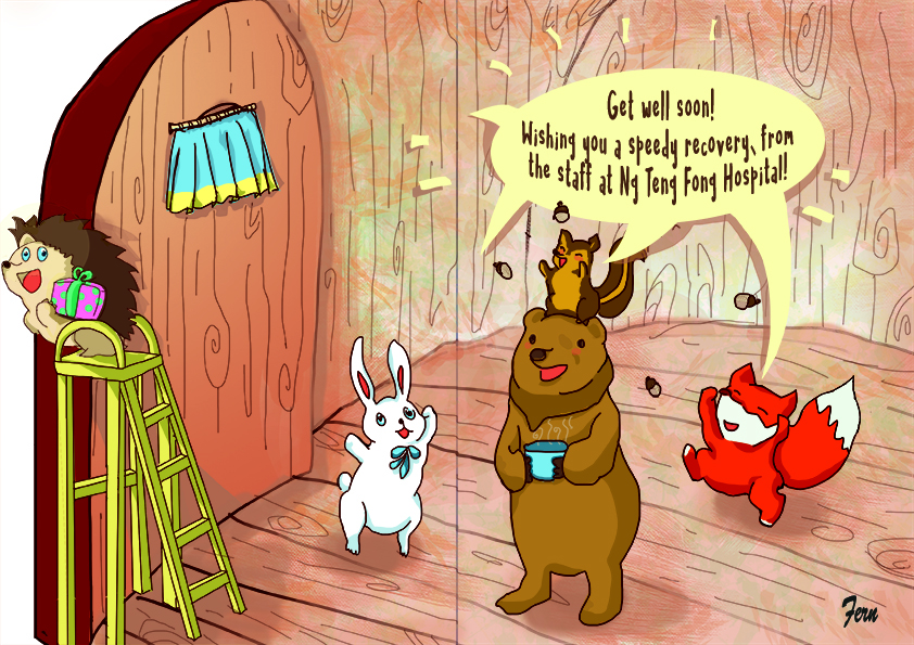
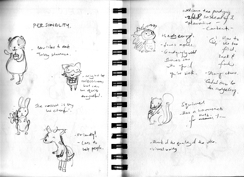
I quite like the idea and decided to stick to it. I had a few design sketches for certain characters but realised that they would not all fit into the final design. So I kept to just four final characters- the Hedgehog, who would be inviting you into the room and has presents (yay!), the Bear, who likes to see people happy and warm so it made soup for you, the fox, who is shy but likes to dance in joy at seeing a person healthy, and the squirrel, who likes its nuts or acorns but doesn’t mind sharing if it makes you feel better.
Character sketchesHedgehog sketches
After designing the characters, I then designed the layout. Using various image sources, I combined them into a final design.
Pencil sketch for the frontPencil sketch for the back design
Front mockup
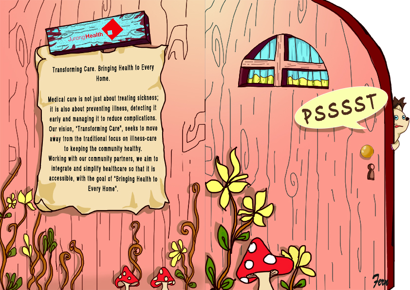
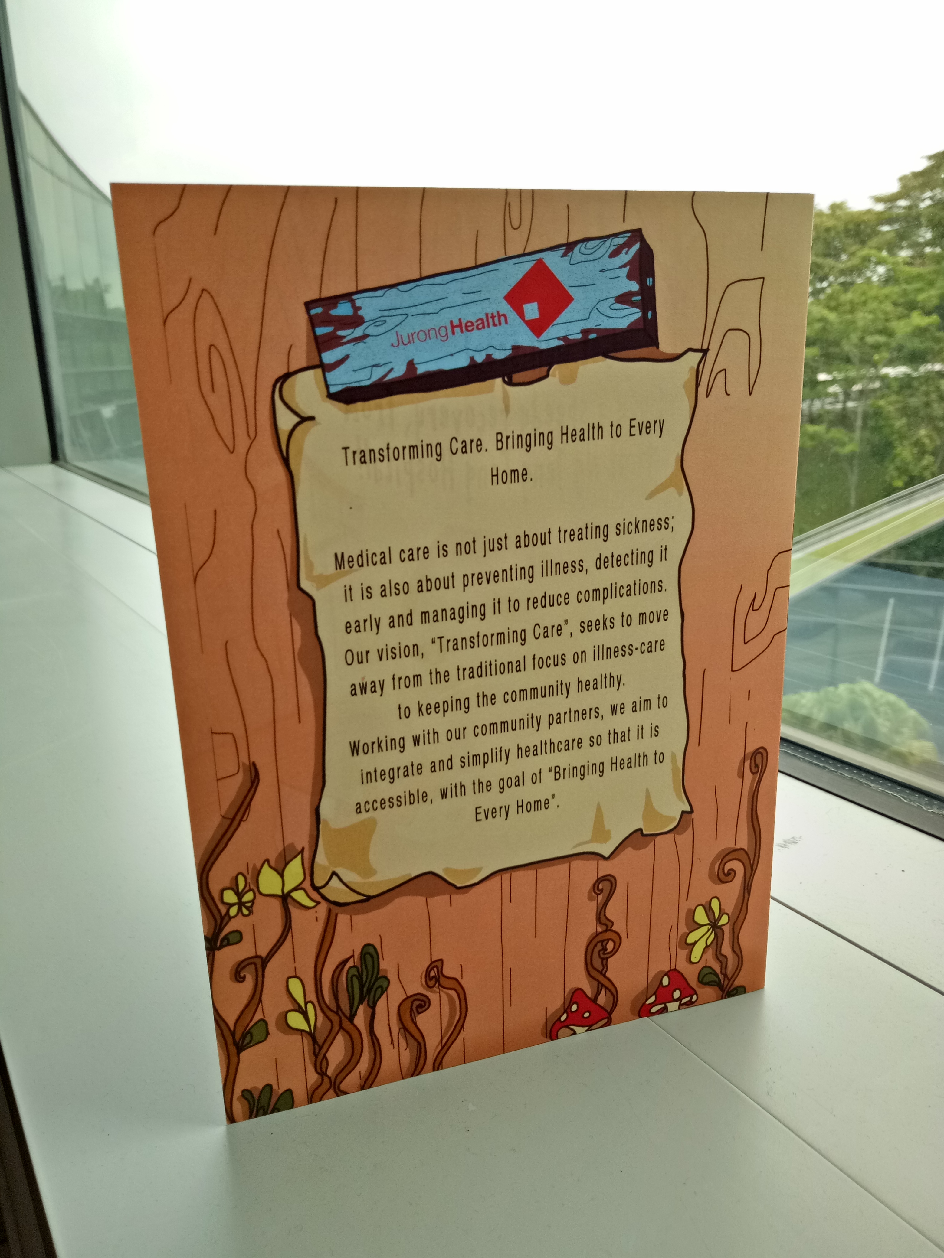
At the third and last consultation, the suggestions given were that I had to consider about the space I was inviting the viewers in to when they opened the door. Also the images of the mushroom could be a little bigger to suggest distance instead of it being flush against the door. A classmate suggested that the corporate text at the back could be combined together with the design, perhaps on a notice board, which I found really helpful!
After weeks of consultation and tweaking, the final artwork was as below:
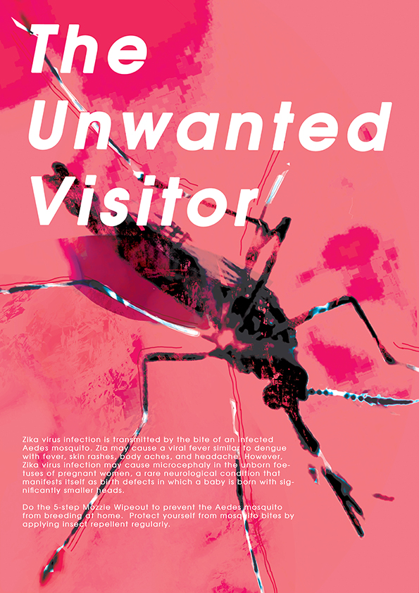
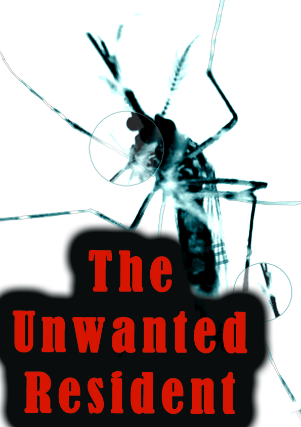
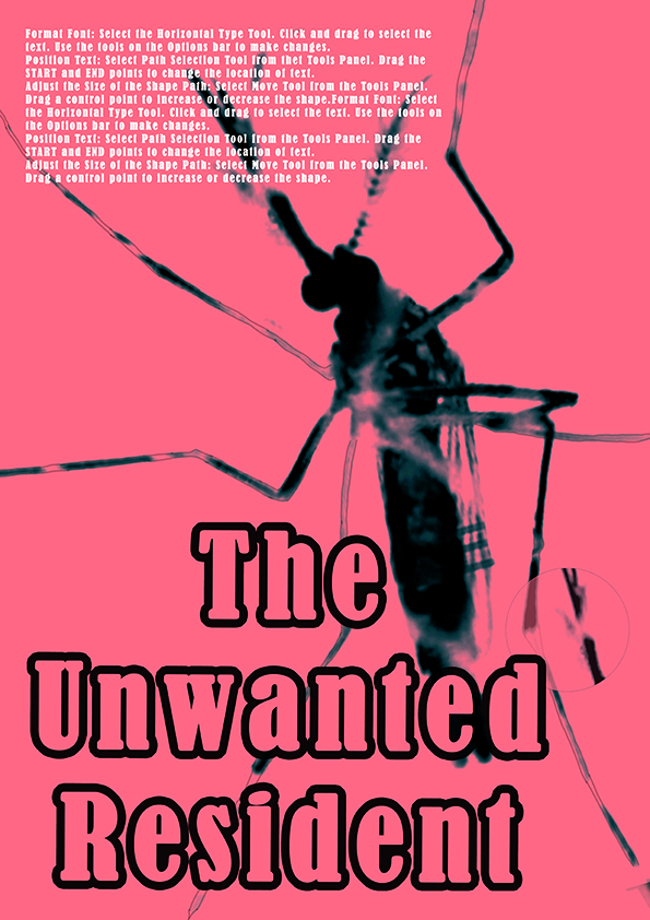
I wanted to give it a contemporary feel hence the font chosen. Texture was also used to suggest blood stains and the sac at the bottom of the mosquito where blood is usually collected. The mosquito creates an instantly recognisable image which people can understand visually before the words register.
Certain challenges I faced were:
Deciding on a slogan: Maybe copy writing is not my thing because I had a bit of trouble trying to come up with something catchy.
Deciding on a layout I wanted to use: It was a little strange that I thought we had to do a sort of infographic and then I see everybody doing image-driven posters instead. In the end, due to time constraint, I did up a poster. Making a decision and sticking with it is something I have to learn.
Positioning of image: I went through many drafts and mock-up to come to the final product. It was pretty interesting in the end.
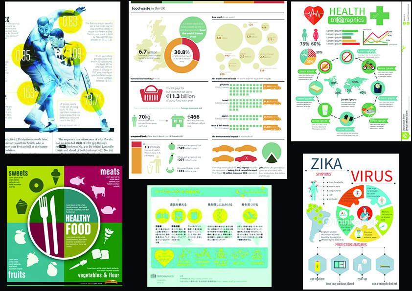
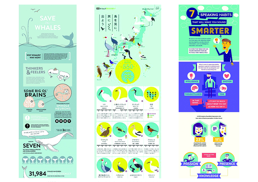
Some research I did before starting the poster was to look at the different ways information was disseminated.
Infographics: This form of information sharing largely uses graphics and colors to provide information in bite sized portions and make it easily digestible.
2. Illustrated infographics and comics: This form of information sharing uses a storyline and related graphics to share its information.
3. Image-driven: This form of information sharing is similar to how websites are design. It sections the information and uses large images that works with the text to create a pleasant combination.
The initial idea was to focus on sharing information in bite-sized portions and also to highlight the danger of Zika. Therefore I decided to focus on the second mood board above.
Initial mockup: Editing the image of a mosquito and redrawing it in an illustrated style. The purpose was to make it seem like a wanted poster hence the choice font seemed to that in a cowboy show.
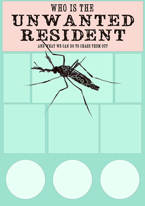
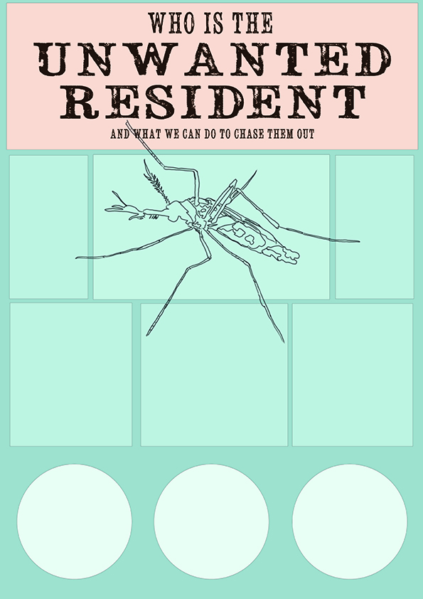
Mock up 1: The squares and circles were to contain informationAnother variation
After consultation, the slogan I decided to work around was “Who is the unwanted resident?” which focused on the idea of the mosquito being unwanted in the home. Certain information I wanted to illustrate were tips on how to mosquito-proof your home and what zika was.
In the end, due to time constraint, I decided to focus on an image and instead use it to catch the attention of the viewer and be able to bring across an understanding of the content with a look. Therefore I focused on the most iconic image to represent zika- the mosquito.
The following are some of the drafts:
Another variation of the poster where the information was supposed to encircle the mosquito image.
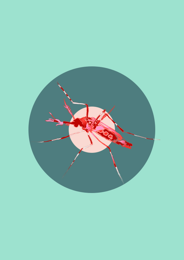
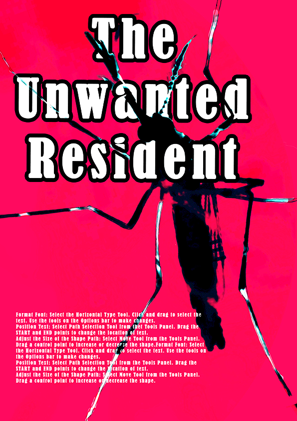
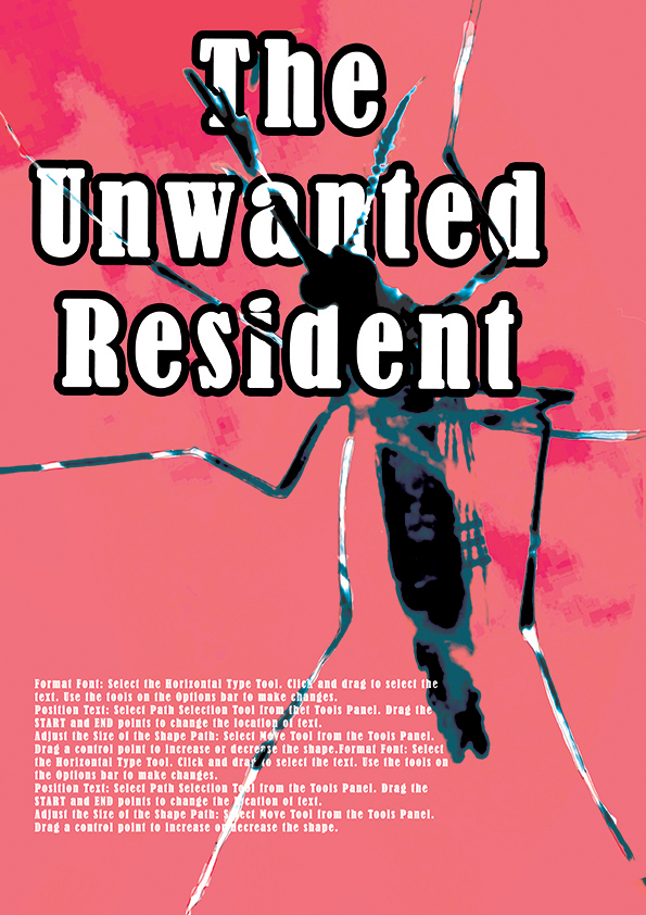
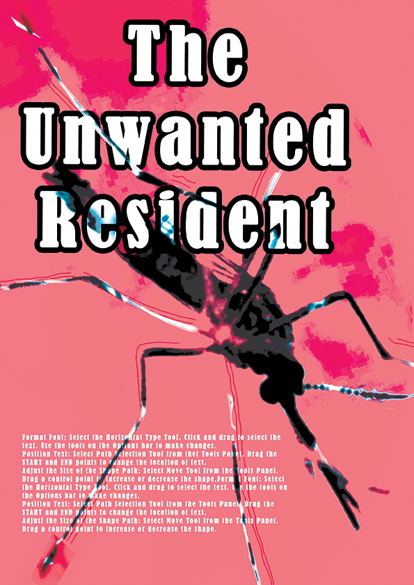
Playing with the mosquito image as main focus of poster. This has an old school feel, like the James Bond movie, hence I decided to put the target images to make it seem as if the mosquito was being aimed at.A variation of the poster above. Black and red was added to give the mosquito a more menacing feel. Certain aspects of the mosquito are repeated also to emphasise its scariness.Initial design with red background. This was an incident; I accidentally painted a whole layer red and it gave a bloody effect which I decided to keep.A variation in which the font is changed and the red is more saturated. It gives a vintage feel which I quite like but might not use since I want to make it more relevant to present times.The colour is a little off-color here… Playing with a textured background and suggesting blood stains.Changing the position of the poster gives it a smoother visual flow. As English speakers, we read from left to right, which is what the suggested direction the mosquito image is providing us.
After a final consultation, the slogan was edited to “The Unwanted Visitor”. Using visitor instead of resident gives the connotation that this is something we do not want in the house in the first place as opposed to a resident which means that it already resides in the home.


